


Kaiku Ñam is not a yogurt. Not a protein shake. And not a miracle product.
It’s a smarter response to how we live today.
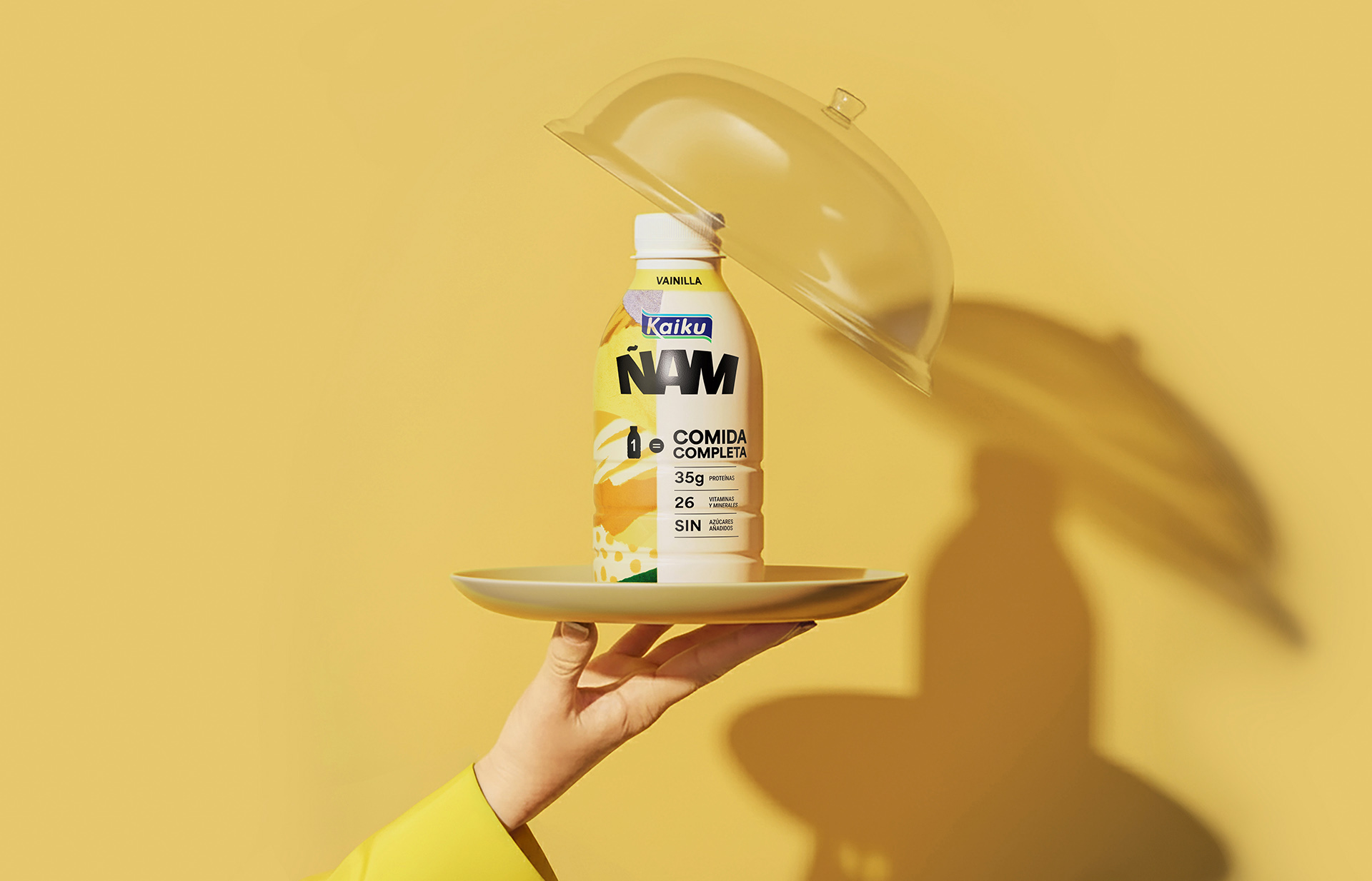
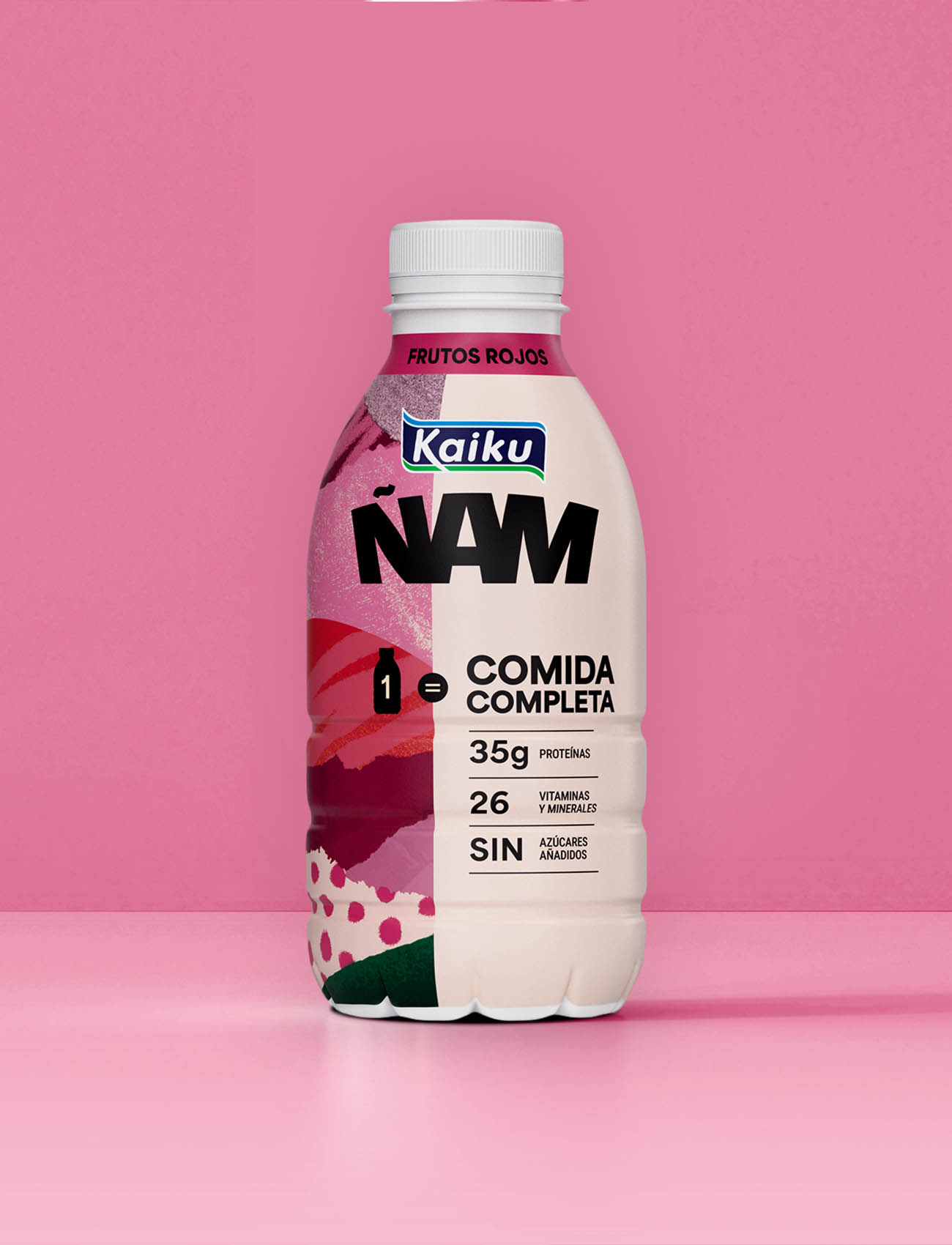
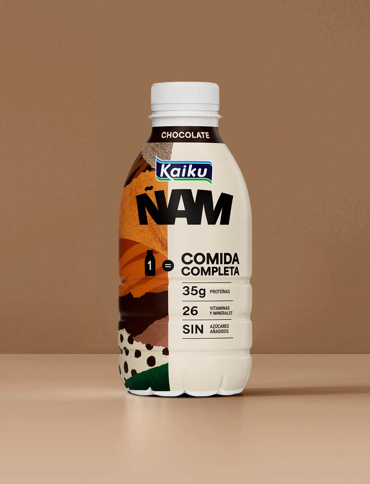
A 500 ml dairy drink that delivers the nutritional value of a full meal—bringing together the balance of a starter, main, and dessert in a single, streamlined format, with just the right touch of indulgence.
Designed for people who see well-being as a choice, not a compromise, Kaiku Ñam redefines convenience. A real, effective solution for those moments when sitting down to eat simply isn’t an option.
In a market increasingly shaped by self-care and functionality, Kaiku Ñam doesn’t just enter the category—it challenges it.OBJECTIVES
• Own the category: redefine the “ready-to-drink complete meal” segment in Spain, positioning Kaiku as the benchmark—just as it did with Lactose-Free.
• Simplify the message: place the core proposition—1 bottle = 1 complete meal—at the center, expressed with absolute clarity.
• Balance function and desire: merge nutritional performance with a modern, aspirational identity that moves beyond traditional dairy codes.
• Drive visual disruption: move away from pastel, “girly” aesthetics toward a bolder, more energetic language designed for an adult audience.
CREATIVE APPROACH
The creative concept deliberately breaks with established category codes to speak directly to a demanding consumer—one who values clarity above all else.
We moved away from the soft, creamy, and predictable visual language of dairy, replacing it with something more defined: tension, geometry, precision. A stripped-back system that removes the unnecessary and focuses on what matters.
The result is a design that feels controlled, energetic, and purposeful.
At its core lies a single idea: boldness.
If the product delivers a complete meal, its visual expression should do the same—solid, dense, and unmistakably present. Every element is designed to hold that promise without compromise.
Information is structured to work instantly: it organizes, prioritizes, and clarifies. No noise. No ambiguity.
What the consumer sees is immediately understood: not a liquid yogurt, but a direct, advanced nutritional solution. One that stands apart on shelf through confident color and distinctive typography—built for instant recognition and recall.
GRAPHIC SOLUTION
Kaiku Ñam’s visual universe is built on a clear endorsement strategy, where the parent brand provides credibility while allowing a new, more contemporary voice to emerge. Kaiku guarantees trust and expertise. Ñam creates distinction.
This system is articulated through three core pillars:
1. Distinctive lettering: The Ñam logotype is redesigned and integrated with the Kaiku masterbrand to form a strong, unified signature: Kaiku Ñam. A custom typographic expression that moves away from the generic to become a recognizable, ownable asset.
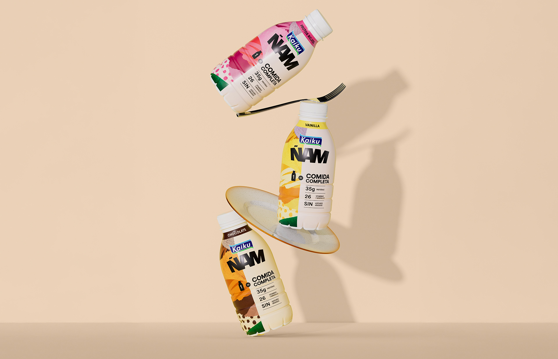
2. Vibrant color as energy: A dual, high-impact color palette differentiates flavors—chocolate, vanilla, strawberry—while projecting energy and immediacy. Color becomes more than identification; it becomes attitude.
3. Information as structure: The message “1 bottle = 1 complete meal” anchors the system. It is supported by clear, transparent benefit cues—38g protein, 26 vitamins and minerals, no added sugar—designed for immediate comprehension.
Together, these elements create a system where brand and product work as one: Kaiku builds trust; Ñam drives memorability.
PRODUCTION
The Kaiku Ñam range is expressed through a 500 ml format designed for life on the move—aligned with fast-paced, real-world consumption.
A matte finish introduces a more refined, controlled presence, deliberately stepping away from the glossy conventions of the category.
The design is built through clean, confident color blocking and geometric compositions that reinforce structure, clarity, and modernity.
In a crowded and visually repetitive environment, Kaiku Ñam opts for controlled disruption.
Saturated colors and sharp contrasts create immediate shelf impact—anchoring attention, enabling fast identification, and strengthening recall.
CREDIT
- Agency/Creative: TSMGO
- Article Title: TSMGO Introduces Kaiku Ñam With a High Impact Packaging System Built for Modern Nutrition
- Organisation/Entity: Agency
- Project Type: Packaging
- Project Status: Published
- Agency/Creative Country: Spain
- Agency/Creative City: Logroño
- Market Region: Europe
- Project Deliverables: Packaging Design
- Format: Bottle
- Industry: Food/Beverage
- Keywords: Packaging
-
Credits:
TSMGO | Brand Consultants: TSMGO | Brand Consultants


