


Kamiku: Tradition Without Nostalgia — From Craft to Contemporary
SUMMARY
Kamiku is an artisanal cheesery born in the heart of the Spanish Pyrenees. Founded in 2006, the brand crafts sheep’s milk cheeses using native molds from the Bertiz Valley. In 2025, Kamiku opens its first flagship in Madrid—a two-story tasting room and gourmet boutique. This premium space combines a tasting bar, workshop area, and curated shop, designed to elevate the brand’s image and connect with urban foodies who appreciate authentic, handcrafted products.
This new chapter prompted a deep reflection on the brand. The goal was to create a more sophisticated identity that remains true to its artisanal roots while positioning Kamiku as a premium brand, enhancing its value and presence in the heart of Madrid.
OBJECTIVES
Build a Prestigious Narrative: Position Kamiku as a benchmark for high-end artisanal cheese. Elevate it from a simple food product to a cultural and sensory object that reflects its unique territory.
Highlight the Craft: Leverage origin, time, and mastery as strategic assets. Showcase the care, precision, and expertise present at every step—from the flock to the final aging.
Develop a Premium Identity: Create a visual system and packaging that embodies excellence, balancing authenticity with understated, modern sophistication.
PROPOSAL
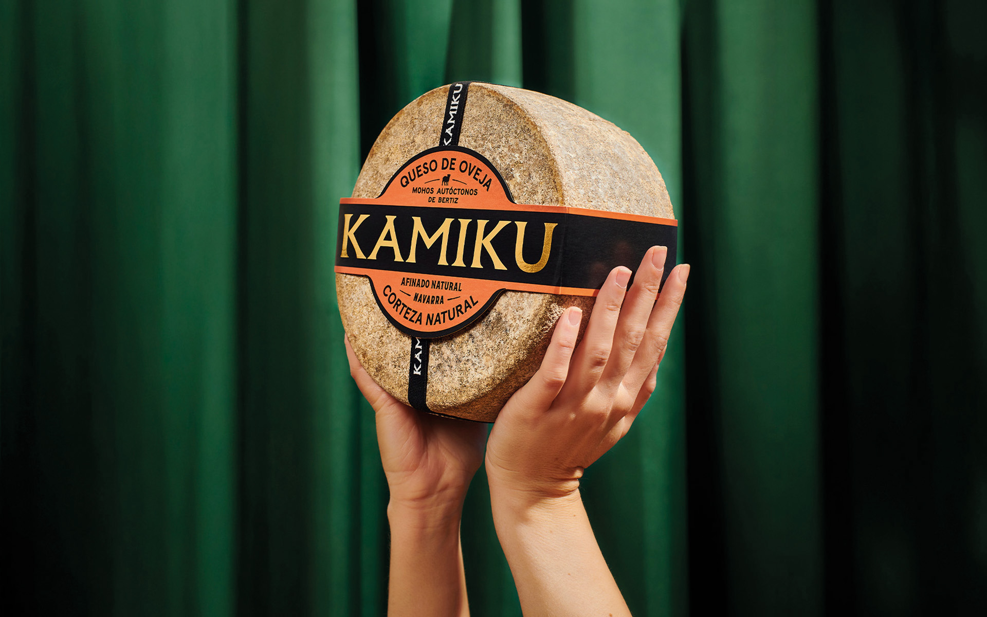
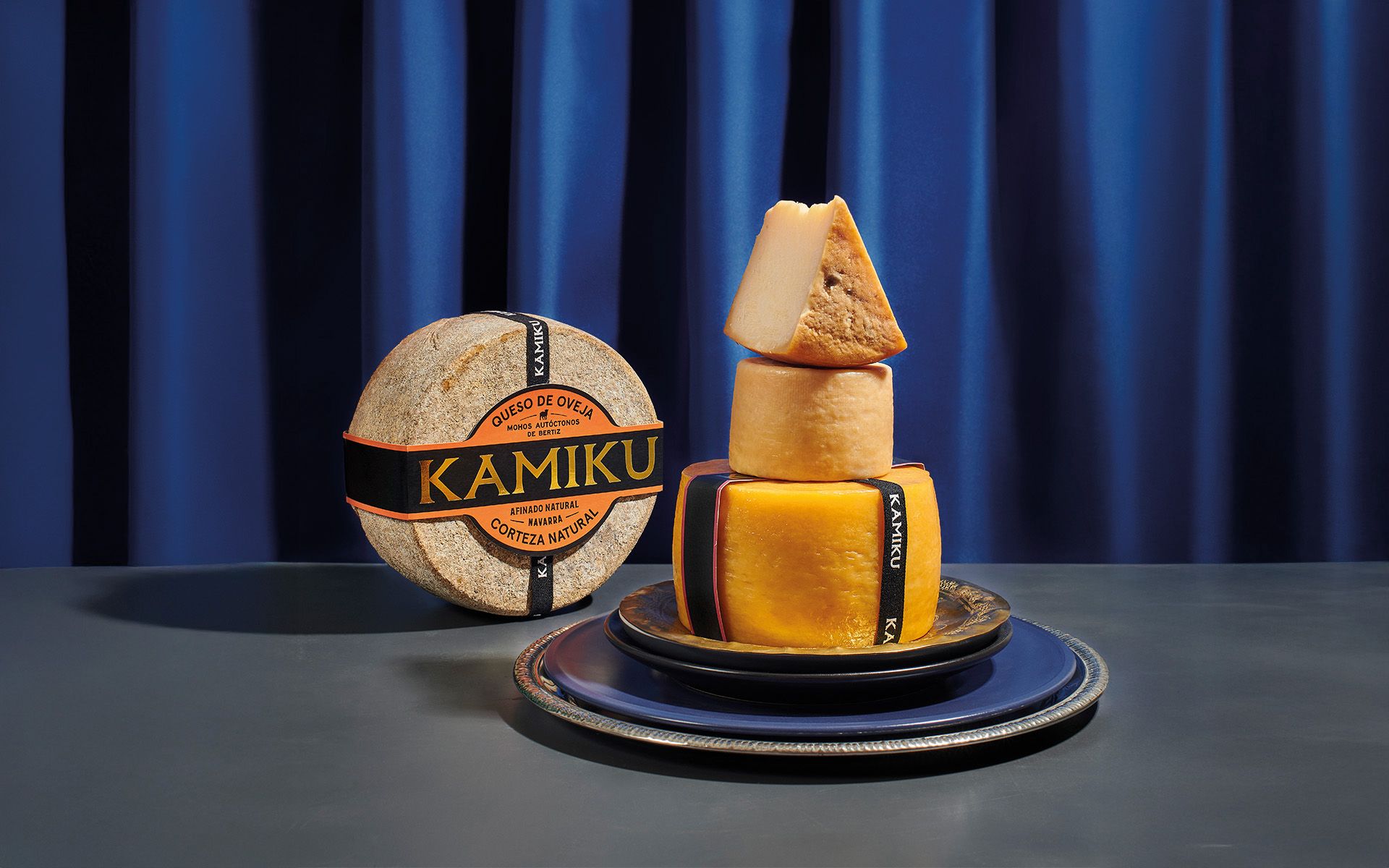
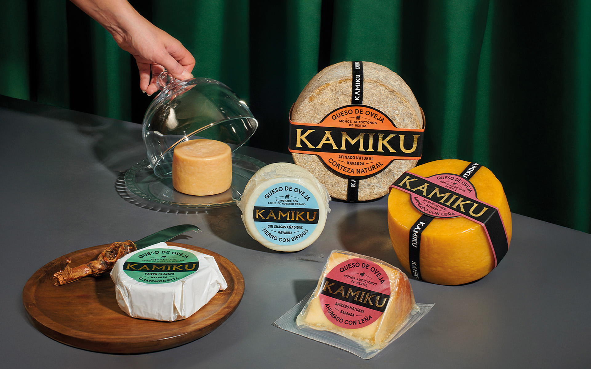
The concept is grounded in a clear conviction: at Kamiku, origin and purpose are inseparable. In a valley where climate, landscape, and heritage converge, these exceptional conditions directly shape the cheese’s personality. One of the project’s most distinctive elements is the use of natural molds during aging. Every wheel is therefore unique—and this is precisely what the design aims to convey.
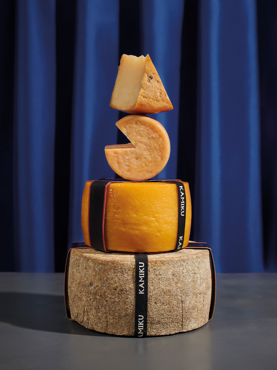
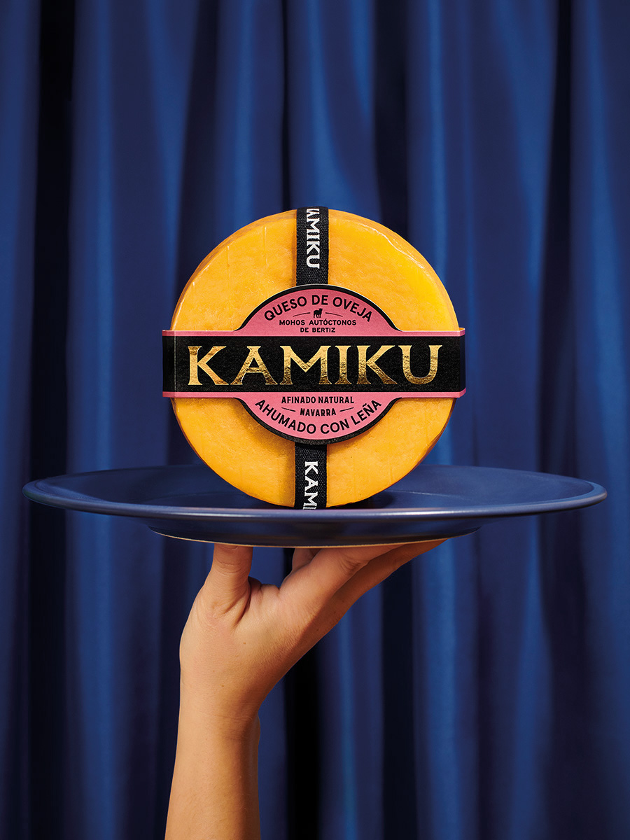
The proposal embraces the idea that imperfection, when authentic, is valuable. Variability is not a flaw; it is a hallmark of artisanal craftsmanship. Each variety is identified with a signature color, and a restrained, contemporary visual language allows the product to speak for itself. Every graphic decision mirrors the artisanal process: slow, deliberate, and detail-oriented. Nothing is excessive. The design frames the cheese without competing with it.
GRAPHIC SOLUTION
The visual identity treats design as “product architecture.” A key element is a custom die-cut wrap: a continuous band encircling each wheel. This serves a dual purpose—creating a recognizable front for the brand while organizing information clearly. Typography plays a central role: bold, modern fonts highlight the brand name, while secondary information—origin, variety, process—is presented with a slower, more rhythmic flow, reflecting care and precision. A branded perimeter ribbon wraps around the cheese, reinforcing the artisanal quality of each piece.
PRODUCTION
Printing techniques and material choices were selected to elevate the sensory experience. High-quality papers, spot colors, and finishes enhance the natural texture of the rind without overshadowing it. Gold foil stamping draws attention and signals premium value, while a silk ribbon encircling the cheese emphasizes craftsmanship and attention to detail.
The result positions Kamiku at the top of its category.
CREDIT
- Agency/Creative: TSMGO
- Article Title: TSMGO Elevates Kamiku with a Contemporary Cheese Identity Rooted in the Spanish Pyrenees
- Organisation/Entity: Agency
- Project Type: Packaging
- Project Status: Published
- Agency/Creative Country: Spain
- Agency/Creative City: Logroño
- Market Region: Europe
- Project Deliverables: Brand Design, Label Design
- Format: Tag
- Industry: Food/Beverage
- Keywords: cheese
-
Credits:
TSMGO | Brand Consultants: TSMGO | Brand Consultants


