


Summary: At a time when we seek to take care of ourselves and monitor the calories we consume, Kaiku believes that we should not give up the pleasure of a tasty dessert. He proposes us to combine in a product that the variables “pleasure not guilty” will soon launch under the zero kilometre work philosophy. A Greek dairy dessert that seeks to revolutionise its category with an “indulgence” approach for a young consumer who is concerned about eating healthy but wants to indulge.
From the conception of the name itself, which will evolve from an initial “moments” to the current “mini”, everything responds to a strategy of clear differentiation and self-explanation of yogurt in anticipation of its consumption in an iconic and modern way, premiumizing the product.The proposal emphasizes the core values of this product: Creaminess, Taste and Pleasure.
Objective: Lean on the heritage of the Brand and its DNA as the basis to build a solid positioning for packaging. Achieve with the design to transmit impact and differentiation in order to promote impulse sales.Show in an iconic way in the packaging the fluidity and texture of the product (creaminess), accentuating seduction and making the product more palatable.
Proposal: Yogurt brands are usually obsessed with the generic attributes of yogurt: white, pure, functional and, in terms of packaging, represent creaminess. In our case, this last variable became an opportunity to establish an attractive design that would link it to its own attributes: appetising, pleasant and that escapes the frequent codes in this category as a way to differentiate itself and to be perceived as unique. It could be considered an open territory to be able to show that this yogurt is different.
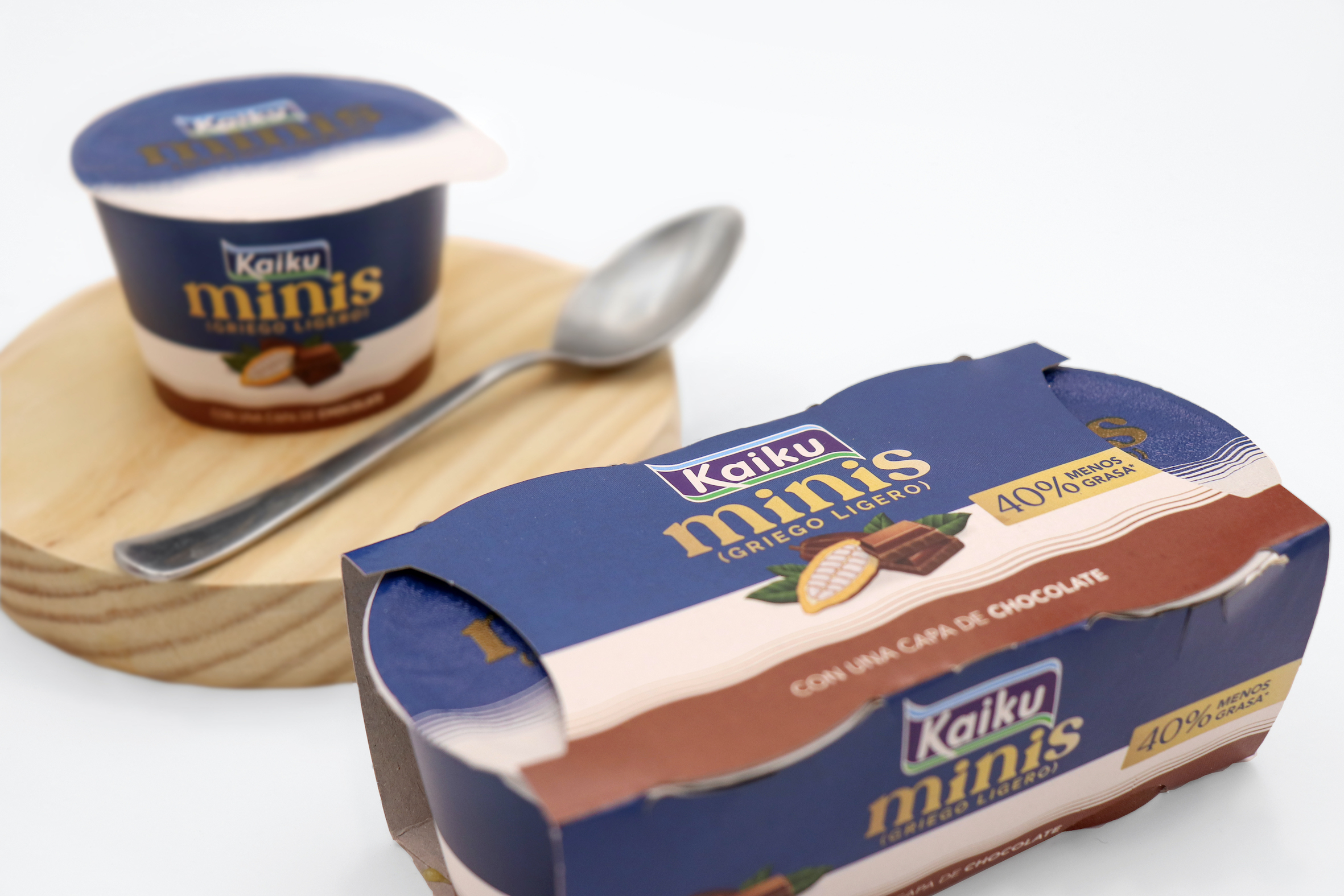
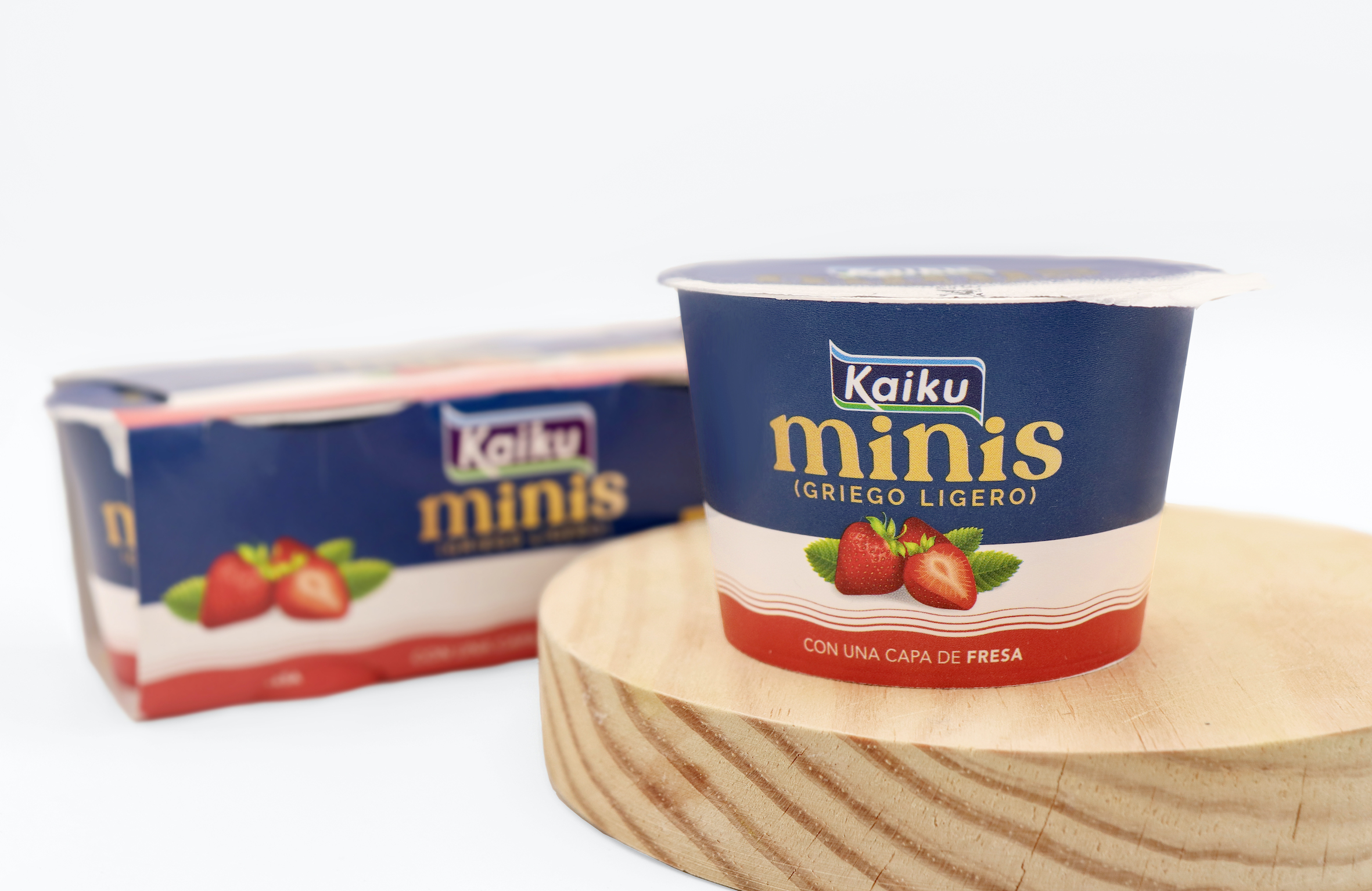
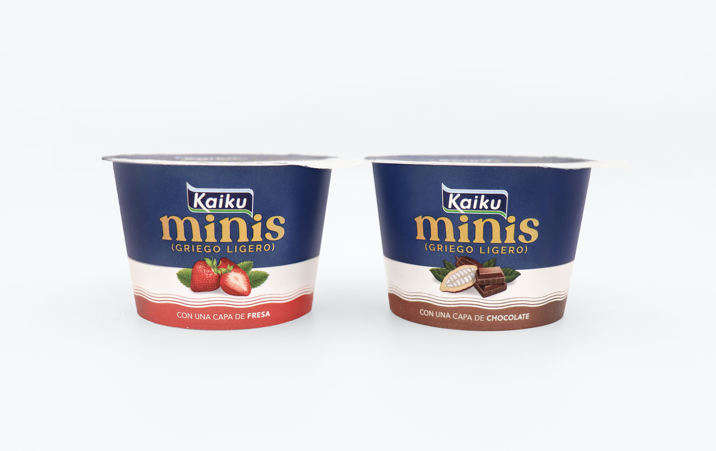
Graphic Solution: We create a premium minimalist aesthetic without losing the Mediterranean origins that are reinforced by the use of blue. We incorporate as a singular element a strip of waves that recall that creaminess and texture in a light way, seeking appetite above all else so that it is visually attractive on the shelf. We simplify all the codes to the maximum to give fluidity and lightness to the product.
The use of golden highlights and a typeface that has ingredients that drink in soft and flowing ways. We incorporate the Light Greek description by limiting it in time with the use of parentheses.
The architecture of the packaging is completed with the incorporation of an illustration of the ingredients of the specific flavour that we offer accompanied by a suggestive invitation: Small, rich and light. What else can you ask your Greek for? We play that the yogurt enters through the eyes and generates an “ummmm” that you want to try fleeing from the aesthetics associated with these products (blue and white). Minimalist, two-dimensional style that seeks maximum precision and functionality. He often uses gradients to create color transitions and shading. In our case, we have textured these gradients to offer a less artificial look.
Production: In smaller than usual jars, all the health and legal information of the product is transferred to the cluster that groups them.
CREDIT
- Agency/Creative: TSMGO
- Article Title: TSMGO Design Brand and Packaging for Kaiku Minis
- Organisation/Entity: Agency, Published Commercial Design
- Project Type: Packaging
- Agency/Creative Country: Spain
- Market Region: Europe
- Project Deliverables: Branding, Packaging Design, Product Naming
- Format: Box
- Substrate: Plastic


