Summary
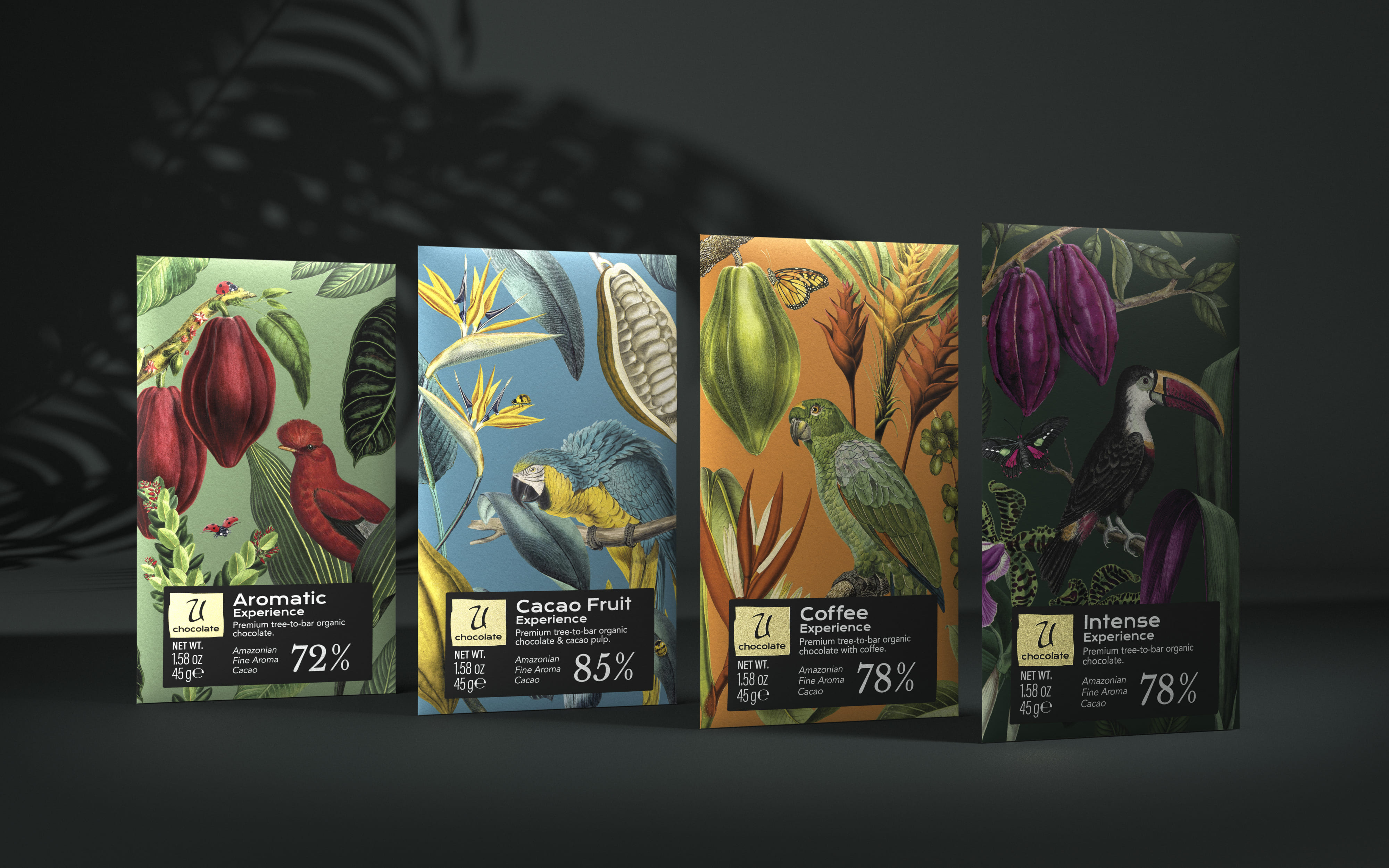
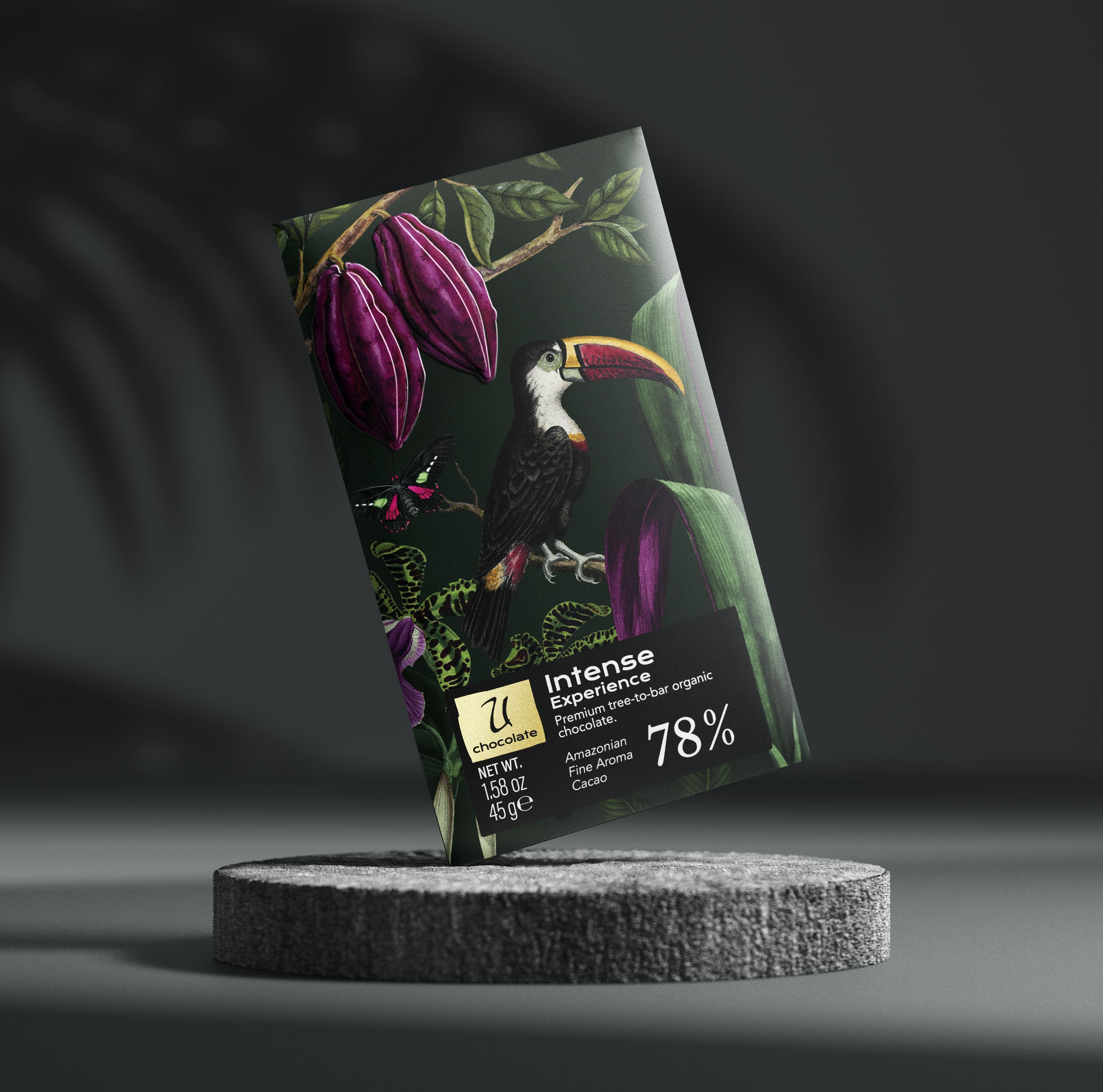
El mejor cacao del mundo, a cocoa producing and distributing company from Pucallpa (Peru), conveyed to us the need to create a brand identity and a packaging in such a way that a taste of the natural environment in which it is grown: the Peruvian Amazon, as well as the values of sustainability, fair trade, and gastronomic attractiveness, reaches every home. We created a visual universe, under the premises of abundance and exuberance, directly encapsulating the seduction of undiscovered nature. With a markedly feminine approach, the subtlety of the shapes, the jungle and the details create a visual metaphor which transports us to its native origin. We propose to capitalise on the value of authenticity through the U chocolate brand, with the U (You) as the common thread which semantically allows us to travel through the territory of the Unusual, Unexpected, Unconventional, Unequivocal… Universal. A tasty, seductive character.
Objectives
Activate the brand from an international framework which can be applied in different markets and achieve the same impact in all of them, with the confidence and security of being an experience-based proposal for consumption.
Highlight, through its packaging, the seductive, natural exuberance of the environment in which the cacao is produced and elaborated.
Visually synthesise and anticipate consumer experience by visually impacting what each of the flavours in the portfolio proposes.
Proposal
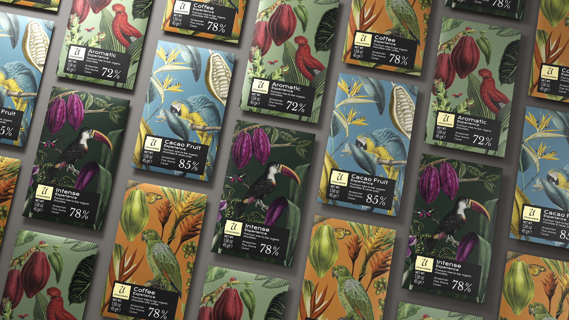
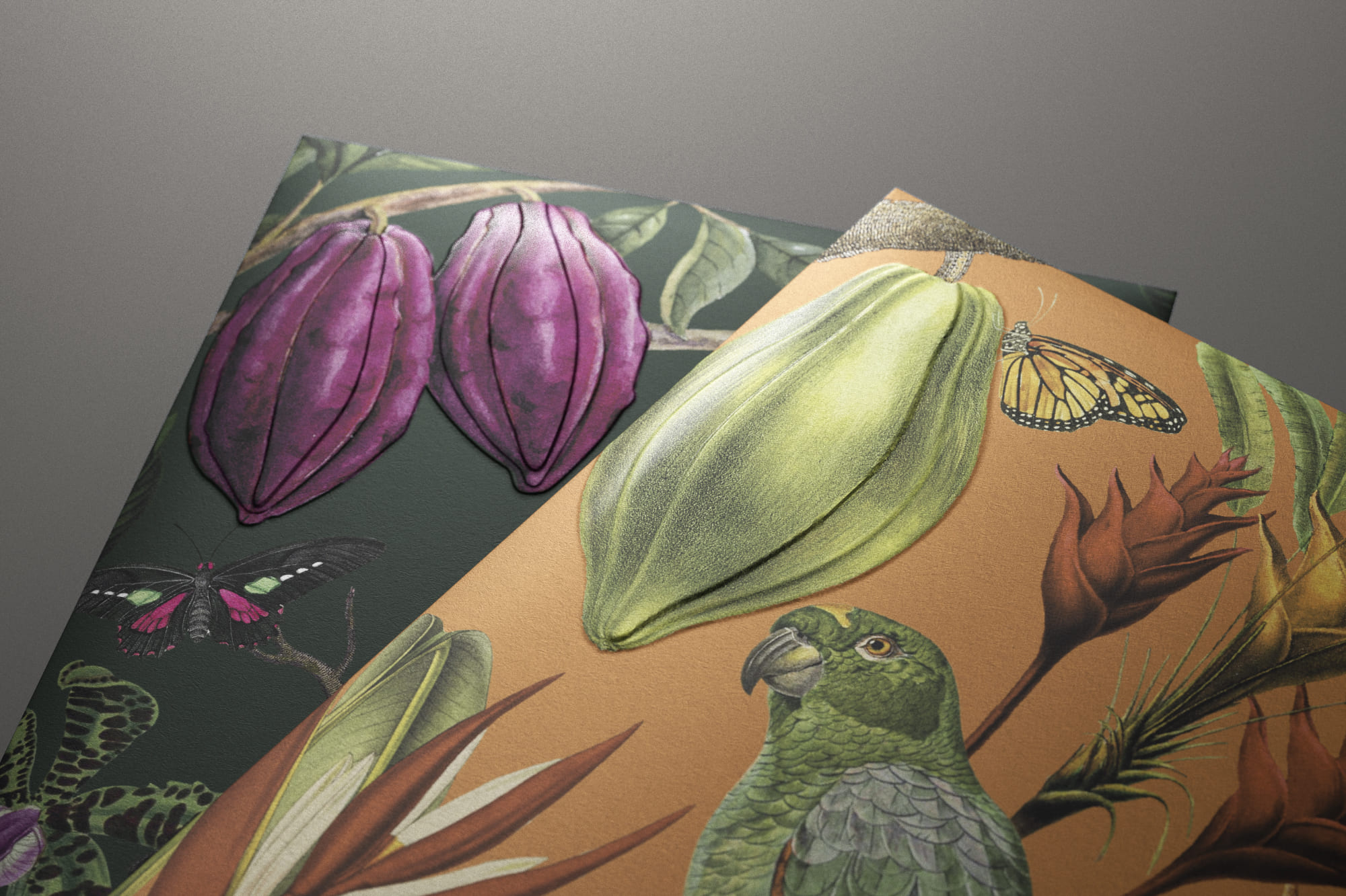
Due to its geographical diversity, Peruvian flora is one of the most diverse in the world. It has more than 25,000 different species, 30% of which are unique in the world. With more than 4,000 species of butterflies and birds, we wish to reflect this reality by creating a visual microcosm which envelops each of the varieties. A poetic universe that responds to the creation of a link between its origin and the vibrant nature of Peru. We also codify the purity of the cacao used with a graduation of intensity; the greater the density, the greater the purity, and so uniquely distinguish each variety. This helps the consumer to visually identify and decode this element. The use of totally sustainable materials reinforces a minimum of intervention in the whole process. Naturalness, craftsmanship and detail, a piece of Peru in every part of the world. The lushness of its compositions reflects the multitude of nuances contained in each of the tablets. It is also inspired by a certain touch of mystery, exotic and mystical, because on entering the Amazon jungle, the wild purity of nature is exposed and evident.
Graphic Solution
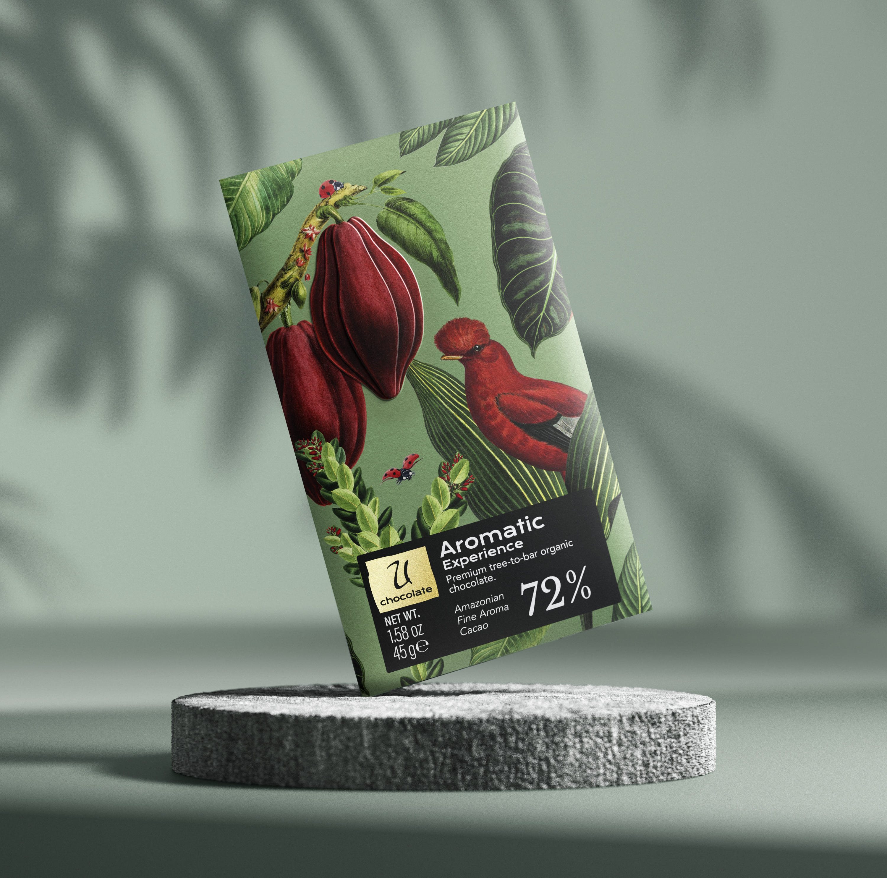
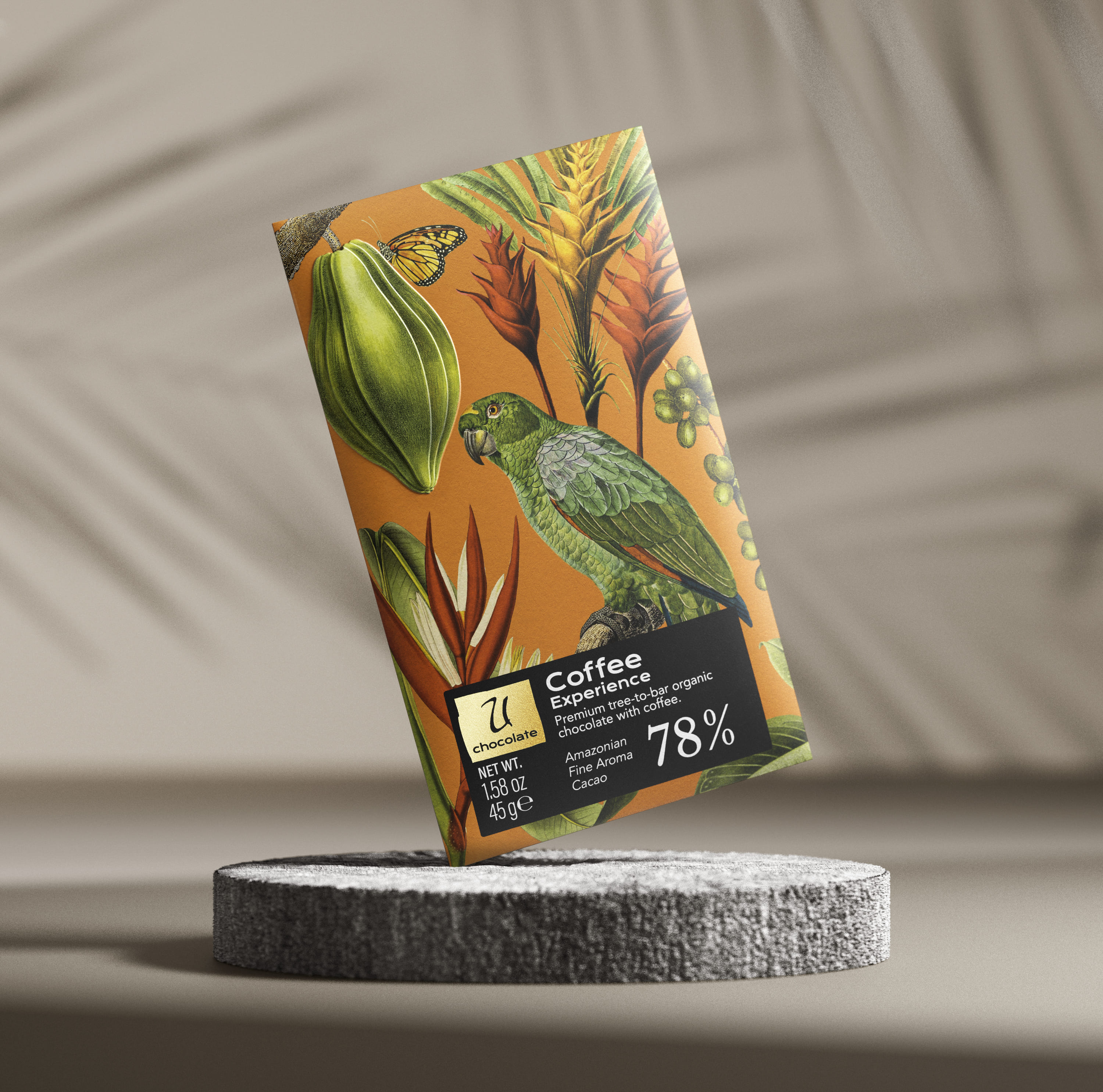
A composition in which the elements form a reality which transports us to a new world. A commitment to a classic, emphatic typography, easy to read, serves to place the product without artifice, laid bare in the most unadorned way; as close to its origin as possible, highlighting its roots. A chromatic range in which each variety creates a palette which enhances the details and harmonises each of the tablets, emphasising their uniqueness.
Production
All materials used are based on the premise of being environmentally friendly and easily recyclable. Embossing serves to reinforce the premium character of the product. Cotton paper from responsibly managed forests provides the physical and emotional texture which brings each tablet to life.
Social Media
To bring the purity and exuberance of the Amazon to a proposal with its own imaginary, a visual microcosm which transports us to Peru, to a wild nature to be discovered in each individual piece of cacao. El mejor cacao del mundo: a committed, pure brand.
CREDIT
- Agency/Creative: TSMGO | The show must go on
- Article Title: TSMGO Design Amazonian Purity and Exuberance for El Mejor Cacao Del Mundo
- Organisation/Entity: Agency
- Project Type: Campaign
- Project Status: Published
- Agency/Creative Country: Spain
- Agency/Creative City: TSMGO/Logroño
- Market Region: Europe
- Project Deliverables: Branding, Packaging Design
- Industry: Food/Beverage
- Keywords: Chocolate
-
Credits:
Agency: TSMGO


