


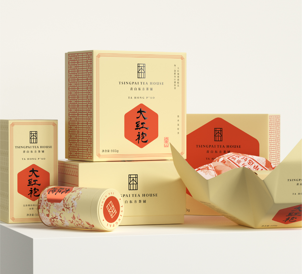
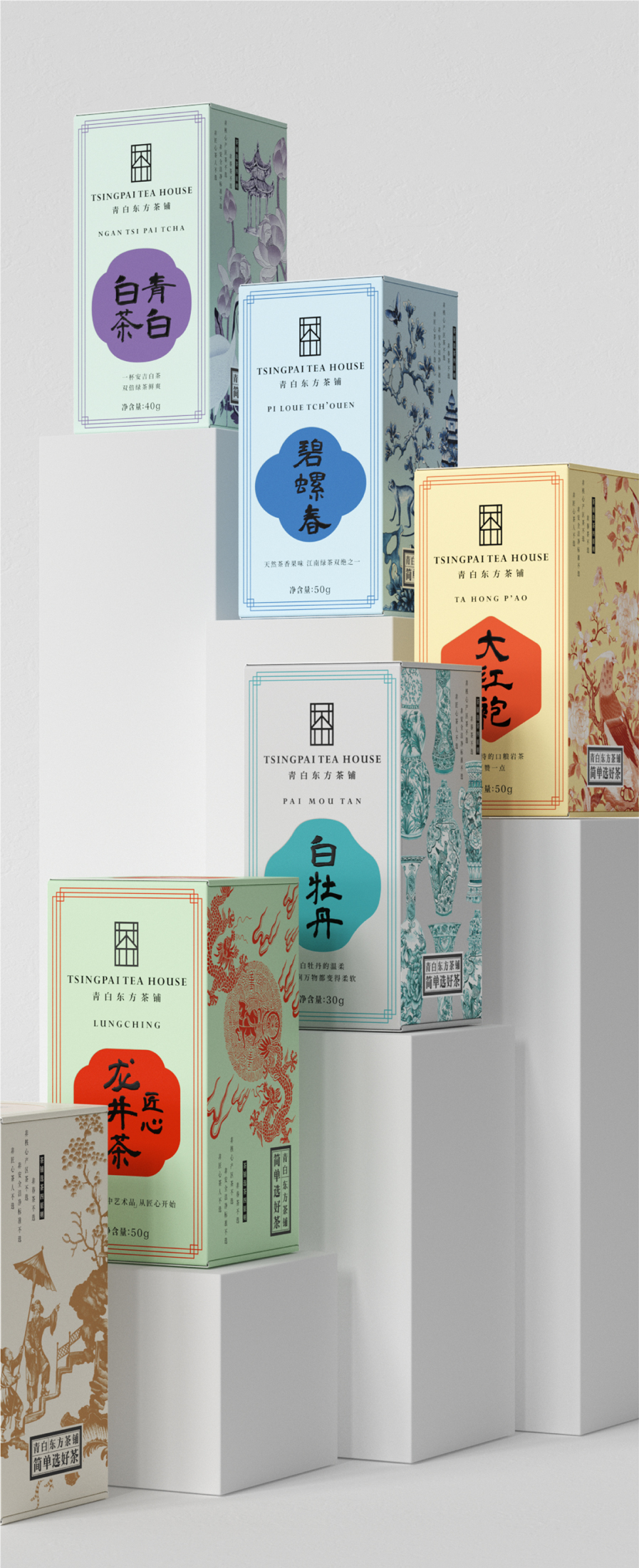
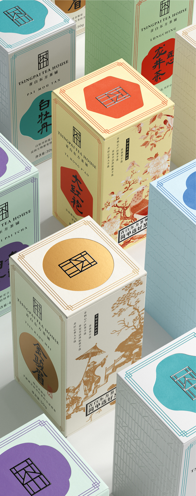
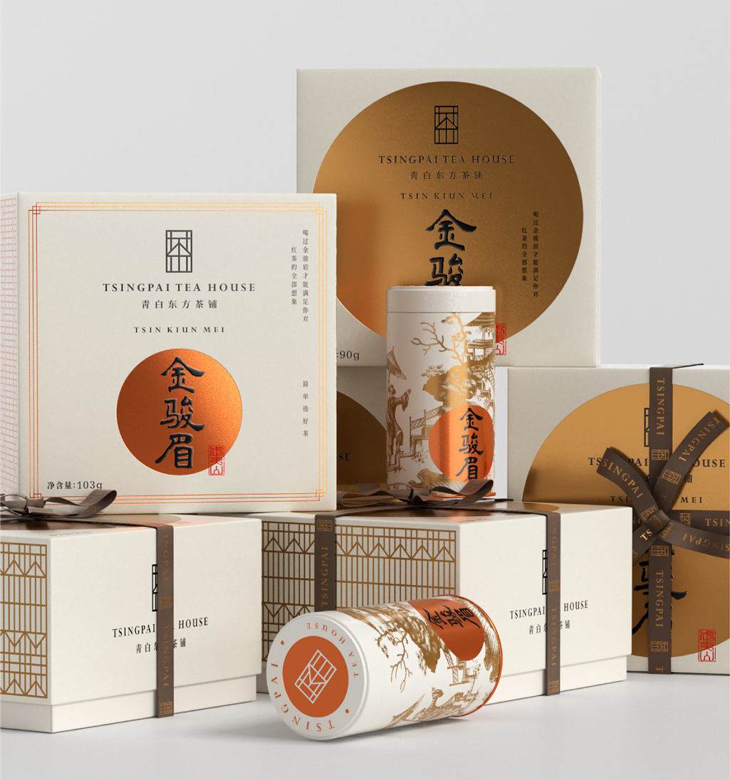
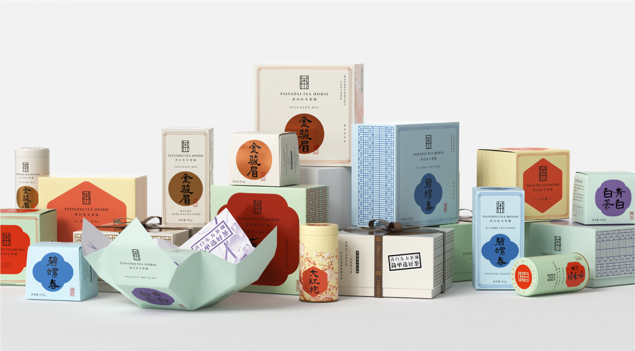
After Tsingpai Tea House turned into a tea-making platform, it still retains the traditional and authentic tea evaluation attitude and the embodiment of Chinese tea culture, mainly attracting young tea drinkers who chase purity, authenticity, and original flavor. The overall style is fresh and elegant, which deepens the brand image of “Making Good Tea Purely (TSINGPAI in Chinese)”. Considering that the actual sales scene is online, each tea product will have an aesthetic feeling. Only if the information is concise, the tea products will be clearly distinguished.
The predecessor of Tsingpai Tea House is Lu Zhenghao Weat Lake Longjing, which boasts various Longjing products. Extracting the core advantages of different Longjing tea and expressing in plain language, it is easy to arouse customers’ curiosity, and also convenient for young people or tea freshmen to satisfy their needs.
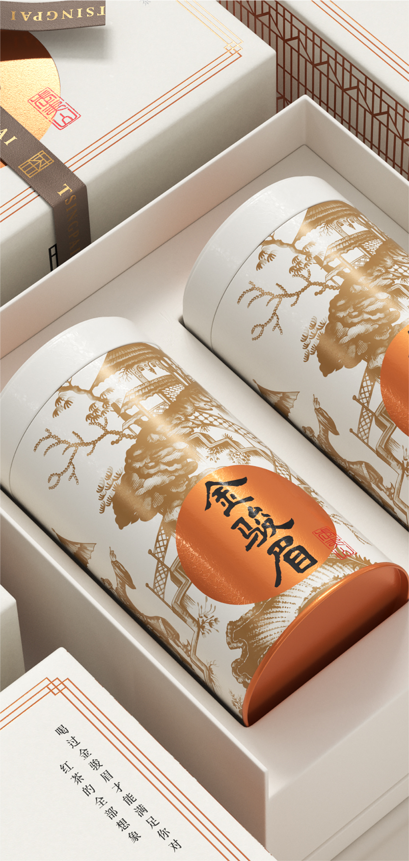
Giving too many additional tea accessories inside the gift box, such as cups and spoons, will make customers doubt the value of the tea itself. The accessories can only be used to reinforce the value. Instead, we configure quality commitment cards and instructions for six tea products, all for the “quality of tea” service.
The high-end product line is a testament to the brand’s strength. Lu Zhenghao is a high-end West Lake Longjing brand. In order to expand the product line in the past, it sells everything, and the sub-brand TSINGPAI is unknown, which has become an “official counterfeit”. It is suggested that after the divestiture, Tsingpai Tea House will no longer emphasize the good tea, but focus on building a “tea platform brand”, strictly select the standard NetEase, and focus on “simply select good tea”. In the future, it will form a joint force with high-end Longjing two sets of product matrix, radiating the overall tea industry. In the future, the image of TSINGPAI Oriental Tea shop will present an authentic, original taste and pure holistic sense.
The concept of “tea house” was introduced into the logo design, giving “tea shop” a “sense of trust”. The new logo design incorporates elements of tea and “plaque” elements of tea shop, and details follow the golden section ratio. Clear TSINGPAI help more “tea small white” simple tea business philosophy.


CREDIT
- Agency/Creative: Pica Strategic Packaging
- Article Title: Tsingpai Tea House Branding and Packaging Design
- Organisation/Entity: Agency
- Project Type: Packaging
- Project Status: Published
- Agency/Creative Country: China
- Agency/Creative City: Beijing
- Market Region: Global
- Project Deliverables: 3D Design, Brand Design, Logo Design, Packaging Design
- Format: Box
- Substrate: Pulp Paper
- Industry: Food/Beverage
- Keywords: tea packaging, packaging, design, food&beverage, simplicity
-
Credits:
Chief Designer: Shuwei Qi


