


BirthRights Norway is a a non-profit organisation working to strengthen women’s rights, opportunities, and choices during pregnancy, childbirth, and the postnatal period. They provide legal support and offer guidance to women and families who experience a violation of their rights, and assist in complaints to the hospital or the Health Supervisory Authority. They also support midwives’ and doctors’ rights to a professional and safe working environment. Additionally, they work to put reproductive health and women’s rights firmly on the political agenda.
As a woman with two difficult births behind me — both of which ended in an emergency caesarean, but one leaving me traumatised and the other empowered — I know how important it is to feel seen, supported, and respected during what is often one of the most vulnerable and life-changing events of a woman’s life. I now watch in horror as the authorities shut down local labour and delivery wards, entire hospitals even, in a bid to save money. Our rights as birthing women are constantly diminished and violated, and when we speak up we’re told to stop whining. So when BirthRights reached out to me asking for my help to make a greater impact, it was an easy yes.
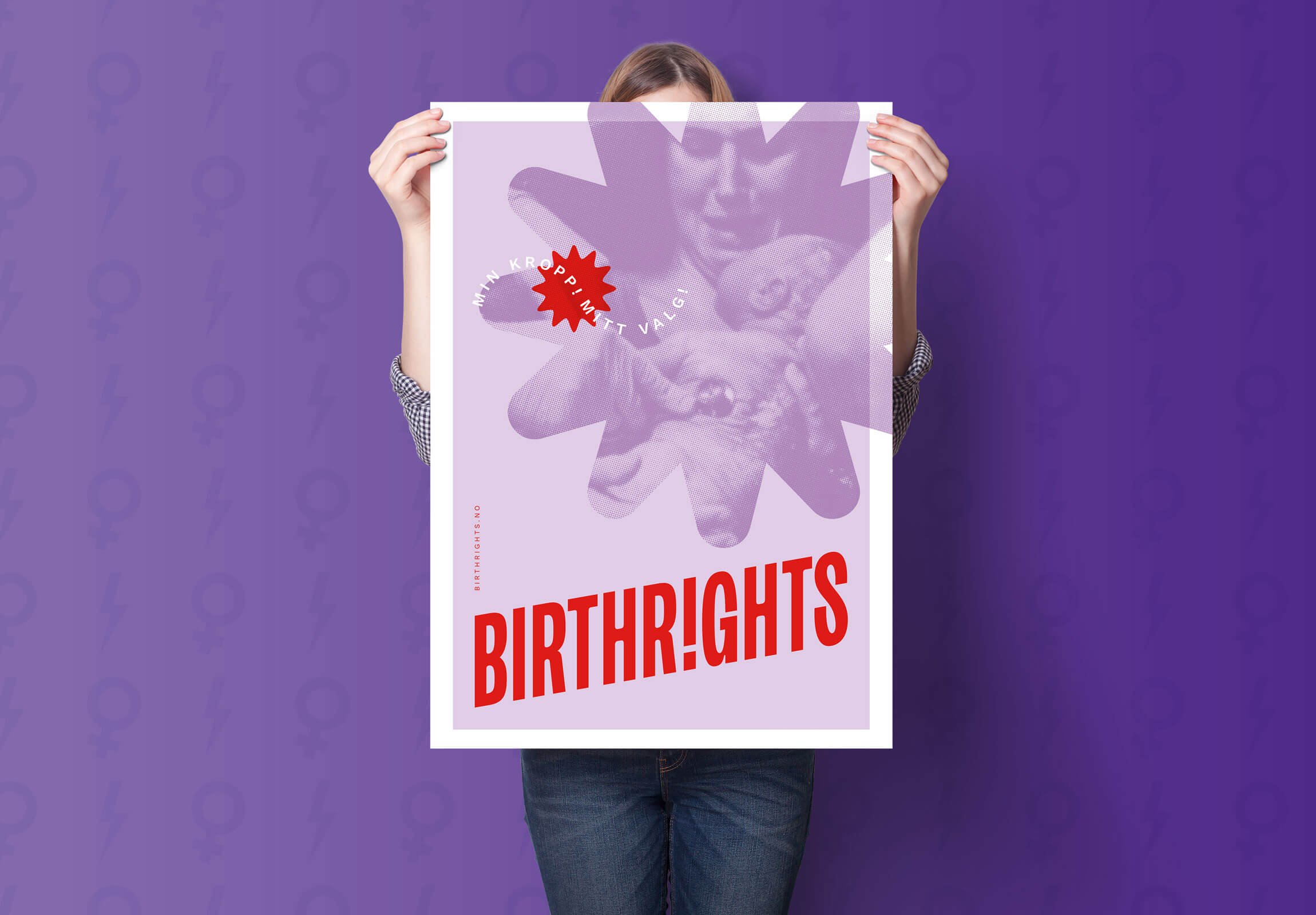
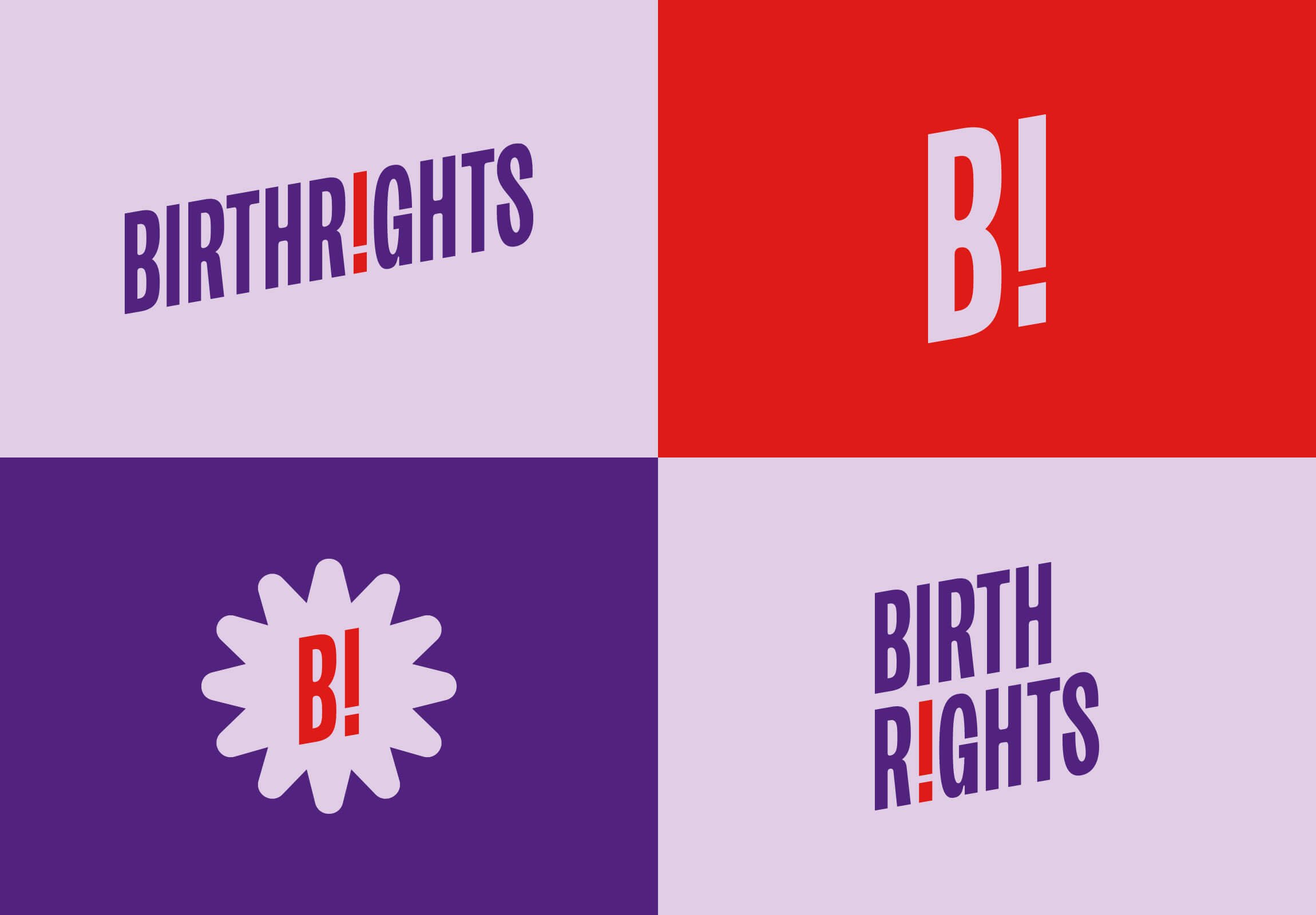
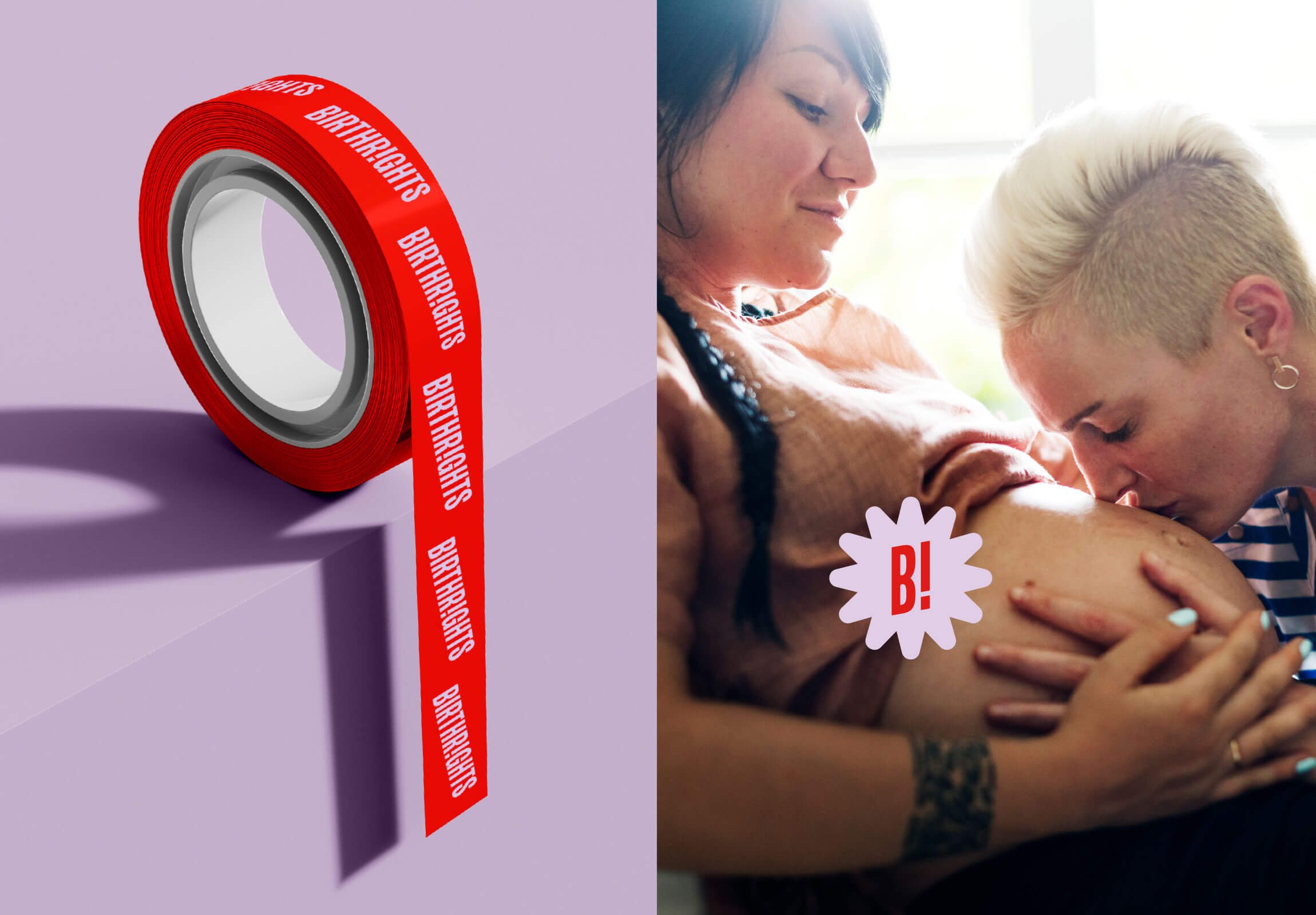
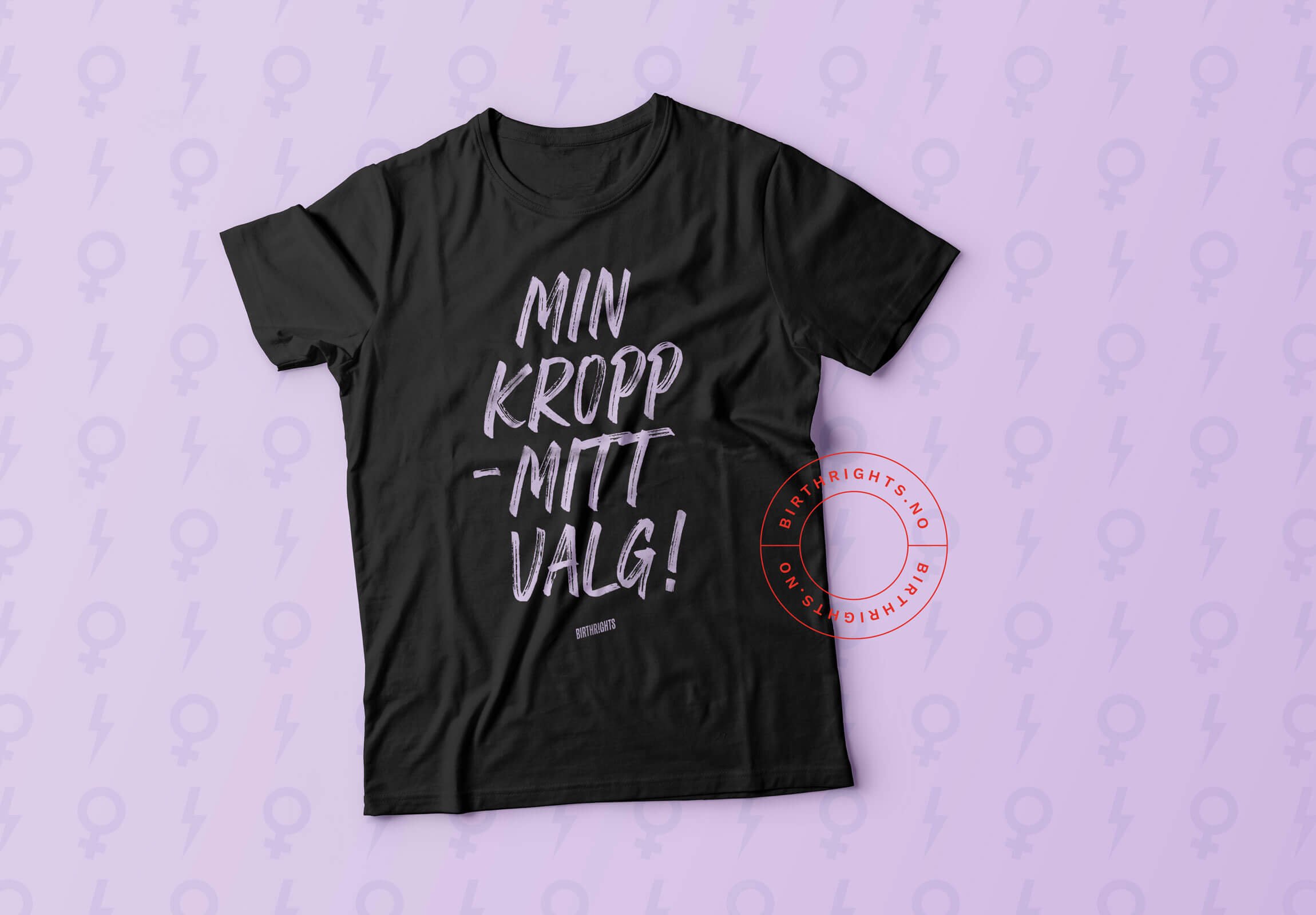
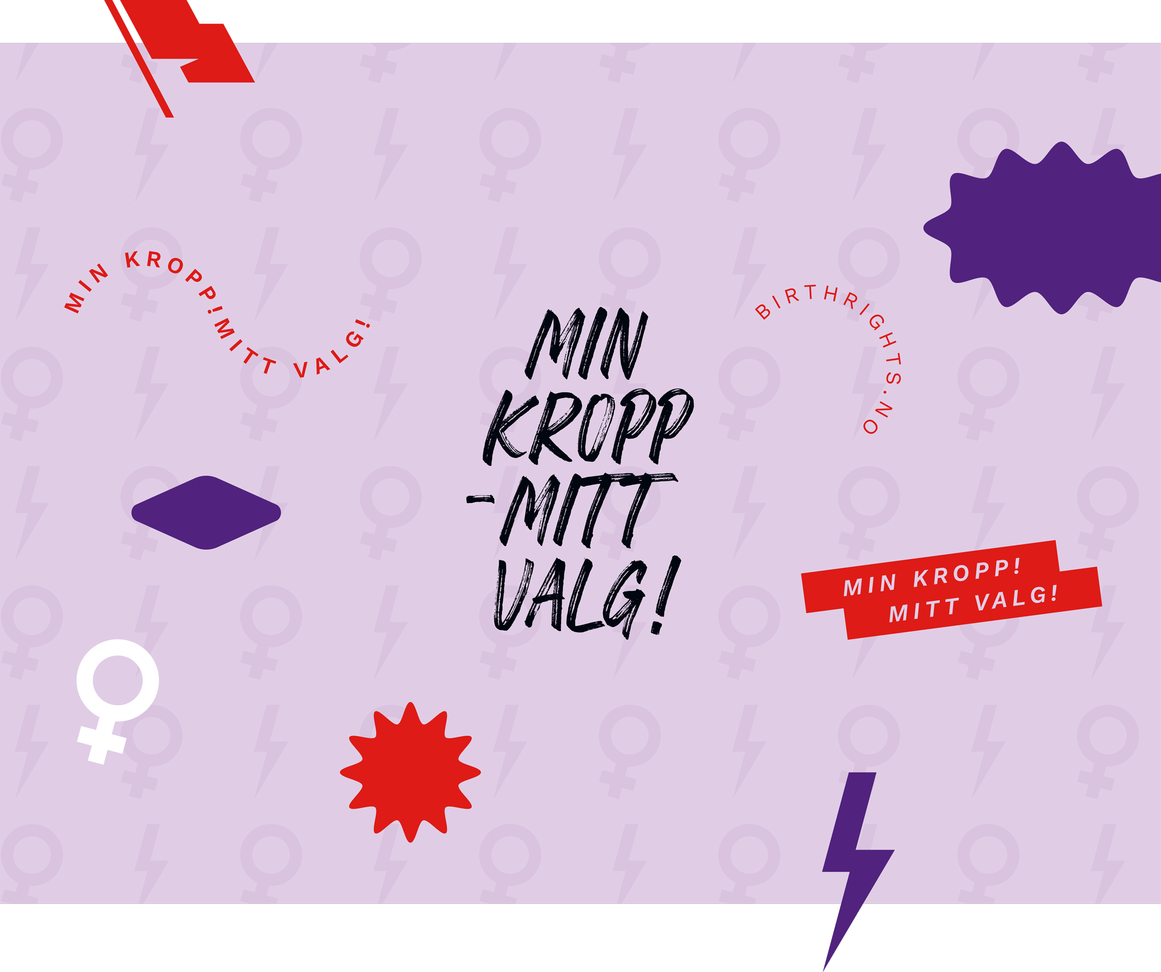
The new brand identity is both feminine and powerful — a bold expression that is eye-catching and demands attention. Contrasting use of typography and blocks of colour against raw and unfiltered photos, allows BirthRights to stand out as an organisation with a clear and distinct voice on behalf of all birthing women, midwives, and other healthcare professionals.
The typographic logo is simple, yet striking. One instance of the letter I is turned into an exclamation mark, and the whole word is set at an angle, for an edgier vibe. The chosen typeface is tall and robust, yet with subtle softer details.
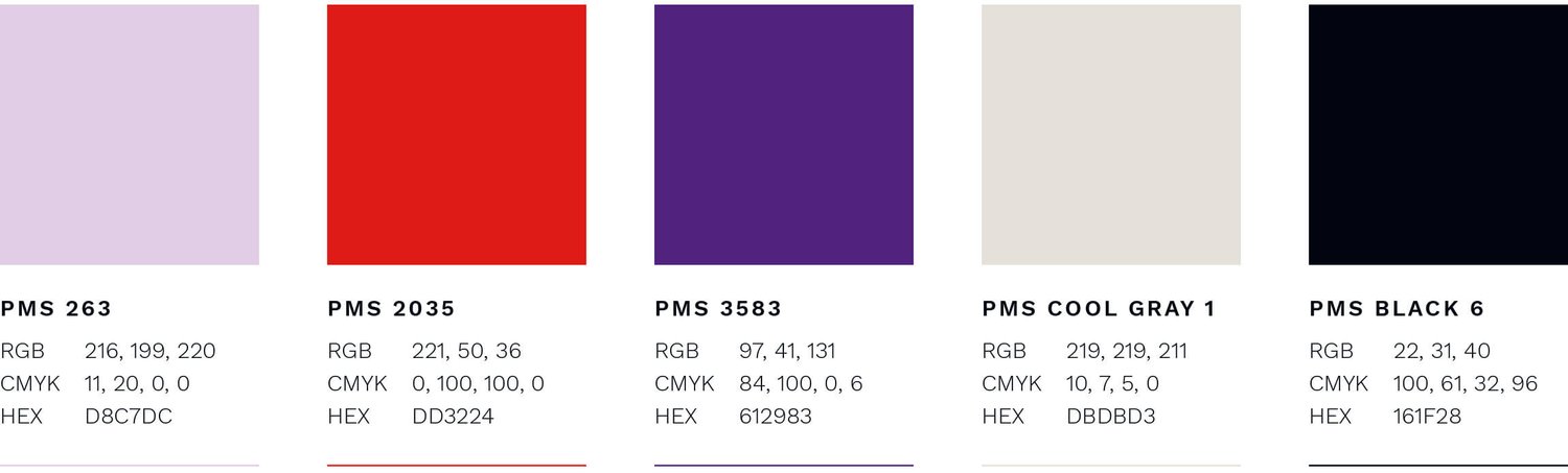
Red is often associated with the women’s rights movement and symbolises strength and determination. A pale lilac adds femininity and visual contrast. Together with a dark purple, this becomes a somewhat unexpected and bold colour combination that demands attention.

CREDIT
- Agency/Creative: Petchy
- Article Title: Trust Women, Protect Choice: BirthRights Norway Reveals Strategic Rebrand by Petchy
- Organisation/Entity: Freelance
- Project Type: Identity
- Project Status: Published
- Agency/Creative Country: Norway
- Agency/Creative City: FREI
- Market Region: Europe
- Project Deliverables: Brand Creation, Brand Design, Brand Guidelines, Brand Identity, Brand Redesign, Branding, Identity System, Logo Design
- Industry: Health Care
- Keywords: branding, brand identity, brand strategy, healthcare, pro bono, women's health, midwife, doula
-
Credits:
Strategic Brand Consultant & Creative Director: Solveig Petch


