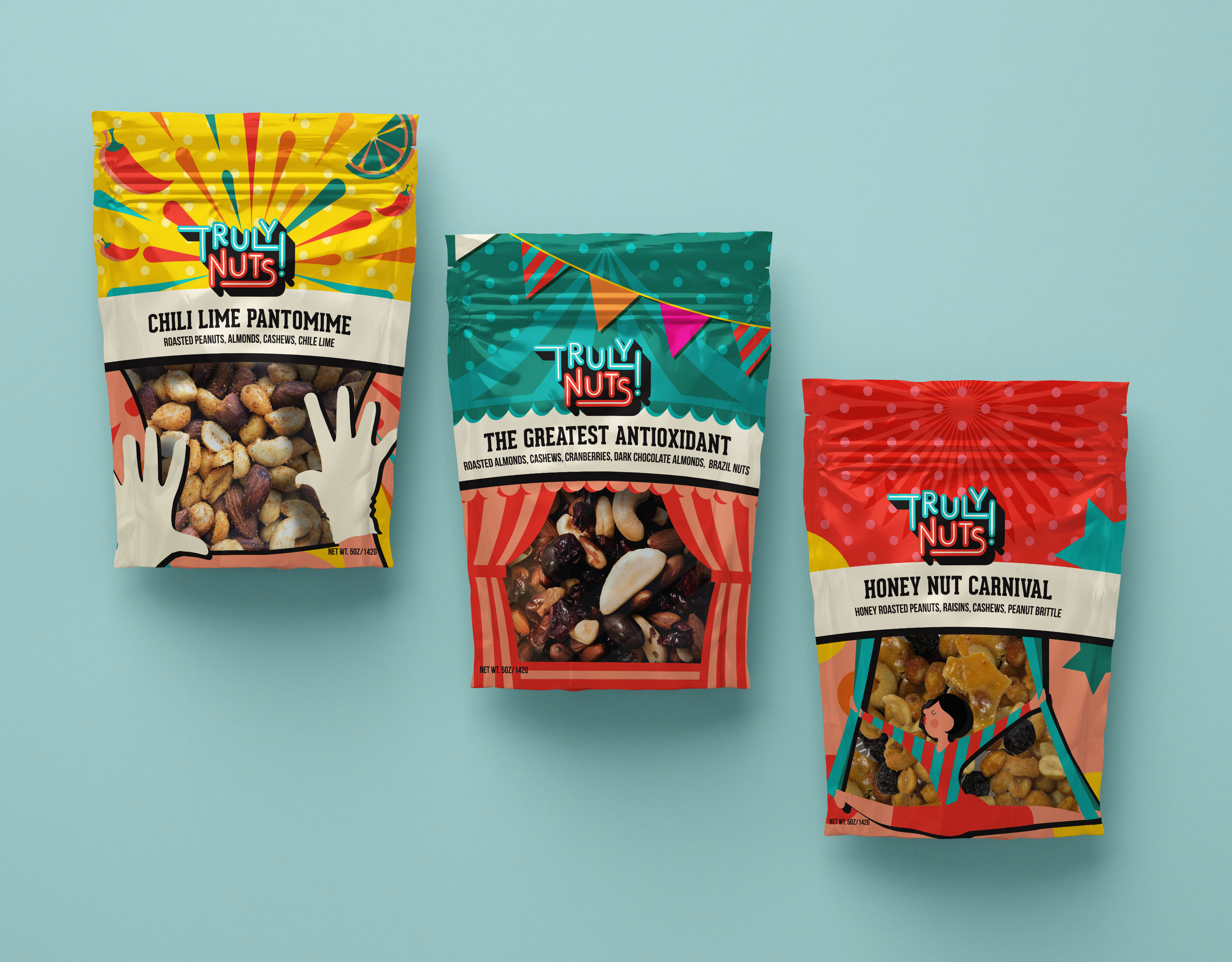
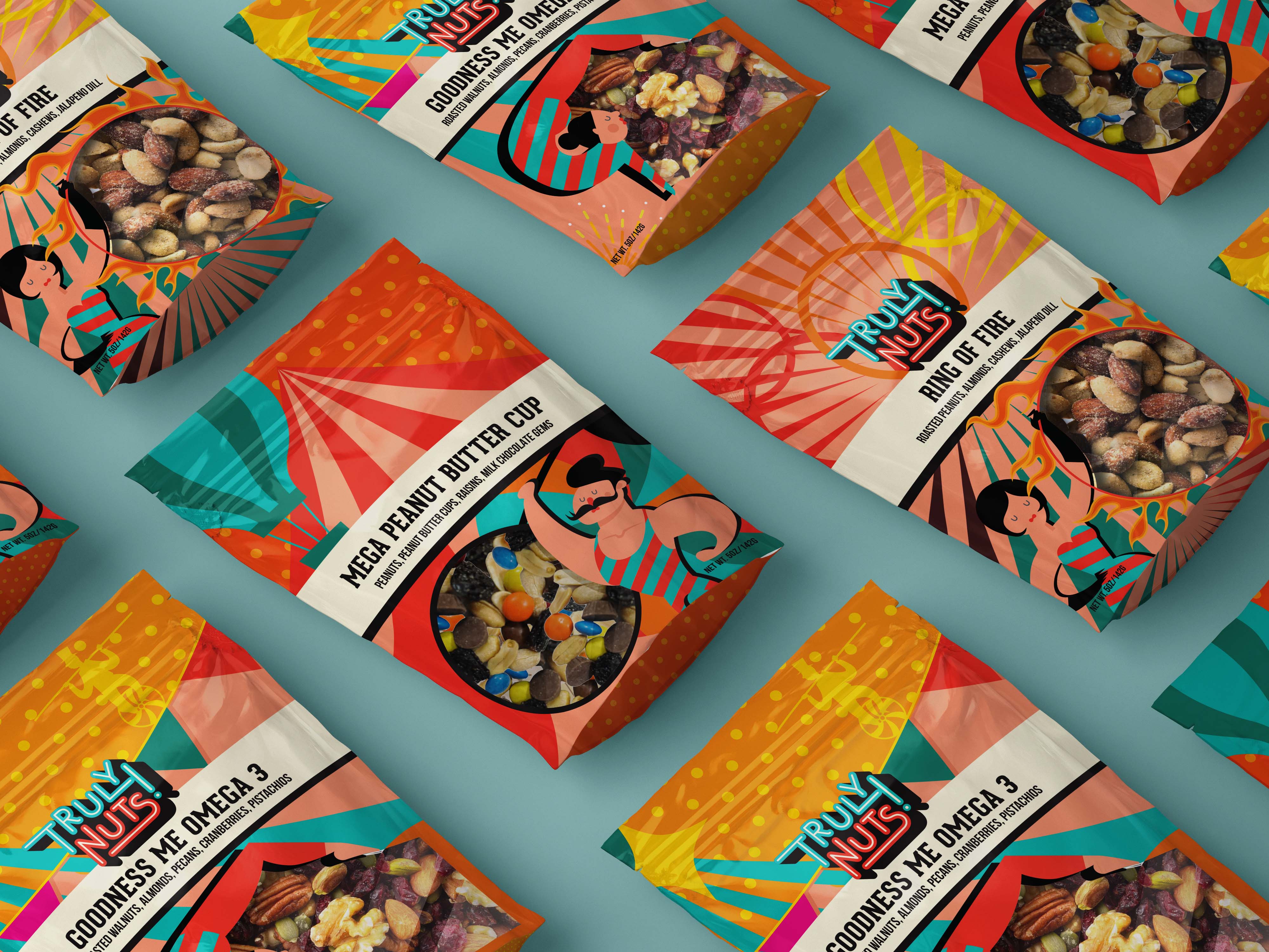
The Truly Nuts Identity was created to set itself apart from all the trail mixes on the market. It carves out a niche all its own with its zany packaging that allows for an extra bit of delight with every single bite! It doesn’t live in the health space or the generic bulk nuts aisle. It taps into a youthful appeal, a childlike wonder of irresistible silliness that makes every helping a little bit more fun!
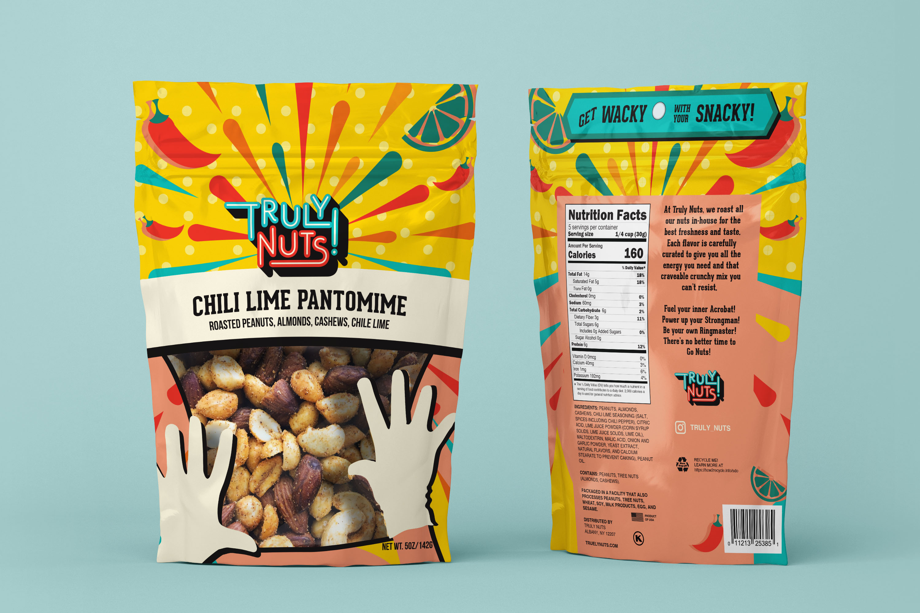
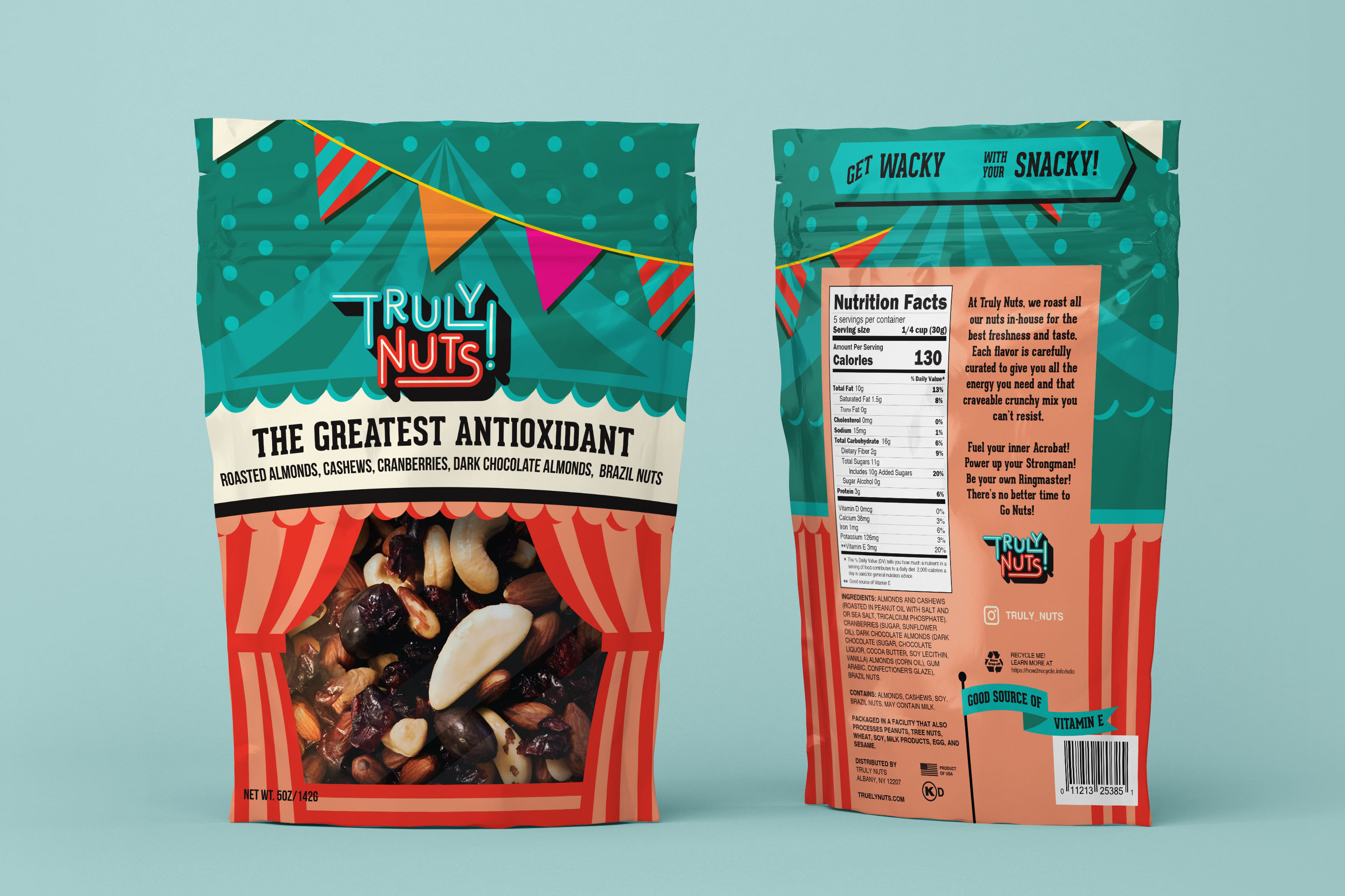
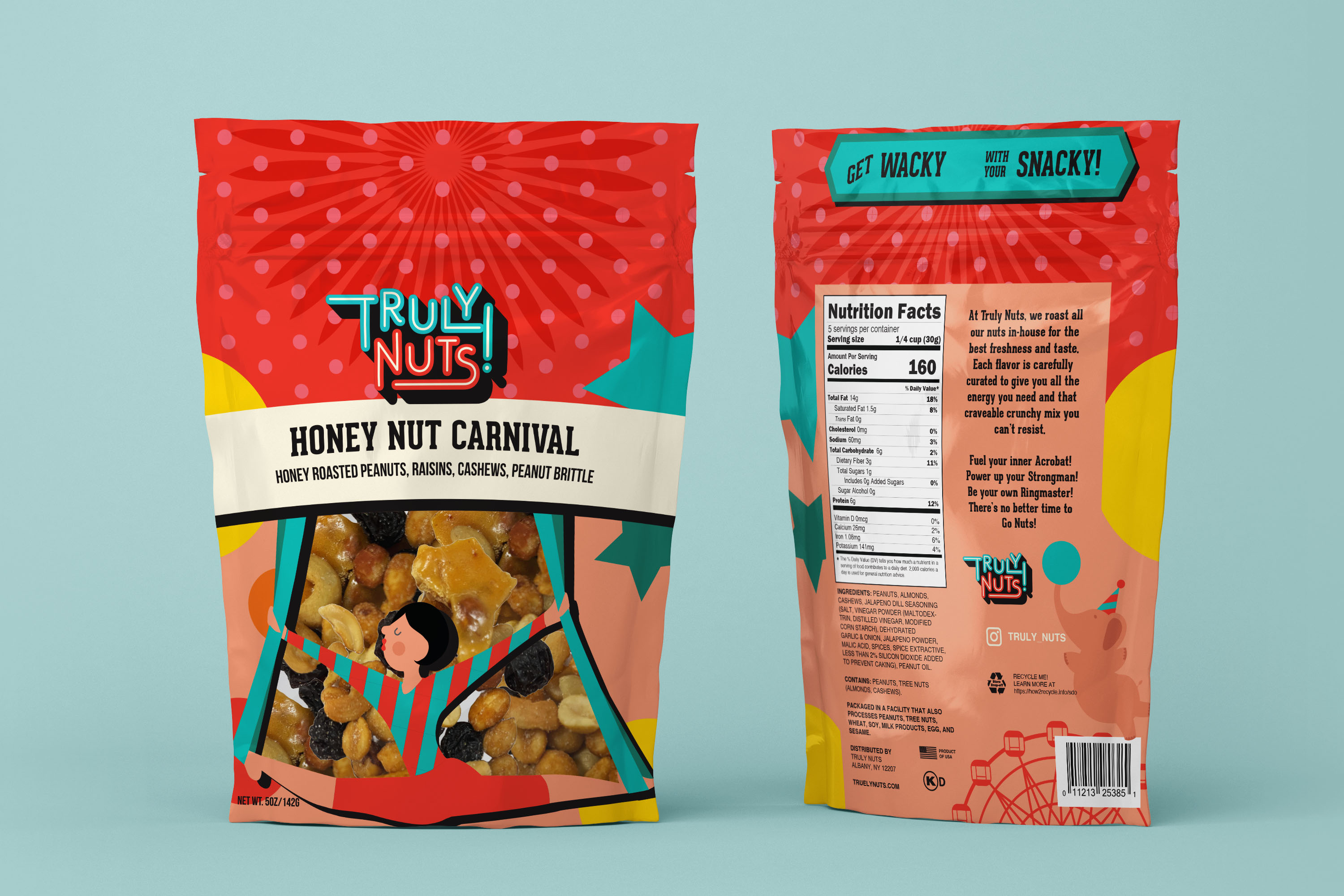
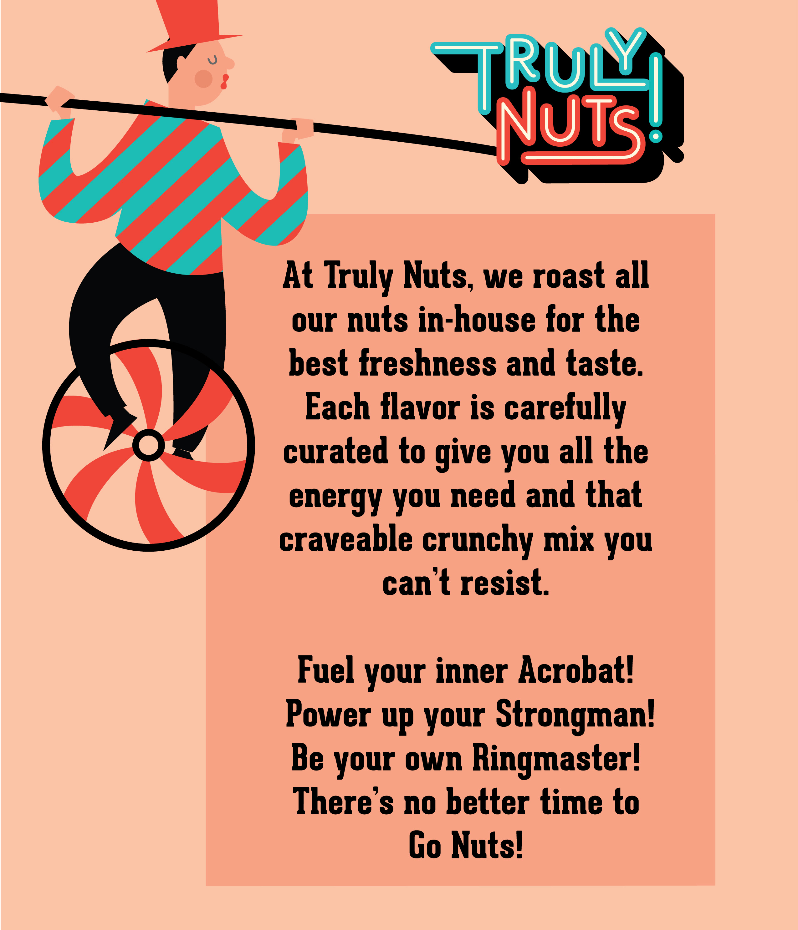
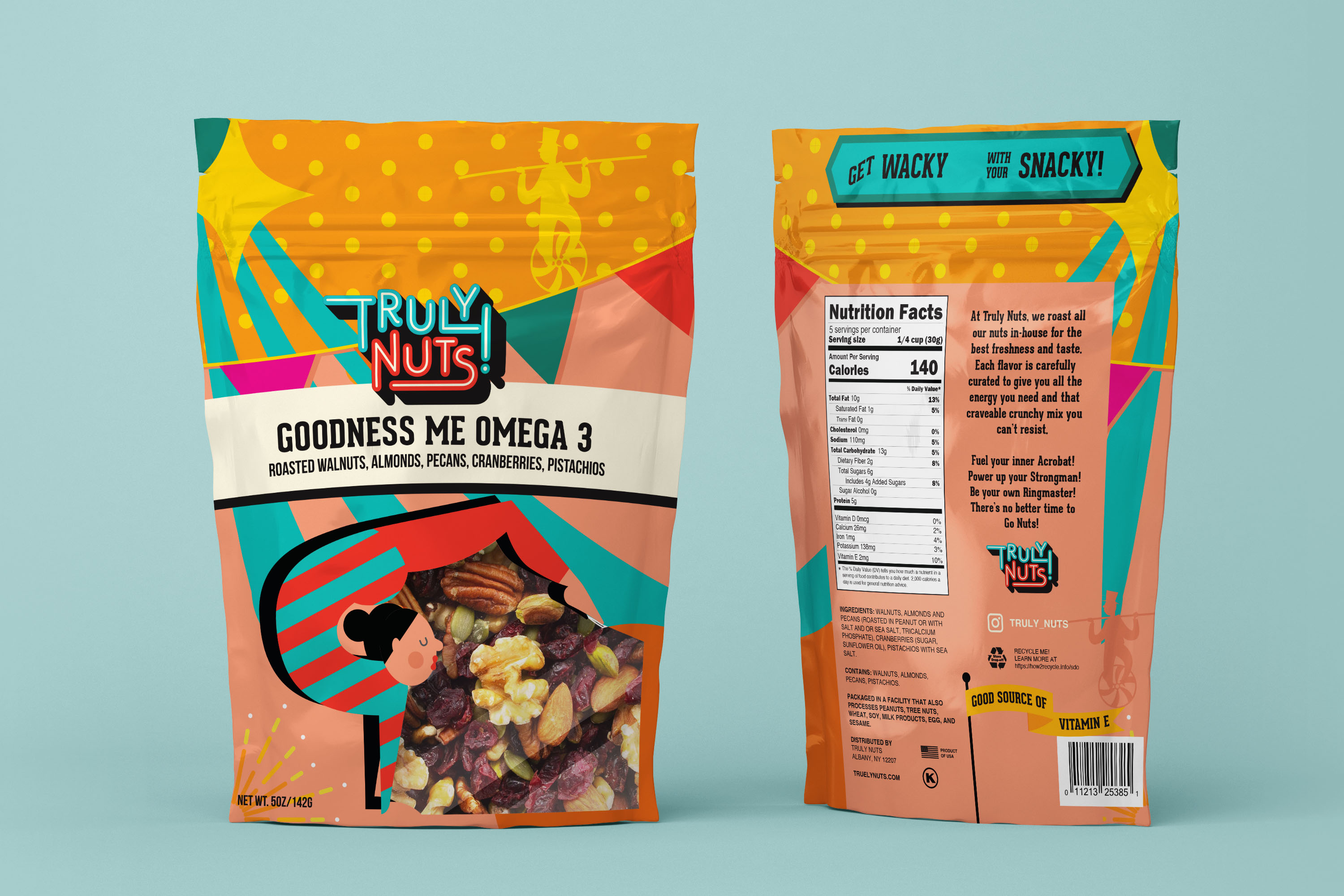
We gave the joyful characters of the circus a cheerful, retro look and used each of their extraordinary feats as windows to showcase the product itself. Enjoy the goodness of the omega 3 mix and you too can fuel your inner Acrobat! Partake in the Peanut Butter Cup and power up your Strongman! Go spicy with the Ring of Fire and become your own ringmaster!
Packaging these days is fraught with concern. We have reached a new level of climate change that is almost too catastrophic to make sense of and at the same time, or perhaps because of this, we as consumers are so hungry for joy and simple pleasures. We designed this packaging so that it can be returned to stores to be recycled again and is not immediately destined for a landfill. While this is not a perfect solution, it is one step closer towards progress while still allowing us to be transported into the exuberant world of those amazing characters that are Truly Nuts.
It’s time to get wacky with your snacky! it is Positively Loony and Absolutely Kooky but Undeniably Tasty!
There truly has never been a better time to go nuts!



CREDIT
- Agency/Creative: RF Designs
- Article Title: Truly Nuts Brand and Packaging Design
- Organisation/Entity: Freelance
- Project Type: Packaging
- Project Status: Non Published
- Agency/Creative Country: United States
- Agency/Creative City: Brooklyn
- Market Region: North America
- Project Deliverables: Branding, Packaging Design
- Format: Bag
- Substrate: Plastic
- Industry: Food/Beverage
- Keywords: trail mix, nuts, packaging, branding, visual identity, wacky, circus, design
-
Credits:
Designer: Rebecca Frantzis


