


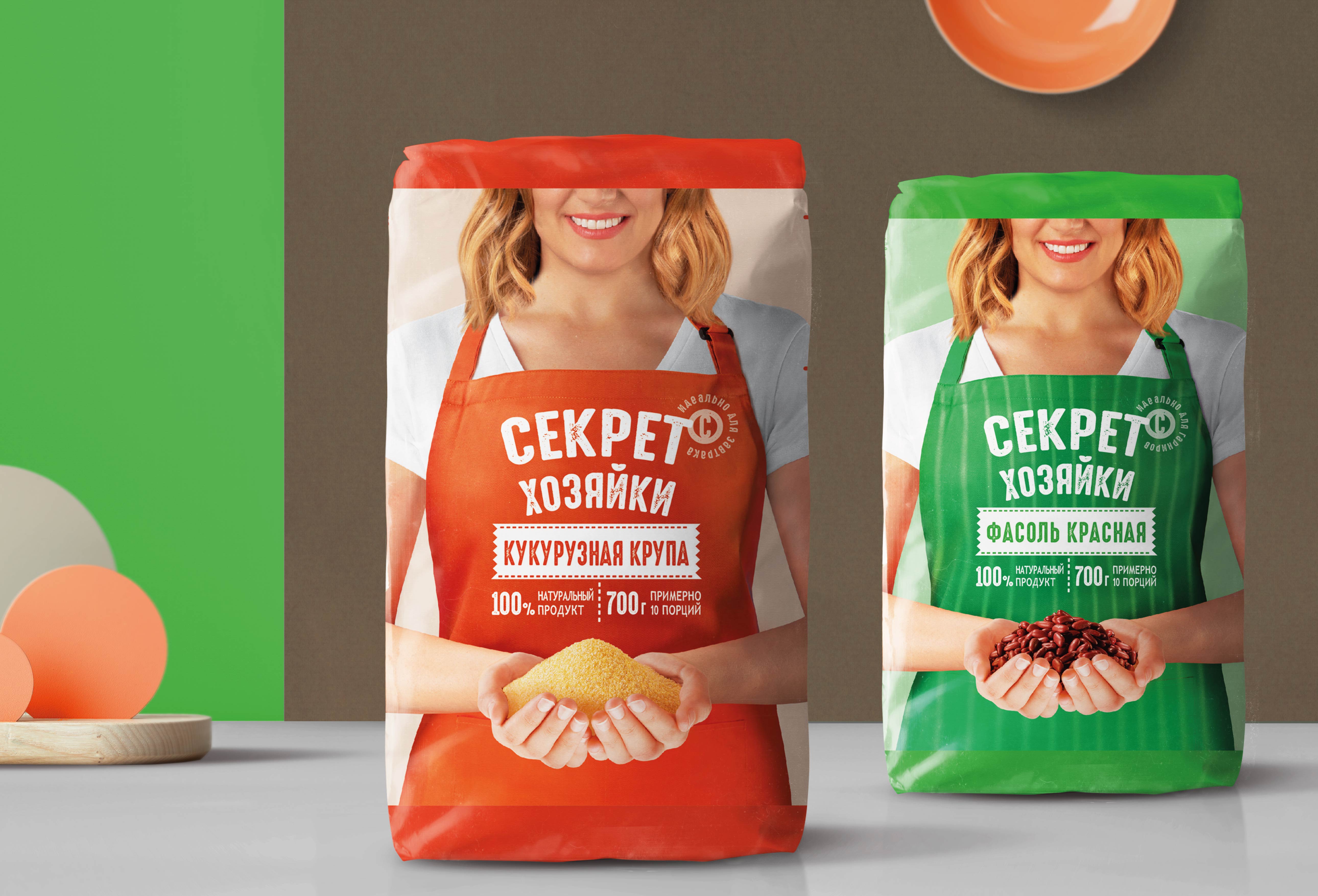
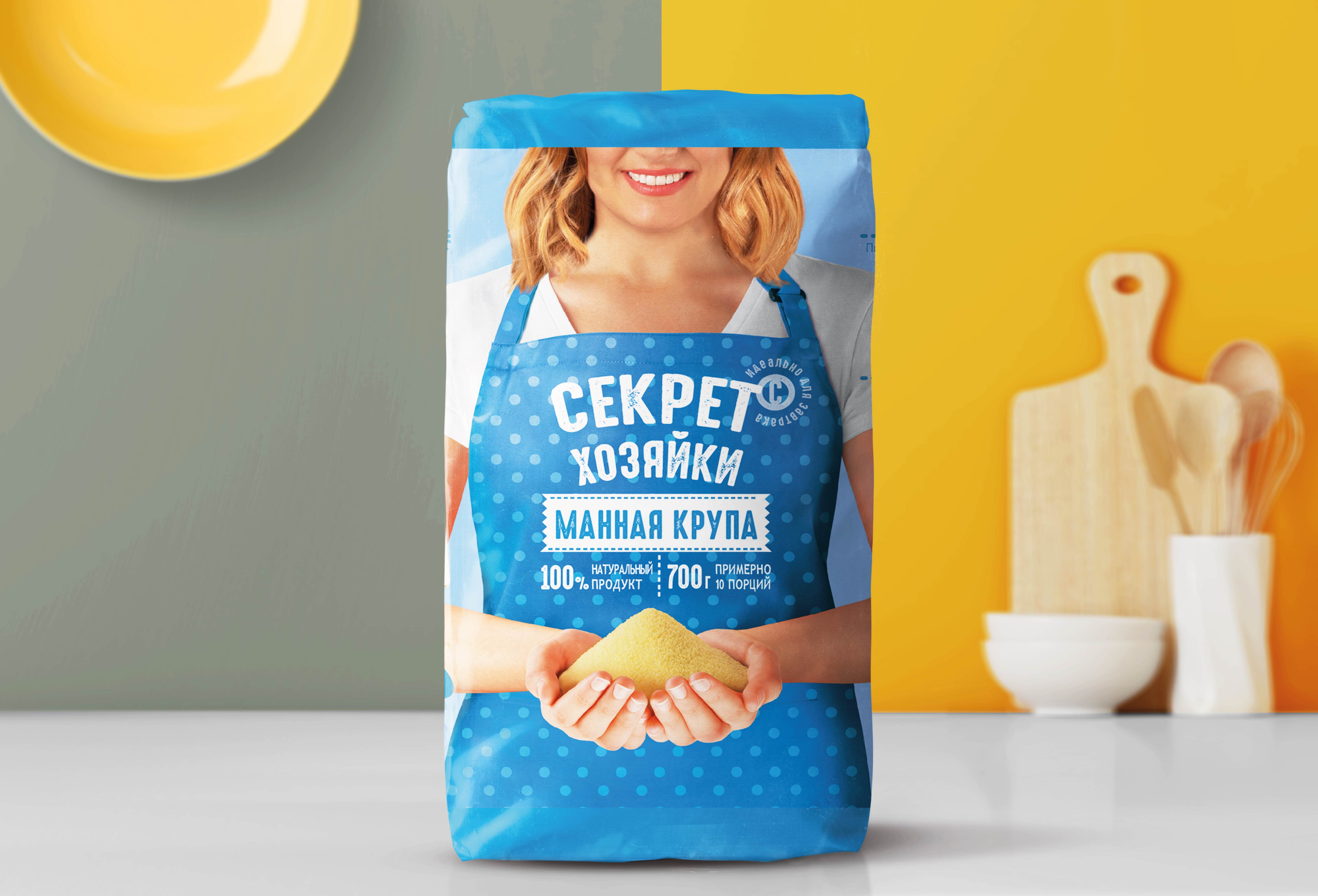
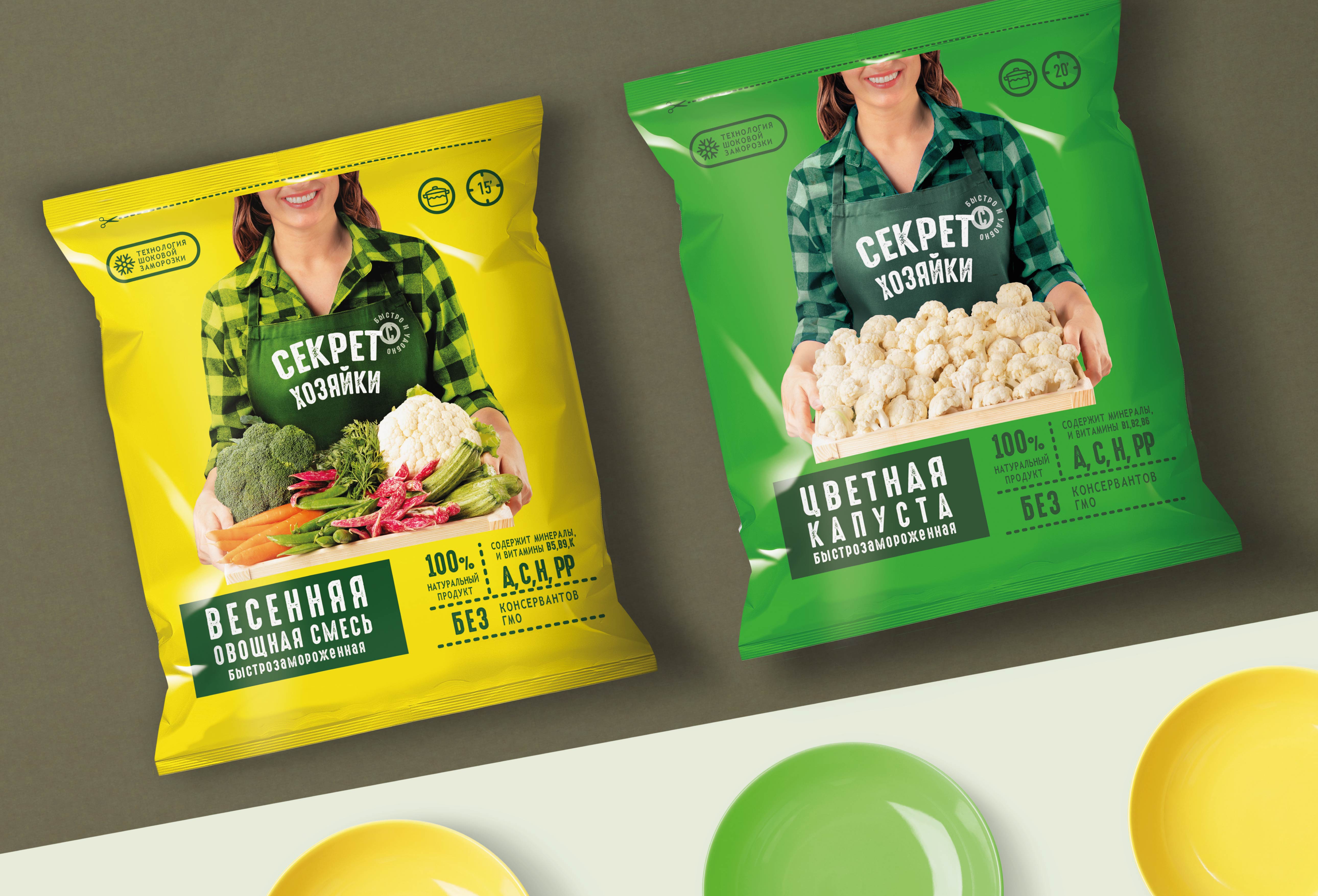
The Italian agency Break Design restyled the brand “Secret of Housewife” for the Russian retailer “Yarche” (part of the KDV group). The product line includes frozen vegetables, fruits and cereals. The agency was tasked with creating an impactful and recognizable packaging. The creative idea was to show the housewife in a variety of situations, cooking different dishes. The image turned out to be close to the consumer and memorable, successfully combining traditional values and modern style. Bright contrasting colors, together with an easy-to-read branding, let the “Secret of the Housewife” products successfully stand out on the shelf.
CREDIT
- Agency/Creative: Break Design
- Article Title: True “Secret of Housewife”
- Organisation/Entity: Agency, Published Commercial Design
- Project Type: Packaging
- Agency/Creative Country: Italy
- Market Region: Multiple Regions
- Project Deliverables: Brand Architecture, Brand Experience, Brand Identity, Brand Redesign, Brand Rejuvenation, Brand World, Branding, Graphic Design, Identity System, Packaging Design, Rebranding, Tone of Voice
- Format: Pouch
- Substrate: Plastic
FEEDBACK
Relevance: Solution/idea in relation to brand, product or service
Implementation: Attention, detailing and finishing of final solution
Presentation: Text, visualisation and quality of the presentation


