


True North has rebranded The College of Optometrists, the UK’s leading professional body for practitioners of primary eye health care, which traces its origins to 1895.
The rebrand was prompted by a number of challenges the College faces: the rapidly evolving nature of optometry due to technological advances and an ageing population; a major regulatory change that meant the College would no longer be the only body to qualify Optometrists; and pressure to justify premium membership fees in an increasingly competitive market.
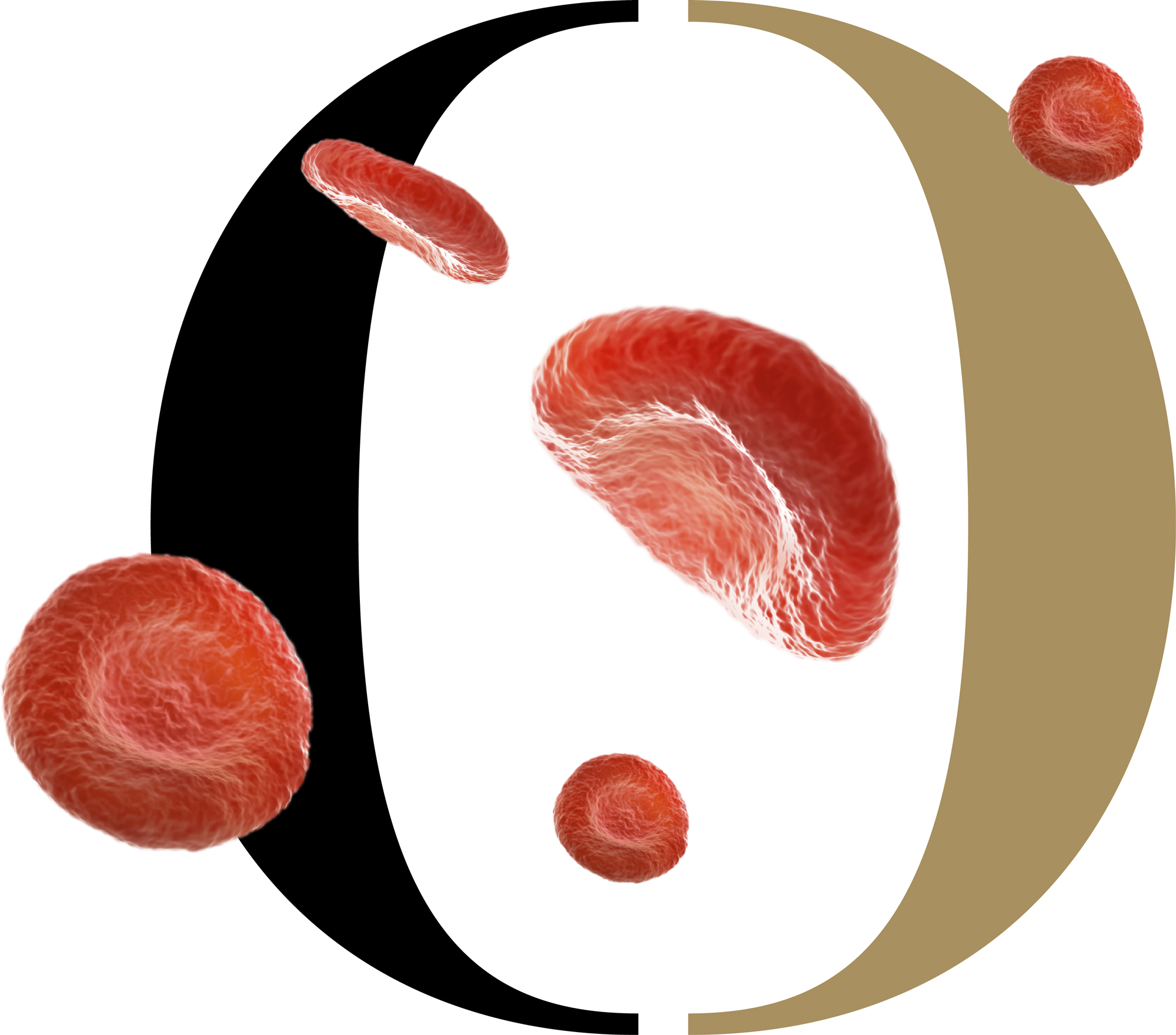
Through research with Optometrists, True North discovered how personally motivated they are by the impact they have on individual patients, but also how often they are dismayed at being misunderstood as technicians, rather than as healthcare professionals. This is becoming increasingly important as the role evolves and requires ever more collaboration with other clinical professionals.
The new brand strategy repositions College membership from being a badge of qualification to being part of the College’s work in championing and supporting excellence in eye health care.
“What Optometrists can now discover through the eye is incredible, and their role keeps expanding. But because of that rate of change, Optometrists really value being recognised as part of the long, progressive lineage of the profession. So making the brand more relevant for the future meant embracing that heritage rather than hiding it.” Ady Bibby, Managing Director at True North.
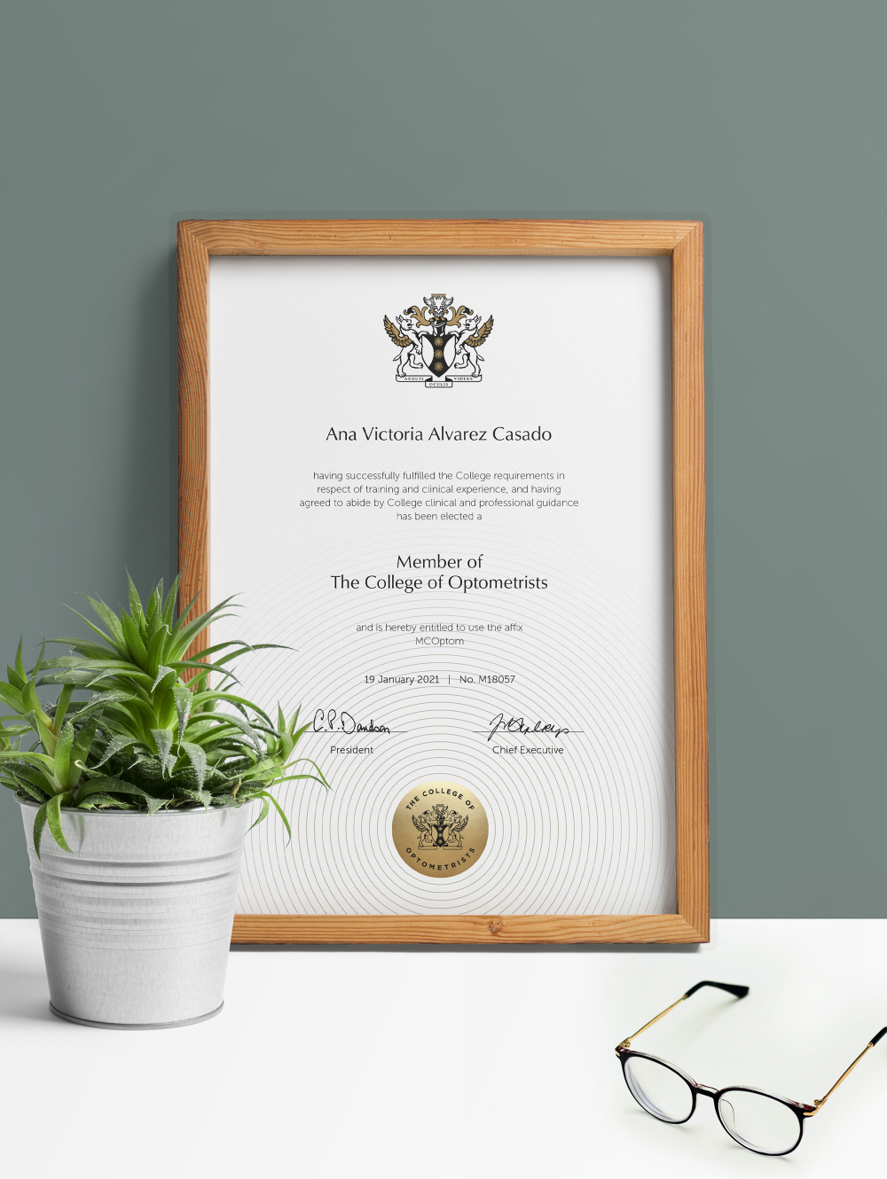
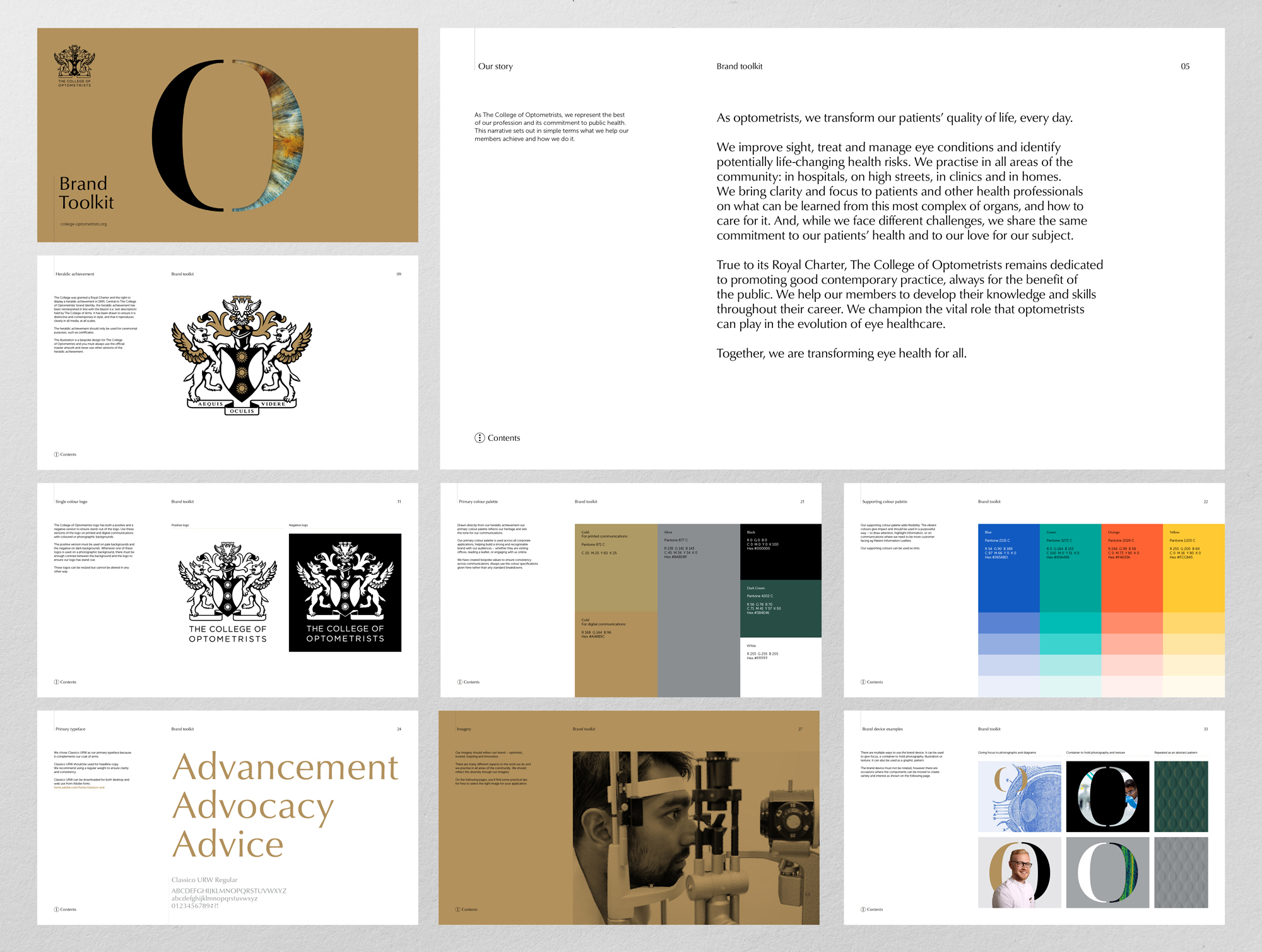
At the heart of the new visual identity is a hand-crafted representation of the College’s heraldic achievement. True North commissioned the illustration from Chris Wormell and collaborated with the College of Arms to ensure this contemporary interpretation remained true to its origins.
“The real challenge was in weaving historical and contemporary aspects together so that the identity is both cohesive and timeless. Being truer to the official heraldry in the branding than the College had in previous iterations allowed us to create something more confident and more inspiring for members.” Victoria Pinnington, Senior Designer at True North
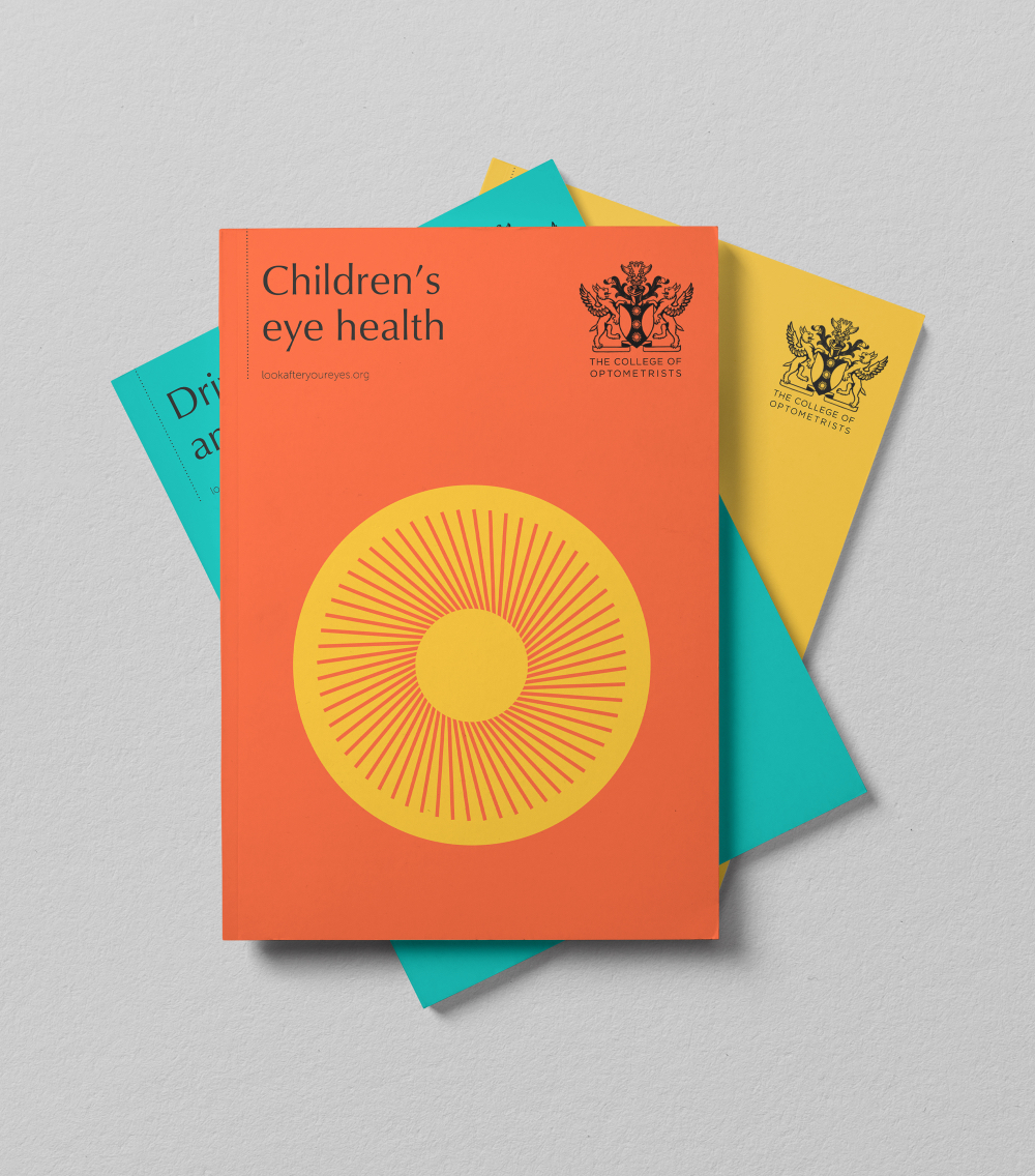
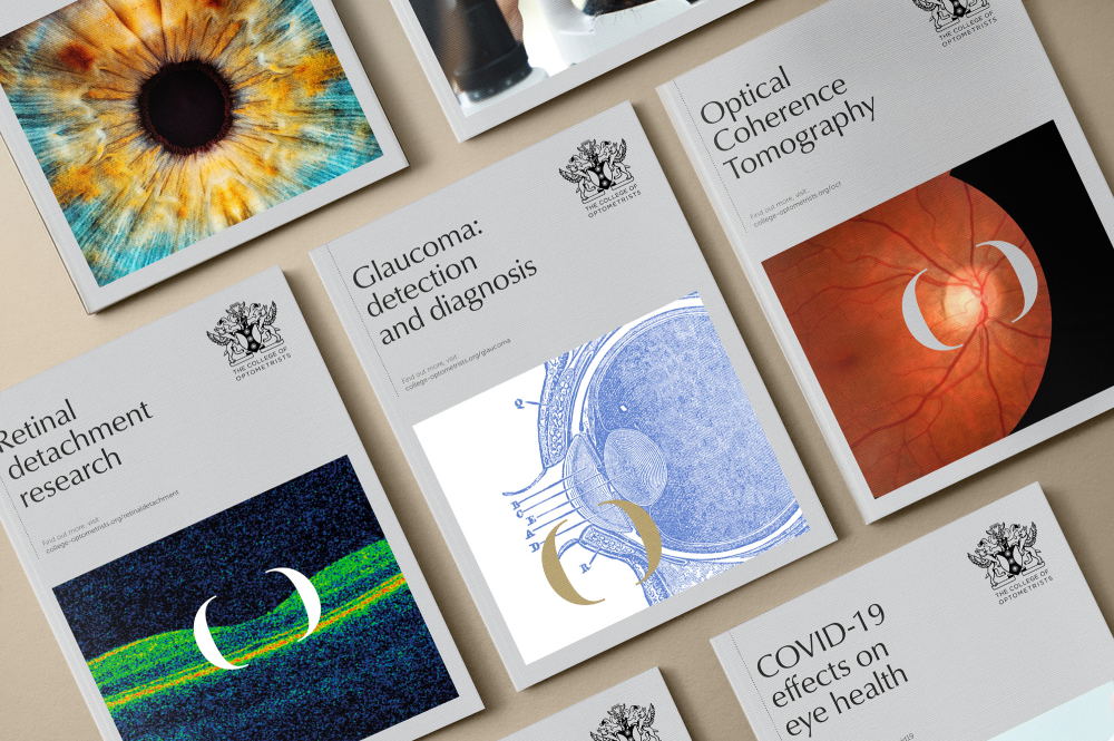
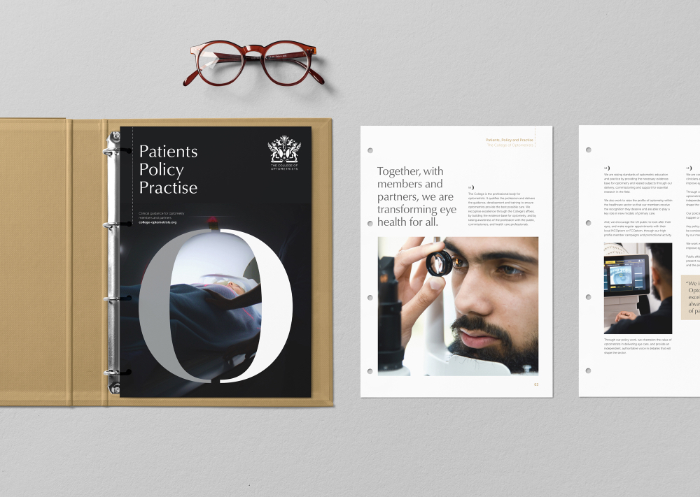
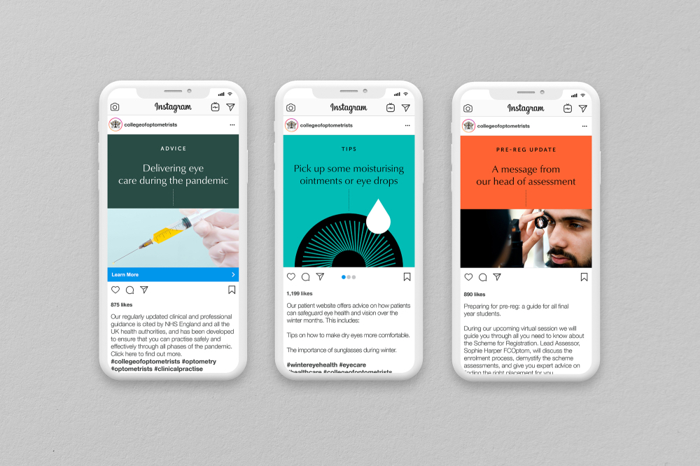
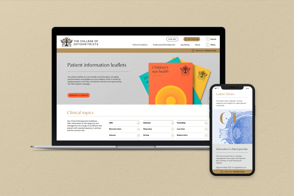
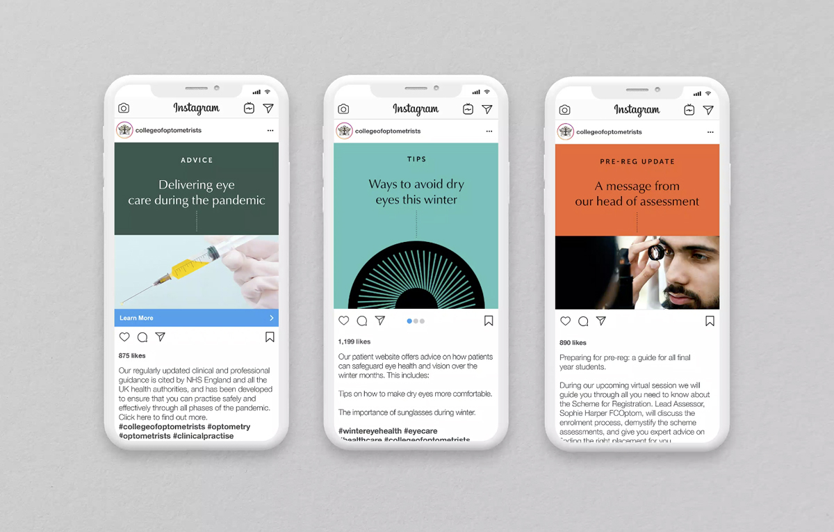
A purposefully small core colour palette of gold, black, white and silver reflects the colours given in the original grant of the heraldic achievement, and is complemented in the new identity with bright highlight colours and elegant contemporary typefaces. Tone of voice and a new photographic style were also introduced to reflect the diversity of modern clinical practice and practitioners.
Victoria Coss, Head of Marketing and Communications at The College of Optometrists “Through the process it became clear that we had to retain and build on our heritage whilst adding a new perspective on our role for our members, our profession and our patients. We needed our eyes to be opened by the insight and strategic thought provided by the team at True North”.

![]()
CREDIT
- Agency/Creative: True North
- Article Title: True North Helps the College of Optometrists Be Truer to Its History to Revitalise Its Future
- Organisation/Entity: Agency
- Project Type: Identity
- Project Status: Published
- Agency/Creative Country: United Kingdom
- Agency/Creative City: Manchester
- Market Region: Global
- Project Deliverables: Brand Guidelines, Brand Identity, Brand Mark, Brand Redesign, Brand Rejuvenation, Brand Strategy
- Industry: Health Care
- Keywords: Rebrand, College of Optometrists, Brand Strategy
-
Credits:
Marketing Director: Rob Grant


