


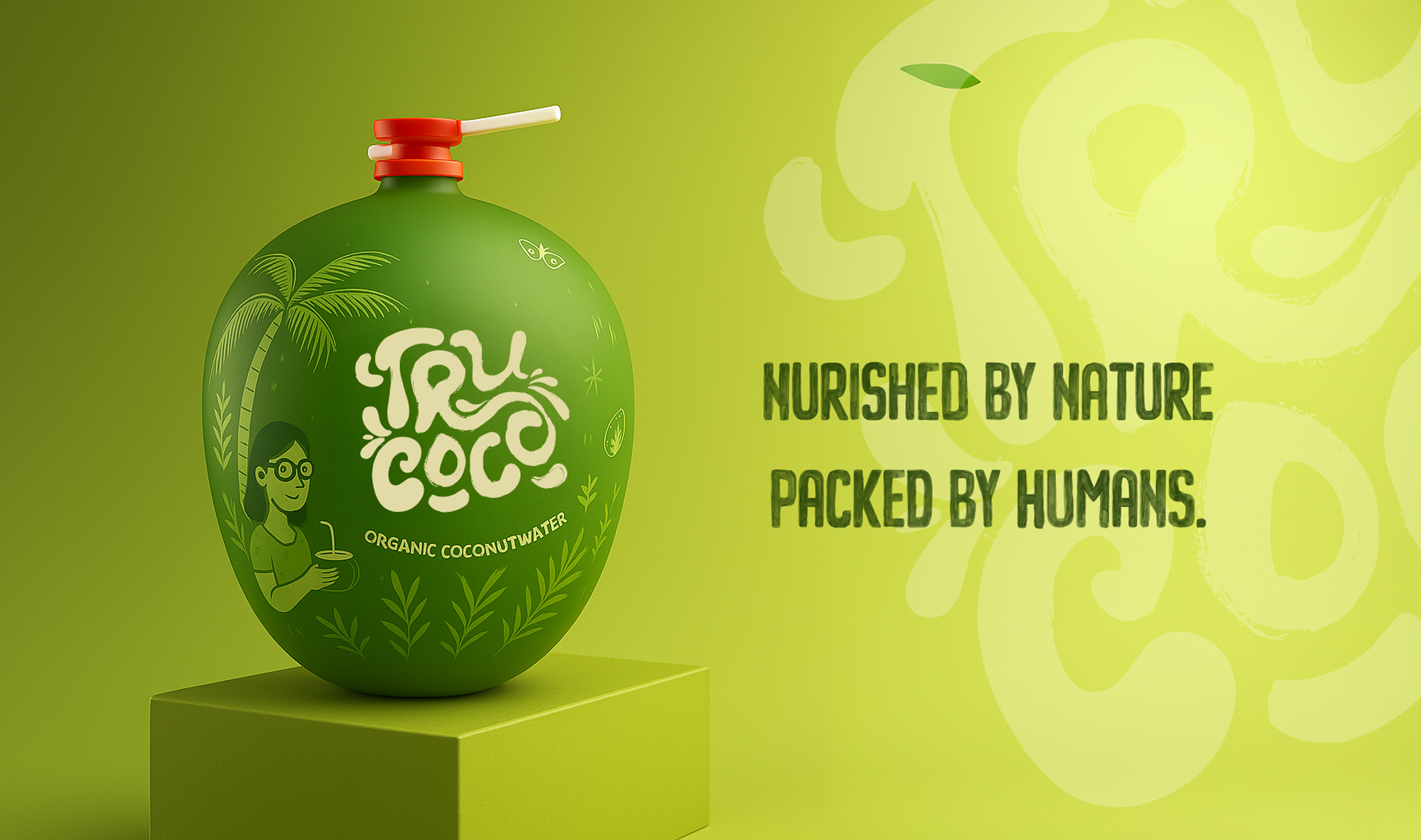
When TruCoco came to us, they weren’t looking for another generic coconut water brand. They wanted a vibe: raw, real, and ready to crack open the market. We delivered a brand identity that’s as bold as a machete swing—starting with a hand-drawn logo and shrink-wrap packaging that’s all about user convenience, wrapped tight around the real deal: a fresh coconut.
The Logo: Brush Strokes with Soul
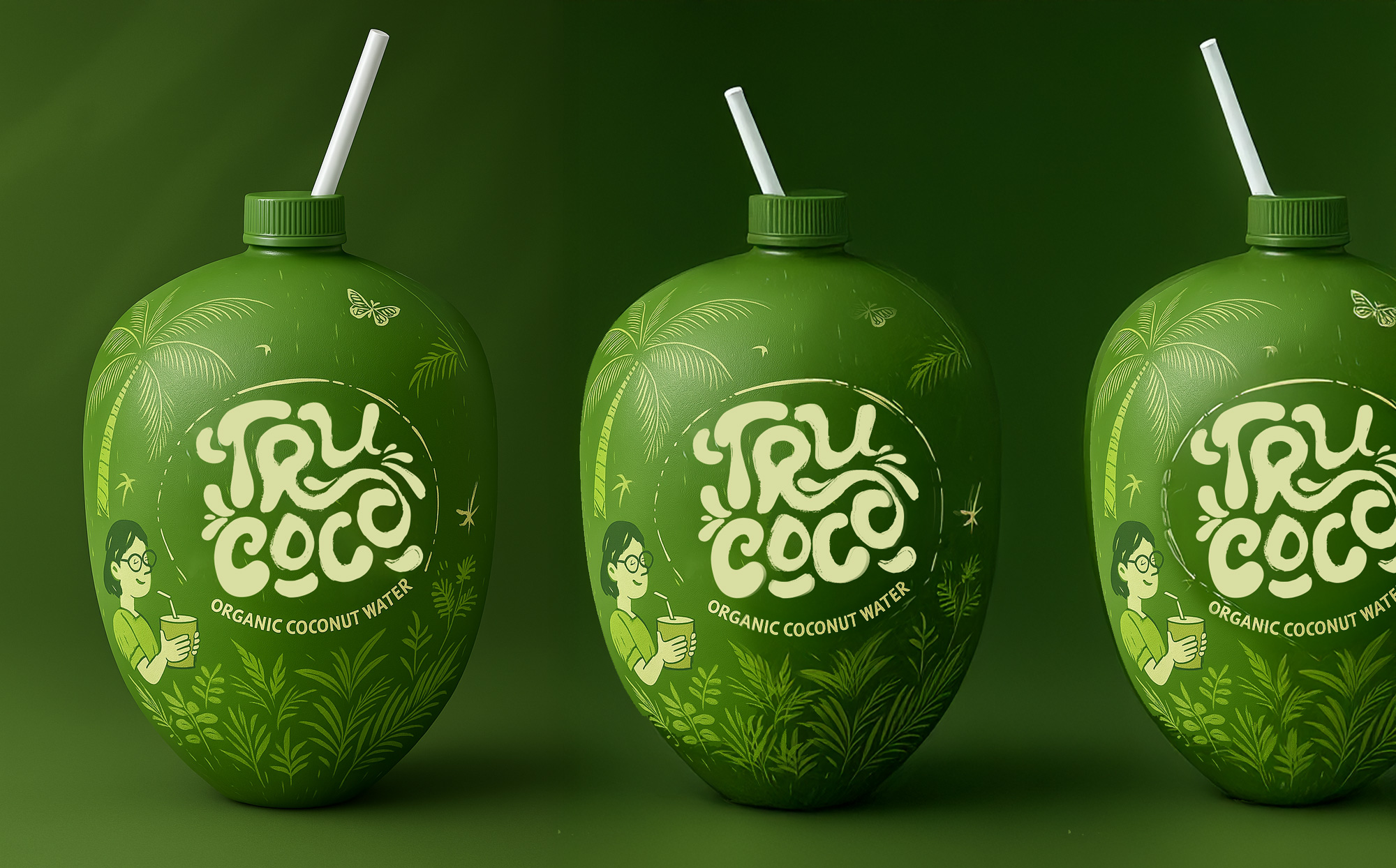
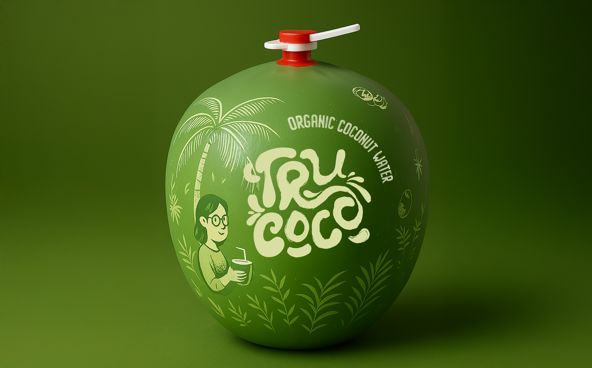
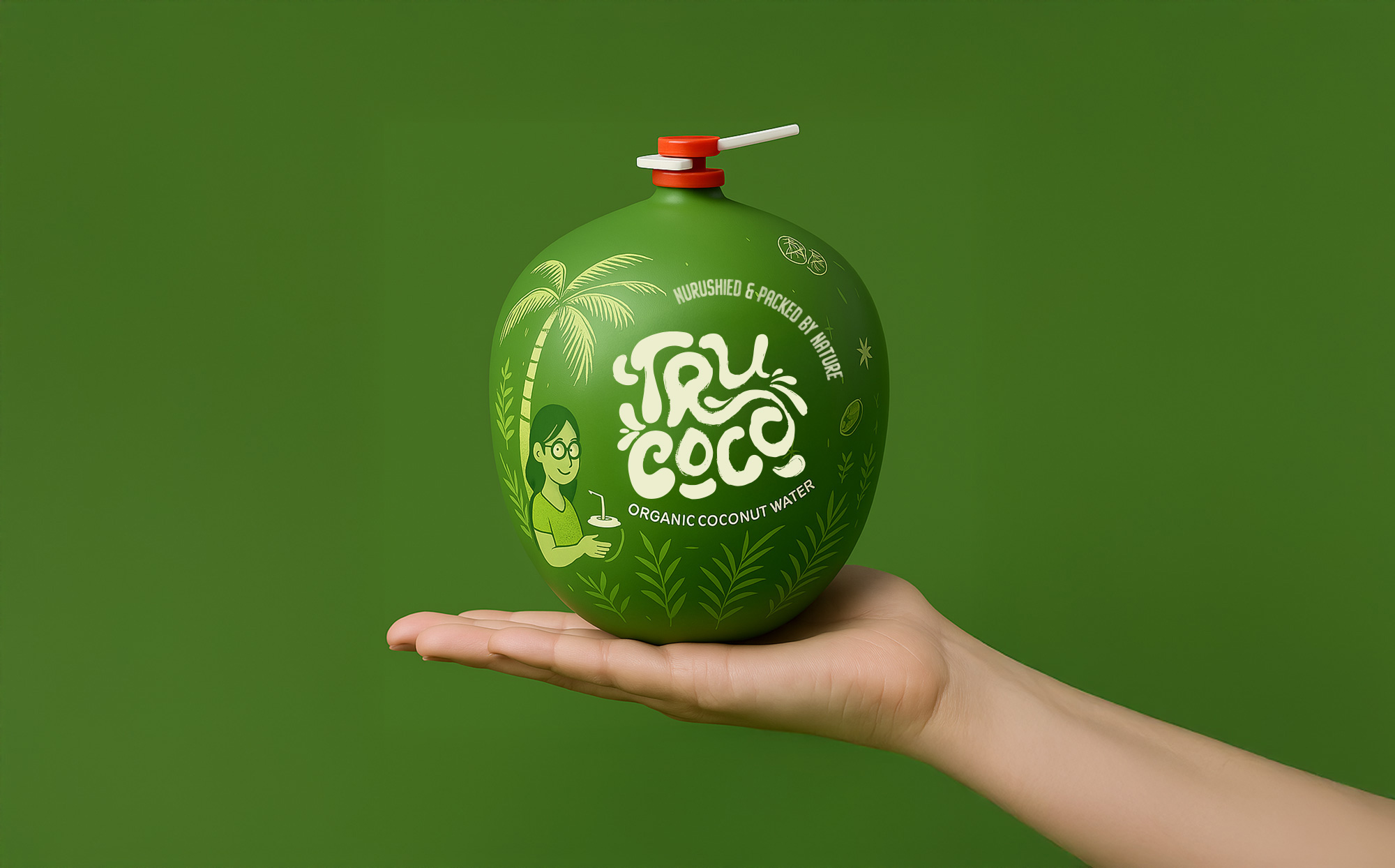
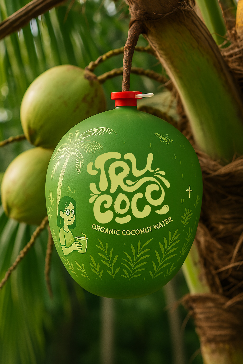
TruCoco’s logo isn’t some sterile vector job—it’s a hand-drawn masterpiece, born from gritty brush strokes. Each line drips with the untamed spirit of the tropics—think coconut husks split open, juice spilling free. We ditched the cookie-cutter polish for something organic, imperfect, and alive, mirroring the real coconuts TruCoco delivers. It’s not just a logo; it’s a vibe check—authentic, rugged, and ready to stand out on any shelf or Insta feed.
Packaging: Shrink-Wrap Swagger
Forget plastic bottles or tetra packs—TruCoco’s packaging is the coconut itself, hugged by a custom shrink-wrap that’s equal parts art and function. We designed it with bold, tropical hues—greens that scream jungle, whites that pop like sea foam—and layered in our hand-drawn aesthetic. But it’s not just pretty; it’s practical. A perforated pull-tab makes cracking in a breeze—no machete required. This is user convenience with a Wortham twist: nature’s best, wrapped in our creative chaos, ready to sip straight from the source.
Brand Identity: Freshness Meets Rebellion
TruCoco isn’t here to blend in—it’s here to break out. We built their identity around two truths: the pure, unfiltered freshness of real coconuts and a rebellious edge that says “we’re not your average hydration.” bursting with local pride and zest TruCoco’s vibe is rooted in its origin: the untamed tropics. Our hand-drawn elements nod to that raw energy, while the shrink-wrap packaging flexes modern smarts. It’s a brand that feels like a sip of freedom—natural, daring, and oh-so-Wortham
The hand-drawn logo cuts through the noise—perfect for a social media scroll or a crowded store. The shrink-wrap packaging? It’s a flex—sustainable, user-friendly, and a visual banger that turns every coconut into a billboard.
CREDIT
- Agency/Creative: Wortham Creative Inc.
- Article Title: Trucoco’s Fresh Hand Drawn Brand Identity by Wortham
- Organisation/Entity: Agency
- Project Type: Identity
- Project Status: Published
- Agency/Creative Country: India
- Agency/Creative City: Noida
- Market Region: Global
- Project Deliverables: Brand Design, Brand Identity, Branding, Logo Design, Packaging Design
- Industry: Food/Beverage
- Keywords: Logo Design, Wortham, Brand identity Design
-
Credits:
Head of Design: Aryan Rajput
Chief Creative Officer: Mayank
Creative Director: Nimesh
Asst. Creative Director: Abbas Haider
Visual Designer and AI Visualizer: Divyansh Kashyap
Hand Drawings: Harsha Chaudhary


