The Brand – TruArt
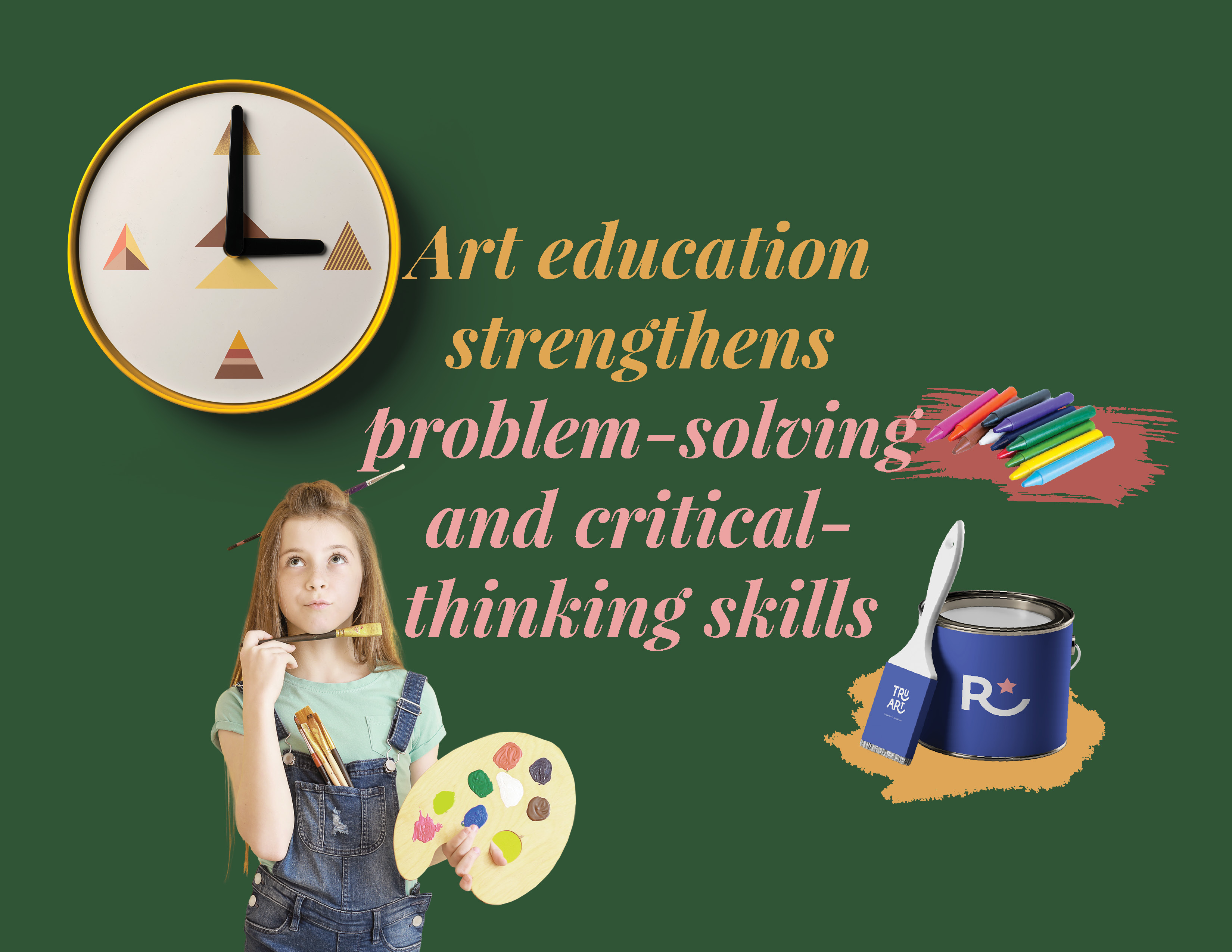
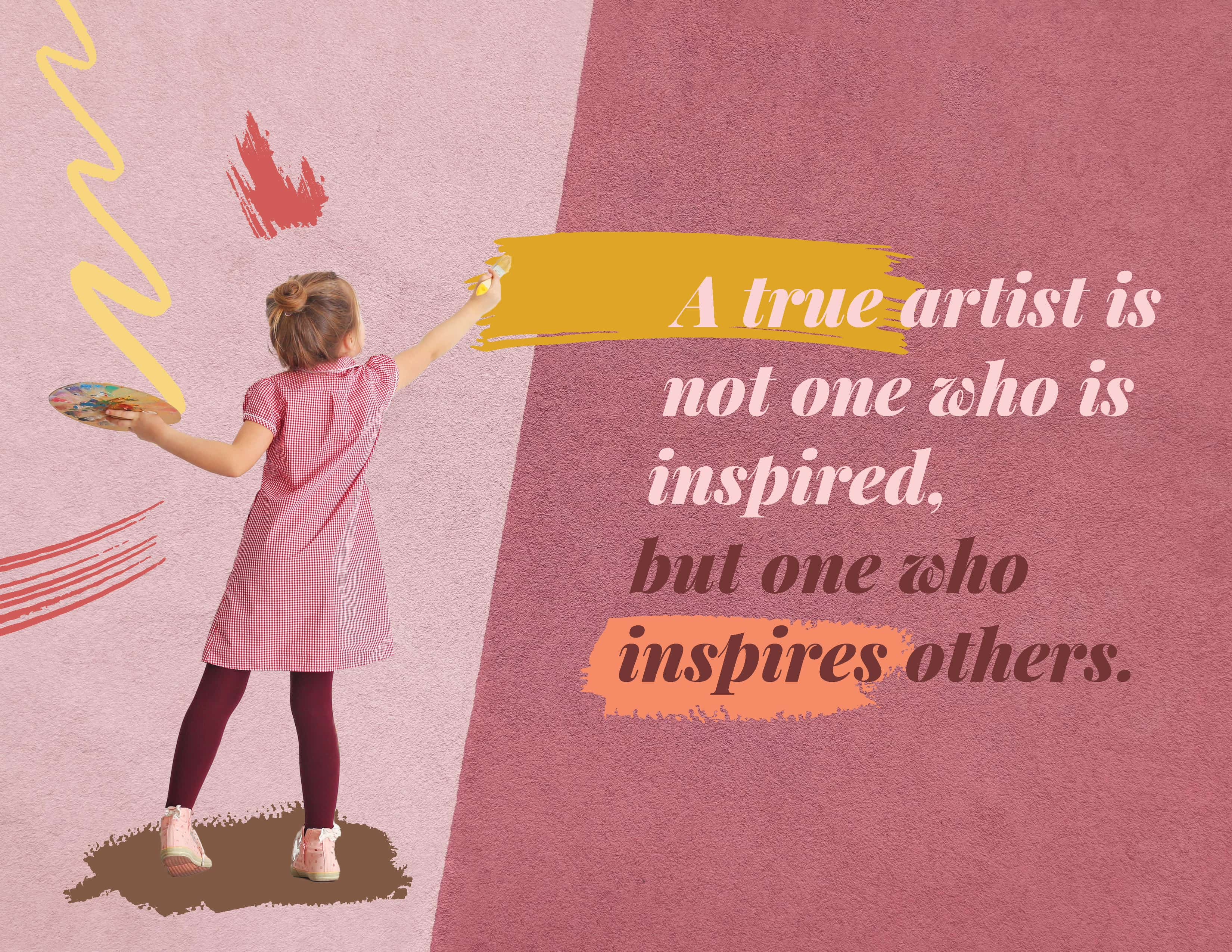
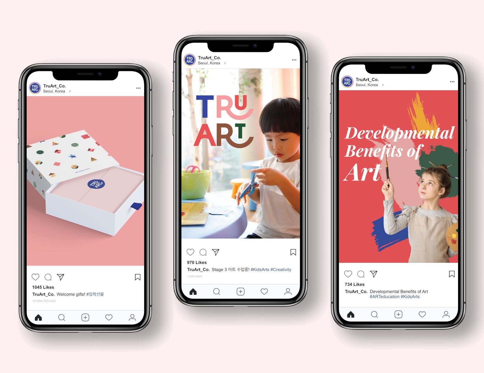
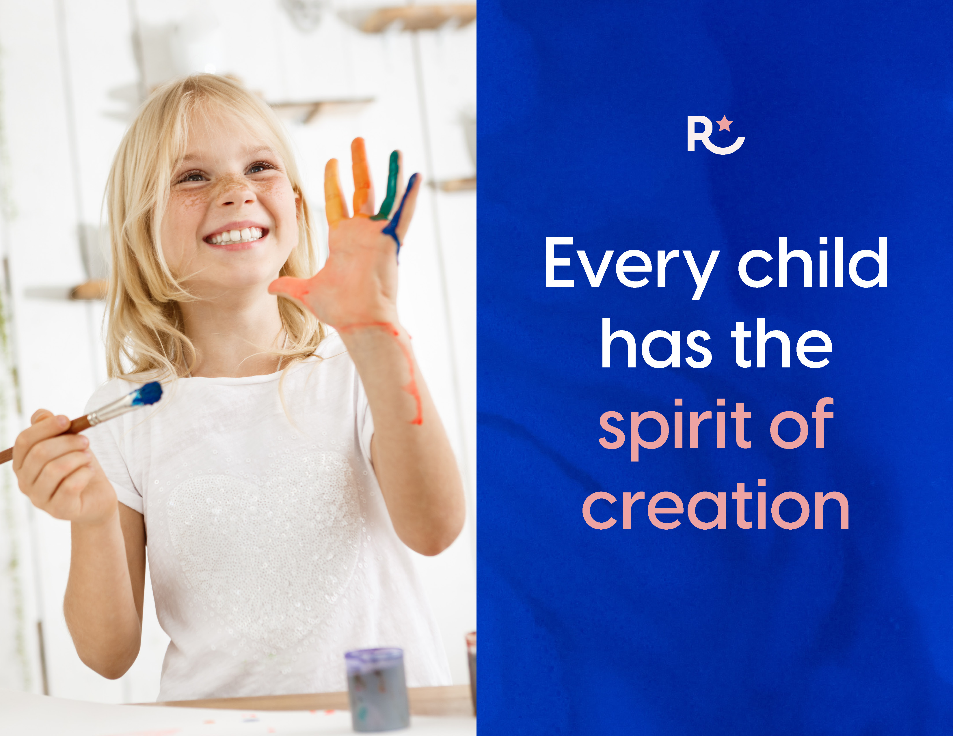
TruArt is a South Korean art education company that offers innovative art education for children, ranging from Kindergarten to Elementary school. Embracing the belief that every child possesses an innate artistic ability and a spirit of creation, the company’s mission is to nurture and develop their creativity. TruArt aims to cultivate essential skills such as problem-solving, innovation, literacy, and empathy, ensuring holistic growth in young minds. With a primary focus on engaging their target audience, little kids, the branding concept was thoughtfully crafted to effectively communicate the company’s mission. By creating a brand identity that conveys playfulness, fun, and vibrant youthful energy, TruArt seeks to inspire children to explore and express their artistic talents freely.
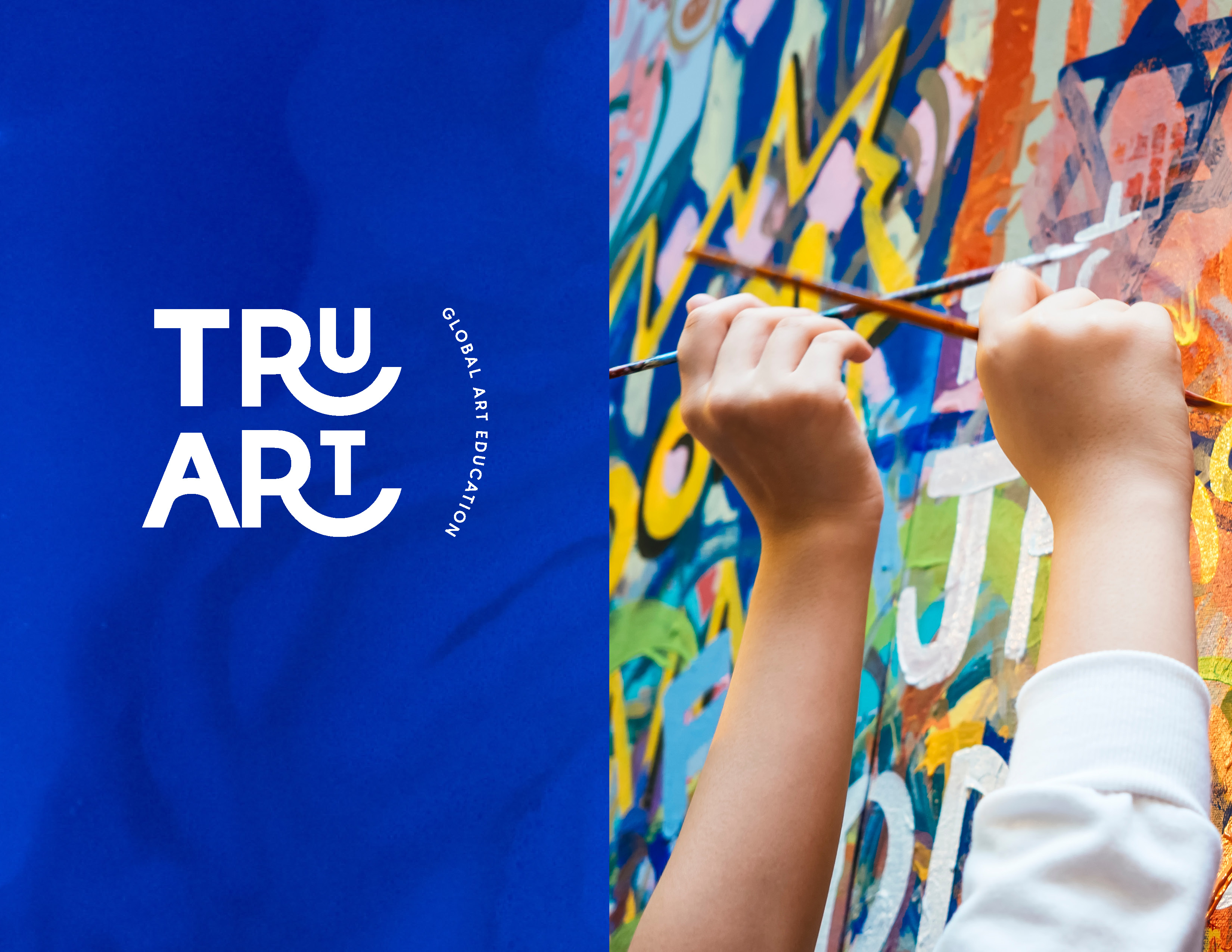
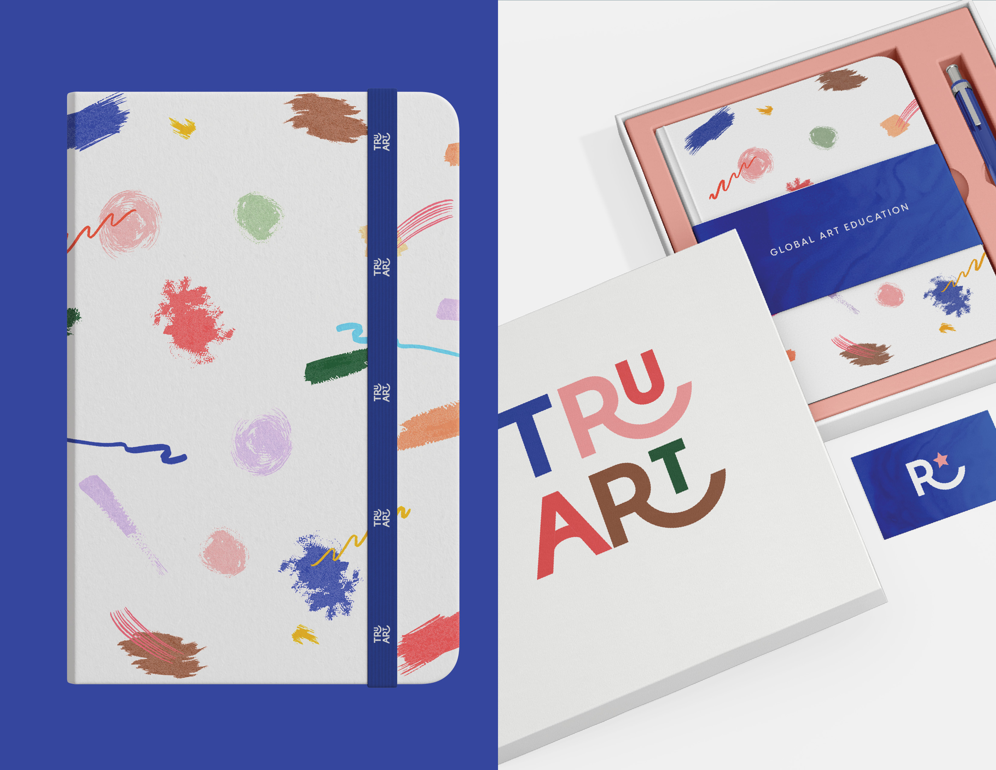
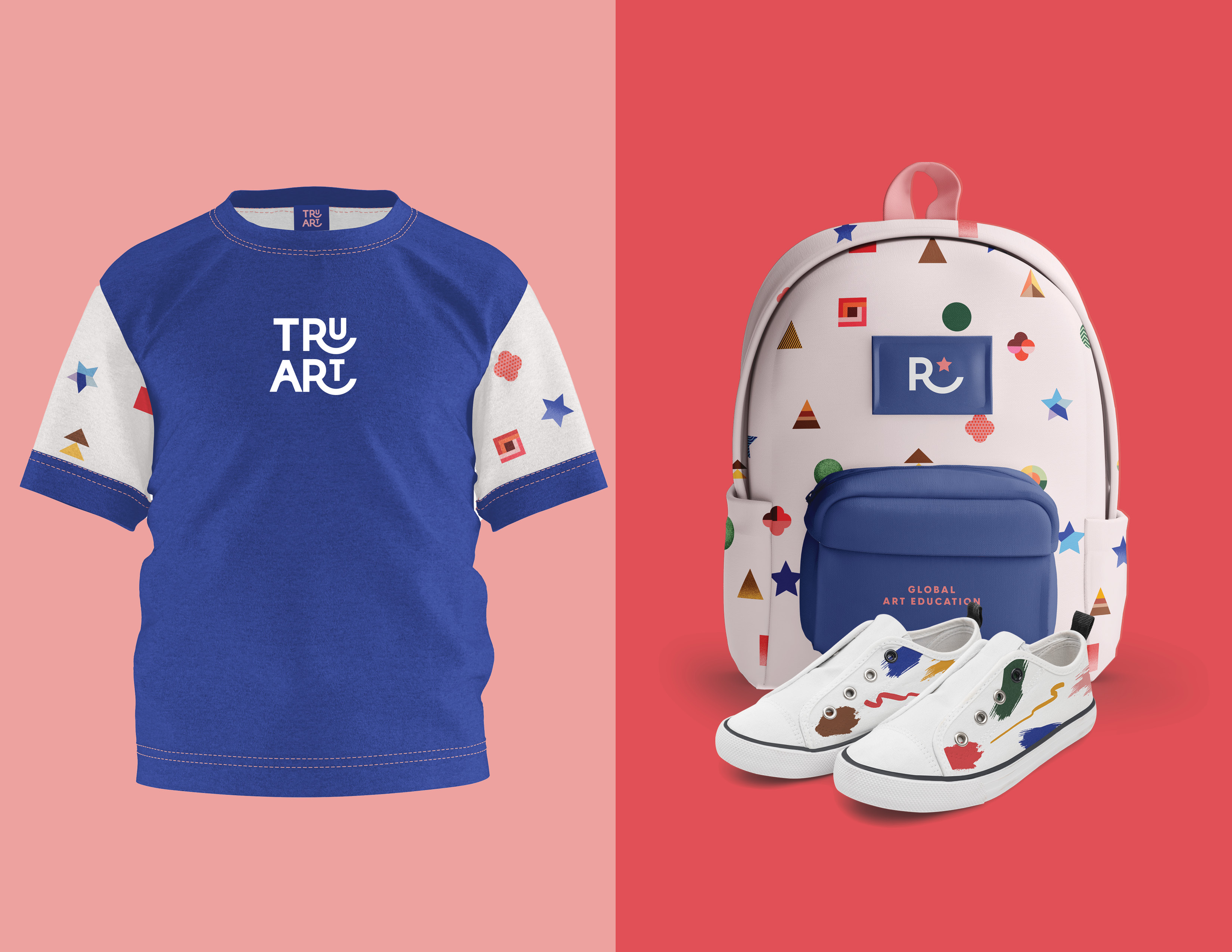
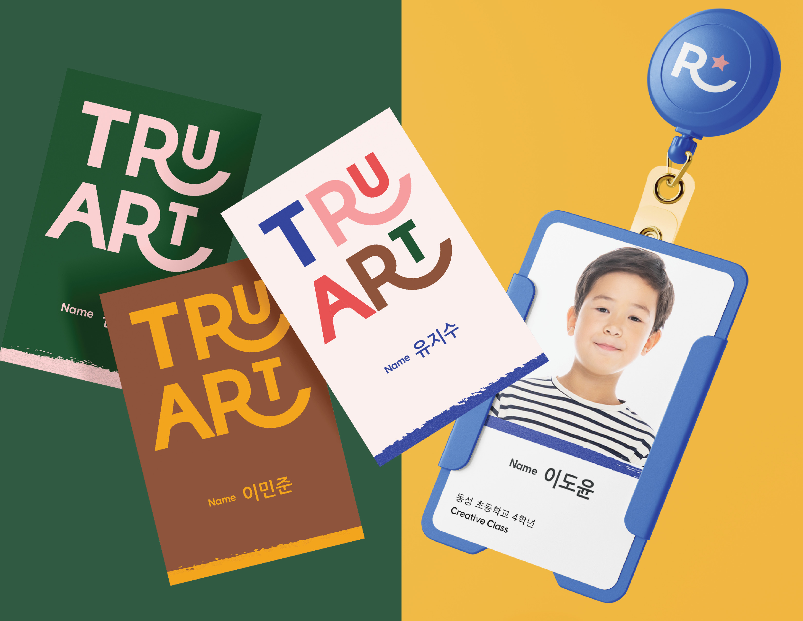
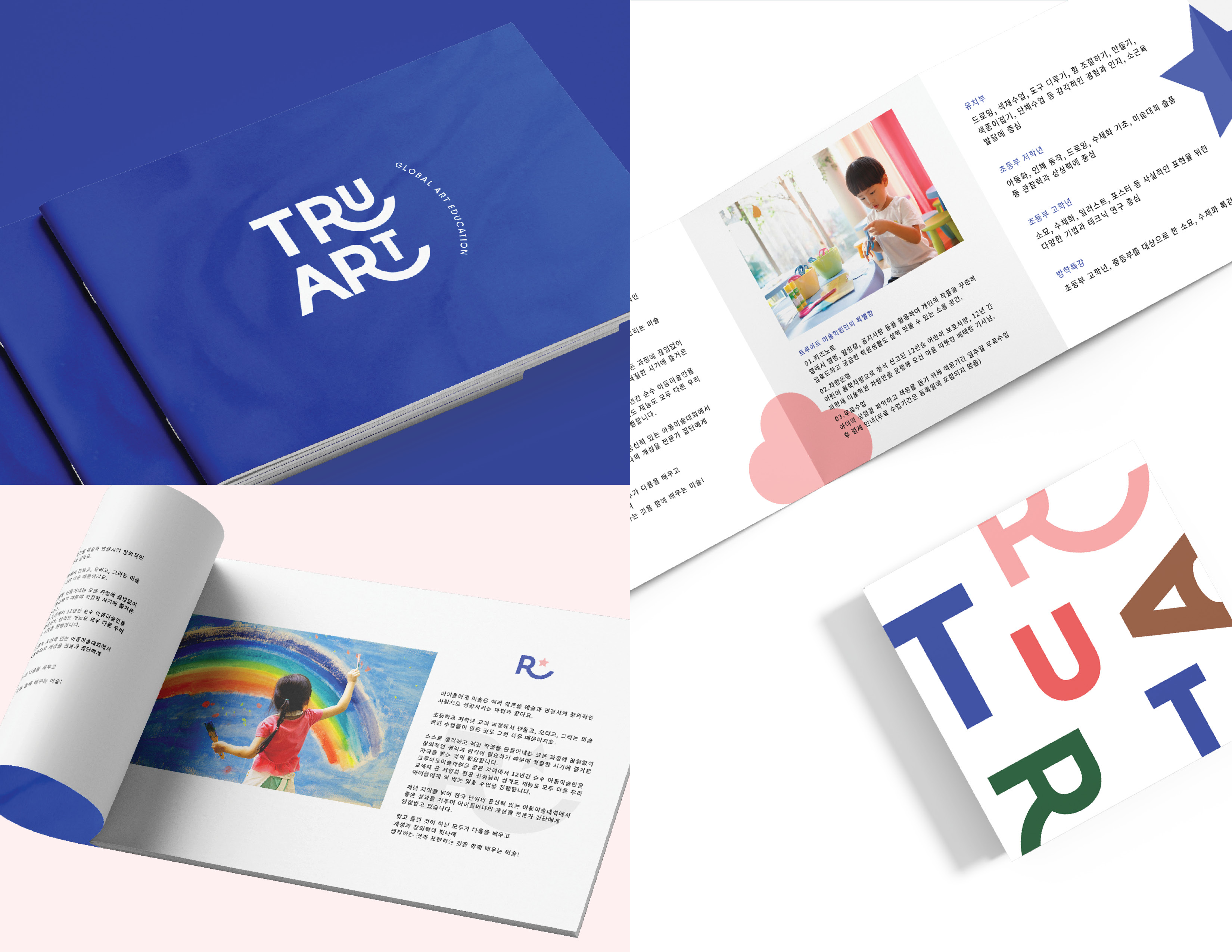
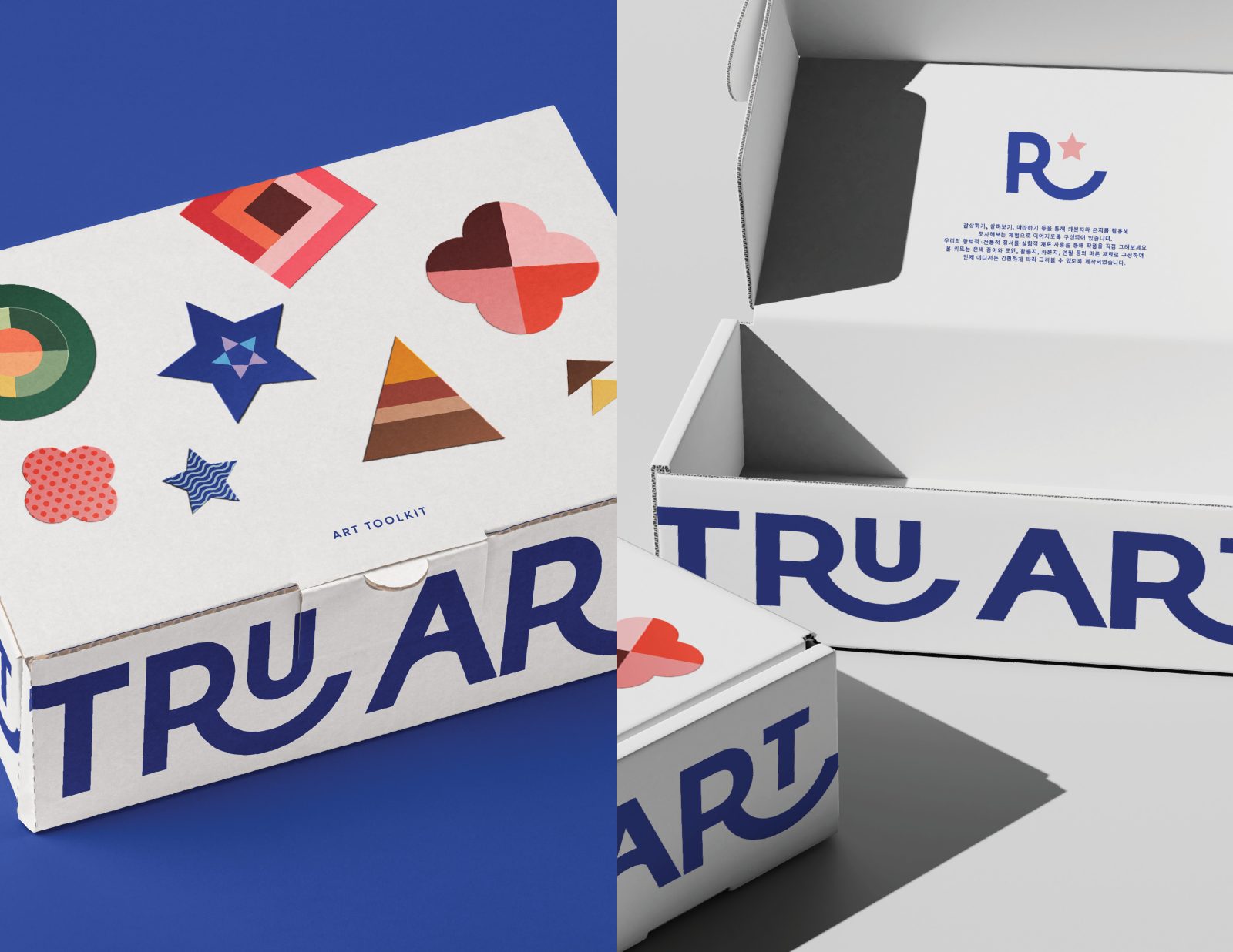
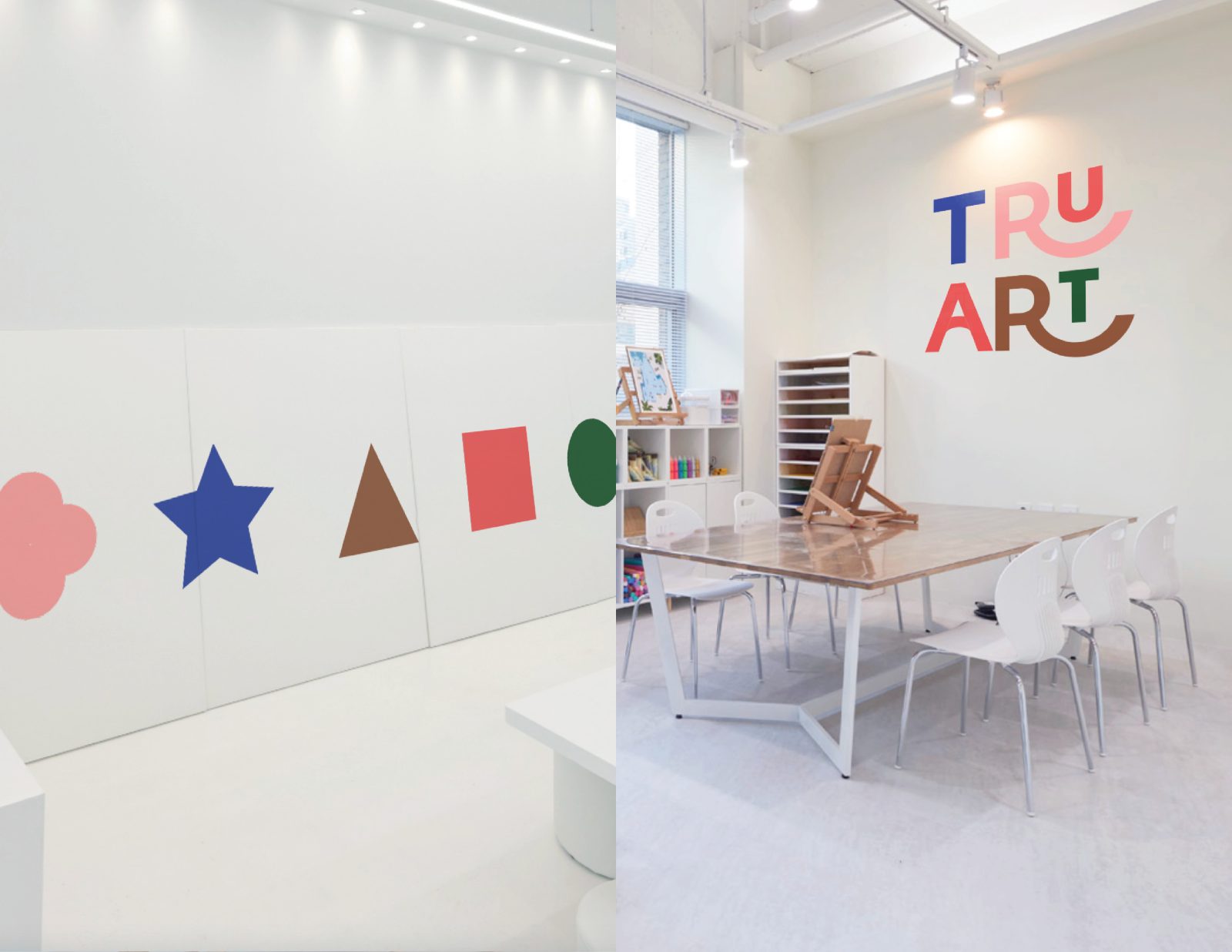
Logo Design: The logo features customized typography, meticulously crafted to convey playfulness, fun, and vibrant youthful energy. By incorporating a flowing stroke in the letter R and strategically repeating it, a captivating rhythm was created, enhancing the overall sense of enjoyment.
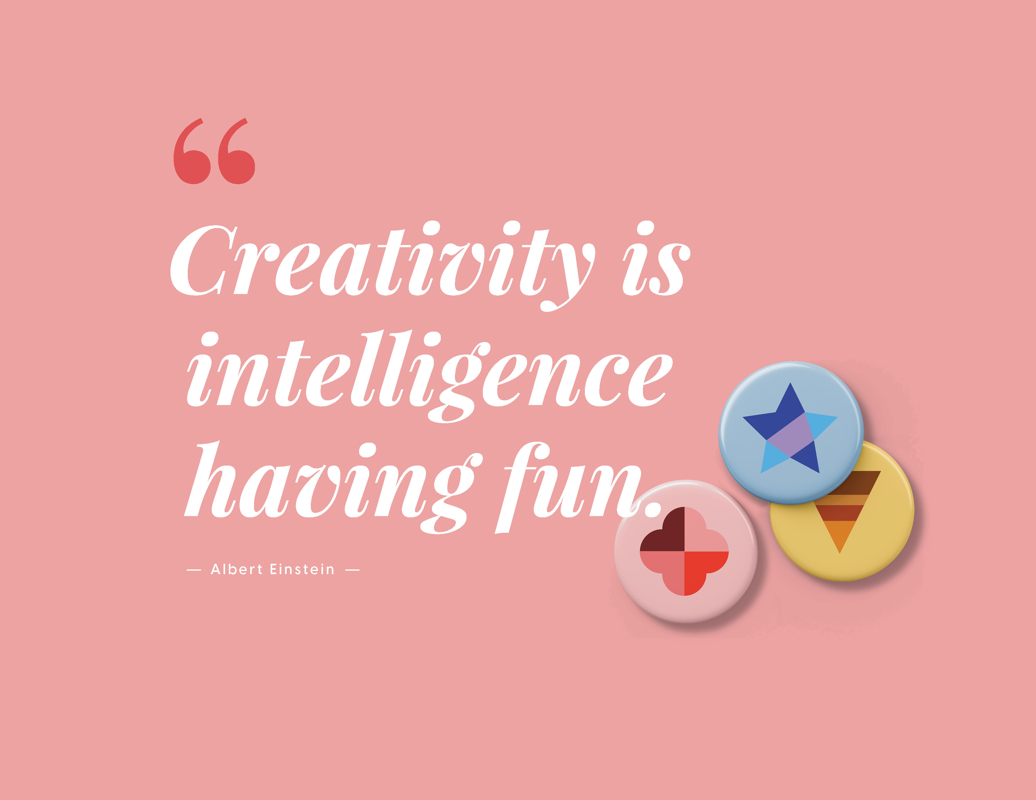
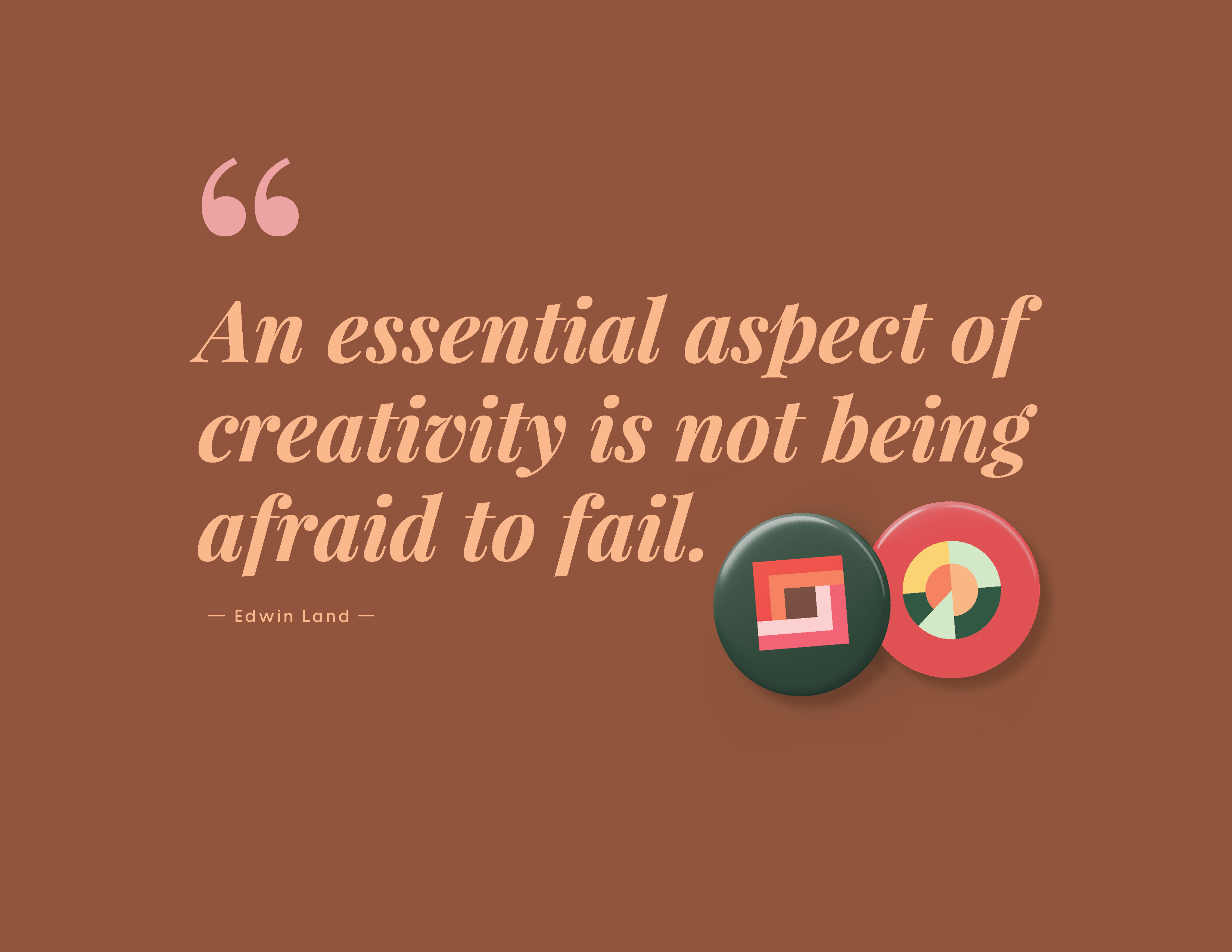
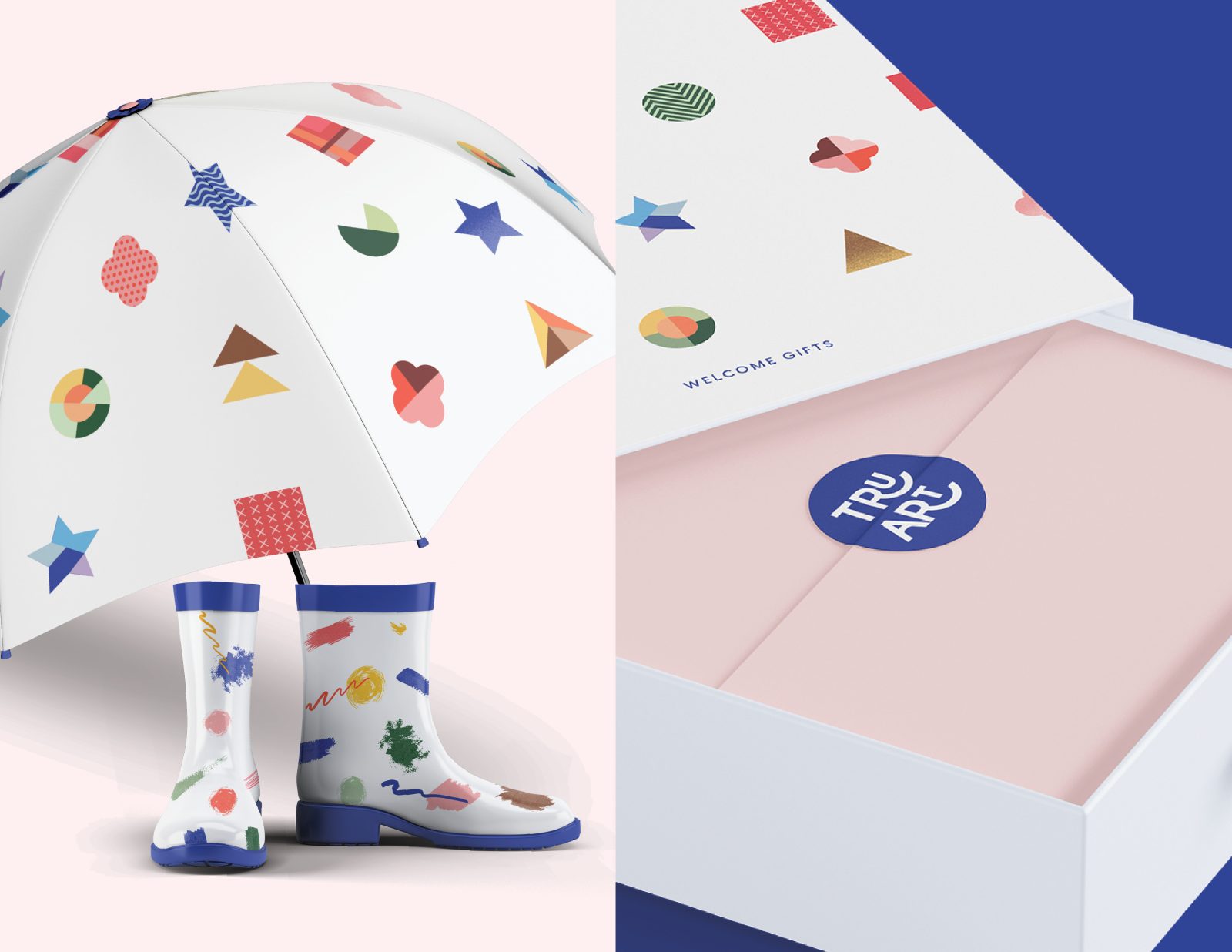
Graphic Elements: To visually communicate the company’s mission, various geometric shapes were utilized: a flower shape to represent problem-solving skills, a star shape for creativity, a triangle for innovation, a square for literacy, and a circle for empathy. These shapes were further refined and combined to create a series of unique and engaging designs that embody the spirit of creativity. In addition to the geometric shapes, a collection of playful doodles was developed to capture the essence of kids’ art and the freedom of self-expression. These additional doodles serve to reinforce the sense of joy and boundless creativity.
Color Choice: Pink, Blue, Brown, Orange-Red, and Green were selected as the primary branding colors to complement TruArt’s mission and appeal to their target audience of young children. Each color was chosen with a specific purpose in mind:
Pink: Reflecting the creative and inventive ways that TruArt encourages children to tackle challenges and find unique solutions through art.
Blue: Embodies the boundless imagination that TruArt aims to nurture in young artists, encouraging them to explore new ideas and express themselves freely.
Brown: Signifies the strong foundation and roots that TruArt provides to help children explore and develop their artistic skills in innovative ways.
Orange-Red: This warm and energetic color symbolizes the ability of art to communicate and convey stories, ideas, and emotions, fostering a deeper understanding of the world around them.
Green: Embodies the compassionate and understanding environment that TruArt cultivates, fostering a sense of connection and emotional intelligence through art.
By incorporating these carefully chosen colors into their branding and visual materials, TruArt effectively communicates its mission and values, creating an engaging and immersive experience for young artists.
CREDIT
- Agency/Creative: Hyena Nam
- Article Title: TruArt Playful Branding Fueling Young Artistic Dreams
- Organisation/Entity: Freelance
- Project Type: Identity
- Project Status: Non Published
- Agency/Creative Country: United States
- Agency/Creative City: West Desmoines
- Market Region: Asia
- Project Deliverables: Brand Identity
- Industry: Education
- Keywords: WBDS Creative Design Awards 2023/24
- Keywords: Identity, Brand Design Creation
-
Credits:
Art Director: Hyena Nam


