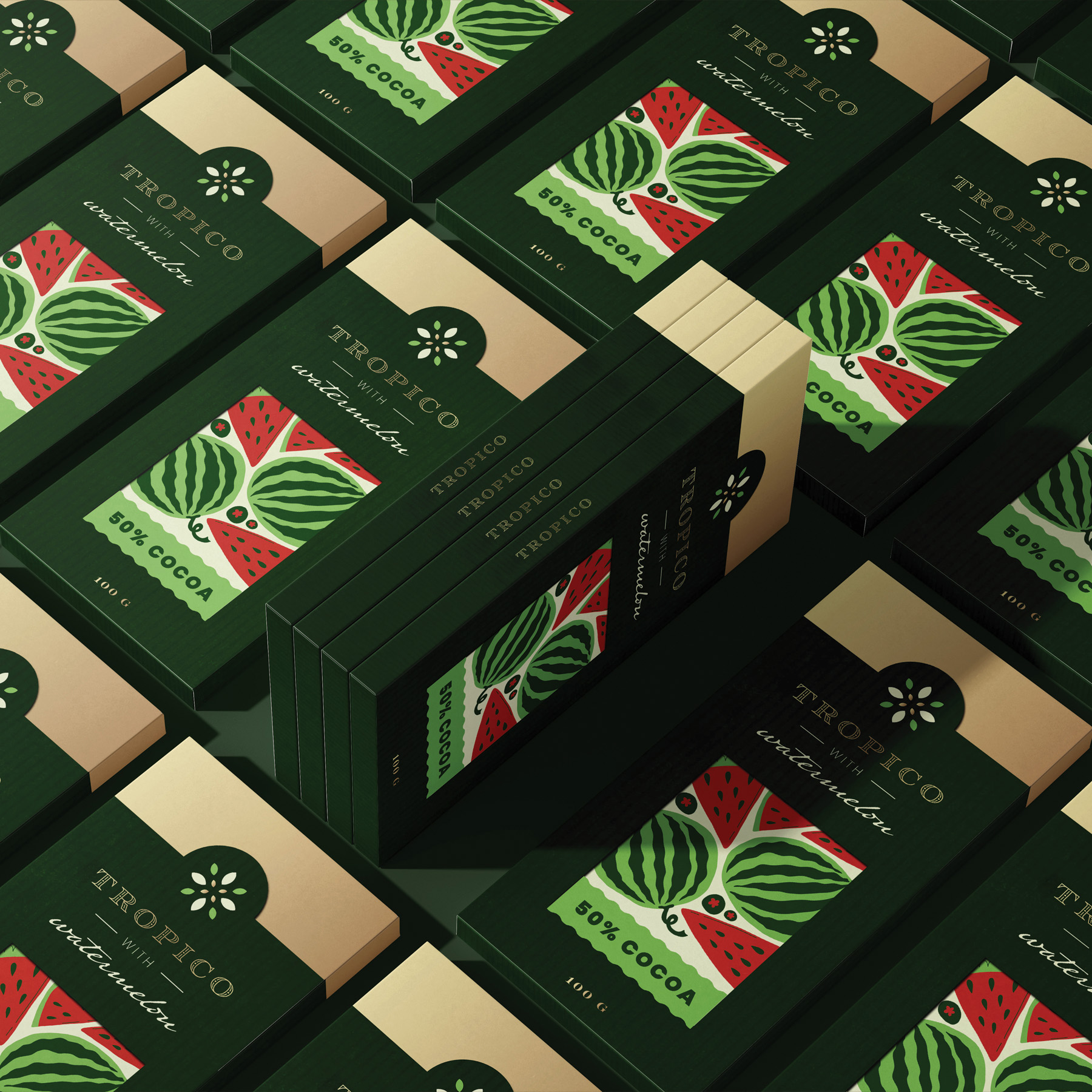
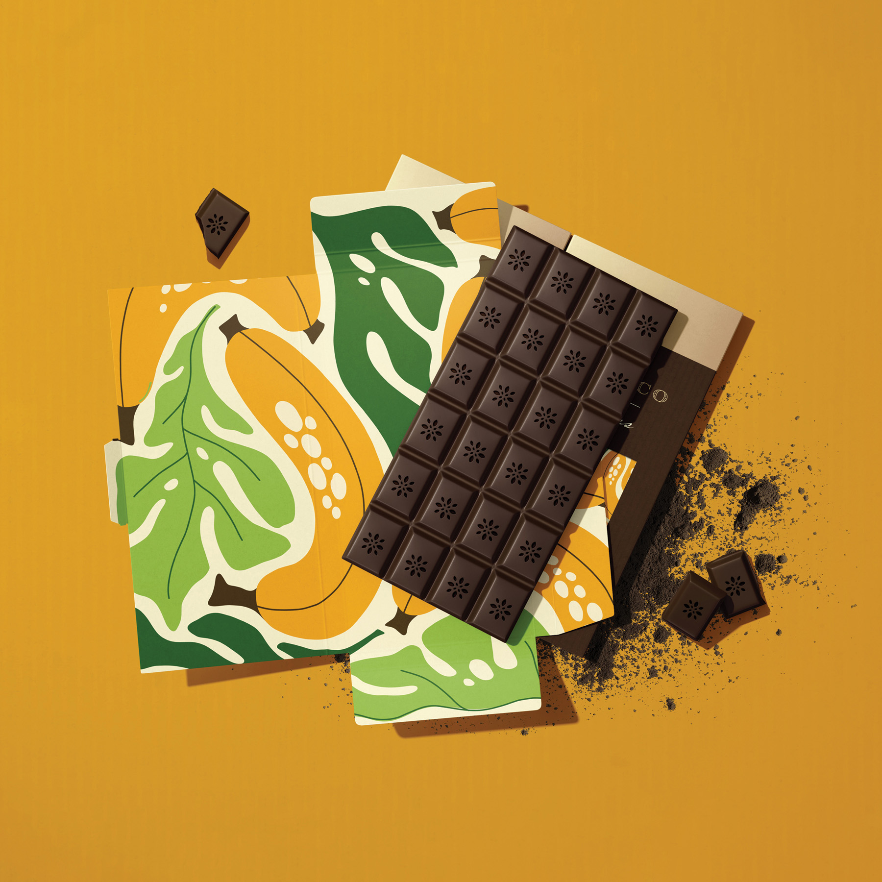
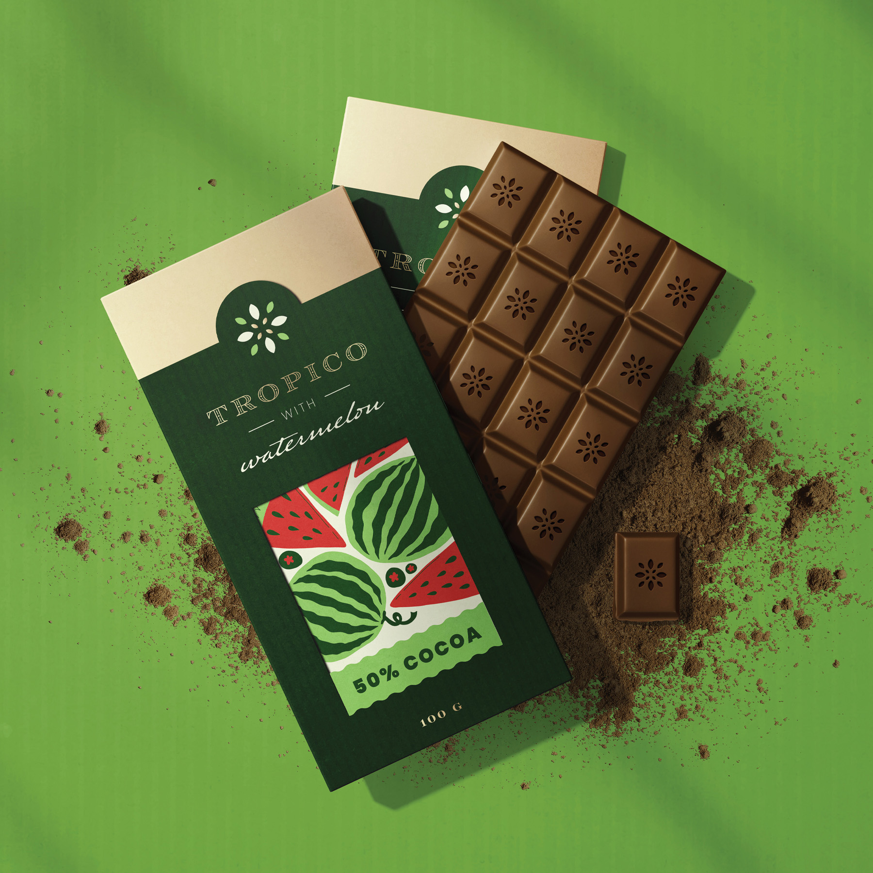
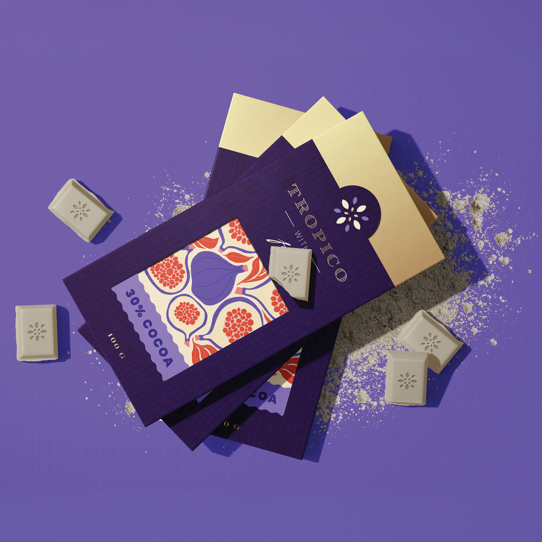
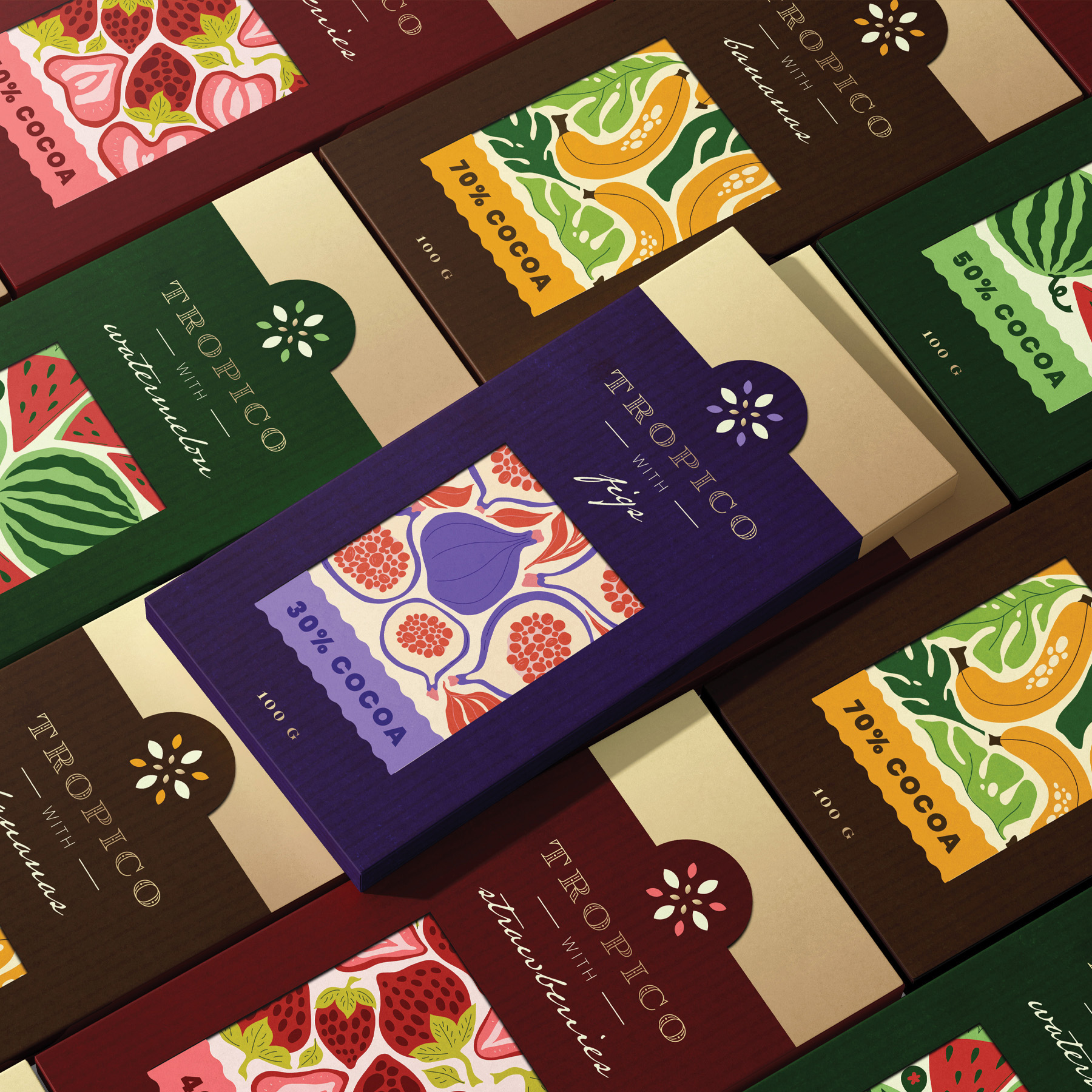
Chocolate is the eternal bliss of the senses an escape from the stress of modern life. Tropico wants to take it up a notch and add new flavors to the mix. Watermelon, figs, bananas are a rare occurrence in the chocolate world so let’s bring them to the table, the dessert table that is. This also means a freedom to explore in the future and add new fruit to the repertoire. There are so many unexplored treasures out there and given its exotic nature Tropico aims at taking the challenge. Tropico, derives from tropical, exotic, which is what we aspire to be.
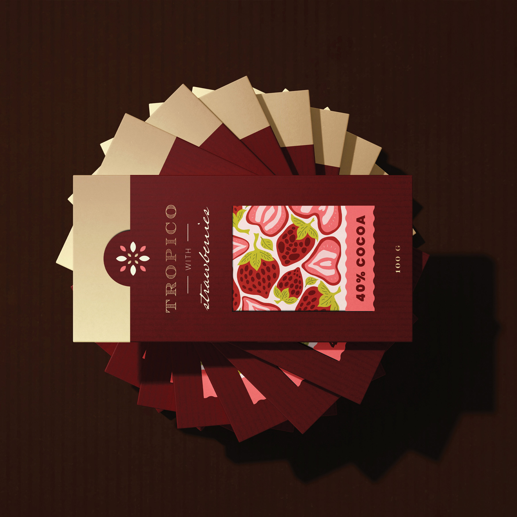
The logo adds to the story as it resembles an ancient type of tribal script with a modern twist. The icon comes as an addition to show the royal and natural aspect of the brand. Everything is curated with great detail similar to making the ornaments for a loved ones clothing. The colors speak to this idea of wild, bold and fresh with a touch of darkness as if walking through a forest in the Amazon. Illustrations are geometric and organic in the same time, they exemplify the nature of chocolate which brings so many ingredients together in a square tablet full of joy.
Indulgence is also a relative to luxury, rarity as this treat will brighten up the day with its unique combination of flavors. The cocoa used is fair trade, organic and top quality. This means the farmers who are paid a fair price for their crop, instead of the low price set by the market. This allows farmers to lift themselves out of poverty and build a better life for their families.
CREDIT
- Agency/Creative: Oa Design
- Article Title: Tropico Chocolate Packaging and Brand Design by Oa Design
- Organisation/Entity: Freelance
- Project Type: Packaging
- Project Status: Published
- Agency/Creative Country: Romania
- Agency/Creative City: Oradea
- Market Region: Europe
- Project Deliverables: Brand Identity
- Format: Box
- Industry: Food/Beverage
- Keywords: chocolate, exotic, cacao, tropical, packaging,
-
Credits:
Graphic Designer: Ofelia Andronic


