Tropicana+ Refuelling a category icon with real-world benefits
Ambition
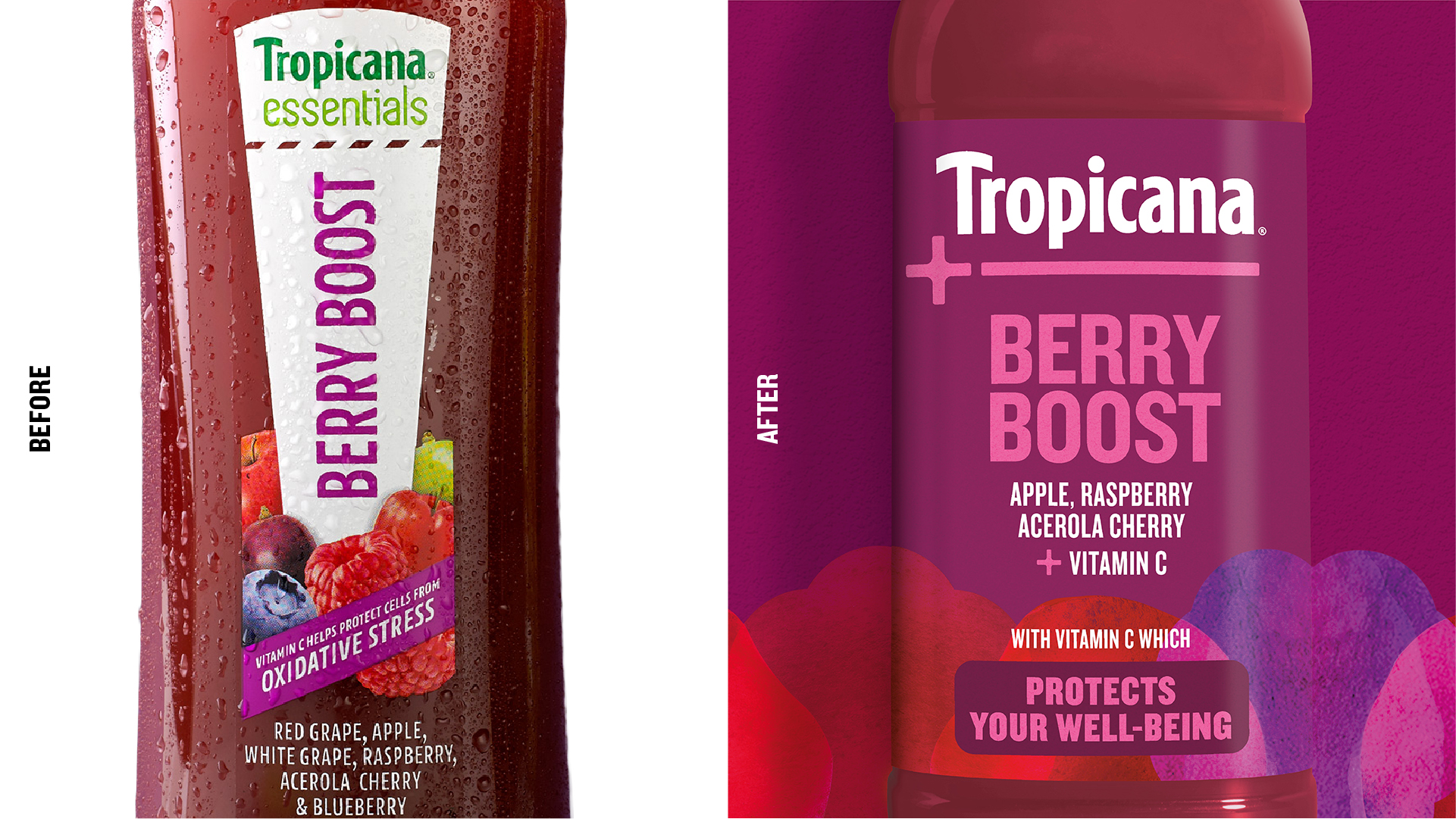
Tropicana is a trusted household name, deep-rooted in a traditional family breakfast consumption ritual. But its Tropicana Essentials range relied on the brand’s functional expertise in fruit and veg, and delivered efficacy based on solving a problem through its medicinal and prescriptive formulations. This one-dimensional approach to nutrition meant it was limited in relevance to a new generation of health-hackers and their on-the-go lifestyles.
We were asked to reposition the range to build on increasing consumer discernment around product formulations, and to deliver benefits aligned with a more holistic attitude to health. It was also important that the brand could justify a premium price-point in the promotion-heavy RTD sector, dominated by characterful disruptor brands.
Insight
With the health and wellness sector developing at pace, we mapped the wider cultural trends informing the emerging design codes. We identified a gap for Tropicana Essentials as an empowering lifestyle accessory, supporting a wider spectrum of real-world needs. This would also build on the mainstream appeal of its core range, and appeal to young health hackers looking for easy ways to get more ‘good stuff’ into their bodies.
Idea
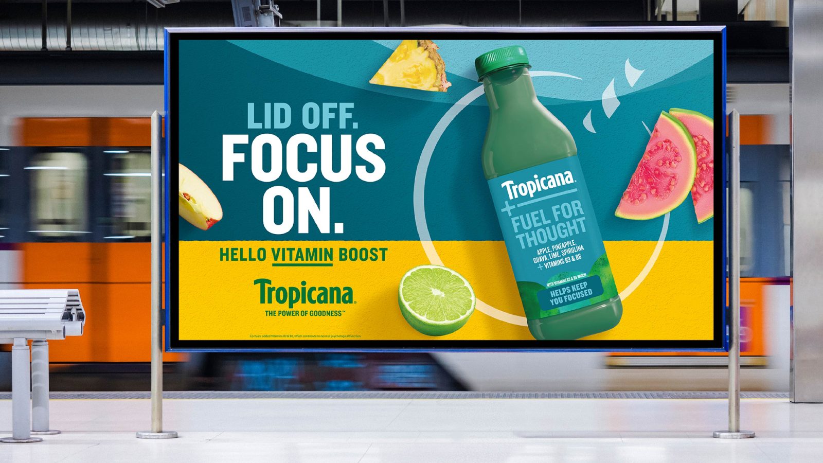
‘Life’s little wins’ delivers exactly what people are looking for, a healthy boost in a single hit. And a new name, Tropicana+, elevates the range from the core brand.
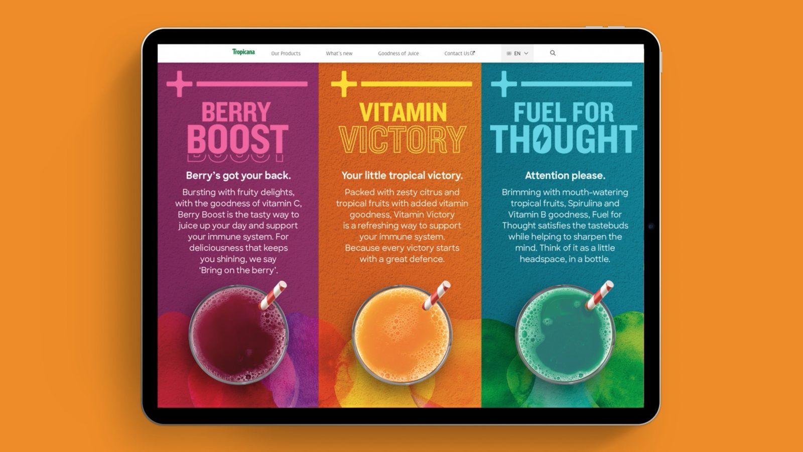
Being mindful of the global regulatory environments in terms of fruit depictions and benefit claims, we worked closely with the Tropicana R&D team to understand the active health ingredients. We then defined more emotive benefits and ‘the win’ for each variant, which was brought to life through a distinct verbally driven identity, benefit-led product names and an empowering tone of voice.
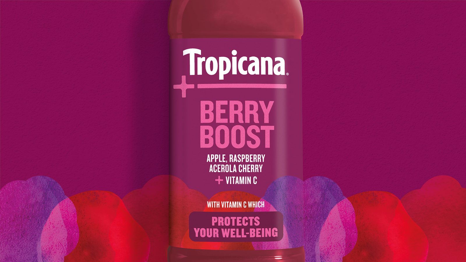
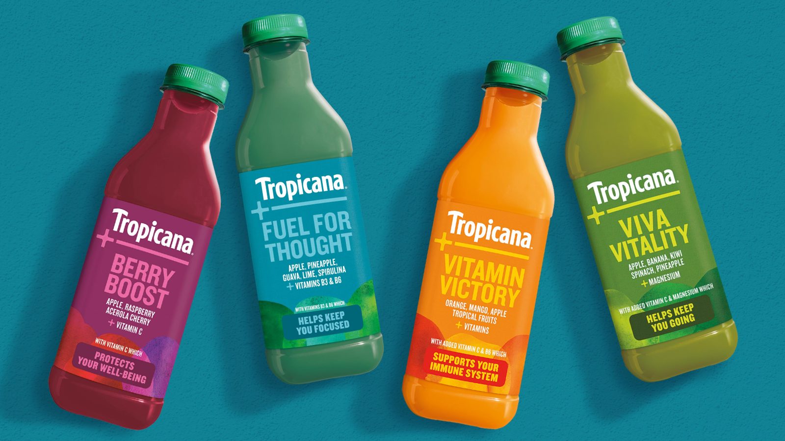
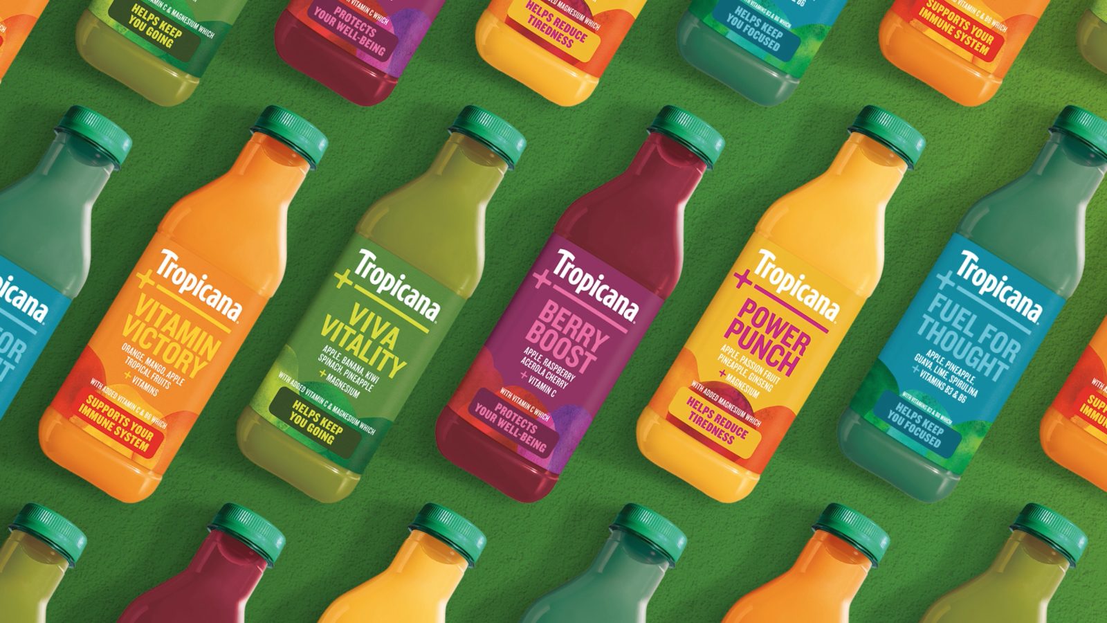
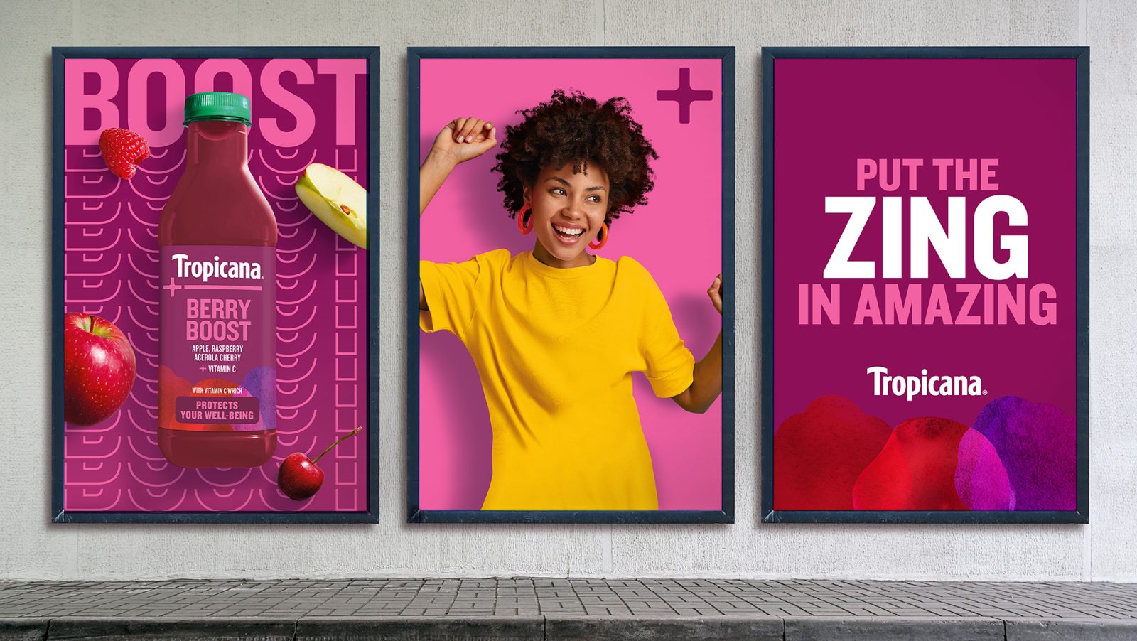
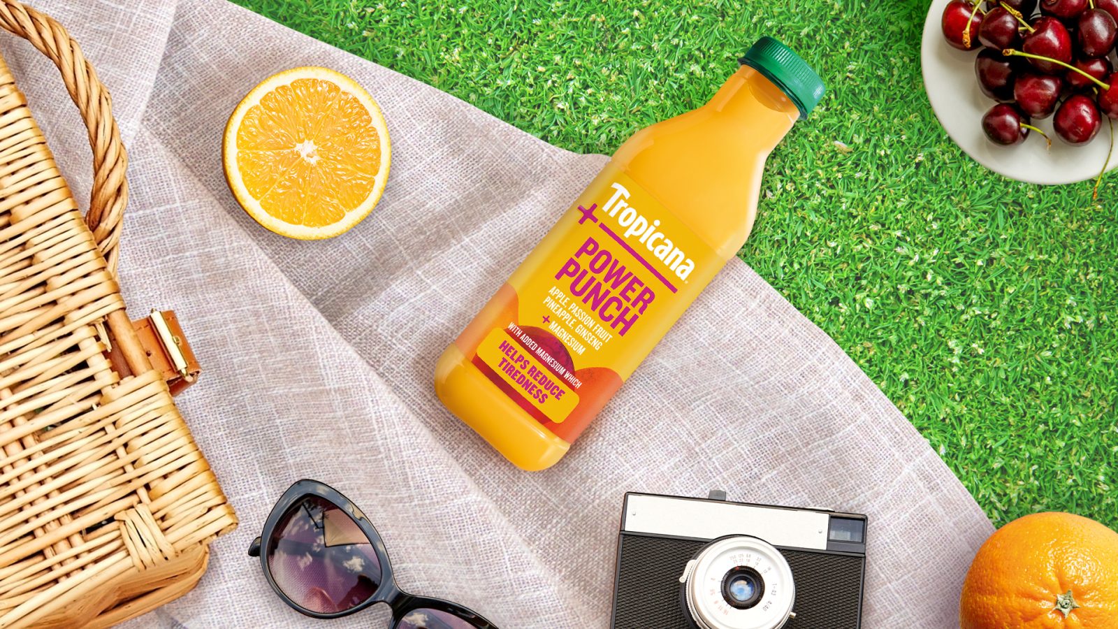
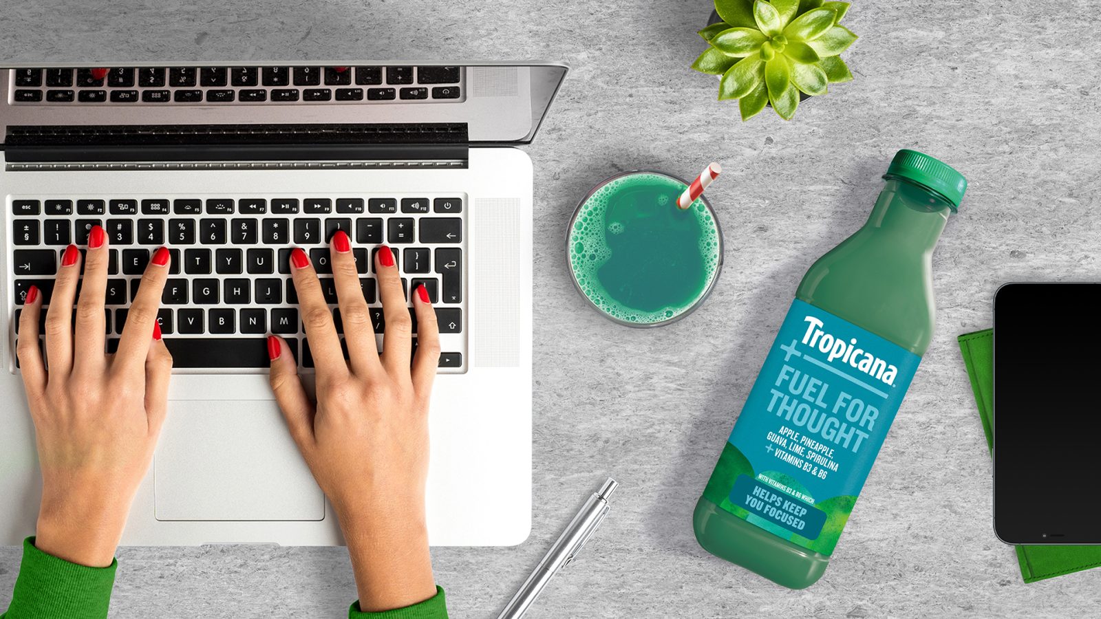
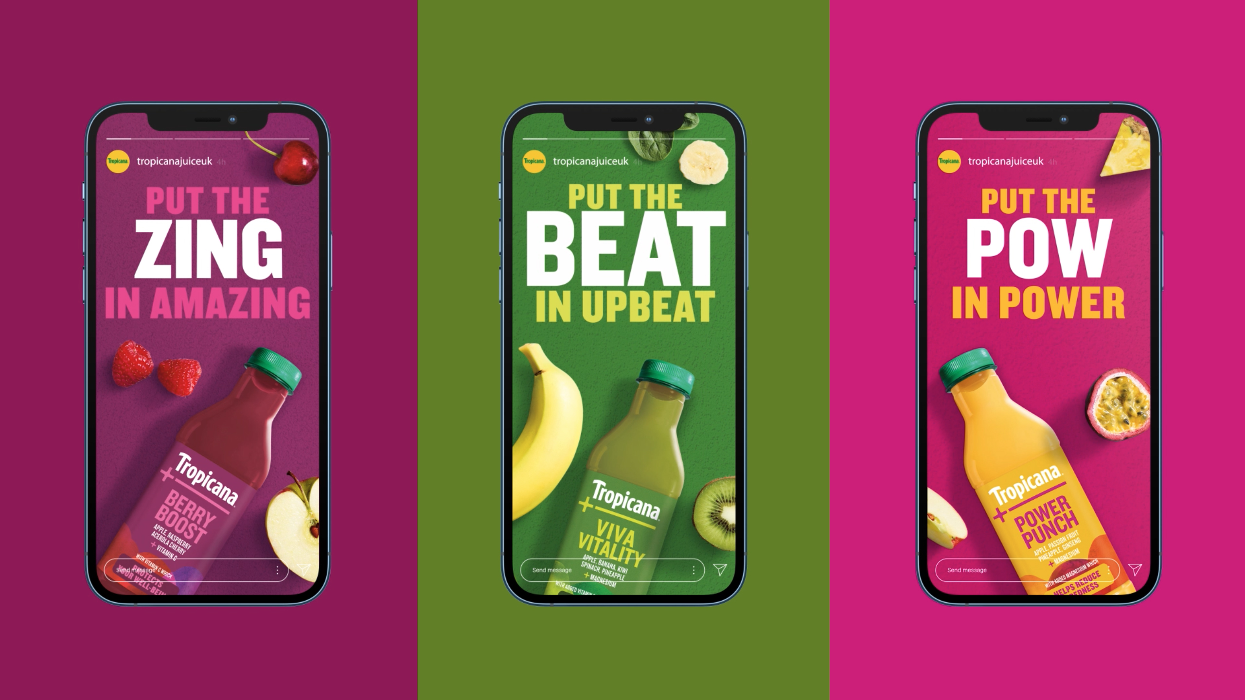
Dynamic variant names lead on front of pack together with key ingredients and vitamins & minerals providing the products’ functional benefits – Berry Boost protects our wellbeing; Vitamin Victory supports the immune system and Viva Vitality keeps us going.
Visually, we combined learnings from the world of health and wellness with our work on the Tropicana master brand to make the range feel Tropicana, while underlining why it was worth paying more for. The bottle designs feature a crafted + symbol at the heart of the pack as a graphic shortcut to signify the ‘more’ aspect and each product’s additional benefit.
Impact
The Tropicana+ range has now transferred the brand’s credentials from the mainstream aisle into the dynamic health sector and established itself as an authority amongst a bunch of characterful disruptors.
The brand now supports everyday life through its multi-dimensional approach to wellness. Its tasty blends are tailored to moods and mindsets and are positively and proactively establishing consumption rituals amongst millennial ‘health hackers’.
CREDIT
- Agency/Creative: StormBrands
- Article Title: Tropicana+ Brand Redesign by StormBrands
- Organisation/Entity: Agency
- Project Type: Identity
- Project Status: Published
- Agency/Creative Country: United Kingdom
- Agency/Creative City: Leeds
- Market Region: Global
- Industry: Food/Beverage
- Keywords: WBDS Agency Design Awards 2022/23
-
Credits:
Client Director: Sarah Hawkins
Client Director: Ellie Croft
Senior Client Manager: Jessica Carter
Head of Strategy: Scott Mason
Senior Creative Director (Verbal) & Copywriter: Nick Corbett
Creative Director & Designer: Zoe Phillipson


