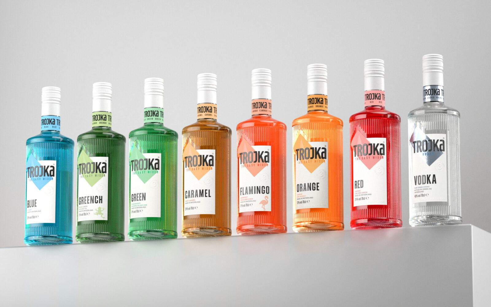
TROJKA doesn’t follow trends; it creates them. Known for its electrifying presence and diverse lineup of flavors, TROJKA has long been a favorite for anyone who wants to mix things up. But staying at the forefront in a saturated market takes more than just great flavors. It demands reinvention. TROJKA’s new look isn’t just an update—it’s a bold redefinition of what the brand stands for.
This evolution wasn’t about blending in with the competition. It was about standing out while staying true to TROJKA’s roots: bold design, unforgettable flavor, and the promise of good times. The result? A packaging transformation that turns heads, sparks curiosity, and makes TROJKA more relevant than ever.
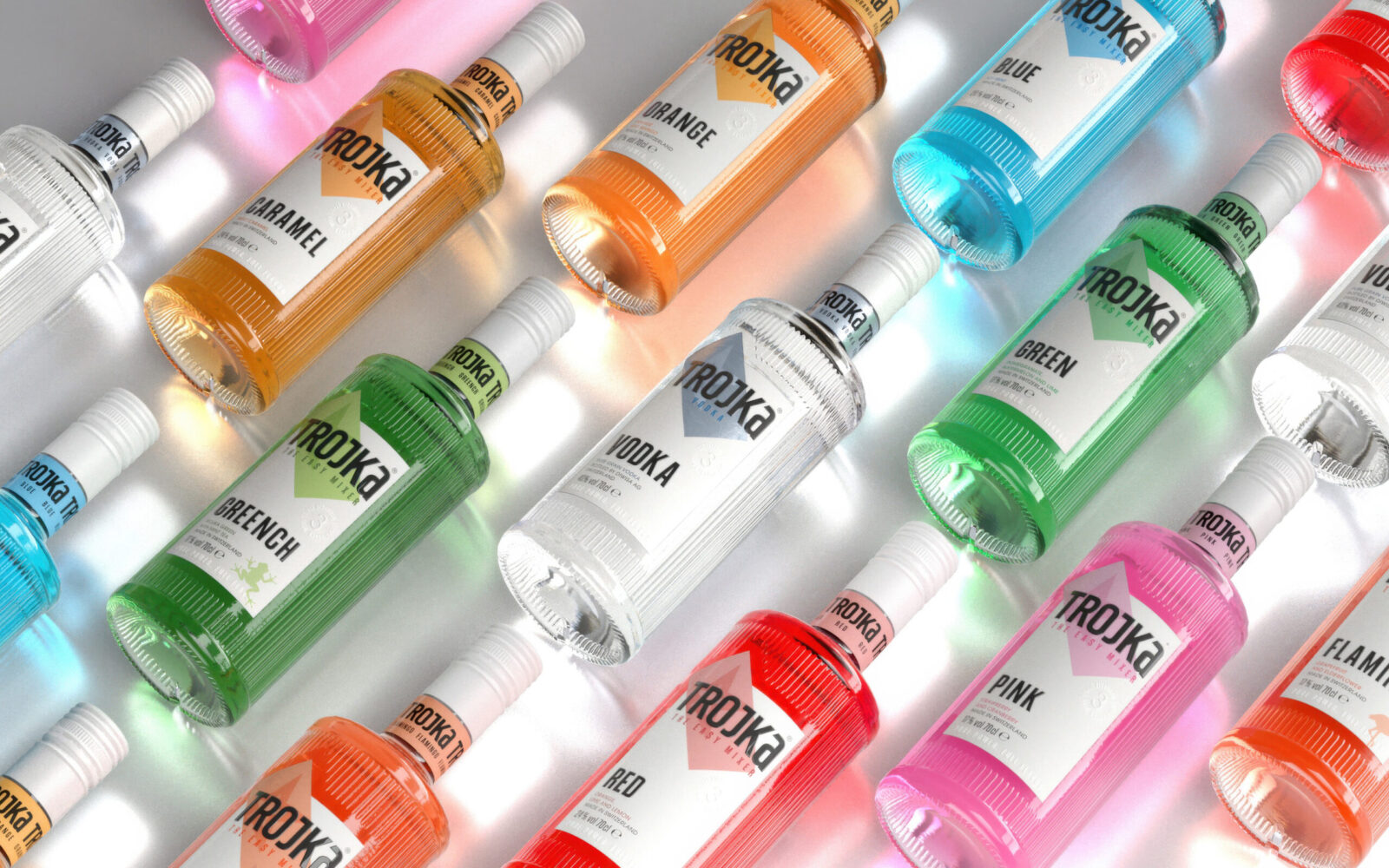
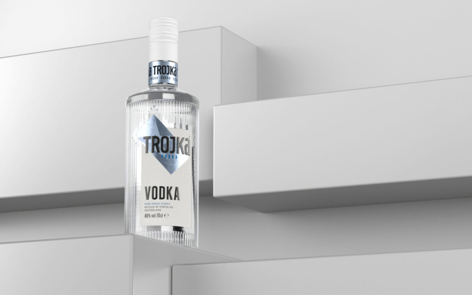
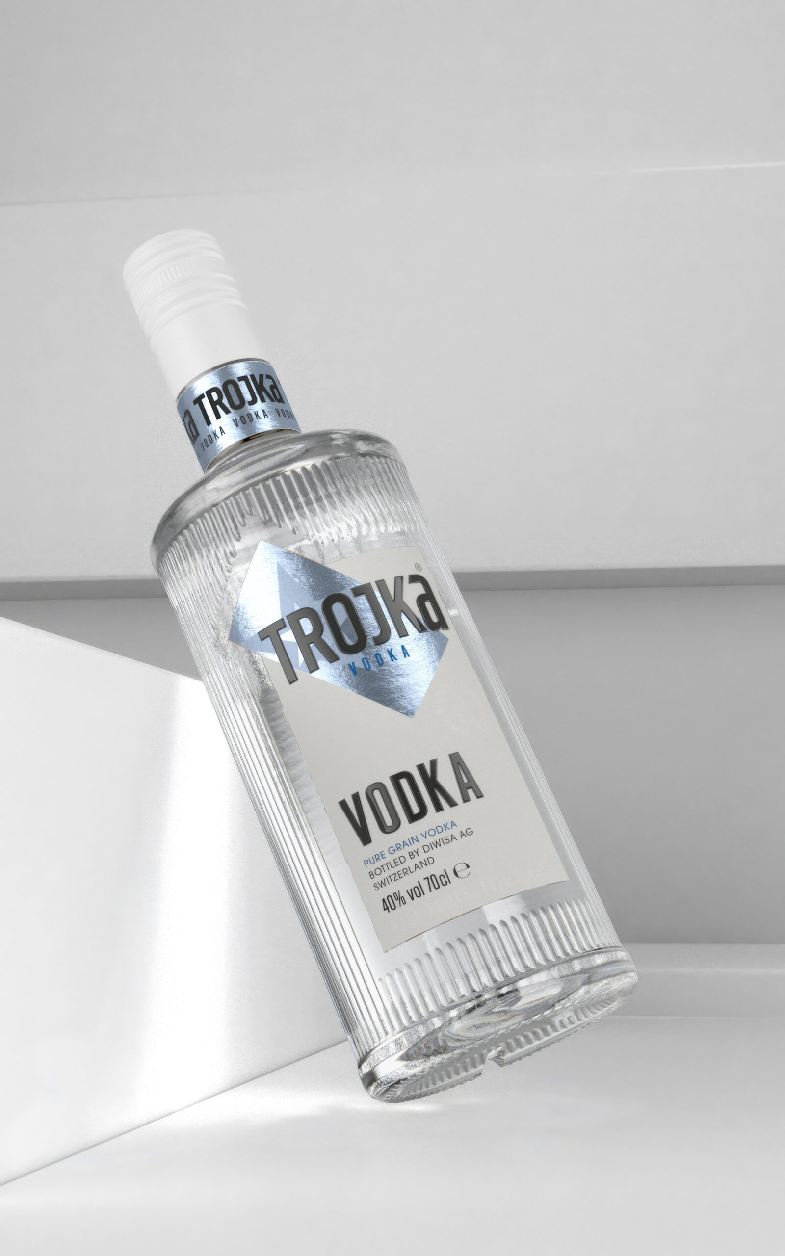
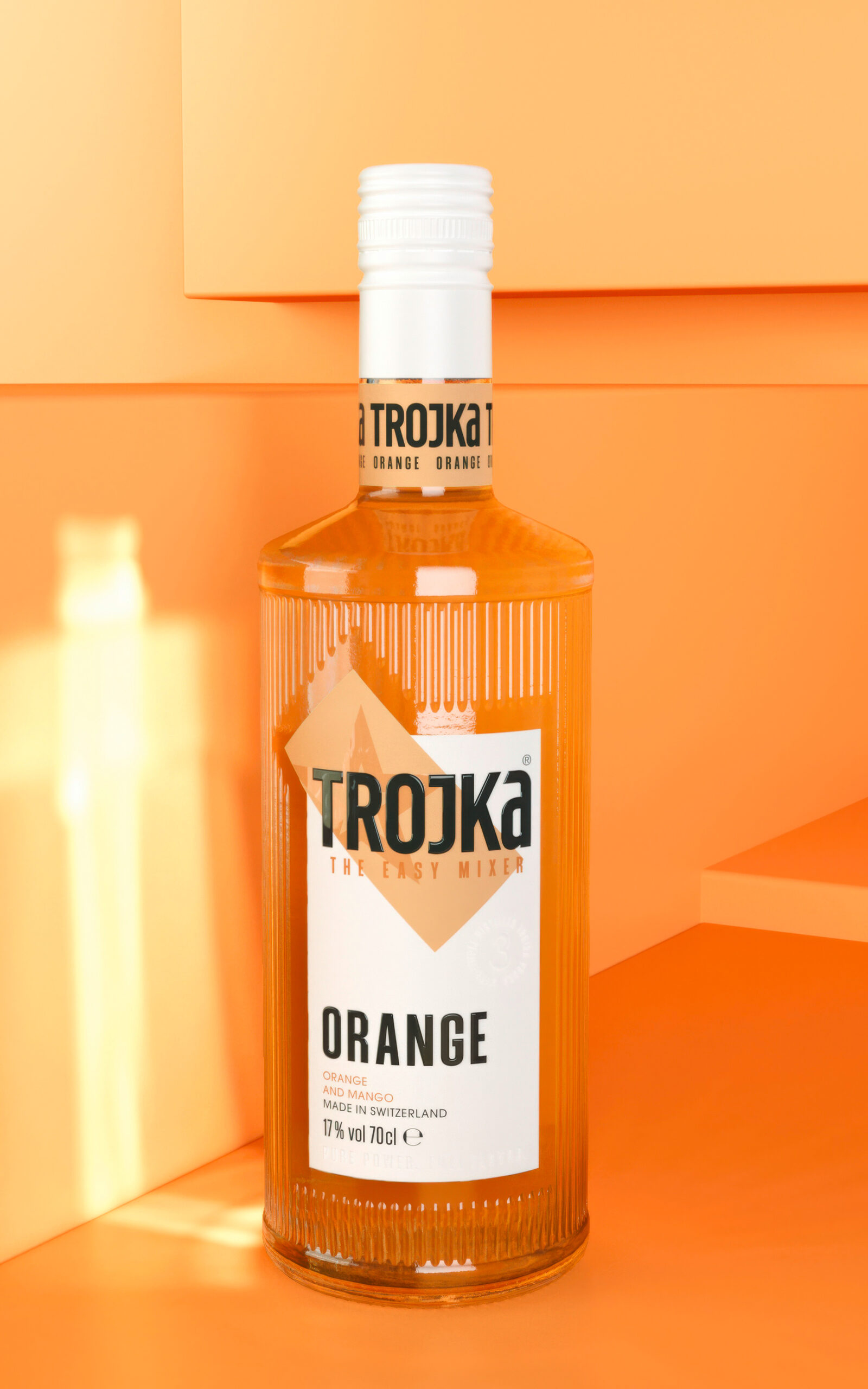
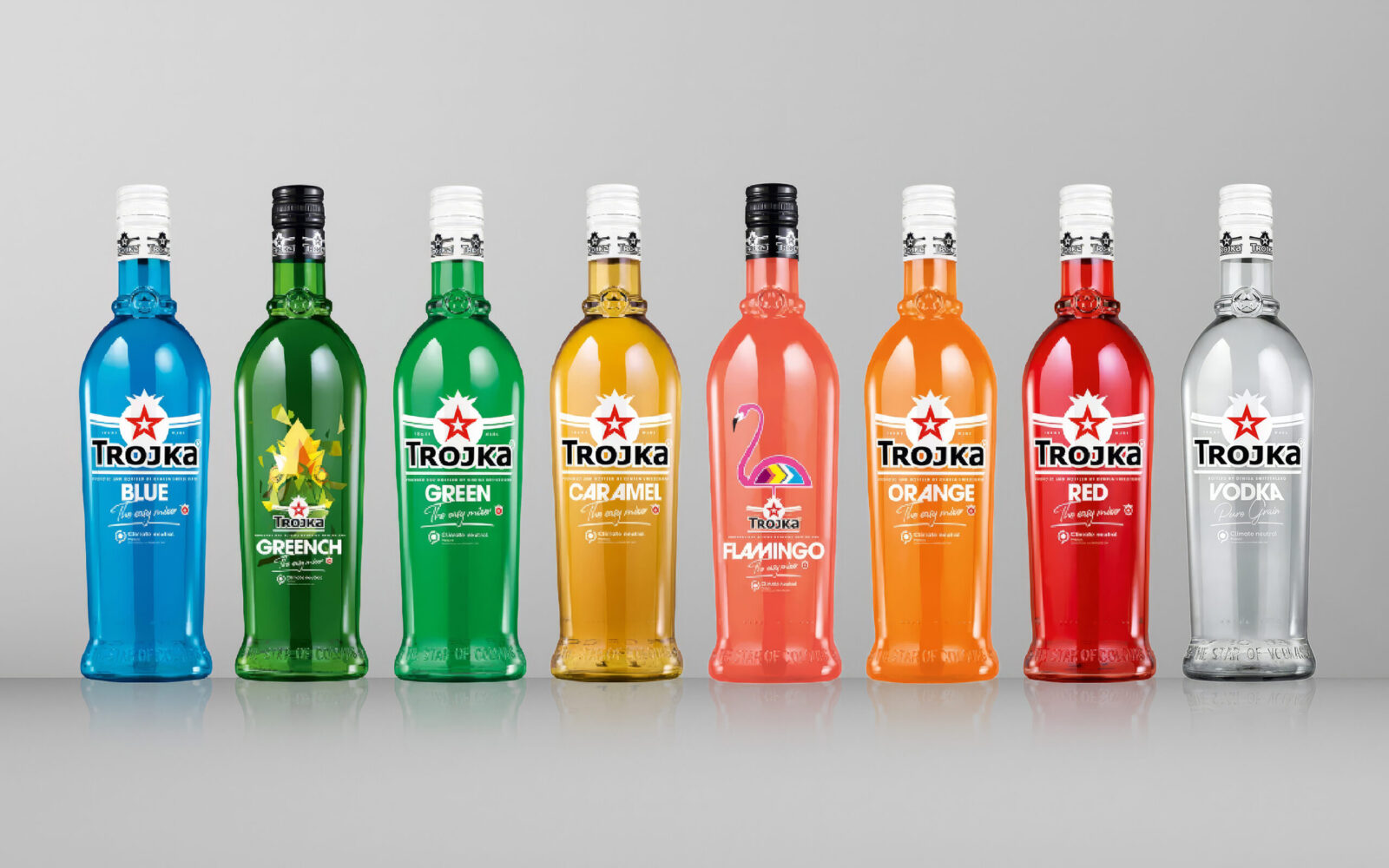
The bottle is the hero of this redesign. Its striking vertical ribbing is not just a design element—it’s TROJKA’s signature. The texture plays with light, refracting and amplifying the vibrant colors of the liquid inside. Each bottle feels alive, glowing with an energy that mirrors the flavors within. Pink exudes playful excitement, Green pulses with fresh intensity, and Vodka delivers sleek, understated sophistication. Every color tells its own story, making each bottle
more than just packaging—it’s a personality waiting to be poured.
Functionality was as important as aesthetics. The ribbing gives the bottle a secure grip, making it practical for real-life moments, whether it’s passed around at a party or used for a quick pour at the bar. TROJKA didn’t just design something to be looked at—it created something to be held, shared, and used. This is a bottle built to make every interaction memorable.
The design is deliberately simple, keeping the focus on TROJKA’s most important asset: its flavors. TROJKA has always been about making mixing easy and fun. Its tagline, “The Easy Mixer,” isn’t just a phrase—it’s a philosophy. Whether it’s the crisp clarity of Vodka or the bold punch of Greench, TROJKA makes creating great drinks effortless. There’s no need for complicated recipes or fancy tools. It’s about grabbing a bottle, mixing things up, and letting the moment take over.
The redesign isn’t just for physical shelves. TROJKA was made for the digital age. The new packaging is a social media natural, with vibrant colors, bold textures, and clean lines that make every bottle pop on camera. Whether it’s featured in a TikTok cocktail tutorial, a glowing Instagram story, or a carefully curated flat lay, TROJKA shines in every frame. It’s not just a drink—it’s a moment waiting to be shared.
TROJKA’s evolution goes beyond aesthetics. It’s about creating connections. Drinks are more than flavors and bottles—they’re part of stories, memories, and celebrations. TROJKA understands this better than most. The new design turns every interaction into an experience, from the first glance to the last sip. It’s not just about what’s in the bottle, but the moments that happen around it.
The redesign also reflects TROJKA’s heritage. As a Swiss brand, TROJKA carries a legacy of quality and precision. This new look honors that tradition while embracing a bold, contemporary vision. TROJKA isn’t following trends—it’s defining them. It’s proof that evolution doesn’t mean losing your identity—it means amplifying it.
The result is a brand that doesn’t just look good—it connects. TROJKA understands its audience and delivers a product that reflects their energy, creativity, and individuality. This isn’t just a drink—it’s a lifestyle, an invitation to celebrate and explore.
This redesign marks more than just a new look—it’s a new chapter. TROJKA has set the bar for what a modern spirit brand can be. It’s bold, it’s creative, and it’s unforgettable. Whether on the shelf, at a party, or in your hand, TROJKA isn’t just part of the moment—it’s the reason for it.
The DIWISA brand Trojka is the most well-known spirits brand in Switzerland, offering 10 exciting flavors (plus limited editions) across 8 countries.

CREDIT
- Agency/Creative: WIN Creating Images
- Article Title: TROJKA: The Spirit of Bold Reinvention by WIN Creating Images
- Organisation/Entity: Agency
- Project Status: Published
- Agency/Creative Country: Germany
- Agency/Creative City: Aachen/Cologne/Berlin/CH-Zug/NYC
- Project Deliverables: Art Direction, Brand Redesign, Brand Rejuvenation, Brand Strategy, Creative Direction, Design, Graphic Design, Logo Design, Packaging Design, Product Design, Rebranding
- Industry: Food/Beverage
- Keywords: WBDS Agency Design Awards 2024/25 TROJKA's roots: bold Design, unforgettable flavor, promise of good times
- Keywords: WBDS Agency Design Awards 2024/25 TROJKA's roots: bold Design, unforgettable flavor, promise of good times


