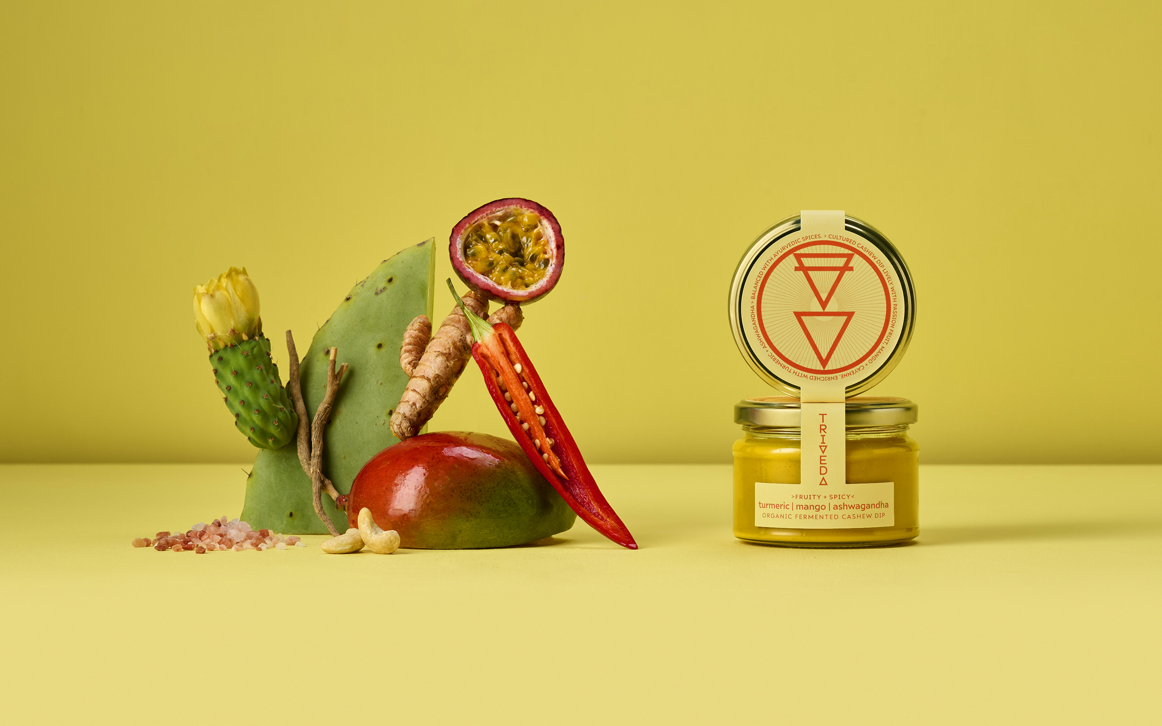
Created by Tenna Anette Schreinert an expert in functional and integrative nutrition, this unique trio of organic fermented cashew dips are made with intention, insight and creativity.
Bursting with live, nutrient-dense and adaptogenic ingredients to support body, mind and gut. The range takes inspiration from the ancient teachings of Ayurveda and blends this with dynamic modern flavours.
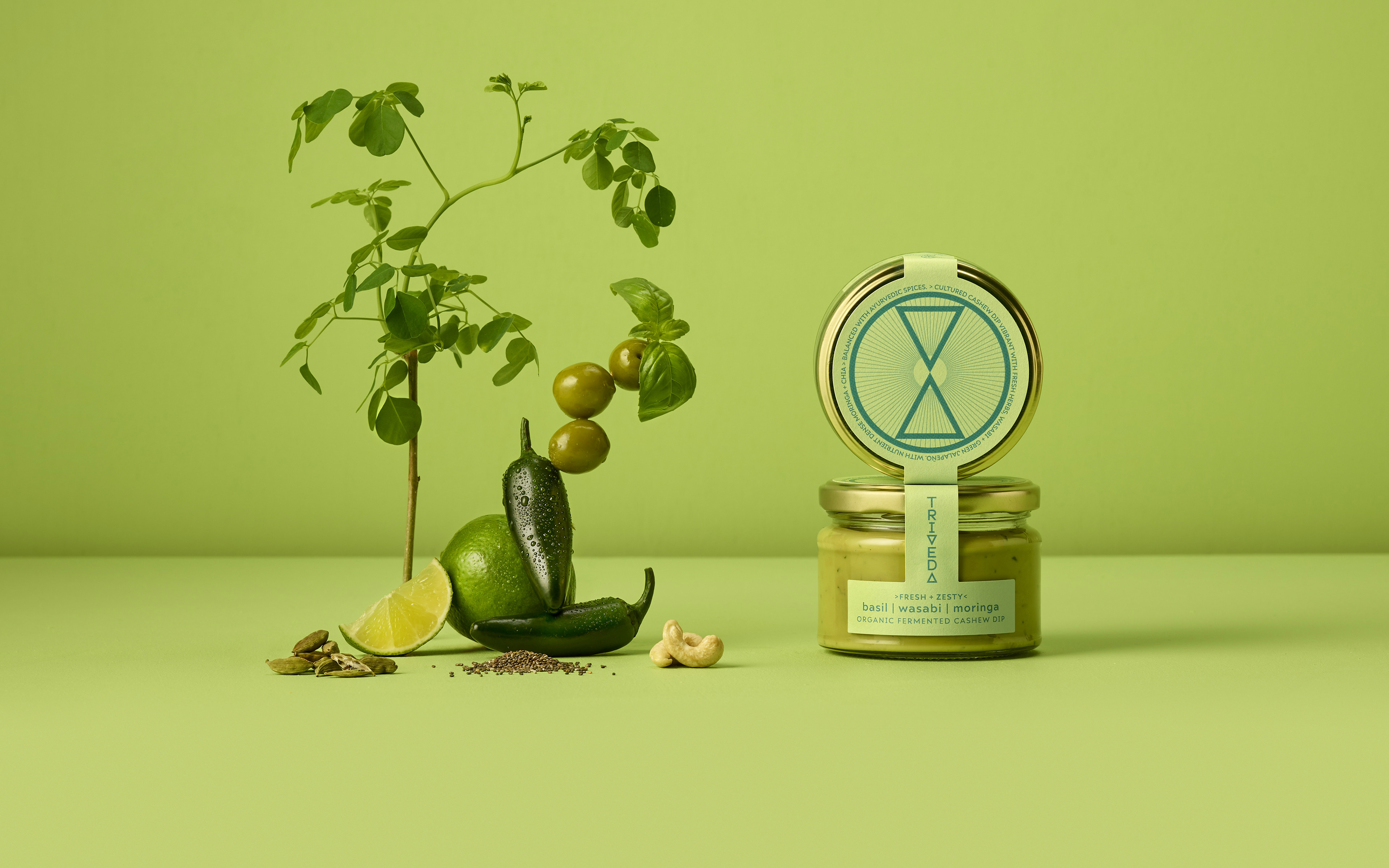
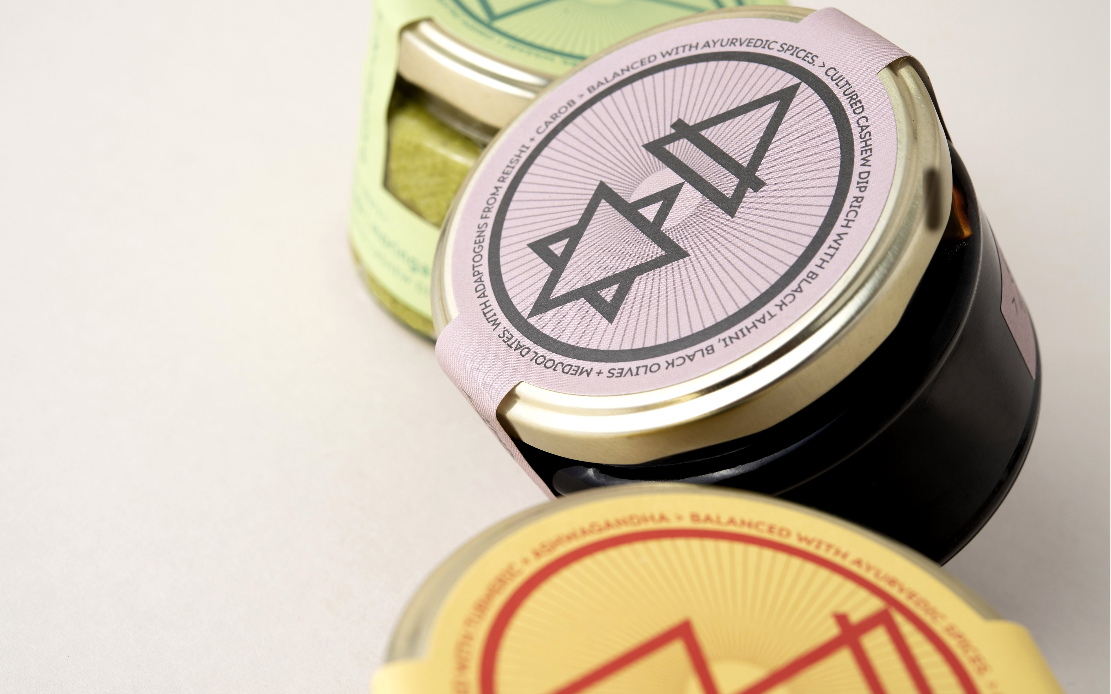
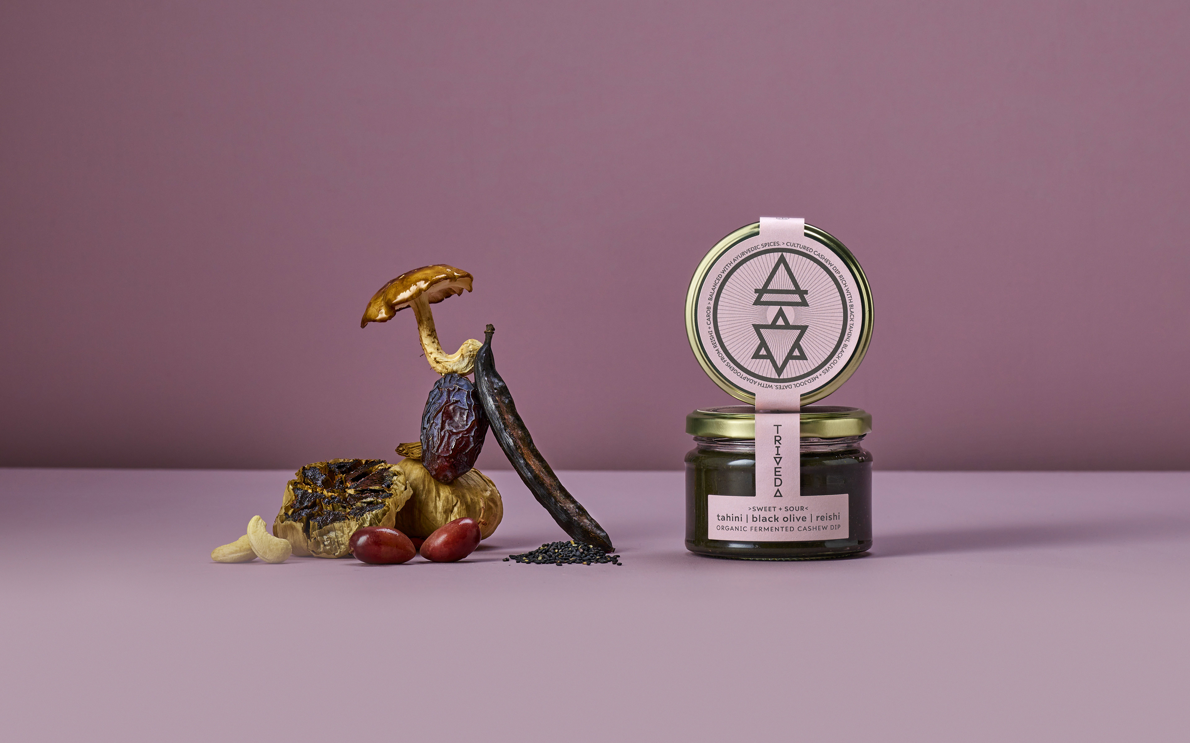
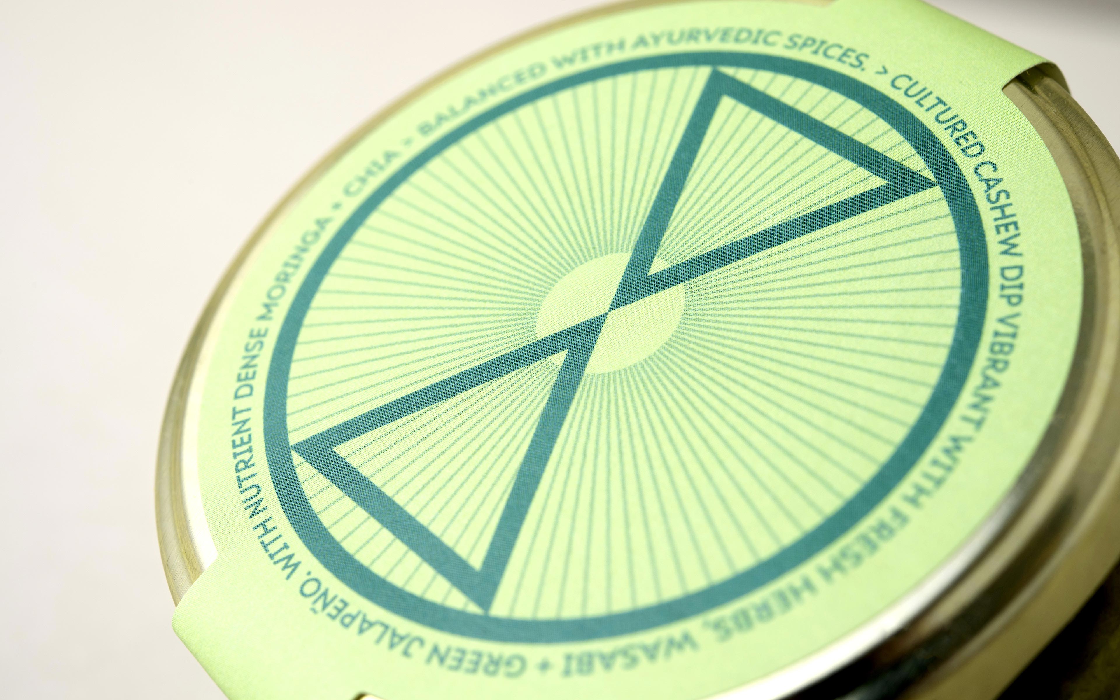
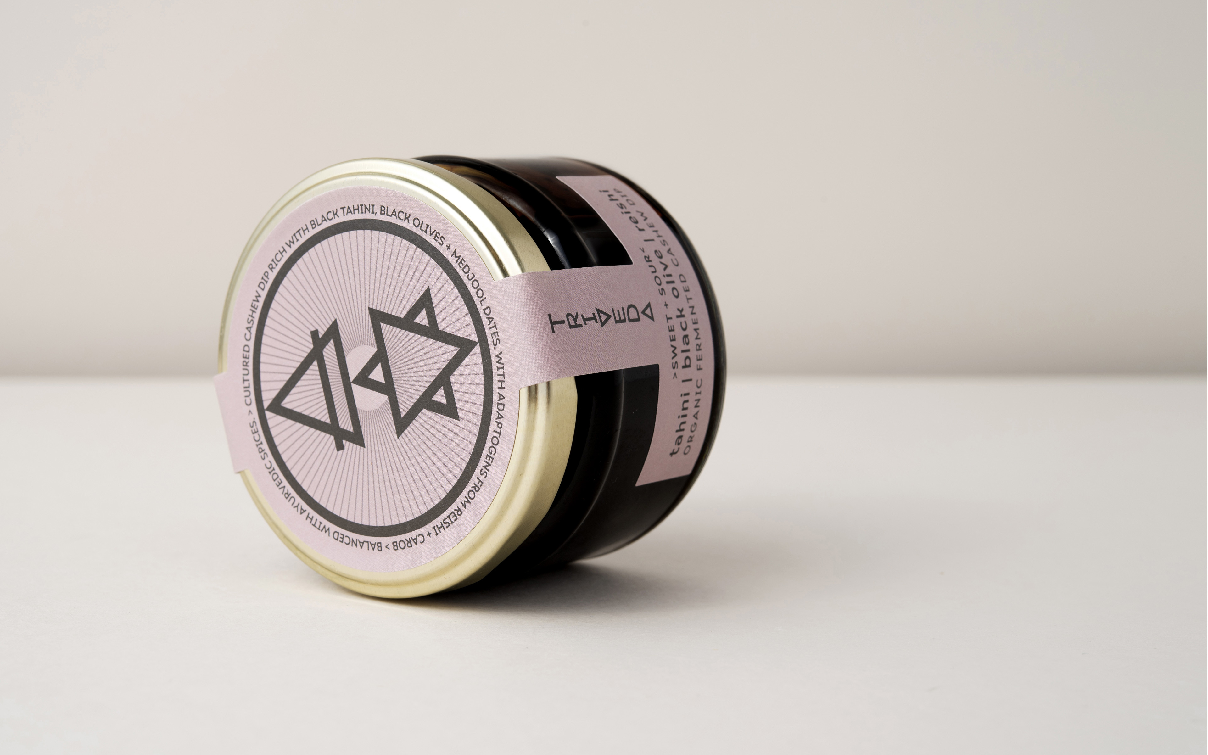
Creative concept – the triangle as a core symbol of balance between of the three Doshas of Ayurveda. This became the foundations of a vertical logotype composed of 2 triangles that in turn form the basis of each dip’s main visual iconography. Each are composed of 2 balancing elemental symbols that reflect the three Doshas of Ayurveda – Kapha [earth + water], Vata [air + ether], and Pitta [fire + water] .
This theme together with the choice of ingredients informed the colour palette for each flavour.
The triangular form continues to inform a wider set of icons to support functional and emotional messaging.
The watch strap label proportions were custom designed to form an inverted T to symbolise the brand name on the front and back sides of the jar.
Typeface – Ariana Pro
Print and materials – Uncoated Tintoretto Gesso paper labels, with spot UV varnish to symbols. Glass jars with gold finish metal lids.


CREDIT
- Agency/Creative: Mid-air Studio
- Article Title: Triveda Brand Creation and Packaging Design
- Organisation/Entity: Agency
- Project Type: Packaging
- Project Status: Published
- Agency/Creative Country: United Kingdom
- Agency/Creative City: london
- Market Region: Global
- Project Deliverables: Brand Creation, Brand Identity, Icon Design, Packaging Design
- Format: Box, Jar
- Substrate: Glass, Metal, Pulp Paper
- Industry: Food/Beverage
- Keywords: fermented cashew dip wellness health food raw organic premium branding packaging design
-
Credits:
branding and packaging design: Mid-air Studio
client: Triveda Ltd
Lifestyle & food photography: Neil White
pack photography: Catherine Markie


