Trive is a next generation, multi-asset investment platform for people who want to go above and beyond. It has partnered with BrandOpus, a brand design partnership, to develop a new brand identity system that will set it apart from peers and facilitate the company’s vision of attracting investors with some trading experience, who are ready to take it to the next level.
In an ever-growing industry, with little to no differentiators, Trive brings complex and sophisticated global investment products to an easy-to-use platform. BrandOpus created a new brand for Trive that aims to be disruptive whilst driving a story that would change the minds of the target audience.
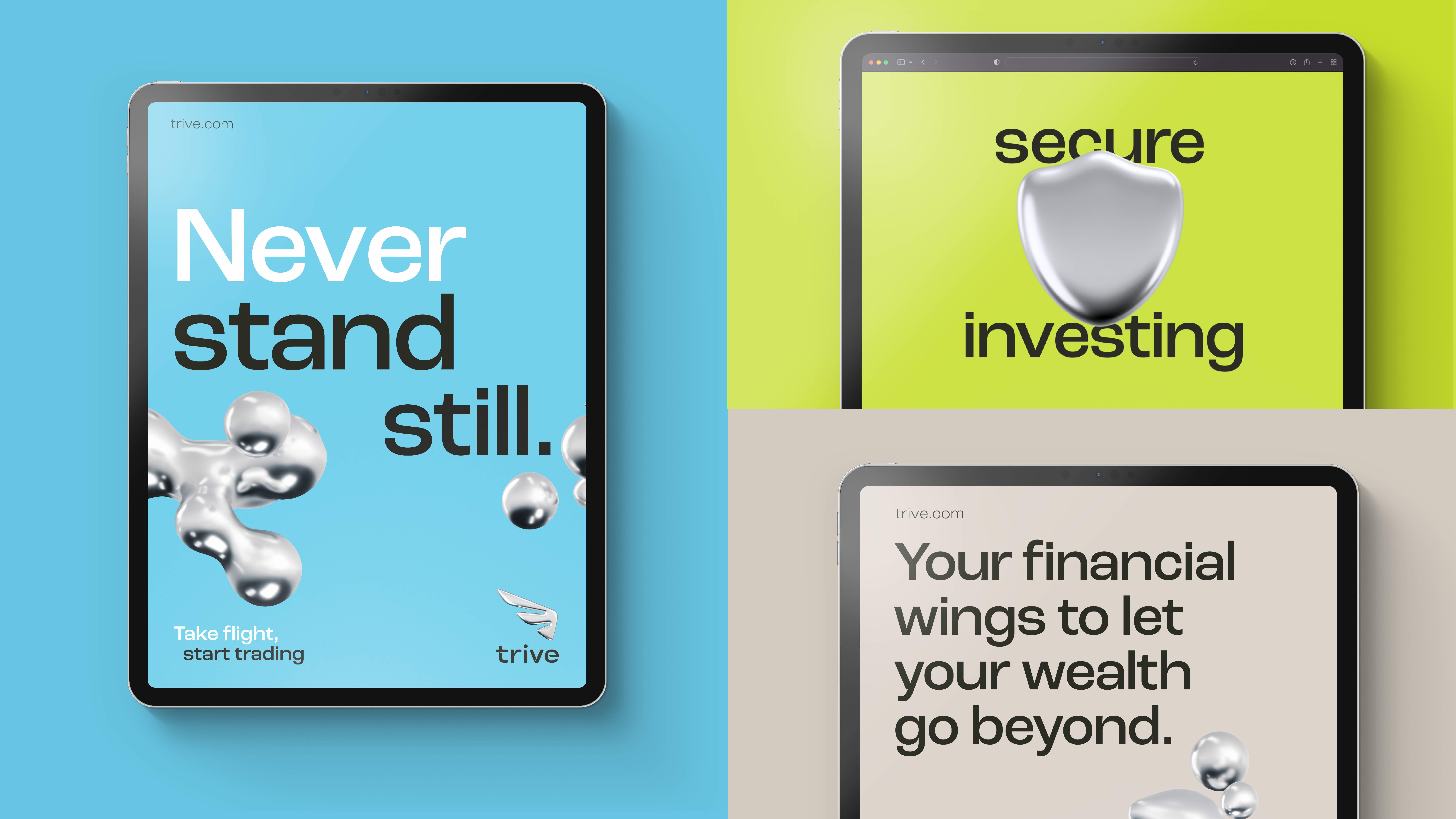
Leaning on the insight that trading is a form of entrepreneurialism for the target audience, BrandOpus based the brand narrative of ‘never standing still’ around the opportunity for Trive to develop, progress and evolve. An idea that reflects a state of constant motion and adaptability.
The new brand identity and visual system reinforce the design thread by elevating the symbolism of Mercury as the inspiration for the brand identity. As the God of Trade, he is the vision of perpetual motion reflected in the brand’s logo, but the natural element mercury provides the metallic colour palette allowing for the Trive brand to come to life.
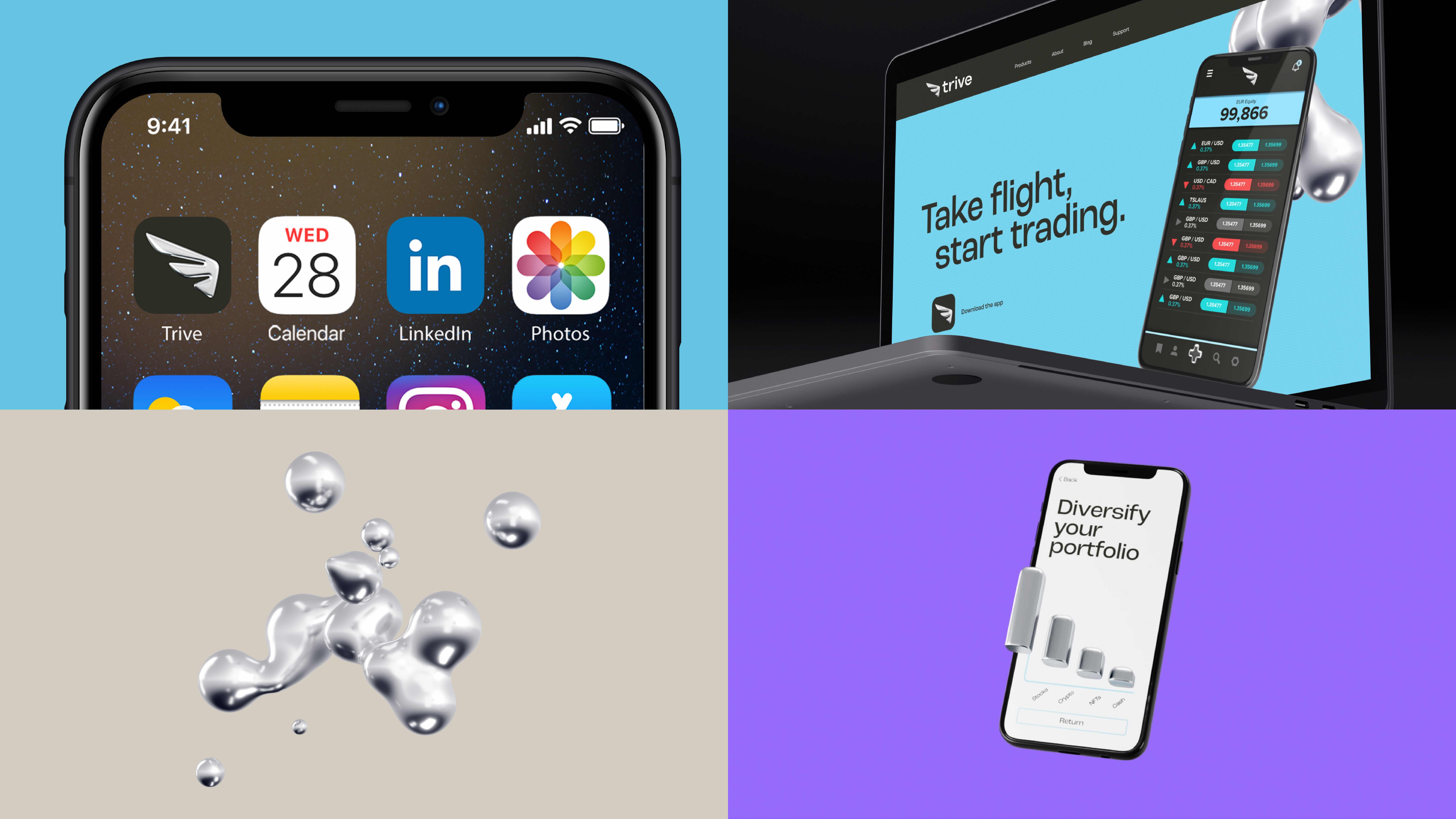
Its shapeshifting nature allowed BrandOpus to create a dynamic and disruptive visual identity system, eschewing the current trend for flat design. Trive now comes alive in three dimensions with the liquid mercury forming and re-forming to create the logo, icons and other shapes that act as a framing device for the entire brand.
Wider details of the new identity system:
Identity – The new Trive identity reflects the strategy of never standing still. This is symbolised as a wing that is cast from the liquid metal mercury, an embodiment of perpetual motion.
Colour – The predominantly white, black and metallic palette is tempered with pops of bright and vibrant nuances which provide forward-looking optimism for the brand reflecting its clean-cut, progressive nature.
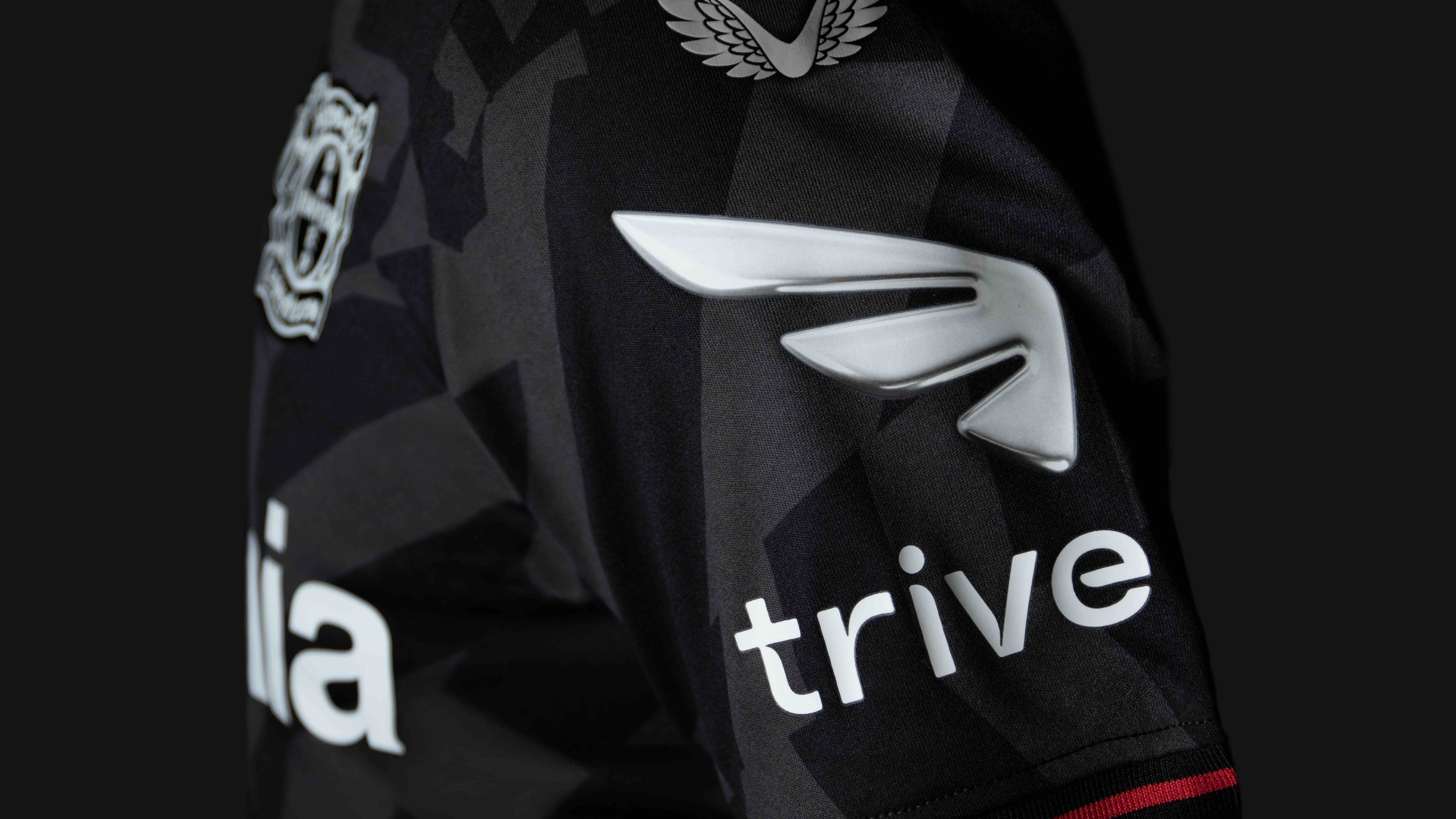
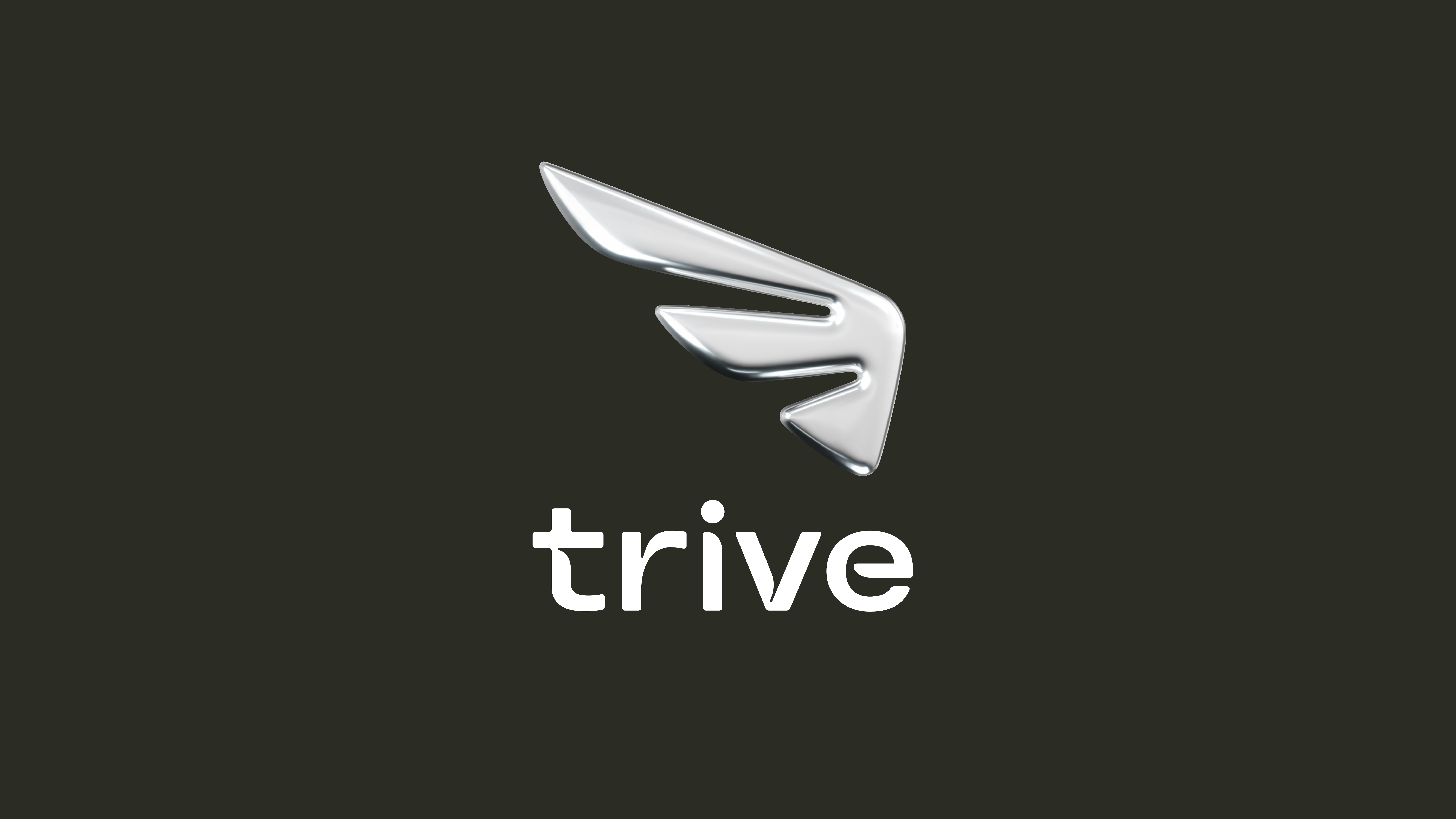
Logo – Inspired by the winged sandals and hat of the God, Mercury, the logo symbolises the vision of perpetual motion, reinforcing the design thread of ‘never standing still’.
Wordmark – Working in partnership with Colophon, BrandOpus established a unique wordmark that echoes the characteristics of the new identity.
Tagline – To embody the entrepreneurial mindset, BrandOpus developed the tagline: ‘never standing still’, an idea that would reflect a state of constant motion and adaptation.
Oner Ozcan, CMO at Trive said: “We are delighted to have partnered with BrandOpus to develop our brand identity. It reflects the visual ease of the new platform and seamless investment experience we aim to offer to investors. Trive’s core values of innovation, people, simplicity, and integrity will be at the forefront of our branding, as we seek to become the next generation investment partner for all, helping to empower progression and enhance people’s digital investments.”
Daniel Wegrzyn, Business Director, BrandOpus, comments: “The investment category is quite cluttered so, as a totally new brand, we wanted Trive to behave a bit differently to stand out. As well as being visually disruptive, we wanted to build a deeper meaning and mythology. The layers of storytelling for the brand give it a sense of stature and credibility not normally associated with start-up brands.
But the idea needed to be motivating as well. For the customers Trive is aiming to reach, trading is a process, not an end goal. We wanted to reflect a shared attitude of learning, growth, and evolution. “Never Standing Still” isn’t a promise, it’s a mindset that customers can aspire to.”


CREDIT
- Agency/Creative: BrandOpus
- Article Title: Trive Partners With BrandOpus to Deliver a New Dynamic and Disruptive Brand Identity System
- Organisation/Entity: Agency
- Project Type: Identity
- Project Status: Published
- Agency/Creative Country: United Kingdom
- Agency/Creative City: London
- Market Region: Global
- Project Deliverables: Brand Identity
- Industry: Financial
- Keywords: Trive, financial identity, brand identity, rebrand, 3D Art
-
Credits:
Business Director: Daniel Wegrzyn


