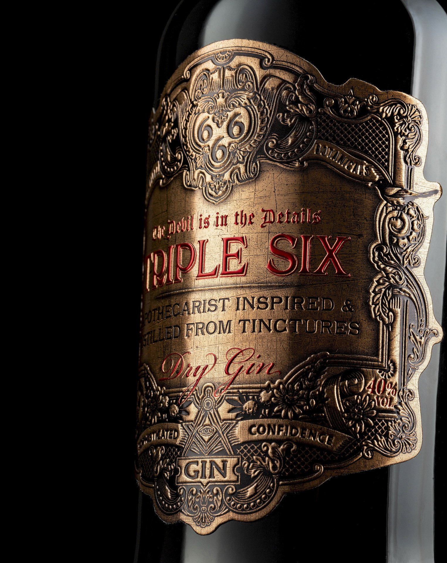
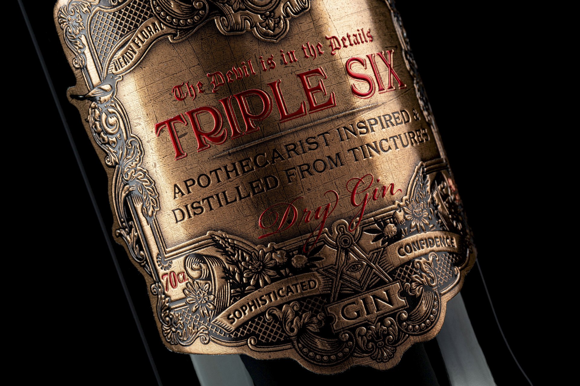
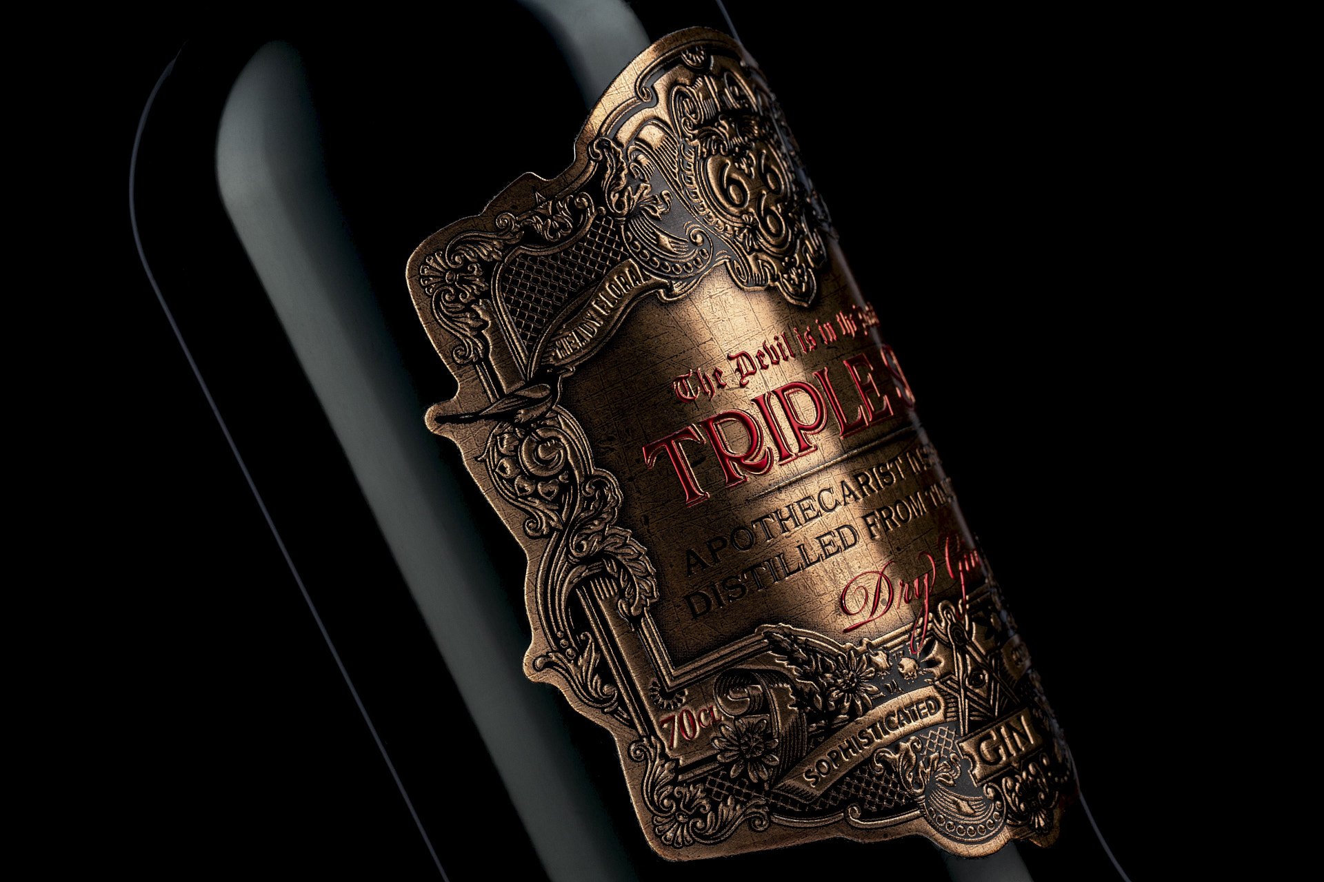
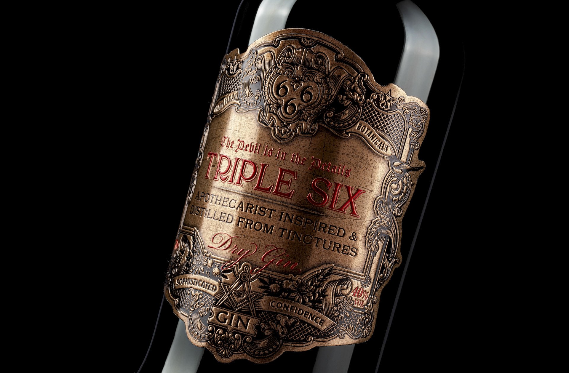
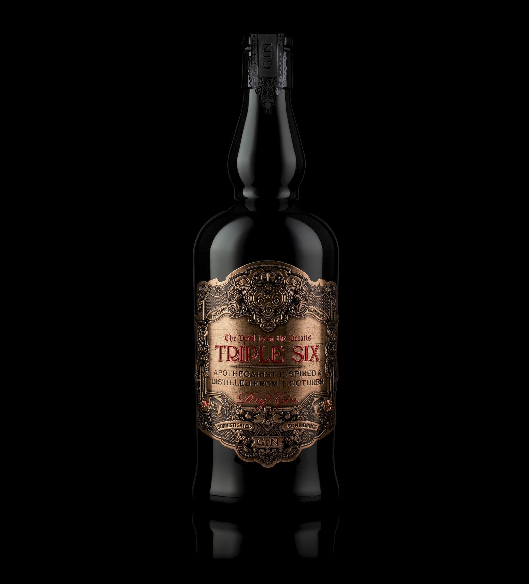
The Triple Six Gin concept design was inspired by the early 19th-century apothecaries laboratory, mixed with influences from the industrial revolution, this moody, dark, sexy gin is heady and intoxicating in both aroma, taste, and appearance and has been curated to exude and display sophisticated confidence.
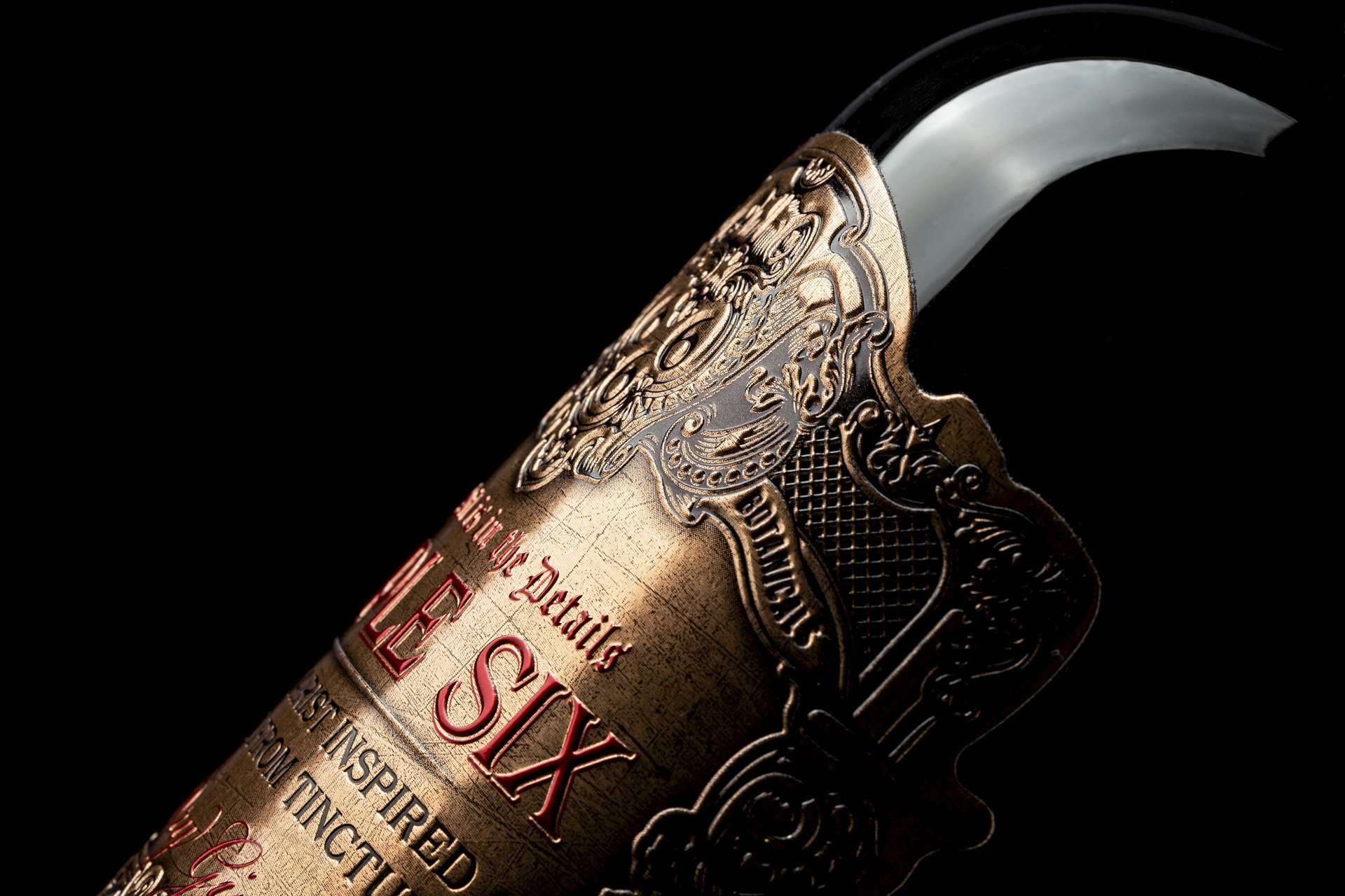
The bottle was painted with black paint to exude a mysterious look, and the label is full of hidden details connected with the ingredients of the gin and also the location. The worn-out copper label gives it a tactile feel and was produced in metal, adding more authenticity to the dark concept. The stopper material is made of black glass and adds to the premium look the bottle already has, and glass also adds to the premium experience of opening the bottle, all of the design materials are unusual, and that was by design, the use of different materials are part of the concept.
The end result is a bottle that looks sexy, expensive, and mysterious, it is also intriguing and seductive and tells a story of a bygone age, at the same time the use of glass and metal together with the dark look keeps the packaging sophisticated and interesting.
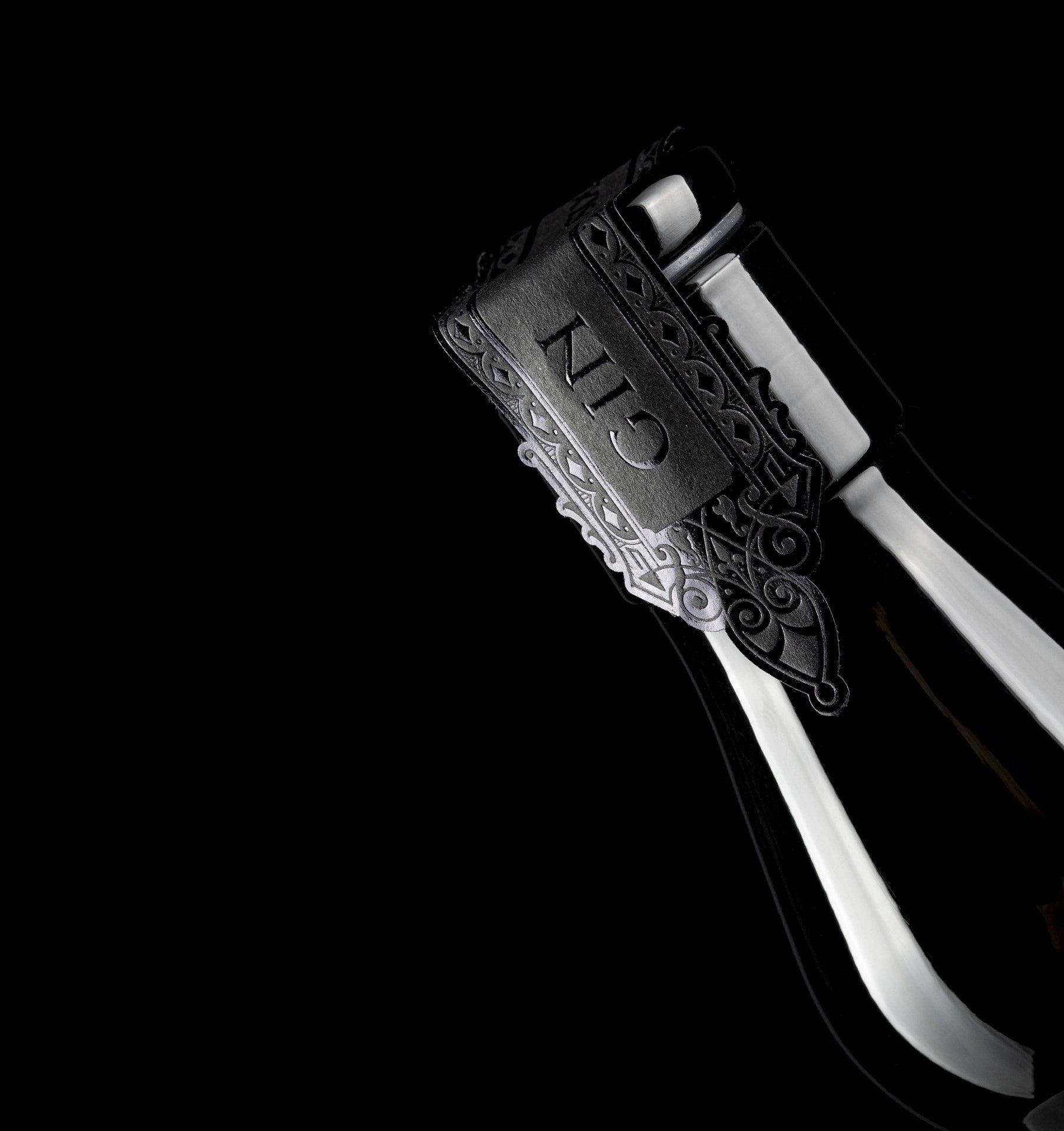
The neck label that covers the glass stopper is printed with black foil over the black cotton paper, resulting in a detailed reminder that one is about to open something special. Overall it is a product that entices the buyer to be curious and intrigued by the storytelling on the label, the packaging design makes the bottle stand out on the shelf, without it being flashy or bright.
CREDIT
- Agency/Creative: Think Bold Studio
- Article Title: Triple Six Gin Packaging Design by Think Bold Studio
- Organisation/Entity: Agency
- Project Type: Packaging
- Project Status: Published
- Agency/Creative Country: Portugal
- Agency/Creative City: Aveiro
- Market Region: Europe
- Project Deliverables: 2D Design
- Format: Bottle
- Substrate: Pulp Fibre
- Industry: Food/Beverage
- Keywords: whisky, packaging design, premium, Japanese, spirit, label, medal
-
Credits:
Creative Director: Hugo Marques


