The creative studio Triple Bang has completed a rebranding for the Czech Badminton Association. The work was not easy, the whole process took several months. It was not just a matter of making a new logo, but also of sending a signal that Czech badminton is becoming more professional and keeps pace with the world’s best.
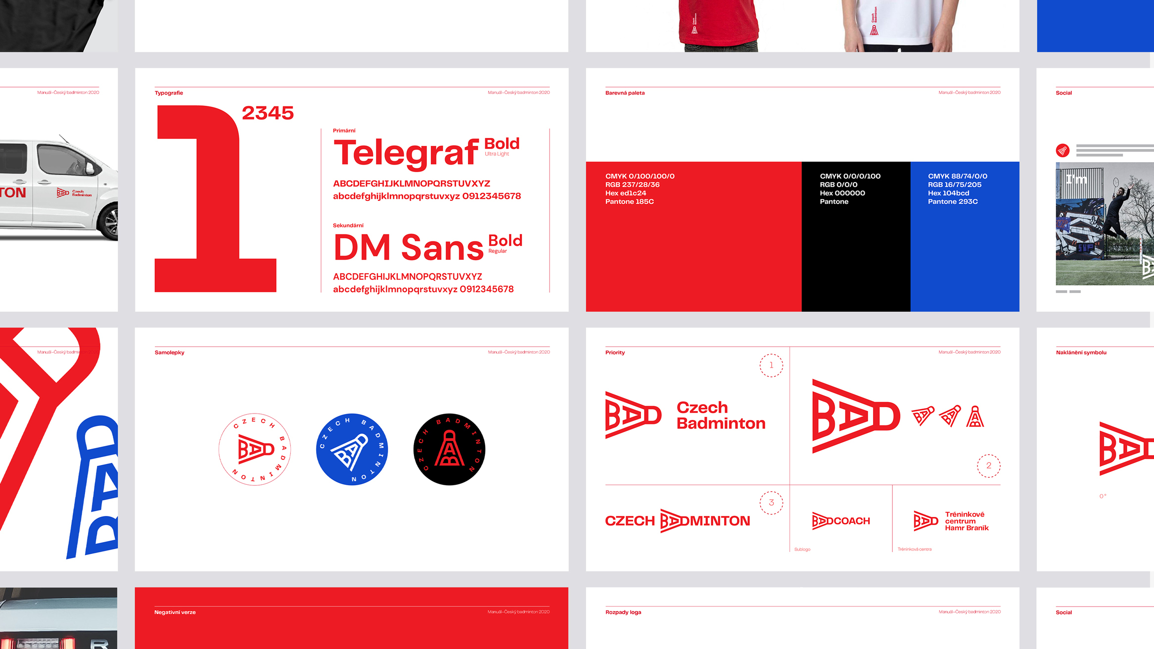
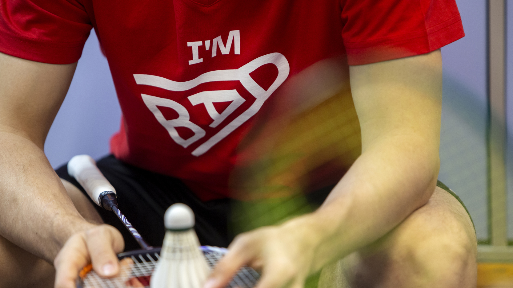
“Creating an identity for any sport is something special, and at the same time, there is a great responsibility behind it. We did not want to use notorious state symbols such as the lion and the flag. A unique element of badminton is the ball, which we managed to create from the word BAD with a minimalistic approach, which brings emotions to the symbolism and gives the whole identity an opinion,” comments the author Pavel Čada, Art director of Triple Bang.
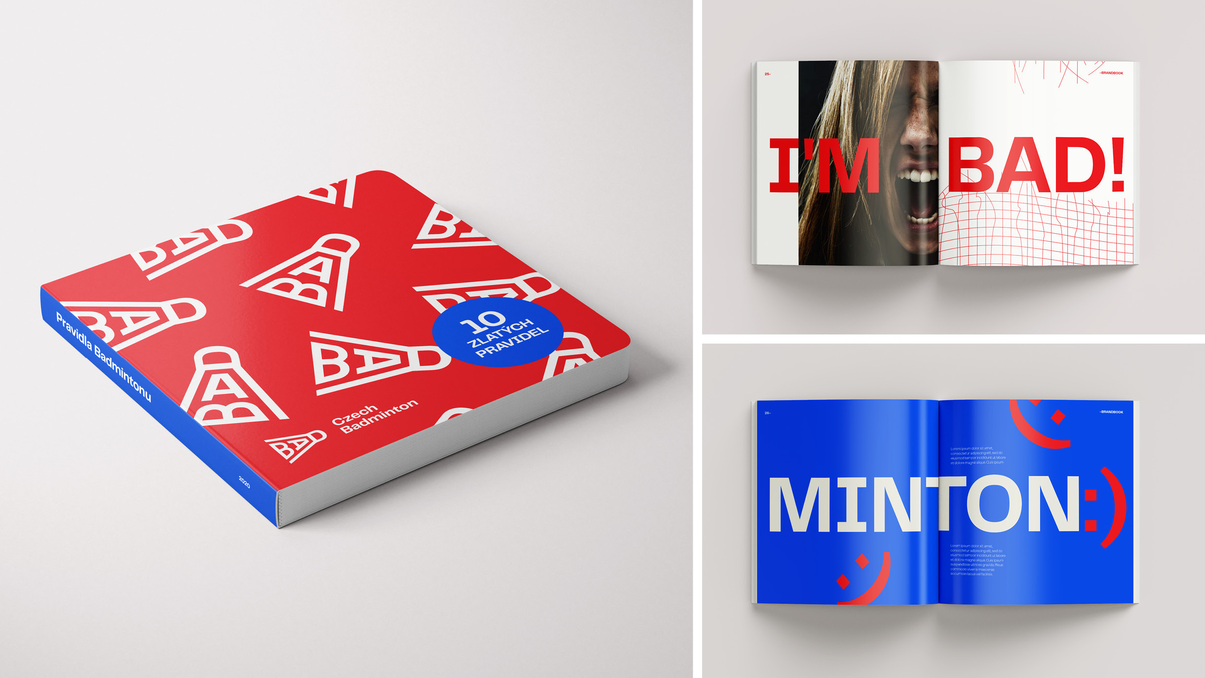
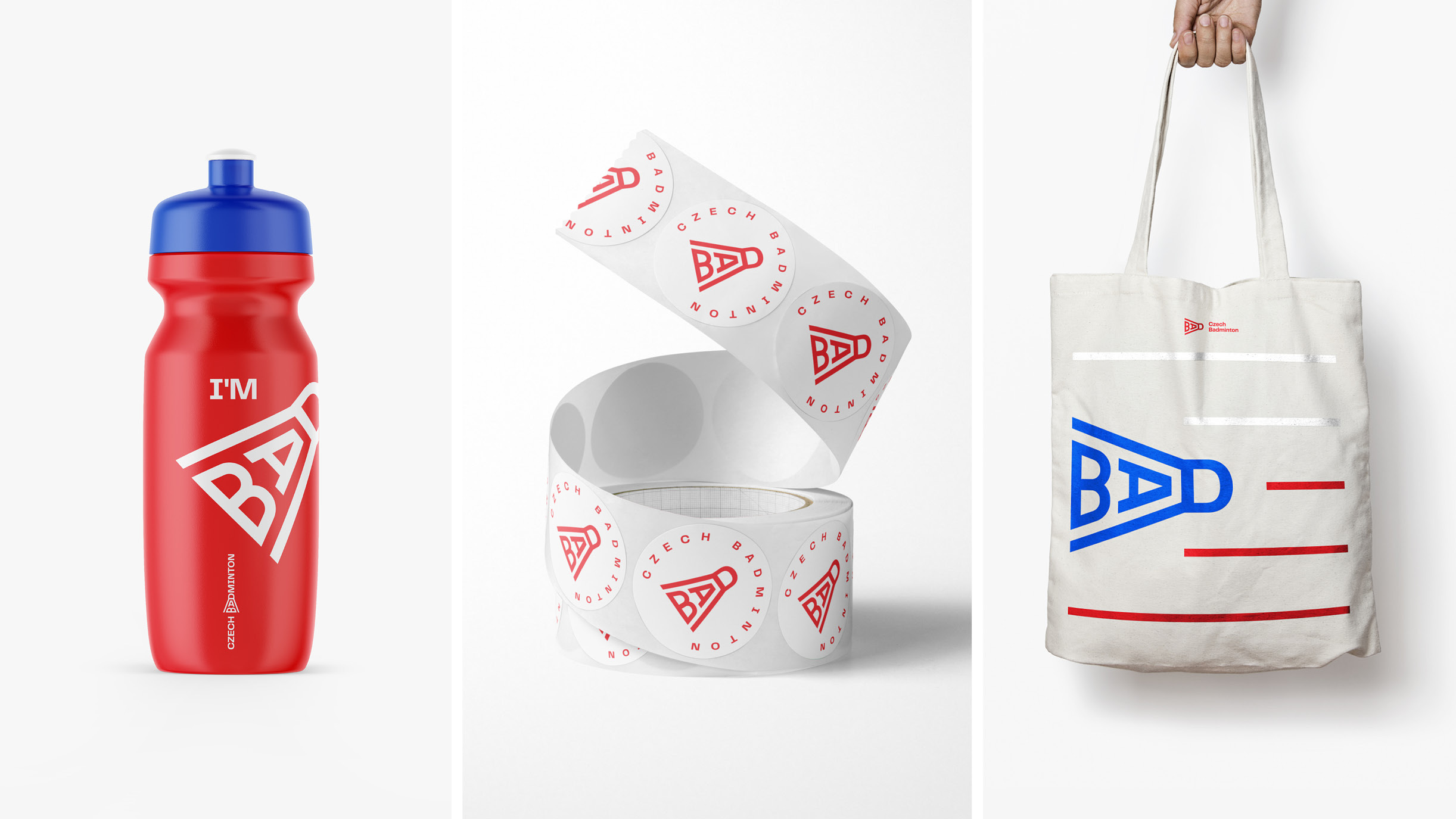
When creating the logo, it was, therefore, necessary to keep in mind that it would appear in international tournaments; at the same time, it must keep up with trends to engage young people and, above all, to be able to process all printed materials, objects or team clothing. The result is a multifunctional, visually clean logo that will represent Czech badminton around the world.
CREDIT
- Agency/Creative: Triple Bang Agency
- Article Title: Triple Bang Agency Create Visual Identity for Czech Badminton Federation
- Organisation/Entity: Agency, Published Commercial Design
- Project Type: Identity
- Agency/Creative Country: Czech Republic
- Market Region: Global
- Project Deliverables: Brand Creation, Brand Guidelines, Brand Identity, Brand Naming, Brand Redesign, Brand Rejuvenation, Brand World, Branding, Graphic Design, Identity System, Rebranding
- Industry: Public Utility
- Keywords: Czech badminton, sports branding, visual identity, sports organization


