


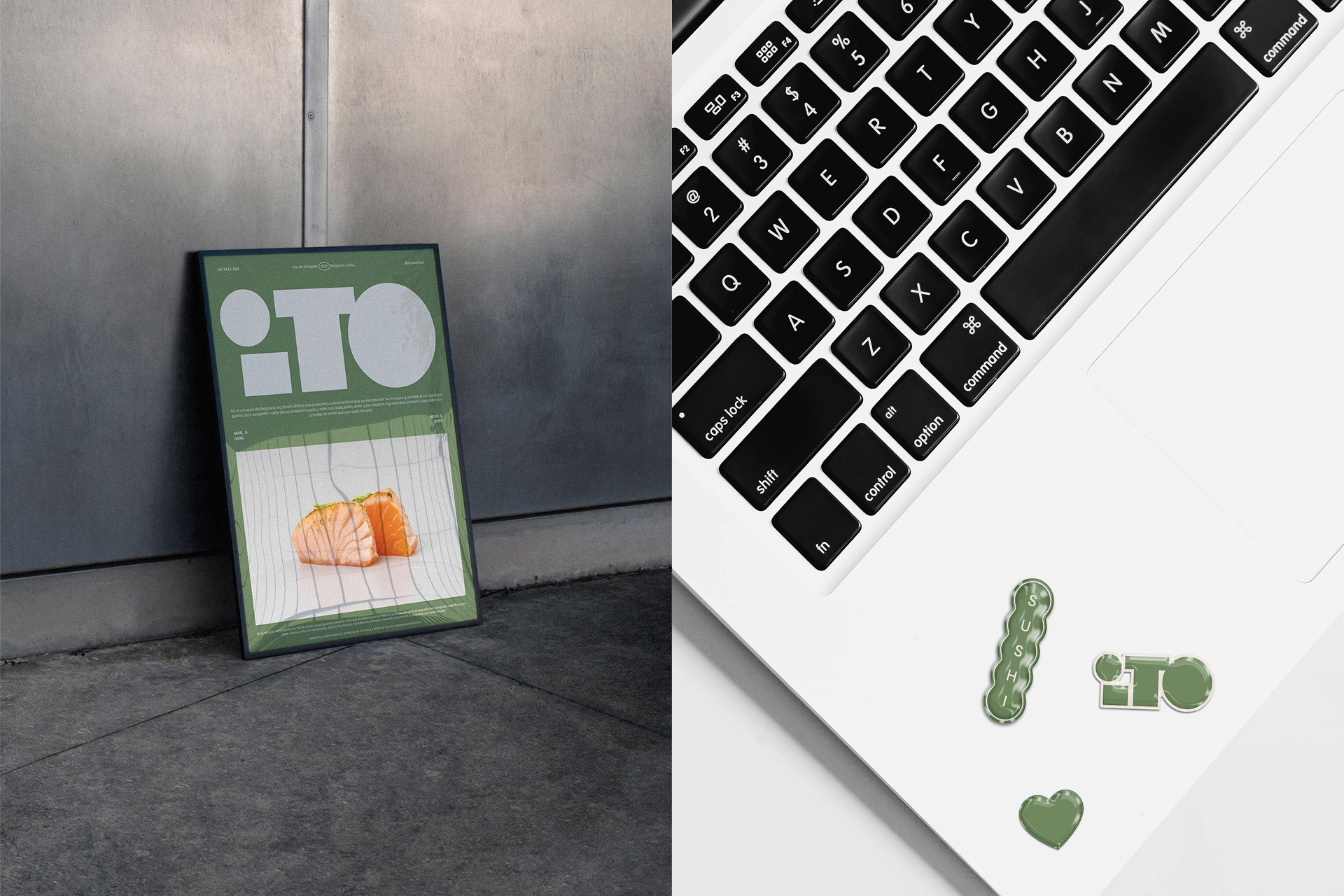
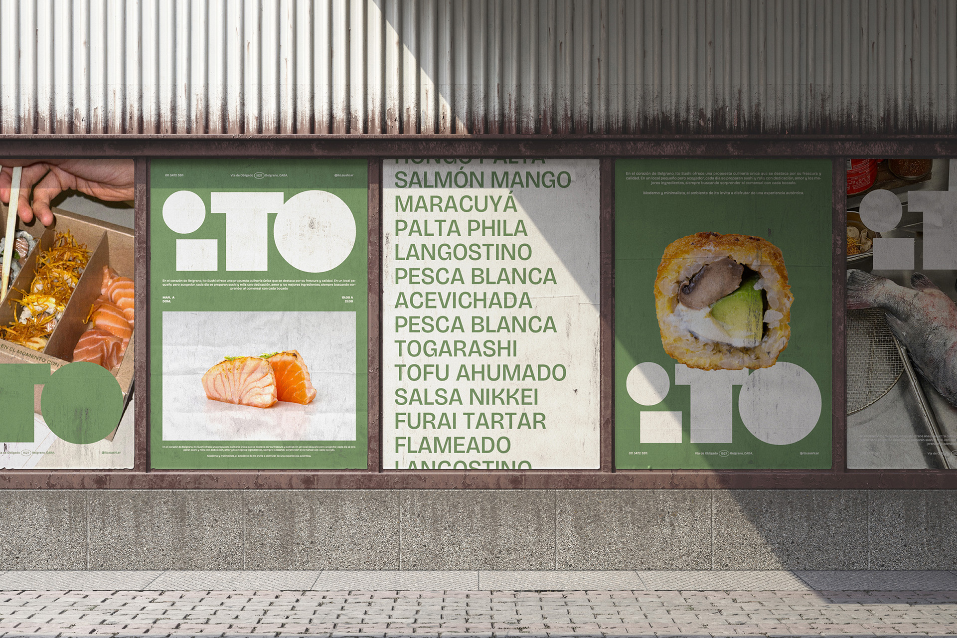
ITO, a take-away sushi project in Argentina, deliberately moves away from typical industry visuals, proposing a purer aesthetic. The client’s core desire was to avoid the obvious, aiming to communicate precision, freshness, and a love for detail – envisioning an almost surgical cuisine where each sushi piece is a perfect, small work of art.
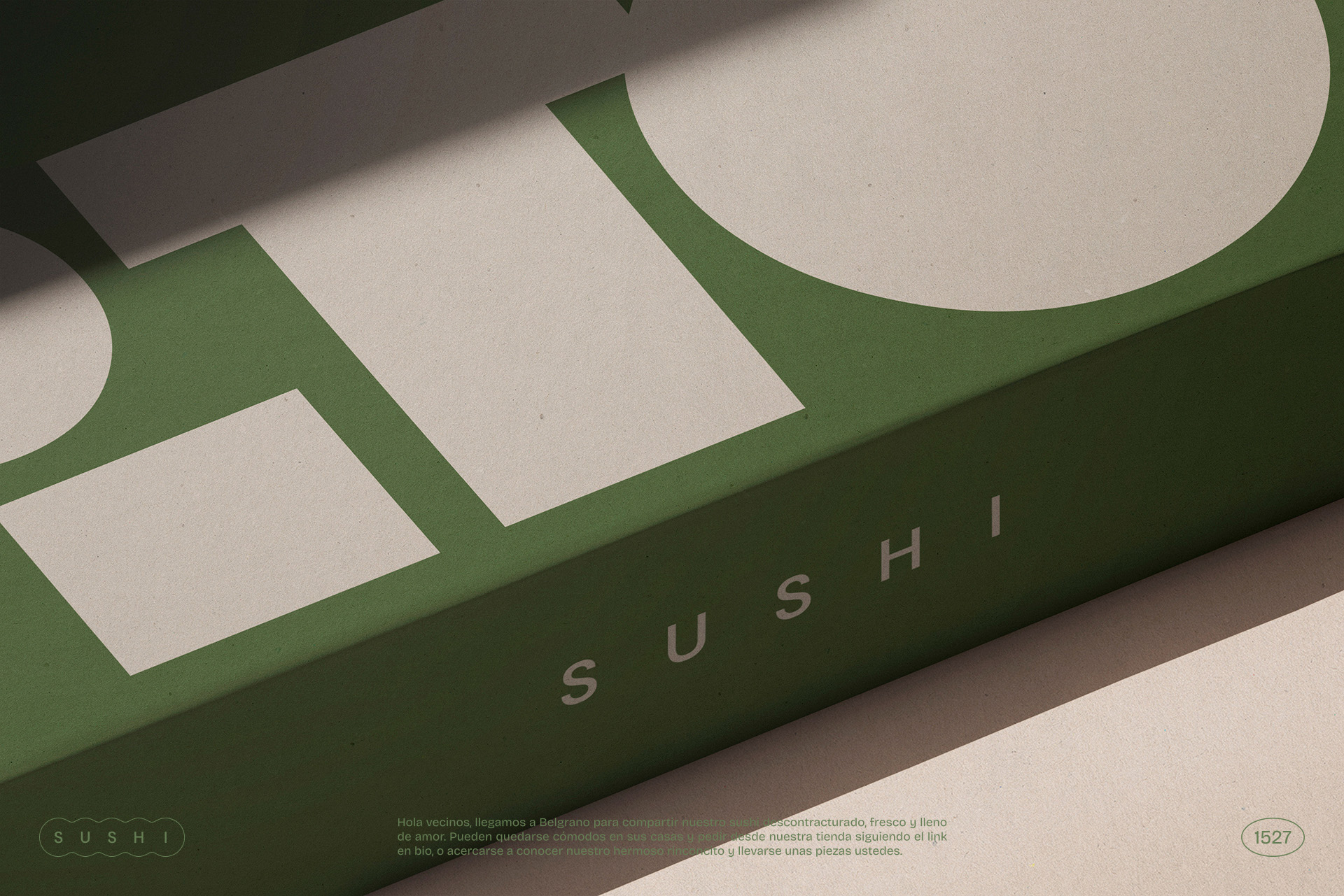
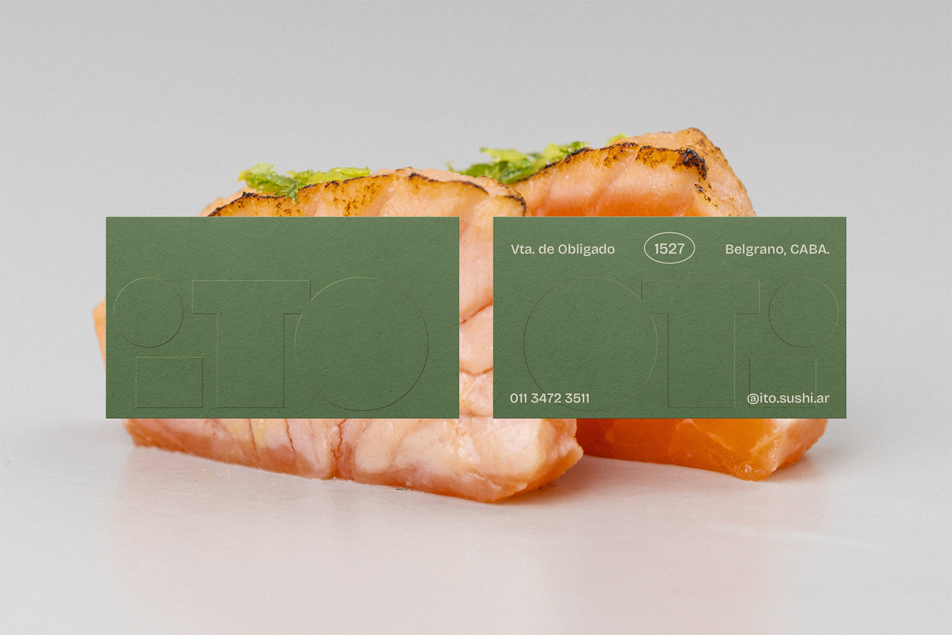
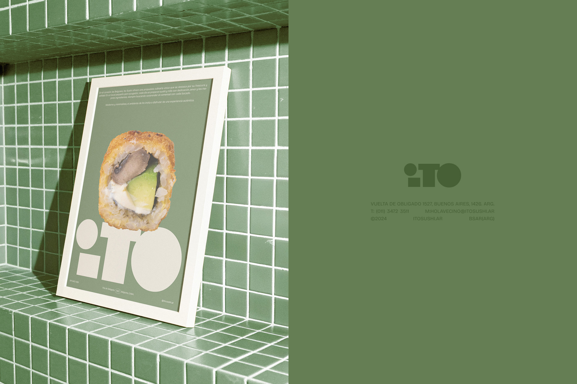
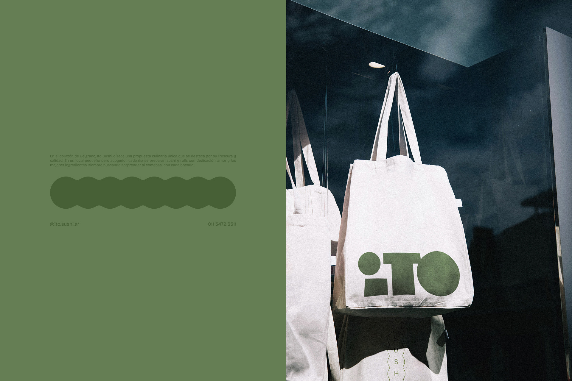
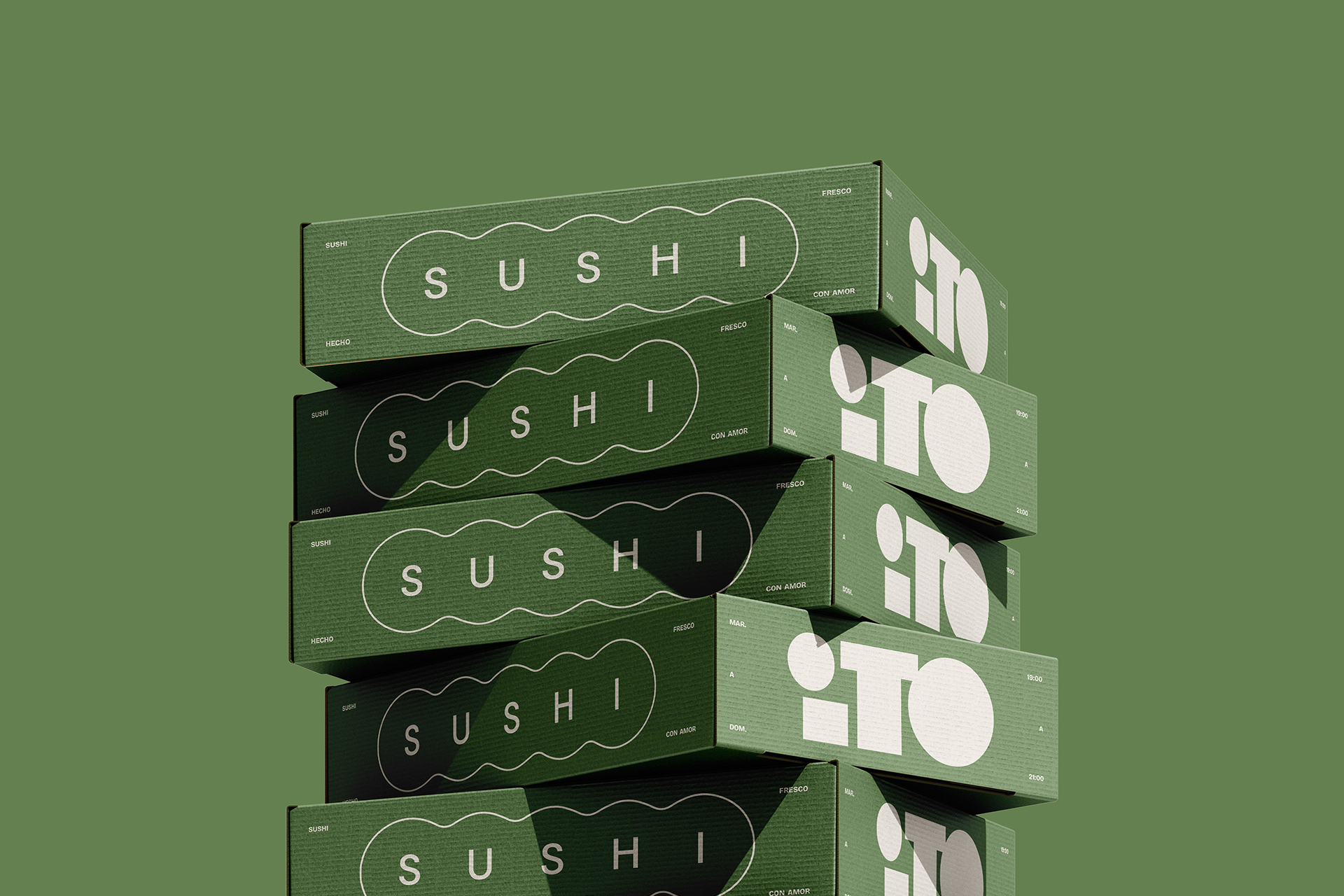
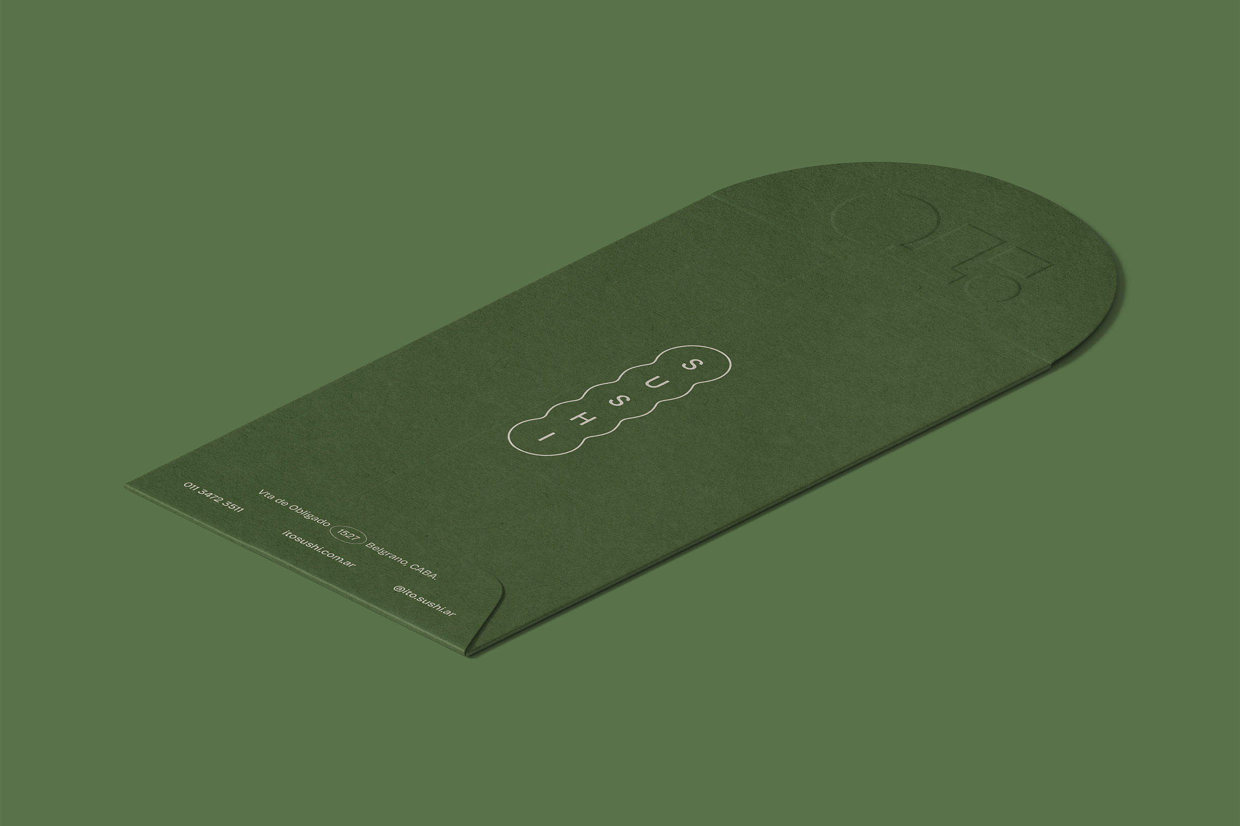
This idea became the foundation for the entire project. The identity is built upon Japanese simplicity, utilizing clean geometries and a limited, sophisticated color palette, where the vibrant colors are reserved for the sushi rolls themselves. The brand subtly supports the quality of the product.
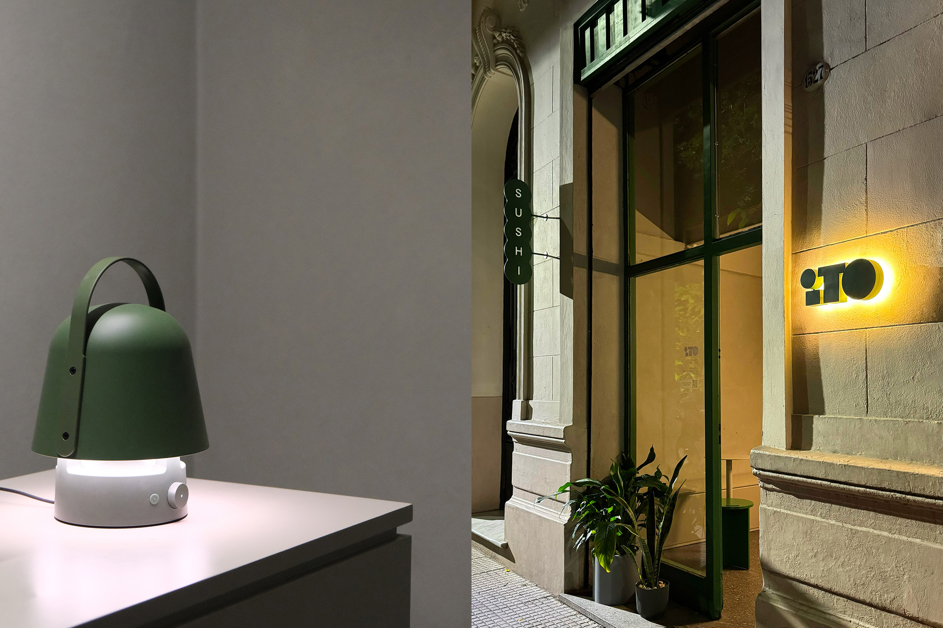
The interior design echoes this ethos: clear functionality designed for a seamless just-in-time shopping experience. The space is inviting yet free of distractions, with every element speaking in a unified, quiet tone.
ITO is more than just a place to buy sushi; it’s an experience that celebrates quality without pretense, grounded in the belief that less is indeed more. This philosophy extends to the packaging, which reflects the clean aesthetic and prioritizes functionality. The digital presence mirrors this clarity, focusing on showcasing the artistry of the sushi and providing an intuitive user experience.
ITO aims to attract a clientele that appreciates the nuances of high-quality sushi and values authenticity and craftsmanship. The brand narrative subtly highlights the dedication of the chefs and the careful sourcing of ingredients. By focusing on the essentials – fresh ingredients, precise technique, and a clean design – ITO seeks to establish itself as a trusted name in the Argentine market, appealing to those who recognize that true quality speaks for itself. The entire project demonstrates how thoughtful design, when aligned with a superior product, can create a truly memorable and resonant experience.

CREDIT
- Agency/Creative: Tricota Design
- Article Title: Tricota Design Creates a Quiet Yet Powerful Brand Experience for ITO Sushi
- Organisation/Entity: Agency
- Project Type: Identity
- Project Status: Published
- Agency/Creative Country: Argentina
- Agency/Creative City: Buenos Aires
- Market Region: South America
- Project Deliverables: Architecture Visualisation, Art Direction, Brand Design, Brand Experience, Brand Guidelines, Brand Identity, Brand Naming, Brand World, Branding, Creative Direction, Environmental Graphics, Food Photography, Food Styling, Identity System, Interior Design, Packaging Design, Poster Design
- Industry: Food/Beverage
- Keywords: sushi, branding, brand identity, minimalist, japanese
-
Credits:
Project Director: Ezequiel Norry
Brand Design Lead: Juan Pablo Bustos Peralta
Product Design Lead: Francisco Negri


