
Stratedgy – TRICE Tea and Health
When we were approached by Trice Tea for redesigning their packaging, we were ecstatic! The company offers amazing tea and is a heritage brand, but it was presented merely as a line of stand alone products packaged in a clutter of information and colour.
The brief was simple – to introduce a line of sophisticated packaging that is in sync with modern packaging guidelines and design standards, without compromising on the mandatory information to be placed on the every pack.
The Challenge:
With a large number of more established players in the market, with a much more refined aesthetic, the mission was to portray the heritage brand (Trice was established in 1896!) in a new light. We were to present a melange of expertise and freshness to connect with consumers.
The brief clearly underlined the importance of conveying all information in a simple, and straightforward manner.
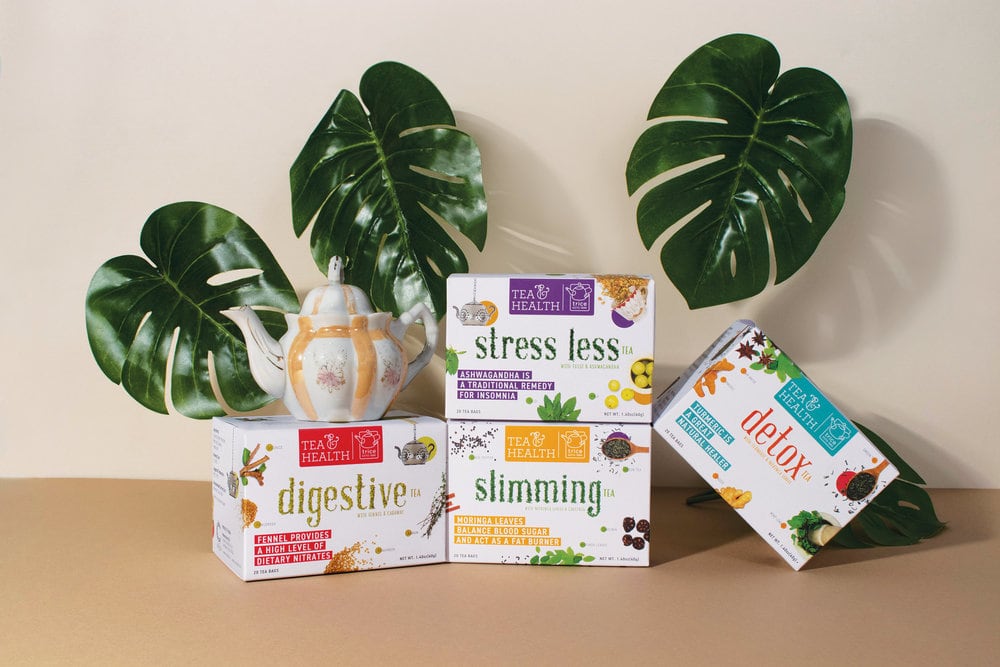
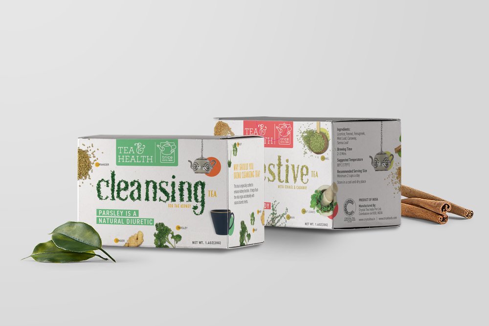
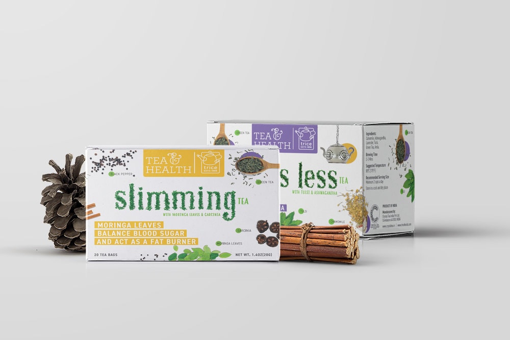
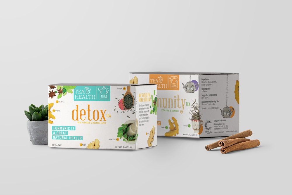
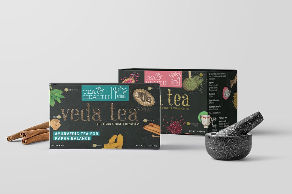
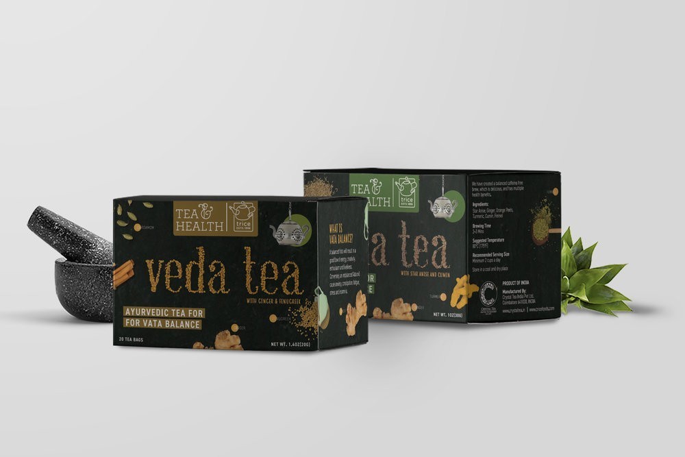
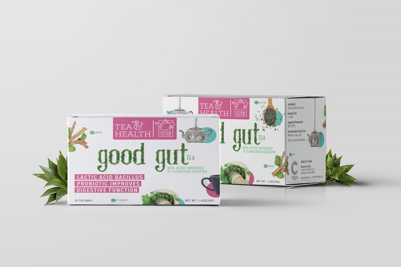
With 11 variants, all having a unique and exotic mix of ingredients, we needed to think beyond front and back of pack structures.
The Insight:
Whilst the switch to organic and health-conscious food and beverages is slowly growing, it also comes with apprehensions in the consumer’s mind.
After a lot of research, we resolved to break the universal image about ‘health teas’ through our design. We needed to break the monotony of the regular, on-the-shelf health products by being straightforward with our visuals. We wanted the honesty of it all to speak for the product.
Health teas are recognised by their mix of ingredients, which contributes to their unique USP. But the awareness about these ingredients is sparse and usually limited to just a line on the packaging.
Consumers, though aware of the options in the market, made their buying choices purely on previous preferences. What we needed to do was to feed them all the information visually, and keep it simple so they can make informed buying decisions.
The Idea:
As a brand that is sold and supplied globally, we deduced that a single statement or one visual cue was not enough. We had to expand the surfaces and push the boundaries.
This came about by the looking at the packaging holistically, and not per surface. The fronts and backs mattered no more. The entire package was our canvas. We had a lot more room to show and say.
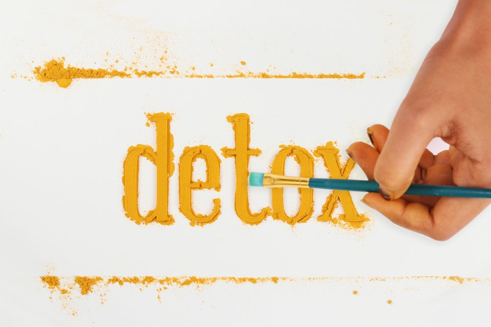
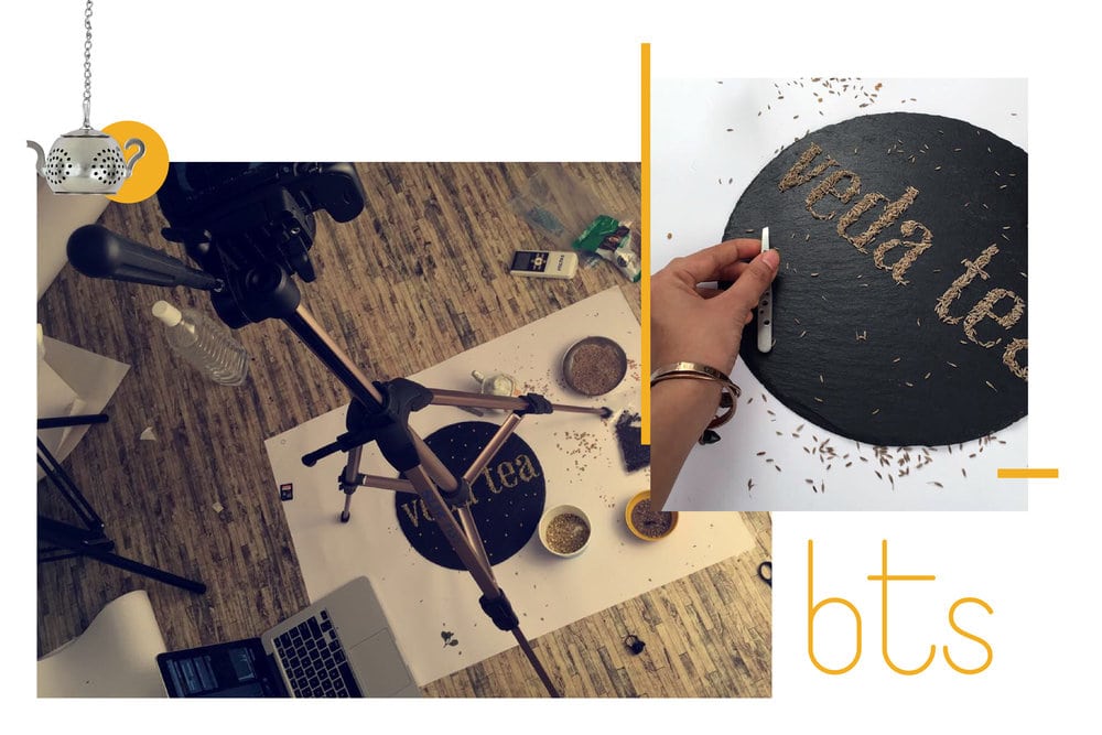
To keep it organic and original, the type unit of each variant was meticulously created using the hero ingredient. Each ingredient (some picked from around the world) were to be presented in it’s original, raw state representing it’s core health benefit.
We experimented with leaves, powders, grains and seeds to obtain textural variety and depth. Along with other ingredients, colours and text we communicated what’s inside, on the outside.
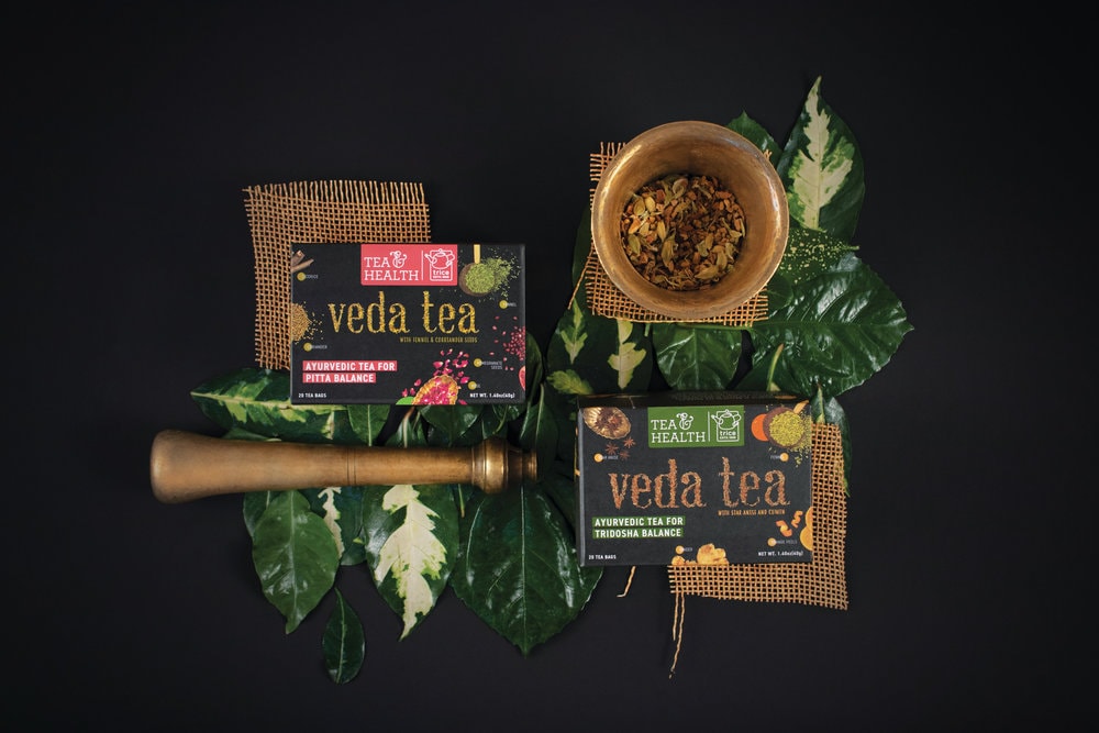
Our designs embrace and imbibe the story, the qualities and the language of each variant, marrying it in entirety to the legacy and credibility of the parent brand.