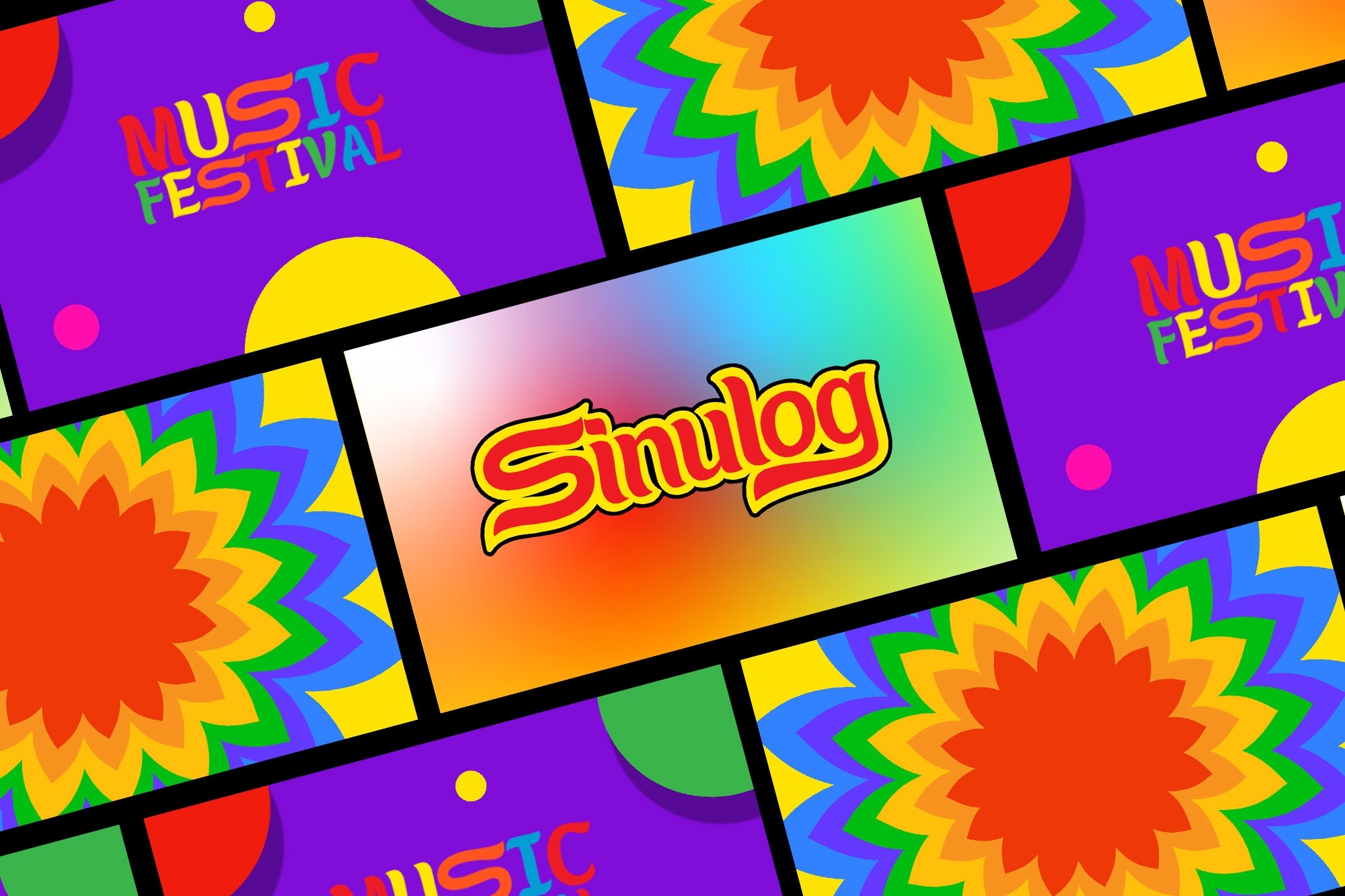
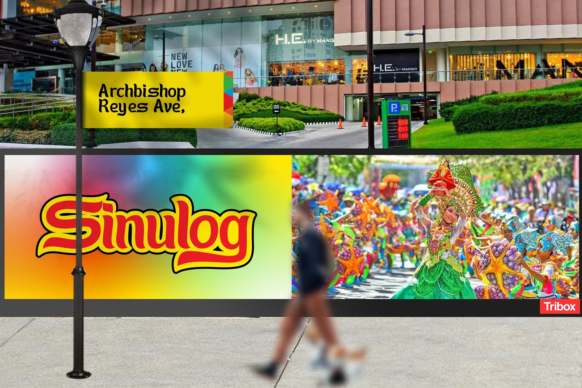
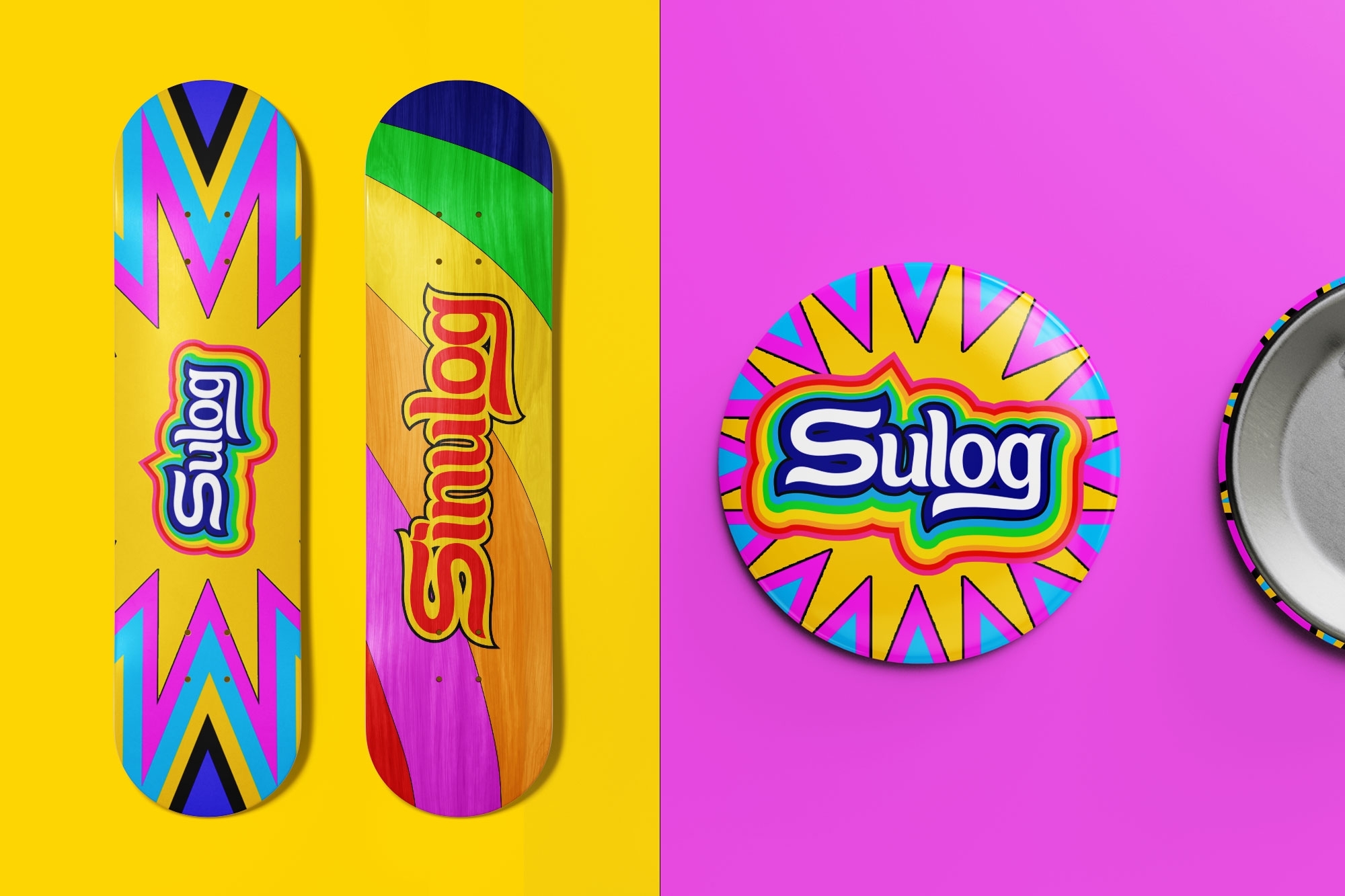
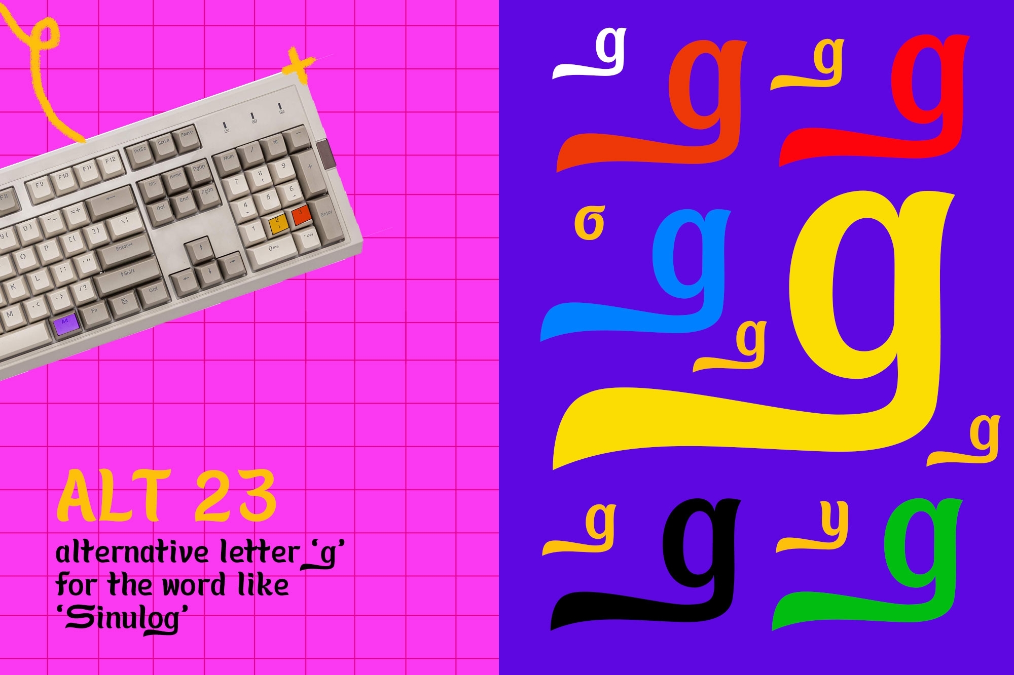
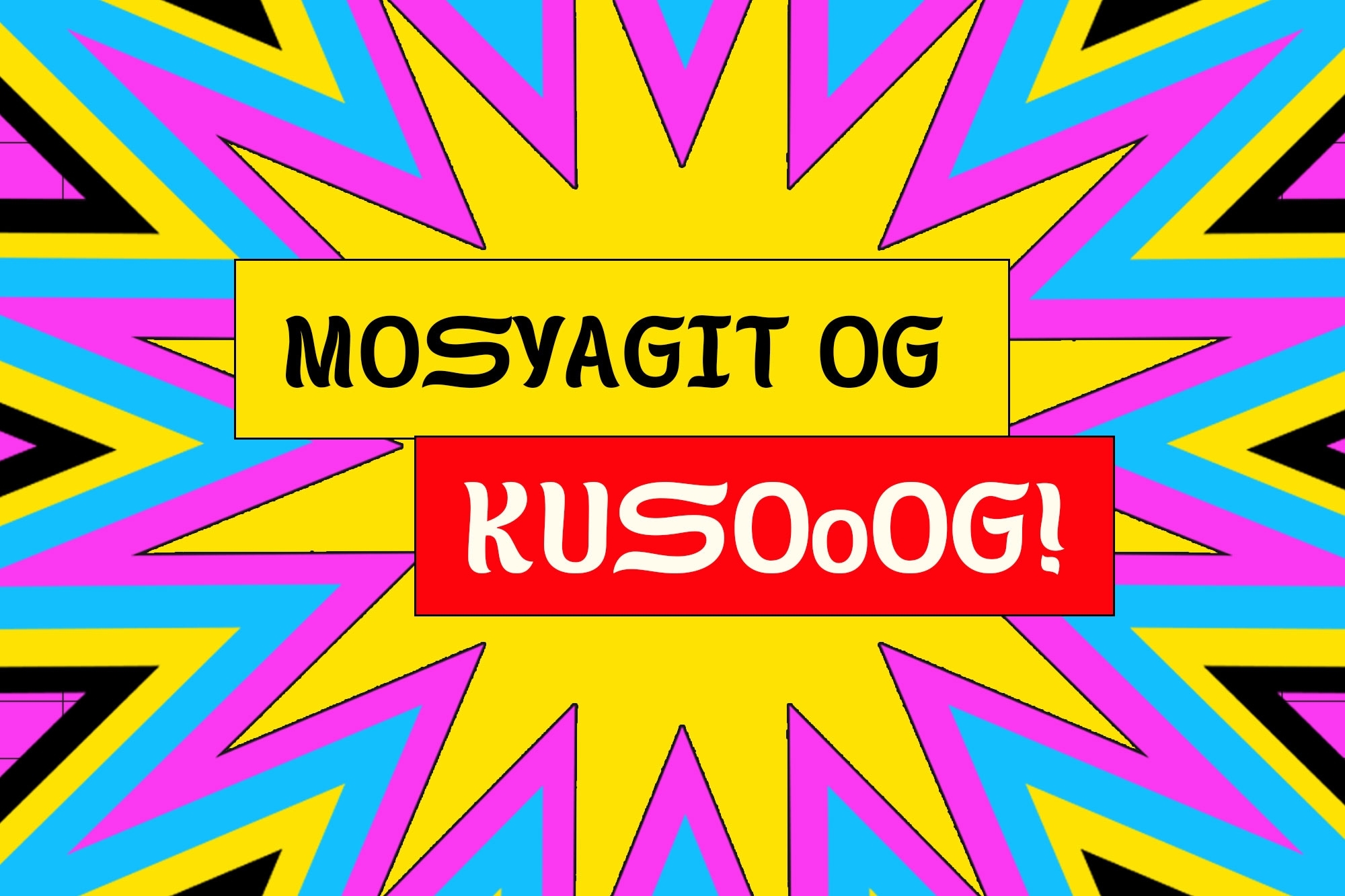
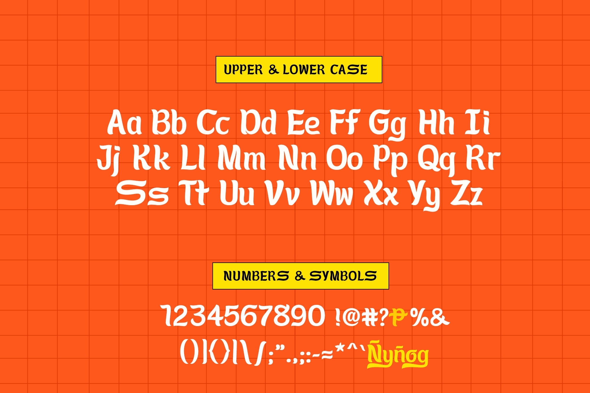
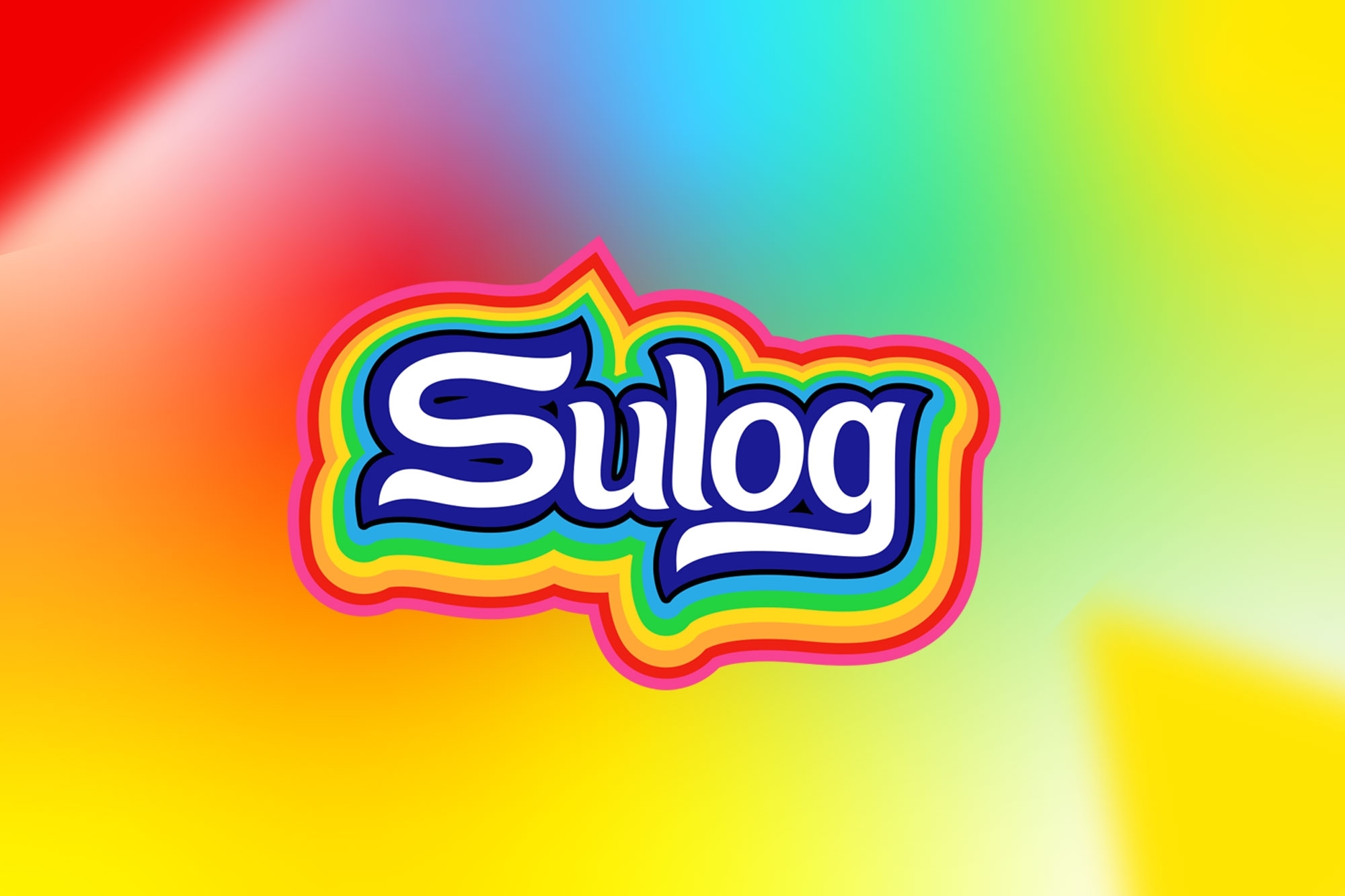
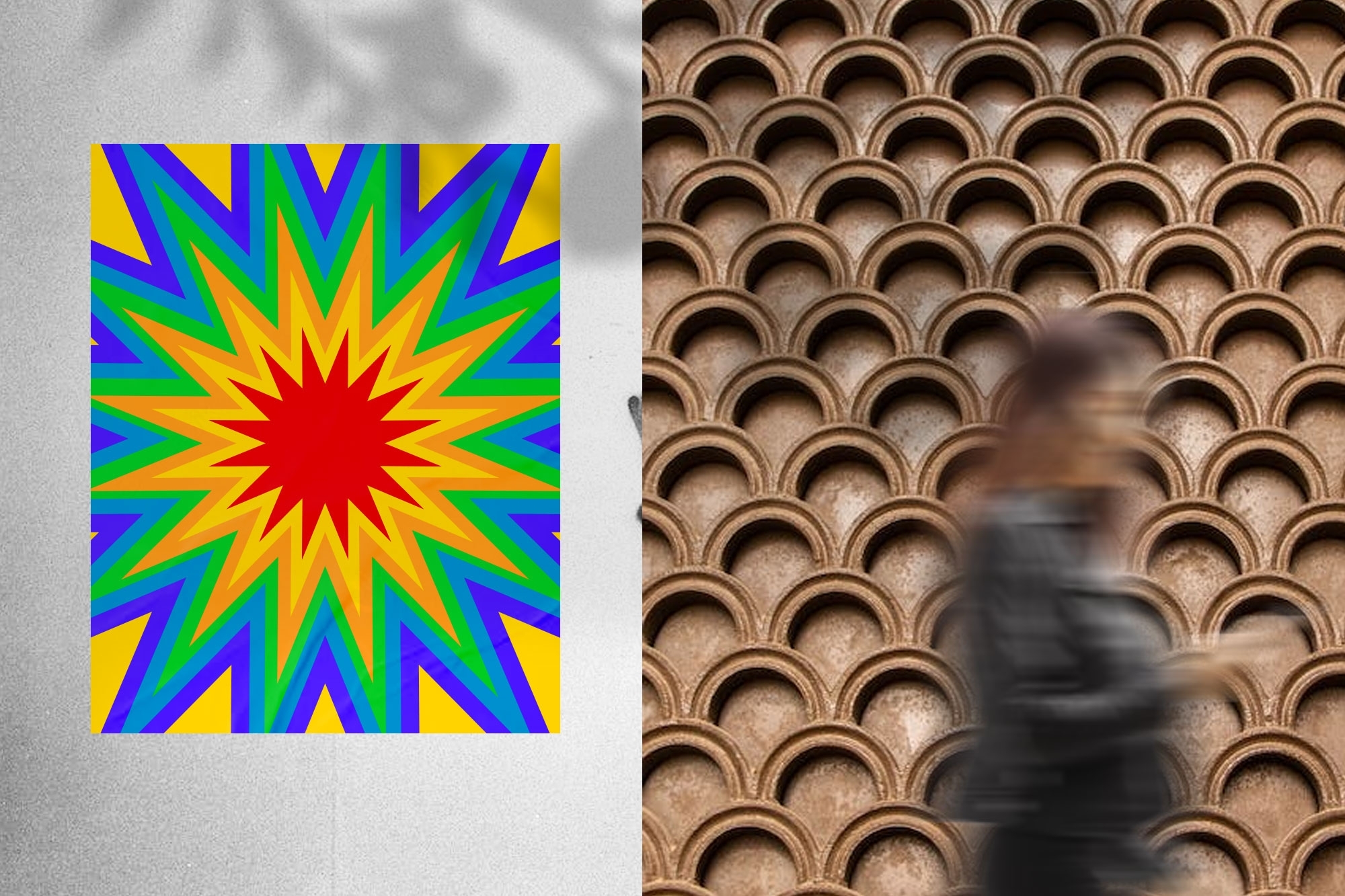
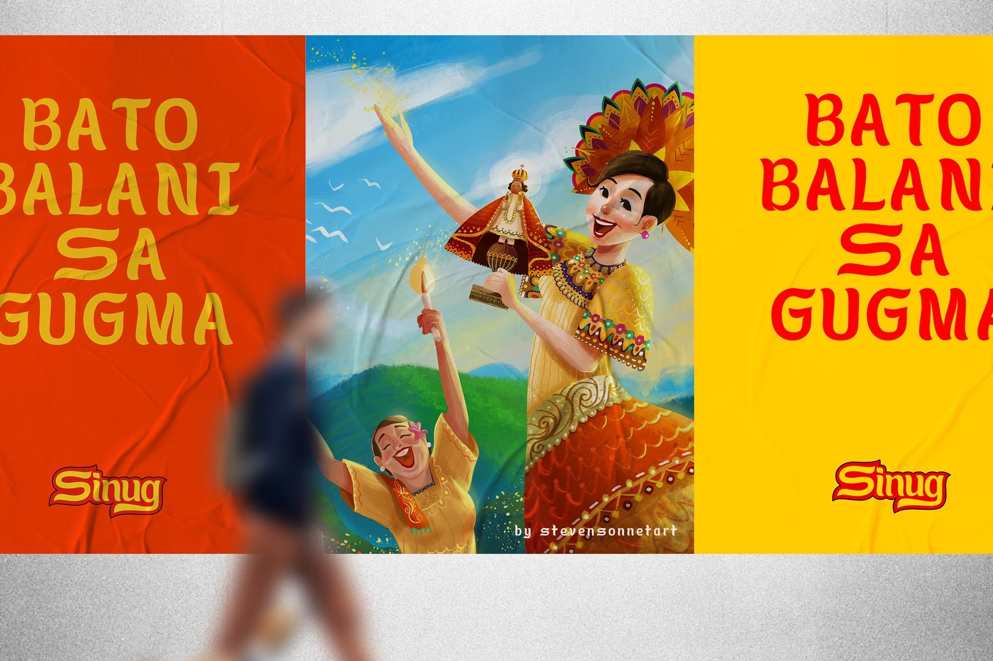
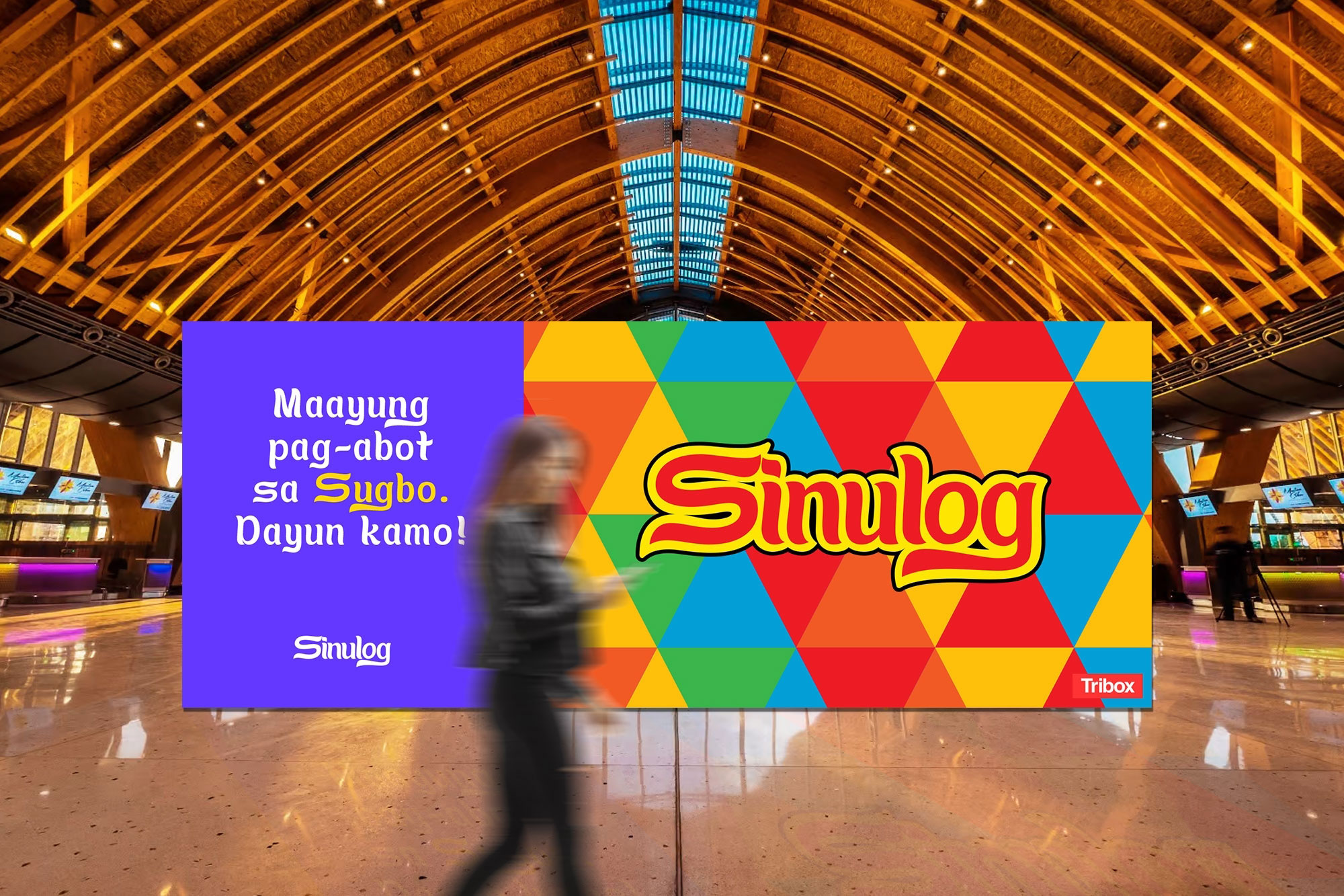
In celebration of Fiesta de Señor Santo Niño, our team created a font called “Sulog” as a gift for our beloved Señor Santo Niño. “Sinulog” is derived from the Cebuano term “sulog”, meaning “current” or “flow of water”, which can be used to describe forward-backward movement of the Sinulog dance. We retained the original structure of the wordmark, the curves that represent resilience, or “kalig-on”. The font has glyphs in upper case, lower case, numbers, and symbols. We also added glyphs for the letters ‘g’ and ‘y’ with tails, upper and lowercase ‘ñ’, and the letter ‘o’. Everything you’ve seen in the images is a mockup, and it only works for virtual viewing.
The problem:
Consistency of a font used
We all know that Sinulog is a festive celebration for every Sugbuanon. Every Cebuano from all over Cebu City and Cebu Province celebrates in honor of The Holy Child Santo Niño. They produce their own collateral with the image of the Santo Niño and messages such as “VIVA PIT SEÑOR” or “Pit Senor kang Lola Kini” then put them up for display outside or inside their respective homes and establishments. One thing Cebuanos have in common is their being “mamugnaon” — being creative individuals. They always want to create their own designs resulting in the use of different kinds of fonts and versions of the Sinulog logo.
The solution and the discovery:
The first thing we did was gather some of the old Sinulog Celebration logos dating back from the 1980s. Based on the old logos, we created a font system that can be used to standardize designs for local Sinulog fiestas such as Sinulog sa Sugbo, Sinulog sa Talisay, Sinulog sa Mandaue, Sinulog sa Santa Fe, and so on. Each glyph is based on the word “Sulog”, which means the back and forth movement of waves.
We discovered that there is no standard font used since the beginning of the Sinulog Festival — which is a shame since it is such a big event. The team was able to create a font that will help to standardize the designs in the Sinulog Festival.
– Seeing that this is a collaborative effort between Tribox Design and Cebu-based institutions, how did these organizations provide support or inspiration for the font design?
First and foremost, we created this to honor our beloved Santo Niño, who has endured despite everything. The second goal is to help strengthen the Sinulog campaign so that it is more enjoyable and full of life.
We teamed up with different Cebu-based creatives to also promote their art using different media including illustrations of the image of Santo Niño, Photography, and Copywriting. The font alone took 6 months to create. It was well worth it.
The Tribox Design team teamed up with local artists, photographers, and individuals to help make this project possible. We would like to thank Insights Cebu, Dreamyria, Stevensonnet Art, JEGI Design, and Amabelle Lorraine Piñon.
CREDIT
- Agency/Creative: Tribox Design and Advertising OPC.
- Article Title: Tribox Design Creates Sulog Font for Sinulog Festival
- Organisation/Entity: In-House
- Project Type: Campaign
- Project Status: Published
- Agency/Creative Country: Philippines
- Agency/Creative City: Cebu City
- Market Region: Asia
- Project Deliverables: Advertising Photography, Animation, Art Direction, Branding, Type Design, Typography
- Industry: Non-Profit
- Keywords: Sinulog Cebu Festival
-
Credits:
Art Director/Research: Regine Ylaya
Copywriter: Faye Penetrante
Creative Director/Typeface Designer: Inusentes Catapusan Jr.


