Background
TRESemmé is the number one haircare brand in the US and the number one styling brand globally. The original salon icon that became a global giant through its professional positioning and salon-worthy formulations.
However, its premium position was being eroded on both sides by mass competitors upping their game and an influx of niche premium brands creating new news. Alongside a confusing brand architecture and little differentiation between price tiers, consumers found the range difficult and
uninspiring to navigate. As a result, the brand had been steadily losing share since 2017.
Challenge
Our challenge was to drive brand reappraisal, by improving brand differentiation and relevance, ultimately reasserting TRESemmé’s authority and premium positioning in category. To do this we needed to establish a more contemporary, premium design expression that felt true and unique to TRESemmé. An expression that would resonate with our target, style-conscious consumer, but standout versus our competitors.
An evolved positioning and brand personality
Research identified that ‘salon quality’ and ‘professional products’ were TRESemmé’s oldest and strongest differentiation drivers, yet in recent years, the brand’s connection to its roots had weakened.
As a brand born in the salon and founded by beauty trailblazer Edna Emmé over 70 years ago, we had to go back to the brand’s history, legacy and true point of difference – the salon. And amplify its product promise of democratising salon technologies and treatments, with formulations that are proven to be superior to many equivalent premium salon brand products, through design.
An elevated visual identity
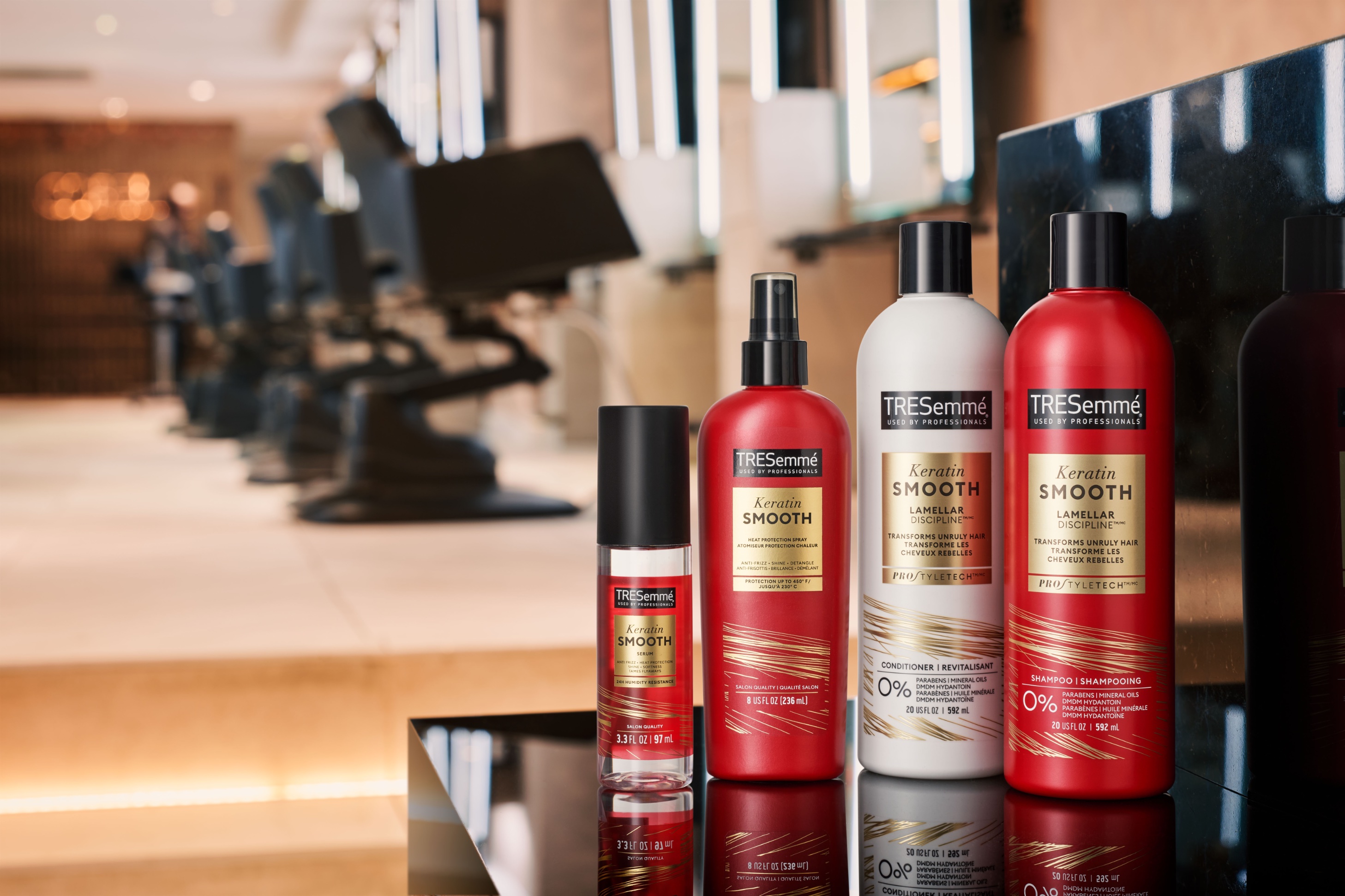
Our driving creative idea was ‘salon-worthy style’. We drew inspiration from the world of contemporary high-end salons and premium beauty culture, developing a design language that sits at the confluence of science and desire. A design language of typography, colour and photography style that balances professional precision with stylish expression.
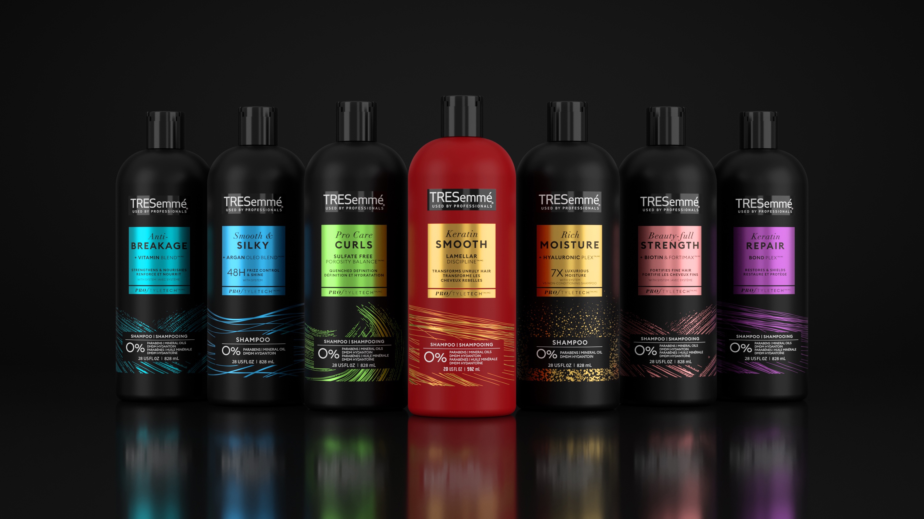
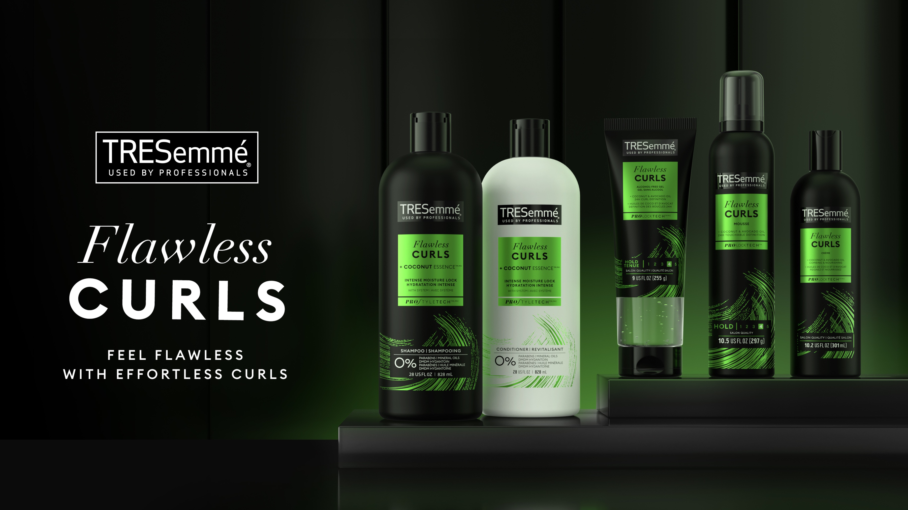
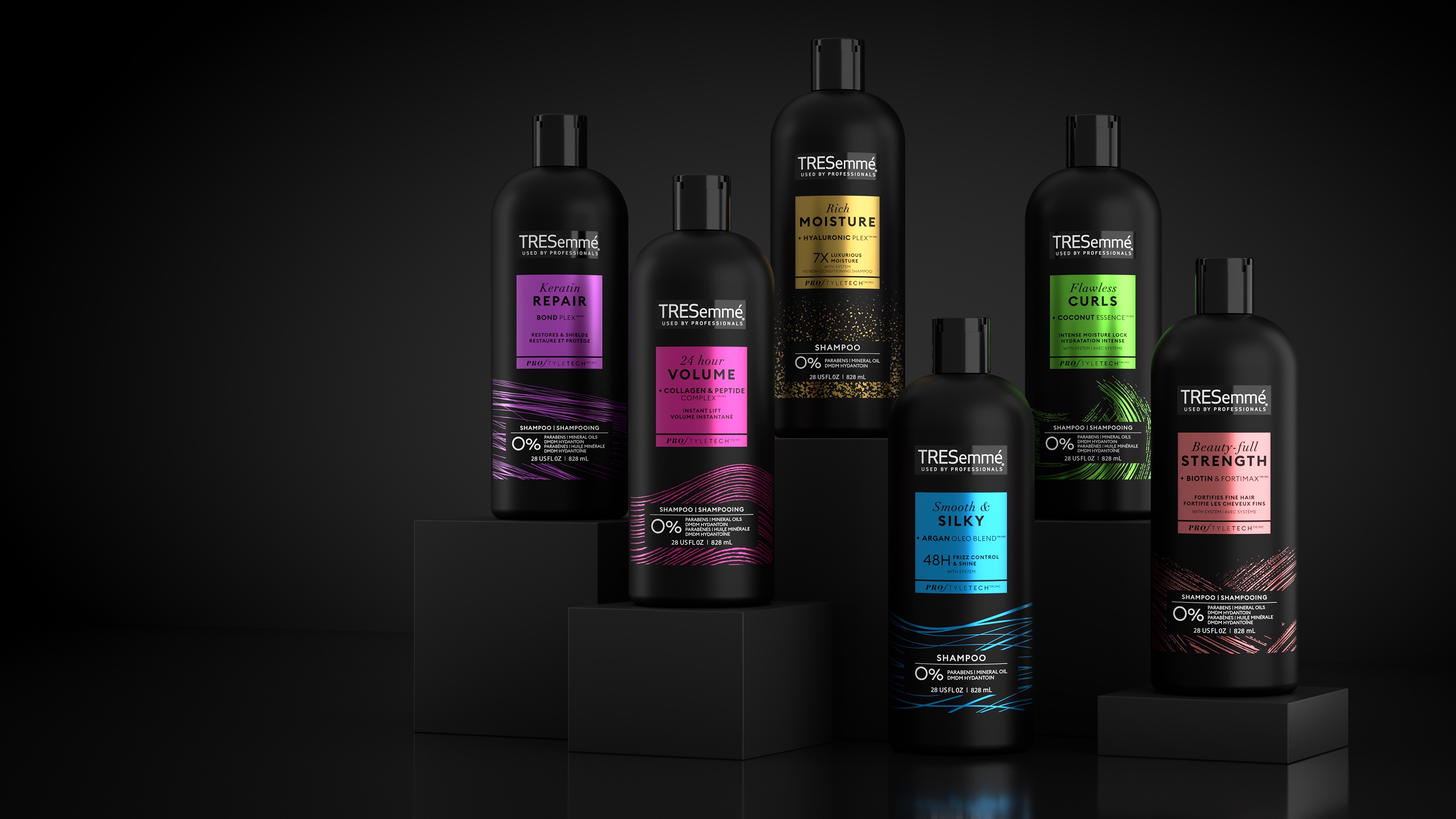
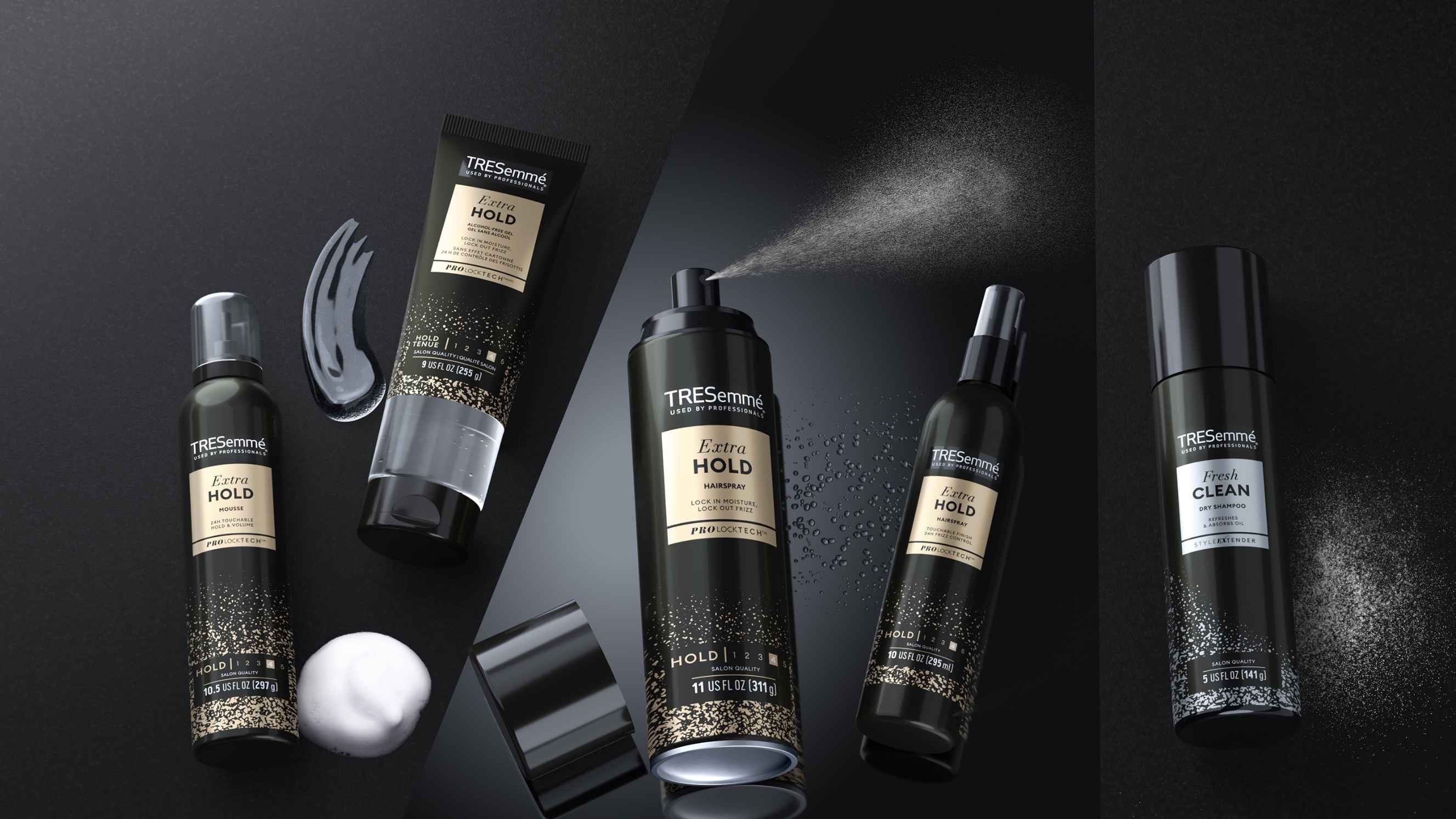
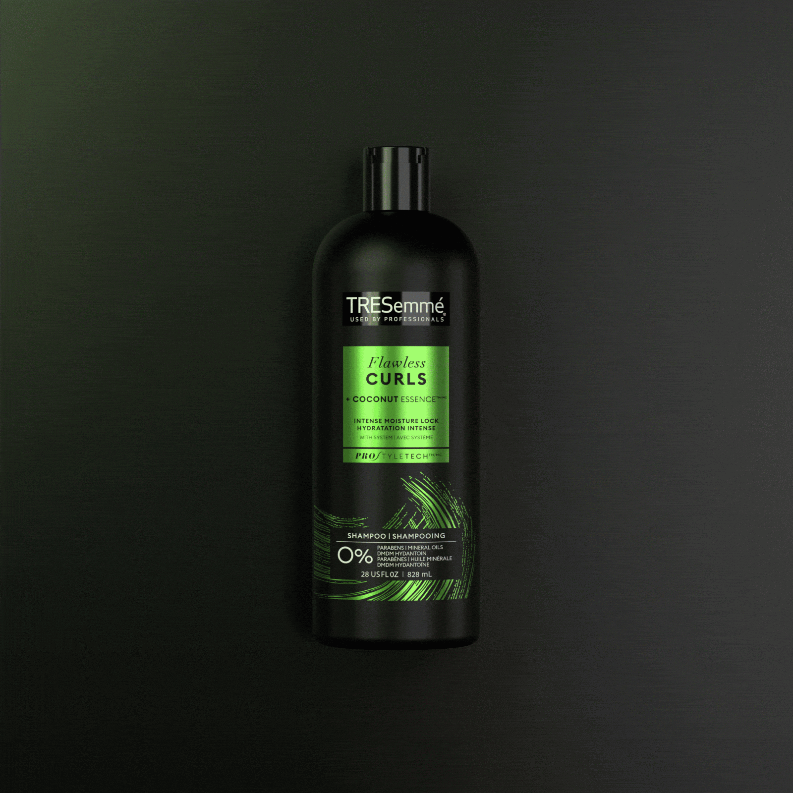
To aid range navigation, we introduced a touch of colour and new key benefit-led variant names, showcasing the brand’s expert but engaging tone of voice, across both Wash & Care and Styling ranges.
Global pack redesign
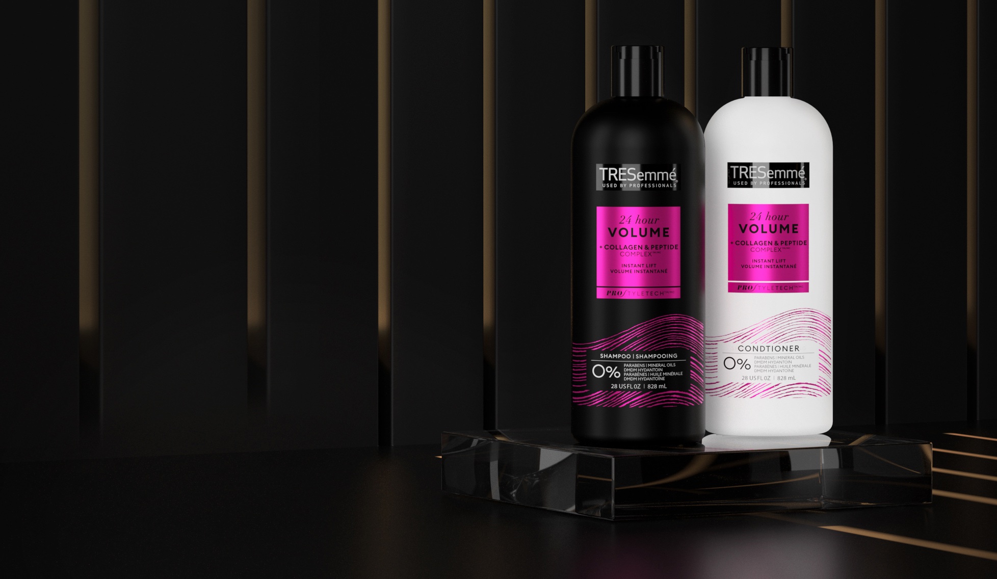
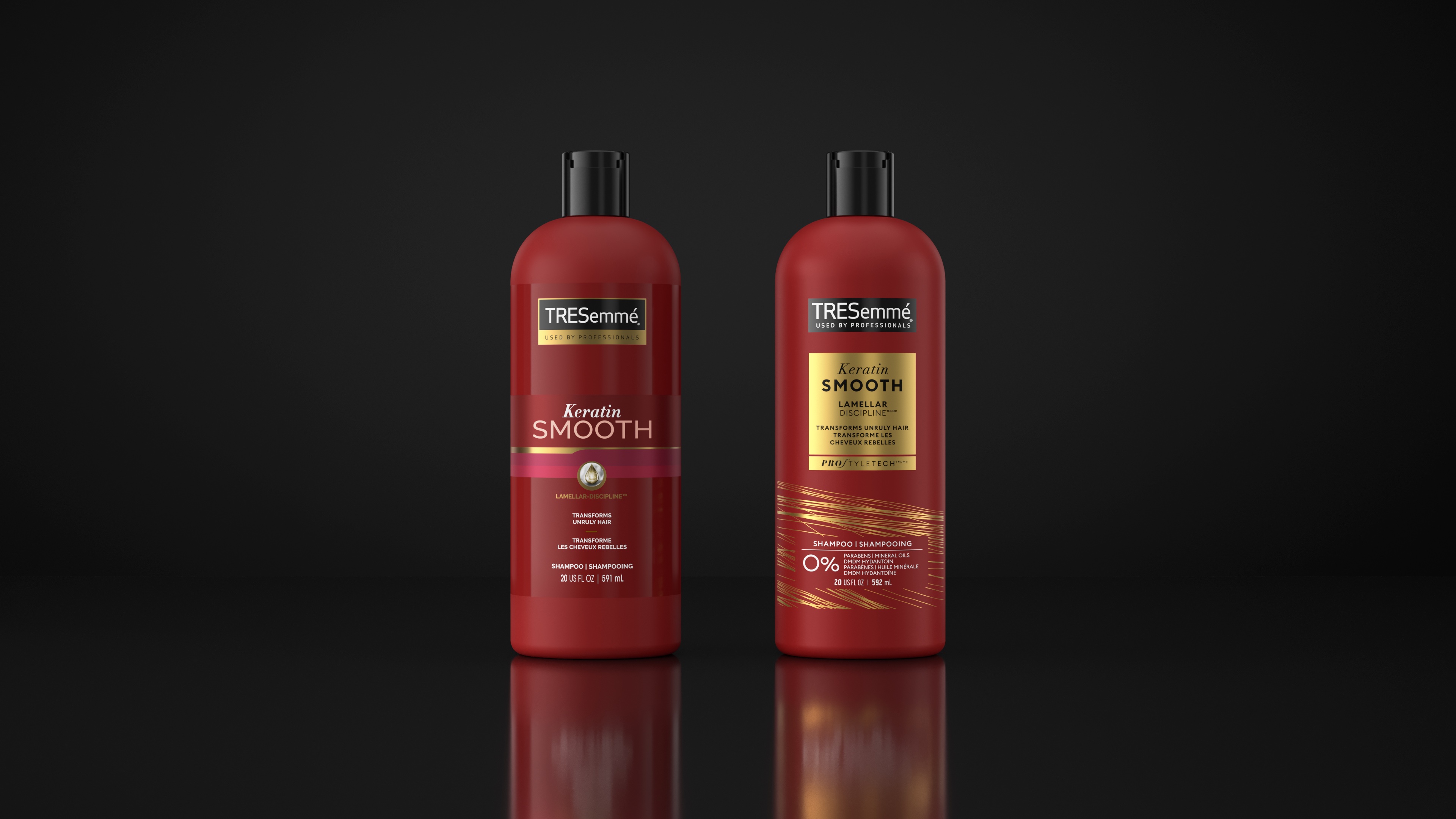
We retained the brand’s distinctive black and white bottles, as well as the red one for the brand’s popular Keratin Smooth range.
On pack, the professional precision comes through the graphic tag – a simple, yet elegant device that highlights the key benefit and technology messaging for enhanced standout and differentiation. The elegant colours and metallic finish add a touch of luxury, instantly communicating premium quality and aligning with the salon aesthetic that TRESemmé embodies.
The stylish expression comes through the graphic patterns. Refined yet expressive marks that are beautifully evocative of hair and the product benefit. They serve a functional purpose to aid navigation and communicate variant, but they also add a more human touch to the design – evocative of the
personal experience of the salon and salon stylist.
The use of two different typography styles, one graphic and direct, the other elegant and evocative, also visually represents the dual nature of the brand’s salon inspired design language, communicating both the scientific credibility and the emotional allure of the product.
The overall design feels bold yet effortlessly sophisticated; the combination of jewel colour palettes, minimalist clean layouts and refined details creating an elegant look and feel that echoes the serene and polished aesthetic of the contemporary salon. The metallic finishes, high quality textures and a gloss varnish on the logo further elevate the design adding a more tactile dimension.
Results
The brand returned to growth in 2022 in the US market and the success of the design has led to the full re-stage of the brand, and the creation of its first global brand book. Within the brand book, we’ve taken the core design idea, and defined what this means across all other touchpoints. This comprehensive resource will serve as a unifying guide, ensuring a consistent brand identity and messaging across diverse markets.
CREDIT
- Agency/Creative: PB Creative
- Article Title: Tresemmé Global Rebrand – Elevating Tresemmé to Salon-worthy Status
- Organisation/Entity: Agency
- Project Type: Packaging
- Project Status: Published
- Agency/Creative Country: United Kingdom
- Agency/Creative City: London
- Market Region: Global
- Project Deliverables: Packaging Design
- Format: Bottle
- Industry: Beauty/Cosmetics
- Keywords: WBDS Agency Design Awards 2023/24
- Keywords: Packaging Design, Product Redesign
-
Credits:
Global Brand Lead: Purnima Lamba
Global Brand Director (Brazil): Luciana Guillaumon
Senior Global Brand Manager: Sara Buchholz


