The real estate market is developing rather conservatively. Many agencies that are now leaders in the local market (Novosibirsk) were created about 15-20 years ago. They have already built up their own customer base and, in general, they have become not agile with regards to marketing and design in general. Many do not have a corporate identity or already look out of date, and in general, the lack of a unified visual system makes brands blurry and creates communication problems.
Our team was approached by partners, themselves come from large real estate agencies, who opened their own agency with a fresh look at the market. In fact, knowing the problems of current agencies, and this:
1. Staff turnover (young managers do not know the market, all legal and technical nuances).
2. A large flow of clients (little time is given to the client and proper support of the transaction, they forget to call back or send letters, etc.)
3. Promptly offer a solution for the selection of residential or commercial real estate.
They focus on solving customer needs, which is the service and competence of the team. At the same time, they understand that it will be more difficult for the new agency, despite the established connections and the client base, to declare itself to the market and overwhelm the old players.
In this regard, we were faced with the task of helping the company immediately boldly declare itself. Form a naming and a unified visual system that will help develop communication in the b2c and b2b markets. The guys needed to strongly detach themselves from competitors, so they were ready to consider non-standard and bold visual solutions.
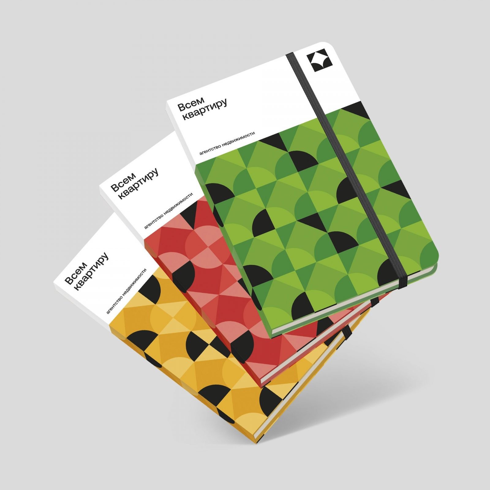
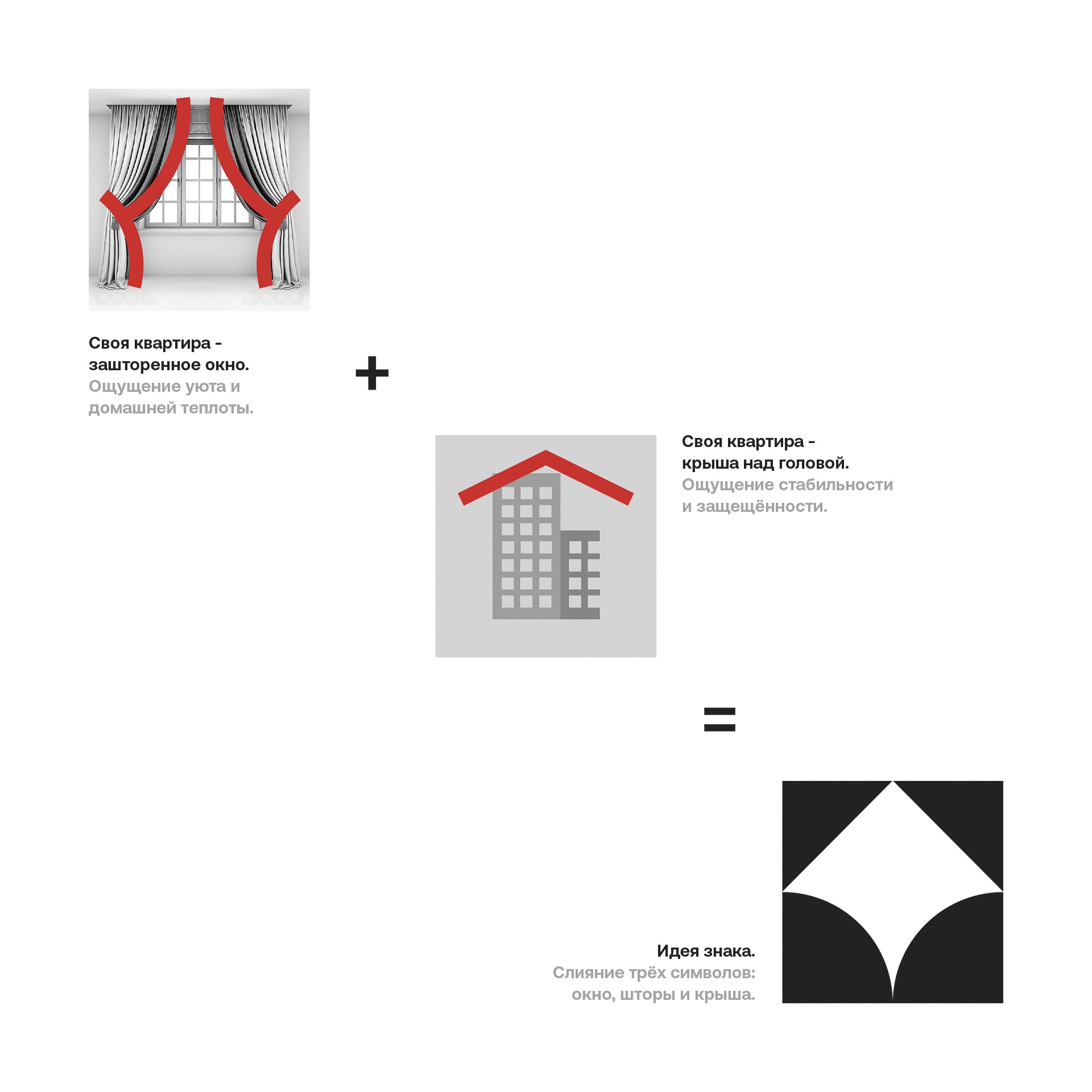
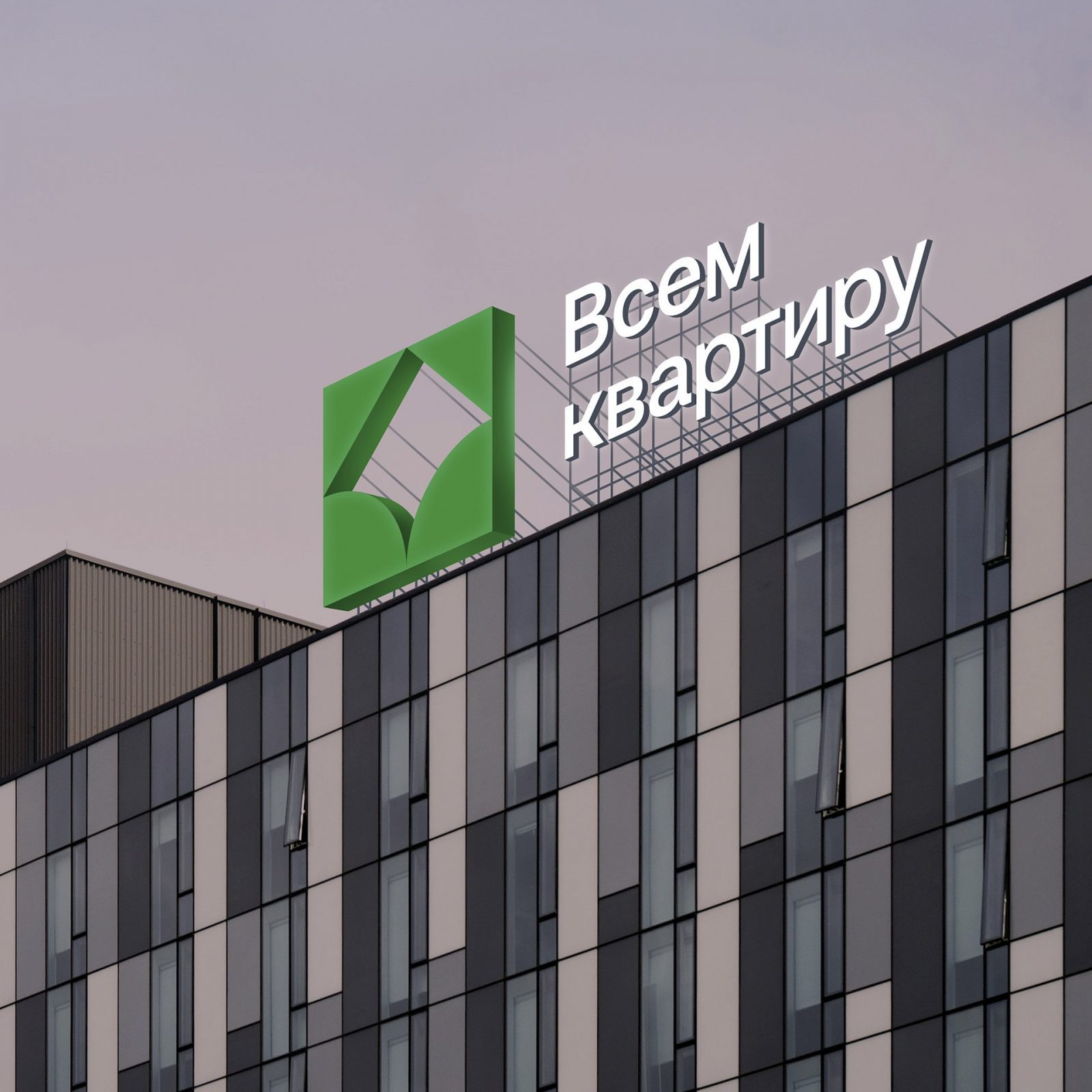
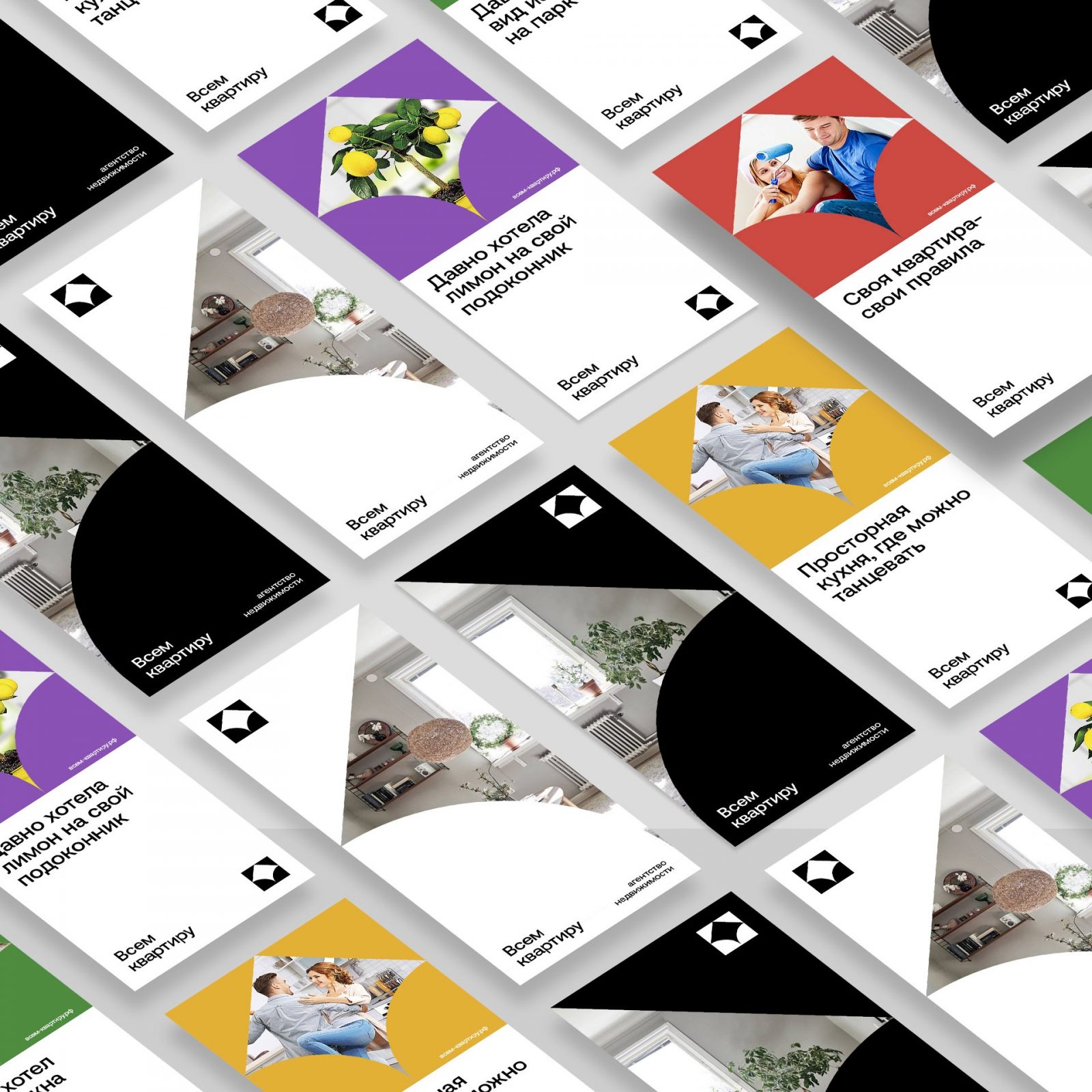
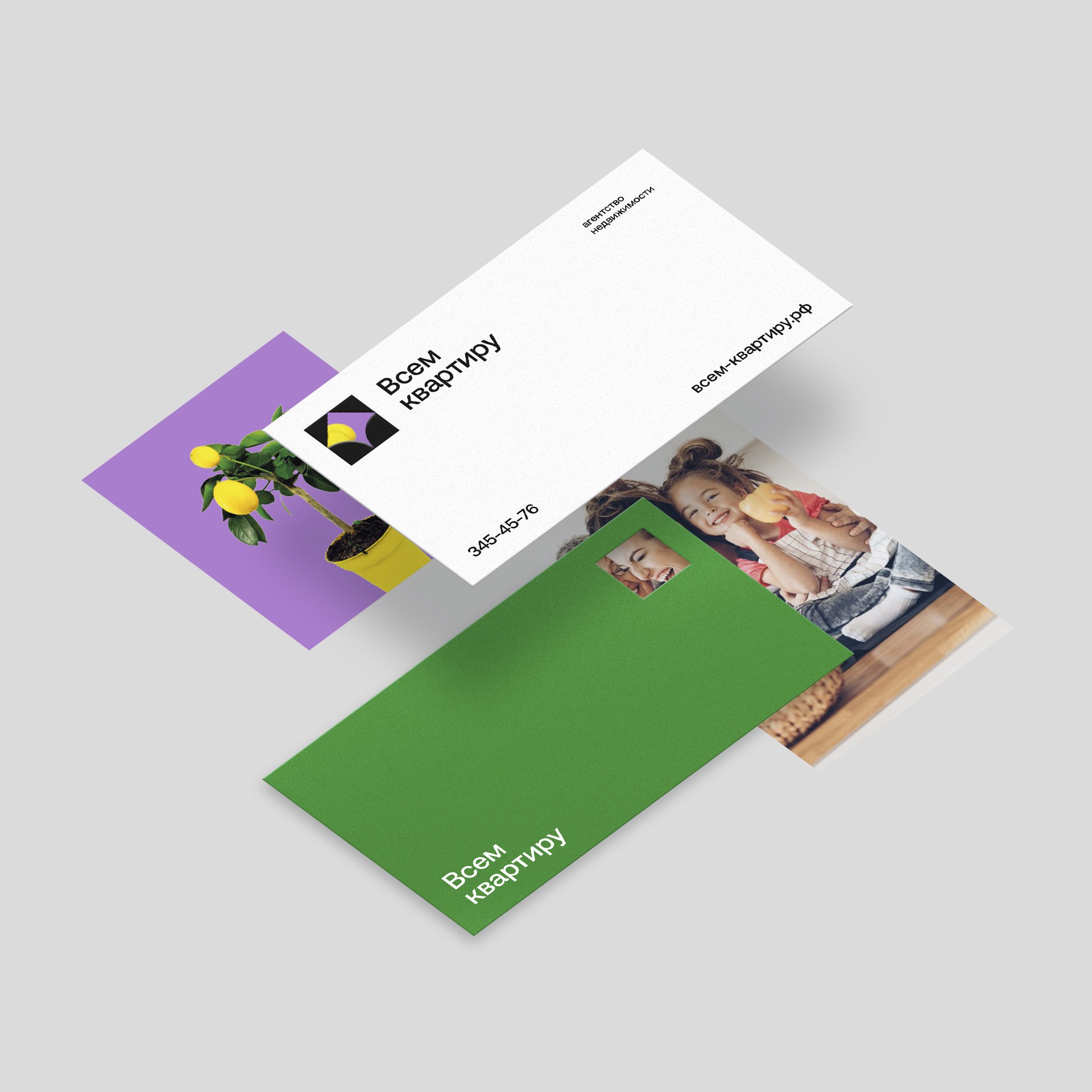
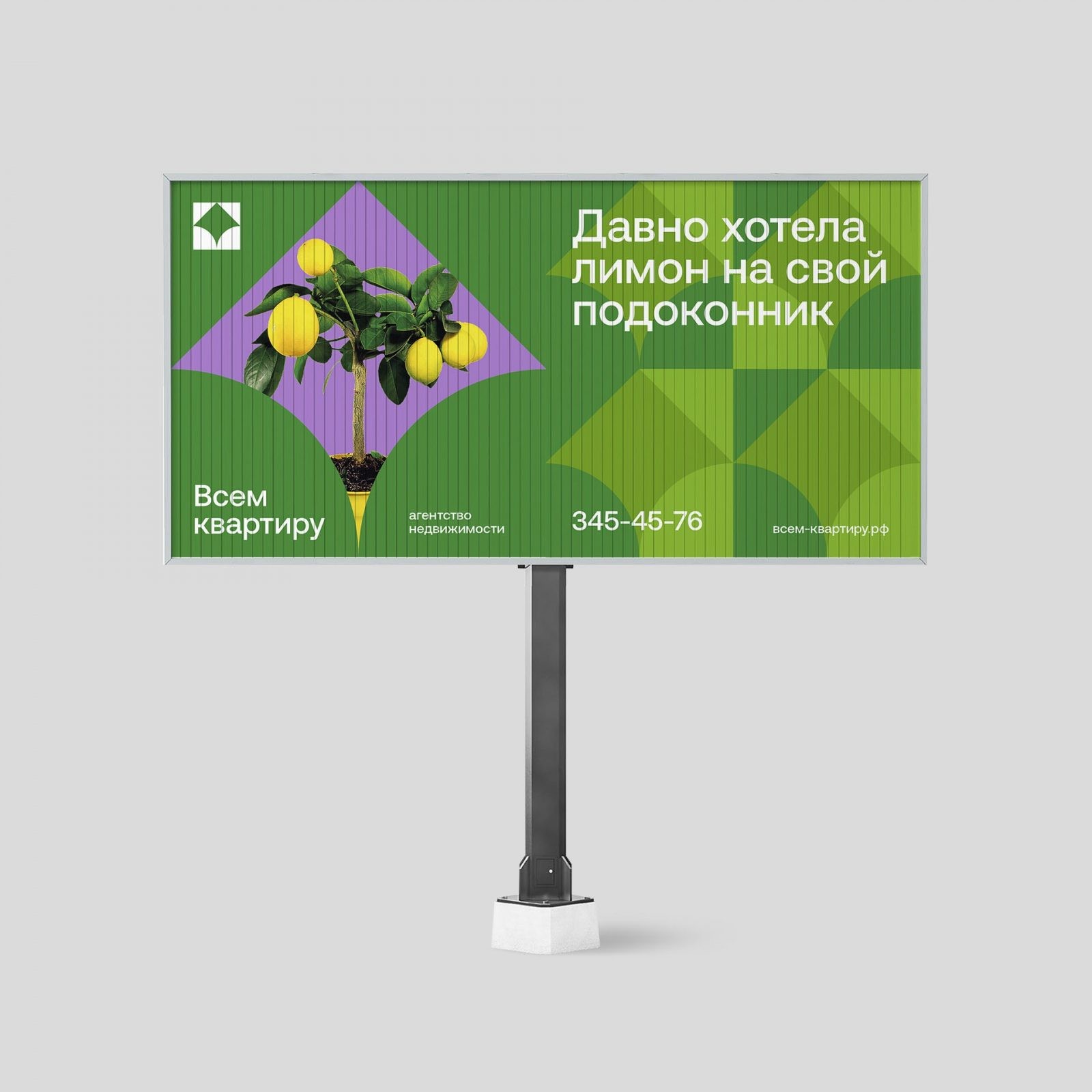
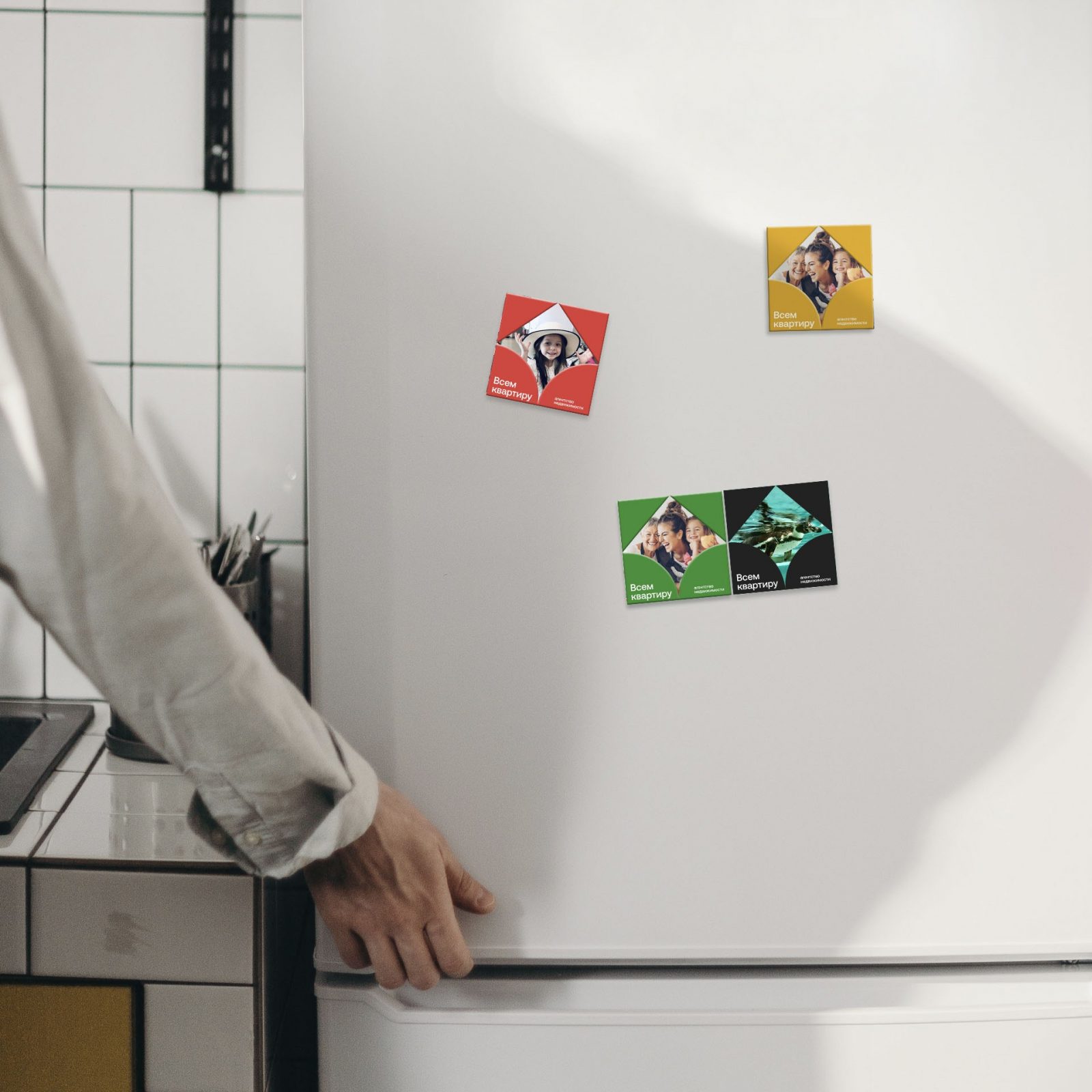
The verbal part is built on the main insight, and this is the desire to have their own home for those who do not have it yet. The name “An apartment for everyone” simply conveys this idea and conveys the value of the agency, and this is to find and select housing according to the client’s parameters. The visual idea is based on a window as an image of an apartment, comfort, and its own corner. There are flowers on the window sills, there are cats and an apartment without windows at all – just walls. The logo is a window, curtains and a roof over your head. A visual system is built from a sign and develops into dynamic graphics, which can either be assembled into a single design system, forming a pattern, or live by separate elements.
CREDIT
- Agency/Creative: Trava brand agency
- Article Title: Trava Brand Agency Creates Real Estate Agency “Everyone an Apartment” Branding
- Organisation/Entity: Agency, Published Commercial Design
- Project Type: Identity
- Project Status: Published
- Agency/Creative Country: Russia
- Market Region: Asia
- Project Deliverables: Brand Architecture, Brand Creation, Brand Identity, Brand Naming, Brand Strategy, Branding, Graphic Design, Identity System
- Industry: Real Estate
- Keywords: Всем квартиру


