Bulging bagels, midnight fridge-raiding and insta beautiful dishes! How people eat smoked salmon has moved on from the 80’s-style appetizers and Grandma’s Christmas salmon side, yet the supermarket aisle is still stuck in the past.
Research revealed salmon’s unique combo of big flavour and great health properties is making it a growing favourite with food loving millennials. Salmon is being used more casually than ever, as topper on a meal, mixed into pasta or even as a highly packed protein snack. Although millennials enjoy eating smoked salmon, its overall perception is still dated – it’s still seen as a dish reserved for dinner parties or a posh-do and therefore not something the average person sees themselves buying as part of their weekly shop. This is reinforced by supermarkets whose salmon offerings are dominated by commoditised own-label products or traditional uber premium brands. Neither of these options are inspiring nor do they spark interest in salmon for a young foodie generation. These factors make salmon a severely under-capitalised category.
We wanted to shift the attitude of smoked salmon and bring it more in-line with its exciting foodie potential, inviting young people into the category to enjoy proper smoked salmon, everyday.
The brand focus was to talk to ‘experience elevators’, those consumers who are actively looking to improve their daily meals – whether that be lunch with friends, saturday morning breakfast or supper in front of the TV. These consumers do so by looking for possible ways to elevate these staple meals by adding big flavours, increasing quality or making something really special.
Bleiker’s has built a reputation in Yorkshire as a family smokehouse famous for their craft, quality and innovation in smoking fish for over 25 years. Their goal was to turn the smoked salmon category on its head and cater to this new demand. This move is key to allow Bleiker’s to future-proof its brand. A unique new position and brand soul was defined and a fresh brand identity created to capture a passion for ‘Smokecraft’, putting an emphasis on their process and delivering real foodie smoked salmon, done properly.
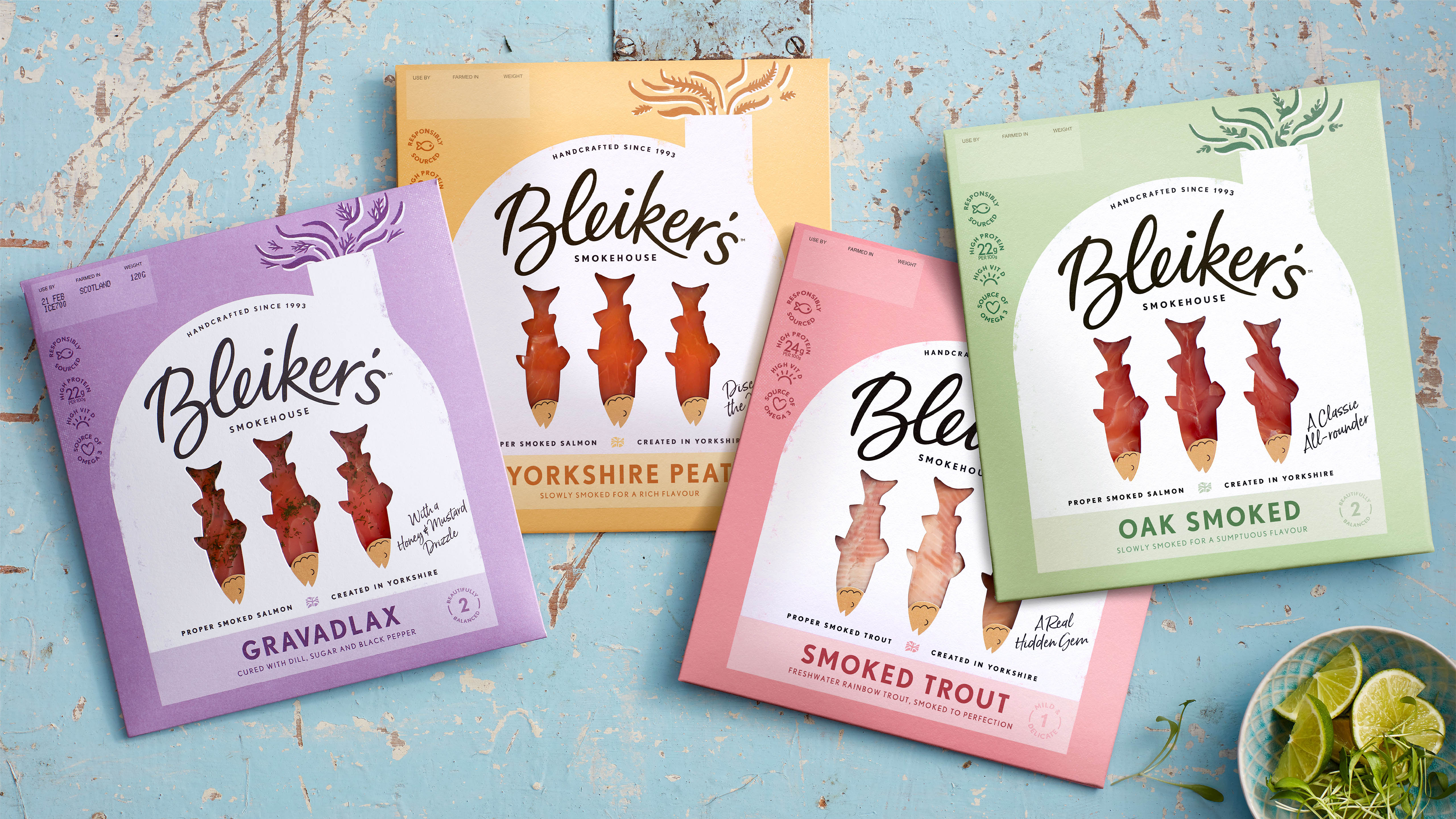
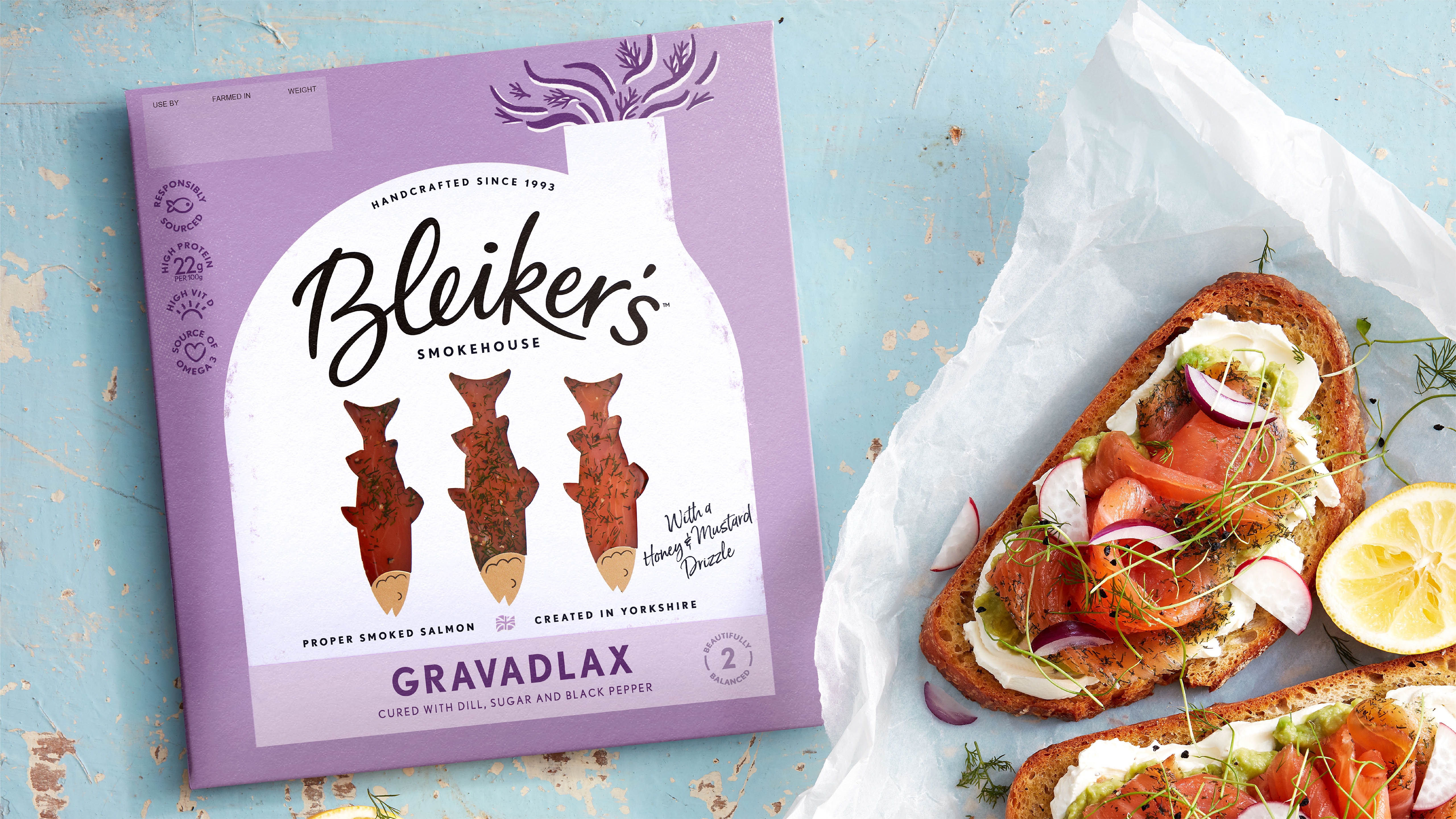
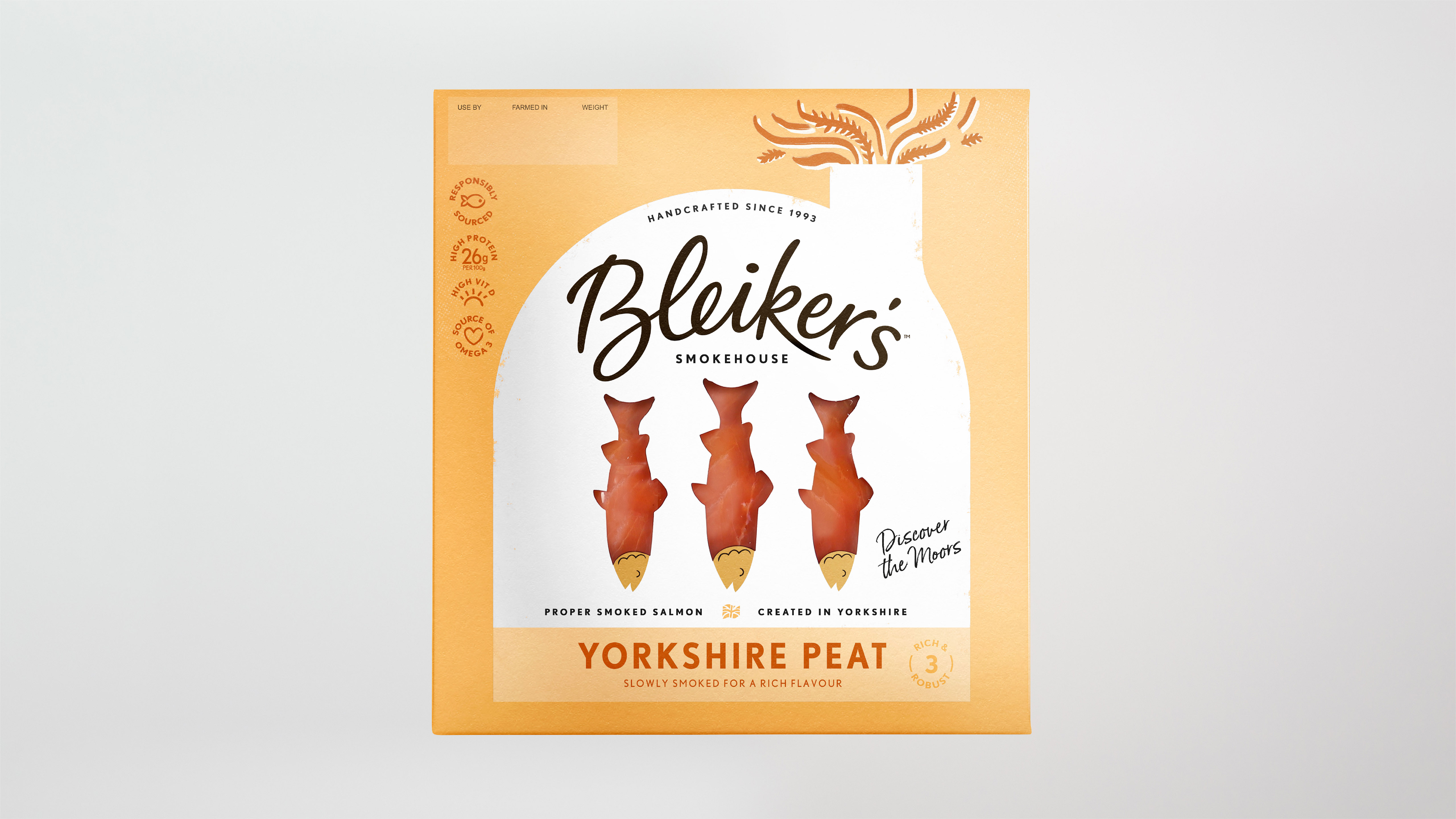
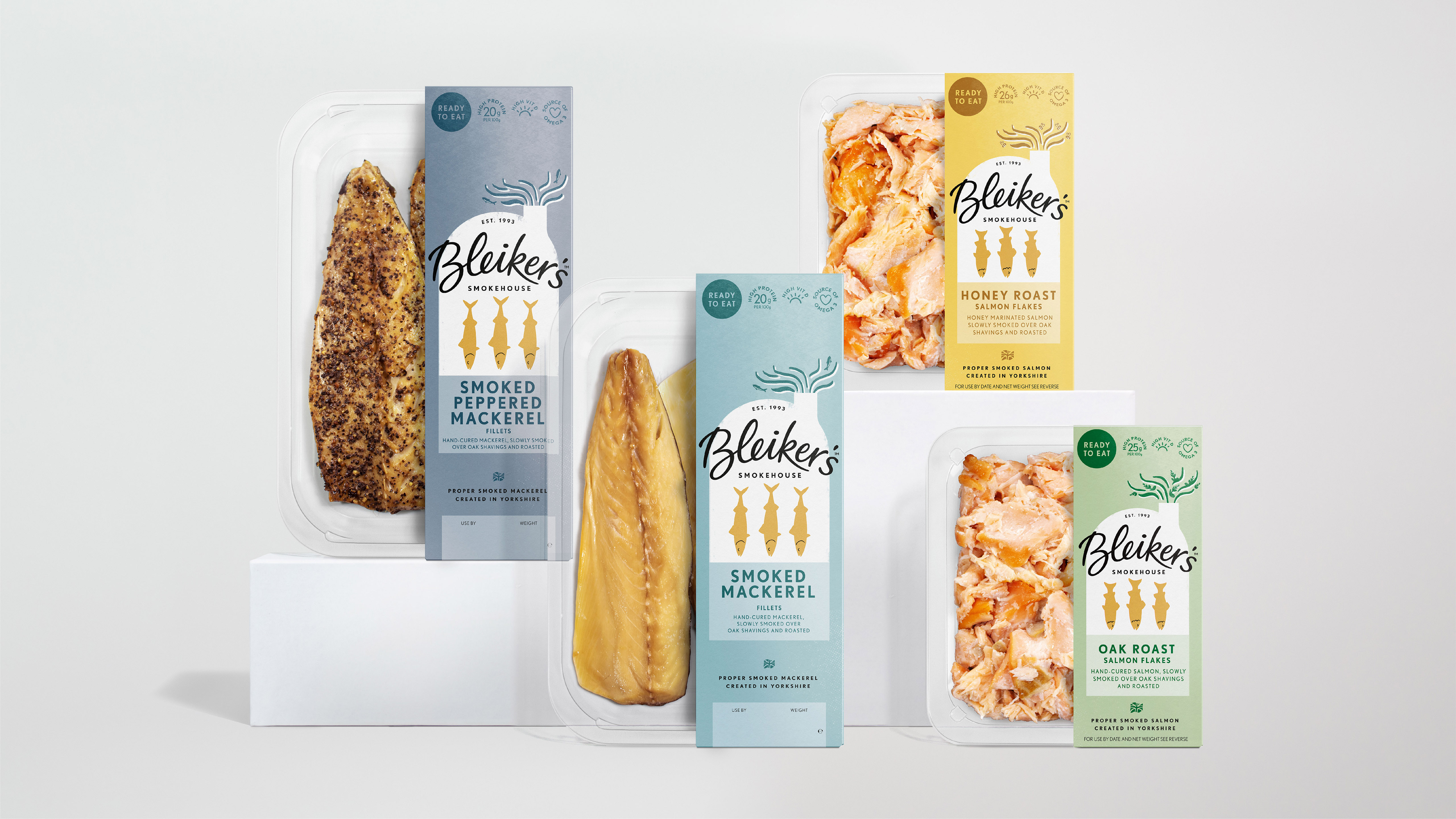
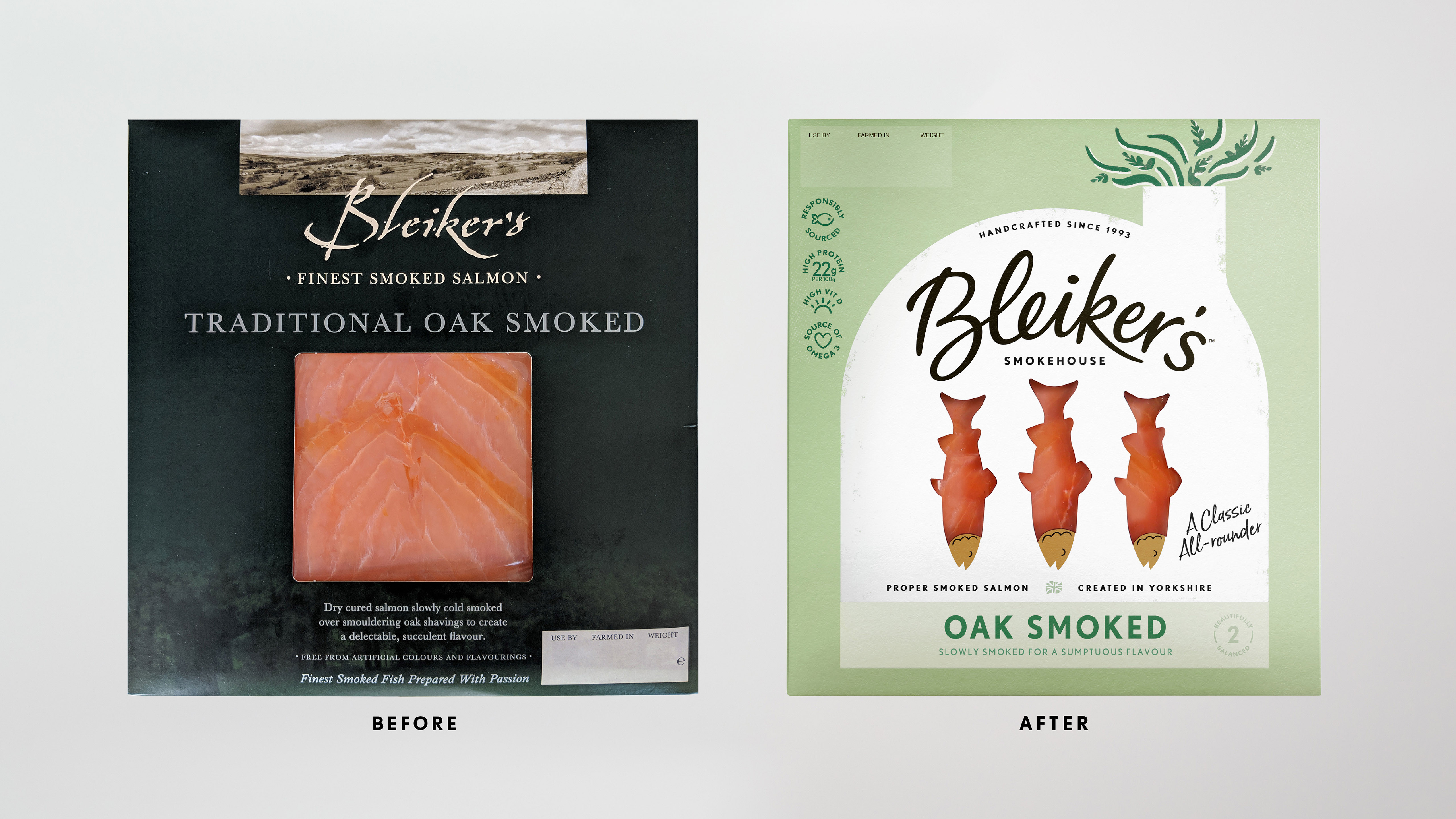
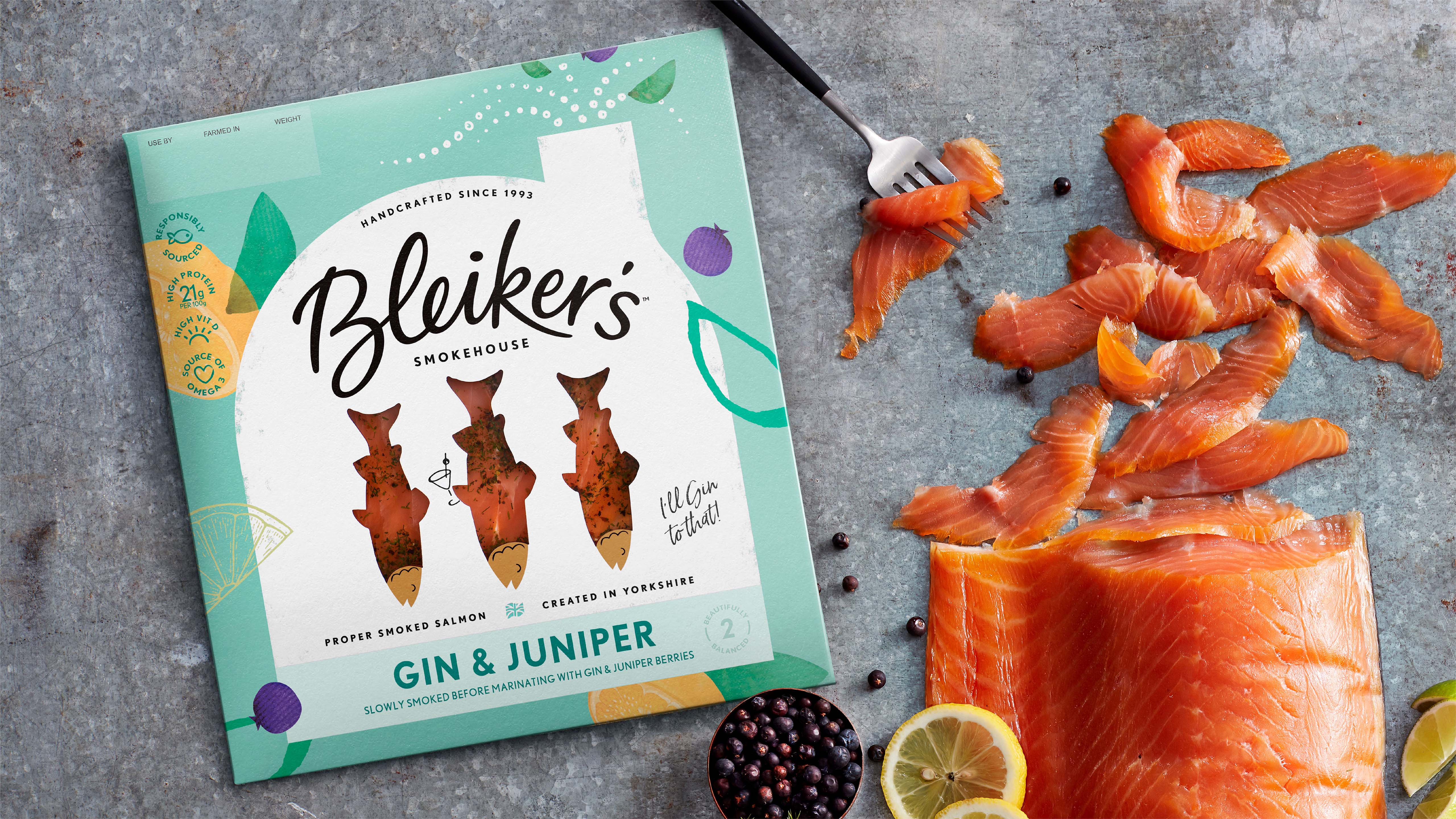
This story is expressed on the packaging through the utilisation of bold and consistent smokehouse architecture, bellowing out the fragrant smoky flavours while framing the fish which also acts as a product window. This radical approach to the window breaks up the square that’s typical of the category and acts as a key element in the packaging’s storytelling of the fish hanging in the smokehouse. Not only does this invite the viewer to witness the process that makes their salmon so good but this combination of elements makes for a brand architecture that feels fresh, fun and flavourful, stepping away from the dark landscapes and typical premium cues, making for big stand out on shelf.
The smokehouse remains consistent across all packs, indicating authority and quality, with a simple and proud Yorkshire tone, whilst everything around the house adapts to each variant. The white of the smokehouse was chosen to deliver freshness, to create contrast between the product window and the flavour variant and to set Bleiker’s apart from competitors. The background colours were guided by the flavour of each variant, creating taste anticipation in the viewer. The fresh colours also counteract the dark shelving in-store, making the pack visible from a long distance in the chilled aisle. As for the paper stock, an uncoated card was used to increase premiumness and break away from the shiny own label finish.
The Bleiker’s logotype has been bespokely hand drawn capturing an expressive and proud Yorkshire spirit. It harks back to the old design through the shapes of some of the letters to create familiarity for existing Bleiker’s consumers but not holding back on modernising. It sits at the focal point, boldly anchored in the smokehouse itself. The fish have subtle smiling faces to help build a friendlier feel to the brand.
The smiling fish coupled with the hand written detail captures the ‘Yorkshireness’ of the company and brings a touch of humour to an otherwise over-serious category. These also become fun devices on the seasonal editions.
The smokehouse architecture seamlessly adapts to different packaging formats across the portfolio, delivering the same consistency. A tall side wallet structure was developed to premiumise the flakes and mackerel packs, allowing the smokehouse pride of place, again adding differentiation to anything else on the shelf.
With a growing range of 12 core products and a long list of exciting flavour innovations in the pipeline, Bleiker’s now has a distinctive set of unique brand assets to future-proof the brand and allow for effective yet easy introductions of additional NPDs. It’s clear to say, no one does Smokecraft quite like Bleiker’s!
After overwhelmingly successful feedback from focus groups, the rebrand launched at the end of January with hugely positive response from both buyers and consumers, sealing new listings across major supermarkets nationally.
CREDIT
- Agency/Creative: Kiss Branding
- Article Title: Transforming Smoked Salmon: Kiss Rebrands Bleiker’s Smokehouse
- Organisation/Entity: Agency, Published Commercial Design
- Project Type: Packaging
- Agency/Creative Country: United Kingdom
- Market Region: Europe
- Project Deliverables: Brand Architecture, Brand Experience, Brand Guidelines, Brand Identity, Brand Redesign, Brand Refinement, Brand Rejuvenation, Brand Strategy, Branding, Graphic Design, Identity System, Illustration, Packaging Design, Product Architecture, Rebranding, Research, Tone of Voice
- Format: Sleeve
- Substrate: Pulp Paper


