


Infused Co. is a premier coffee brand based in Kuwait, dedicated to revolutionizing the coffee experience with its unique beans infused with spices, fruits, and distinct flavors. Our mission is to offer a novel approach to coffee, setting us apart in the market as a brand that delivers exclusivity, modernity, refinement, and high standards.
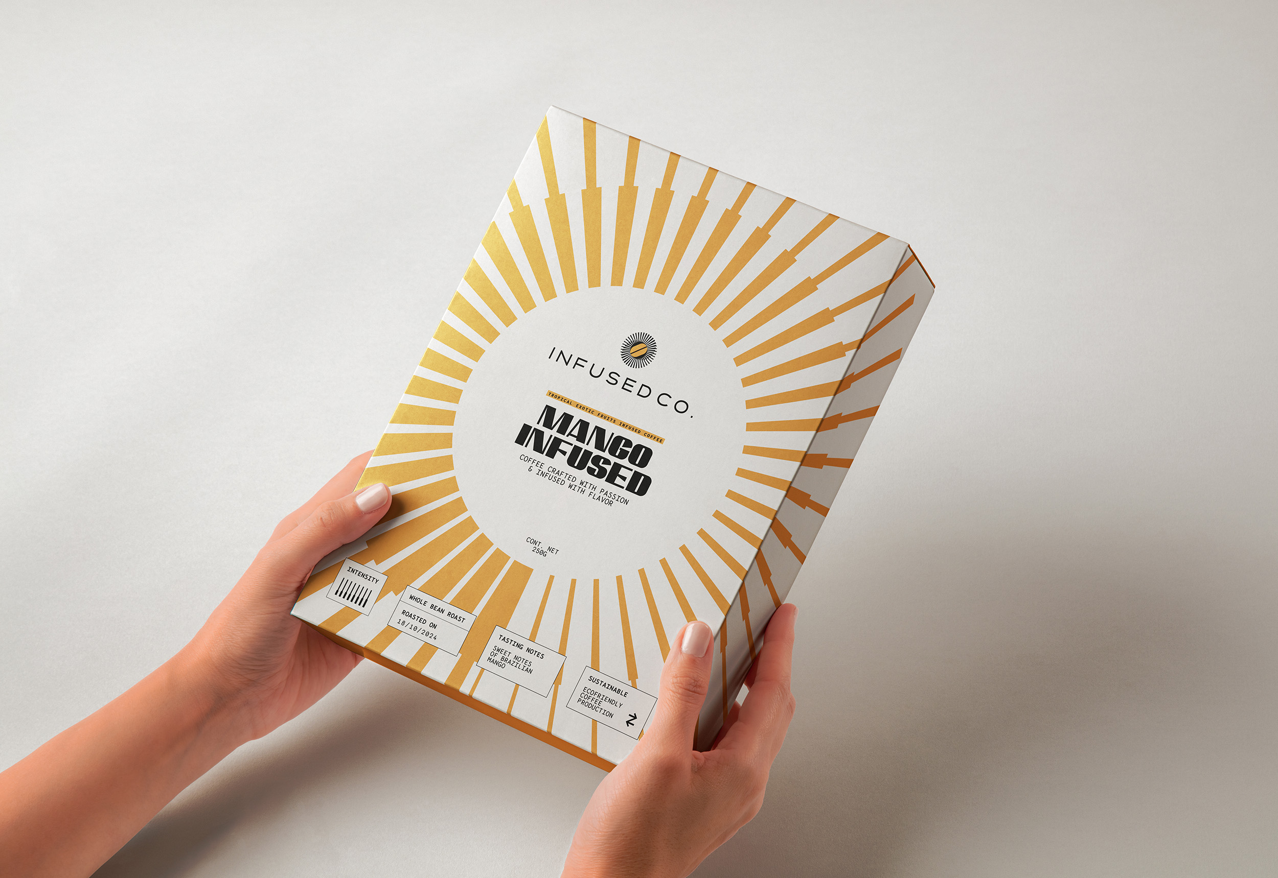
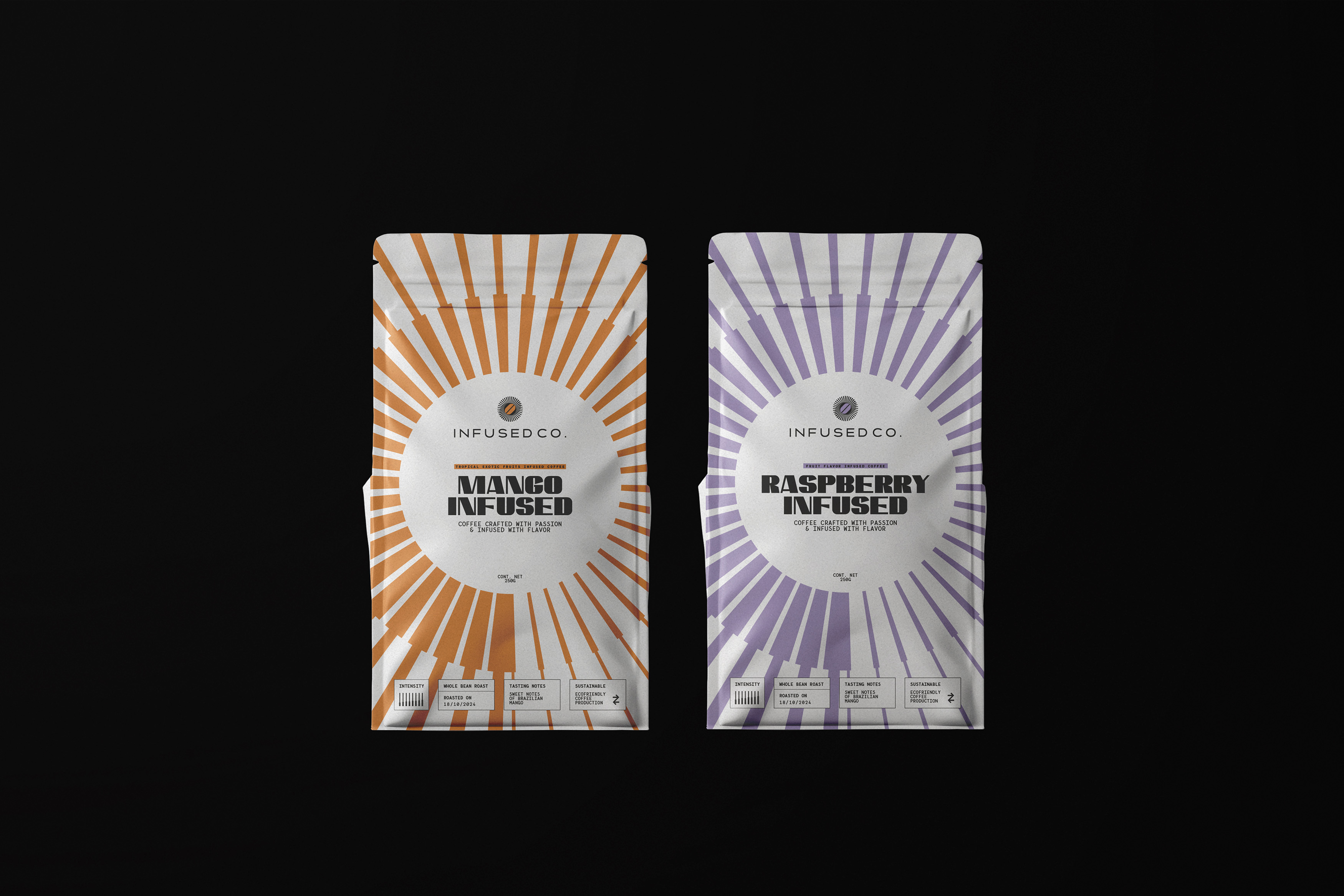
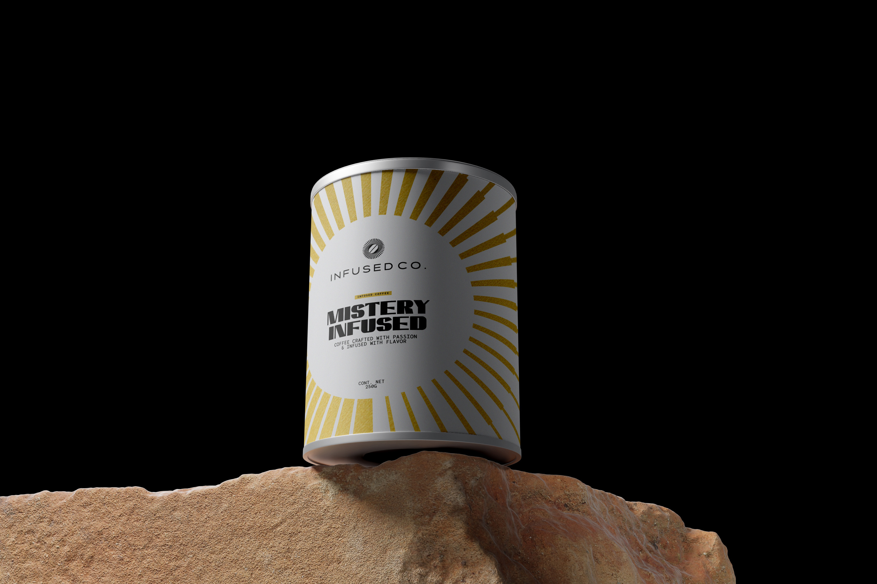
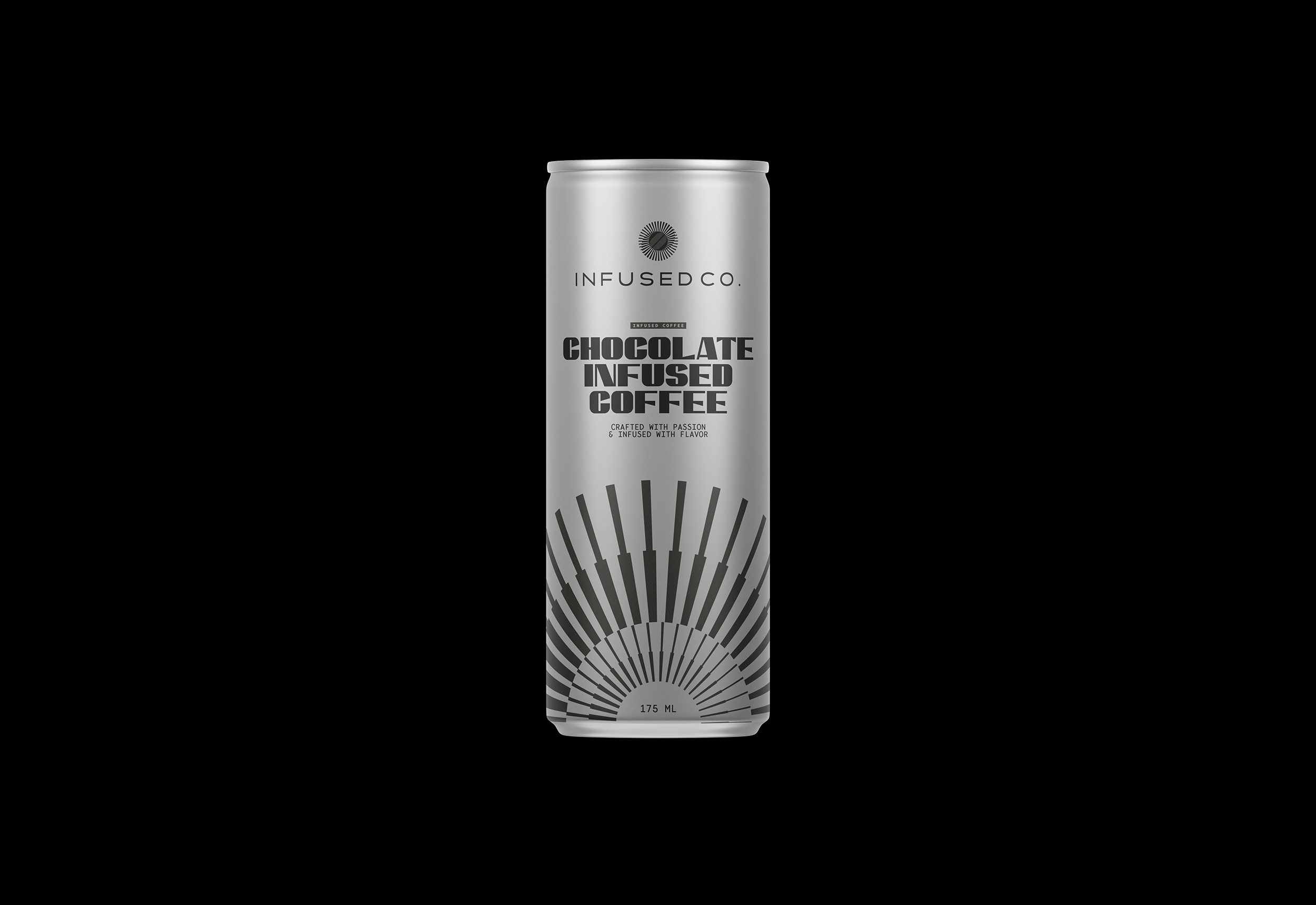
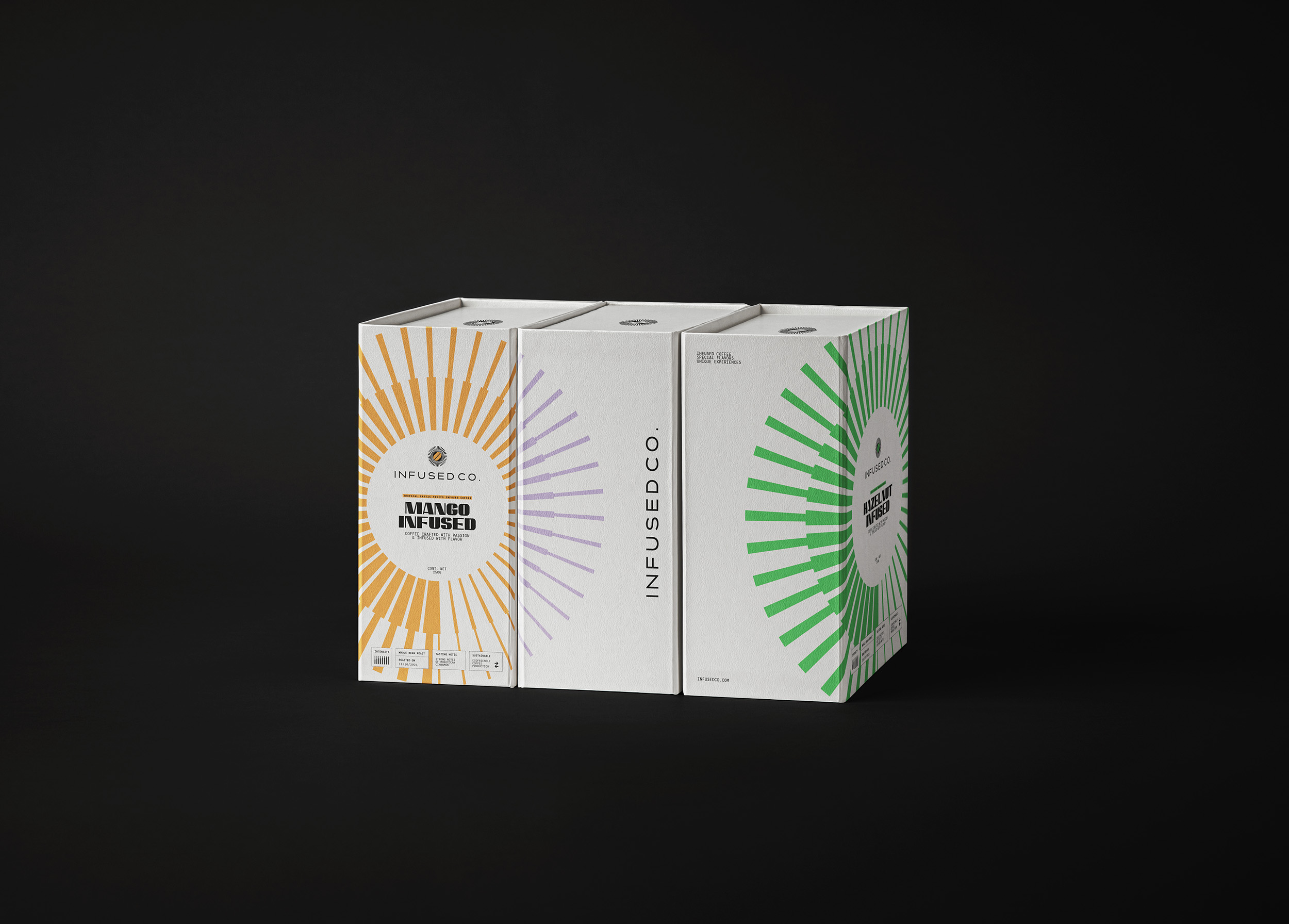
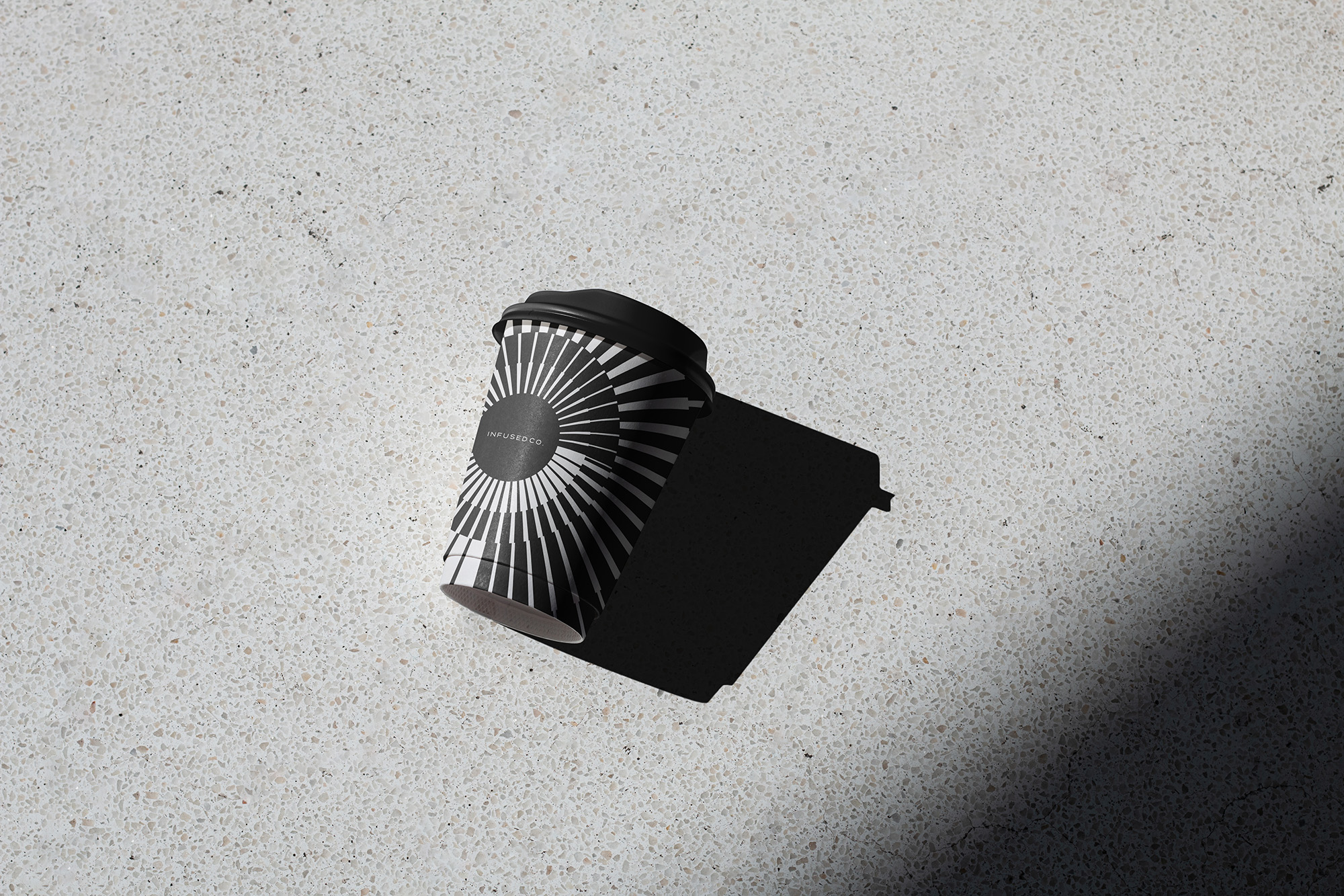
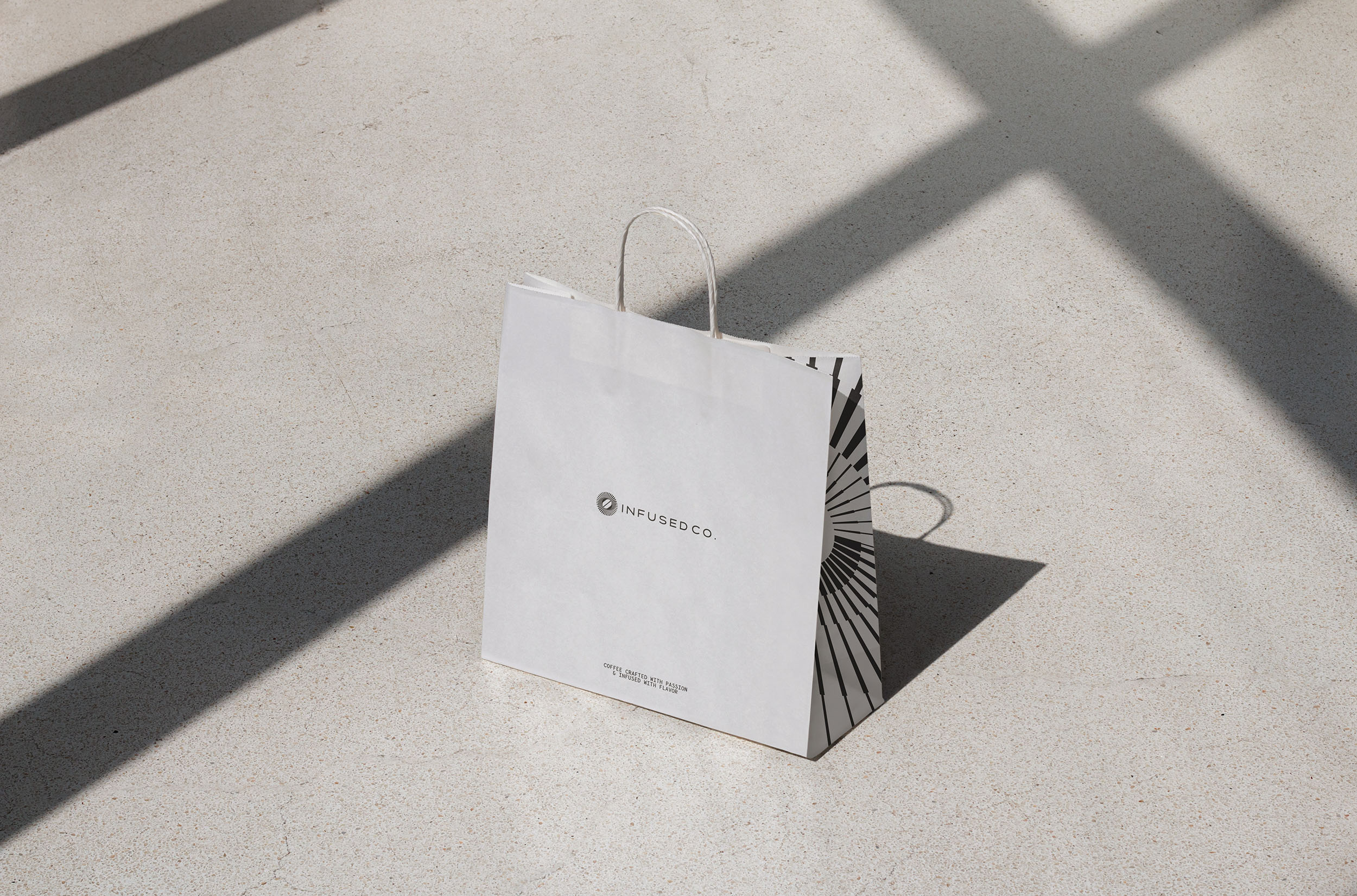
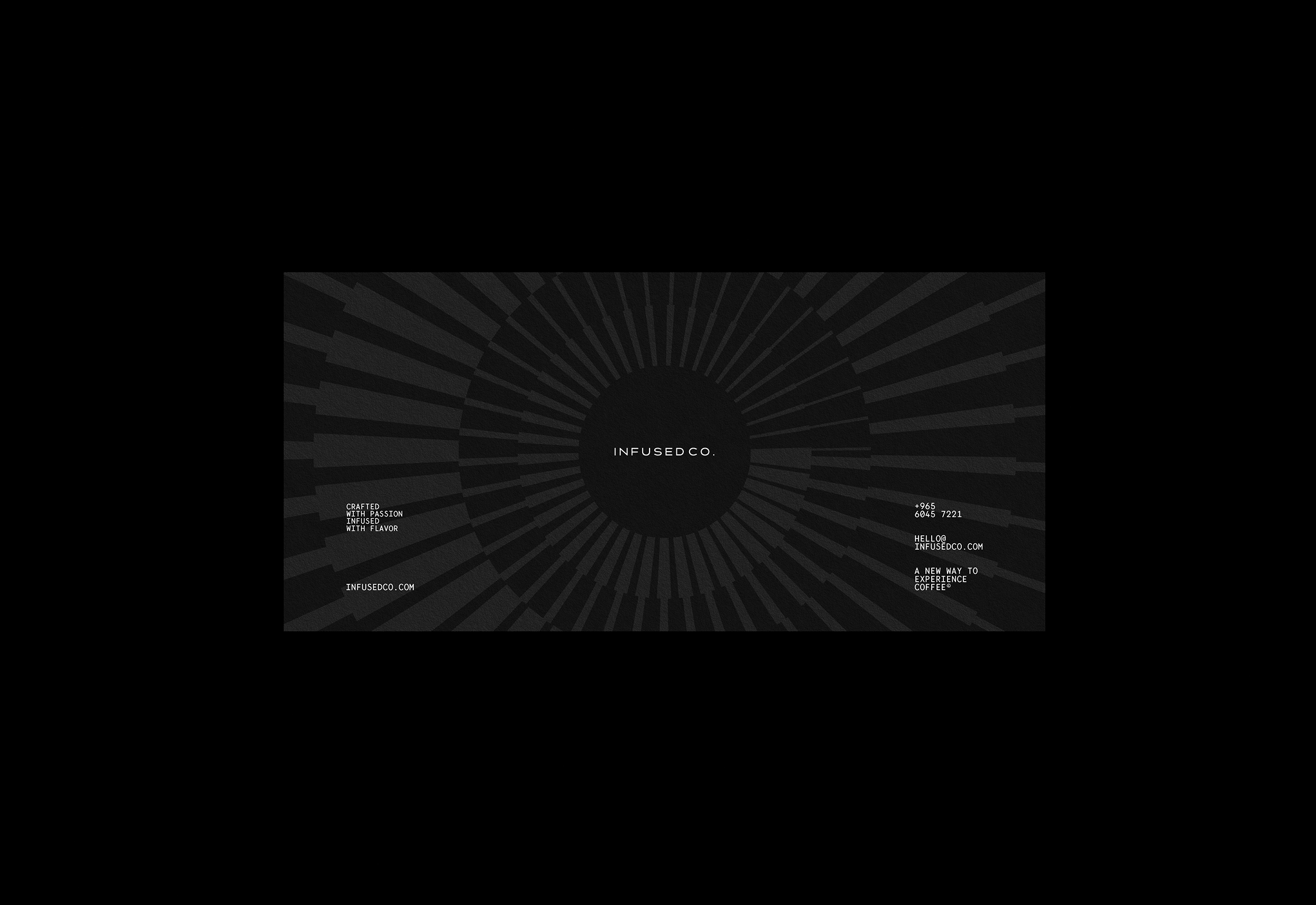
Visual Identity: The visual identity of Infused Co. is designed to reflect our brand’s unique proposition and premium positioning. Central to our branding is a spiral symbol, which represents the infusion process of coffee with water. This symbol not only signifies the blending of flavors but also evokes a sense of continuous movement and transformation, mirroring the dynamic experience we offer with every cup.
Graphic Elements: The graphic elements used in our visual identity are inspired by the shapes present in the logo, creating a cohesive and harmonious design language. These elements are employed across various brand touchpoints, reinforcing our distinct visual style and making our packaging instantly recognizable.
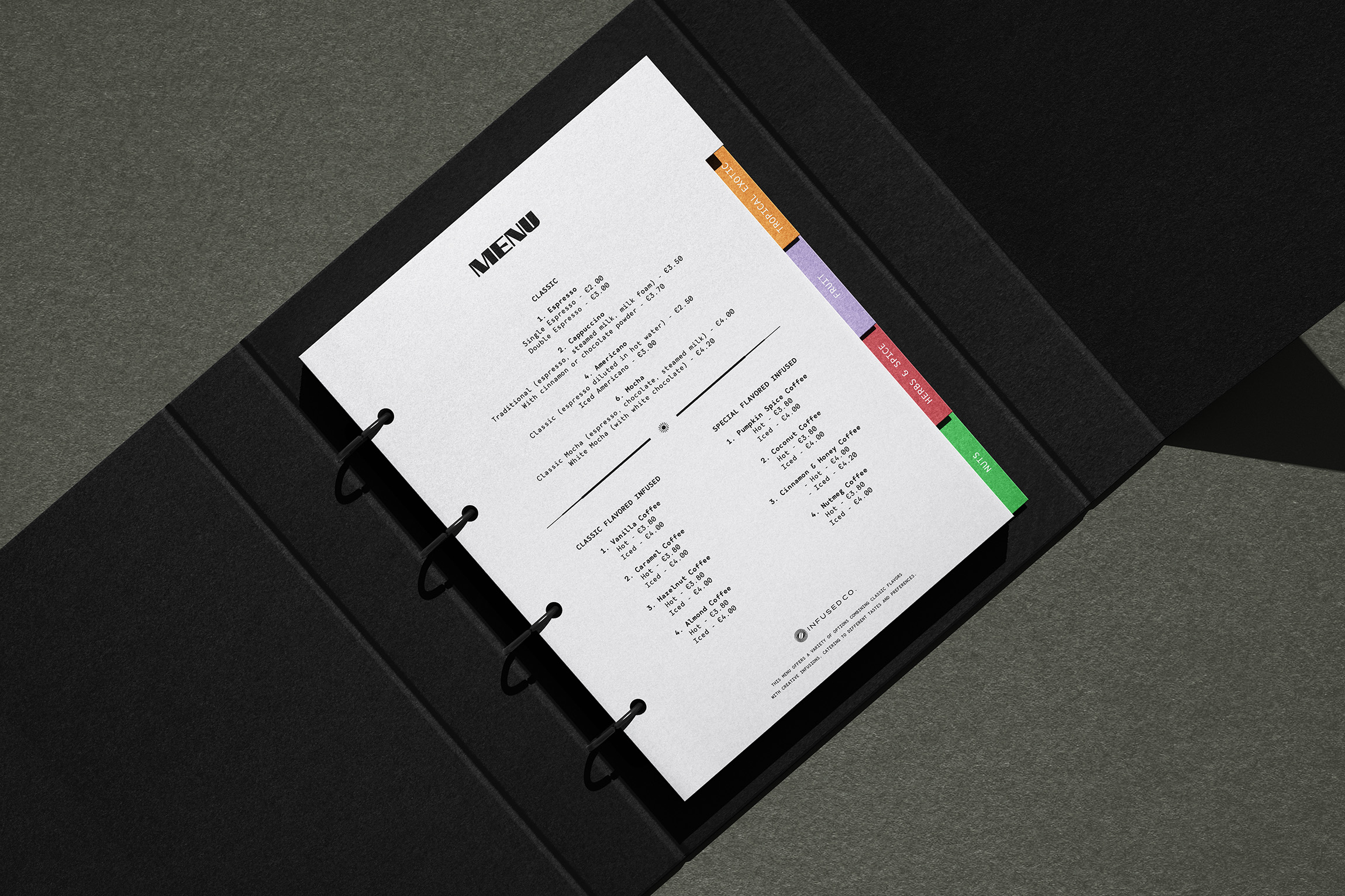
Typography: For the typography, we chose a monospace typeface with a strong weight and pronounced personality. This choice adds a modern and sophisticated touch to our branding, while also ensuring clarity and readability. The unique combination of these typographic elements with our graphic design creates a visual identity that is original and unmistakable.
Packaging Design: The packaging for Infused Co. is crafted to not only protect our premium coffee beans but also to convey the essence of our brand. As one of the primary touchpoints with our audience, the packaging received special attention to incorporate the key visual assets of Infused Co.’s identity. Each package features the spiral symbol prominently, along with the cohesive graphic elements and typography, ensuring a sleek and elegant presentation. The design is intended to stand out on the shelves, attracting coffee enthusiasts who seek a high-quality, innovative coffee experience.
In summary, the visual identity and packaging design for Infused Co. capture the brand’s essence and promise to transform the coffee experience. By combining modern aesthetics with elements that highlight the infusion process, we create a memorable and distinguished brand presence in the market.
CREDIT
- Agency/Creative: Rafael Guedes Design Studio
- Article Title: Transforming Infused Co. Coffee Experience with Visual Identity and Packaging Design by Rafael Guedes Design Studio
- Organisation/Entity: Freelance
- Project Type: Packaging
- Project Status: Published
- Agency/Creative Country: Brazil
- Agency/Creative City: Rio de Janeiro
- Market Region: Asia
- Project Deliverables: Brand Creation, Brand Design, Brand Strategy, Branding, Packaging Design
- Format: Bag, Box, Can, Cup
- Industry: Food/Beverage
- Keywords: coffee, coffe packaging, branding, visual identity, packaging design, coffee logo
-
Credits:
Creative Design Director: Rafael Guedes


