


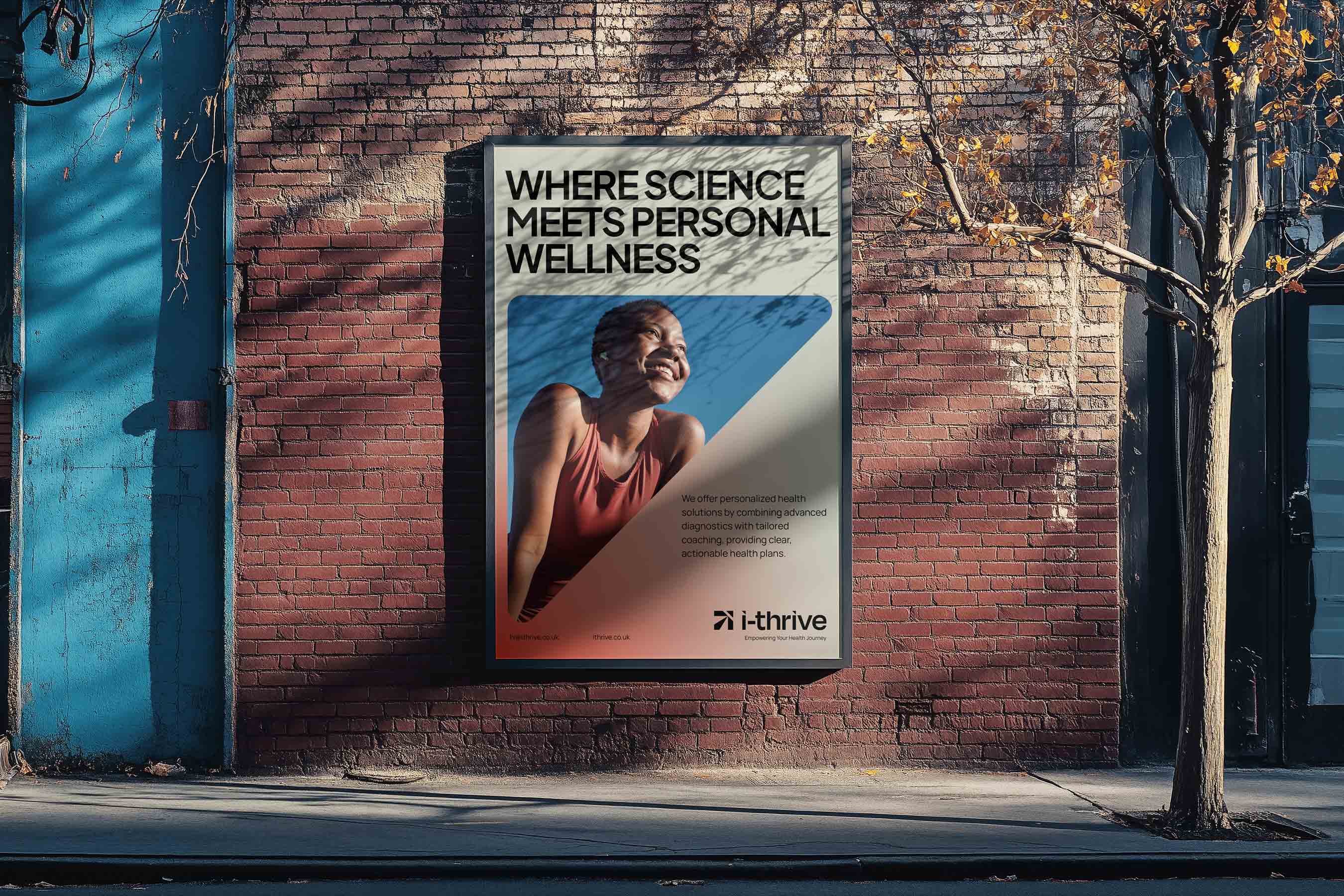
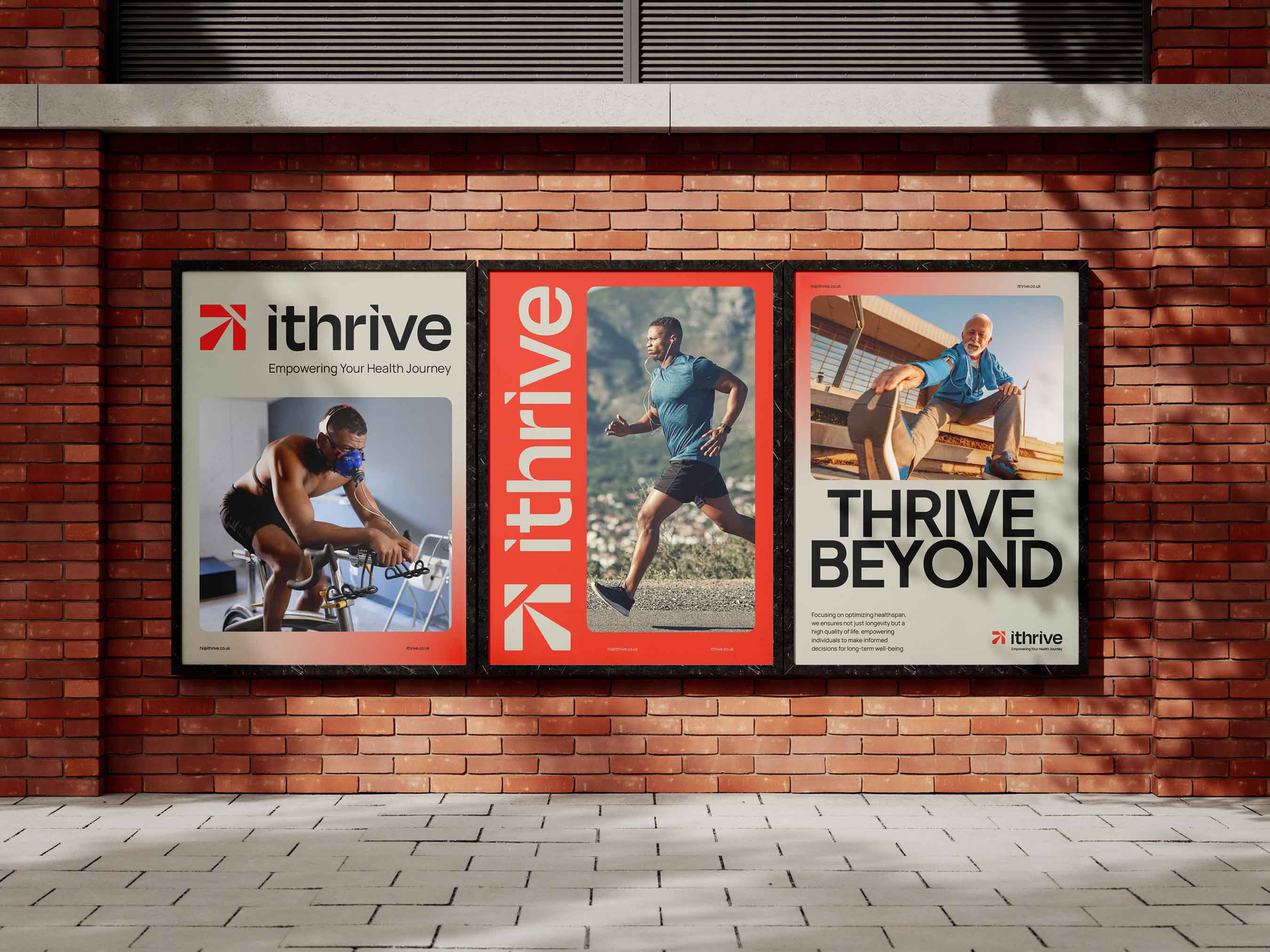
In the competitive health and wellness sector, standing out requires more than quality services—it demands a cohesive and memorable brand identity. This case study examines how our branding agency transformed i-Thrive, a UK-based healthspan clinic founded by Jodi and Mark Zibser, into a distinctive and trusted brand through a comprehensive visual identity overhaul. i-Thrive’s unique approach integrates advanced diagnostics, personalized coaching, and specialized wellness programs for various audiences, from mid-age individuals to executives and endurance athletes. However, despite its innovative model, the clinic faced significant branding challenges, including market fragmentation, a lack of cohesive visual identity, and difficulty differentiating from competitors that focused on only part of the wellness journey.
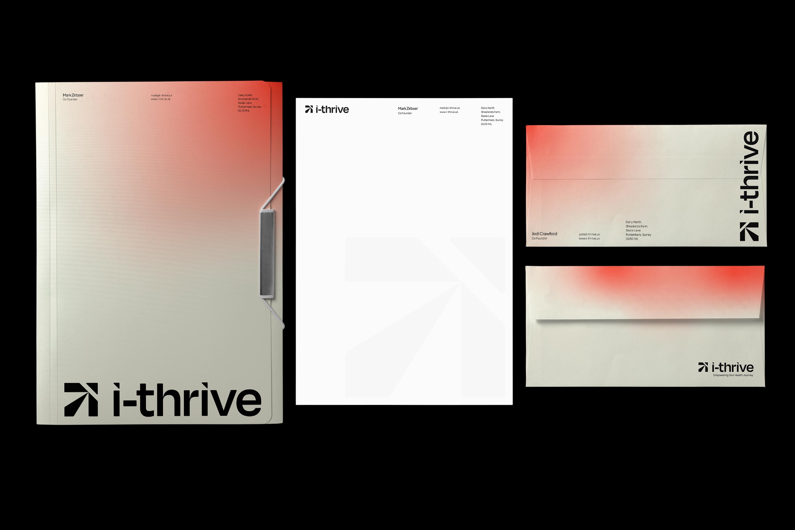
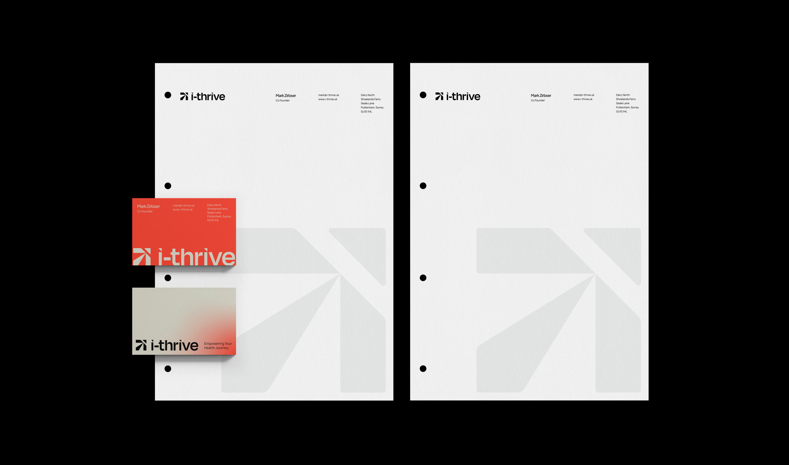
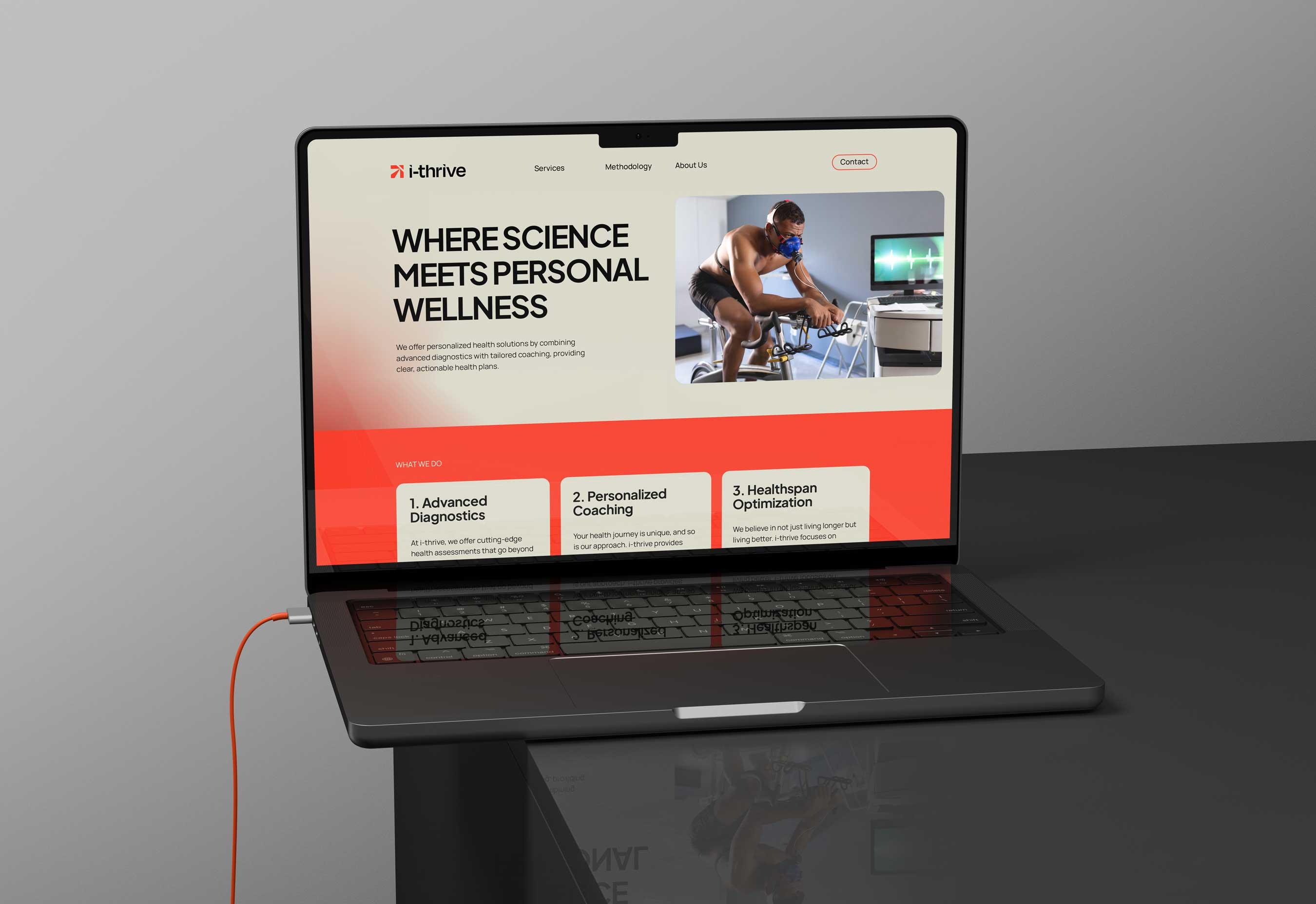
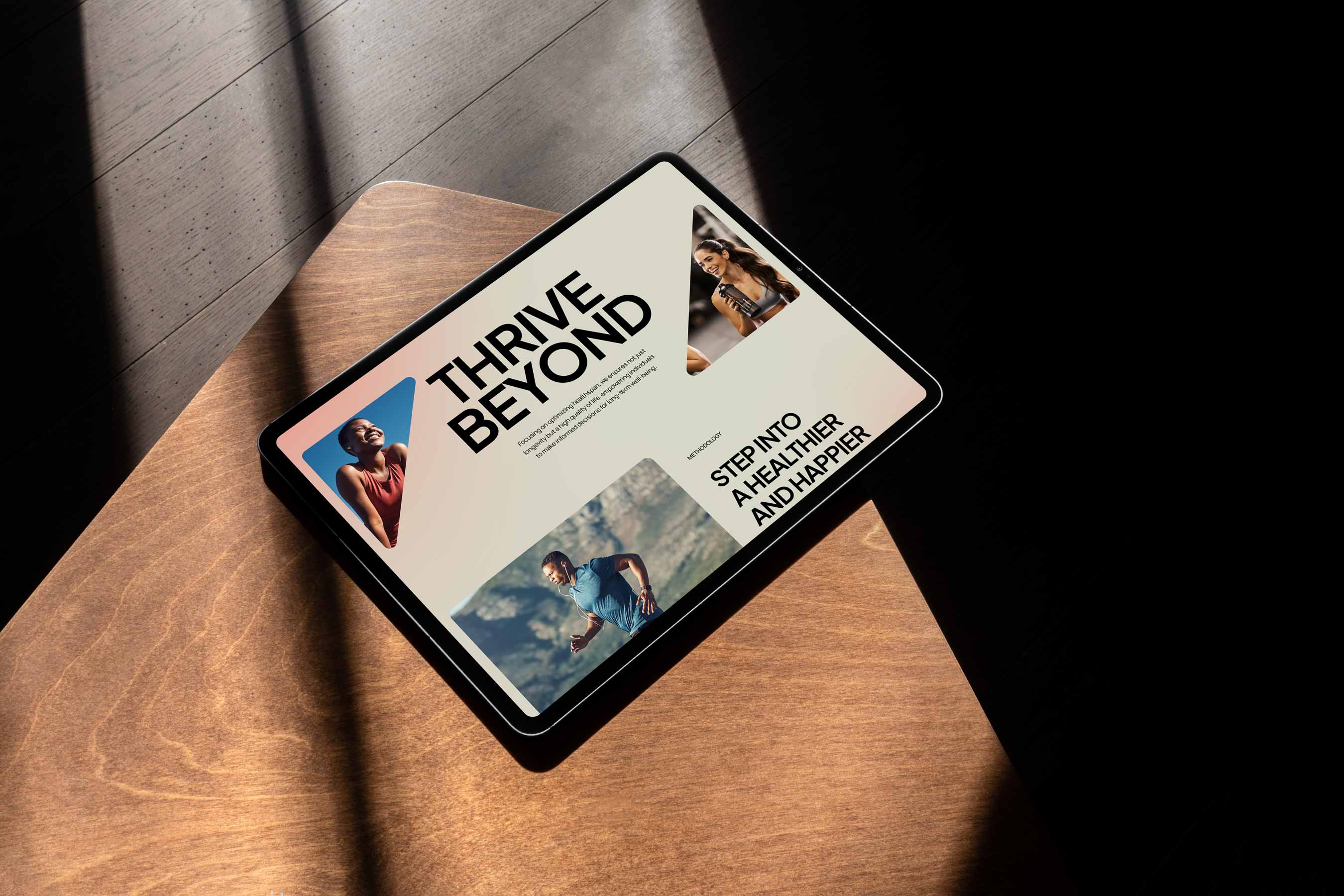
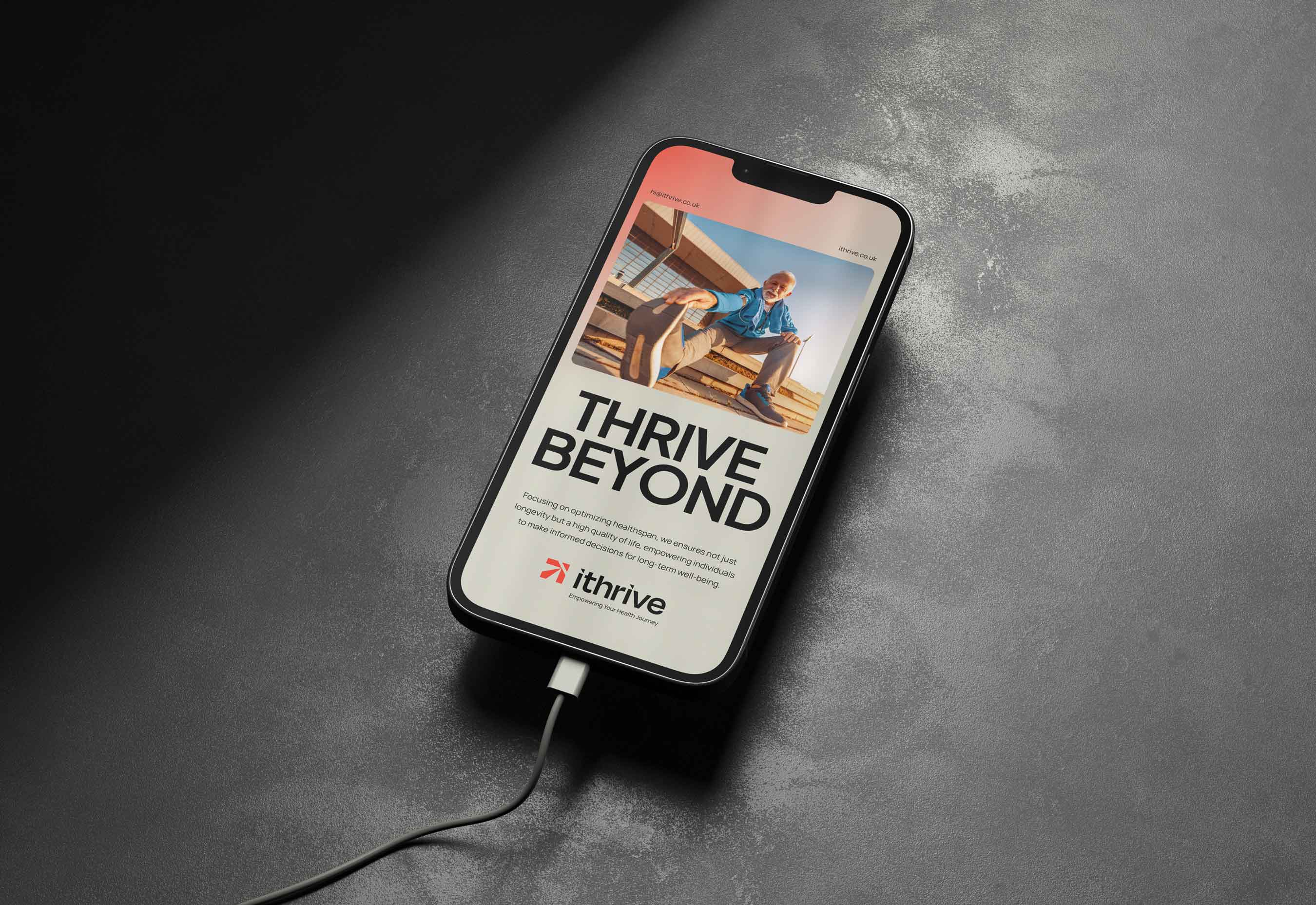
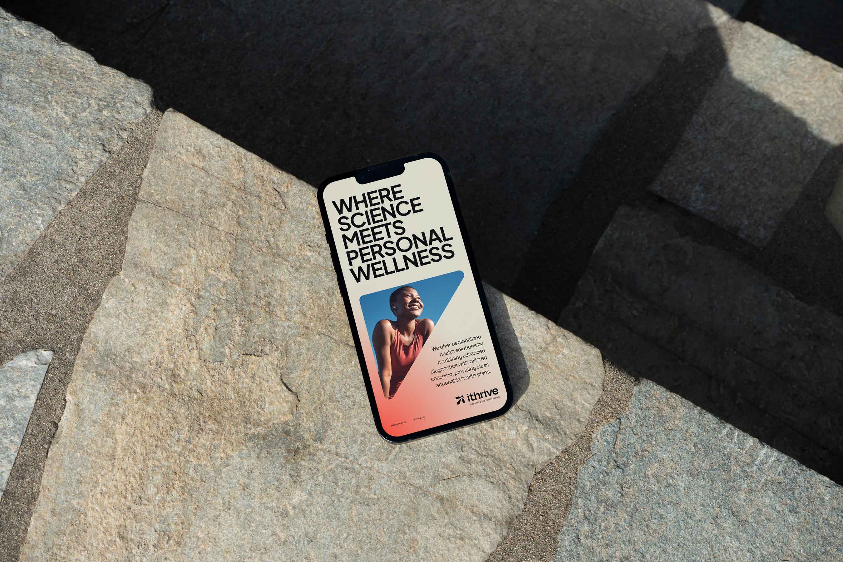
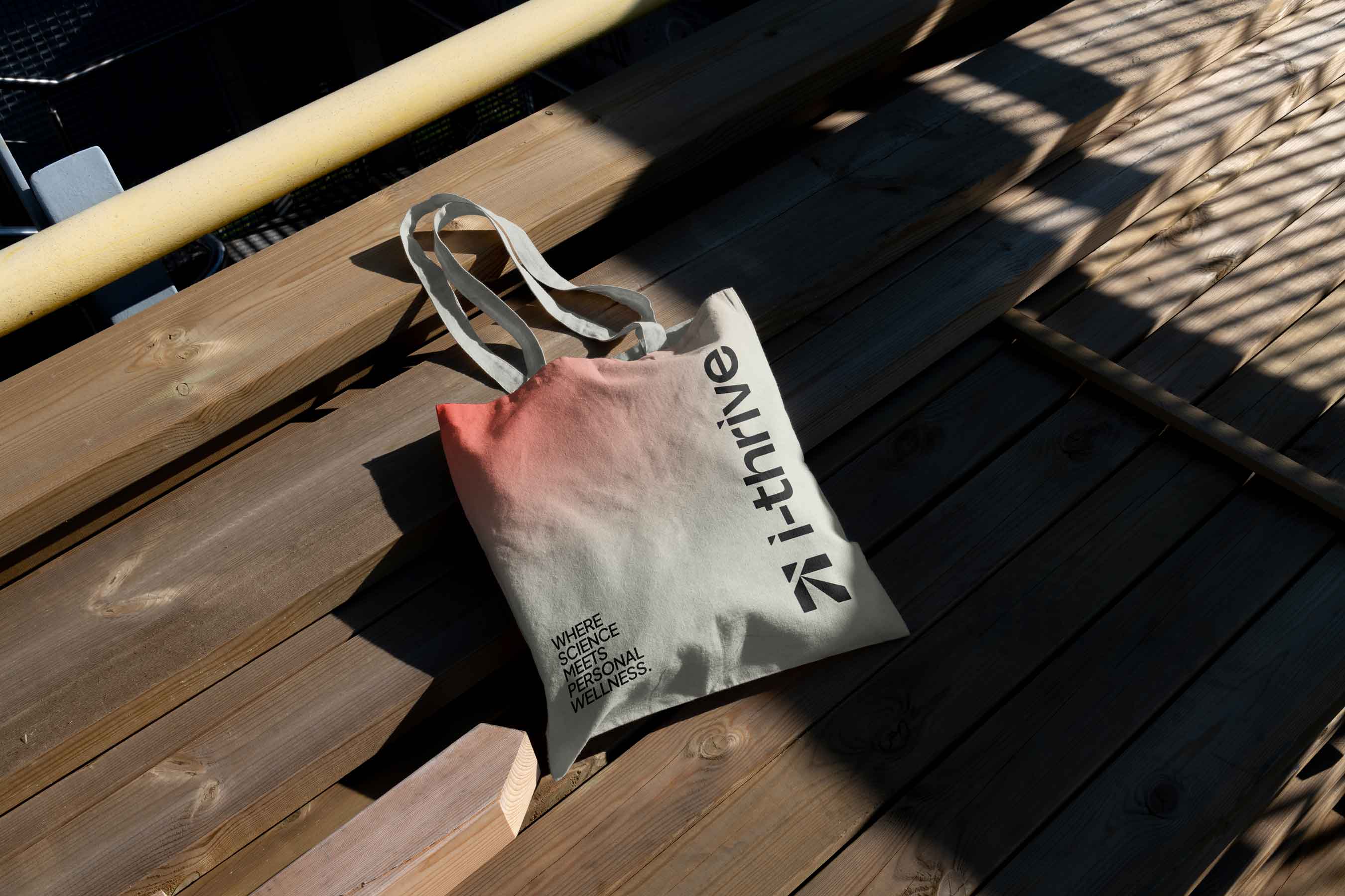
Our process began with an immersion phase, uncovering the founders’ vision, identifying gaps in the market, and mapping the competitive landscape. Research followed, analyzing trends in health and wellness branding, competitor strategies, and the preferences of their health-conscious target audience. This informed the creation of a strategic, modern, and scalable visual identity. The new brand centered on a geometric i+T arrow logo symbolizing progress and transformation, a vibrant coral-red palette to convey vitality, clean geometric typography for a contemporary, science-backed feel, and a structured visual language for consistent application across platforms.
We developed comprehensive brand guidelines detailing logo usage, color systems, typography hierarchy, and visual element applications to ensure lasting consistency. The rebrand repositioned i-Thrive as more than just a diagnostics provider—now clearly perceived as a holistic partner in long-term health transformation. Tangible results included stronger market positioning, improved client perception, enhanced digital presence across website and social media, and a deeper connection with their core audience of executives, athletes, and professionals seeking science-based, personalized wellness solutions.
The project demonstrates how strategic branding, paired with expert design, can elevate a clinic’s visibility, credibility, and client engagement in a crowded marketplace. Today, i-Thrive serves as a prime example of how integrated brand strategy and visual identity can redefine industry standards in health and wellness.

CREDIT
- Agency/Creative: HolmanDesign®
- Article Title: Transforming i-Thrive: How Strategic Branding Redefined a UK Healthspan Clinic’s Market Presence
- Organisation/Entity: Agency
- Project Type: Identity
- Project Status: Published
- Agency/Creative Country: Brazil
- Agency/Creative City: Pelotas
- Market Region: Global
- Project Deliverables: Art Direction, Brand Design, Brand Guidelines, Brand Identity, Graphic Design, Identity System, Logo Design
- Industry: Health Care
- Keywords: i-thrive, branding, brand identity, branding agency, branding for startups, holman design, brand identity agency
-
Credits:
Brand Identity Design: Felipe Correa Holman


