


Bio-kult is trusted by retailers and consumers across the world. New category entrants with clearer navigation and ranging were eating into their market share, highlighting areas where they could do more to engage.
We needed to appeal to new growth audiences with a refreshed, modern look, but without losing the trust of our loyal customers.
The Concept
To appeal to new growth audiences, we modernised core brand assets; new product descriptors and navigation system to make products easy to find, choose and buy, without losing the trust of our loyal customers.
The Impact
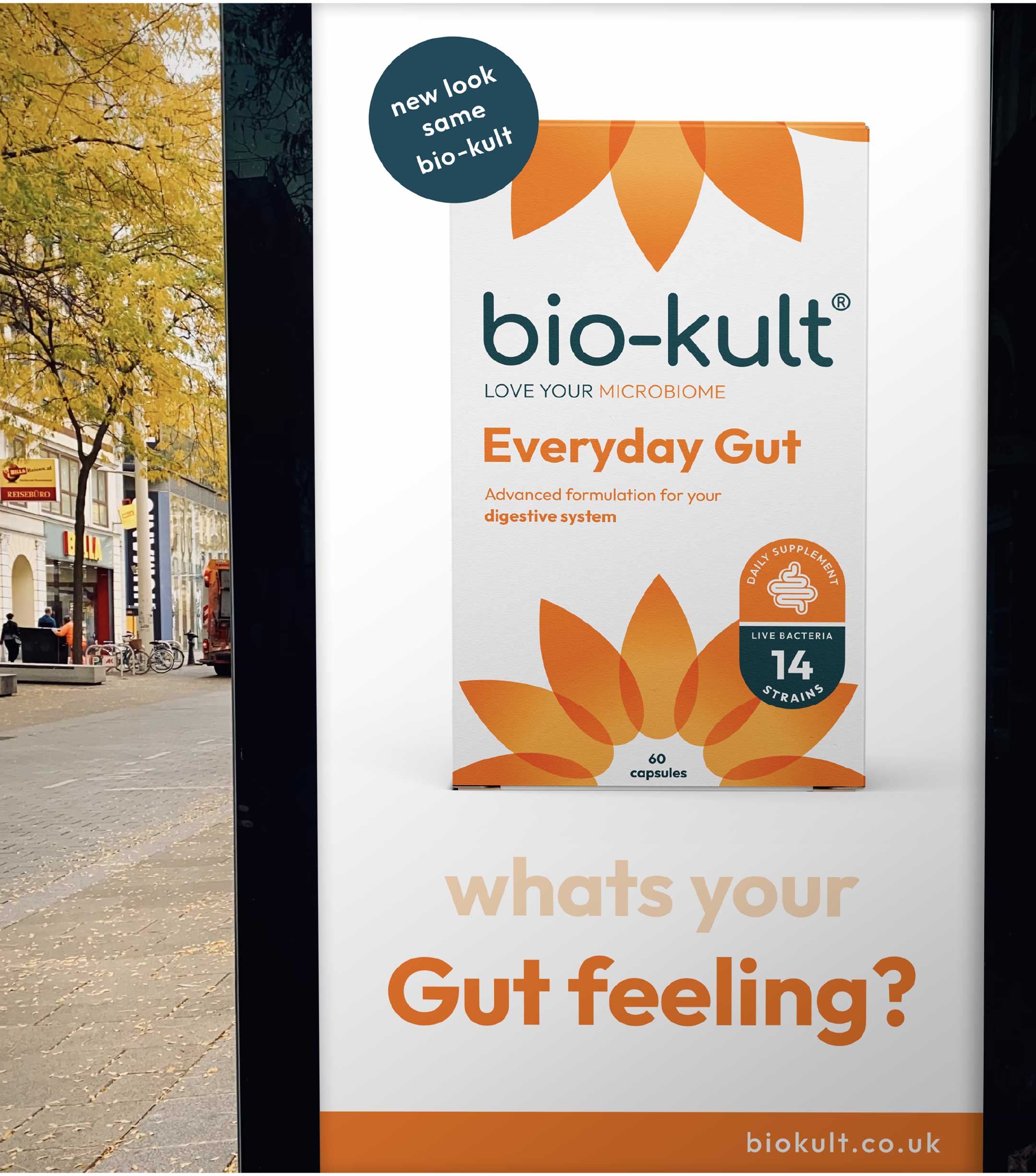
New packaging rolled-out across all major grocery and health stores in the UK.
Awarded Silver by World Brand Society awards.
Positive Change
The existing identity and packaging felt a bit dated, especially when sat alongside new market brands. The messaging was complex and tricky to navigate and brand assets were difficult to use in digital channels.
Most of all it didn’t reflect the new personality of the brand; Bio-Kult wanted to deliver on their Pioneering history, but to appeal to new customers they really wanted to inject some playfulness into the identity. And it had to feel inclusive with less jargon and more accessible navigation of the range and packs.
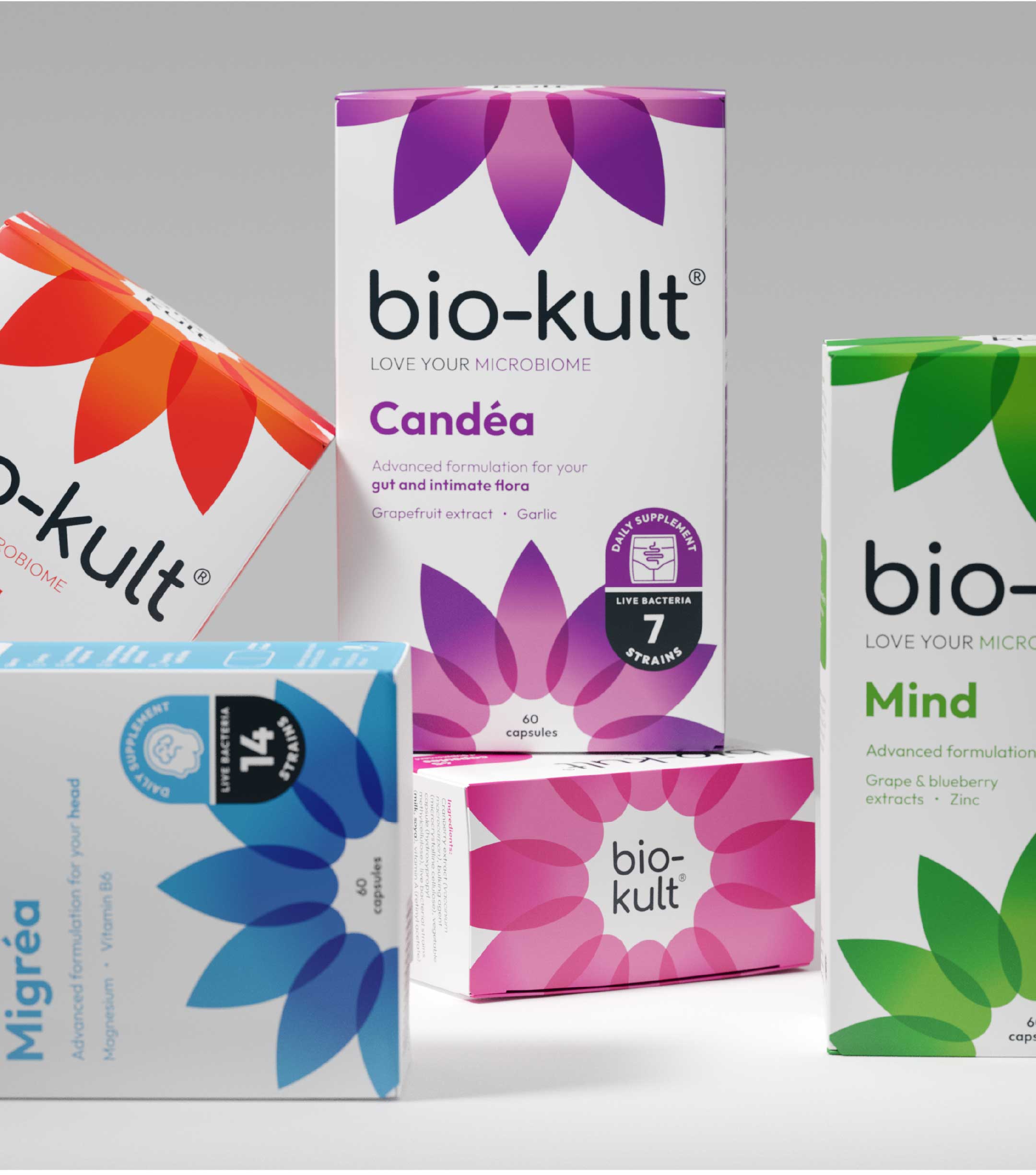
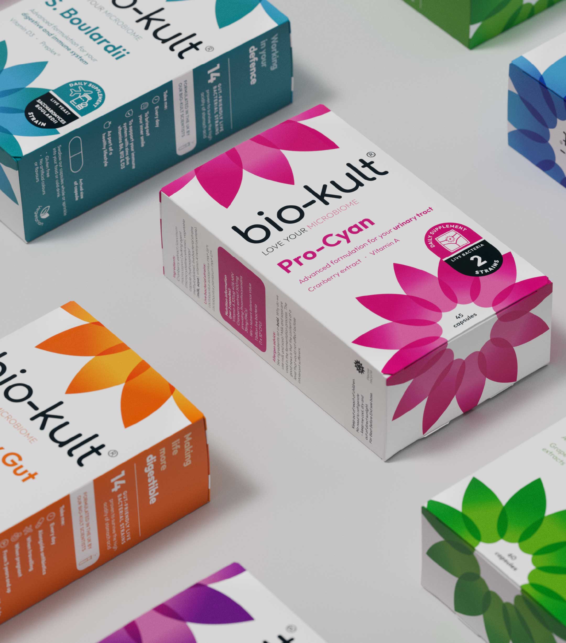
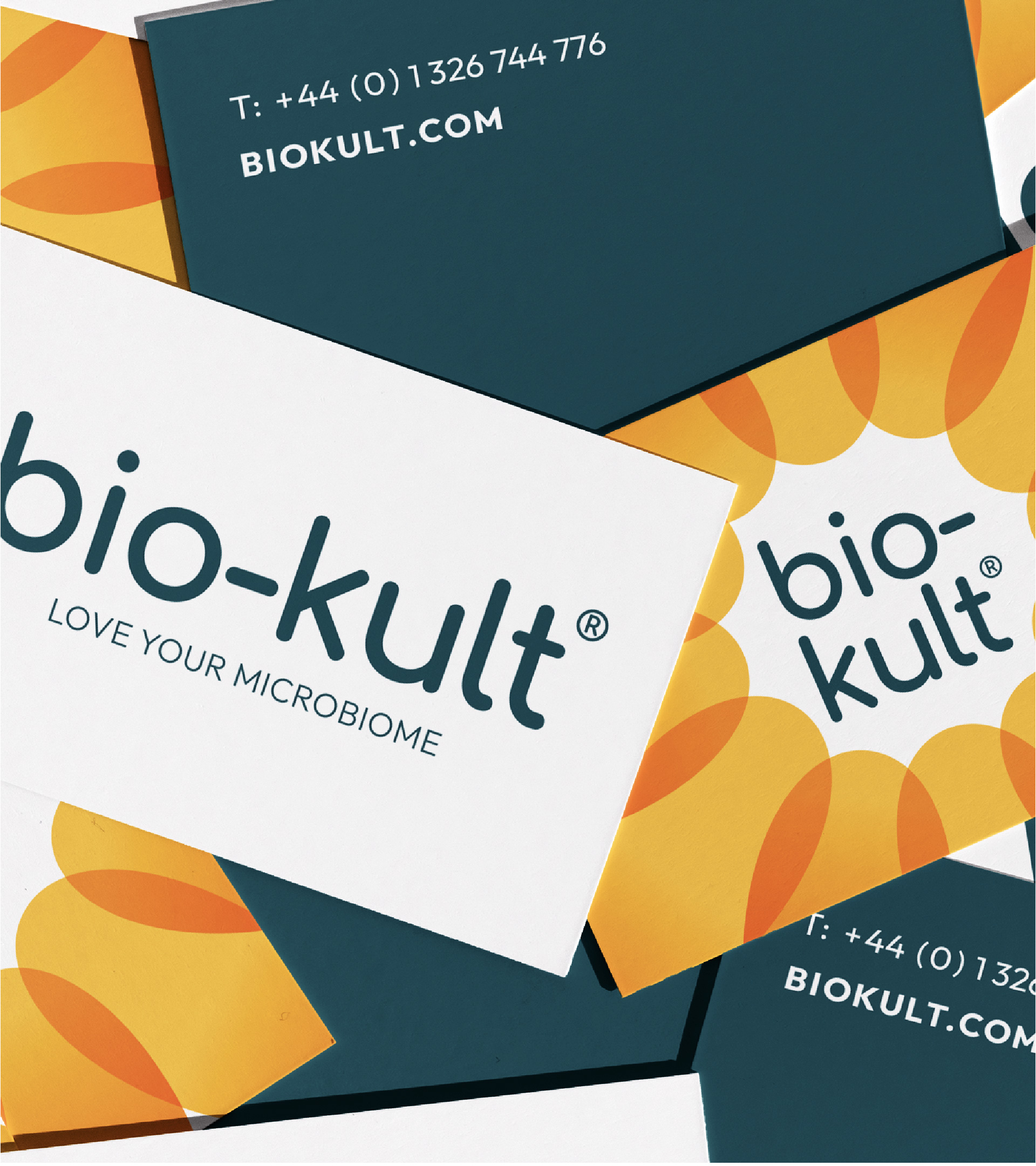
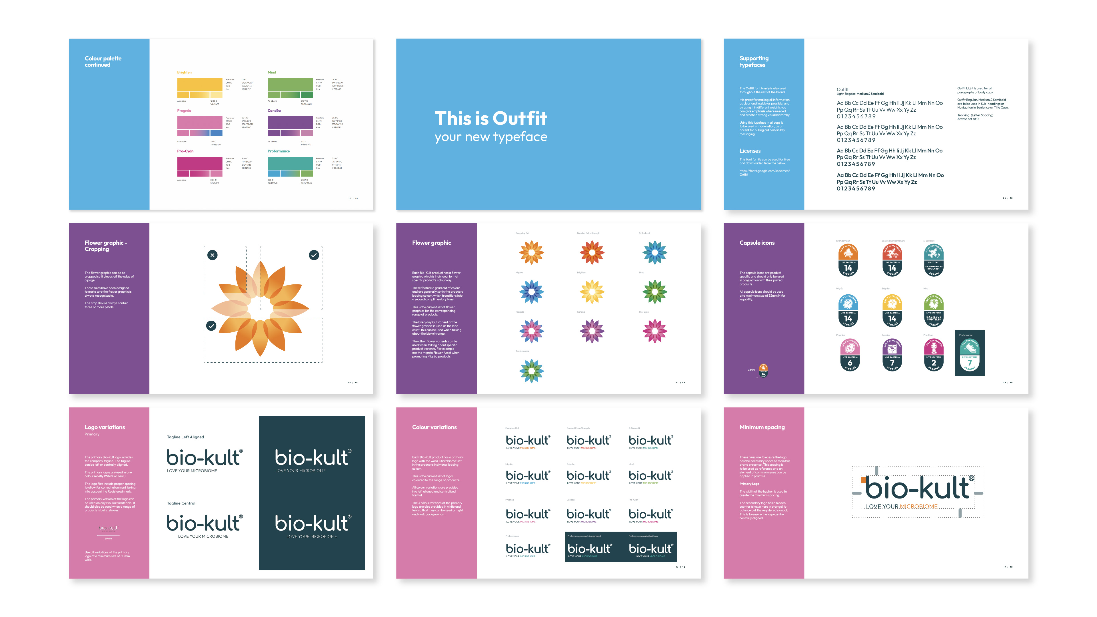
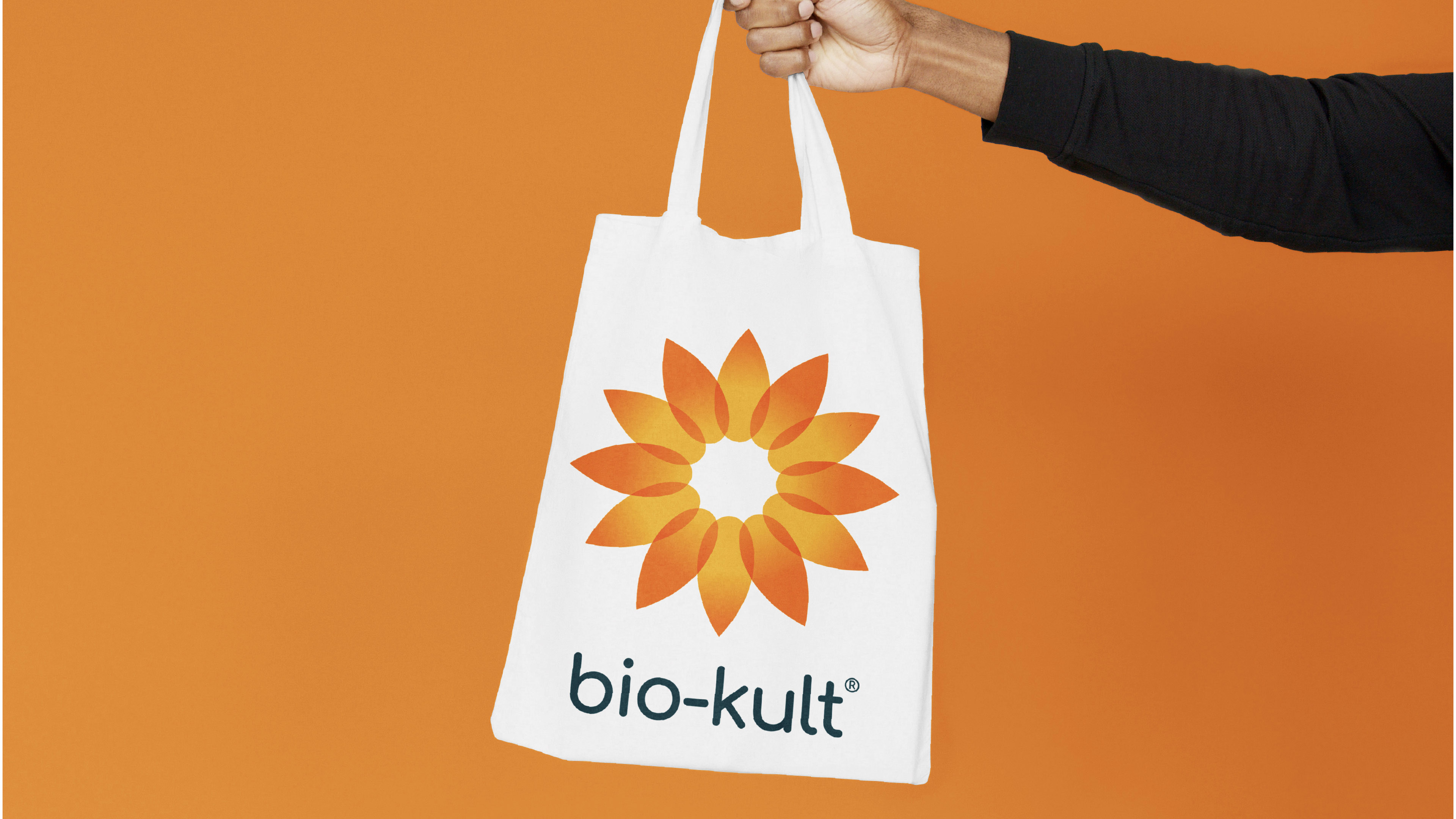
There were some design elements we felt it important to retain. The Bio-Kult flower has been an important identifier for the brand from its inception. But we simplified how the flower looked – still precise, but now less clinical, and more flexible to use. Similarly the logo-mark was updated with a bespoke, more modern, stripped back, yet approachable typeface. It still feels like a trusted brand, but more accessible.
We also created some very clear and engaging icons to make the packs as easy to navigate as possible. Clear illustrations and reasons to purchase made for clear navigation and engagement.
We also evolved the palette for the brand, using bold bright colours and gradients for shelf stand-out, but also allowing ease of navigation across the range.
And this all comes together in the packaging across the range. The colours make it easy to differentiate between product lines. The iconography lands benefits very clearly. And the injection of some personality into the messaging helps break-up the required clinical information with a more playful tone.

CREDIT
- Agency/Creative: Kingdom and Sparrow
- Article Title: Transforming Bio-Kult: The UK’s No.1 Probiotic Brand
- Organisation/Entity: Agency
- Project Type: Packaging
- Project Status: Published
- Agency/Creative Country: United Kingdom
- Agency/Creative City: Falmouth
- Market Region: Global
- Project Deliverables: Brand Design, Brand Guidelines, Brand Identity, Packaging Design, Typography
- Format: Box
- Substrate: Pulp Carton
- Industry: Health Care
- Keywords: Branding design, Kingdom and Sparrow, Typography, Brand guidelines, Brand Identity. Brand Evolution
-
Credits:
Account and Marketing Manager: Deborah Simmonds


