


This project aims to tell a story of preserving traditional gastronomy in Istria. The packaging design of Pazinski cukerančić, an indigenous Istrian delicacy whose art of making is protected as Croatian intangible cultural heritage, reveals the tale detail by detail, making the experience of tasting the famed pastry intriguing and instructive.
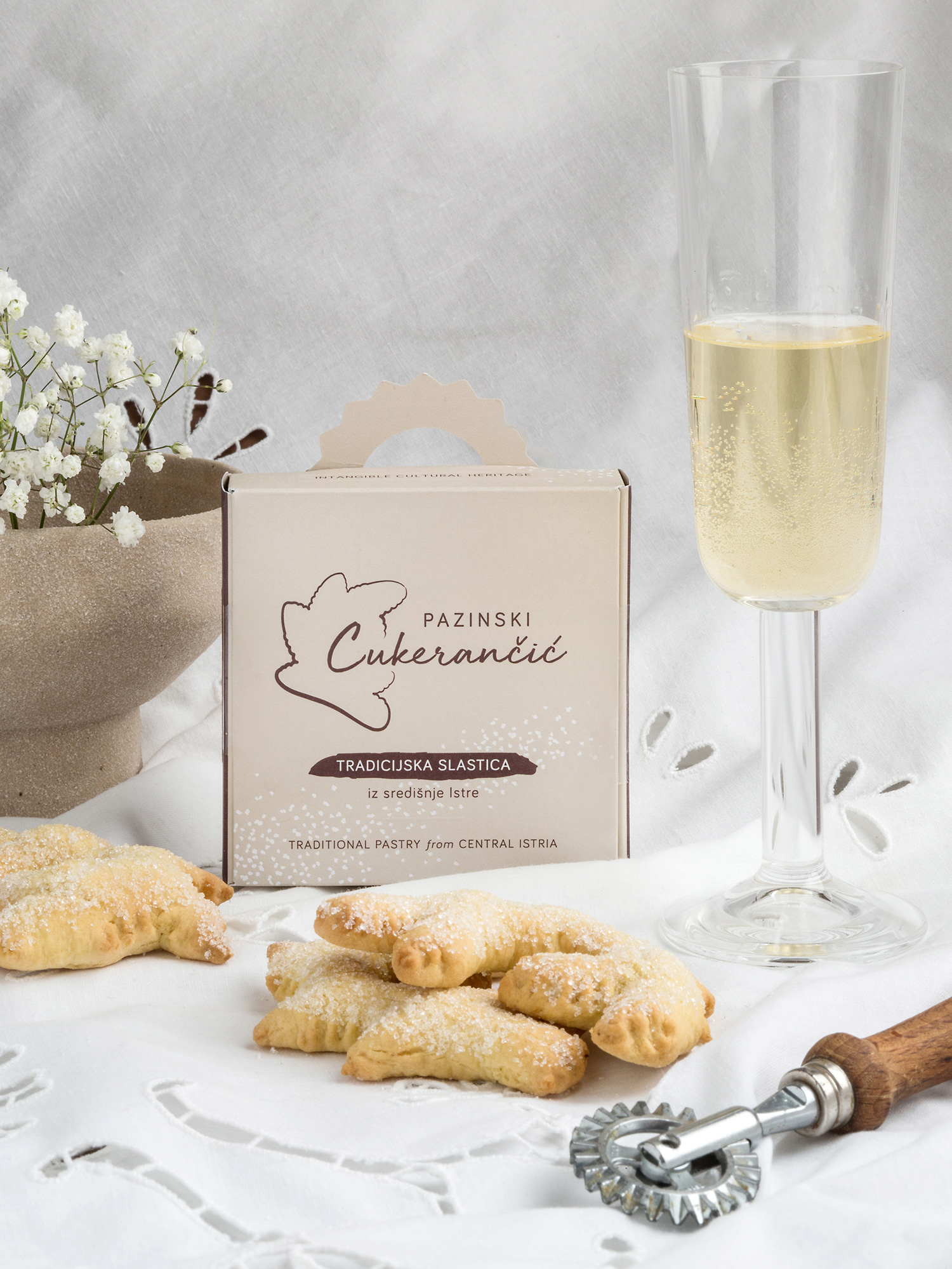
About Pazinski cukerančić: Recognisable by its distinctive form, taste, and golden-like color, Pazinski cukerančić is one of the most significant traditional Istrian desserts. Not so long ago, it was a wedding pastry whose making was an occasion for female gatherings in Istrian households. Nowadays, it is an unavoidable dessert at family celebrations.
Because it differs from other recipes across Istria, the art of making cukerančić in the area of Pazin has been protected as Croatian intangible cultural heritage since 2018. To make a Pazinski cukerančić, you have to use ammonia instead of baking powder, and before sprinkling the pastry with sugar, dip it into white wine to intensify its juiciness. The final appearance of this golden-like pastry has a distinctive branched form.
Objective and project phases: The objective was to create an intriguing visual identity and design for three package types of different dimensions.
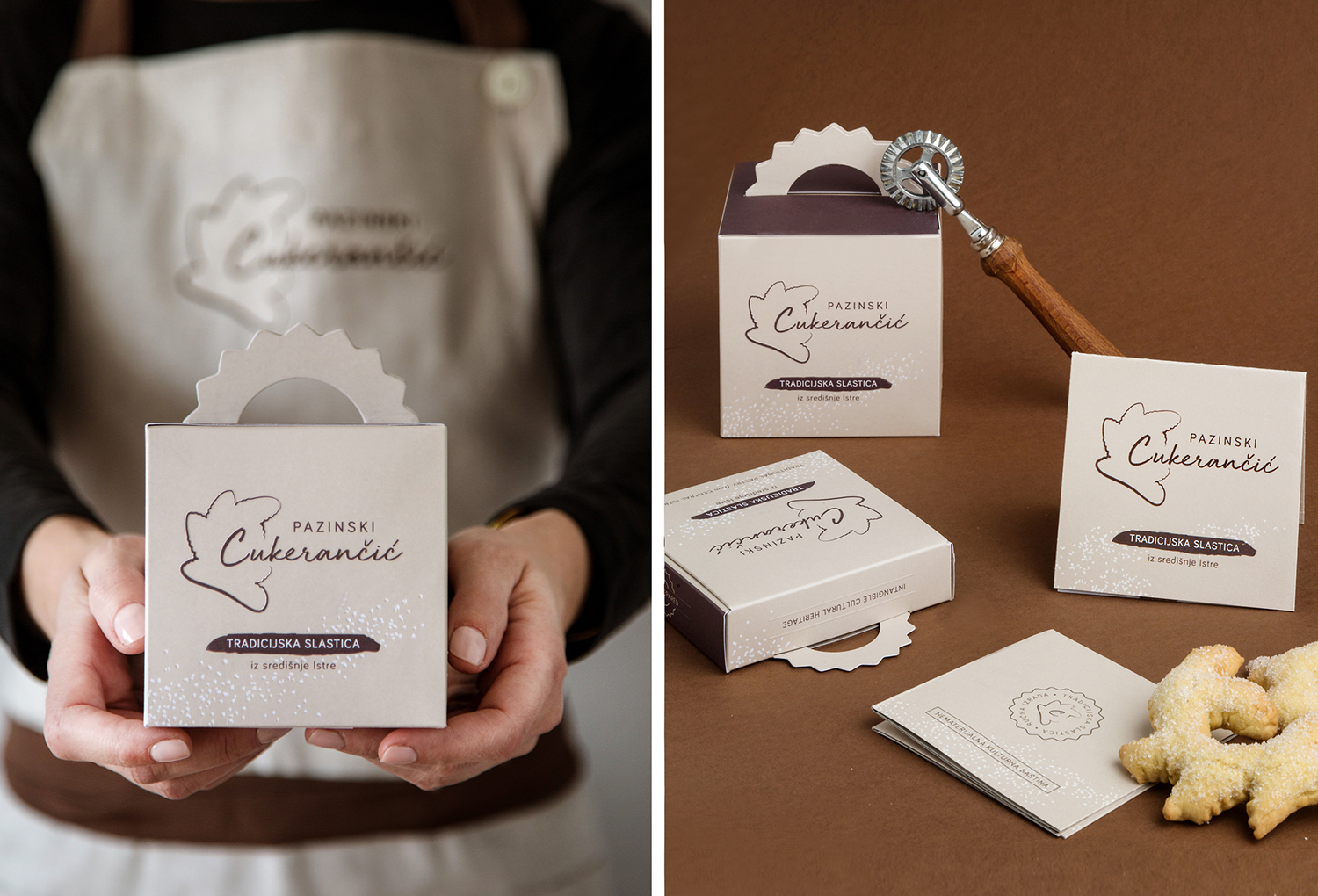
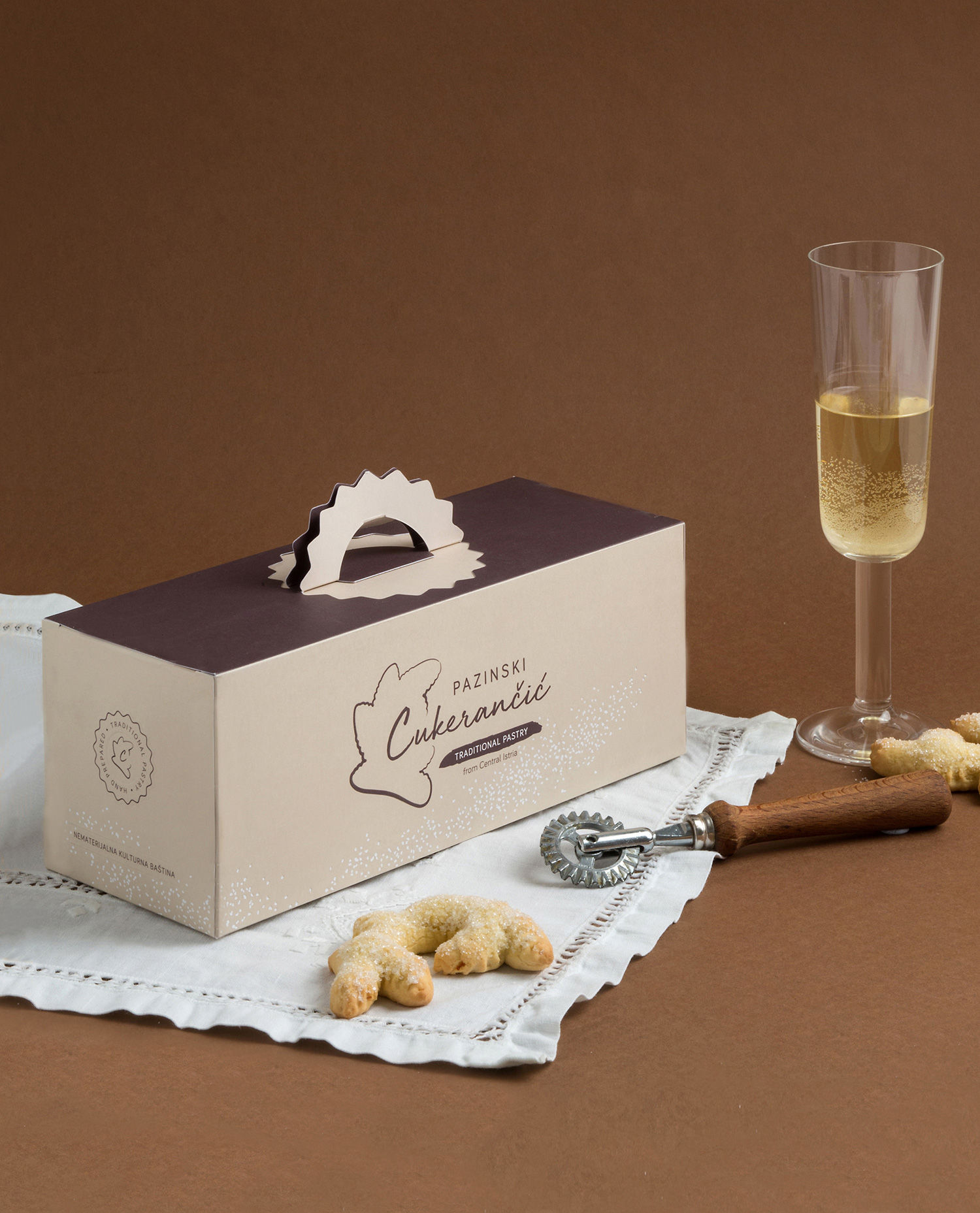
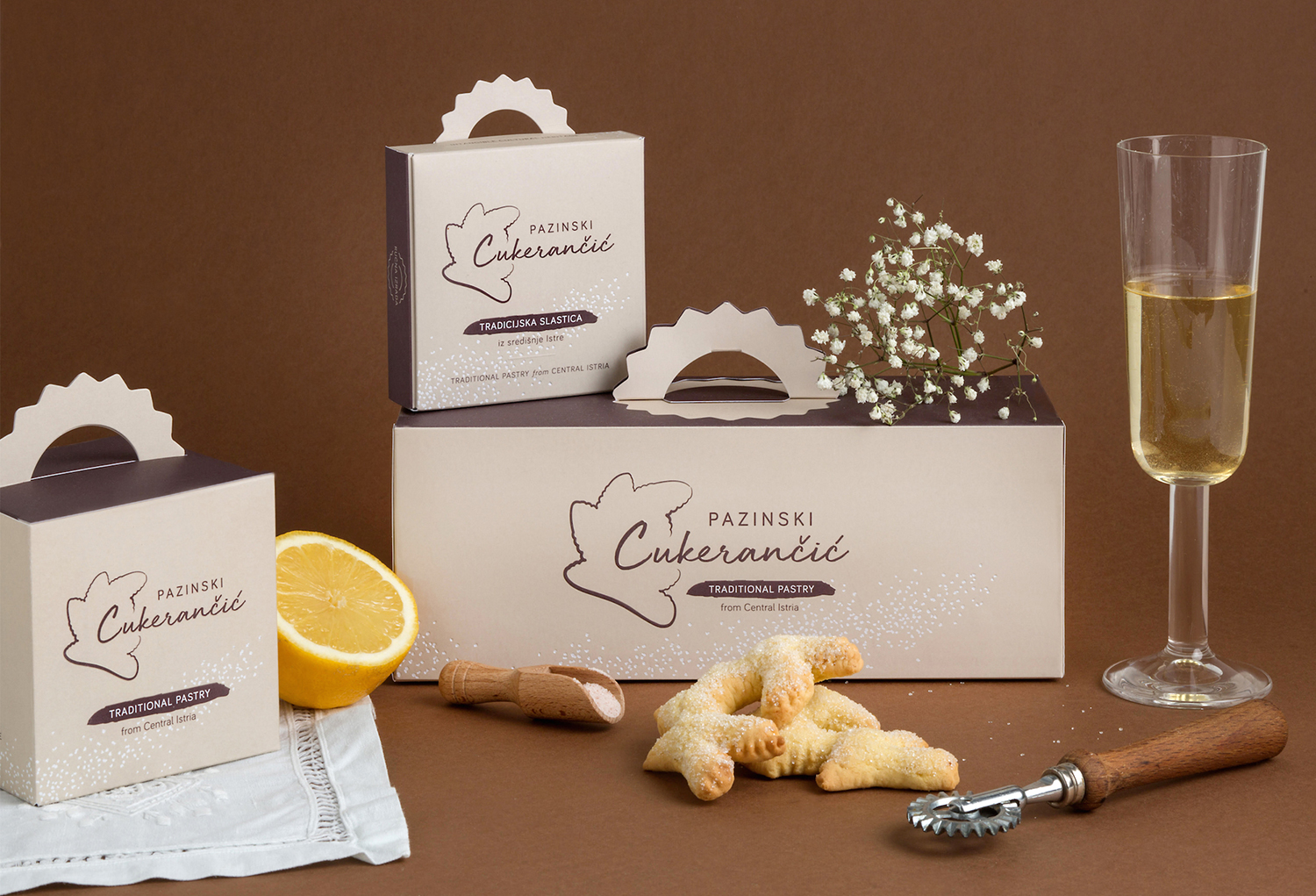
During the first phase, we have designed the logo and set the visual identity guidelines. We have also designed a leaflet explaining the socio-cultural context of the pastry, including its original recipe. For the packaging to be practical in all phases of its lifecycle (storage, filling, delivery), we have designed box sizes for 1, 5, and 15 pieces of pastry, respecting all agreed technical requirements.
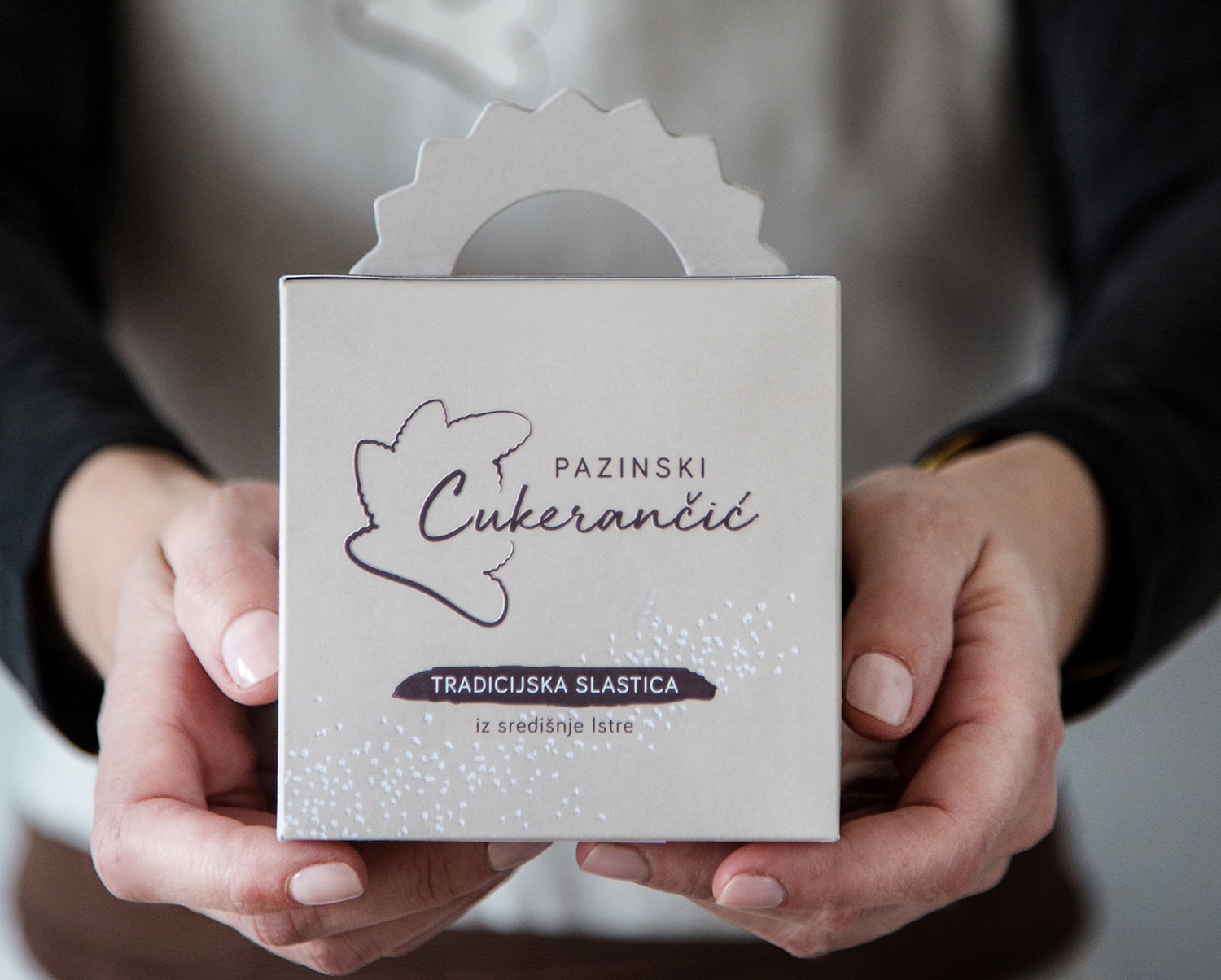
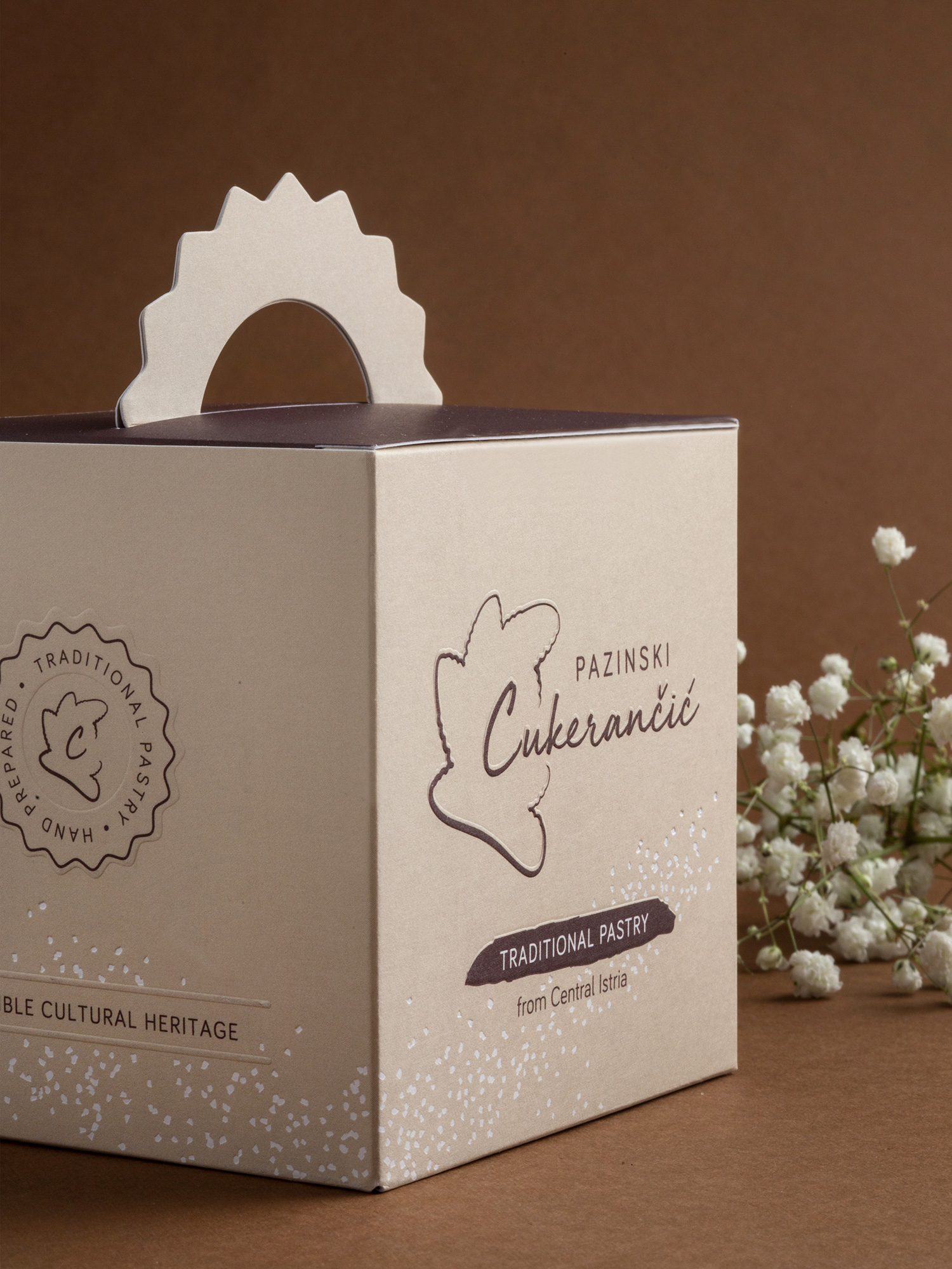
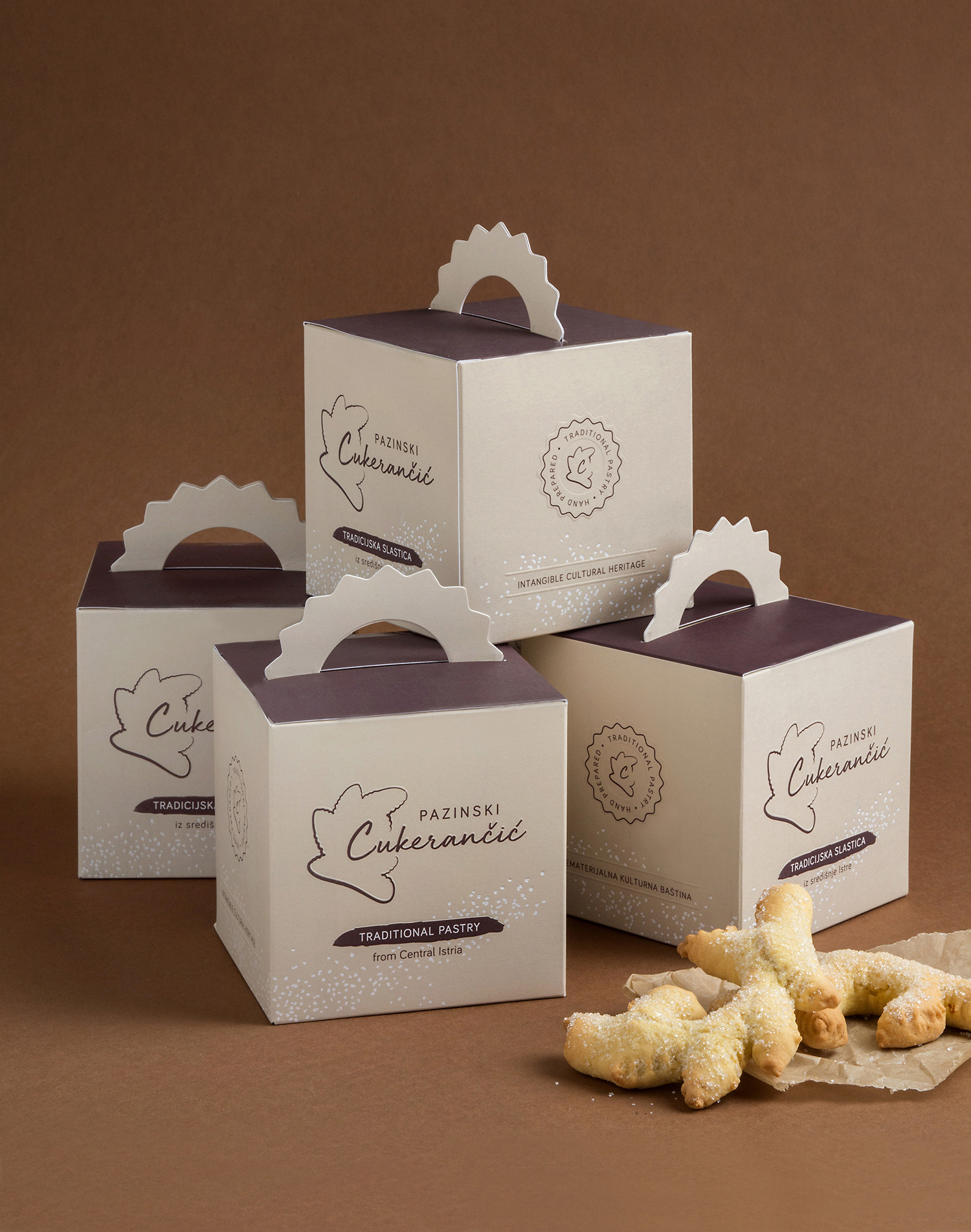
Packaging design concept: We based the visual identity on pastel tones with contrasting white and brown details. The white color symbolizes a wedding ceremony, while brown indicates tradition and the colors of Istrian folk costumes.
The minimalist design reflects the simplicity of the pastry itself and the modest way of life in Istria. Each element of the packaging adds to the whole story of Pazinski cukerančić, leaving the consumer to discover it detail by detail:
Stamp – The packaging sides contain stamps with inscriptions emphasizing a handmade dessert and an intangible cultural heritage. The stamp has the shape of rulić, a tool for shaping the pastry in its recognizable branched form.
Handle – The handle that is ‘notched’ into the package imitates the act of notching the pastry to get its characteristic branched form, thus further emphasizing the use of rulić tool in its making.
Sugar – Using hot foil printing, we enhanced the package design with a decorative pattern of white dots that indicates sprinkling the pastry with white sugar and reminds of the wedding ceremony of tossing rice.
Box – The general aim is to educate the consumer about the socio-cultural importance of the pastry before tasting it. Therefore, the box contains the pastry wrapped in white decorative paper, with a leaflet on top. That way, the consumer follows a carefully structured narrative intended to give an authentic experience before tasting
CREDIT
- Agency/Creative: Lastik studio / Tina Erman Popovic
- Article Title: Traditional Pastry Pazinski Cukerancic Packaging Design by Lastik Studio
- Organisation/Entity: Freelance, Published Commercial Design
- Project Type: Packaging
- Agency/Creative Country: Croatia
- Market Region: Europe
- Project Deliverables: Branding, Packaging Design, Tone of Voice
- Format: Box
- Substrate: Pulp Board, Pulp Paper


