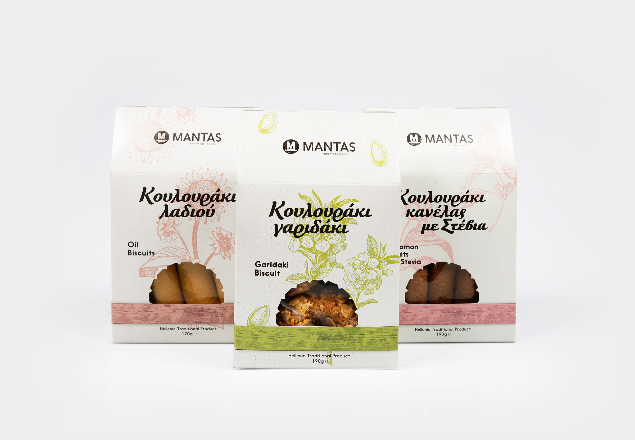
Circus Design Studio – Mantas Bakery Cookies
“Since it’s establishment in 1993 and the renovation of their first bakery, to this day although operating multiple stores, Manta Bakery and it’s staff have been working with love and passion while retaining traditional knowledge.
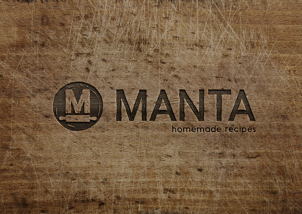
In their new endeavour, distributing their products in supermarkets, we were asked to undertake the designing of the packaging. But before everything else, we had to completely redesign the company’s logo, dealing with the possibility of exporting products in the near future. In this process, our idea was to try and preserve this “homemade”, “family” image of the business. The pictogram, which is depicting a rolling pin rolling out the first letter M on a piece of dough played the main role.
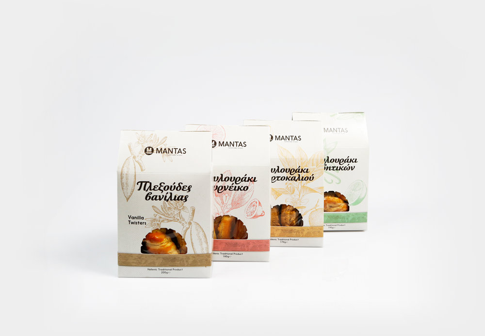
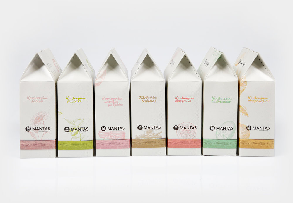
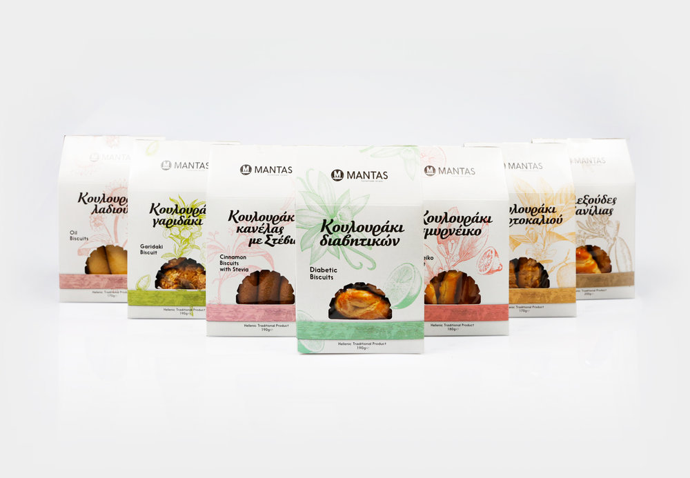
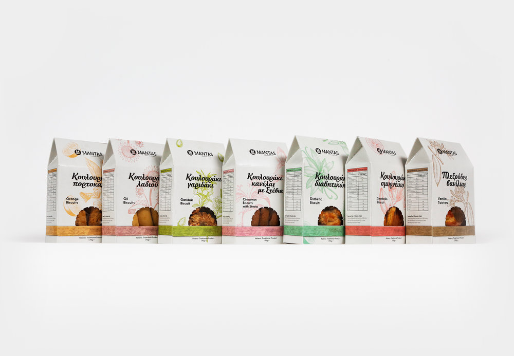
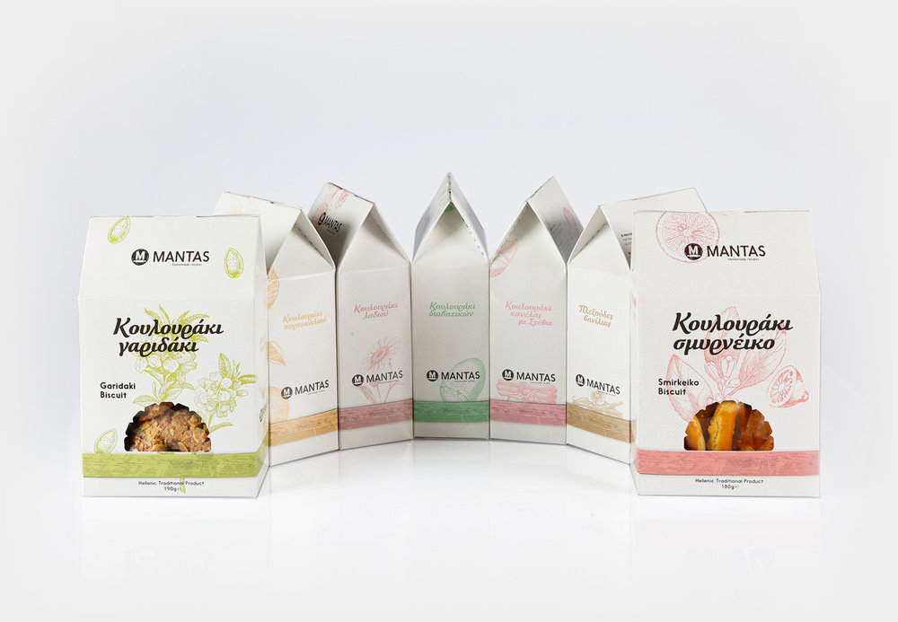
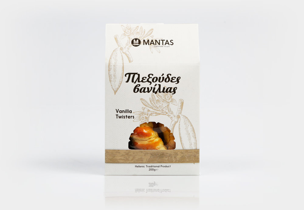
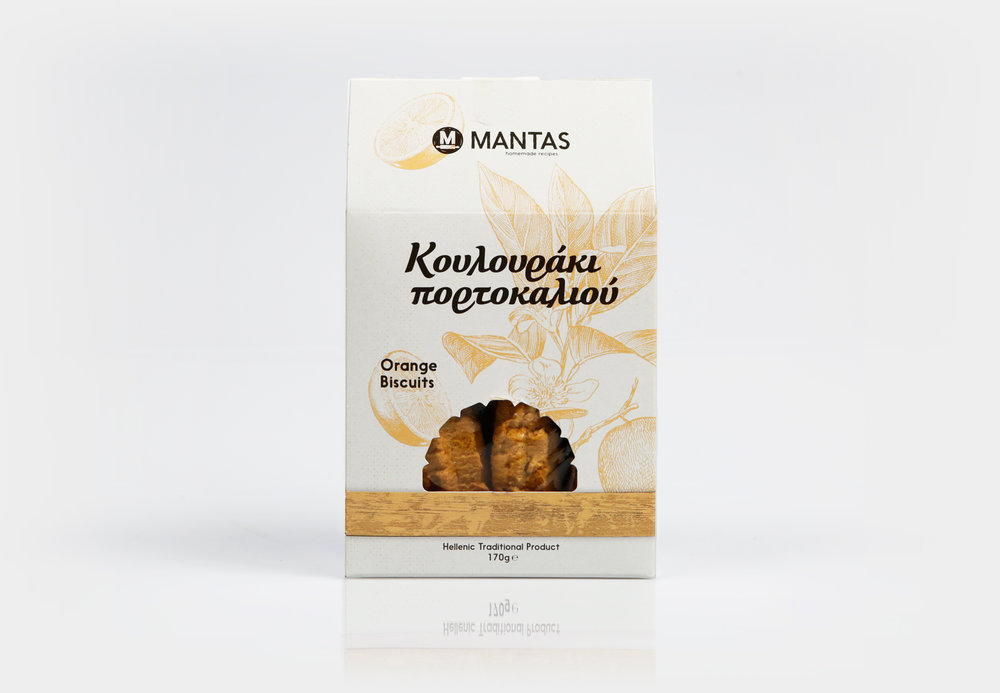
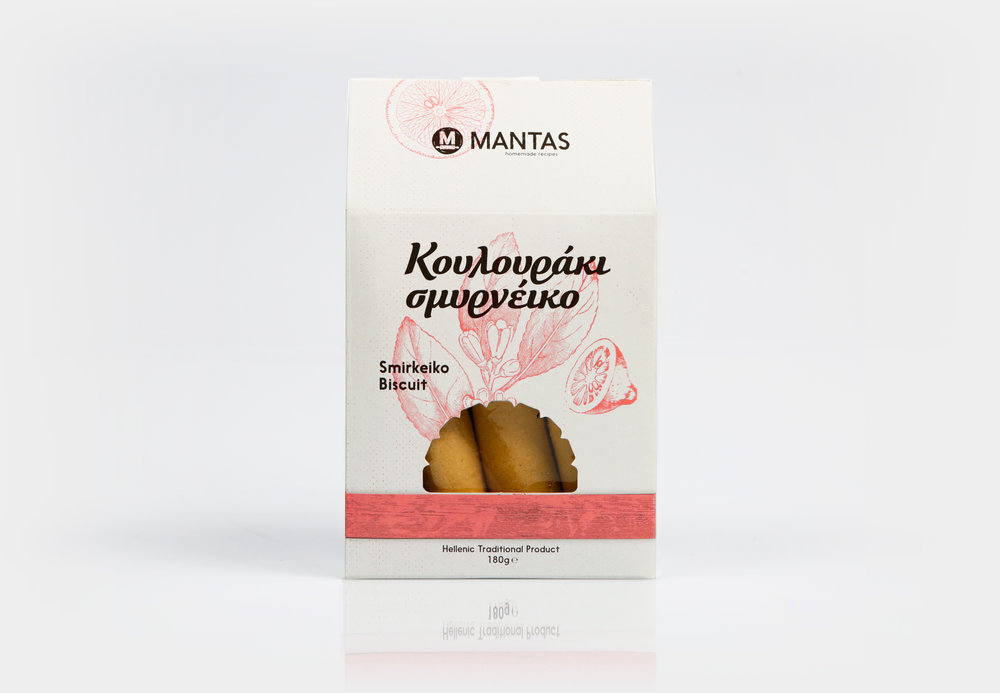
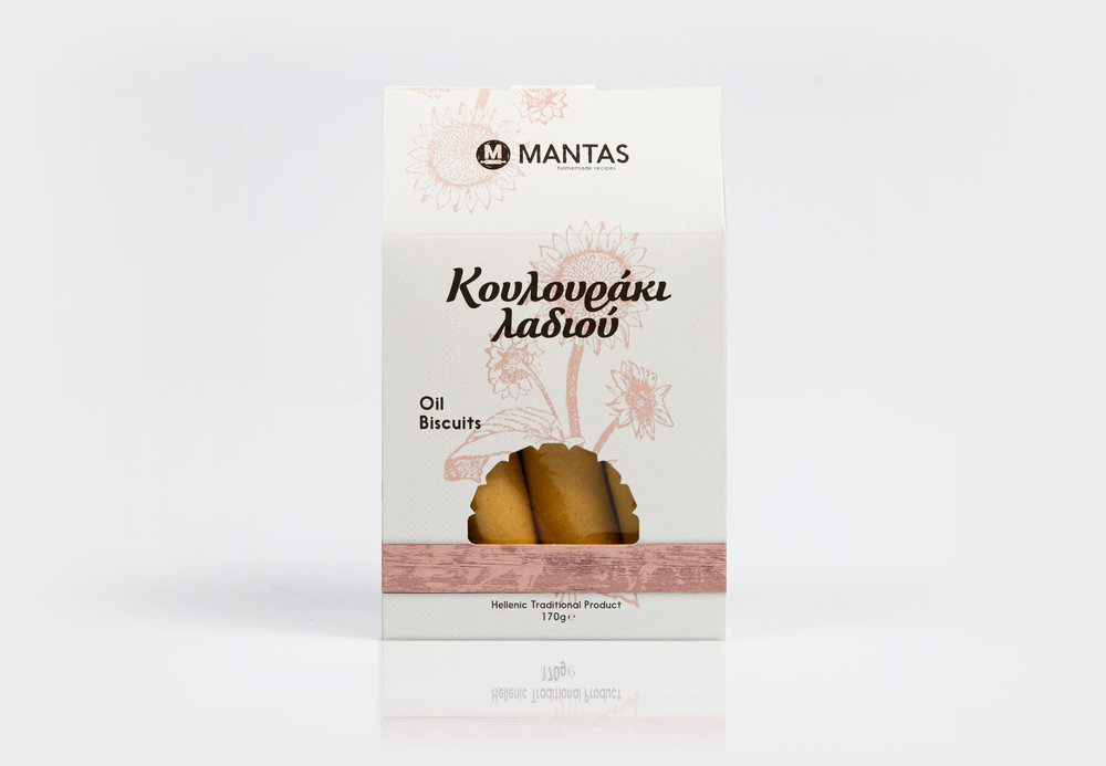
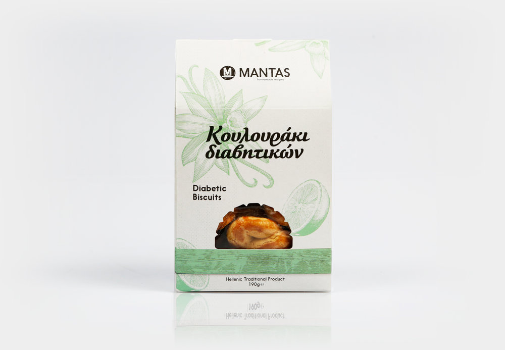
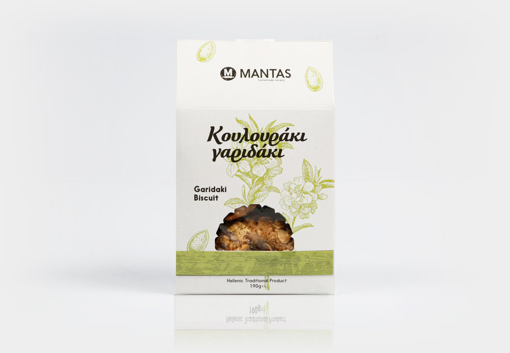
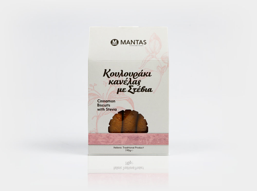
For the packaging, the line of products consisted biscuits in 7 different flavors. Based on these exact flavors, aromas and ingredients a color palette of 7 colours was selected that would represent them and set each other apart. The typography was chosen to “hint” tradition and spontaneity. Finally, another important element is the window resembling a stone oven in order to highlight the product, remind the way it was made and it’s origin.”


CREDIT
- Agency/Creative: Circus Design Studio
- Article Title: Traditional Greek Bakery Needed Some Branding to Express it’s Love and Passion
- Organisation/Entity: Agency Commercial / Published
- Project Type: Packaging
- Agency/Creative Country: Greece
- Market Region: Multiple Regions
- Format: Box
- Substrate: Pulp Carton, Wood


