


As the wellness industry continues to grow, supplements have evolved to meet the demands of an educated audience committed to building better, healthier lifestyles. Still, one of the oldest forms of health and wellness, Traditional Chinese Medicine (TCM), remains largely unexplored in the U.S. due (in part) to its mysterious reputation. Hoping to bridge this gap for western audiences is Nooci, who partnered with branding and marketing agency Smakk to create an identity based in transparency and science while fostering accessibility to the world of TCM.
Nooci was founded by Stephanie Tan, a Hong Kong-born/U.S.-educated entrepreneur with a global perspective and an ambition to break down the opaque veneer of TCM-based supplements by giving it a broader sense of community. This was especially crucial in the context of the COVID pandemic – a time when tensions resulted in a stigma towards anything with perceived Chinese origins. Working with Tan, Smakk helped Nooci embrace its Chinese heritage but also face these tensions head-on by stressing the company’s incredibly transparent sourcing of ingredients and products, strict manufacturing, sustainable mission and welcoming philosophy.
“Nooci was on a mission to make Traditional Chinese Medicine accessible to all and that meant detailing what goes into producing the supplements and how they really impact wellness,” explains SMAKK Founder Katie Klencheski. “Far from some shrouded process, Stephanie meticulously sources herbs globally – carefully selecting the right time-honored ingredients. Our work had to highlight this as well as reference its science-backed research and herbal extraction technologies to show where Nooci fit in along a modern customer’s wellness journey.”
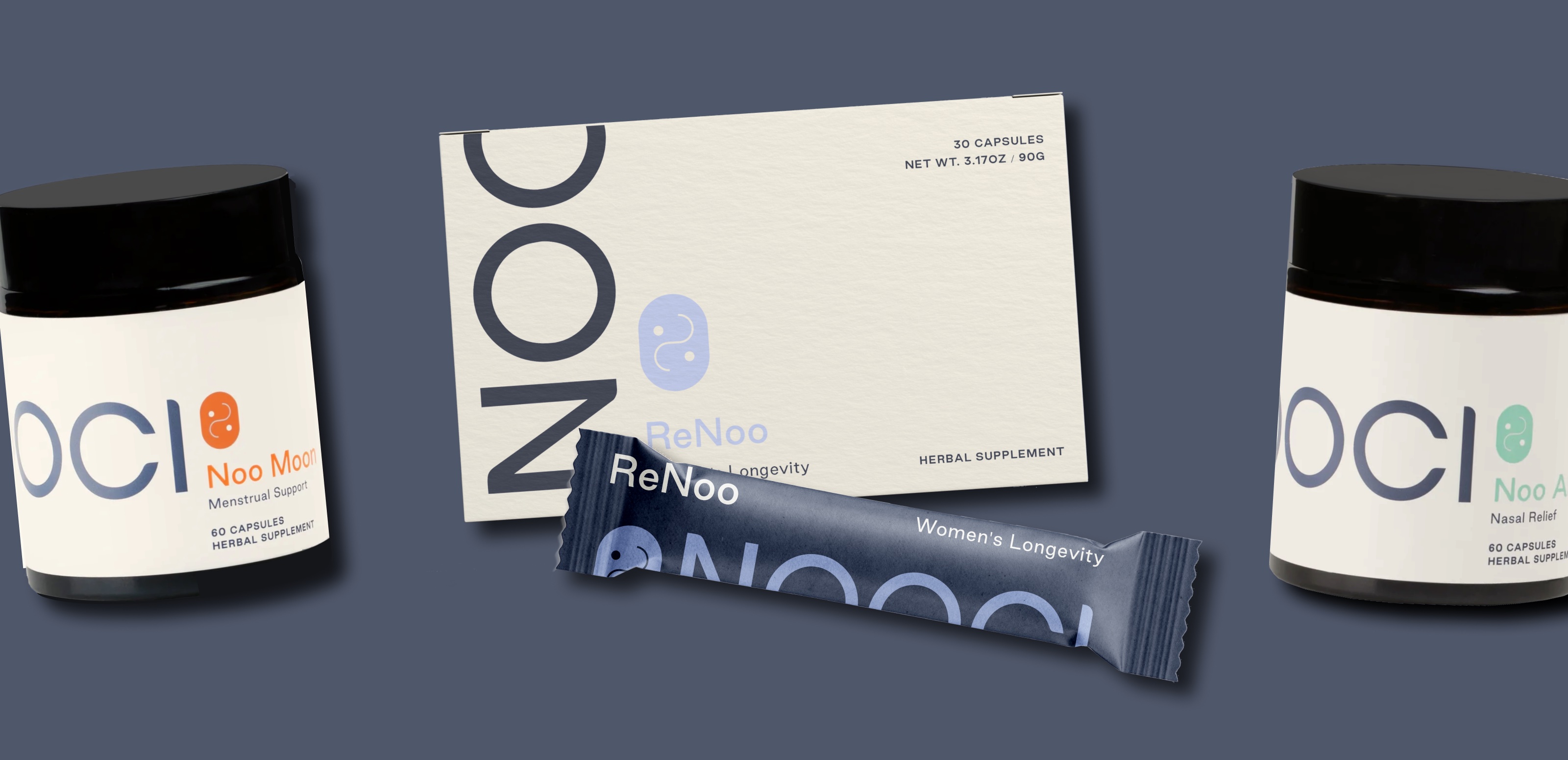
Smakk created the brand strategy, messaging and overall visual identity, including packaging design, website design and marketing assets to support the launch across social and email. They also developed product naming conventions to provide a sense of unity across the product line, while also communicating the unique benefit of each product: ReNoo (for Women’s Longevity), Noo Air (for Nasal Relief), Noo Moon (for Menstrual Support). Testing these various elements was an incredibly important piece of the strategy behind the brand building, helping the team to craft the right messaging and voice that could provide education and persuade TCM skeptics.
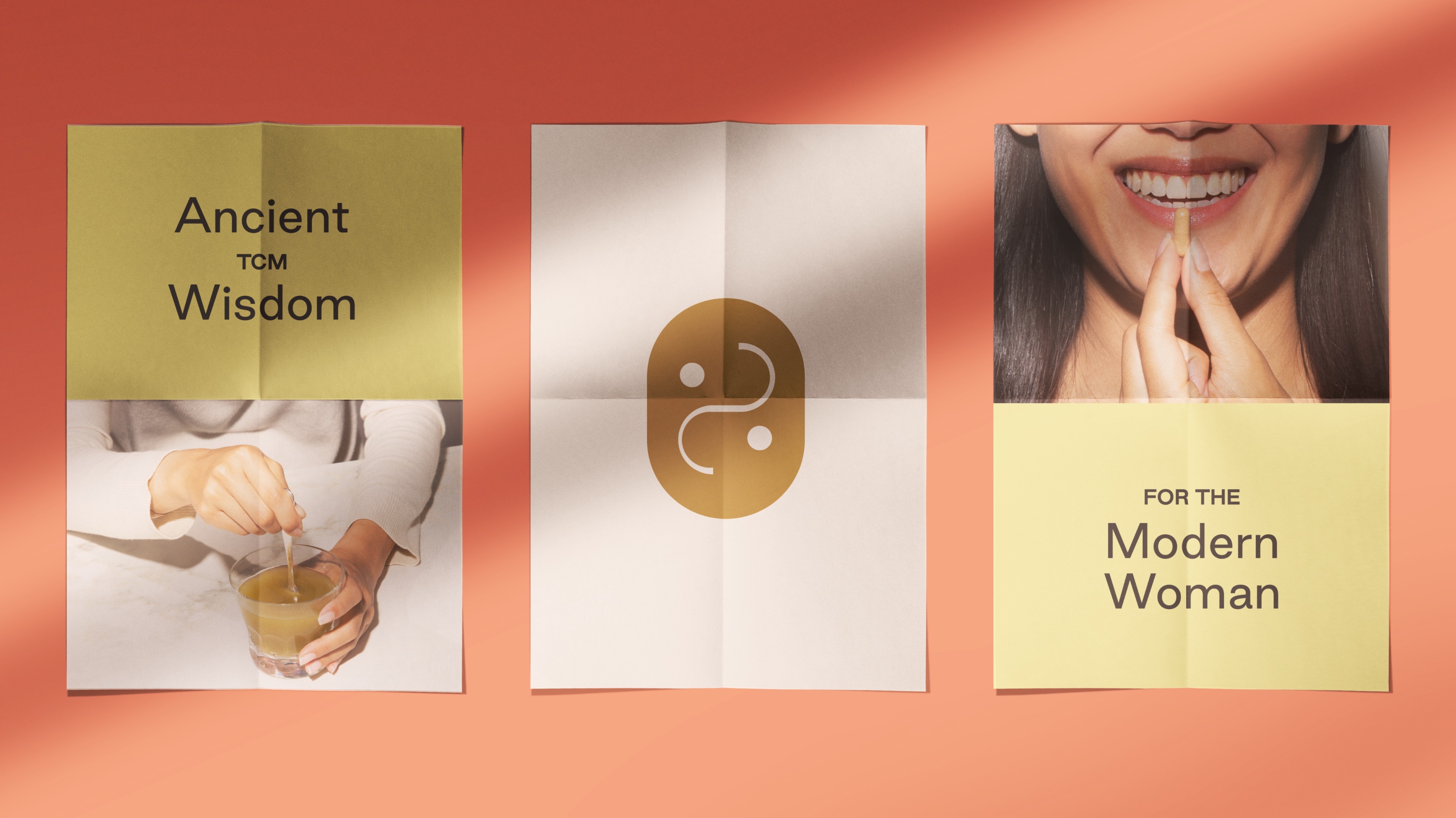
Their informative approach ultimately worked to balance the modern voice of Nooci with some older visual cues. For example, the brand mark is an abstract representation of the yin and yang, an important symbol in TCM. A crisp suite of sans serif typography is used to balance some of the more traditional aspects of the identity and the color palette is vibrant and bright, but grounded in some earthier tones, like the sienna brown – unifying modern and classical elements.
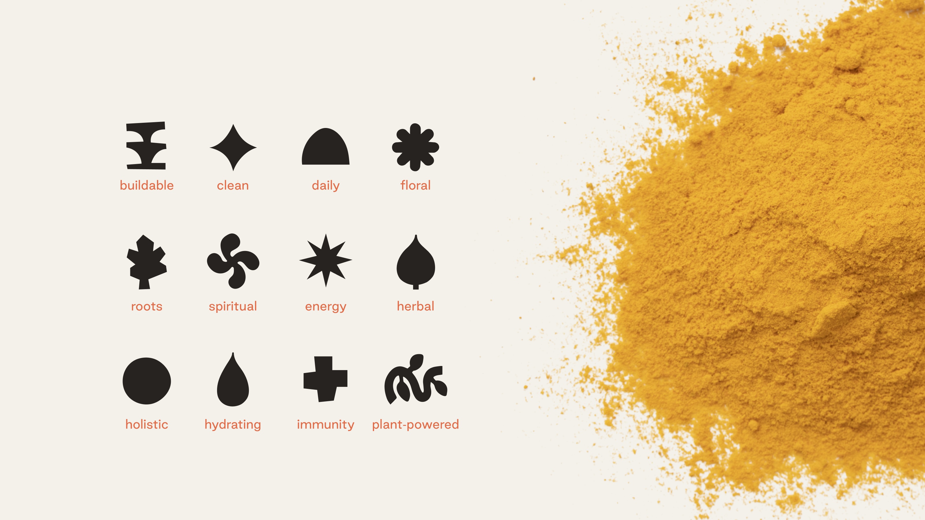
Smakk also created a system of icons representing different categories of plant-based ingredients found in Nooci herbal supplements, illustrated in a more organic and fluid way than typical iconography. More than decoration, these icons were important to educating consumers – providing a wayfinding system that felt approachable and new, but still somewhat recognizable. These icons were used across packaging and web in order to help consumers understand the products quickly. For similar reasons, Nooci’s infographics feature real photos of real ingredients, removing some of the mysticism that may be associated with functional medicine.
This natural focus extended to the packaging, where Smakk applied its typically environmentally conscious approach. “For the brand, we really wanted to reinforce the idea that health is more than just what you put into your body,” explains Klencheski. “Stephanie really wanted to be as sustainable as possible, and we guided her to use packaging that could support a refill system to help lessen the environmental impact of the products. Both Noo Moon and Noo Air come in a reusable glass jar to eliminate plastic waste, and the refill packet is made from 100% recyclable materials.”
The result is a brand that’s forging a new path forward for the wellness and supplements industry but still has an eye toward the past. “This is a great example of how all branding, educational and storytelling elements have to work together around the brand concept to really find the white space in the market,” says Klencheski. “In Nooci, we’ve helped build a brand that celebrates what makes it unique and stands out in an evolving, competitive wellness space.”
CREDIT
- Agency/Creative: SMAKK
- Article Title: Tradition Meets Innovation in Smakk’s Identity for Supplements Brand Nooci
- Organisation/Entity: Agency
- Project Type: Identity
- Project Status: Published
- Agency/Creative Country: United States
- Agency/Creative City: New York
- Market Region: North America
- Project Deliverables: Brand Identity, Packaging Design
- Industry: Health Care
- Keywords: NOOCI, SMAKK, supplements, TCM, wellness
-
Credits:
Founder/Creative Director: Katie Klencheski


