Distilled Scandinavian spirit aquavit, the drink of Vikings
Overview:
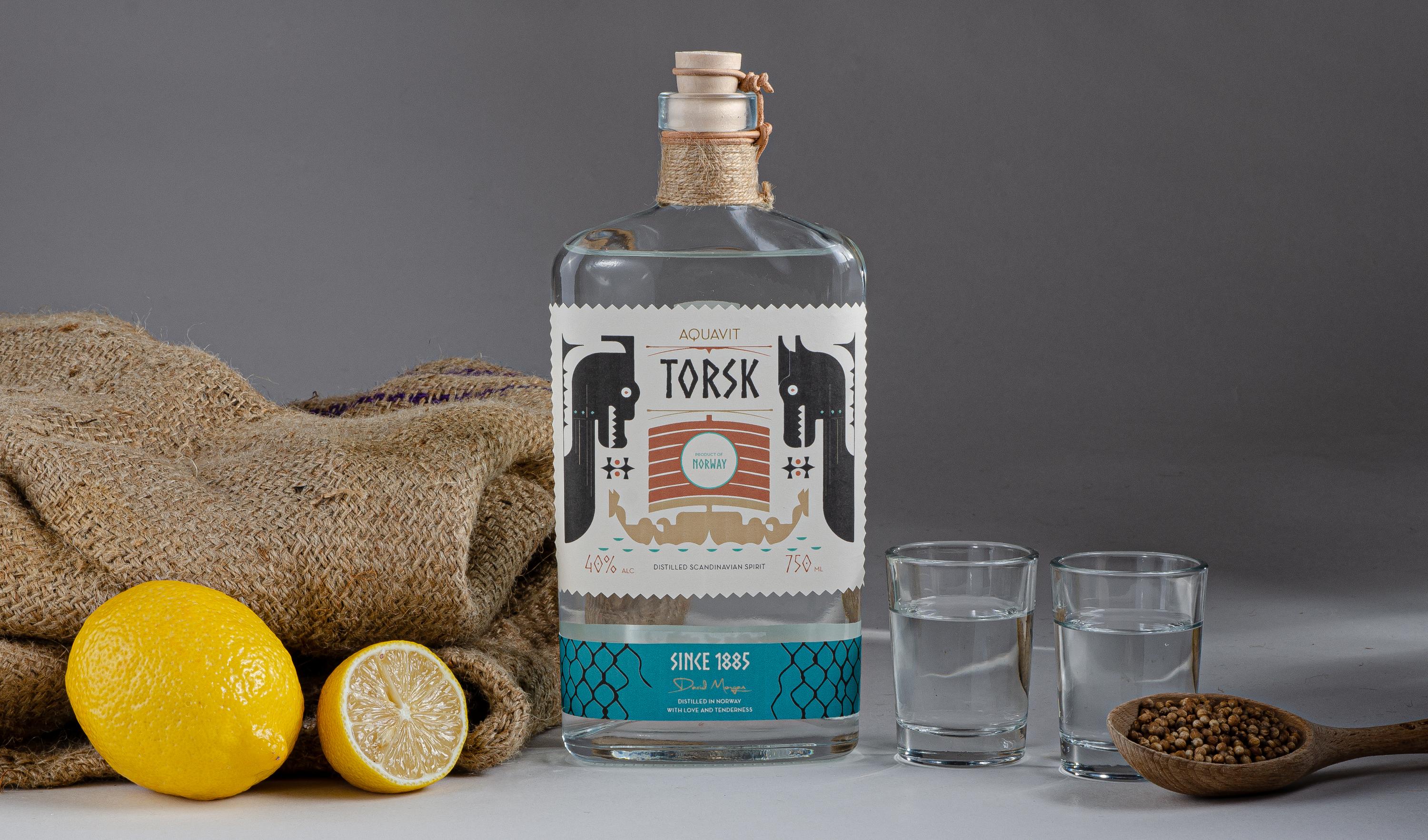
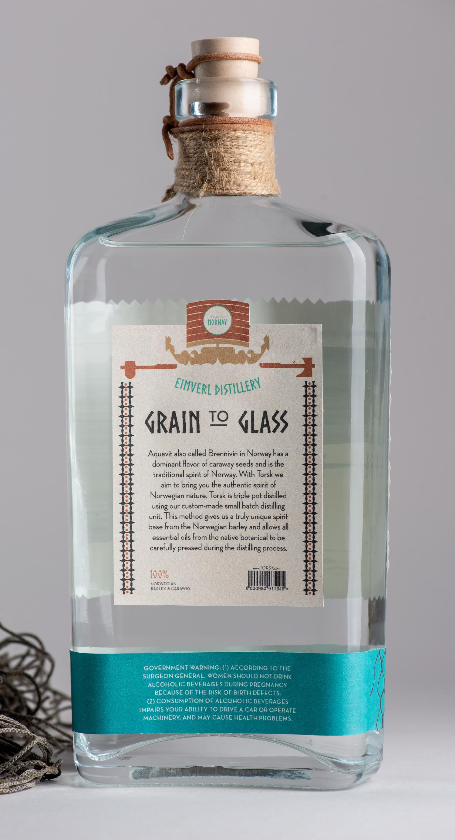
Torsk is a premium Norwegian aquavit spirit distilled from barley, capturing the authentic essence of Norway. Dominated by the robust flavor of caraway seeds and enhanced with aromatic elements like citrus peel and whole spices, this triple pot distilled drink stands out in its authenticity. The brand carves a distinctive space in the beverage industry with its strong and clean approach. It’s tailored for middle to upper income male consumers, aged 25-55, who are on the hunt for a refreshing and unique alternative to mainstream choices.
Solution
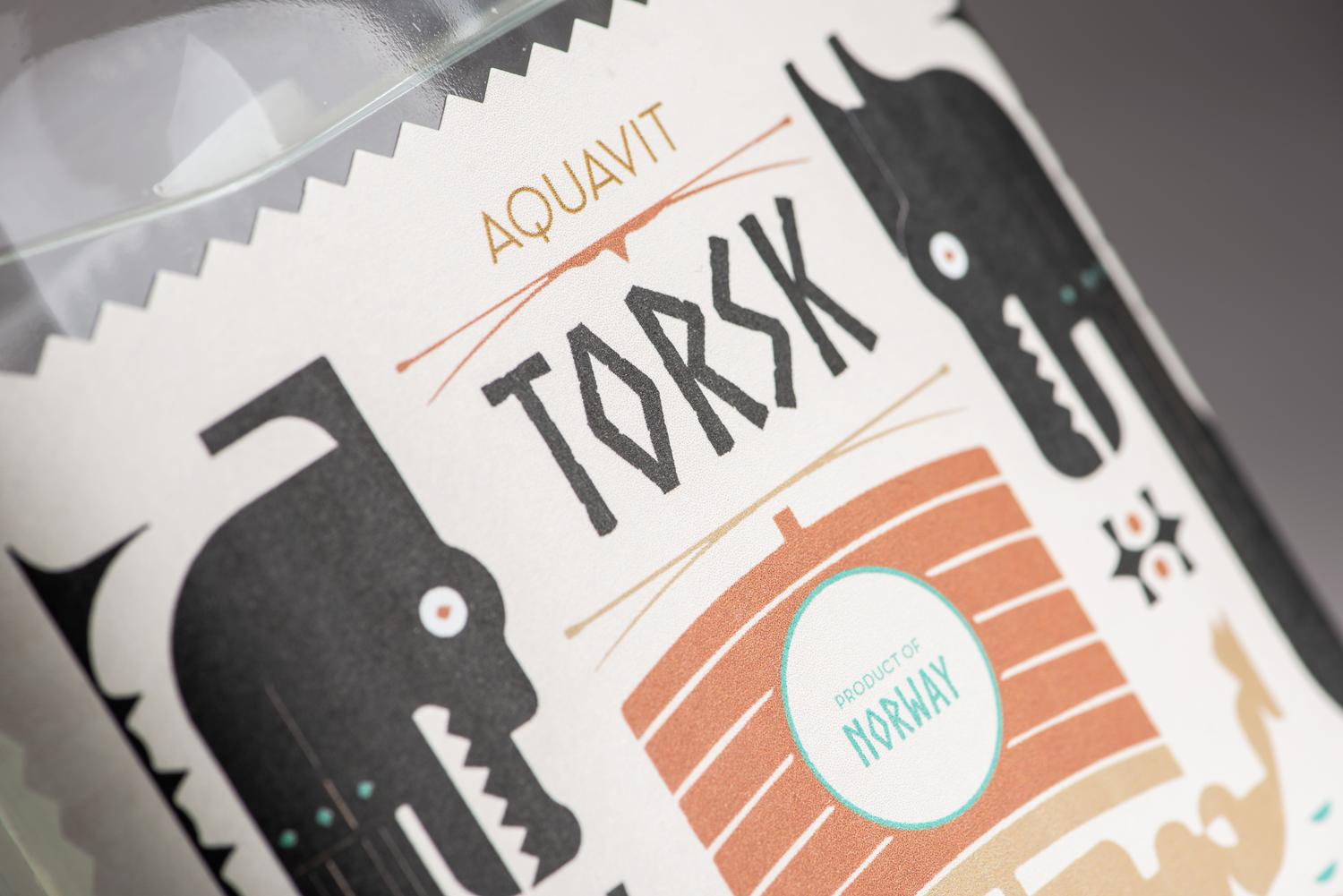
To effectively communicate the rugged, viking personality of the brand, I used the Norse typeface inspired by nordic epigraphy. Distinguished by their sharp angles and almost rune-like shaped letterforms, it brings a sense of mystery and strength to the project. I combined it with geometric sans-serif typeface Neutraface, which has a clean texture, giving the brand a balanced feel.
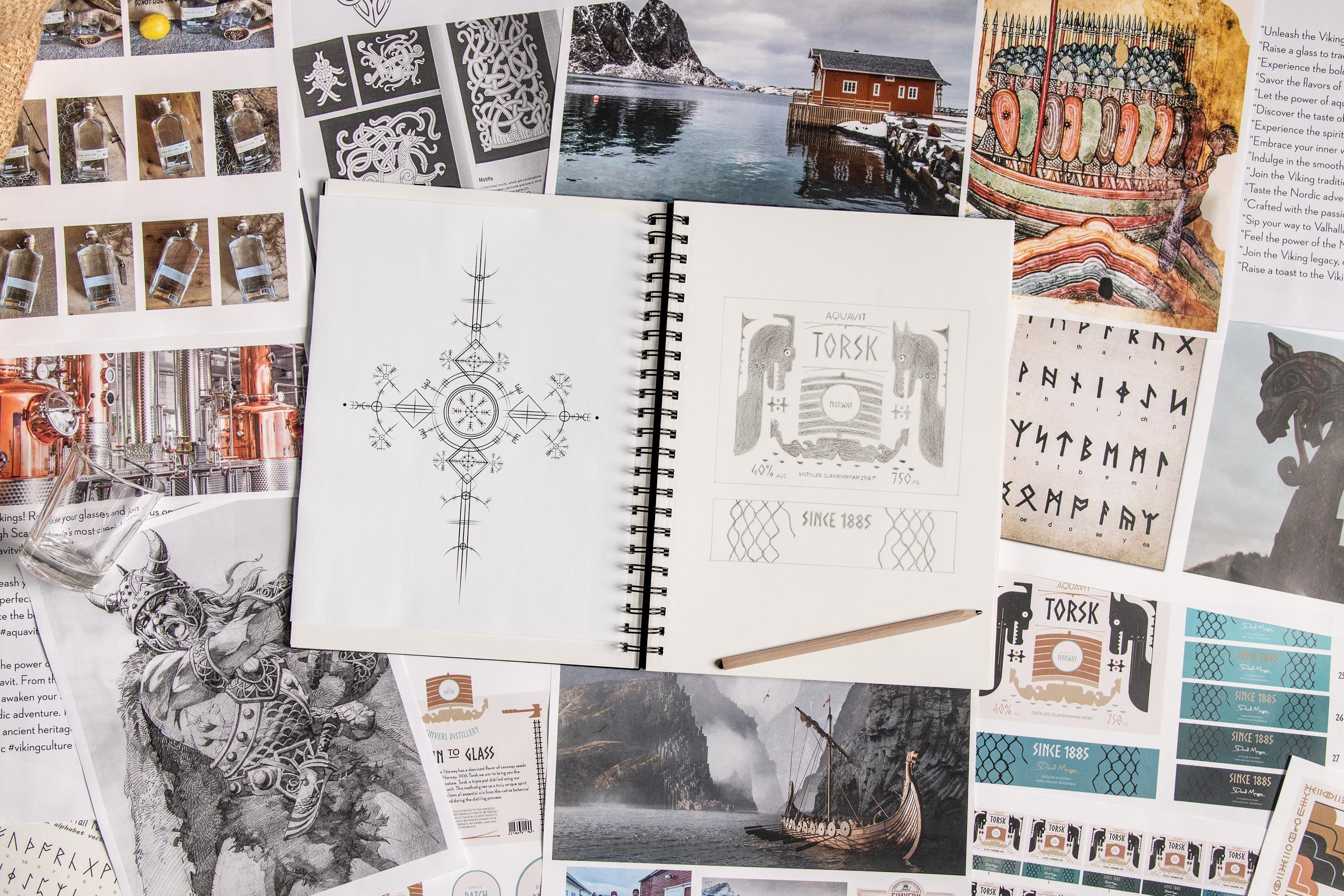
The chosen color scheme plays into the brand’s roots: earthy browns combined with a striking teal contrast against the black silhouettes of Viking longboats. It’s a clear nod to the brand’s commitment to authenticity and heritage. The design process was comprehensive, incorporating extensive Viking research, a thorough analysis of diverse bottle shapes, and an exhaustive phase of logo sketching and label layout planning.
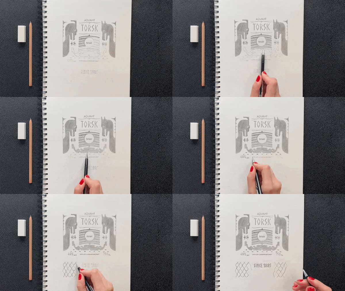
Drawing from the profound art and symbols of the Viking era, the logo was meticulously hand-sketched, encapsulating the brand’s adventurous ethos. Infusing it with elements like runes and the distinctive imagery of Viking longboats, the resultant logo emerged as a modern representation that pays rich tribute to the bygone era of Viking legends.
Torsk’s digital presence seamlessly complements its physical identity. Social media channels delve into the brand’s journey, highlighting aspects of the distillation process while weaving in picturesque imagery from Norway’s landscapes. This multi-faceted approach not only enhances brand recognition but also deepens the bond with its target audience.


CREDIT
- Agency/Creative: Ksenia Galyga
- Article Title: Torsk Aquavit Packaging Design
- Organisation/Entity: Student
- Project Type: Packaging
- Project Status: Non Published
- Agency/Creative Country: United States
- Agency/Creative City: San Diego
- Market Region: North America
- Project Deliverables: Brand Identity, Packaging Design
- Format: Bottle
- Industry: Food/Beverage
- Keywords: WBDS Student Design Awards 2023/24
-
Credits:
Educational Institution: San Diego City College - Graphic Design
Educator's Name: Sean Bacon and Bradford Prairie


