


Caleño Spirits
Savory Tropical Rhythms of South America
Intro
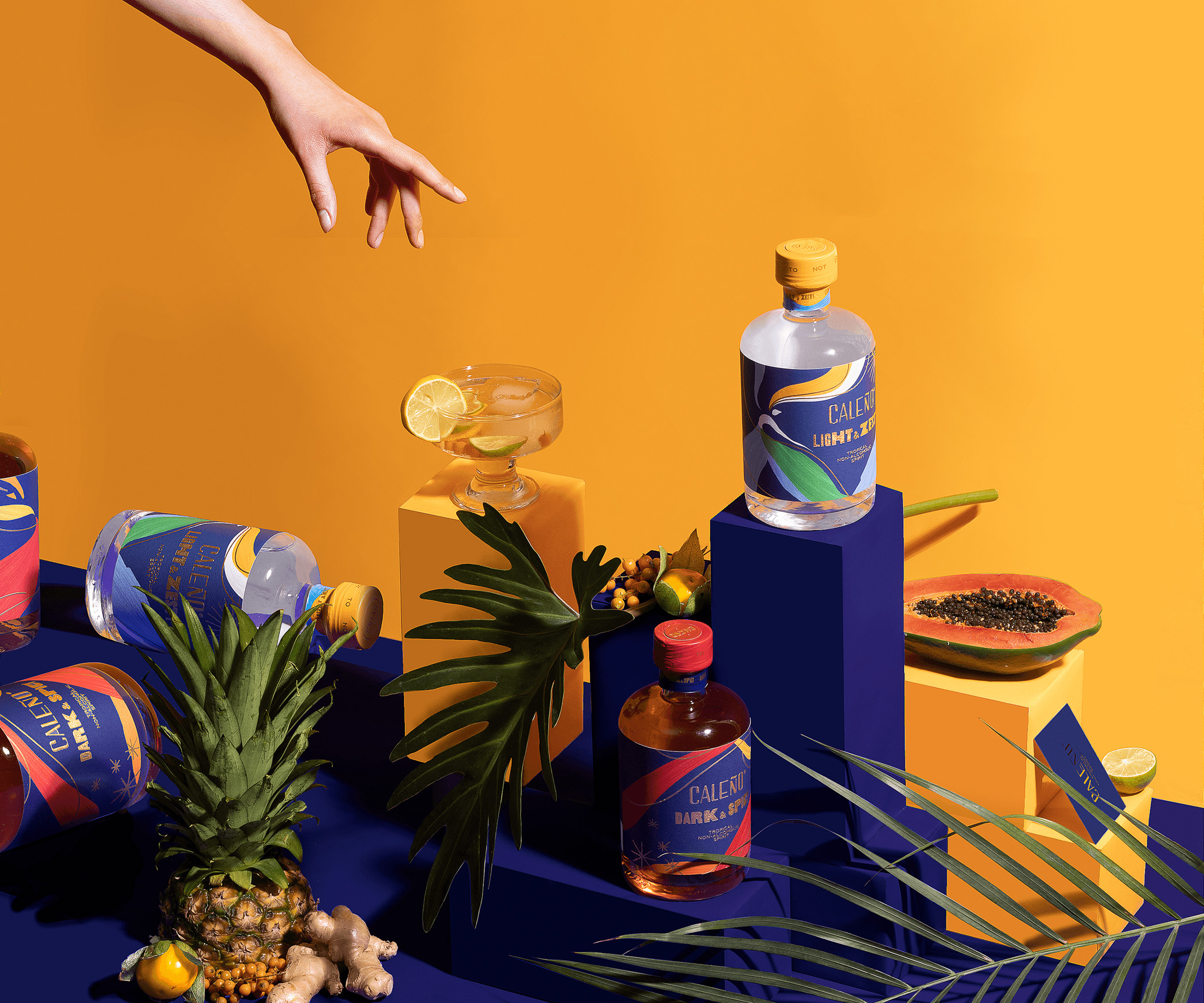
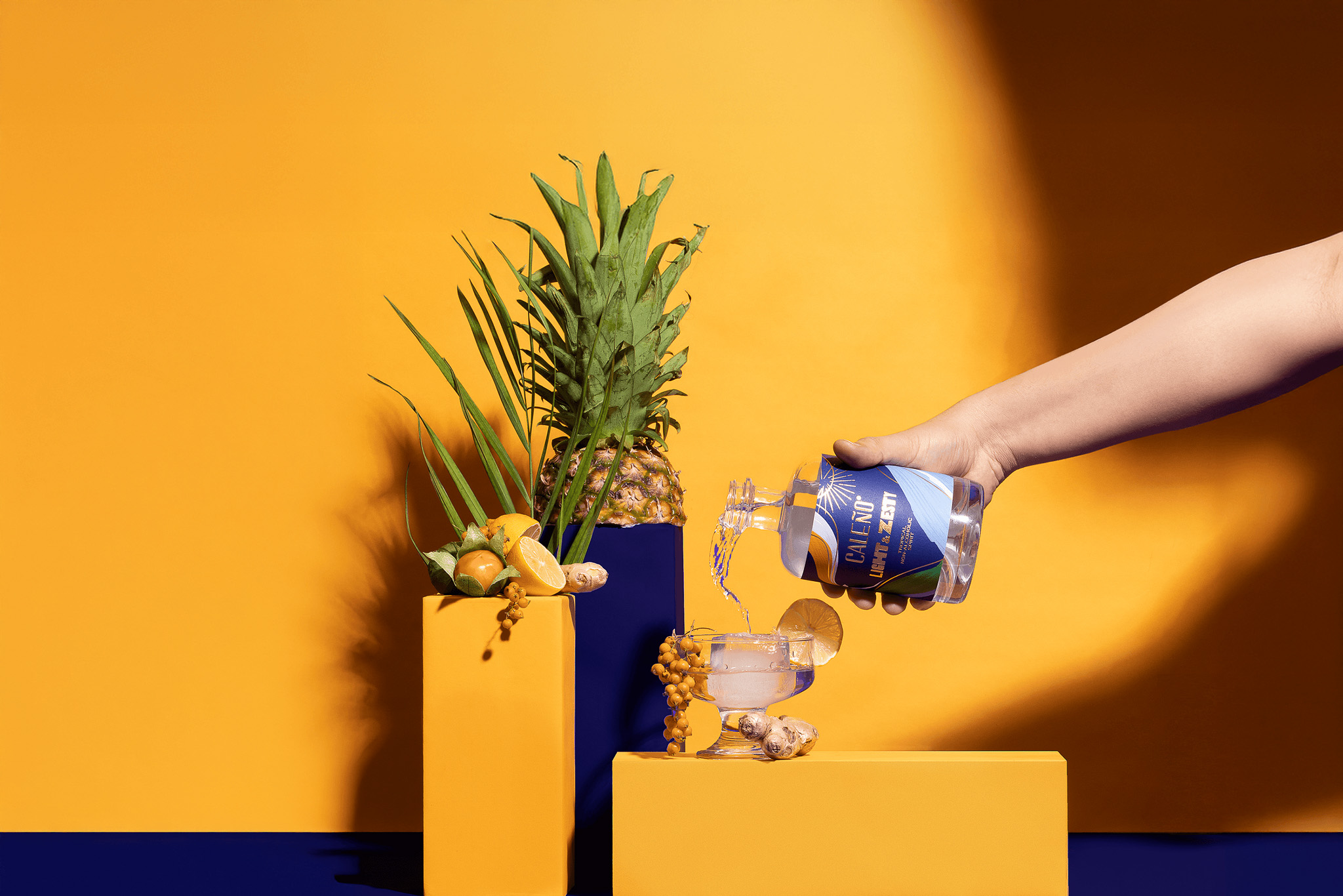
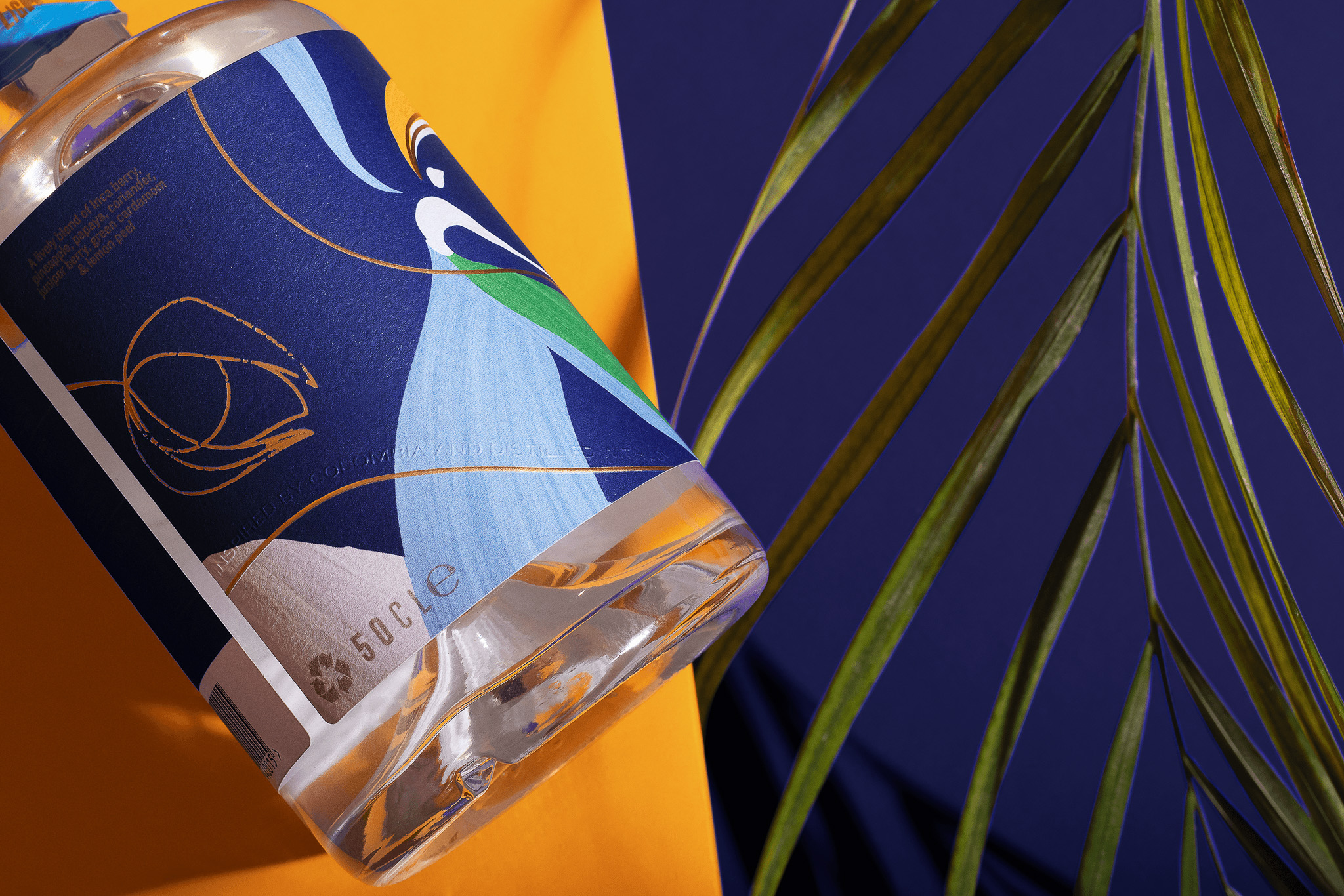
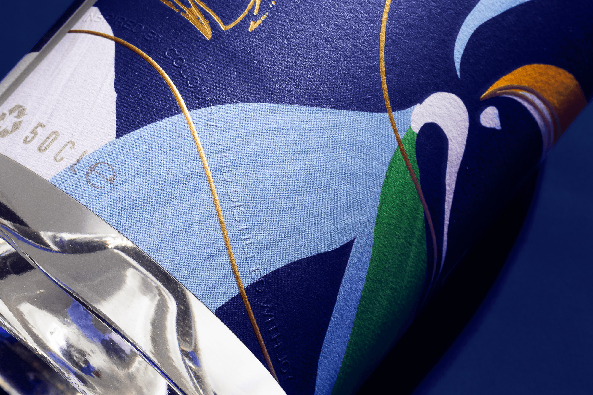
Time dances. It doesn’t wait. Caleño comes from South American rhythm, the kind that travels through the body before it becomes a thought. A brand built for nights that want to stay open: color, music, presence. A dancer appears in brushstrokes, caught mid-move. Not a logo, not a symbol—just motion caught on paper. The palette is unapologetic: pigment-forward, warm, alive. Rhythm, held.
About
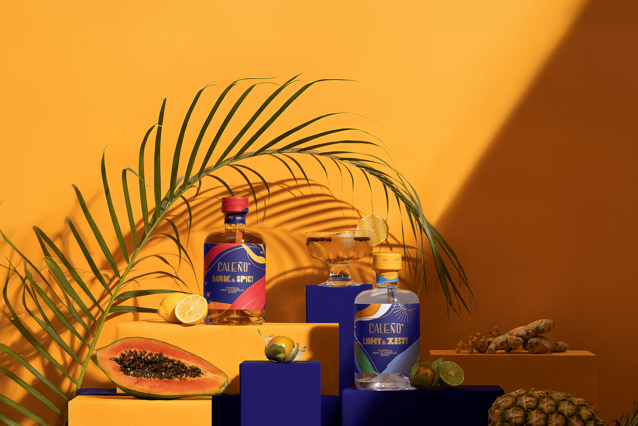
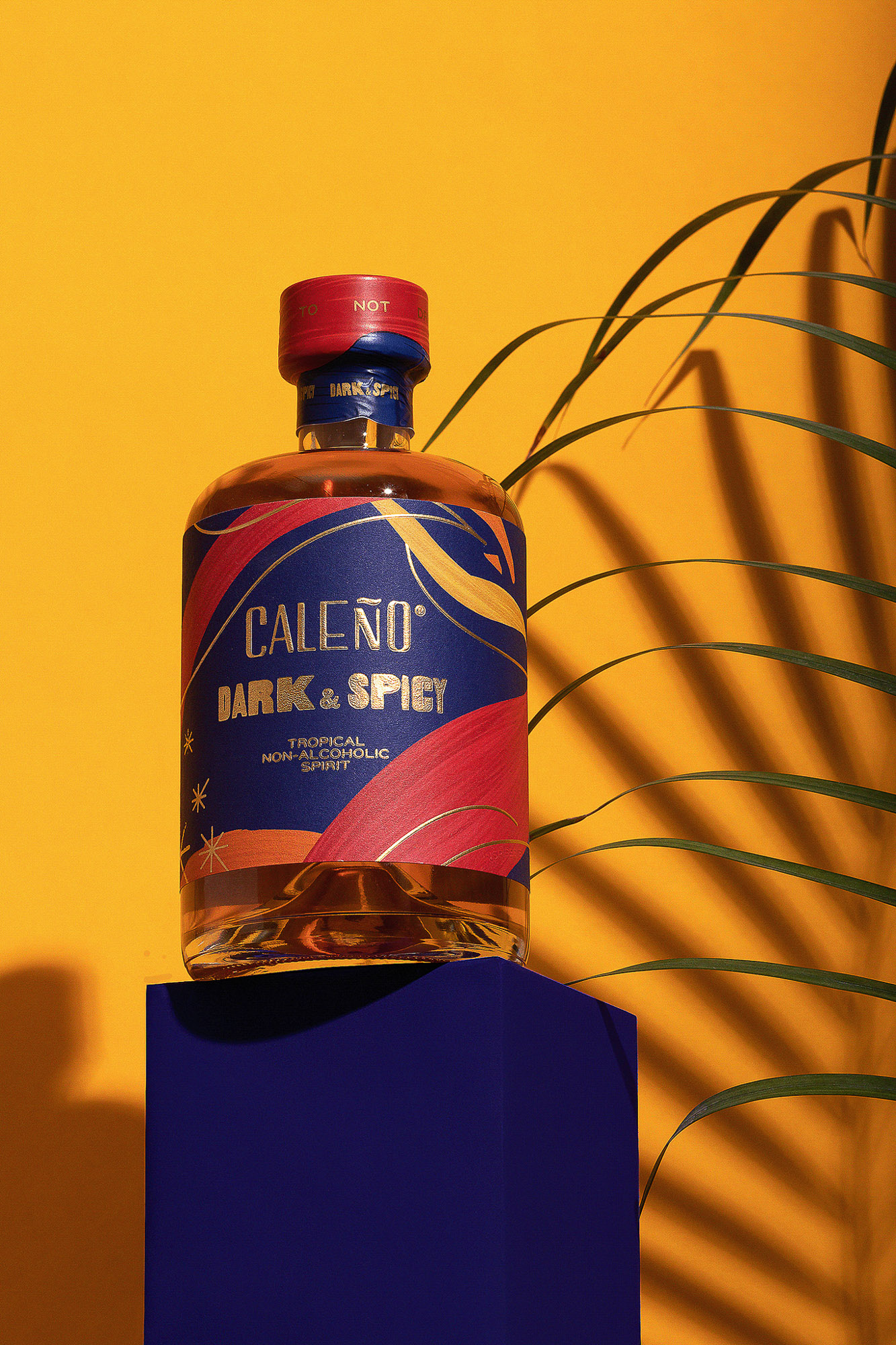
Caleño is a non-alcoholic spirits brand rooted in South American celebration and heritage, founded by a Colombian woman and tied to her family story, with inca berry as a defining cue running through the brand’s world.
Challenge
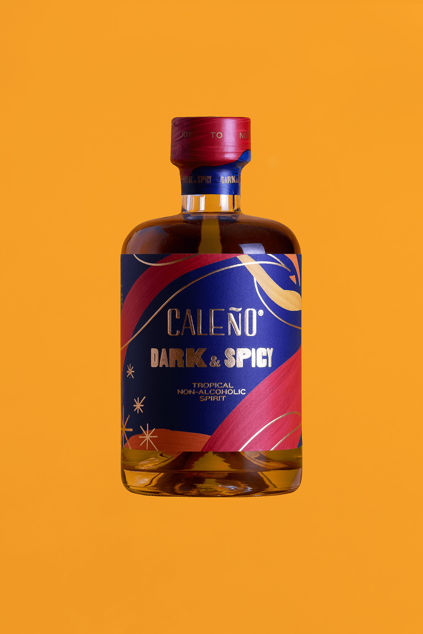
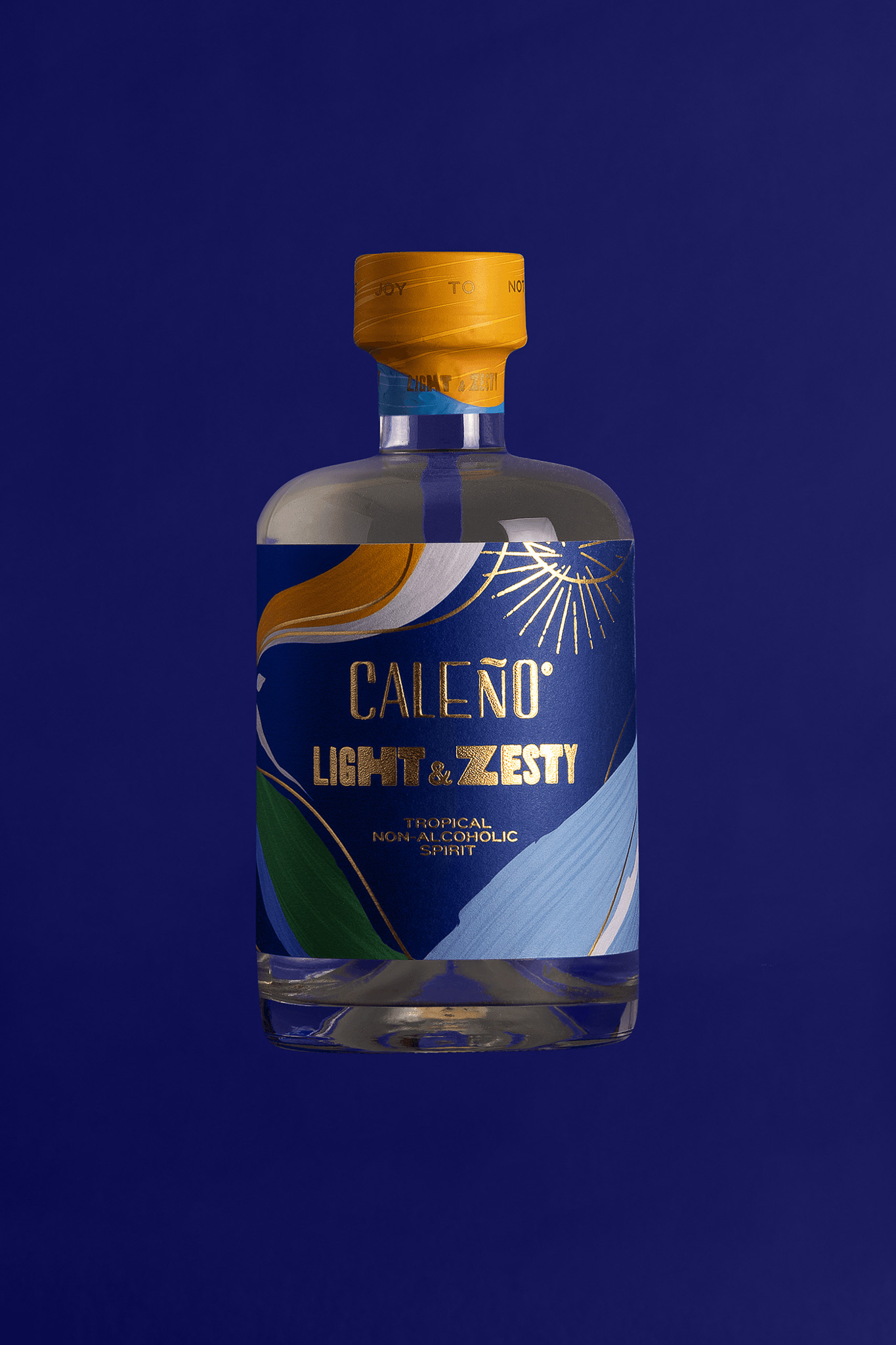
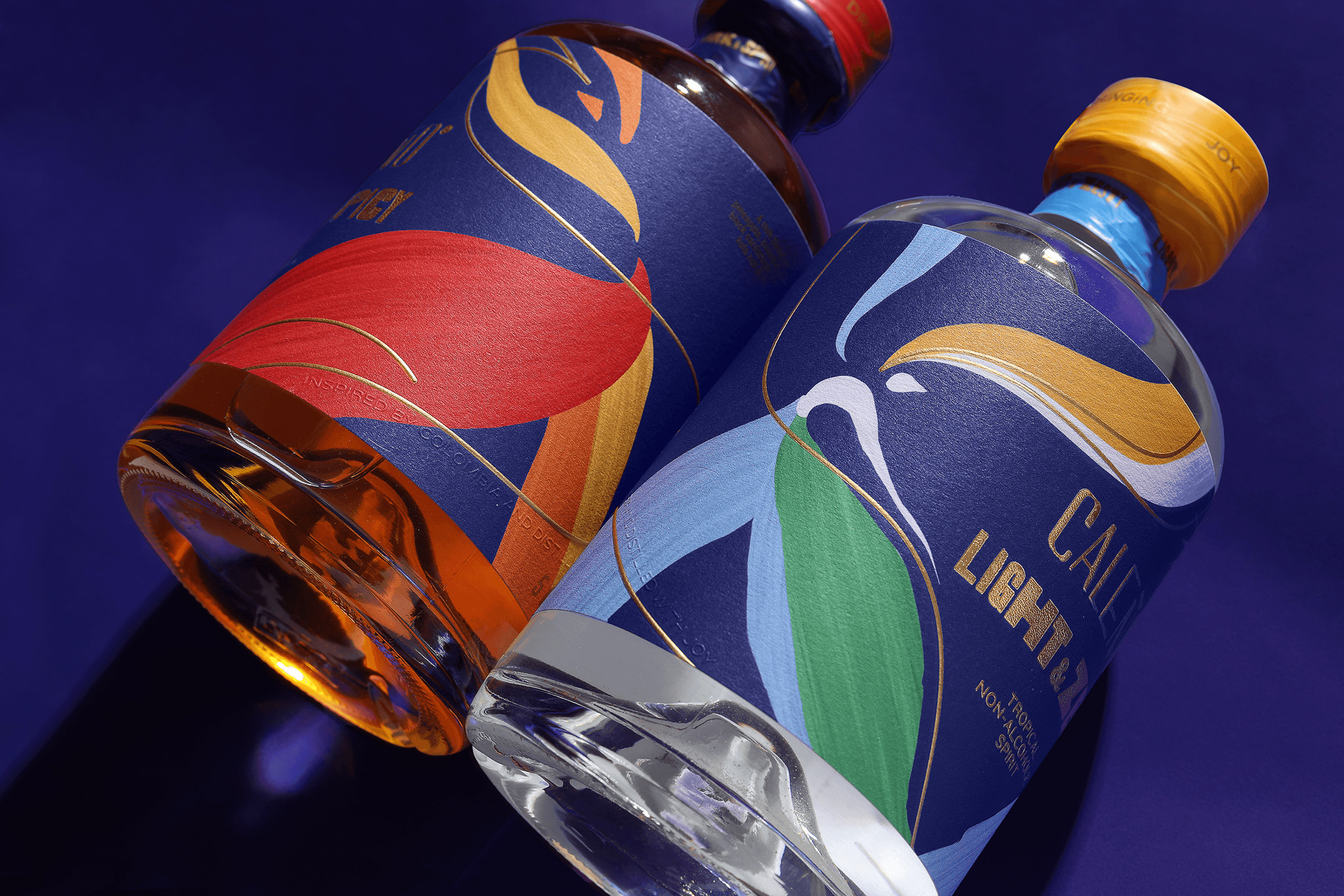
The work was to reintroduce Caleño in the UK and EUR with a more current, festive presence, while keeping the iconic blue as the one constant.
Solution
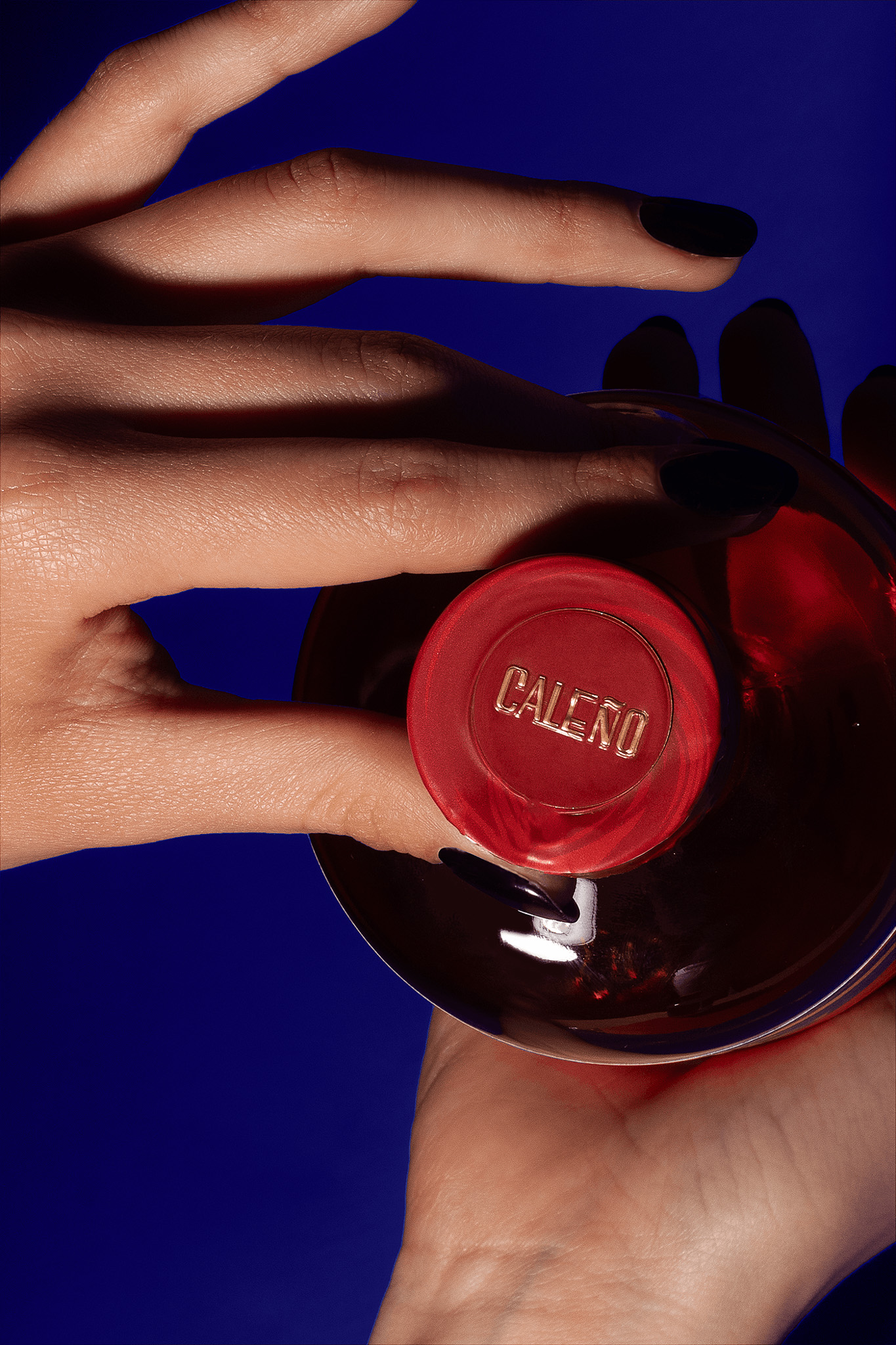
We kept the blue and built a brushstroke-led system that introduces an abstract dancer in motion, then clarified the range into Light & Zesty and Dark & Spicy, using palette and packaging cues to signal the shift from daytime ease to night-time energy, finished with small on-pack cues that keep the experience moving between both expressions.
CREDIT
- Agency/Creative: Toro Pinto
- Article Title: Toro Pinto Reintroduces Caleño Spirits With Brushstroke Packaging That Captures South American Rhythm
- Organisation/Entity: Agency
- Project Type: Packaging
- Project Status: Published
- Agency/Creative Country: Mexico
- Agency/Creative City: JALISCO
- Market Region: Europe
- Project Deliverables: Brand Redesign, Packaging Design
- Format: Bottle
- Industry: Food/Beverage
- Keywords: Packaging, Re-packaging, South America, Non-alcoholic,Spirits
-
Credits:
Copywriting: Olga Villegas, Karen Viz
Art Direction : Mario Higinio HGNO Ballesteros
Design: Mario Hgno , Sandra G. Wolff, Nubia Fdz.
Photography : Fredy Morfin Picture editing Caro Ballesteros


