


Ometeo — Gin Mexicano
Intro
Two elements face each other: the root and the sky, the ancestral and the new. In between, a sip. Ometeo doesn’t seek to choose a path but to reconcile opposites. It celebrates contrast as connection, herbalism as language, and ritual as a form of gathering. We move calmly, without rush, stopping when needed. We glance at the extremes only to remember the value of the center. Because on Earth—when everything is in balance—nothing is missing.
About
Ometeo is a botanical gin born from the dialogue between ancestral herbalism and the natural richness of Mexico. Inspired by the medicinal origins of gin, it reclaims that tradition through a deeply local lens: plants that heal, that connect, and that tell stories. Each distillation honors knowledge handed down through time, turning the ritual into experience. More than a drink, Ometeo is a tribute to the land that sustains us and the balance that lives within us.
Challenge
Translating the language of Mexican herbalism—spiritual, ancestral, and sensorial—into the world of gin was the heart of the project. The challenge wasn’t just to design a brand but to build a symbolic system capable of reconciling the visible and the invisible: the medicinal and the mystical, the graphic and the emotional. The name had to resonate like an ancient echo, and the identity needed to evoke without explaining everything—suggest without becoming superficial or simplistic.
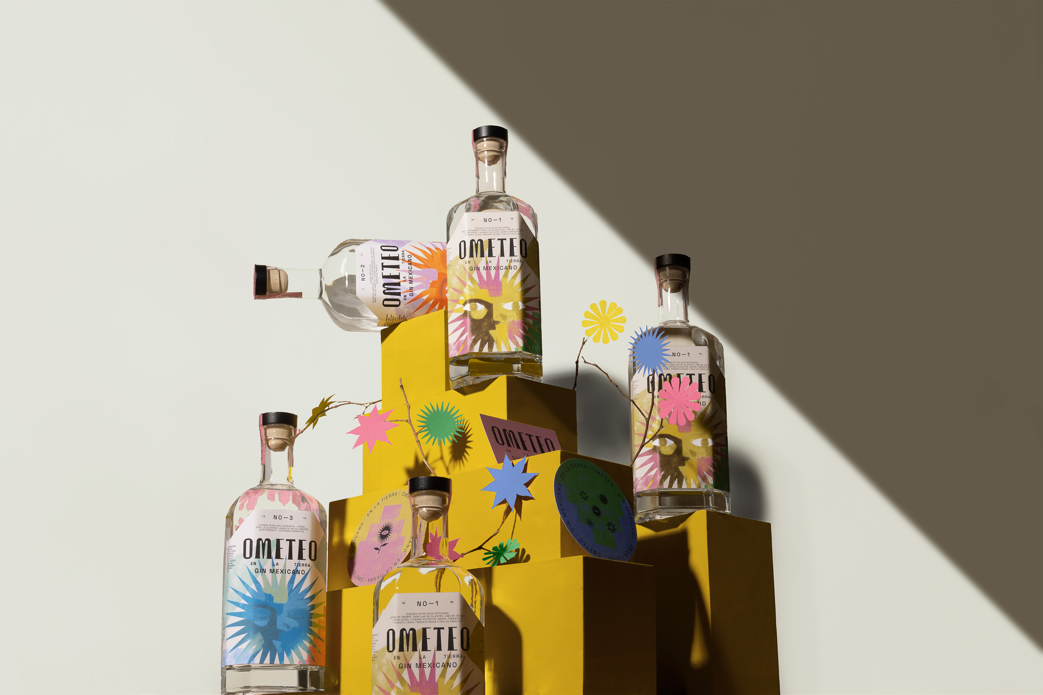
Solution
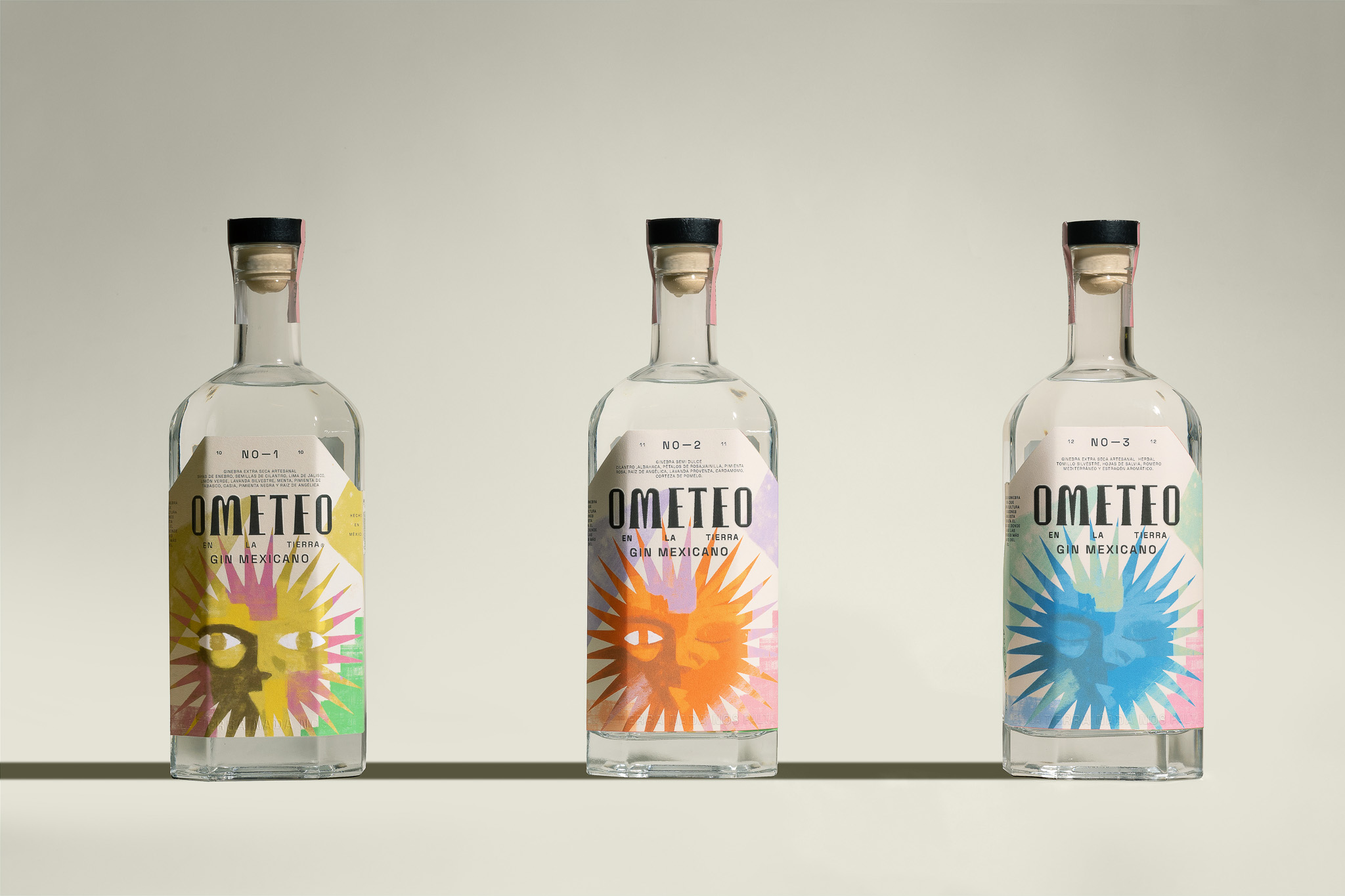
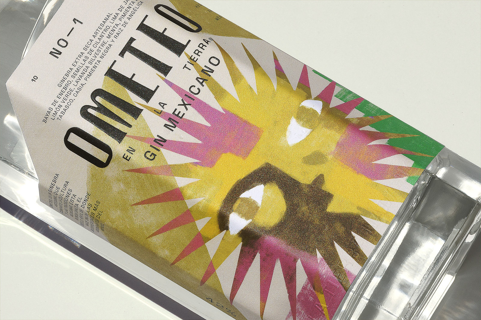
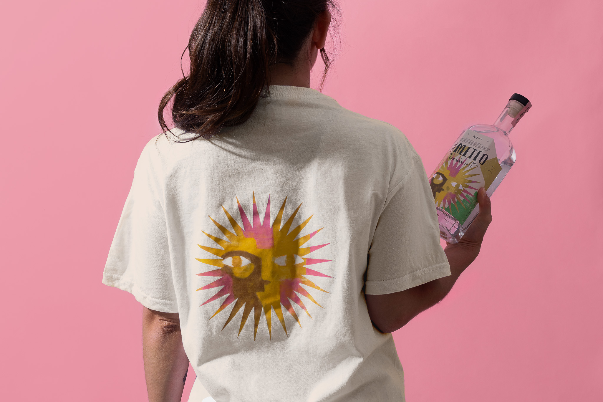
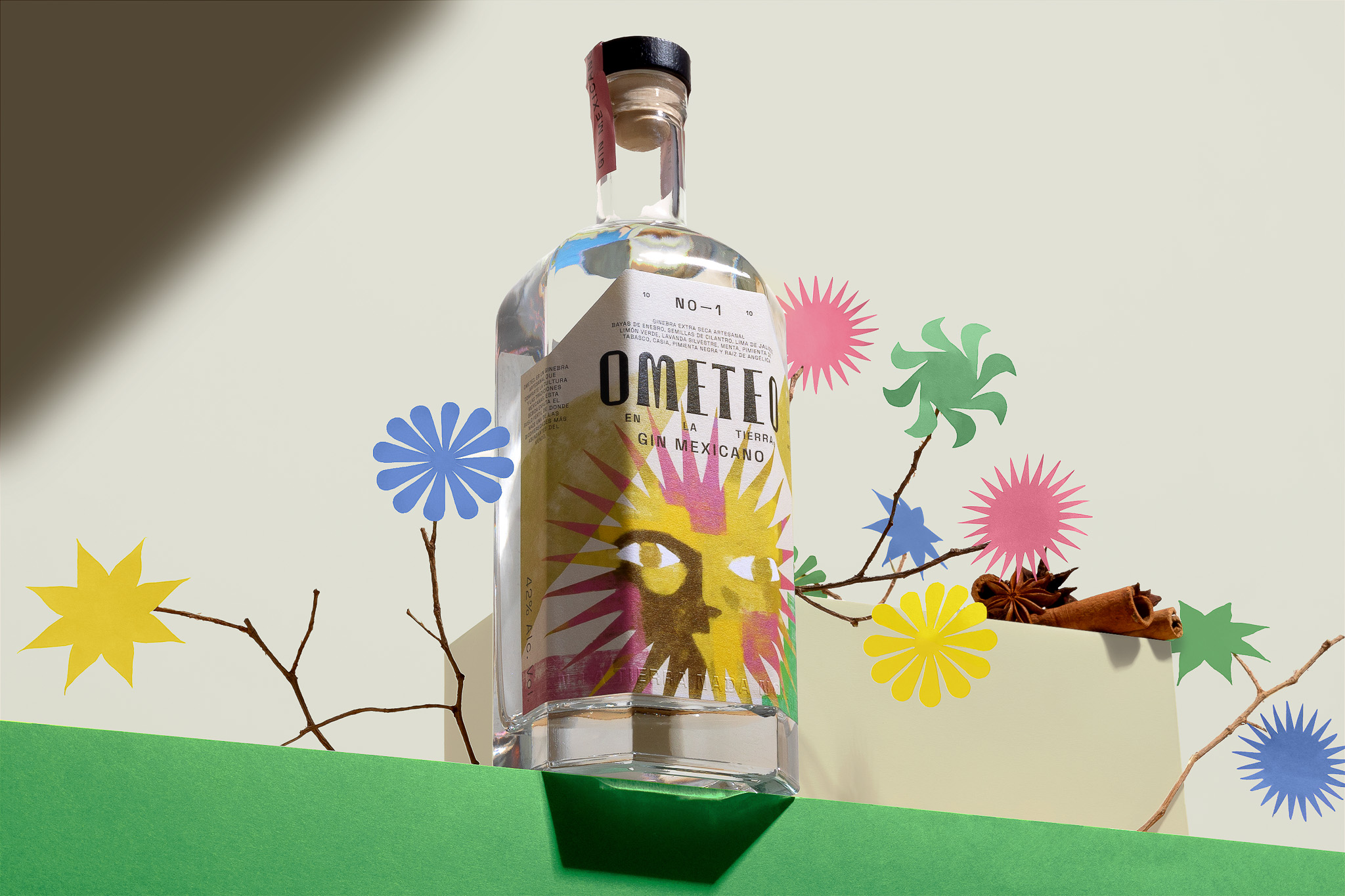
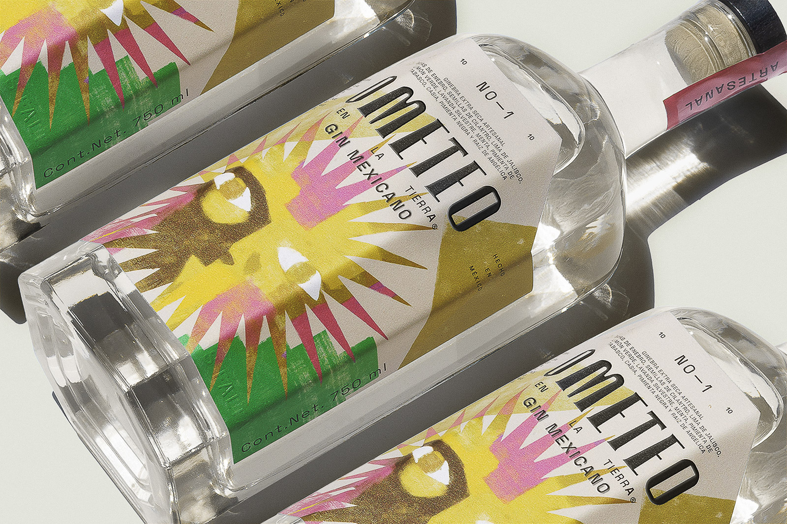
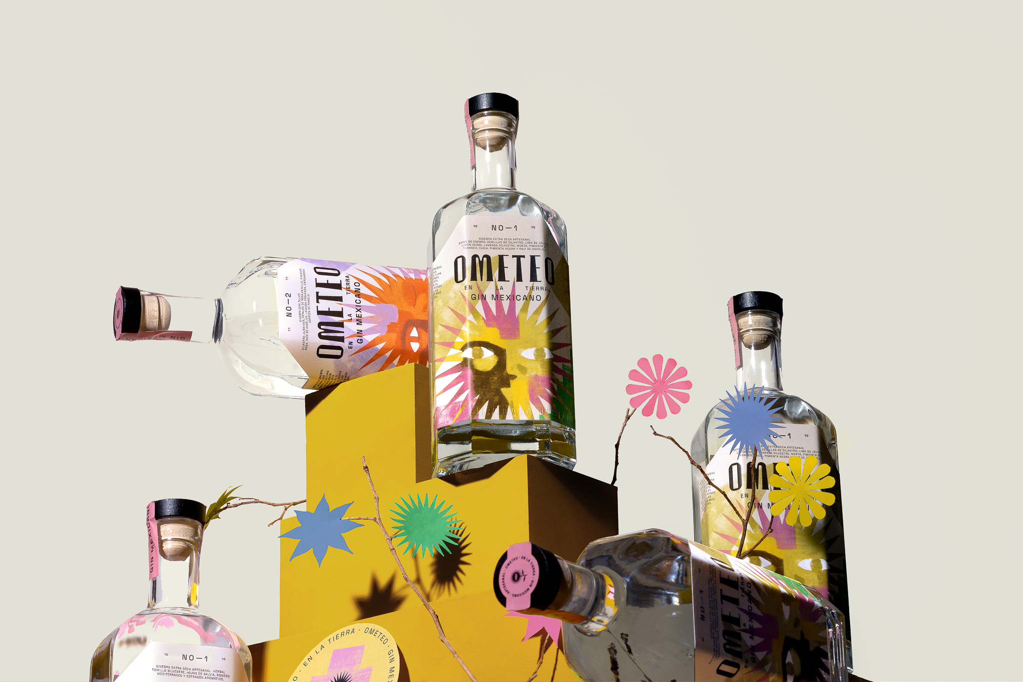
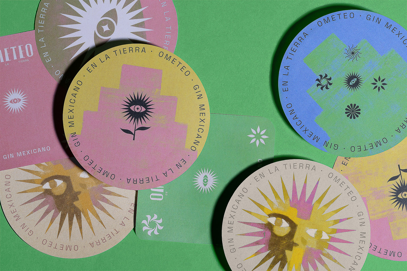
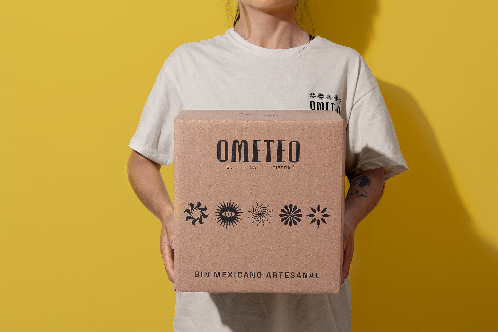
We started with Ometeotl, the Mexica deity of duality, to name the brand and shape its symbolic universe. The sun—source of life, energy, and balance—became the central emblem of the visual system. We designed a custom typeface that evokes pre-Hispanic monumentality, interpreted with a graphic attitude that’s urban, precise, and vibrant. The packaging becomes a visual ritual: a sun in bloom, a flower that radiates. The graphic system—bold, geometric, almost electric—lives between tradition and the present. The symbol, a sun-flower, embodies the union of earth and sky, while botanical patterns reinterpret Mexica and Maya motifs through a contemporary lens. Ometeo doesn’t dwell in the past—it proposes a new kind of spirituality, a sensorial experience with its feet on the ground and its gaze on the city. A gin meant to be sipped slowly, but lived in the now.

CREDIT
- Agency/Creative: Toro Pinto
- Article Title: Toro Pinto Creates a Symbolic Identity for Ometeo That Blends Herbal Ritual and Modern Design
- Organisation/Entity: Agency
- Project Type: Packaging
- Project Status: Published
- Agency/Creative Country: Mexico
- Agency/Creative City: Guadalajara
- Market Region: North America
- Project Deliverables: Brand Design, Brand Naming, Packaging Design
- Format: Bottle
- Industry: Food/Beverage
- Keywords: Mexican Heritage, Cultural Branding, Botanical Spirits, Contemporary Rituals, Ancestral KnowledgeBranding Packaging, Naming, Identity, Typography, Visual system, Custom type, Graphic design, Art direction
-
Credits:
Agency: Toro Pinto


