


Owners of Lost & Found partnered with Belfast-based studio Angel and Anchor for their rebrand in 2019 and again in 2022 for their North Coast co-habitant sister brand, Little Sister. Seeking to create a brand as part of the family of Lost and Found but have its own personality, a takeaway hatch serving speciality coffee and soft serve ice cream was born.
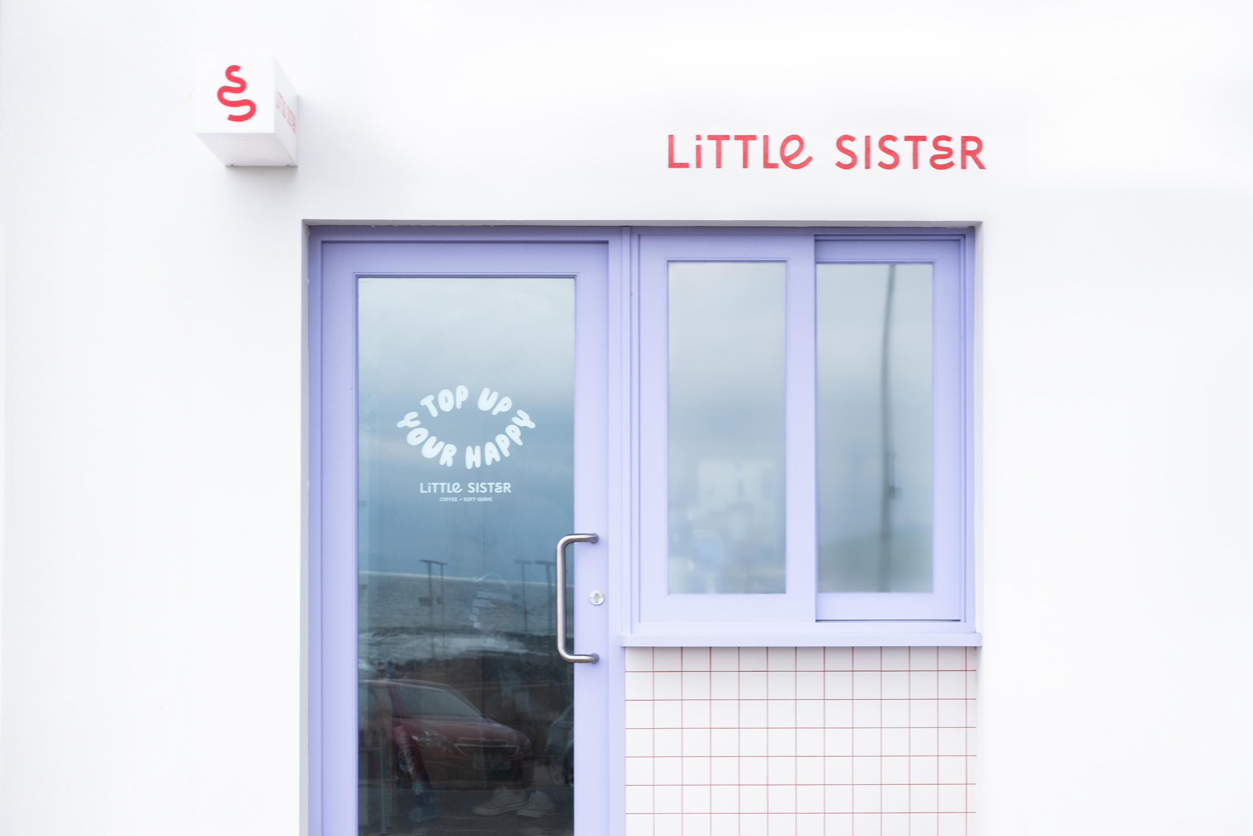
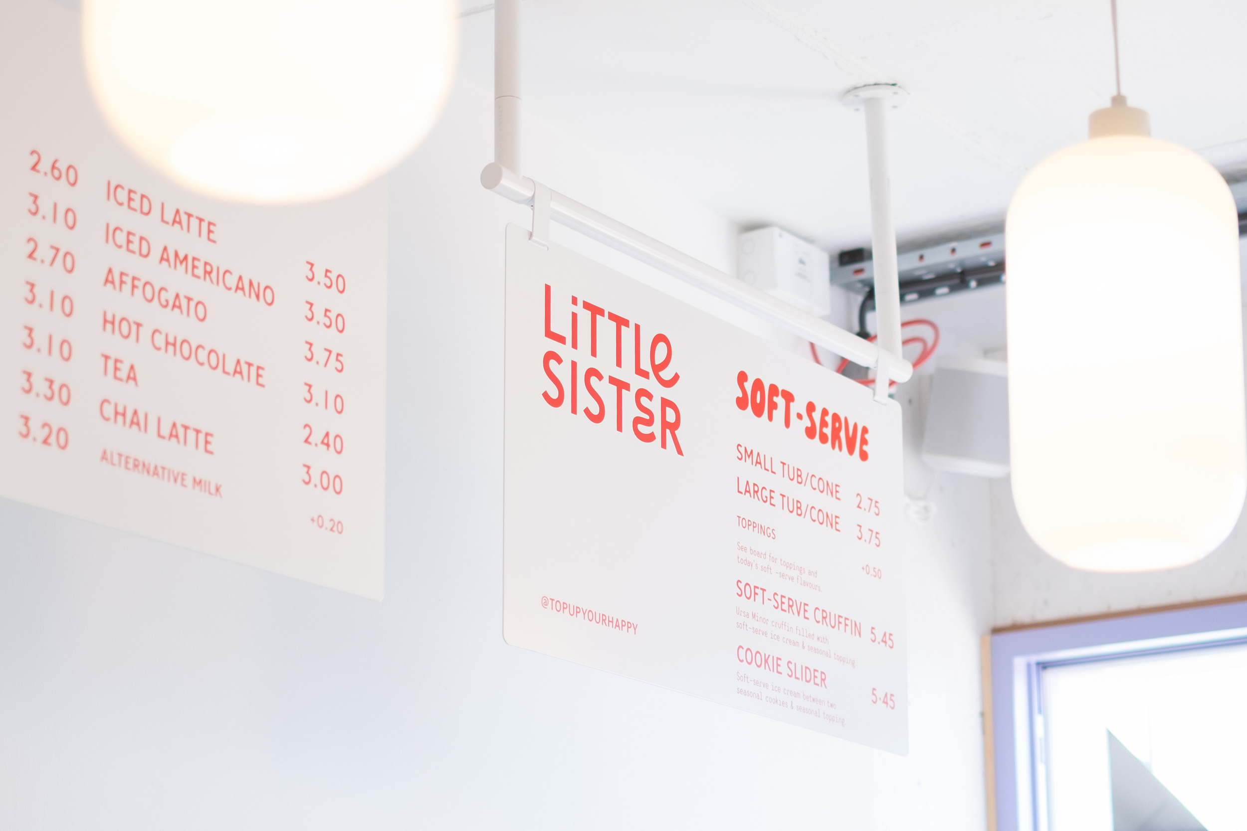
Art direction was a key part of the creative scope, starting with the shop’s fit-out and influencing other visual choices. The direction informed fit-out details such as tiles, signage, and surface colours, immediately expressing a vibrant and fun personality. Key features of the interiors inspired by classic ice cream shops, speciality cafe culture and modern editorial product photography found new life in the shop. Bright colours and minimalist design became Little Sister’s signature flair.
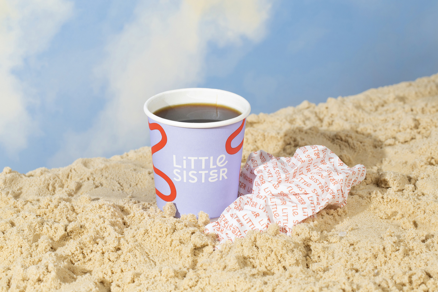
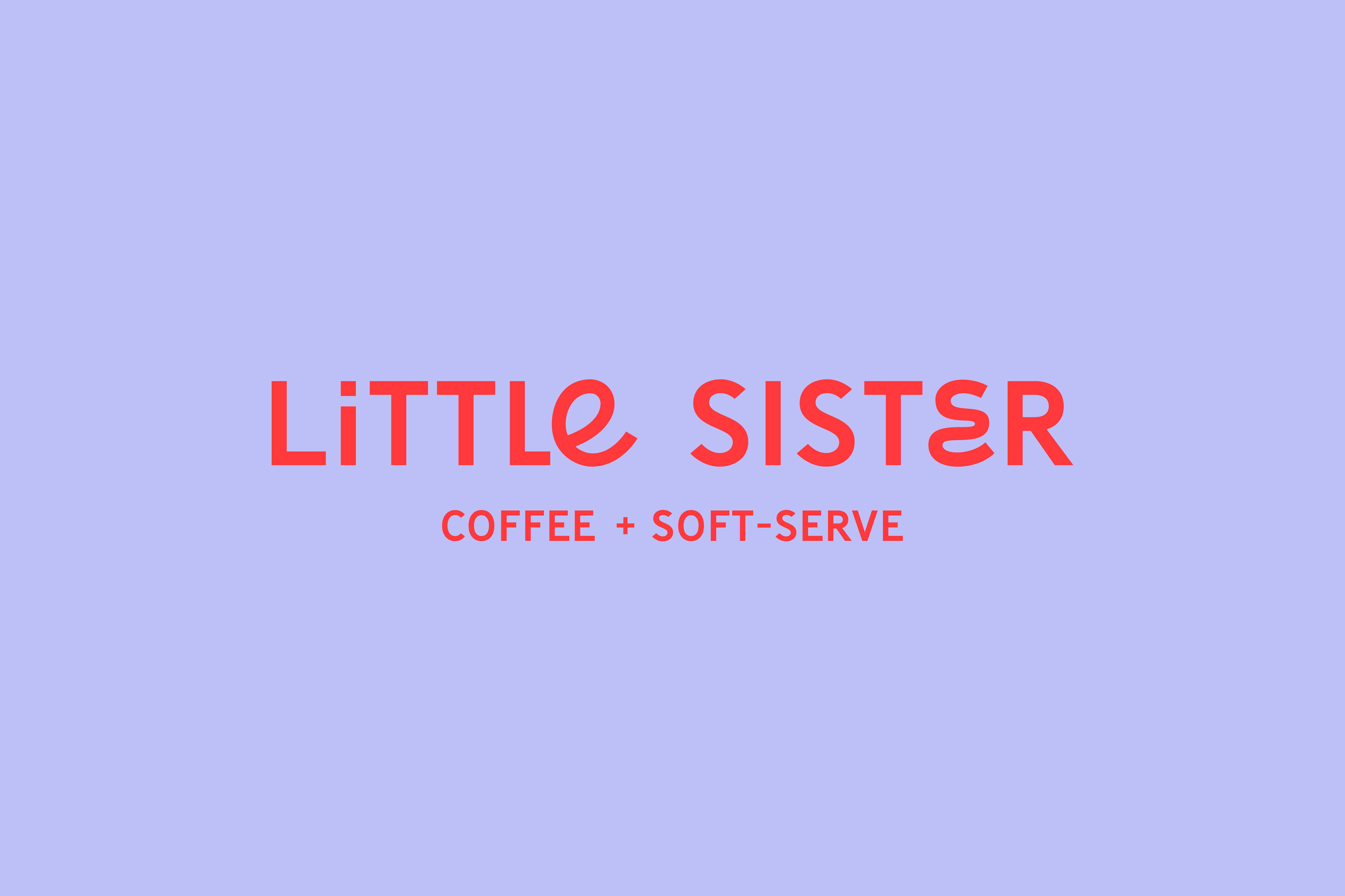
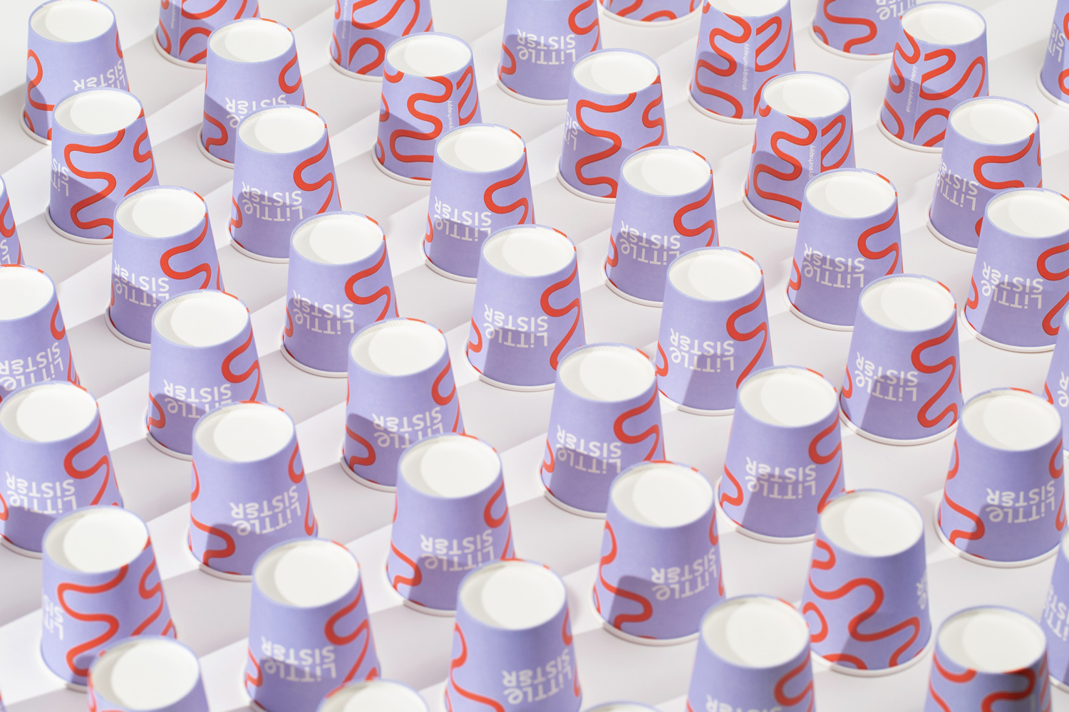
The brand identity flows through the details of the space. Parma violet purple, light peach and bright mailbox red are a sweet but punchy combination of colours for Little Sister’s palette. Colours splash the walls, contrasting grout with tiles, and a bright coffee machine dips the shop in an upbeat personality.
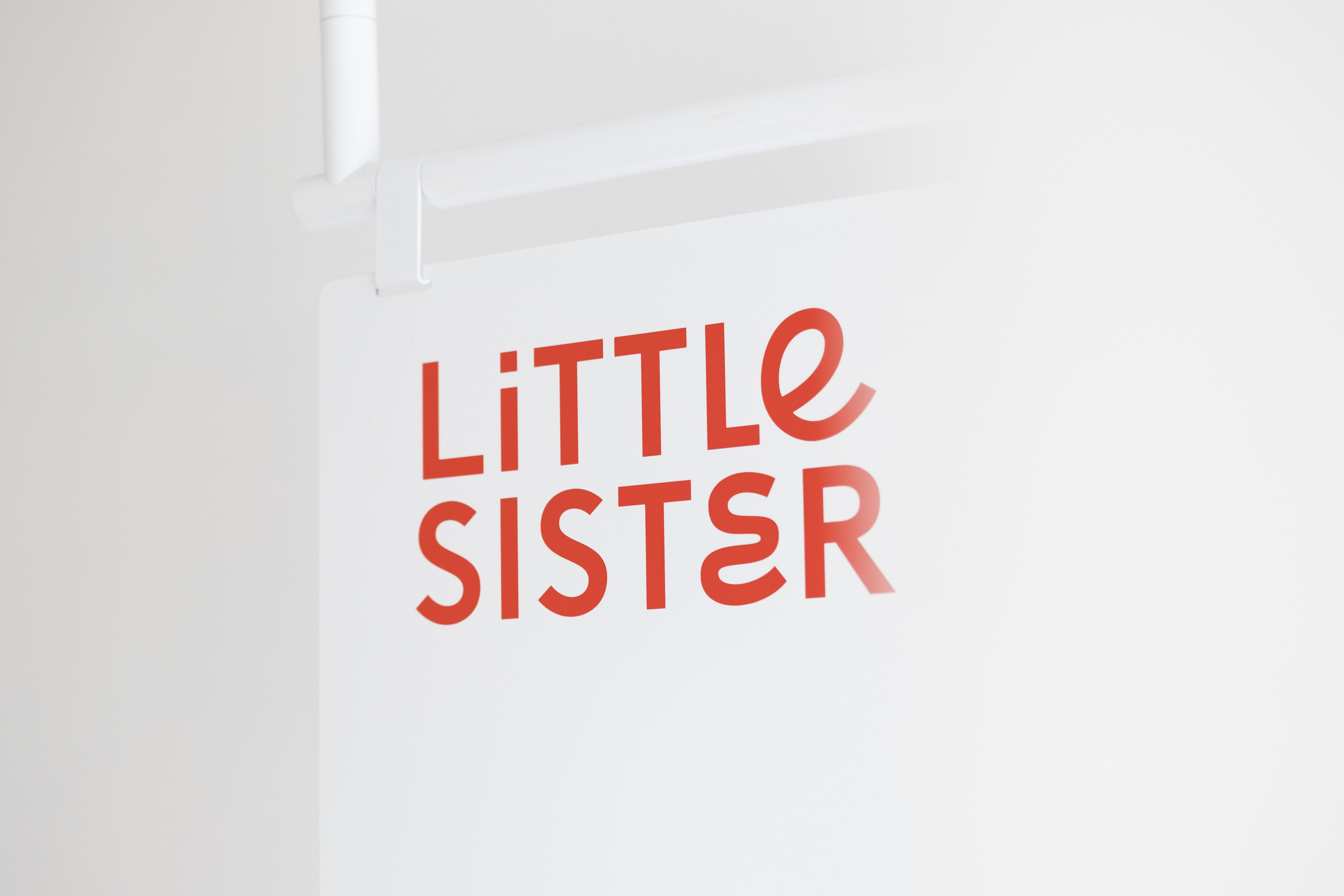
Little Sister’s custom mixed-case logotype combines a minimalist sans serif with swirling letterforms. The round open curves inspired by children’s handwriting paired with straightforward type creates a playful nod to lost & Found’s approach to their new project. The curly ‘E’s’ composed of flowing curves interrupting the tall sans serif’s uniformity give the brand the same air of mischief we often see in young kids. The playful hints throughout the brand carry Little Sister into a category of family-friendly fun. Alongside the logotype, alternative bubbly, inflated hand-drawn lettering serves as a cheerful dose of personality used throughout signage and packaging. A pairing body copy in a monospace style allows for an approachable and relaxed nature, whether detailing soft serve flavours of the day or shop opening hours.
Little Sister’s logo mark is an abstract swirl inspired by the north coast ocean waves, winding country roads and soft serve ice cream swirls. The custom mark echoes the shape of the custom ‘E’ in the logotype with extended curves, becoming an illustrative motif for the brand, used across packaging and signage.
Brand language plays a lead character role in the fun that Little Sister serves. A messaging strategy uncovered the shop’s personality and carved a foundation for copywriting. The brand features copywriting vignettes of north coast-specific, nostalgic immersion, uniquely identifying Little Sister’s voice.
“Servin’ up” is the spark for their key phrase formula that encapsulates the endless possibilities of the north coast. Tagging on the end of “Servin’ up” are picture painting scenes of “wet hair and sandy toes,” “break-time for beach architects,” “big ‘get-in’ group selfies,” and “back-seat sleepers” of north coast road trips.
Further emphasising the brand’s lighthearted, curious and friendly nature is the key messaging line ‘Top Up Your Happy,’ which hints at the seaside antics of regularly topping up sunscreen and keeping the morale sweet with sweet treats. Whether you are a parent of little ones or reminded of your own little self, this language system will hit you hard in the feels.
A visit to Little Sister is a unique way to experience the north coast, with something for everyone– delights for the mature palettes who enjoy speciality coffee and big soft-serve flavours for little hands.


CREDIT
- Agency/Creative: Angel & Anchor
- Article Title: Top Up Your Happy With Angel & Anchor’s Latest Project
- Organisation/Entity: Agency
- Project Type: Identity
- Project Status: Published
- Agency/Creative Country: United Kingdom
- Agency/Creative City: Belfast
- Market Region: Europe
- Project Deliverables: Art Direction, Brand Design, Brand Identity, Brand Mark, Brand Strategy, Copywriting, Identity System, Interior Design
- Industry: Hospitality
- Keywords: soft serve, ice cream, belfast, northern ireland, cafe, speciality coffee, visual identity, brand design, copywriting
-
Credits:
Creative Director: Ben Connolly
Designer: Ben Connolly
Designer: Kellyn Bowler


