


Tong Coffee Shop Brand Identity
Concept Overview
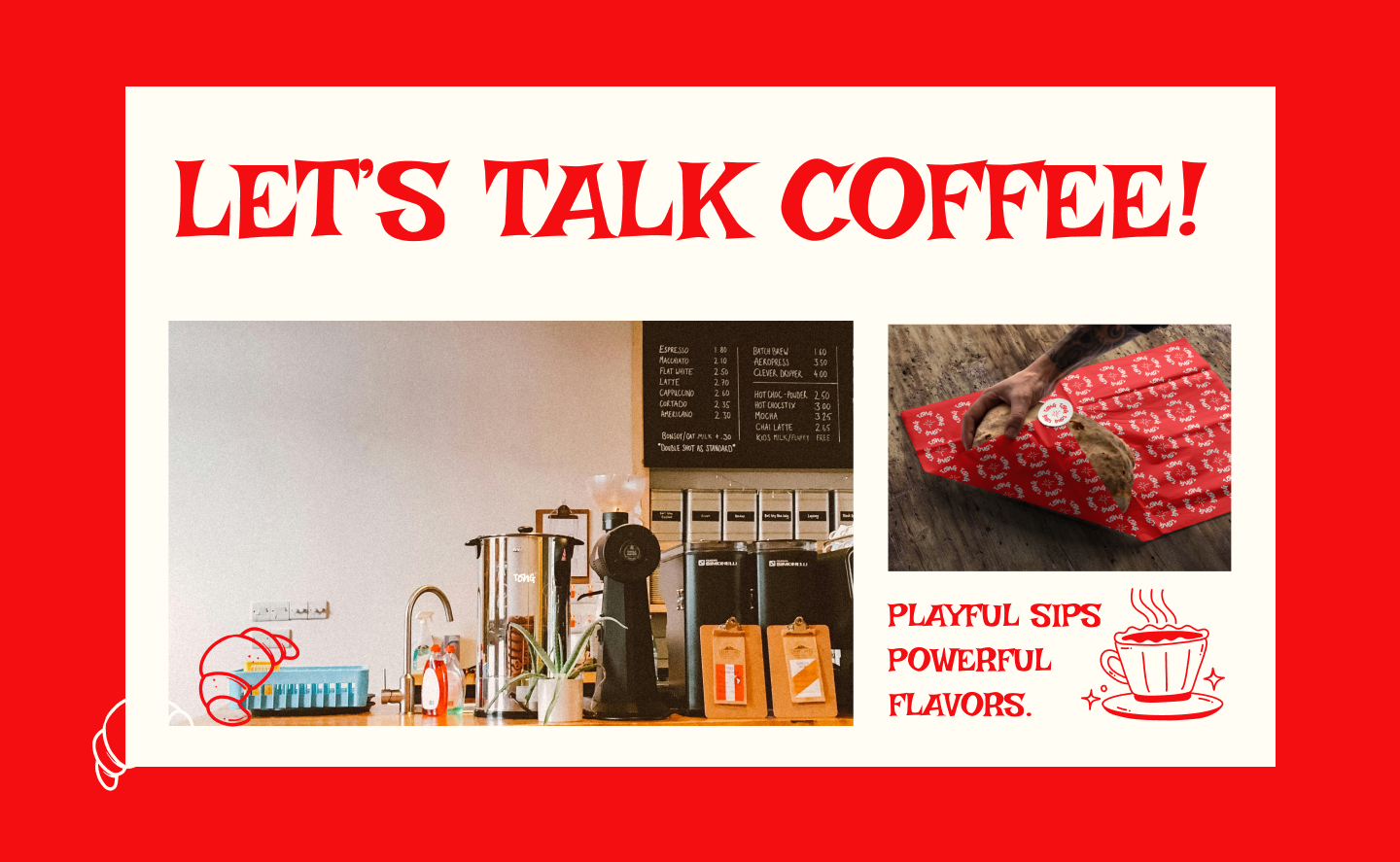
Tong is more than just a coffee shop—it’s an experience, a journey, and a celebration of individuality. In the world of traditional cafés, we’re the ones pushing the boundaries and offering something truly unique. At Tong, we aim to blend bold flavors, vibrant energy, and creative spirit to break free from the monotony of your typical coffee experience. Our space is designed to be more than just a place to get your caffeine fix—it’s a place where ideas flow as freely as the coffee, where laughter is abundant, and every interaction is filled with possibility. Each cup of coffee we serve tells a story, bringing together individuals from all walks of life for unforgettable moments. Whether you’re here to spark new ideas, catch up with friends, or just enjoy a quiet moment, Tong is where adventures begin and memories are made.
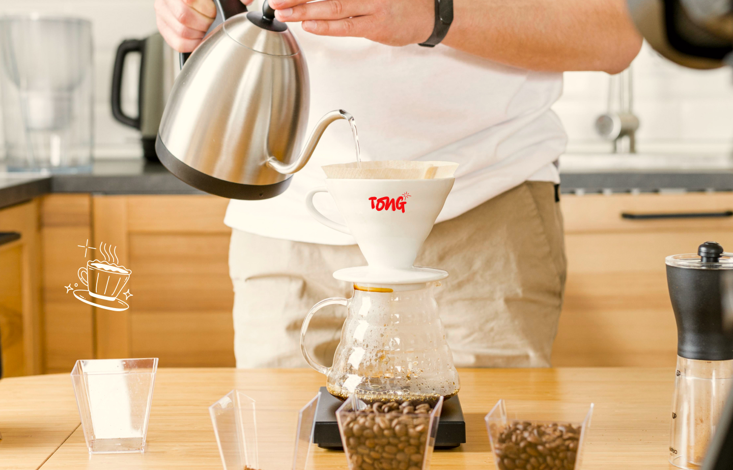
At Tong, the focus is on quality, creativity, and community. Our coffee is carefully crafted to be more than just a drink; it’s a catalyst for inspiration, connection, and change. We are redefining the coffee culture by creating a space where boldness and creativity can thrive. From our unique coffee blends to the lively, inviting atmosphere, everything about Tong challenges the conventional, encouraging customers to break free from the ordinary and embrace the extraordinary.
Signature Characters
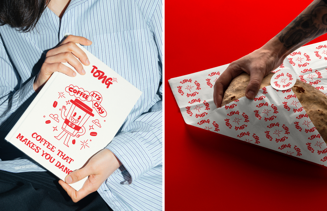
Tong’s identity is captured through the persona of The Coffee Rebel. Loud, bold, and unafraid to break the rules, the Coffee Rebel is the embodiment of Tong’s fearless spirit. This character represents our brand’s willingness to step outside the norm and challenge the conventional ideas of what a coffee shop should be. With a cup of coffee in hand, the Coffee Rebel stirs up creativity, energy, and just the right amount of chaos. This character fuels the vibrant, adventurous vibe that Tong embodies, reminding everyone that coffee is not just about taste but about experience and energy. Every visit to Tong is an invitation to break free from the mundane, embrace creativity, and find your own spark of inspiration.
The Coffee Rebel is not simply a symbol; it’s a mindset. It represents our dedication to forging a new path in coffee culture—one that’s defined by boldness, freedom, and creativity. Through this character, Tong encourages its customers to think outside the box, try something new, and discover the possibilities that come with every cup. It’s about creating a space where unconventional ideas are celebrated, and every moment is filled with energy and excitement.
Brand Typography
Logo & Headings:
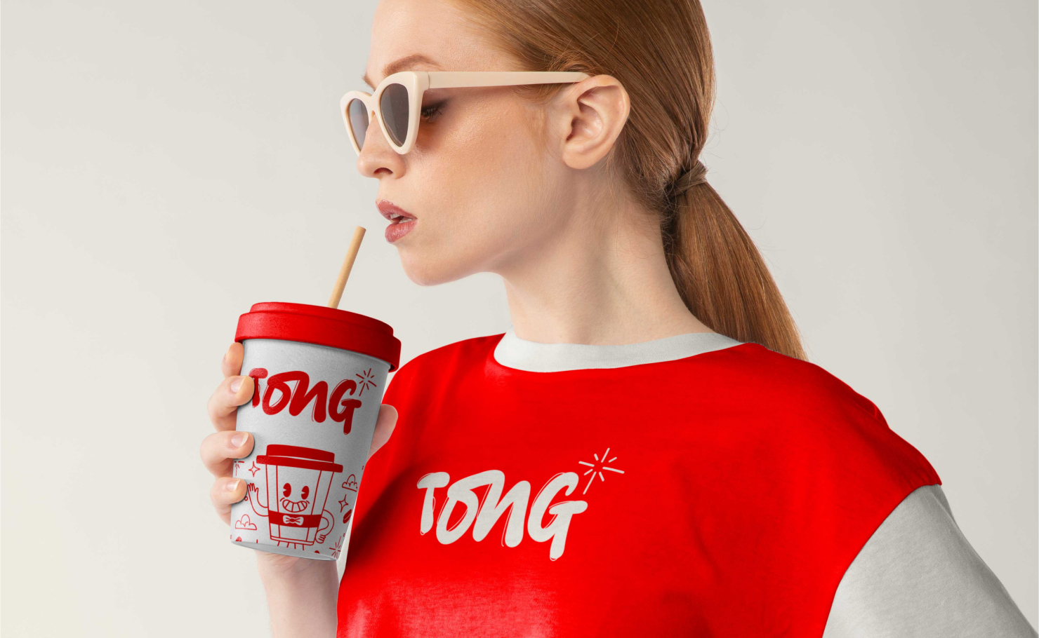
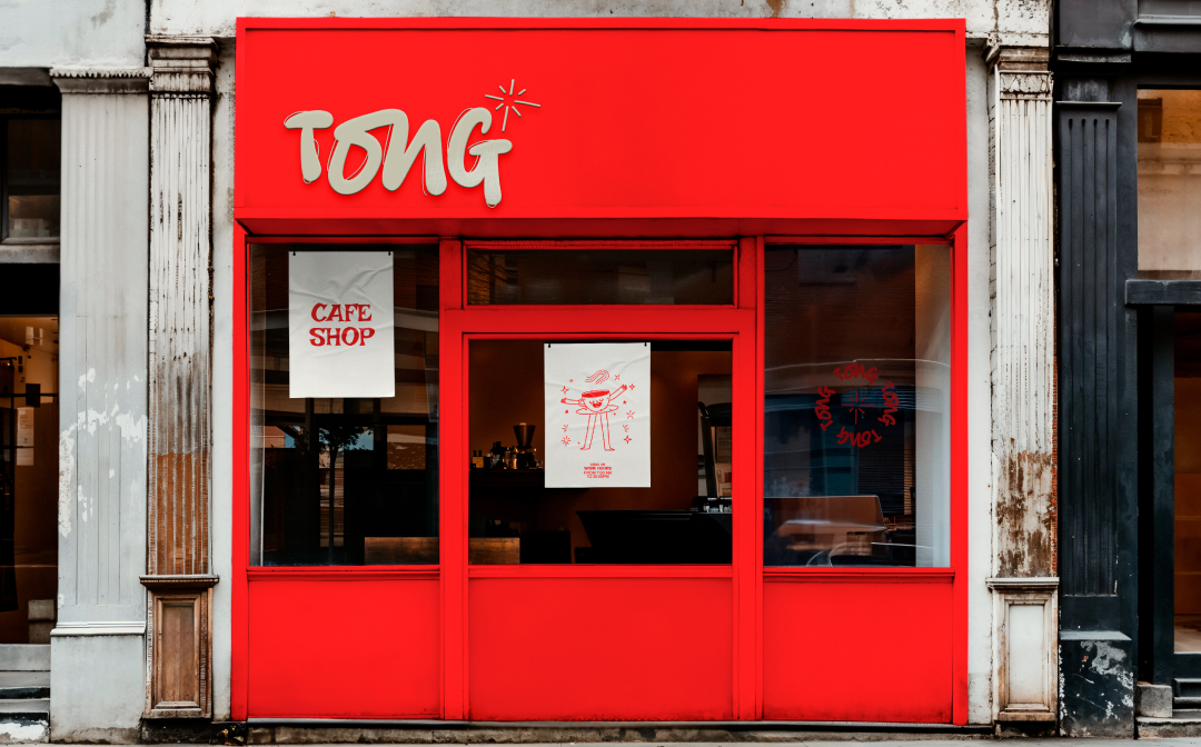
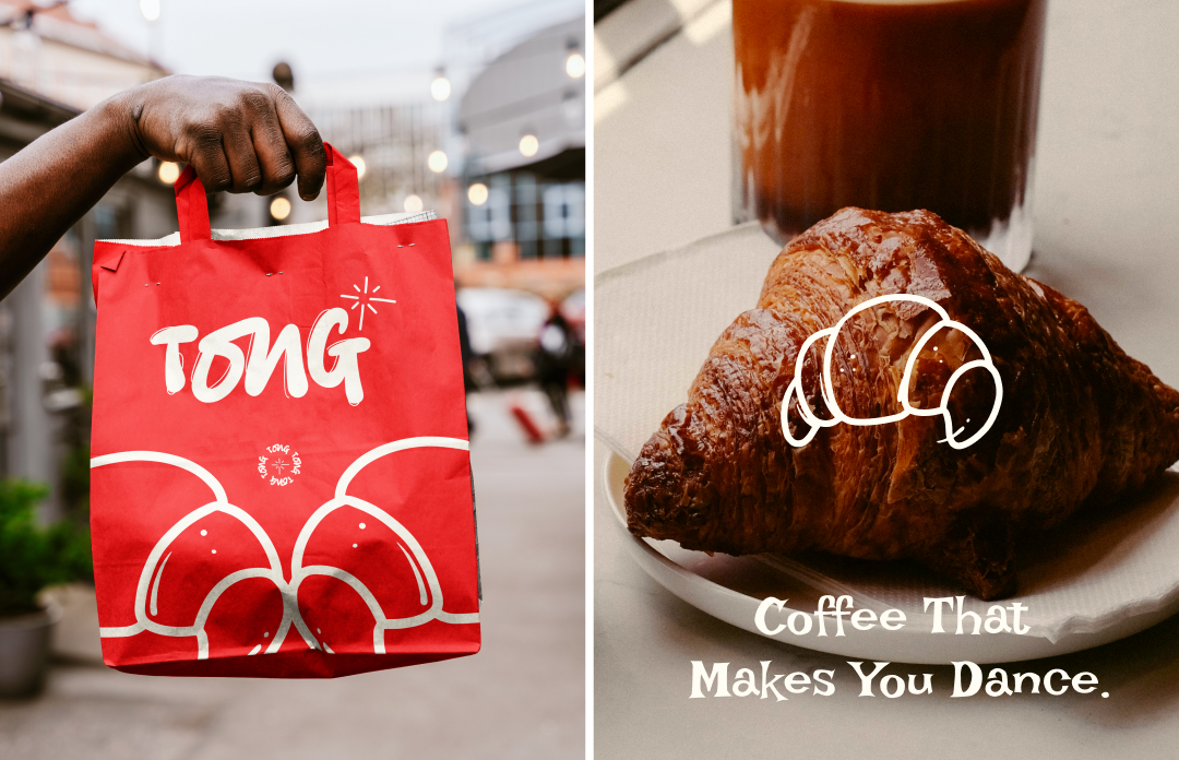
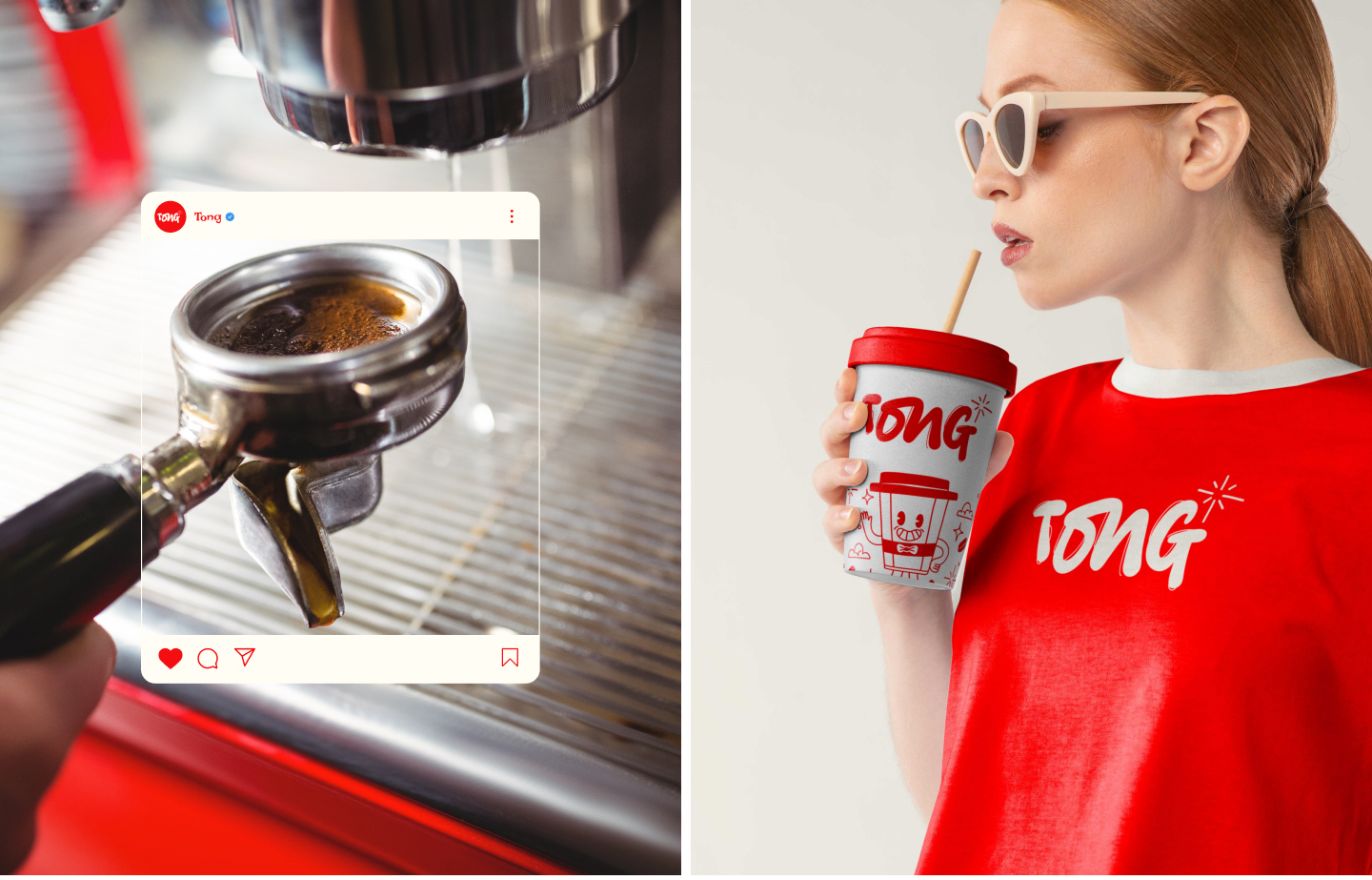
The typography used for Tong’s logo and headings is a bold, funky handwritten script that perfectly captures the brand’s playful, rebellious spirit. The logo’s style reflects Tong’s energetic and creative vibe, making it instantly recognizable and unmistakably unique. It’s designed to stand out, catching the eye and giving off a sense of liveliness and fun. The handwritten nature of the script gives the brand a personal, human touch, inviting people into the world of Tong with warmth and authenticity. The boldness of the font speaks to the brand’s confidence, while its playful nature reflects the brand’s commitment to breaking the rules and embracing individuality.
Body Text:
For body text, Tong uses a clean, modern font that balances readability with style. This font is simple and contemporary, ensuring that all content is clear and accessible to readers while still maintaining a fresh, inviting atmosphere. The contrast between the bold, dynamic headings and the sleek, modern body text ensures a harmonious visual balance. The modern typeface helps convey professionalism while keeping the overall tone light, fun, and approachable. This design choice allows Tong to communicate its messages effectively while preserving the energy and spirit that the brand is built upon.
Accents:
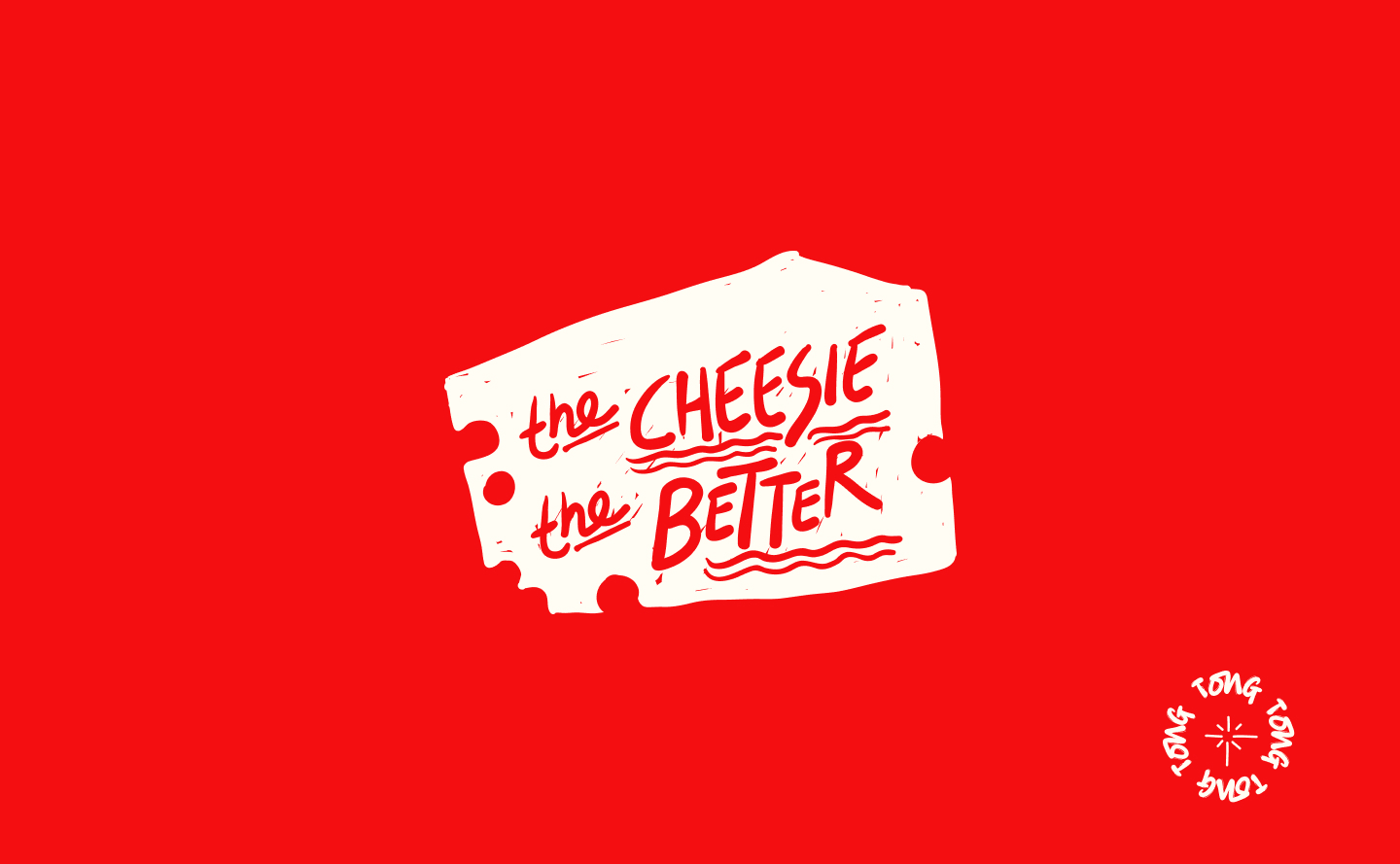
For special highlights, promotions, and merchandise, Tong incorporates a retro or stencil-style display font. This accent typography adds an urban, edgy feel, perfect for reinforcing the adventurous, rebellious nature of the brand. Whether it’s for event posters, limited-time offers, or merchandise like t-shirts and mugs, the accent font gives the design an added level of character. It enhances the sense of boldness and excitement, making it clear that Tong is a place that’s all about standing out and being unapologetically unique. The retro or stencil font brings a touch of nostalgia and grit, creating a sense of timelessness while maintaining the brand’s forward-thinking attitude.


CREDIT
- Agency/Creative: Wolfpixel
- Article Title: Tong Coffee Shop Brand Identity by Wolfpixel
- Organisation/Entity: Agency
- Project Type: Identity
- Project Status: Published
- Agency/Creative Country: United Kingdom
- Agency/Creative City: England
- Market Region: Europe
- Project Deliverables: Brand Identity
- Industry: Food/Beverage
- Keywords: coffee shop, brand identity, cafeteria, cafe, restaurant, Branding design
-
Credits:
Masuder Rahaman: Masuder Rahaman


