


Baikal – Water from Tomatdesign
Brand: Baikal / Agency: Tomatdesign
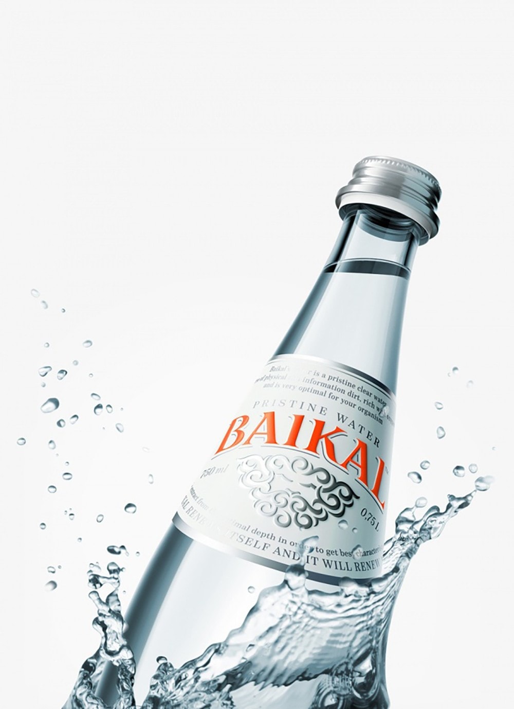
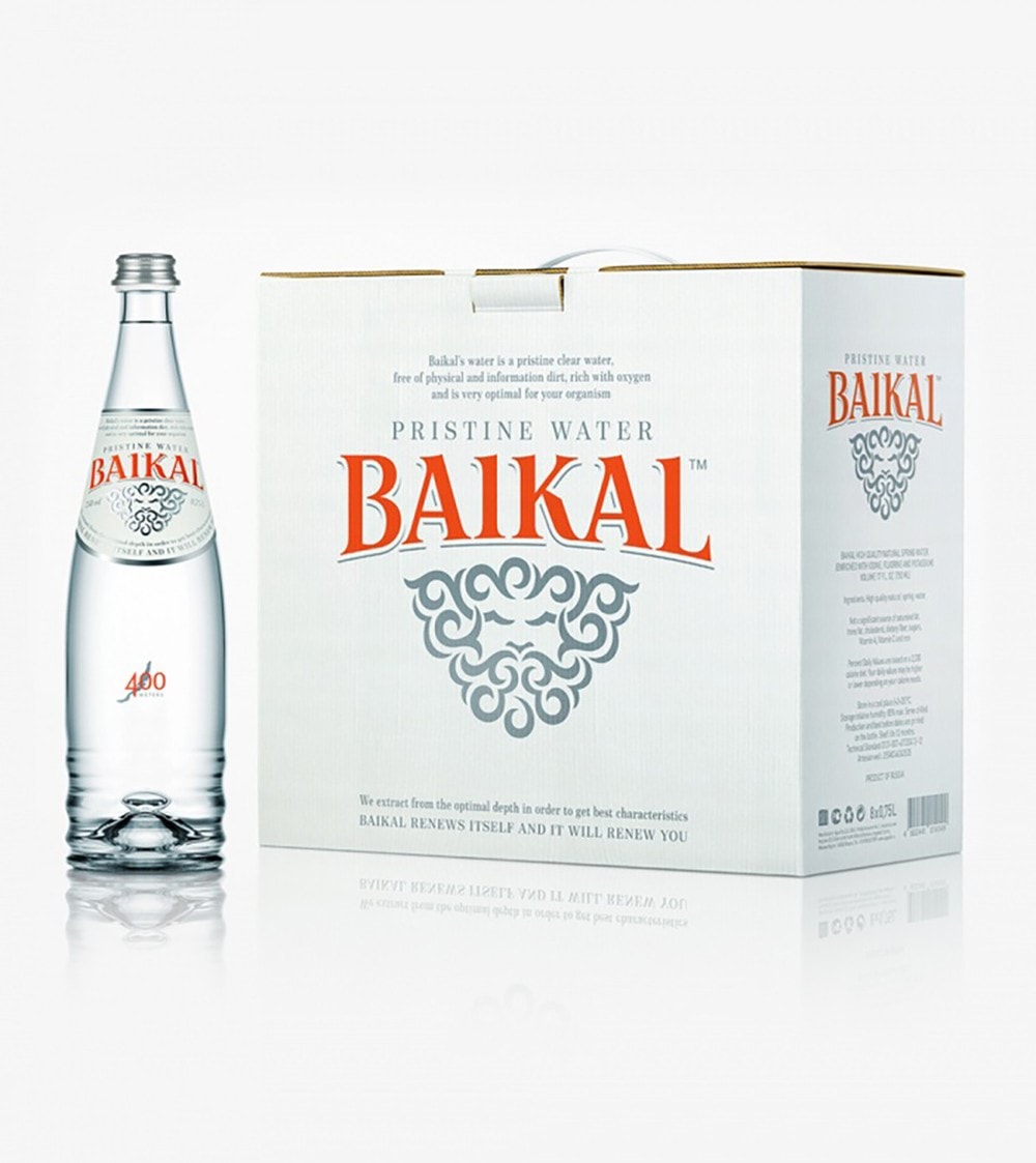
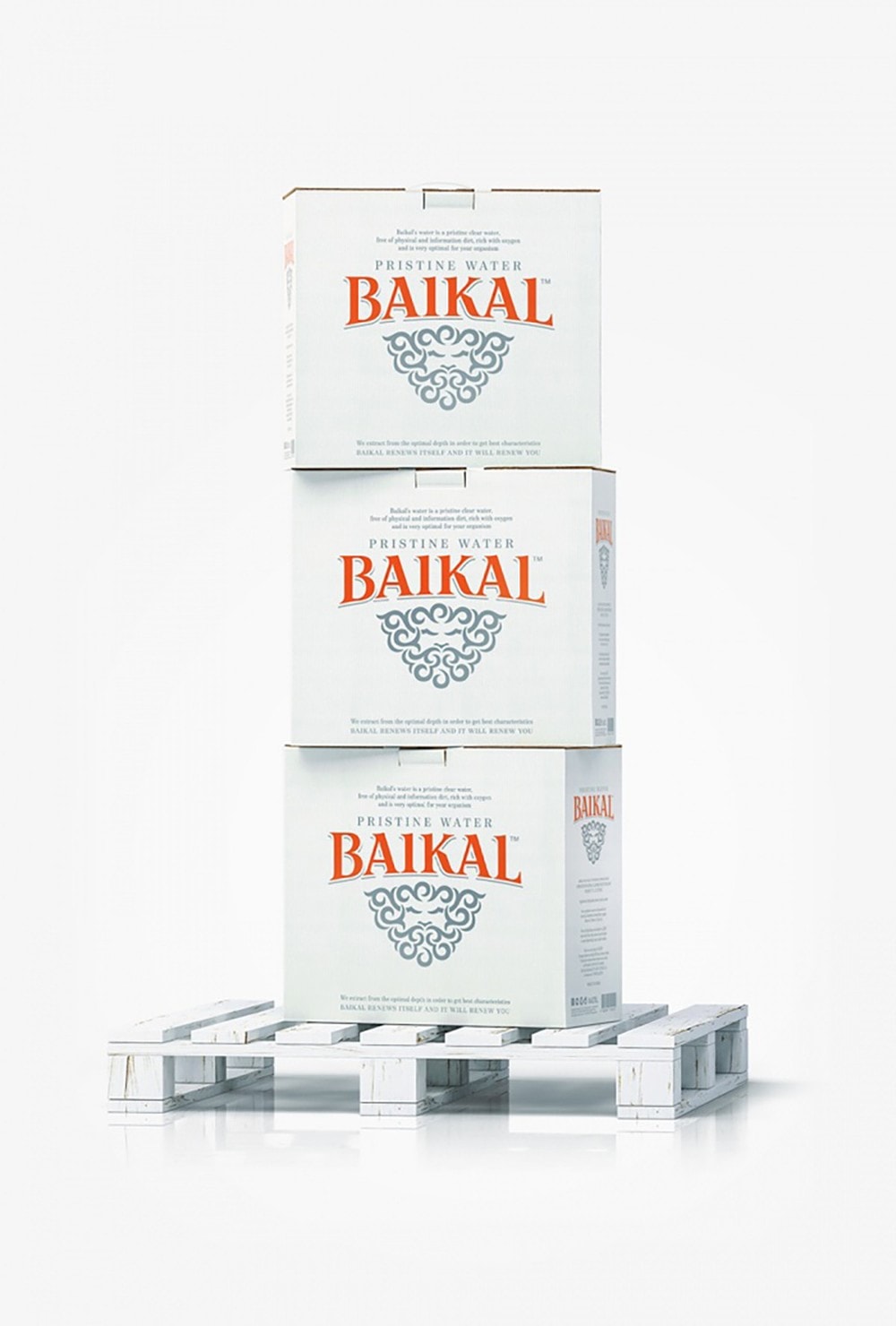
“Tomatdesign Agency has developed a new packaging for the brand Baikal. Drinking water class premium, extracted at a depth of 400 meters, directly from the wells on the lake.
It became a symbol of the brand image of the old man of Lake Baikal – the popular character of many legends and myths of the peoples of Buryatia. The image itself is styled with Buryat national ornament. This graphical method gives a unique brand and product positioning support – clean pristine water.”


“Агентство Tomatdesign разработало упаковку для новой торговой марки Baikal. Питьевая вода класса premium, добывается на глубине 400 метров, непосредственно из скважины на озере Байкал.
Символом бренда стал образ старика Байкала – популярного персонажа многих легенд и мифов народов Бурятии. Само изображение стилизовано под национальный бурятский орнамент. Такой графический прием придает уникальности торговой марке и поддерживает позиционирование продукта – чистая первозданная вода.”

CREDIT
- Agency/Creative: Tomatdesign
- Article Title: Tomatdesign – Baikal Water
- Project Type: Packaging
- Substrate: Glass, Pulp Paper


