


Toblerone has unveiled a new brand story and visual identity redesign for its iconic chocolate bar to encourage uniqueness in all its forms, empower individuals and pay tribute to the importance of being stubbornly triangle in a world of squares.
Conceived through collaboration between Toblerone and strategic brand creative agency Bulletproof, Toblerone’s new brand story pays tribute to the importance of being stubbornly triangle in a world of squares. It draws on the brand’s heritage of being different in the traditional world of chocolate – its shape as well as its original signature taste of smooth chocolate, chewy nougat and crunchy almonds.
It brings a new relevance and appeal to chocolate fans around the world, showing up in unexpected ways through creative execution, tone of voice and activation.
Dare to be different
Mondelēz’s SVP of global brands Mie-Leng Wong says: “The premium chocolate market is growing at a phenomenal rate and as the world’s number one premium chocolate in Global Travel Retail, we need to evolve with what our consumers want to see. With a rich brand heritage over 110 years in the making, we saw an opportunity to return to our roots with a new brand story that pays homage to the core values embodied by our innovative founder.
“The aim is to challenge stereotypical behaviours in the category and allow us to do things in a more progressive premium way, encouraging uniqueness and celebrating all things triangle. It also offers an opportunity to repurpose and strengthen the quality credentials of Toblerone to grow it beyond its heartland of world travel retail.”
Driving brand purpose
To drive strategy, visual execution and communications, Bulletproof distilled the brand’s new purpose, creating the distinctive call to action, ‘Be More Triangle’, which informed the development of a whole new brand world.
Nick Rees, Chief Creative Officer and Partner at Bulletproof says: “Theodor Tobler broke the mould in his time – when others were creating squares, hemmed in by the refinement and rules of Swiss chocolate production, he went off on a tangent. Delving into the archive and the founder’s story informed the new brand purpose. Toblerone champions the triangles: those who dare to be different, to be themselves, who have the courage to stand against conformity and unleash their ingenuity.
“Looking back into a brand’s archives usually uncovers a world of craft and lost nuance. But we uncovered something much more powerful. Mr. Tobler was way ahead of his time, an activist, a maverick and a true disruptor yet he never once took his eye from his driving ambition: to make high quality, deliciously surprising chocolate experiences.”
A bold and vibrant visual style
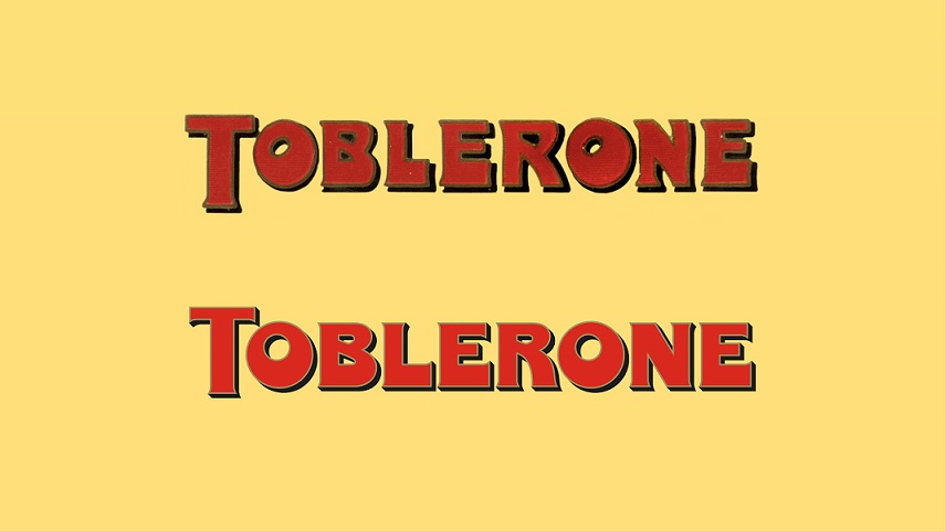
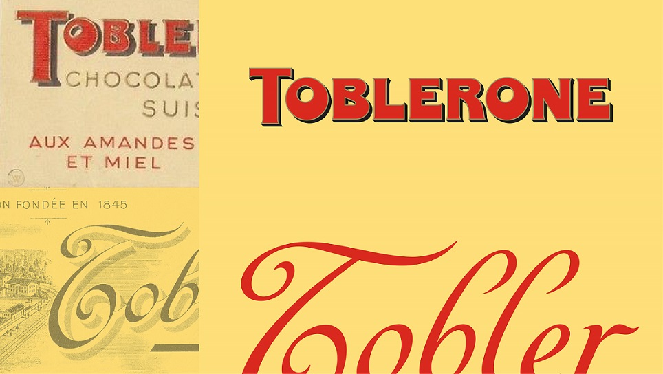
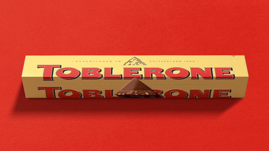
The new visual identity includes a redrawn wordmark, a complementary typeface and a modern and disruptive colour palette. The revitalisation of the Toblerone wordmark drew inspiration from the Toblerone archives, reintroducing the character of the original through bold quirks such as an off-centre counter in the ‘O’ and an unconventionally thickened base to the ‘E’.
All visual executions, including on pack, supporting brand world and digital communications, are based on three core design principles: ‘defined by our edges’, ‘strikingly different’ and ‘vibrantly positive’.
“Applied in combination, they create stand-out and offer the unexpected in a lively and powerful way,” explains Rees. “They’re about purposeful disruption, about standing out and being proud and adding vibrancy to the tone of voice and all design elements.”
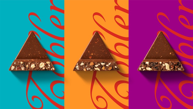
The new colour palette marks a move away from the chamois and gold of the past to a more confident and modern approach with eye catching wild bursts of contrasting colour.
The creative elements also include a contemporary, yet quirky graphic style and a new ‘Tobler’ signature inspired by the founder’s sign-off on an archive poster. The redesign also modernised and streamlined the mountain logo, in line with the geometric and ‘be more triangle’ aesthetic, while retaining its famous hidden bear.
Reinventing the gifting experience
This new look and feel are further supported with the launch of a progressive direct-to-consumer e-commerce gifting platform with advanced personalization features. It was developed in collaboration with digital production specialist Media Monks which used the new identity for the creative build aspects of the new site.
The Toblerone team, Bulletproof and Media Monks collaborated to create a new direct-to-consumer UK ecommerce website that shifts the conventional online gift shop towards a more unexpected user experience.
Toblerone.co.uk offers a curated assortment of personalised gifting ideas and content that amplify and celebrate the uniqueness of relationships, and events that chime with the purpose of celebrating individuality.
Aiming to take personalisation to the next level, it launched with ‘Send a Feeling’, a gifting occasion that allows people to select a 6x100g bar bundle to send a feeling in support and celebration of those individual moments that matter. These sentiments are evoked through limited-edition pack design that features personalised messages.
The pack is inspired by the new brand world and includes the new Toblerone typeface and wordmark, Tobler signature and redrawn mountain, combined with vibrant illustrations that embrace the new brand purpose. Expressing the different feelings in weird and wonderful ways, the illustrations are full of the new brand vibrancy and expressive quirks, saluting the triangle, the edges and individuality in all.
The launch also highlights the ambitious motion principles of the brand – an integral part of the work – with the brand assets brought to life through bold, clean graphics in unexpected and dynamic ways.
Global Brand Lead for Toblerone Emanuel Gävert adds: “Our new purpose and elevated identity marks the start of an exciting new journey for the brand, one which we hope encourages uniqueness in all its forms. As a brand, we want to effect positive change and positively influence consumer behaviour, and – thanks to a truly collaborative approach between us and our agency partners – this rebrand gives us the purpose and platform to set such change in motion.”
The new brand will be rolled out in full across core packaging, point of sale material and other communications over the coming months.

CREDIT
- Agency/Creative: Bulletproof
- Article Title: Toblerone Celebrates All Things Triangle With New Brand Story
- Organisation/Entity: Agency
- Project Type: Identity
- Project Status: Published
- Agency/Creative Country: United Kingdom
- Agency/Creative City: London
- Market Region: Global
- Project Deliverables: Brand Design
- Industry: Food/Beverage
- Keywords: Identity, brand, story, toblerone
-
Credits:
Creative agency: Bulletproof


