


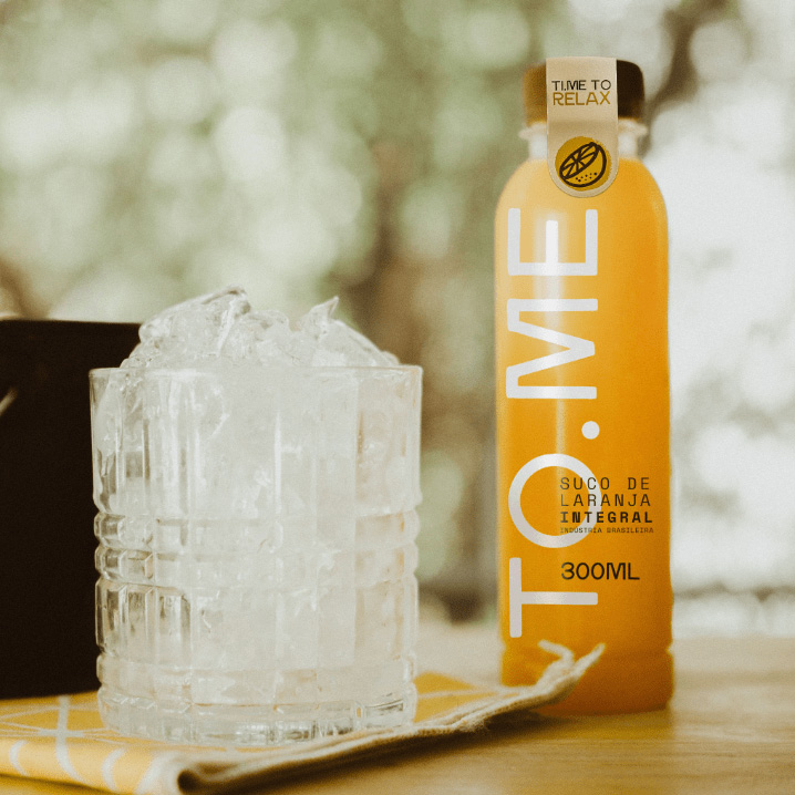
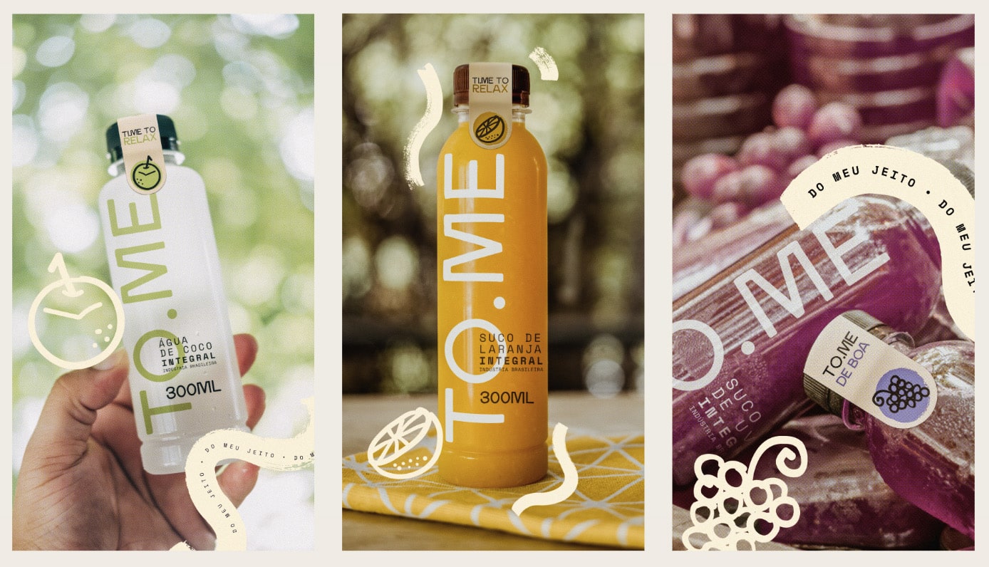
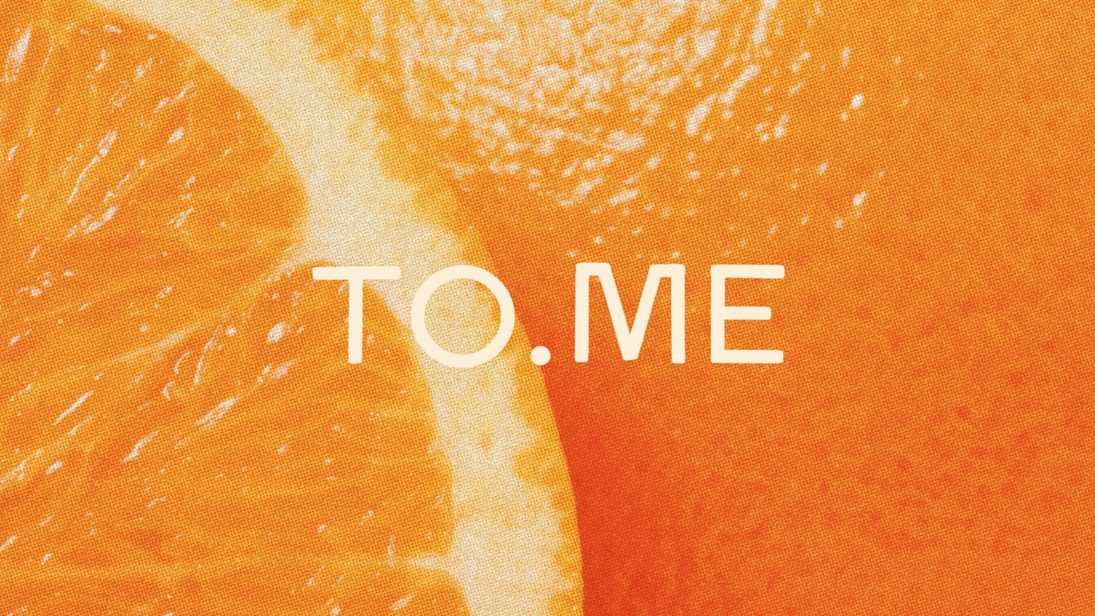
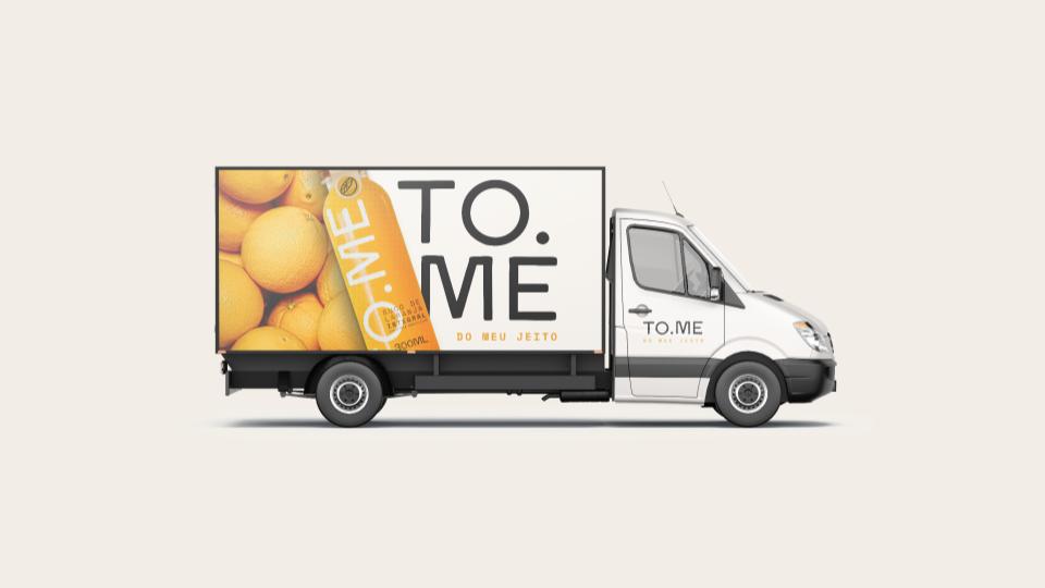
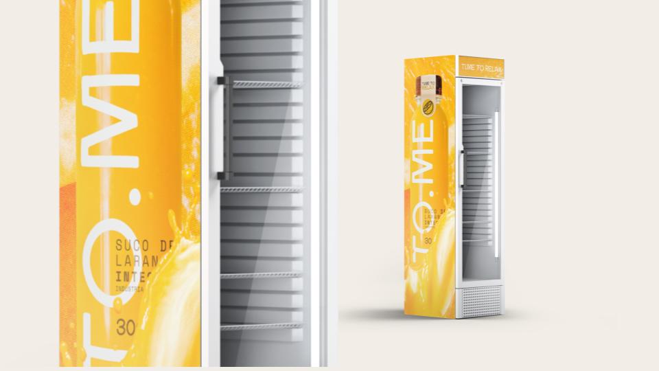
The branding and naming of To.Me, the new beverage brand from food distributor Pater, was carefully developed to convey its unique personality. The name “To.Me” has two meanings: a drink made “for me” and the verb “to take” in the imperative, reflecting its energy and flexibility.
Now, we come to the step of translating that personality into your look. We will present the elements that will build and consolidate its concept and visual identity, adding even more value to the brand and the affordable products it offers.
To.Me was born to stand out. It is remarkable on the shelf, on the breakfast table and in the rush of everyday life. This brand combines, adapts and generates identification with the public, as it is fully aligned with the lifestyle of those seeking quality and well-being.
The To.Me manifesto expresses the grace of life, which has a taste of spontaneity. It’s taking time just for yourself, living the routine with pleasure, dressing authentically every day, dancing in a funny way, singing out of tune, learning new things, being free, light and loose.
And the best of all? It’s okay not to be perfect. Authenticity is assuming one’s quirks, without fear of being judged. Each individual is unique, moving at their own pace. If you hit that urge to change, move. Life is full of daily upheavals and, therefore, it is important to appreciate the taste of the path.
When you lack courage, take action. When you lack the will, be bold. When short of breath, take a breath. Take your time. Take what’s yours. Enjoy what it transforms. Drink from the source of those who inspire you. Break rules. Create your own. After all, nothing is more surprising than not being like everyone else.
Discover the best of life in every sip of to.me, be it your way.
CREDIT
- Agency/Creative: gas rocket
- Article Title: To.Me – Redefining Refreshment with Unique Brand Identity
- Organisation/Entity: Agency
- Project Type: Identity
- Project Status: Published
- Agency/Creative Country: Brazil
- Agency/Creative City: Curitiba
- Market Region: South America
- Project Deliverables: Advertising, Art Direction, Brand Identity, Brand Naming, Brand World, Branding, Craft, Creative Direction, Graphic Design, Identity System
- Industry: Food/Beverage
- Keywords: Bebidas
-
Credits:
agency: gas rocket


