The (self-proclaimed) official rum for non-conformists.
Reif Rum is an American-made rum that originated during the dull days of the COVID confinement period—while some people enjoyed baking fresh bread, others thought, “Why not create a rum brand?” To establish Reif’s brand—both identity and visuals—we recognized that we needed to fully embody the founders’ motto: “Whatever you do, you should be having fun doing it.” The result was a bold and cheeky brand that seamlessly blends irreverence with sophistication and class with provocation. In the end, we indeed had a great deal of fun doing it.
Let’s drop the heritage thing.
In an industry that values heritage, Reif Rum is the child of three partners, new to distilling, who crafted an unconventional sweet and smoky liquor that defies rum-making rules. Our strategic positioning captures their ambition to eschew heritage and forge a new history, uniting like-minded risk-takers tired of the same old, keen to discover new flavors, and eager to create new memories while having a drink.
Modern with a classic touch. Elegant with a playful attitude.
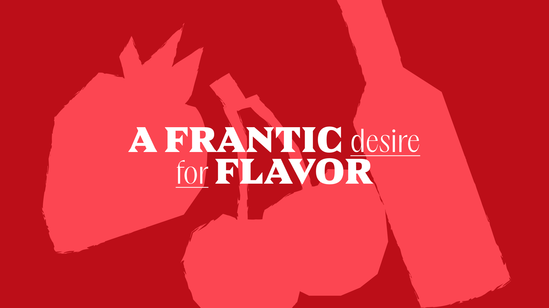
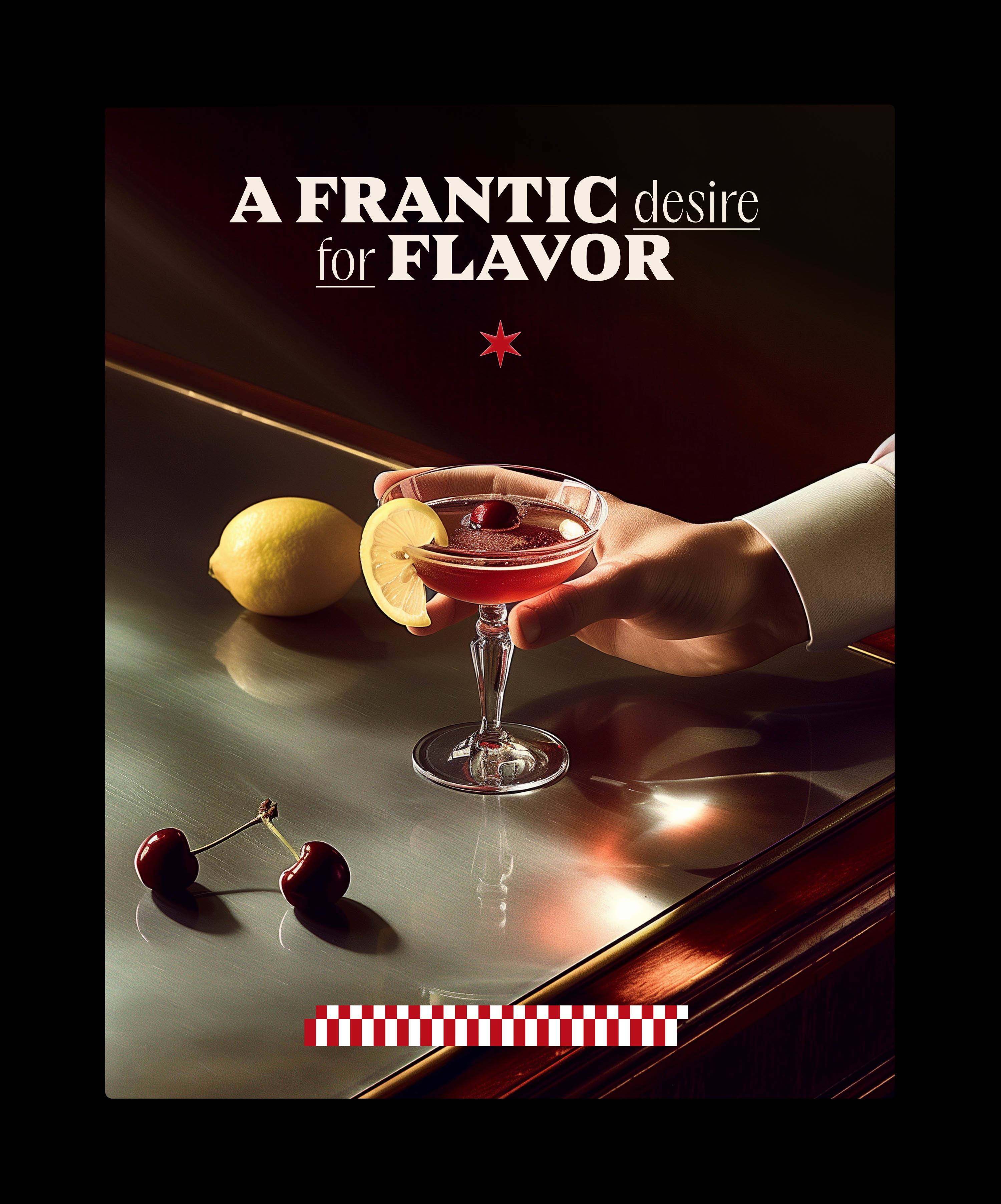
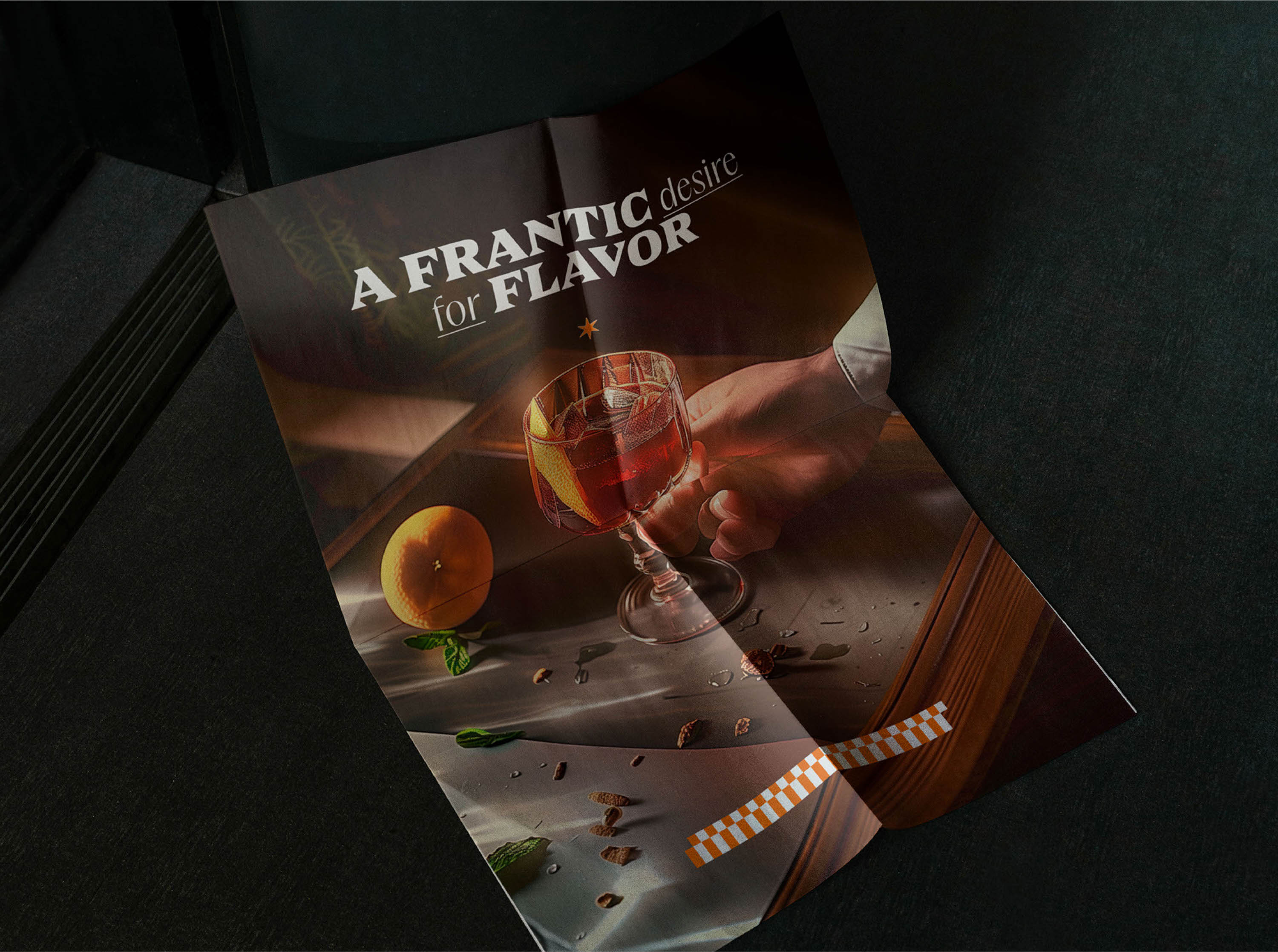
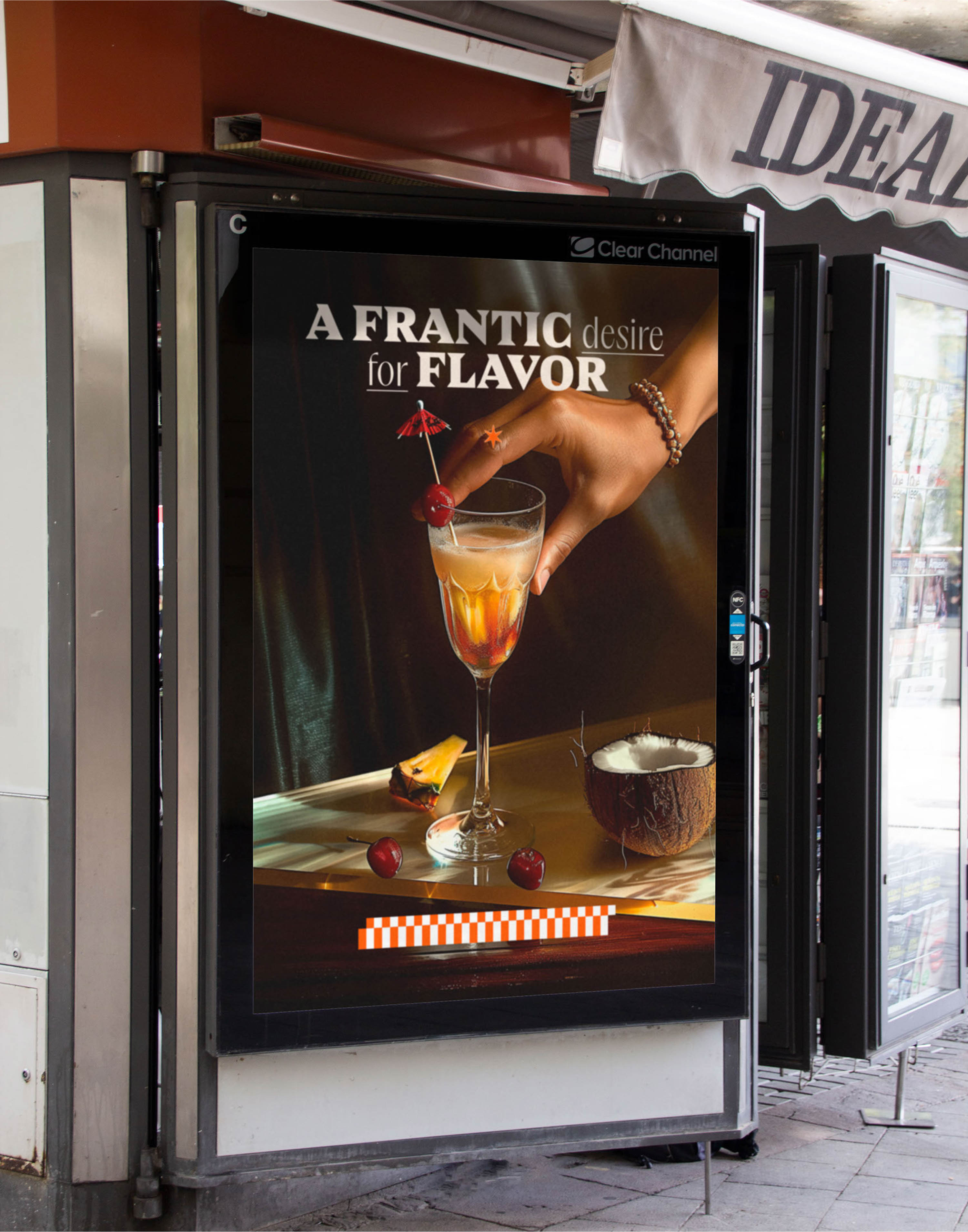
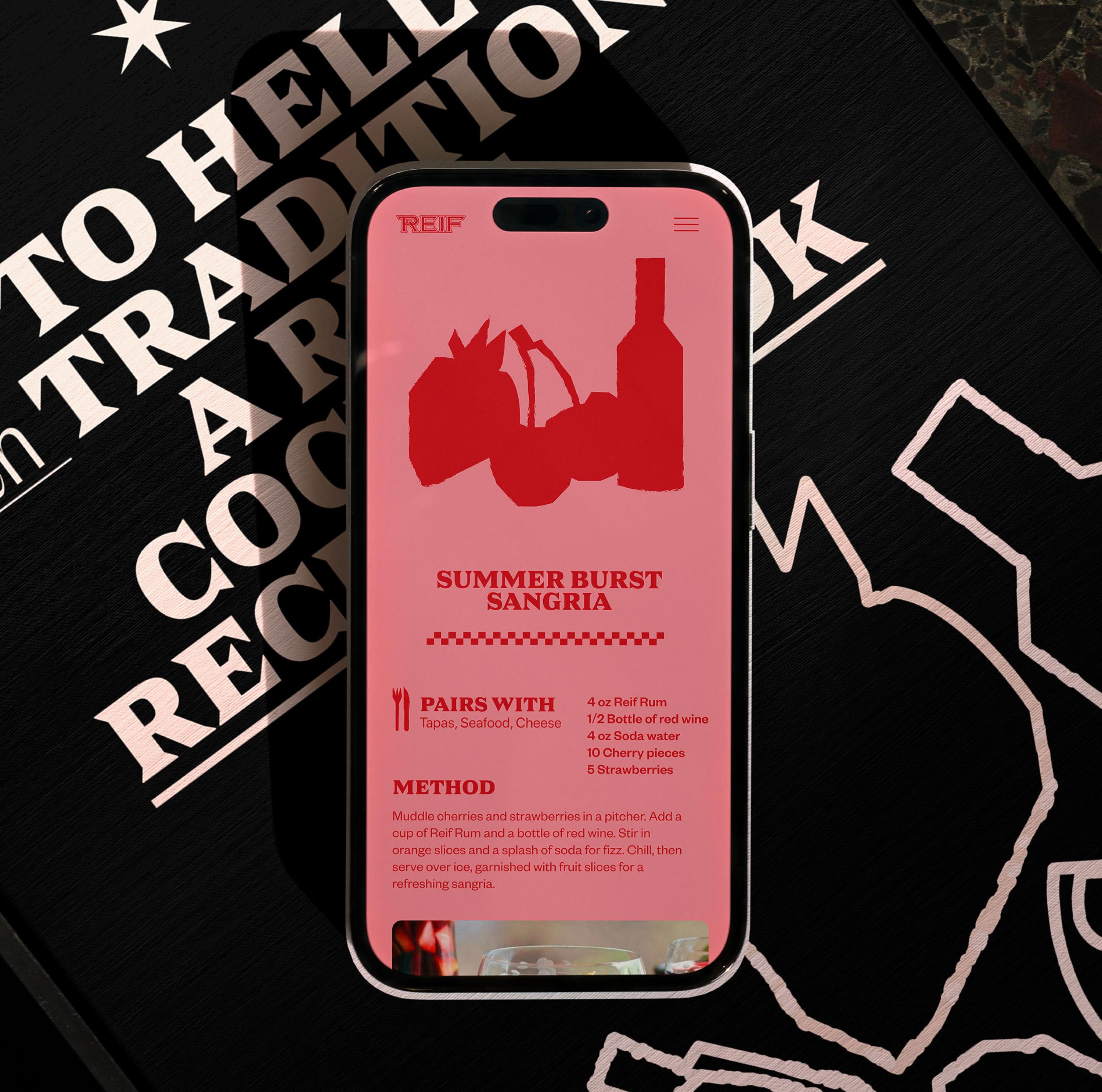
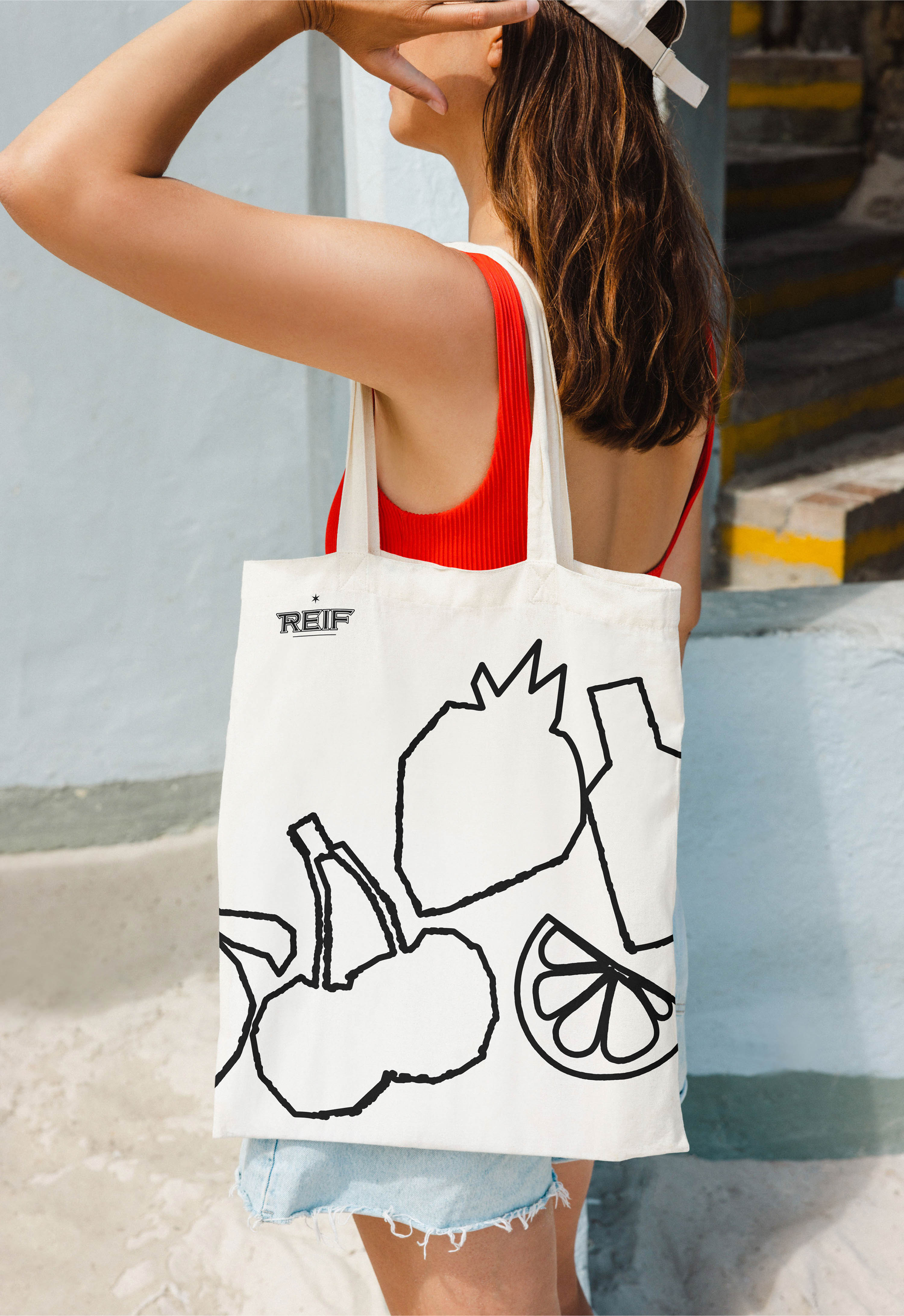
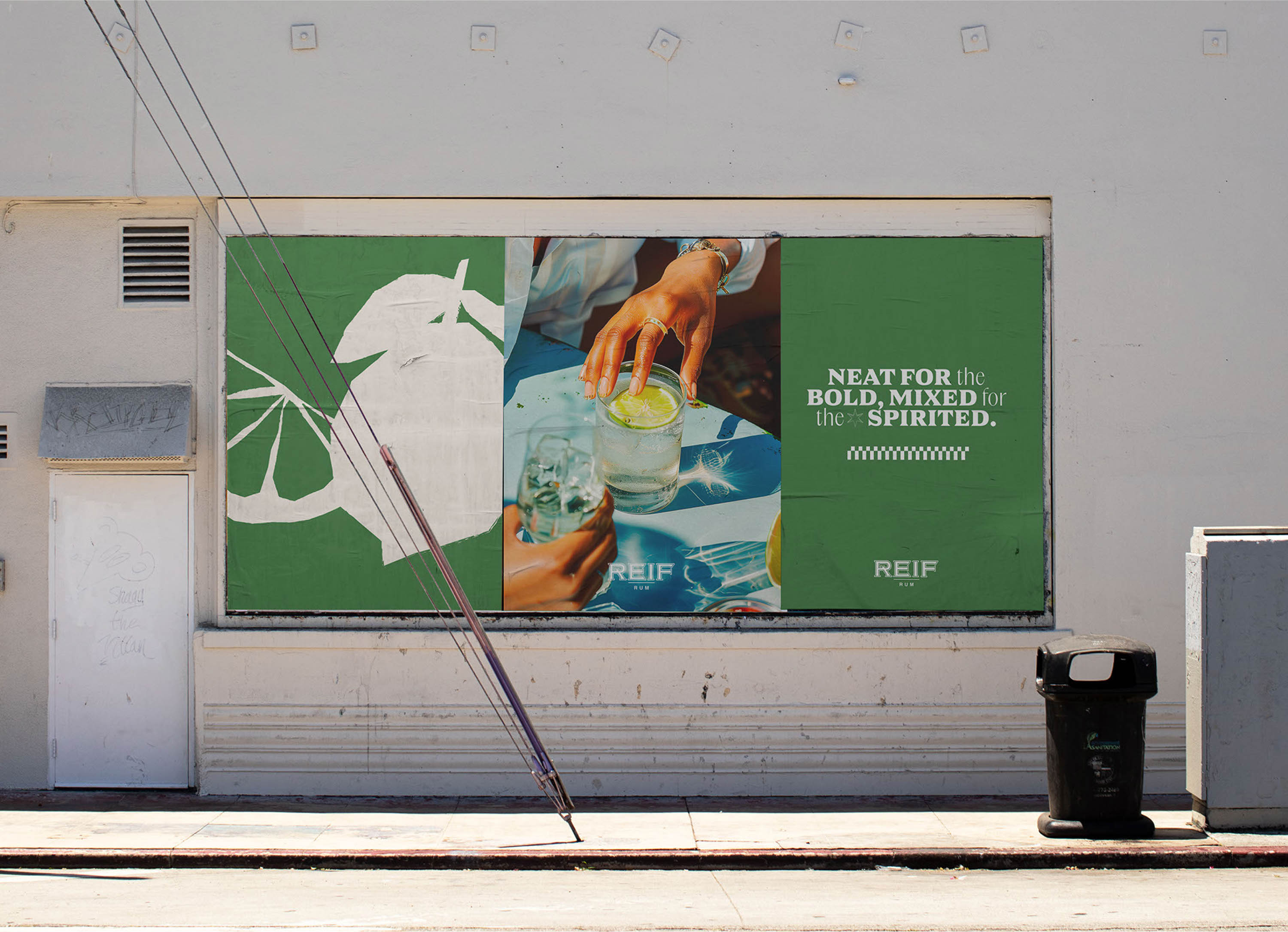
Reif’s blend and philosophy are all about balance. We created a brand that mirrors this by merging contrasting elements and reinterpreting conventional visuals in the rum category. While the logo and primary typeface maintain a classy appearance, the entire visual system introduces a fresh take through colorfulness, geometric illustrations, and the use of AI to create atmospheric imagery.
For the wise and the rebel.
A crucial part of our work with Reif Rum was giving life to these sets of ideas that the clients wanted to embed in their brand: the playful and daring part that should be allied with a more classic and sophisticated component. Besides that, they aimed to distance the brand from the traditional association between rum and Caribbean cliches. For that, our copywriters decided to fully own this objection with a persona that mixes the traits of a jolly, modern pirate with a hedonistic spirits connoisseur—which became a fundamental part of how Reif Rum presents itself. Terms like “for nonconformists,” “insatiable spirits,” or “unapologetically enjoy yourself” helped set a witty and provocative tone. With this verbal identity, Reif Rum declares: “To hell with tradition”—a philosophy we have wholeheartedly embraced in our work.

CREDIT
- Agency/Creative: Studio Carthagos
- Article Title: To Hell with Tradition: the Challenge of Creating a Daring Brand with Reif Rum
- Organisation/Entity: Agency
- Project Type: Identity
- Project Status: Published
- Agency/Creative Country: United States
- Agency/Creative City: Dublin, OH
- Market Region: Europe, North America, South America
- Project Deliverables: Brand Design, Brand Guidelines, Brand Identity, Brand Strategy, Brand Tone of Voice, Branding, Film, Graphic Design, Label Design, Logo Design, Motion Graphics, Photography, Tone of Voice, Web Design
- Industry: Food/Beverage
- Keywords: Rum, Spirits
-
Credits:
Creative director: Leonardo Vieira
Graphic designer: Victor Valle
Graphic designer: Lucas Schievenin
Video: Rafael Mondini
Video: Victor Balestrin
Video: Maikon Miranda
Motion designer: Sérgio Sampaio
Motion designer: Victor Balestrin
UI/UX designer: Gabriel Bonfim
Strategy and copywriting: Natália Lago Adams
Strategy and copywriting: Filipa Magalhães de Rooij
Webflow developer: Jonathan Cavalcanti
Lead developer: Elnatan Haim
Developer: Sabin Bhandari
Project Manager: Filipa Magalhães de Rooij


