About Leng Keng:
Leng Keng positions itself as a traditional toy brand that embodies the essence of Vietnamese culture, serving as a bridge between generations through traditional games. By producing and developing heritage-inspired products, Leng Keng recreates folk toys and games that were once an integral part of childhood for many generations. With personalization and storytelling at its core, Leng Keng hopes to bring customers a unique experiential journey through each traditional toy product.
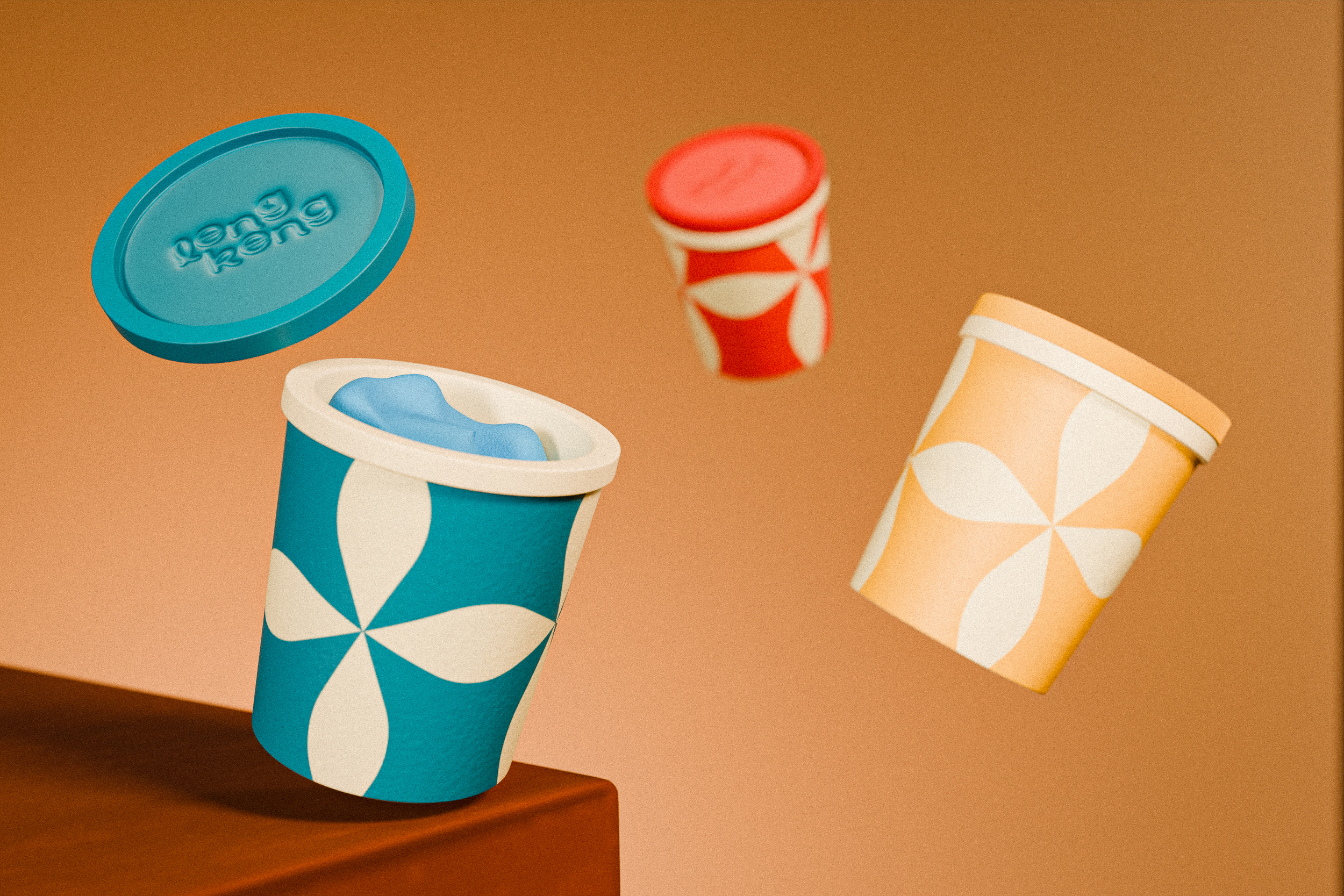
Brand name: “Leng Keng” echoes the tinkling sound of childhood bells, evoking memories of carefree days, joy, and boundless imagination. It embodies the spirit of innocence, fun, and creativity, taking consumers on a nostalgic journey back to cherished moments of play and wonder.
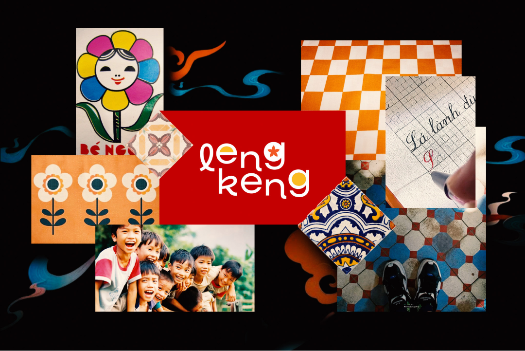
Logo: The Leng Keng logo features the Neulis Cursive typeface, inspired by the simplified lowercase handwriting practice sheets from primary school, evoking nostalgia and a sense of familiarity. The design incorporates a floral motif in the descender of the letter “g,” blending the iconic “hoa điểm 10” (perfect score flower) and “gạch bông” (traditional flower-patterned Vietnamese tile) to highlight cultural heritage. To add a playful and dynamic touch, the letters “lk” are slightly staggered, creating a sense of movement that reflects the brand’s fun and creative spirit. The logo strikes a perfect balance between nostalgia and modernity, appealing to both older generations and younger audiences.
Pattern: Leng Keng’s overarching pattern takes inspiration from gạch bông (traditional Vietnamese tiles), reimagined with a modern twist. The intricate geometric and floral motifs are simplified and streamlined, featuring clean lines and contemporary shapes to blend cultural heritage with a fresh, playful aesthetic. This modernized design maintains the essence of tradition while appealing to today’s minimalist and creative sensibilities.
Color Palette: Leng Keng’s color palette features a vibrant combination of International Red and Selective Yellow, evoking energy, creativity, and warmth. International Red symbolizes boldness and cultural pride, adding a dynamic and modern edge to the brand. Selective Yellow complements it with a sense of joy, nostalgia, and playfulness, reminiscent of cheerful childhood memories. Together, these colors create a striking yet harmonious visual identity that bridges tradition and innovation.
About To he & the toy kit:
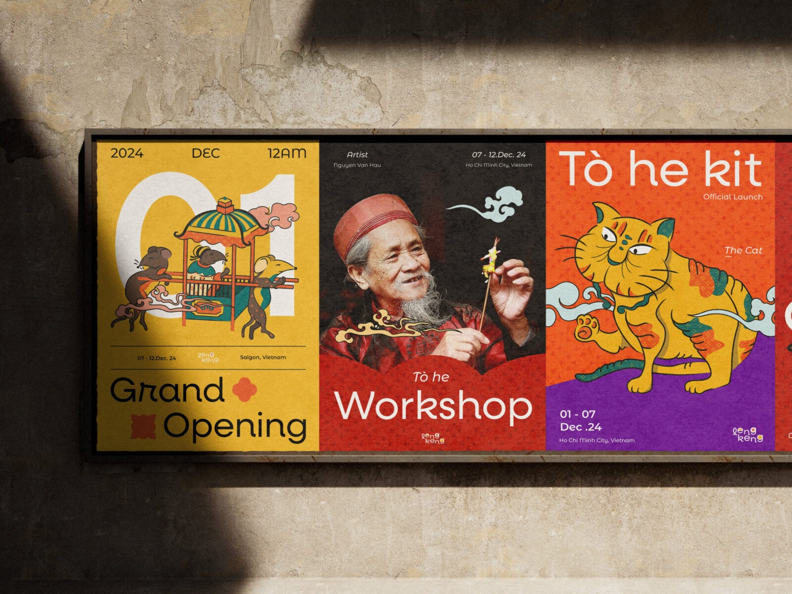
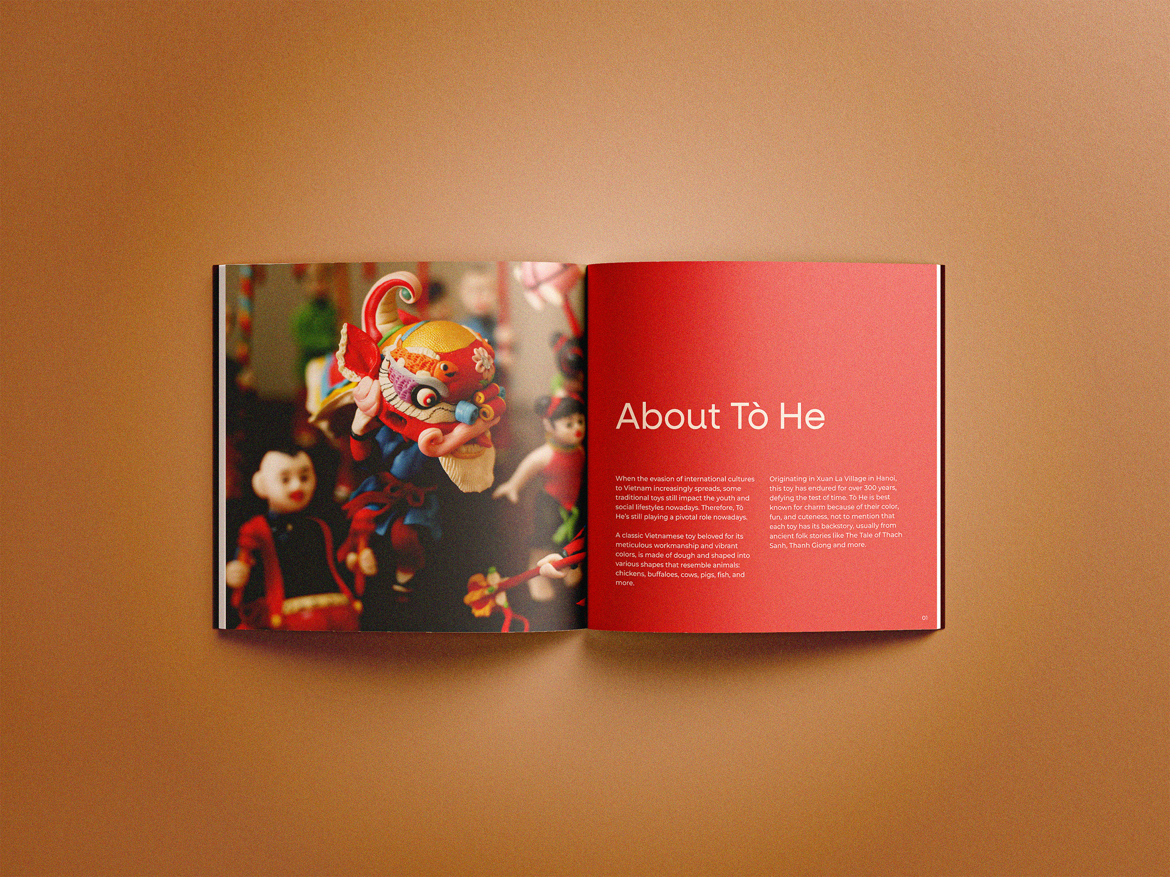
Tò He is a classic Vietnamese toy beloved for its meticulous workmanship and vibrant colors. Originating in Xuan La Village in Hanoi, these soft and delicate figurines have endured for over 300 years, defying the test of time. Greatly inspired by this adorable toy, the “Tò He Kit” was conceptualized to bring Tò He back to life.
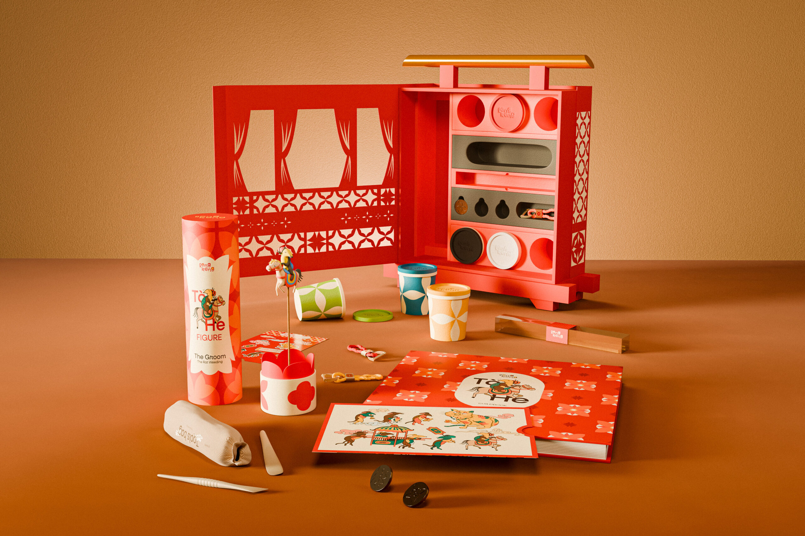
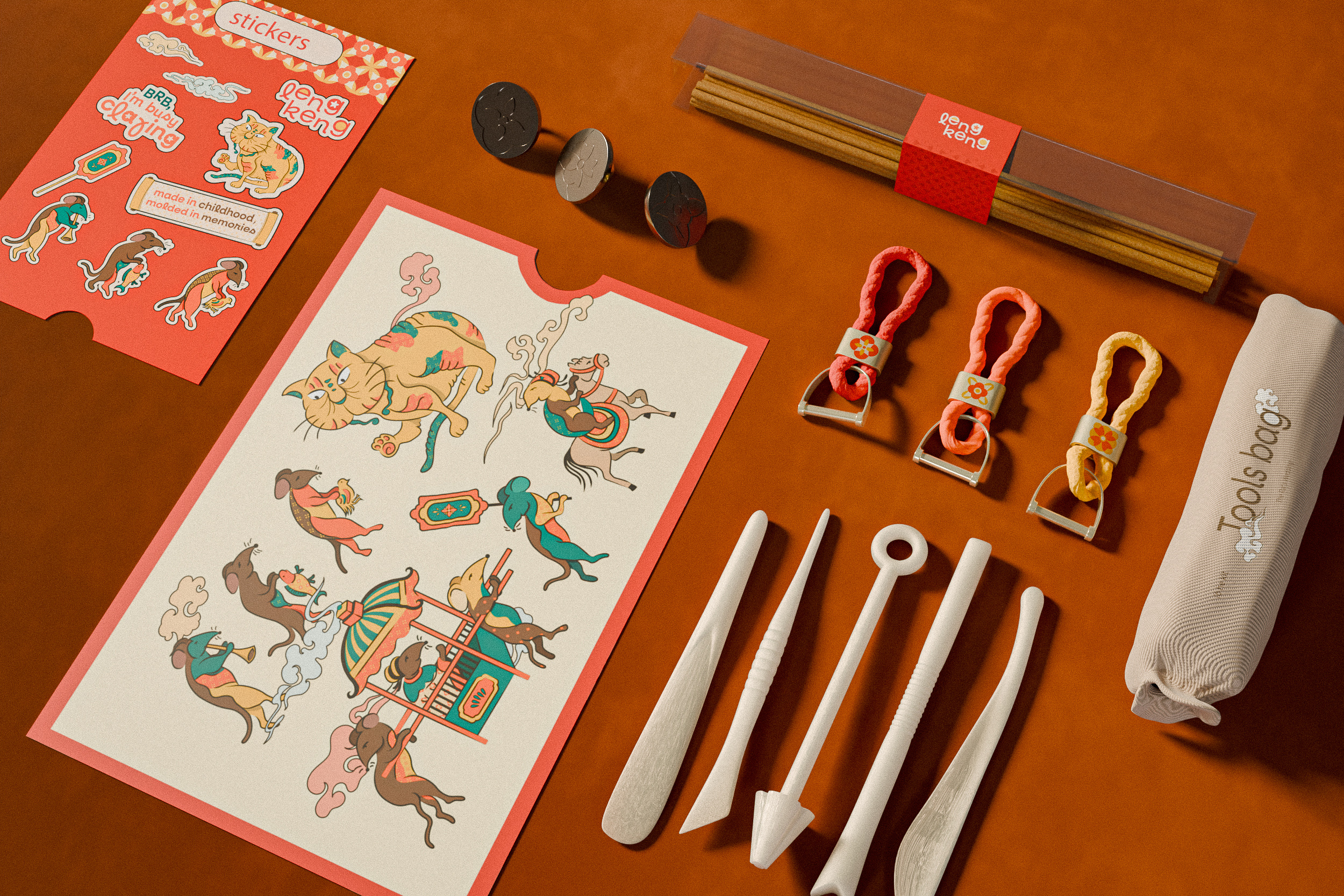
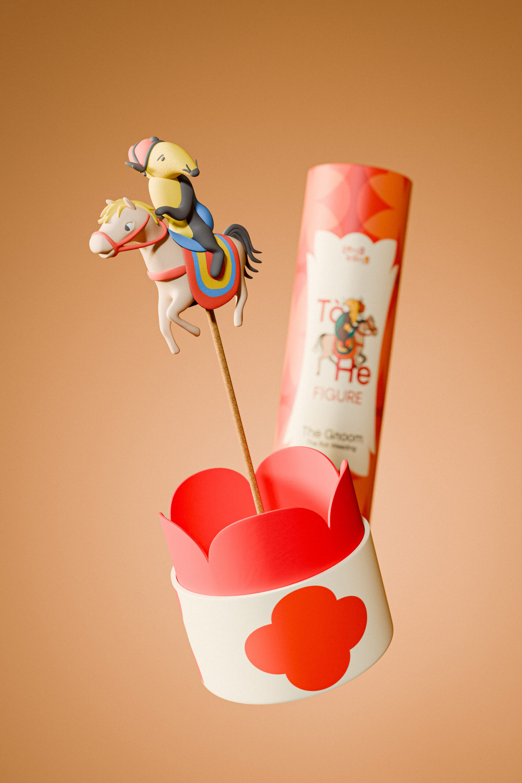
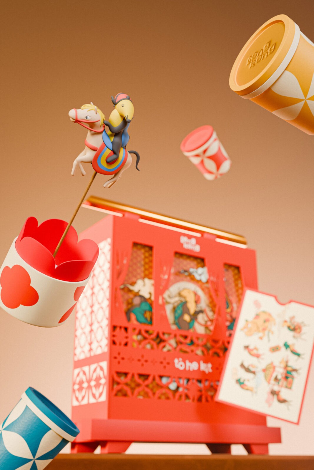
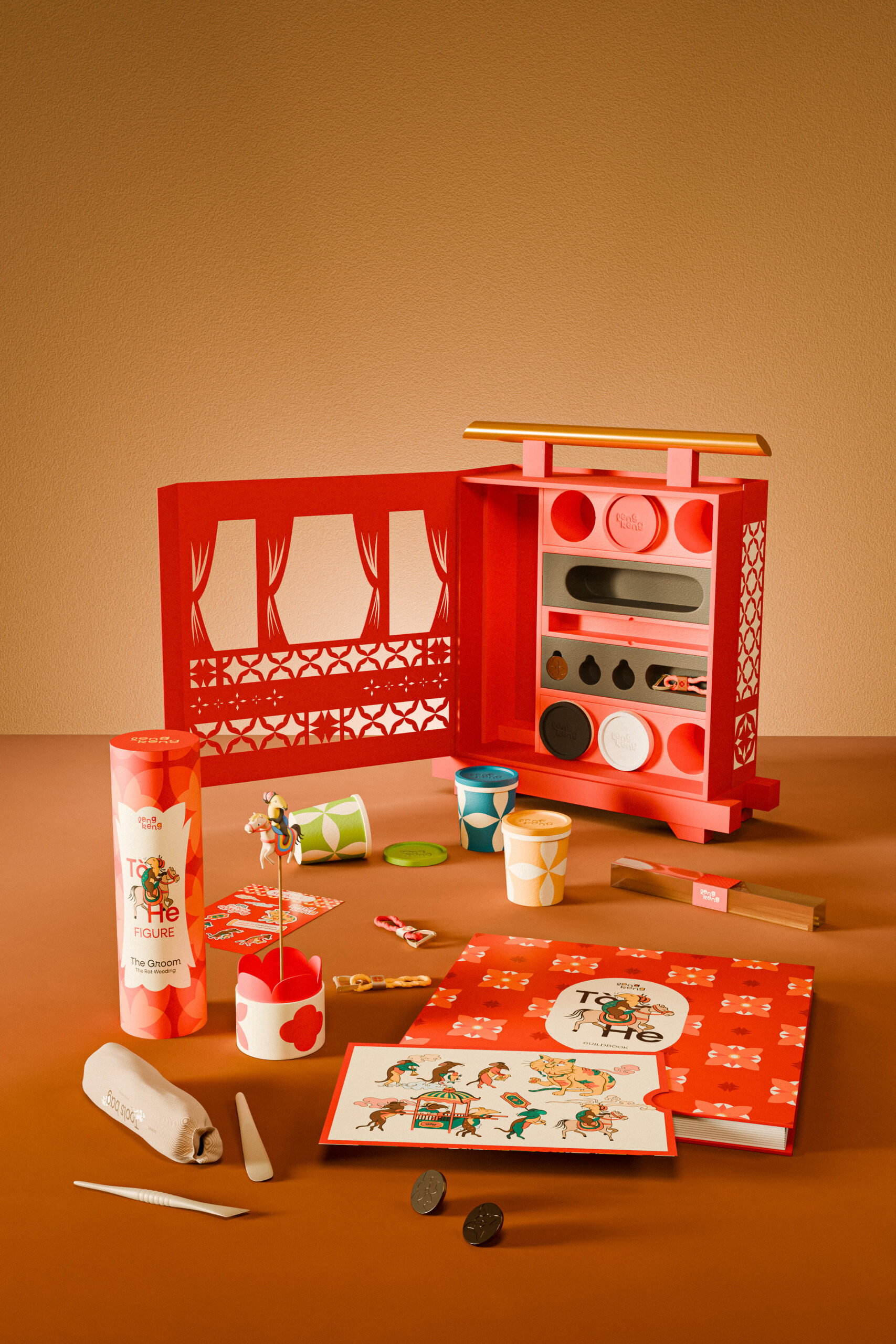
Each set of the Tò He Kit comes with six boxes of colored dough, a toolbox, a ready-made Tò He of one of our characters, The Groom, and a set of stickers, metal stamps, and keychains. Additionally, the ready-made Tò He box is sold separately along with the Tò He Kit to introduce this cultural toy to more audiences in Vietnam as well as other countries.
What makes Leng Keng and our toy box stand out?:
Cultural values: Each item reflects its rich history and cultural significance, ensuring these traditions are passed on to younger generations. Promoting Vietnamese culture fosters a sense of pride and identity in both creators and participants.
Visually appealing design: The Tò He Kit perfectly combines classic Vietnamese aesthetics with fresh, innovative design approaches. Our product provides unique, interactive designs, allowing users to personalize their experience and make each toy feel unique.
Unique experience: The Tò He Kit offers a rare opportunity to enjoy traditional activities with modern perspectives, creating a memorable and meaningful experience.
Inspiration:
As passionate enthusiasts of Vietnam’s rich cultural tapestry, our team found and cherished the charm of our homeland country through multiple approaches. The Tò He Kit is, thus, a tangible manifestation of this passion, serving as a tribute to the nation’s heritage. We aim to nurture a deeper appreciation for Vietnamese culture by bringing this traditional craft into modern toys, particularly among younger generations.
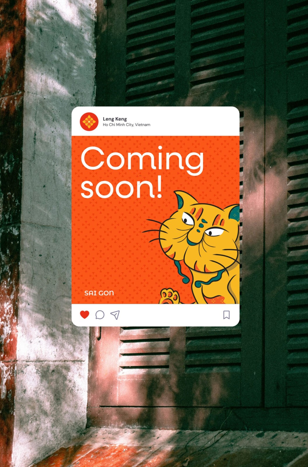
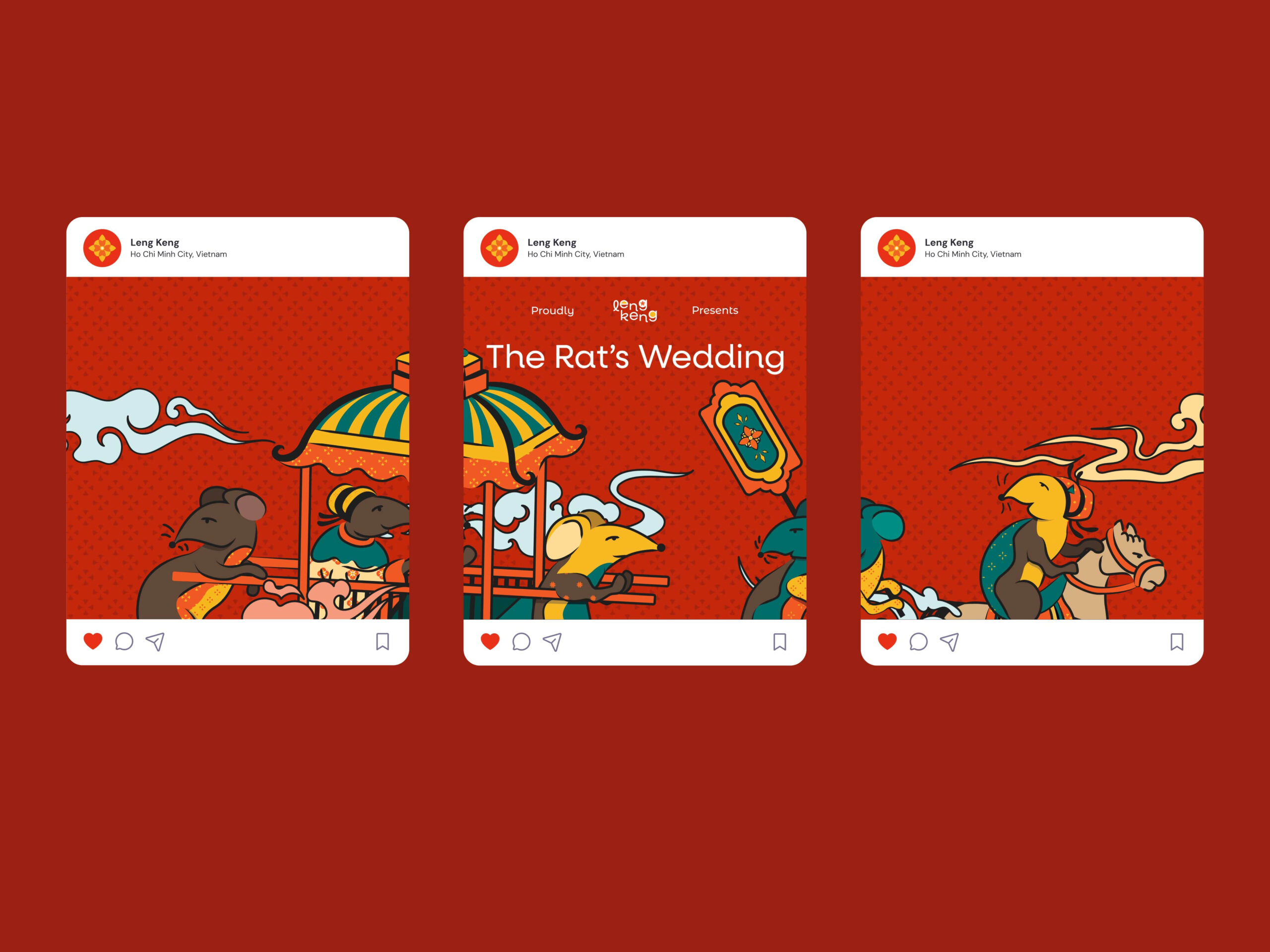
Our primary inspiration, the renowned “The Rat’s Wedding” painting, boasts a storied history stretching back over 500 years. This artwork is iconic for its intricate details and vivid colors and carries a profound meaning. It serves as a timeless reminder of the simple joys of life, the power of love, and the enduring spirit of the Vietnamese people. The rats, representing ordinary people, are depicted as humble and hardworking, while the cat, symbolizing the wealthy and powerful, is portrayed as corrupt and oppressive. The painting humorously portrays the rat couple navigating the challenges of their wedding, including the need to appease the cat with gifts and bribes. The painting is a satirical commentary on feudal Vietnam’s societal norms and power dynamics.
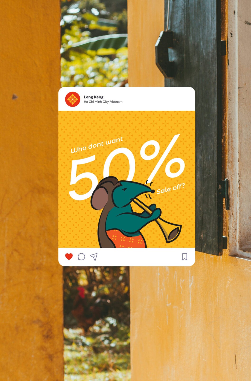
Through Leng Keng’s interpretation, the Rat’s Wedding is portrayed in a modern, playful, and cutesy way. The traditional painting’s earthy tones are replaced with bright, cheerful palettes that resonate with a younger audience while keeping the festive atmosphere of the wedding alive. The artwork captures lively moments, like the bride and groom’s joyful procession, the rats playing musical instruments, and their playful interactions with the cat. Leng Keng’s interpretation pays homage to this beloved folk tale and reintroduces it in a fresh, approachable, and timeless way. The redesign invites audiences of all ages to enjoy “The Rat’s Wedding” while appreciating its cultural significance.
CREDIT
- Agency/Creative: Huong Nguyen Quynh , Trang Pham Minh , Huy Nguyen Tran Gia
- Article Title: Tò He (Playing Clay) Kit Student Packaging and Branding Concept
- Organisation/Entity: Student
- Project Status: Non Published
- Agency/Creative Country: Viet Nam , United States
- Project Deliverables: Brand Identity, Packaging Design
- Industry: Entertainment
- Keywords: WBDS Student Design Awards 2024/25 Identity , Brand Design Creation , Packaging Design, Product Creation , Renovation, Playful & Creative, Reliable, Innovative
- Keywords: WBDS Student Design Awards 2024/25 Identity , Brand Design Creation , Renovation, Playful & Creative, Reliable, Innovative
-
Credits:
3D Visualizer: Pham Minh Thu
Tò He Artist: Dang Van Hau
Assistant / Copy Writer: Ngan Khanh Nguyen Vu
Assistant / 2D Designer: Quynh An Nguyen Tran
Educational Institution: Lehigh University
Educator's Name : Maren Less
Educational Institution: RMIT
Educator's Name : Pham Hong My Duyen


