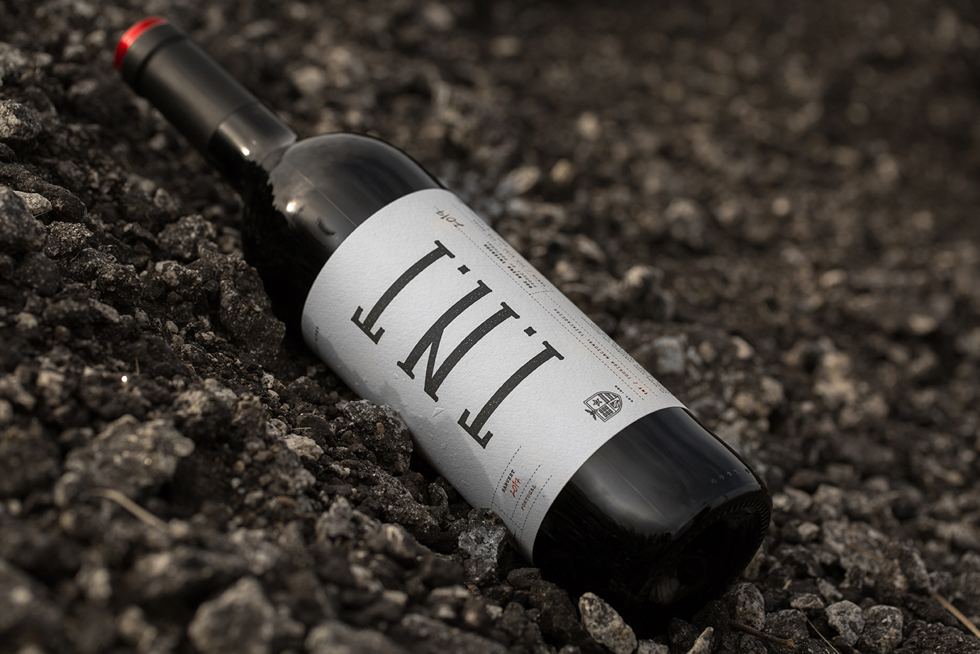
TNT is made out of a blend of the two best known Portuguese grape varieties — Touriga Nacional and Trincadeira. These two complement each other, creating body, spice and violet expressions.
The result? A velvety rich red wine with explosive wild fruit flavour and soft tannins.
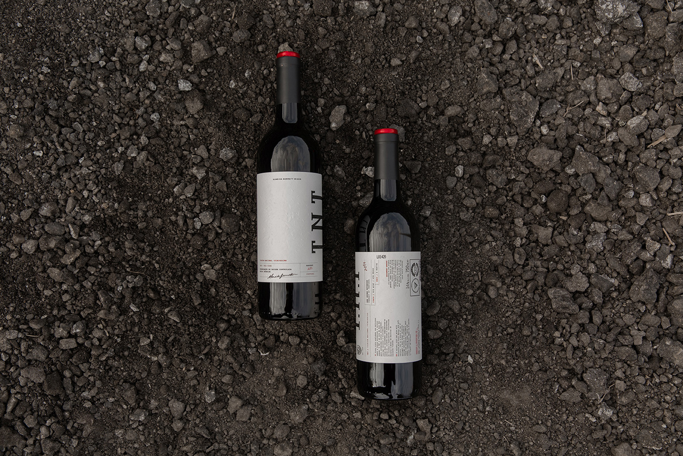
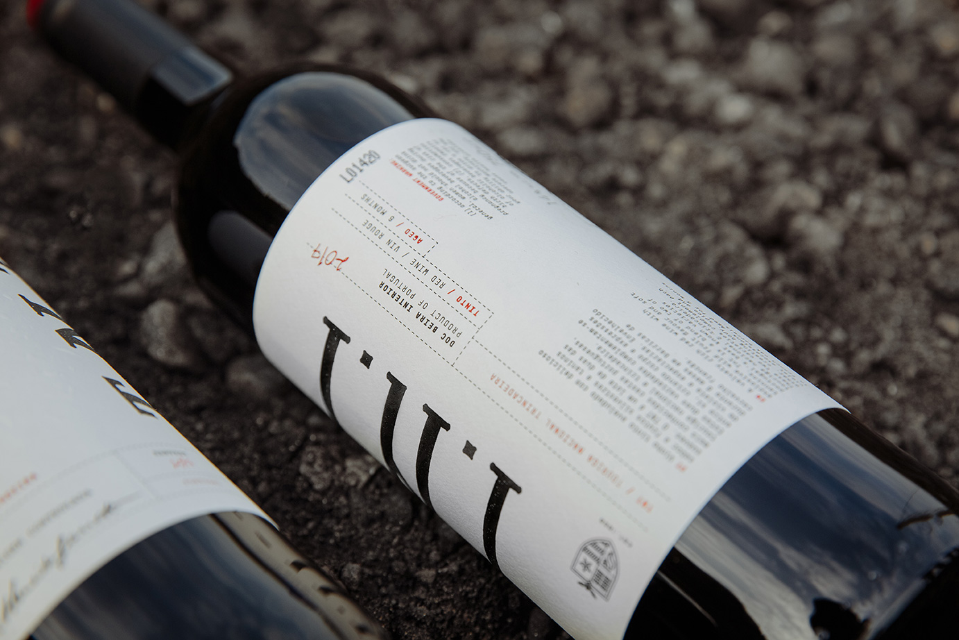
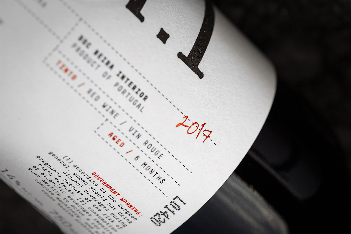
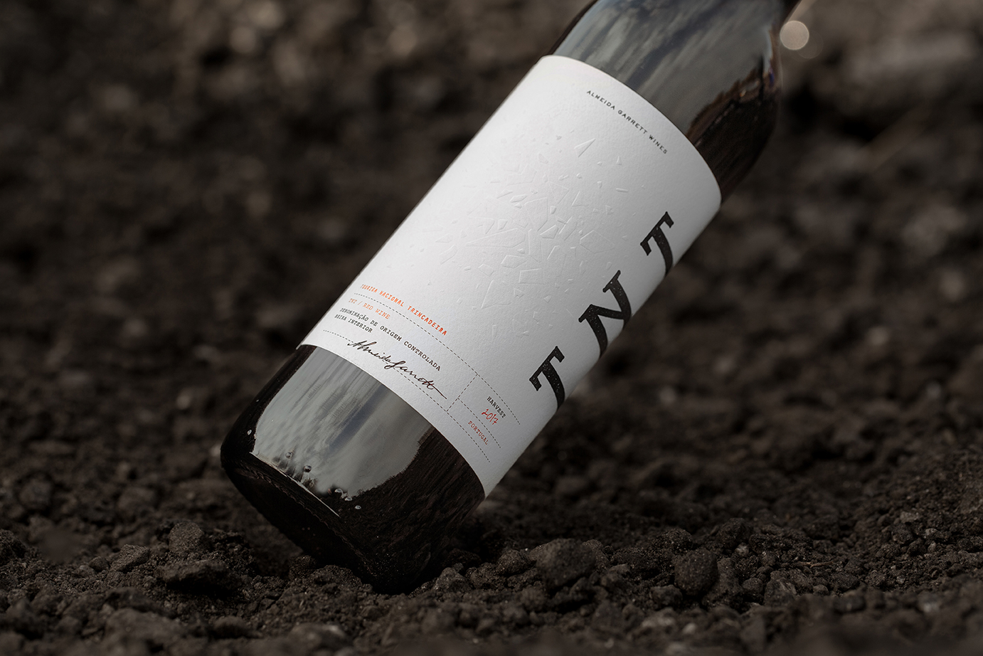
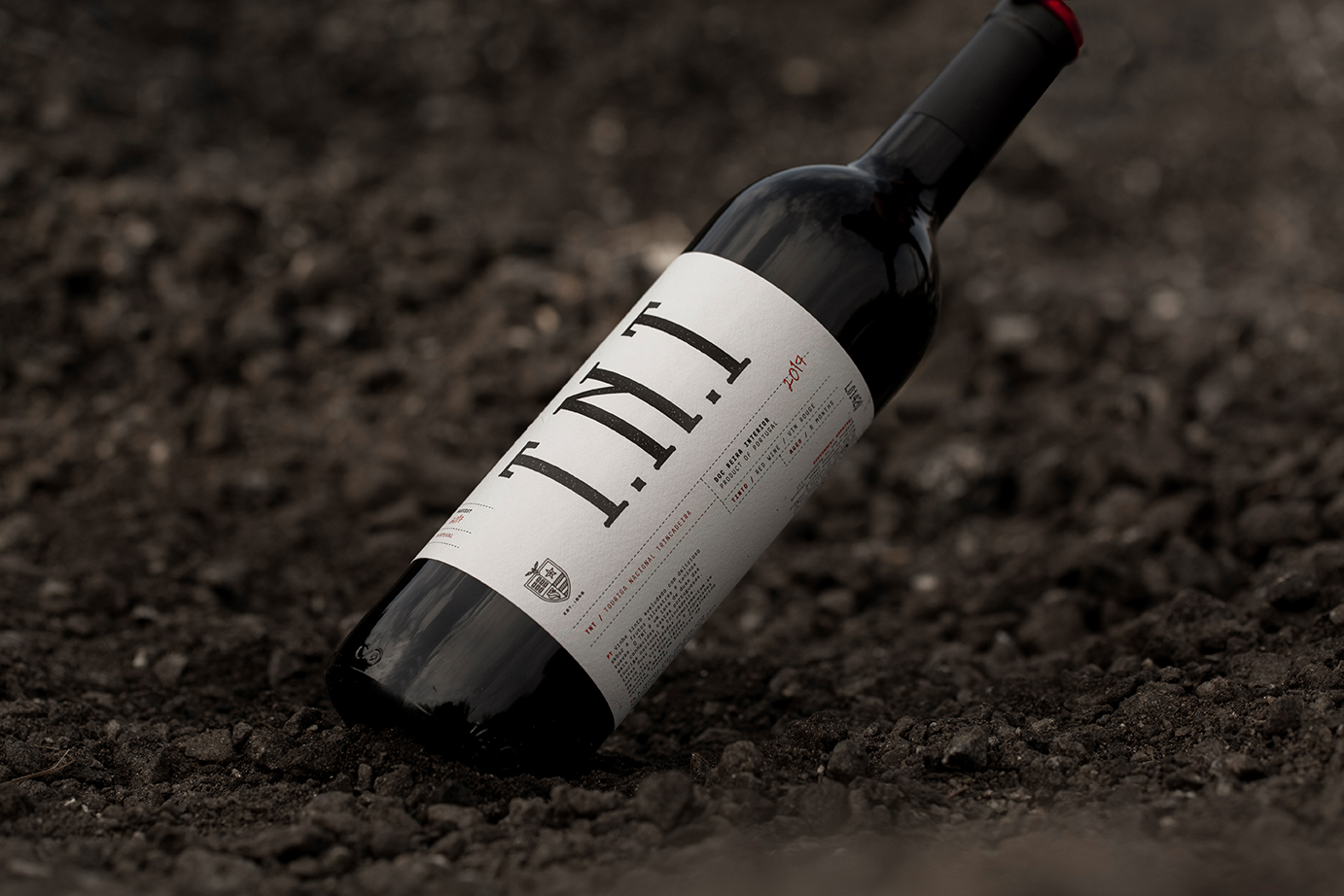
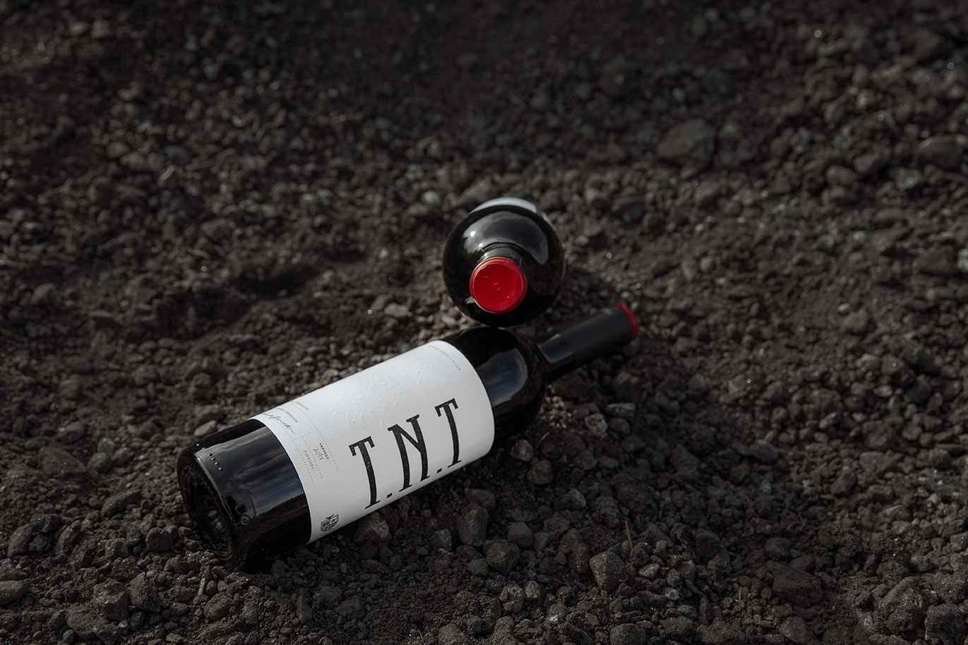
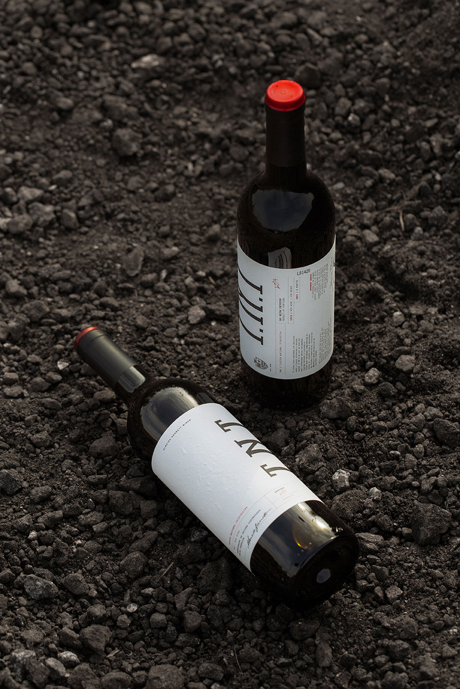
Using the double meaning of TNT, our goal was to design a label that could be as explosive as the wine’s flavour. Exploring elements from military documents, such as ballots and letters, and explosives transport boxes, we were able to come up with an elegant and disruptive approach, where we chose to combine a minimal representation of an explosion (with an emboss on the front label) with a vintage and rough type from the old times.
A label full of details that you can explore while tasting it!
CREDIT
- Agency/Creative: 327 Creative Studio
- Article Title: TNT Wine Label — Almeida Garrett Wines
- Organisation/Entity: Agency, Published Commercial Design
- Project Type: Packaging
- Agency/Creative Country: Portugal
- Market Region: Global
- Project Deliverables: Brand World, Branding, Graphic Design, Packaging Design, Tone of Voice
- Format: Bottle
- Substrate: Glass Bottle


