


This award-winning packaging redesign represents a strategic turning point for the TiQuero brand. The project was conceived to reposition the product line from a mindset of “price justification” to a clear and intentional premium brand strategy, elevating packaging from a purely aesthetic function to a core business asset.
Rather than competing in an overcrowded category based on heat levels or exaggerated visual aggression, the new design system shifts the conversation toward quality, authenticity, and sensory experience. The packaging acts as a silent salesperson, guiding the consumer through a more confident and intuitive decision-making process at the point of sale.
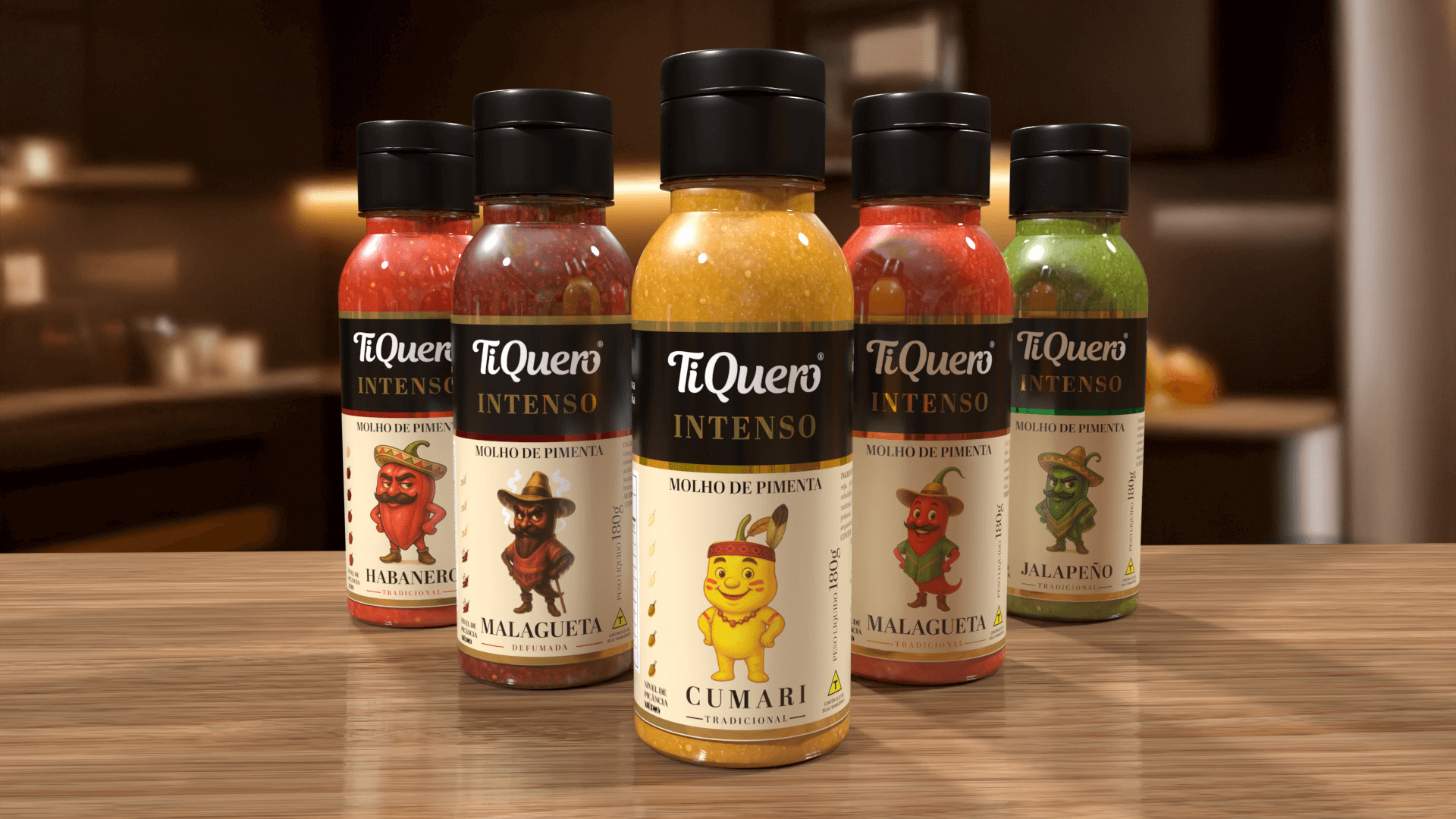
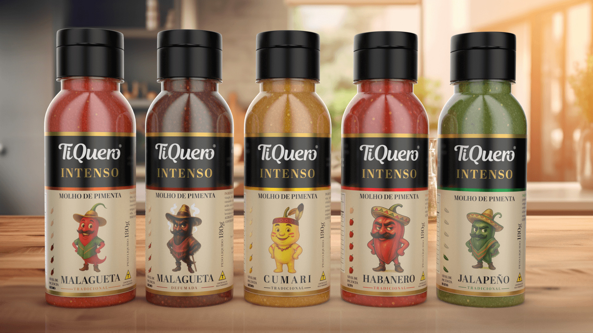
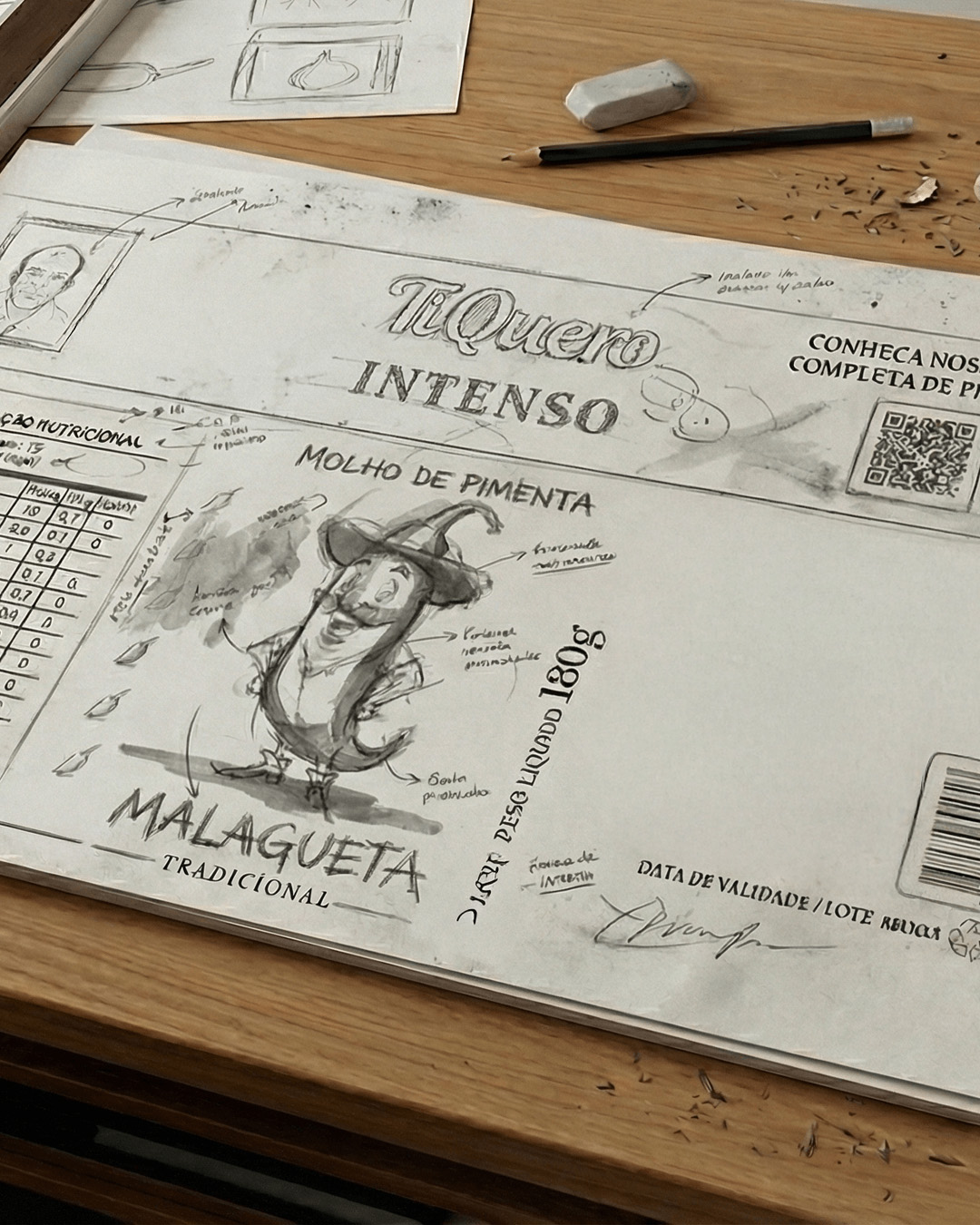
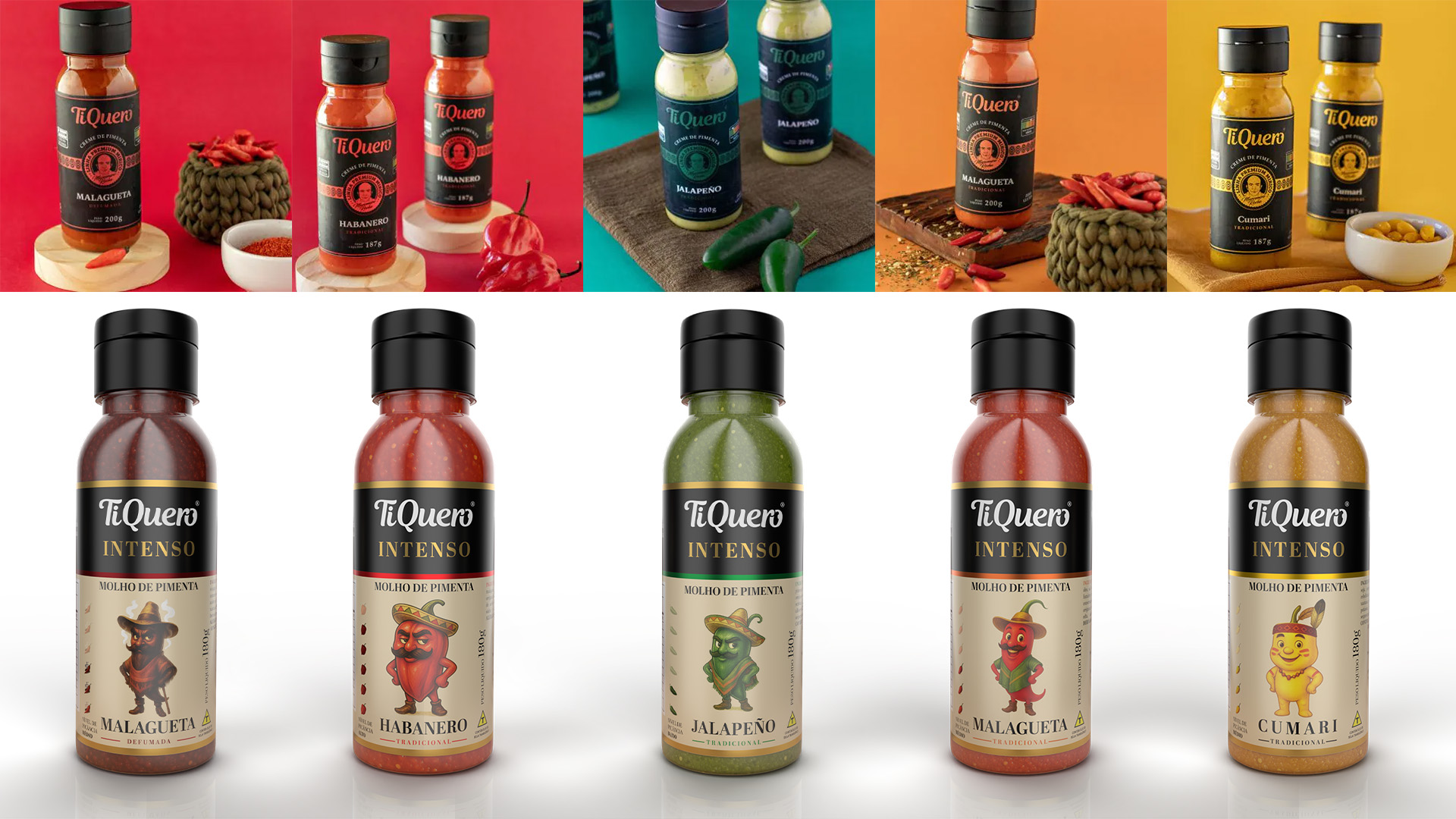
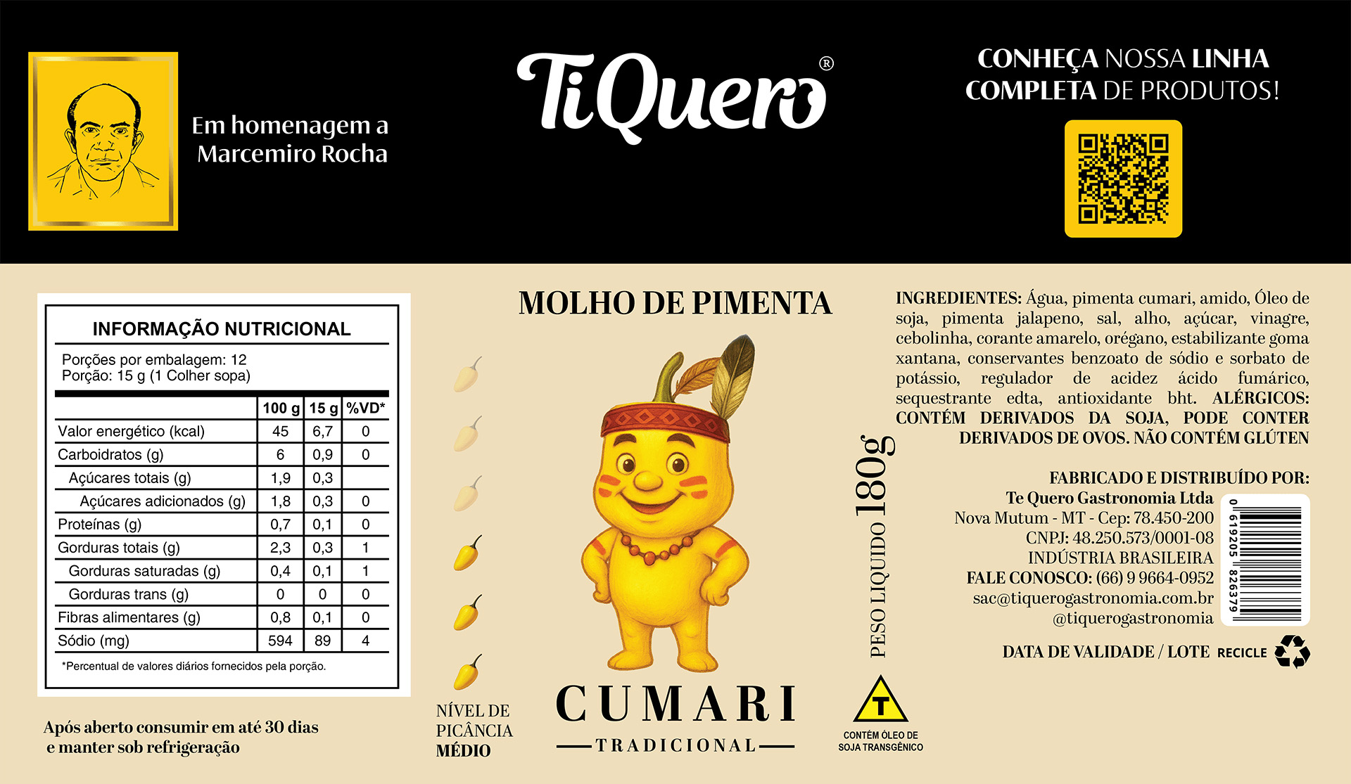
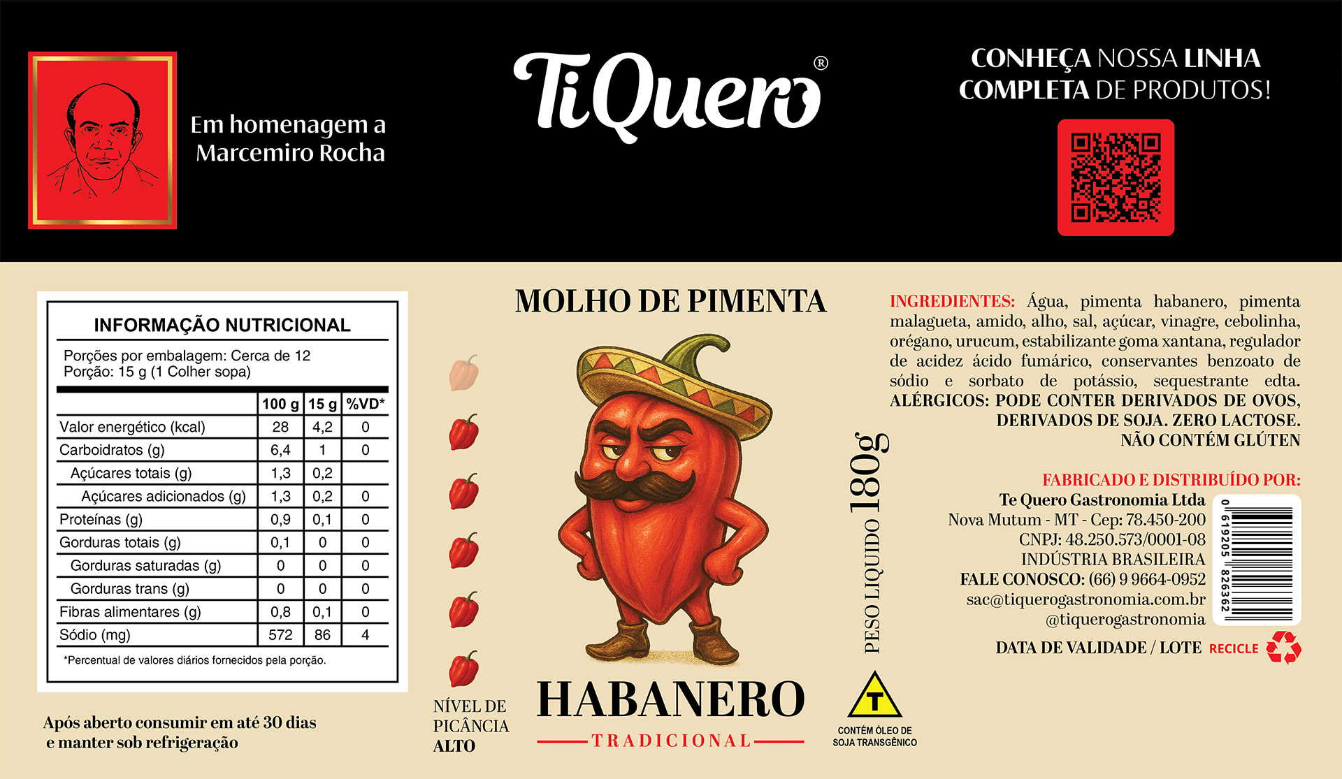
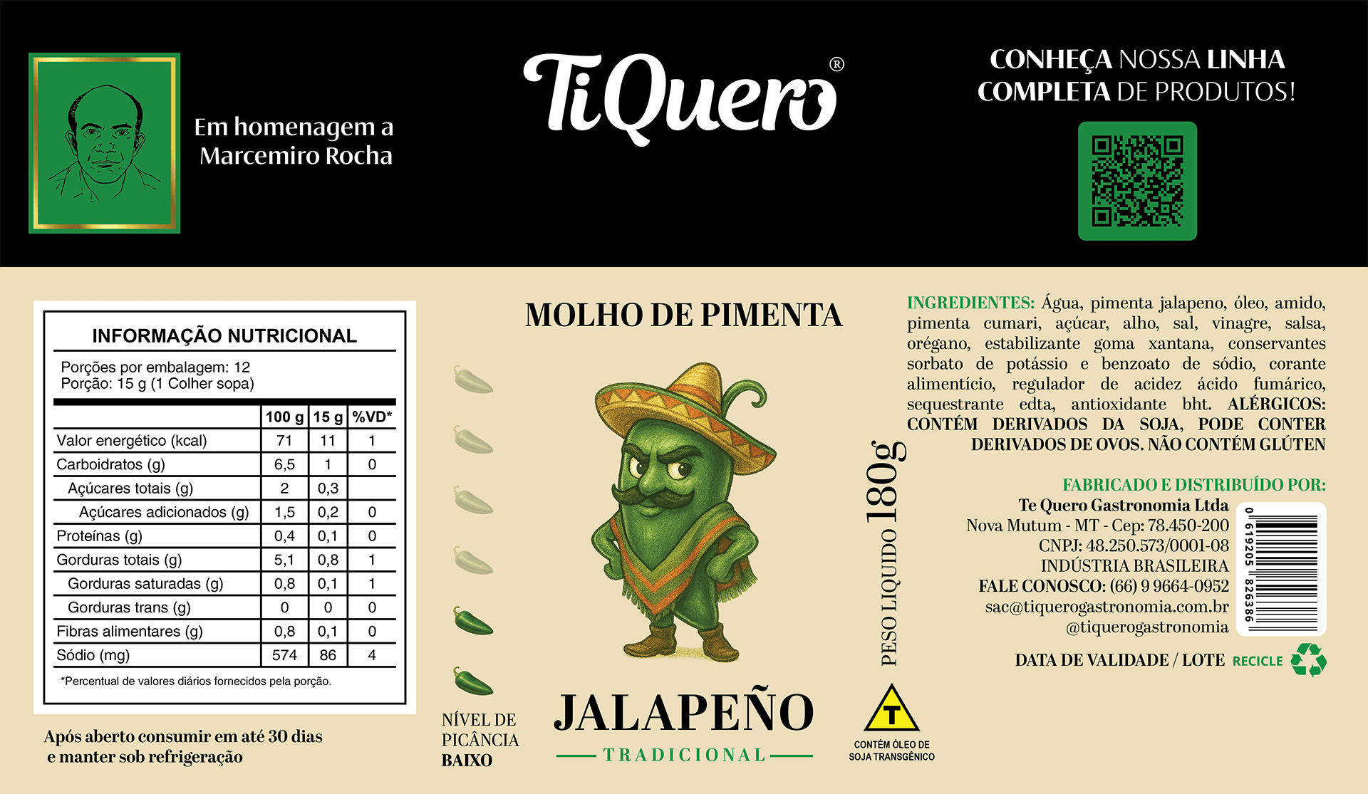
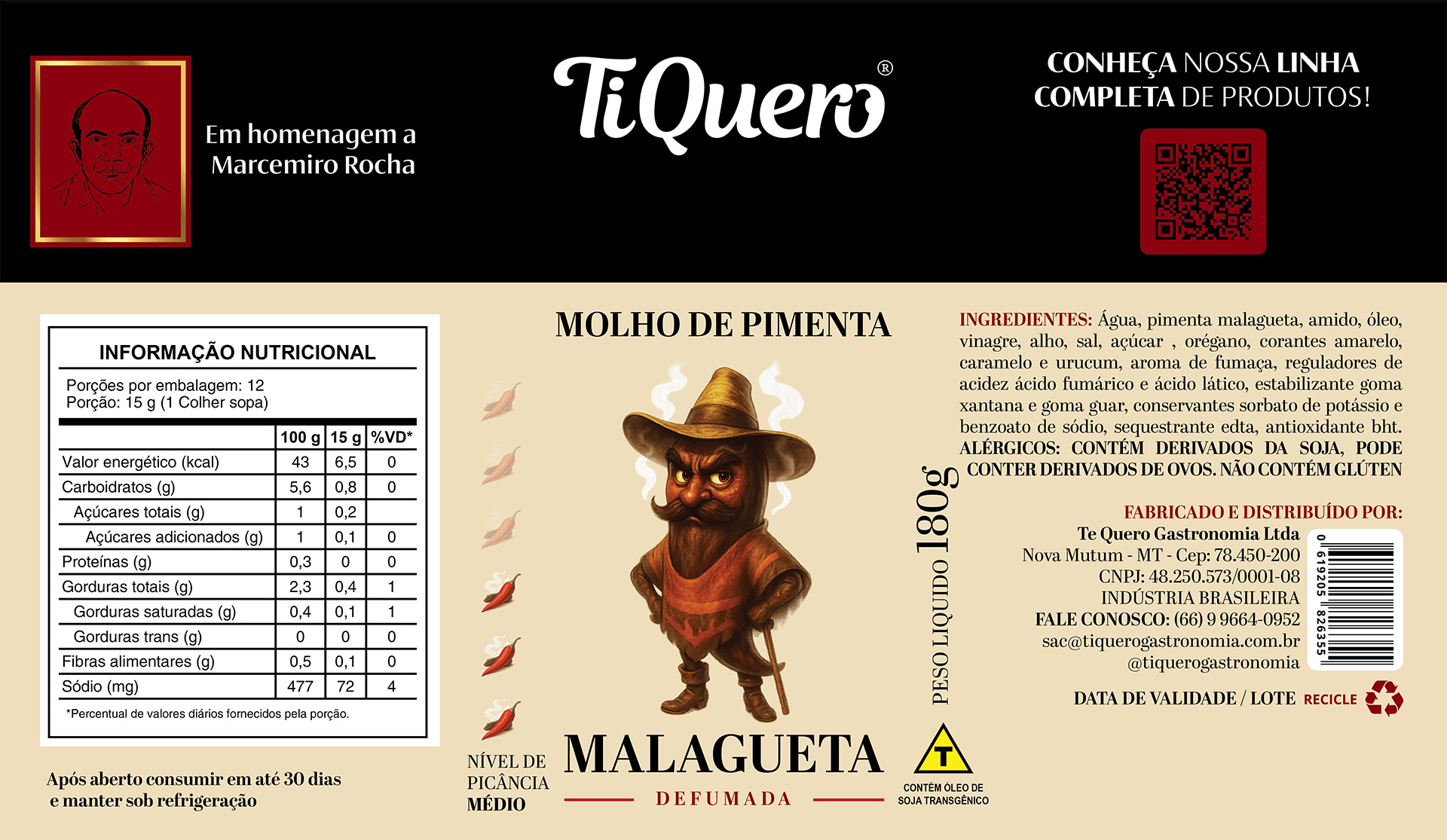
The solution is built on a scalable and highly recognizable visual system, defined by a strong information hierarchy, reduced visual noise, and bold color blocking. Hand-drawn illustrations play a central role, reinforcing a handcrafted, non-industrial perception that aligns with the brand’s flavor profile and production philosophy. Every design choice was made to communicate care, craftsmanship, and credibility.
A key consumer insight inspired one of the most distinctive elements of the project: exclusive mascots for each flavor. Instead of abstract naming conventions or technical descriptors, every sauce becomes a character with its own personality. This approach humanizes the product line, creates emotional connection, and increases memorability, while maintaining a refined and trustworthy look that resonates with both adult consumers and family audiences.
The results go beyond visual appeal. The new packaging delivers stronger shelf impact, faster product recognition, clearer differentiation between flavors, and improved brand recall. More importantly, it establishes a solid foundation for portfolio expansion, future extensions, and consistent brand storytelling.
More than a redesign, this project demonstrates how strategic packaging design can organize choice, build long-term brand value, and generate tangible business results—turning products into experiences and customers into loyal fans.
CREDIT
- Agency/Creative: Habm Design
- Article Title: TiQuero Hot Sauce Packaging Redesign by Habm Design
- Organisation/Entity: Agency
- Project Type: Packaging
- Project Status: Published
- Agency/Creative Country: Brazil
- Agency/Creative City: MARECHAL FLORIANO
- Market Region: South America
- Project Deliverables: 2D Design, Character Design, Graphic Design, Packaging Design
- Format: Bottle
- Industry: Food/Beverage
- Keywords: Sauce, Pepper, Pimenta, Molho, TiQuero, Brazil, Brasil
-
Credits:
Designer: Hu00e9ctor Antonio Boeno Menendez


