


TipZ RTD Coctails packaging design
Creation of a new RTD can design for TipZ
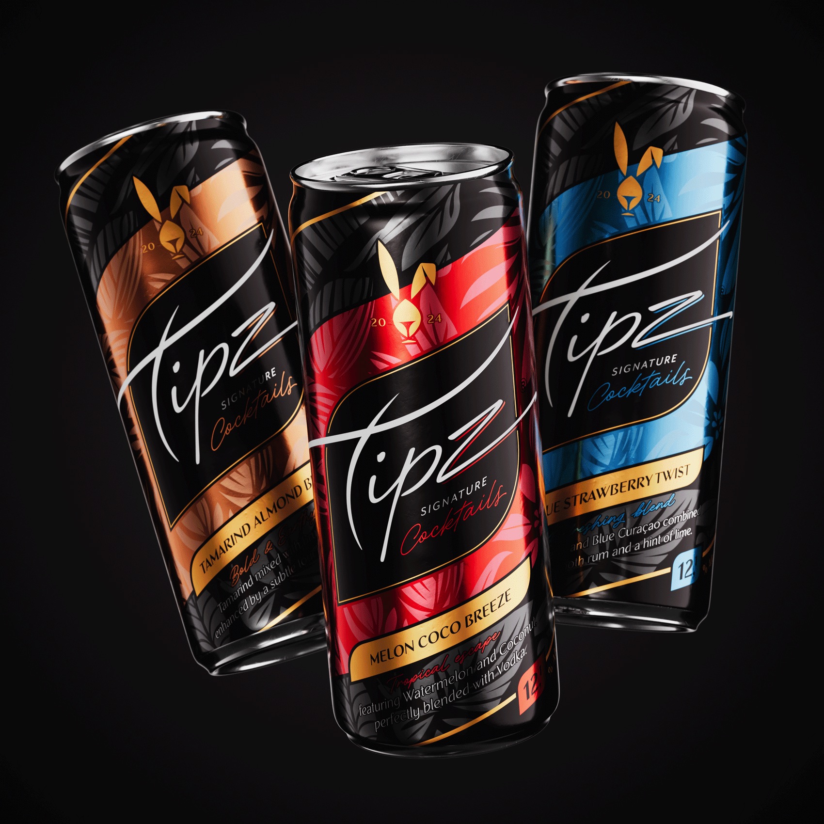
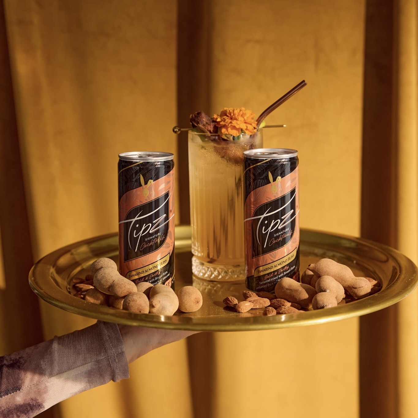
TipZ is a new and frisky brand, with a high alcohol content. It will be bringing “signature cocktails” to the market, with different recipes and tropical fruit. There are some roots from Curacao and it needed to have a luxurious brand feeling. Not just your quick and dirty RTD can. So where did we focus on in the design process?
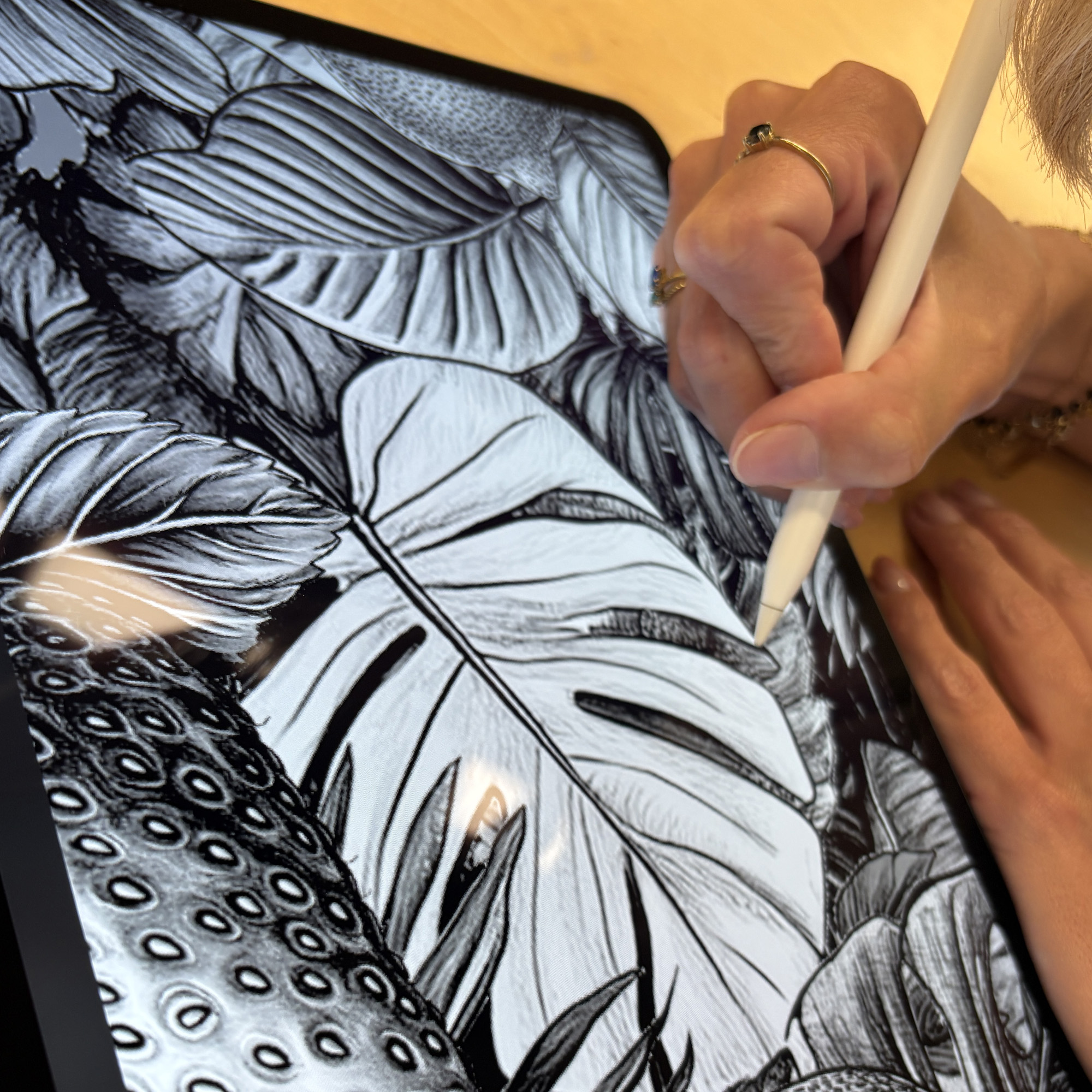
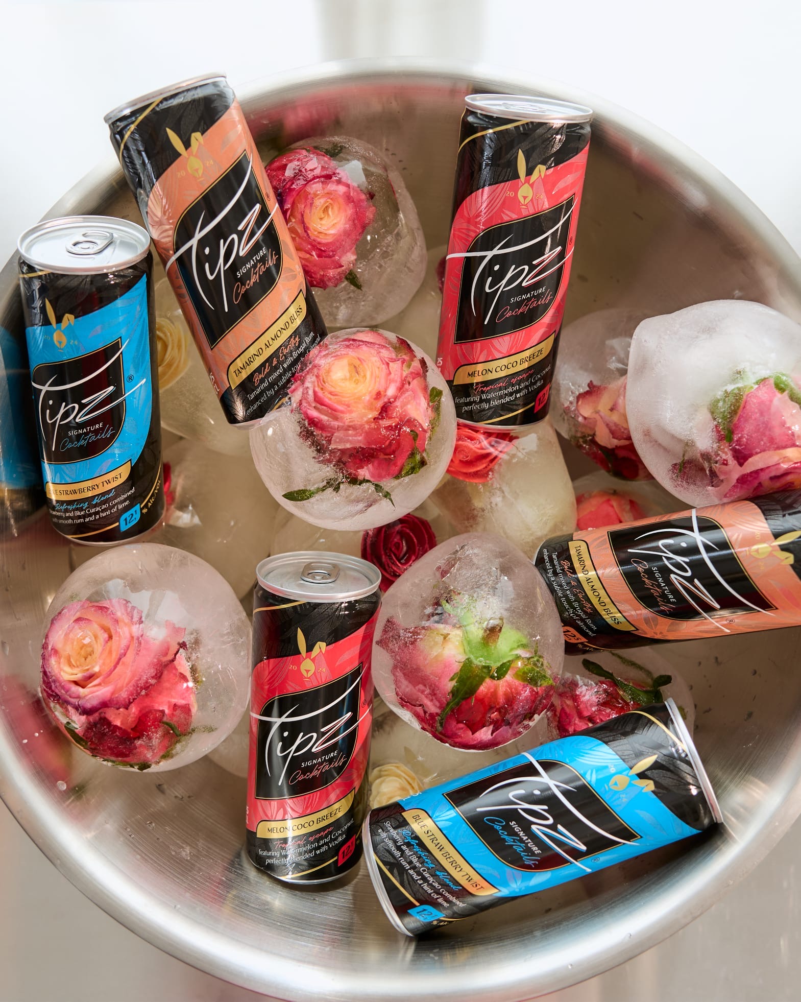
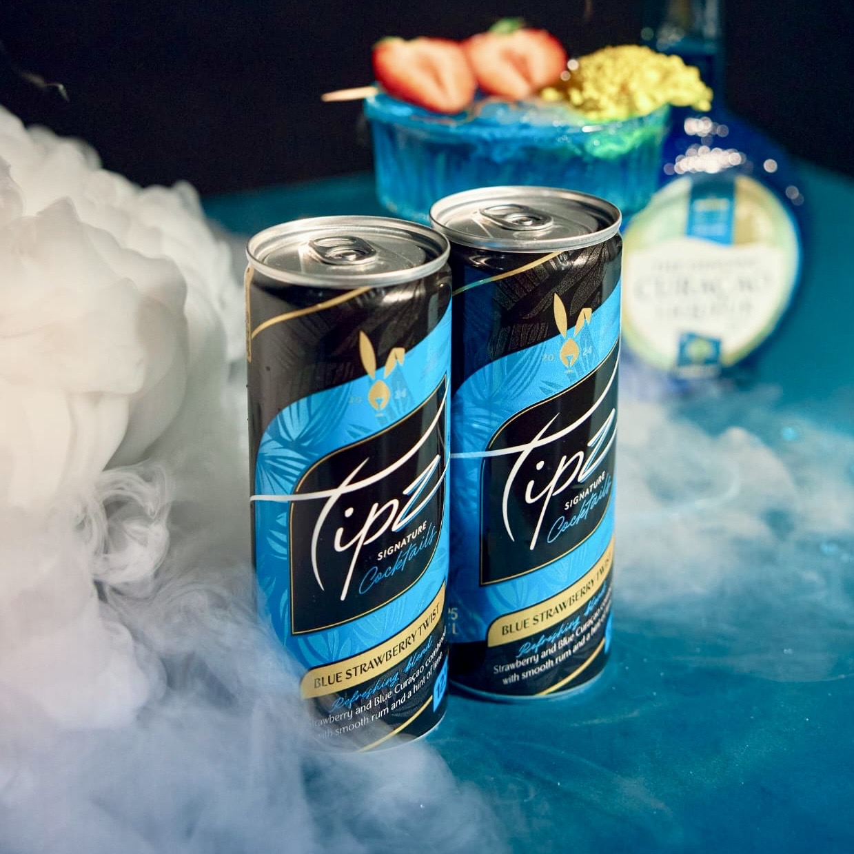
Of course, when you think about curacao and tropical fruit, you immediately think about using fruit in the design, and you start illustrating. But in the end, we stepped away from that. The brand owner has a love for black and gold which perfectly works with the luxurious and high alcohol content but does not really match with fruit visuals. Also, there are some “ugly” fruits involved, tasty but they don’t look good on a design. So, after some discussion, we just focussed on “tropical” illustration which we could use in our designs. Colour would be the main link to taste and fruit used in the specific cocktails.
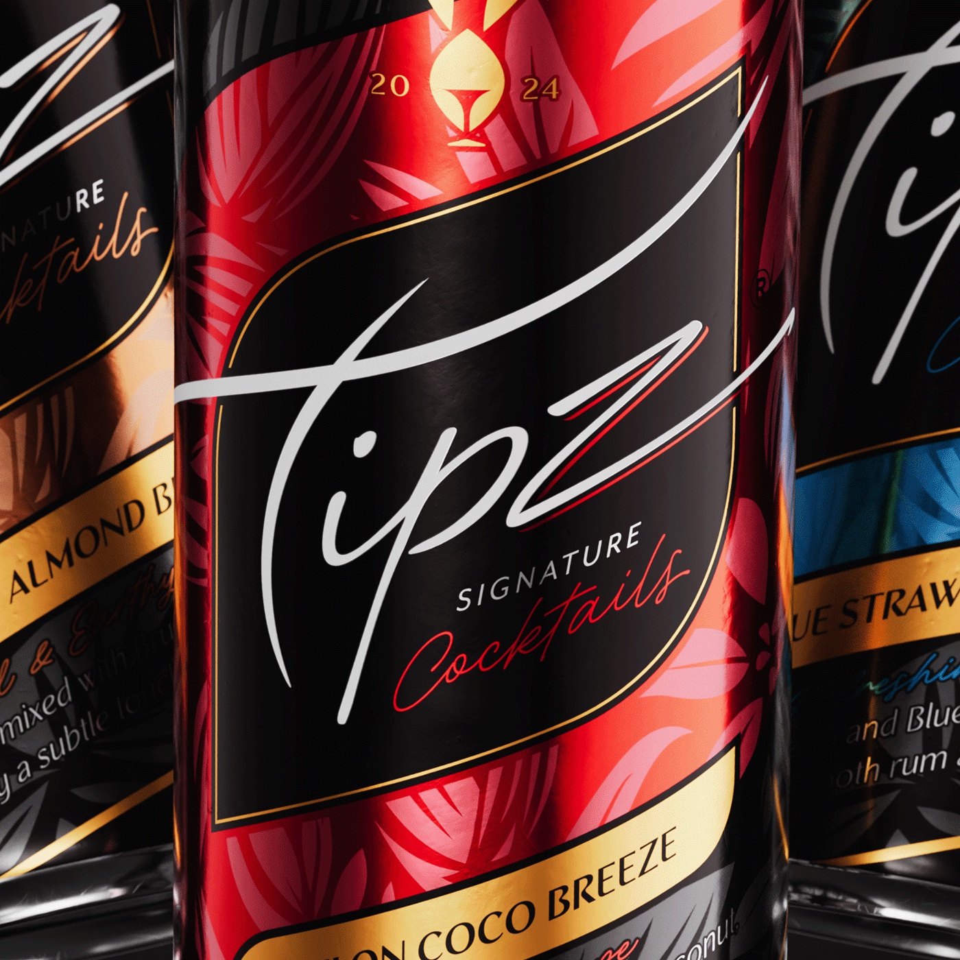
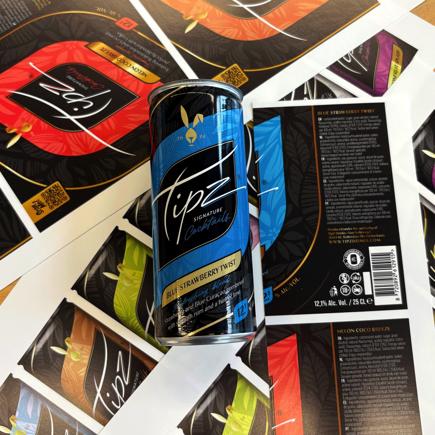
Since there are a lot of different cocktails in the entire range, color coding was very important. We needed to find colors that were connecting to the fruit and taste of the cocktail, but also would stand out in the complete range, without being too close to another cocktail color.
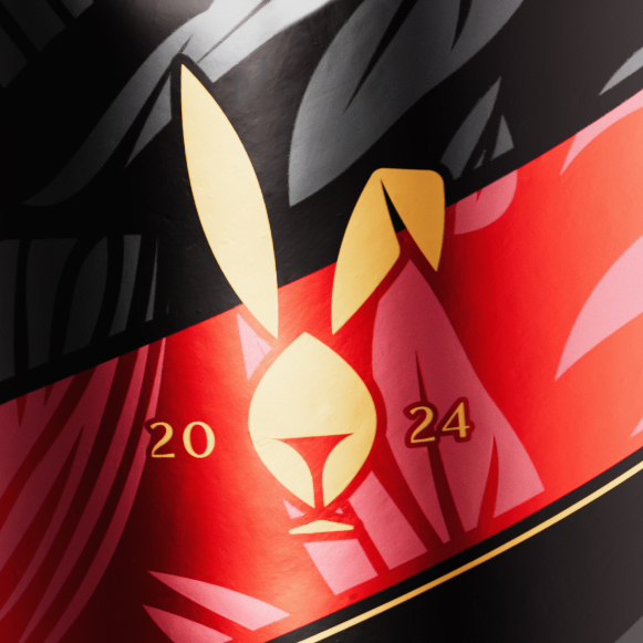
We are using feminine shapes suiting the logo and created a curved but strong design carrier for the color coding. On these color carriers we worked in the tropical illustrations that continue to the second layer of the main graphical shape on the front.
Production will also have a big part in the outcome of the design, as we want to use the aluminium to create metallic colors and shapes on the can as a contrast to the opaque surfaces on the can. This really gives different layers to the design and has a great brand feeling in your hand. So, there was a lot of mock up production work, by the supplier to come to an end results. As we speak the three first cocktails are in production and will hit the market soon. Make sure to try one coming summer!
CREDIT
- Agency/Creative: Van Heertum Design VHD
- Article Title: TipZ Embodies Tropical Indulgence Through Color-Driven Packaging by Van Heertum Design VHD
- Organisation/Entity: Agency
- Project Type: Packaging
- Project Status: Published
- Agency/Creative Country: Netherlands
- Agency/Creative City: Tilburg
- Market Region: Global
- Project Deliverables: Brand Creation, Brand Design, Design, Graphic Design, Illustration, Logo Design, Packaging Design
- Format: Can
- Industry: Food/Beverage
- Keywords: RTD, Cocktails, can design, rtd design, tropical, high alcohol, spirits, premium
-
Credits:
Strategy Director: Rob van Heertum


