The creation of Tipsy Cobra comes in response to a noticeable gap in the market that seems to hide in plain sight: few popular South African beers acknowledge party culture through their packaging, and none acknowledge it profoundly.
This is surprising given that many South African beers are often consumed at parties hosted and attended by young adults. Furthermore, these beers are often bought by these youngsters or influenced by their preferences. Since this is the case, it makes sense to market to these young adults in a relatable fashion that allows them to feel seen.
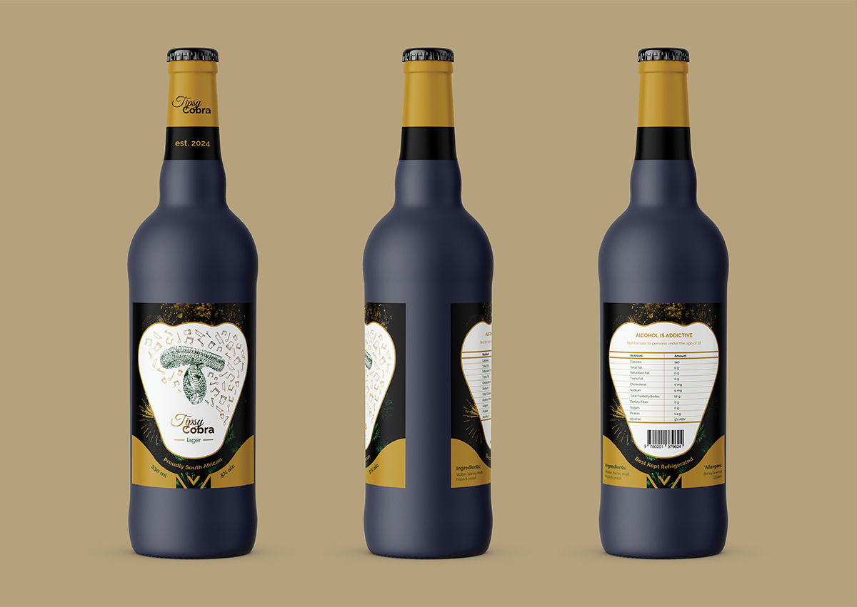
Hence, the introduction of Tipsy Cobra, a beer brand that embraces South Africa & the celebratory nature of party culture through its packaging design. This design will capture the attention of young South African party-goers by making them feel recognized, which will cause them to gain an interest in Tipsy Cobra as a brand.
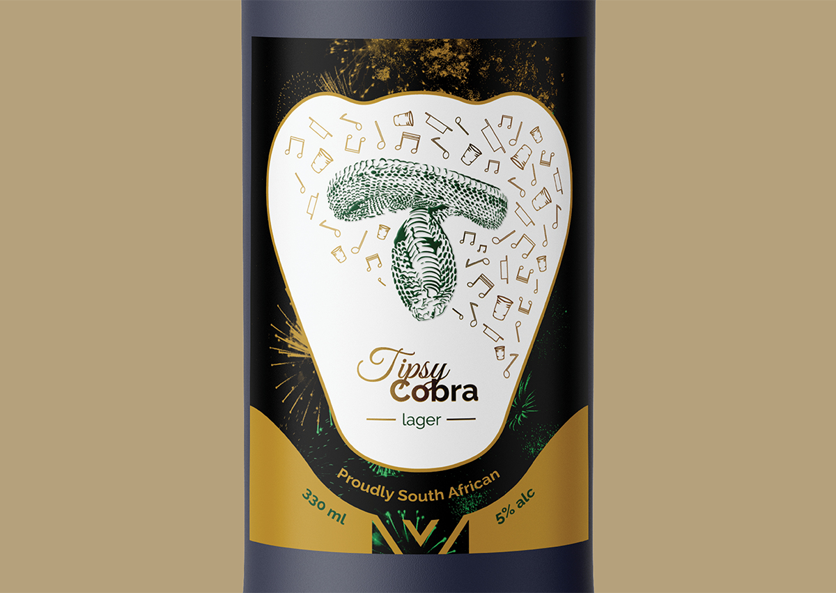
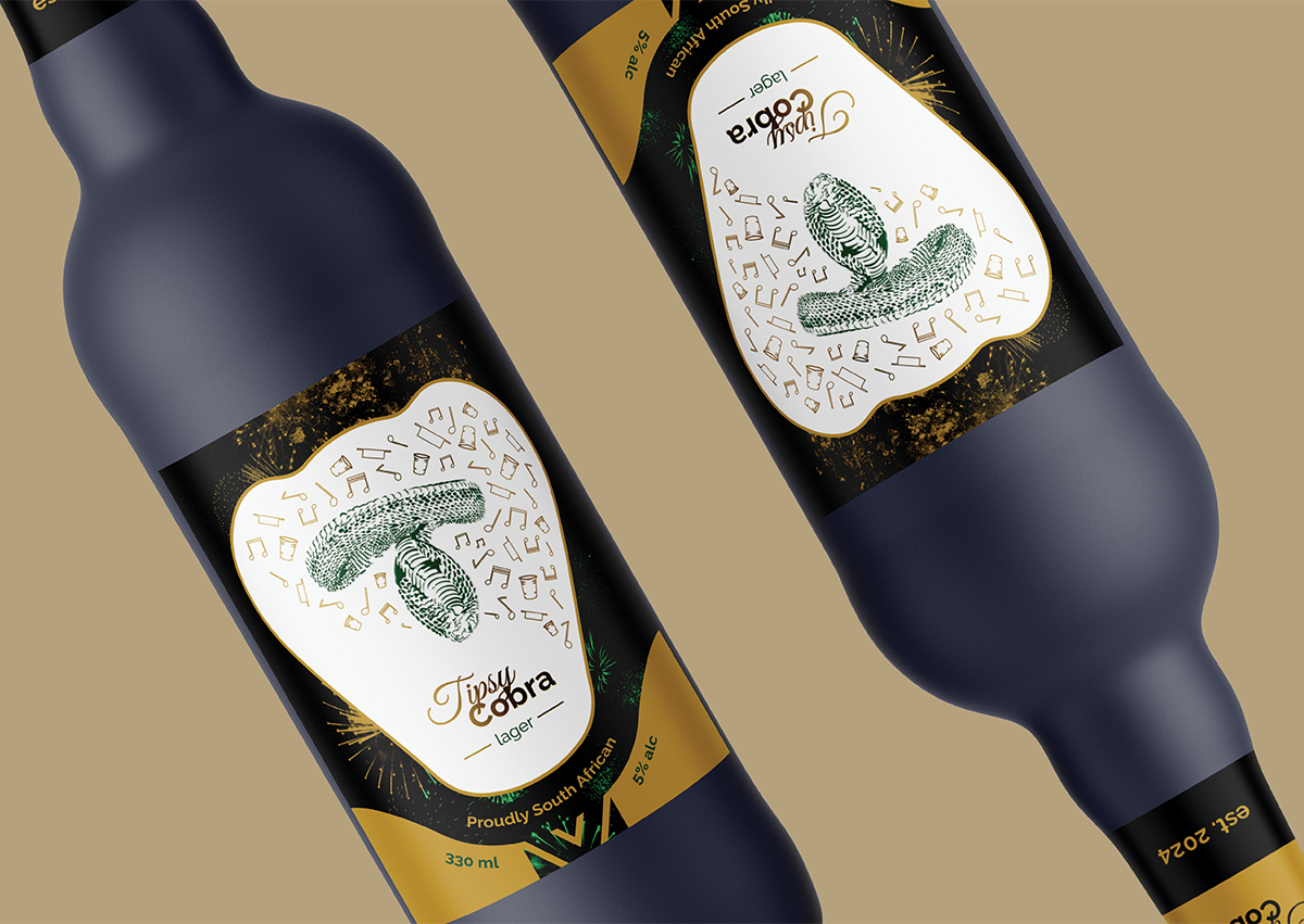
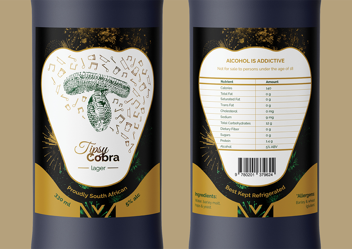
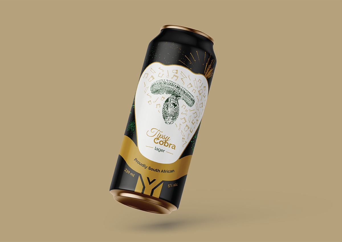
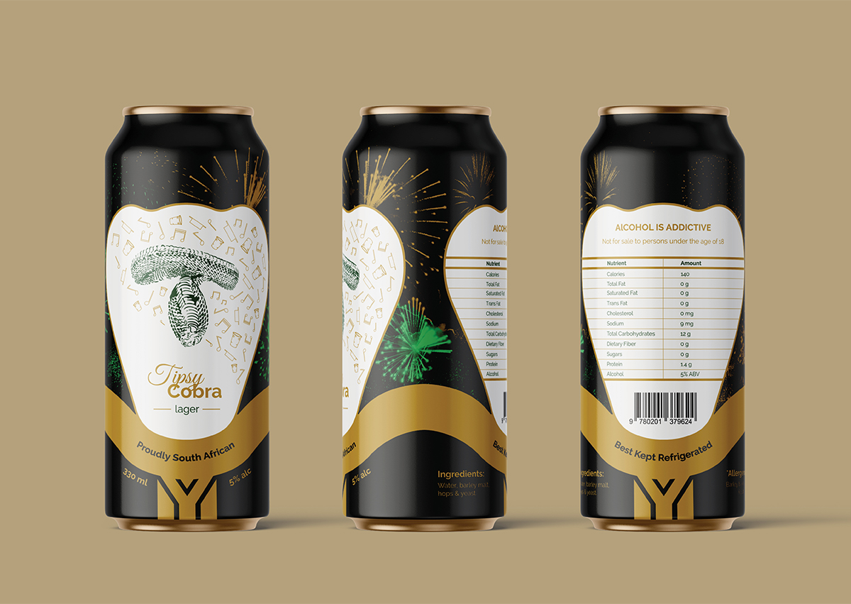
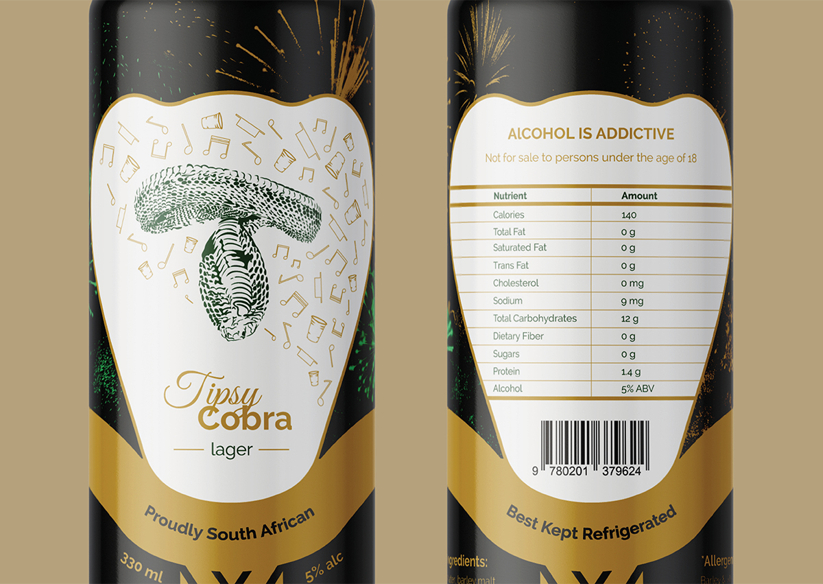
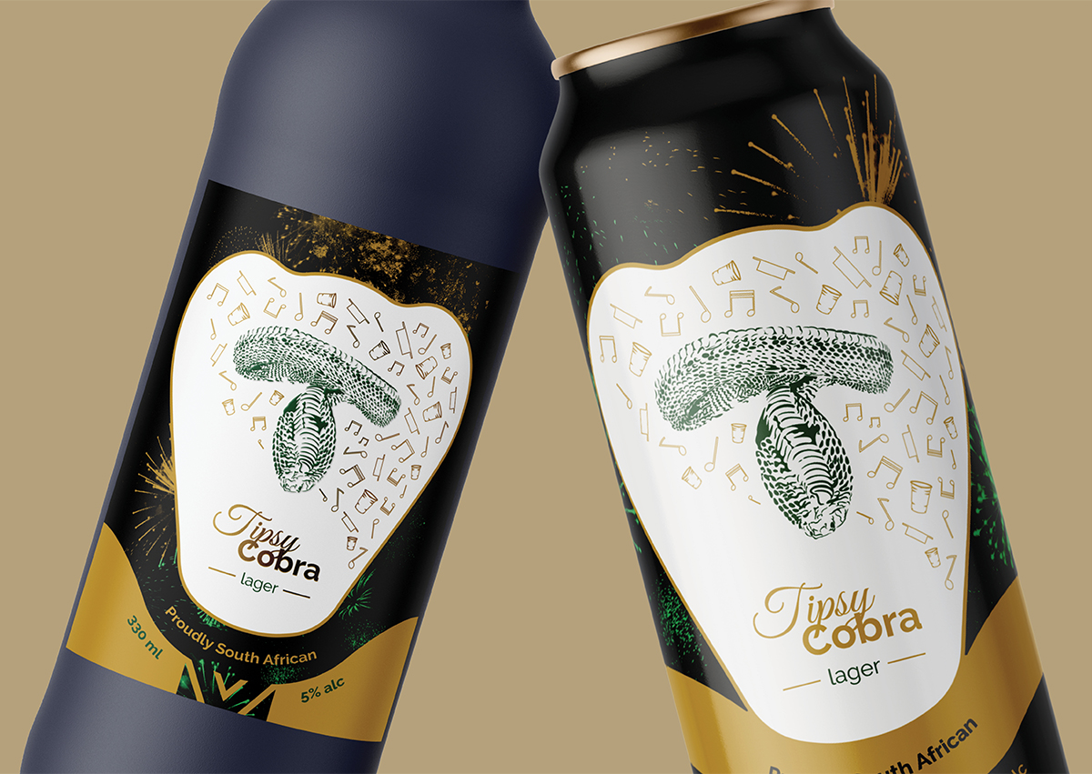
Speaking of interest, Tipsy Cobra makes use of a premium design style, which allows its packaging to stand out on the shelves and also communicates that this lively brand can enhance your party experience. Additionally, Tipsy Cobra predominantly uses green and gold to reference South Africa because South Africans associate these colours closely with their nationality.
As for the name, “Tipsy” is self-explanatory but “Cobra” is included because the Cape Cobra is a well-known brown South African snake & beer is brown as well. This is a subtle connection that, perhaps, might be a little more difficult to spot but it adds depth to the brand’s identity.
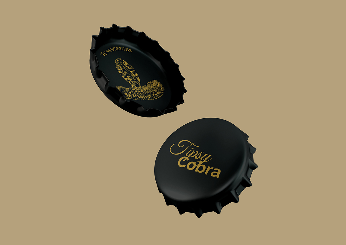
Other finer details in Tipsy Cobra’s design will be noticed by the majority. These details include the “T” in the brand’s designs, which is an upside-down cobra (hence, “Tipsy Cobra”), and the simple, fun pun found inside the bottle cap.
Overall, Tipsy Cobra aims to let youngsters know that they acknowledge them and encourage them to live their lives jovially. They want youngsters to know that life is too short to take too seriously so you should just go out and have some fun now and then!
CREDIT
- Agency/Creative: Thomas Burke
- Article Title: Tipsy Cobra Packaging Design Concept by Thomas Burke
- Organisation/Entity: Student
- Project Type: Packaging
- Project Status: Non Published
- Agency/Creative Country: South Africa
- Agency/Creative City: Cape Town
- Market Region: Africa
- Project Deliverables: Graphic Design, Identity System, Packaging Design
- Format: Bottle, Can
- Industry: Food/Beverage
- Keywords: Graphic Design, innovative design, creative packaging, beer branding, beer packaging, premium packaging, party culture, South African design, youth marketing
-
Credits:
Graphic Designer: Thomas Burke


