


Apothekary is an herbal wellness brand that bridges Eastern herbalism and Western science. In their dedication to kaizen (continuous improvement), Apothékary sought a rebrand that showed the efficacy of herbal medicine, addressed packaging concerns, and laid the groundwork for future growth. The transformation included a new logo, vibrant but sustainable packaging, and simple yet sophisticated visual elements.
Forner’s strategic approach to Apothekary’s rebrand was to remove entry barriers for new herbalist and to establish plant medicine as an enjoyable, empowering practice. The result was a brand that demystifies herbalism and positions Apothekary as the natural choice for both herbal enthusiasts and novices. At the heart of the new visual identity is the logo, crafted to symbolize the connection of East and West. The curved arch within the “A” represents a bridge connecting both cultural influences and brings a sense of unity and balance to ancient tradition and modern science.
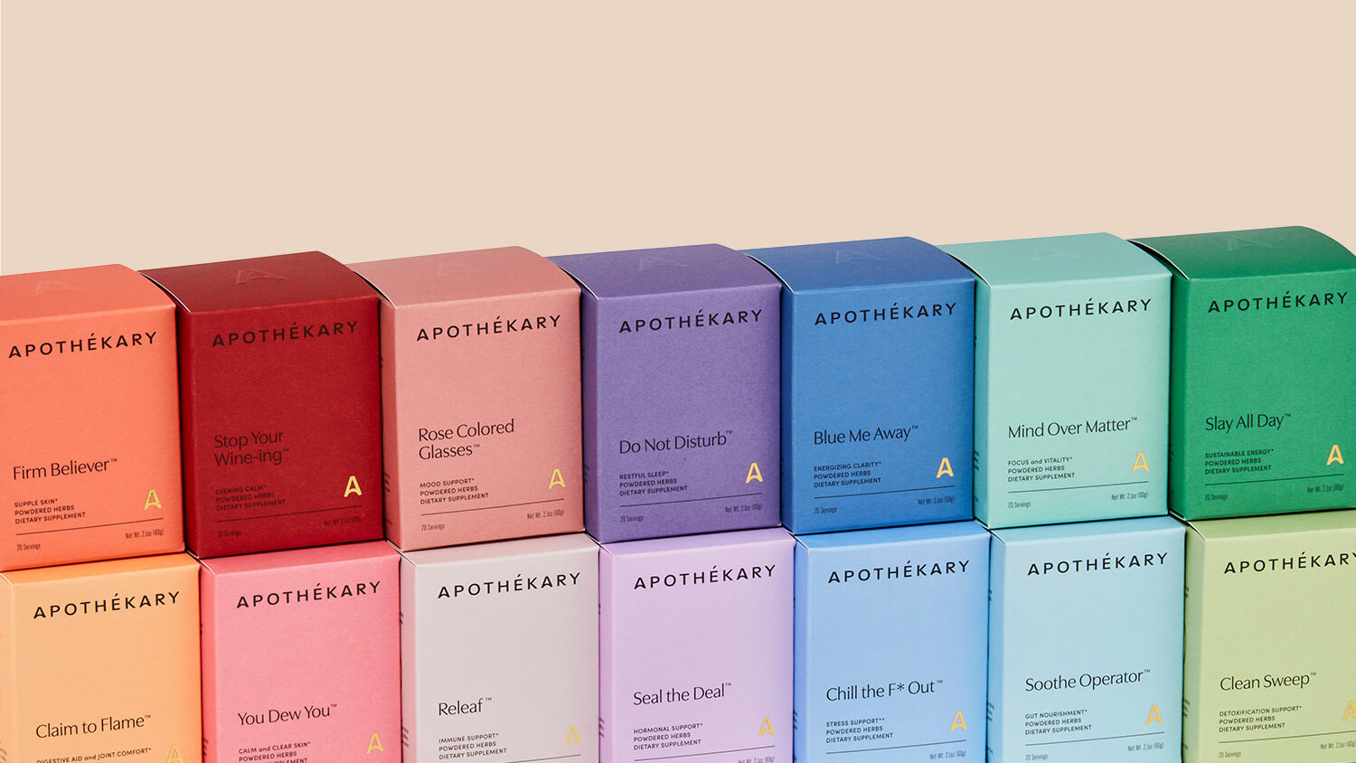
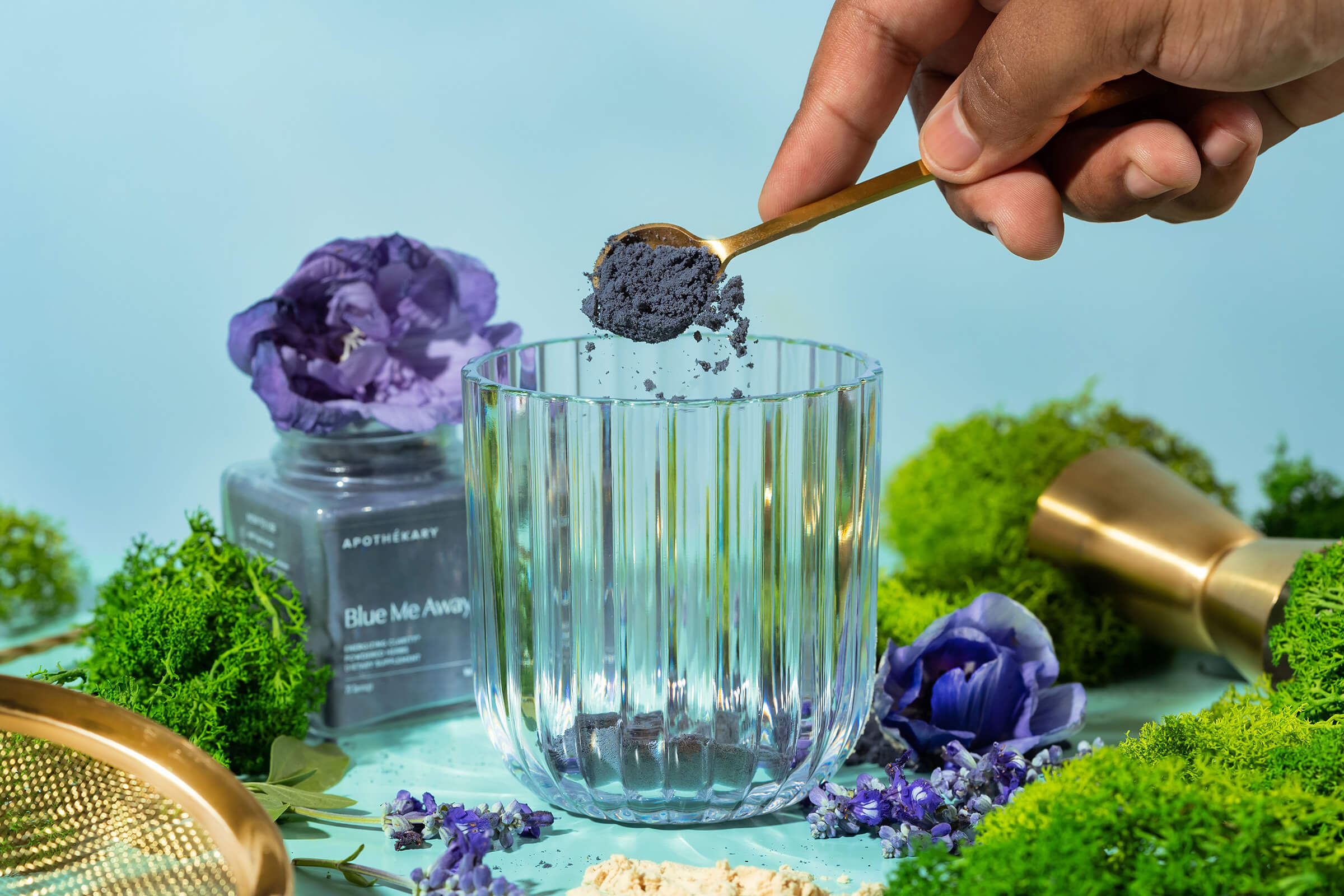
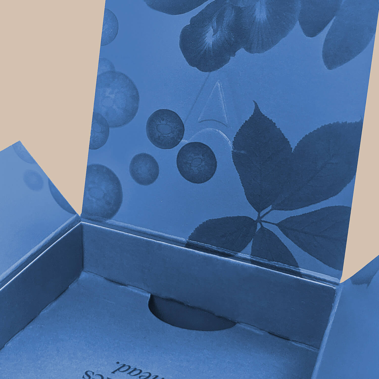
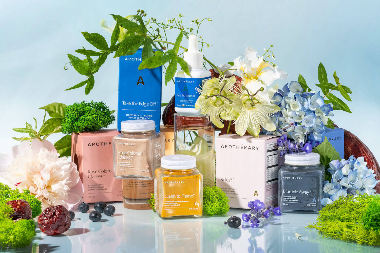
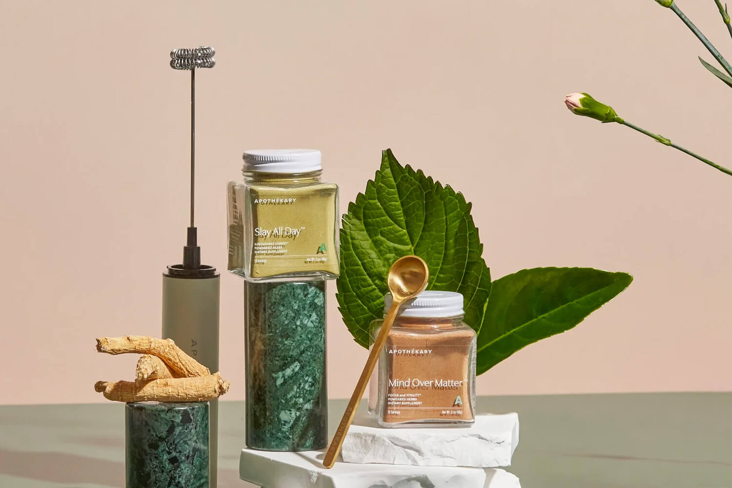
For their packaging, Apothekary turned to Timia Lewis to execute Forner’s vision. Each signature formula stands out with a distinctive color palette, ranging from serene blues and greens to vivid reds and pinks. Through ingredient collages by Timia and Forner, the signature and single herb boxes depict the real plants behind the formulas. The box’s addition of gold foil logos introduce an element of sophistication and the strategically placed die-cut invites viewers to glimpse the jar inside. The jars themselves are uniquely cubed with embossed logo-marked lids that add subtle distinction to the packaging. Apothekary’s new look and feel reaffirms its goal to make plant medicine an accessible and enjoyable part of everyday well-being.


CREDIT
- Agency/Creative: Timia Lewis
- Article Title: Timia Lewis Execute Forner Studio’s Vision, Building off their Branding to Create Apothekary’s Packaging Design
- Organisation/Entity: Freelance
- Project Type: Packaging
- Project Status: Published
- Agency/Creative Country: United States
- Agency/Creative City: Atlanta
- Market Region: North America
- Project Deliverables: Packaging Design
- Format: Box
- Industry: Food/Beverage
- Keywords: apothekary, branding, packaging, diecut, gold foil, herbal, medicine, box, jar, powder, blend, herbalism
-
Credits:
Branding, Packaging: Forner
Packaging: Timia Lewis


