Overview
Time Hop Brewing Company is a craft brewery centered in the vibrant locale of San Diego, CA, drawing inspiration from the past to present. The brand is both contemporary and infused with nostalgia. Specifically targeted at 25-45-year-old craft beer enthusiasts, Time Hop carves a distinctive identity by marrying elements of retro with the robust flavors of craft beer.
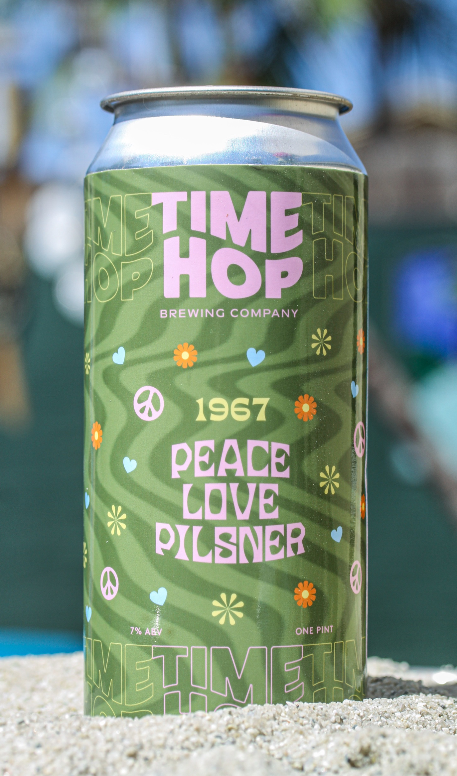
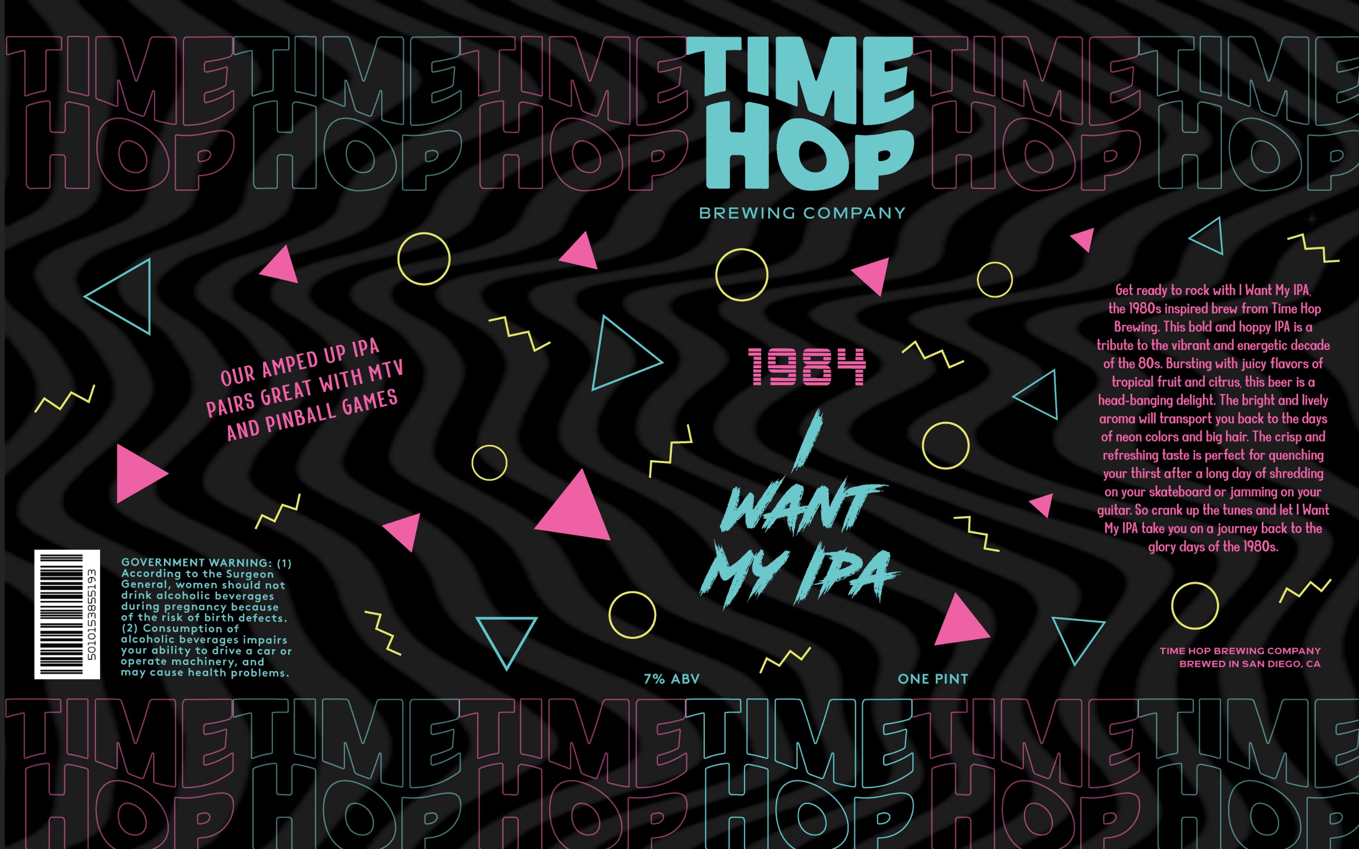
Central to Time Hop’s visual identity is its meticulously hand-lettered logo, which not only serves as a testament to the brand’s attention to detail but also cleverly references the concept of time travel. The curved center alignment within the logo mimics the appearance of a time portal, further accentuating the brand’s thematic essence. The development of this logo evolved from an extensive sketching process where numerous iterations were explored to achieve the desired blend of aesthetics and brand resonance.
Positioning plays a crucial role in Time Hop’s market appeal. While it celebrates the artisanal nature of craft beer, it also ensures affordability. By maintaining prices slightly below those of close competitors, Time Hop ensures its products remain within reach for a broader spectrum of beer aficionados.
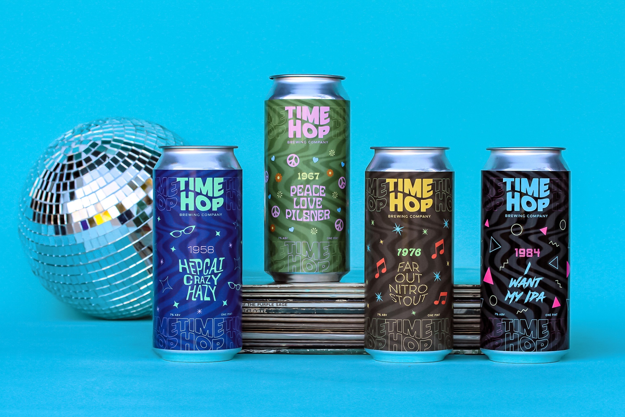
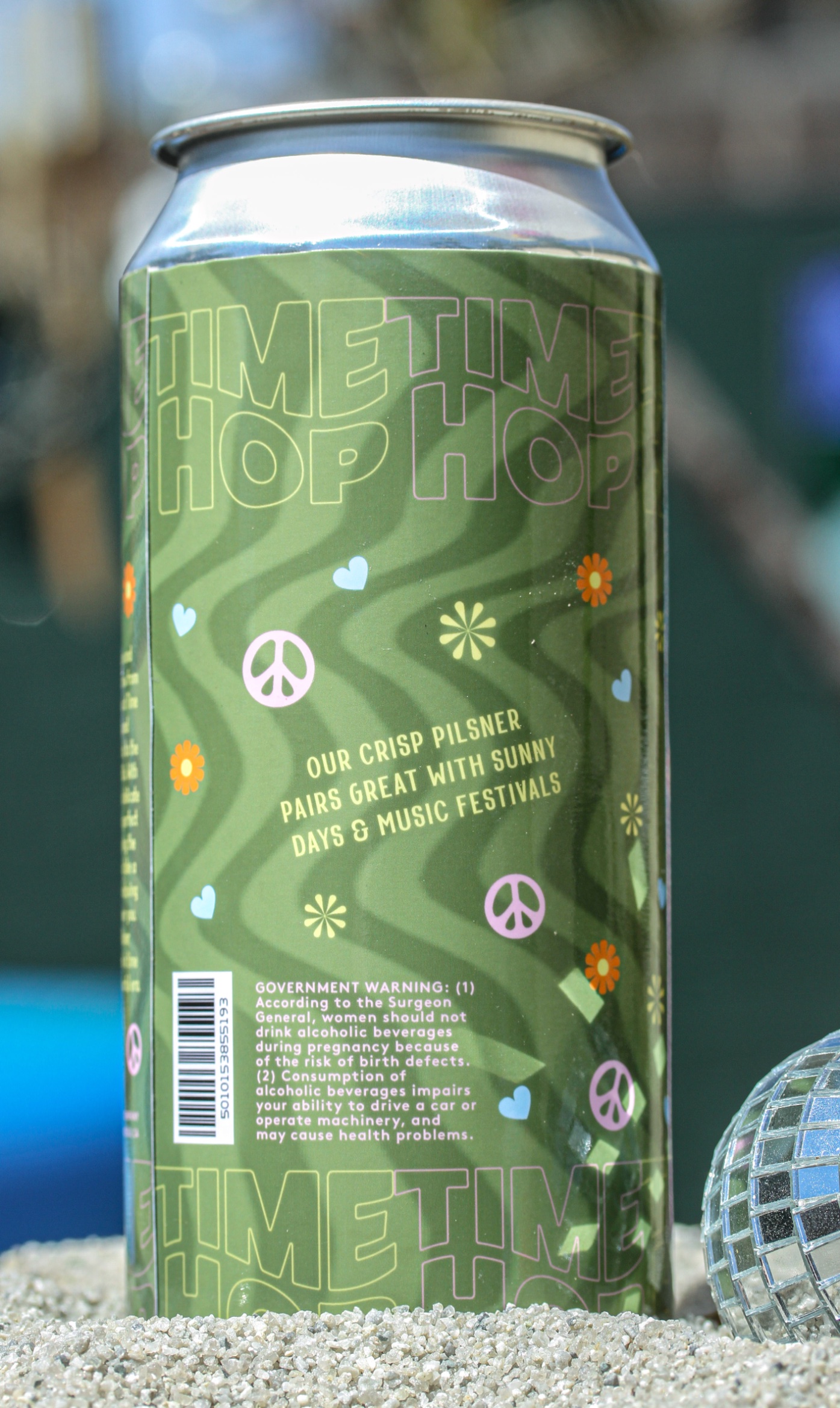
Each beer can stands as a visual theme of a specific decade. This is achieved through a medley of carefully chosen iconography, graphic elements, typefaces, and colors reminiscent of the respective era. This deliberate design choice transforms each can into a miniature time capsule. Moreover, the logo’s repetition along the can’s top and bottom, wrapping seamlessly around, adds a touch of brand consistency amidst the varying decade-themed designs.
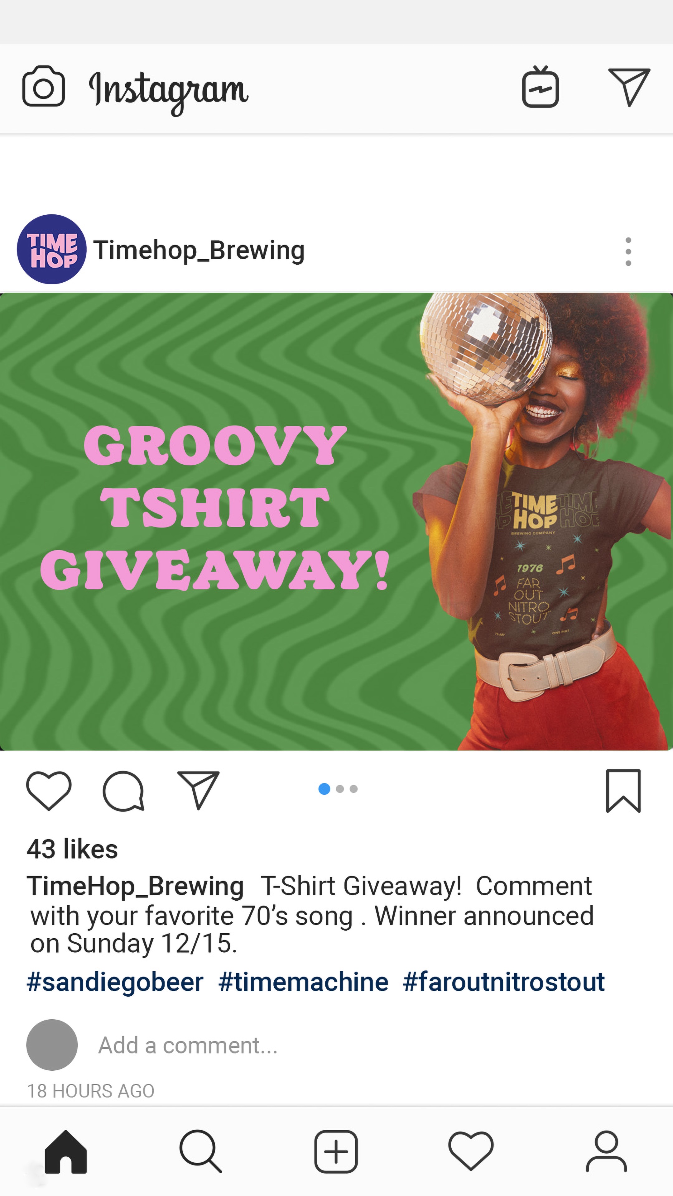
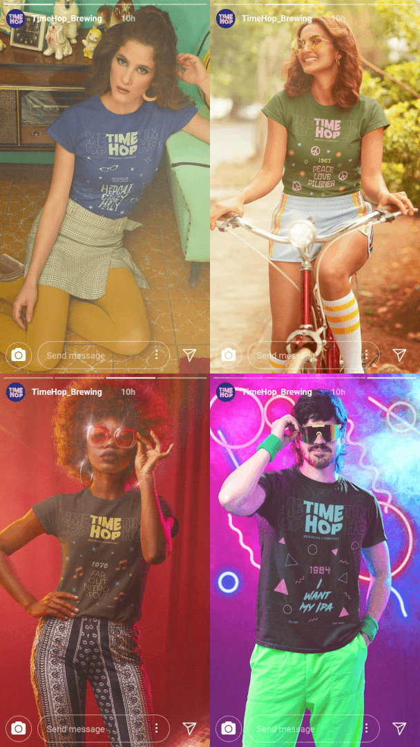
To extend the brand’s presence and narrative, Time Hop exploits the digital realm, particularly social media. This platform witnesses a visual extravaganza of photographs, each echoing the different time periods corresponding to the beer flavors. Beyond mere product promotion, these images also serve to market related merchandise. A noteworthy element in Time Hop’s branding strategy is its adept use of copywriting, which deftly pairs each beer with cultural nuances from the represented decade, offering drinkers a sip of both flavor and history.

CREDIT
- Agency/Creative: Alissa Whelan
- Article Title: Time Hop Nostalgia in a Can
- Organisation/Entity: Student
- Project Type: Packaging
- Project Status: Non Published
- Agency/Creative Country: United States
- Agency/Creative City: San Diego
- Market Region: North America
- Project Deliverables: Brand Identity, Logo Design, Packaging Design
- Format: Can
- Industry: Food/Beverage
- Keywords: WBDS Student Design Awards 2023/24
- Keywords: Packaging Design, Product Creation
-
Credits:
Educational Institution: San Diego City College - Graphic Design
Educator's Name: Sean Bacon and Bradford Prairie


