


ТИЛИ ТЕСТО (Tili Testo) is a Russian childish idiom about dough. Not to dig deep in the details of translation, “tili testo” means unity between people (to be more correct, a couple of people, the bride and the groom), but mostly it’s just a funny ditty used mostly by little kids. It became a name for my project, the identity for imagined annual Russian food festival.
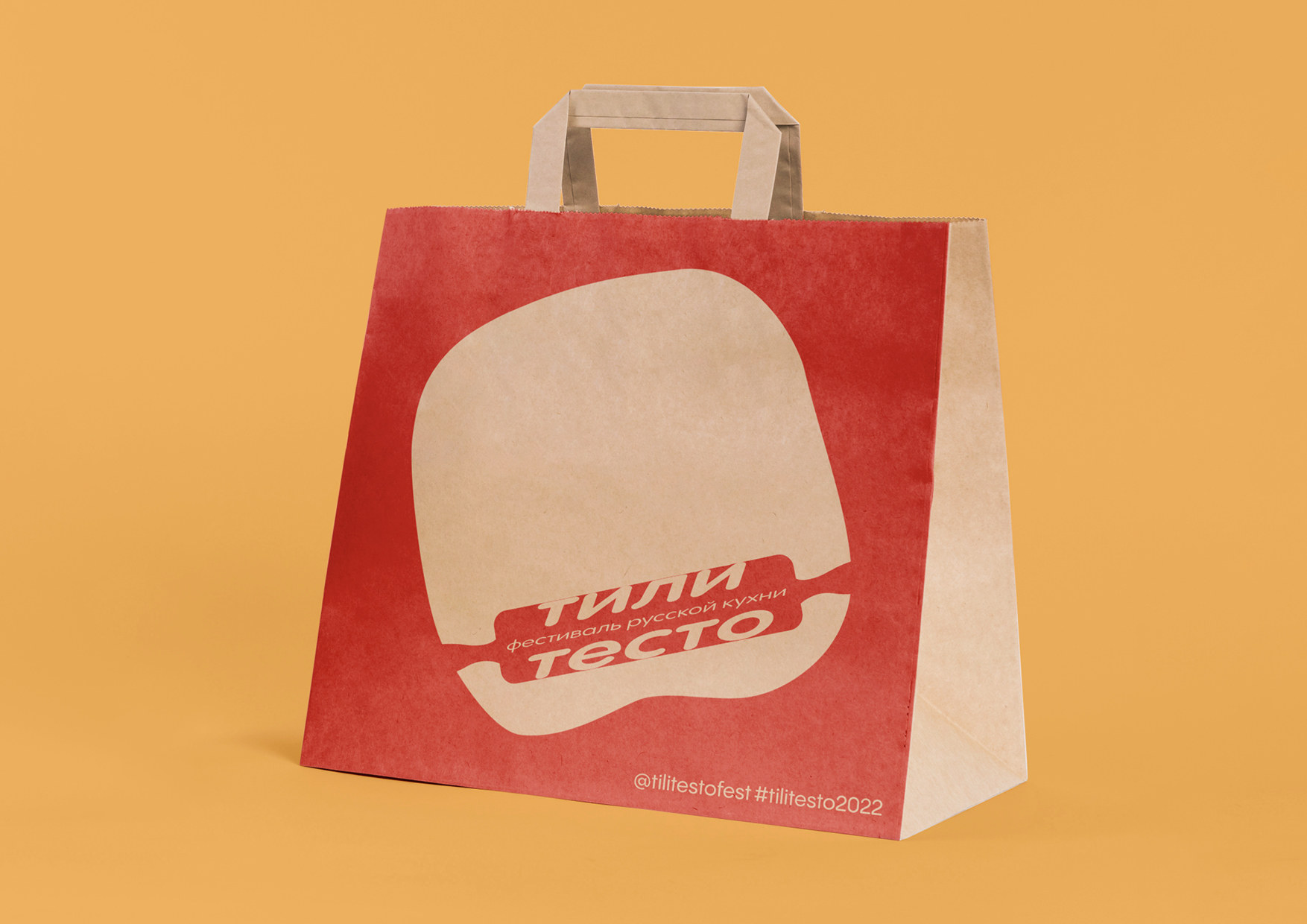
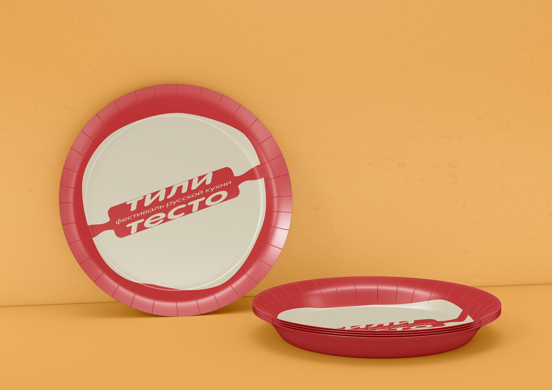
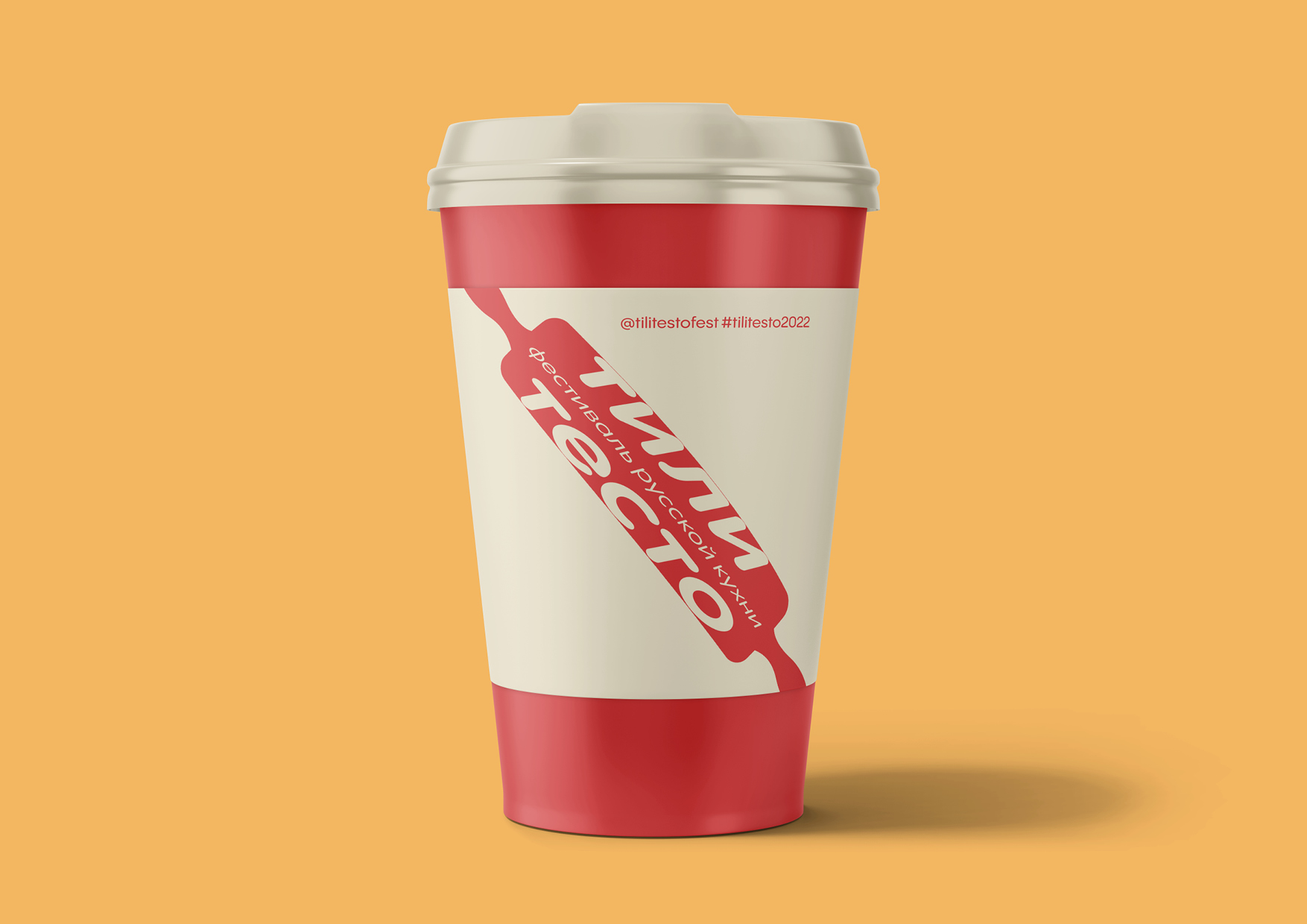
As I think, the festival may include points where you can try and taste different kinds of Russian traditional food, maybe there could be some educational points, where you can learn about where certain popular Russian dish came from and how to cook it. It may also include some kind of entertainment, for example, a concert with Russian traditional dances and songs. Depending on that, I chose types of assets to place the identity, such as plate and cup.
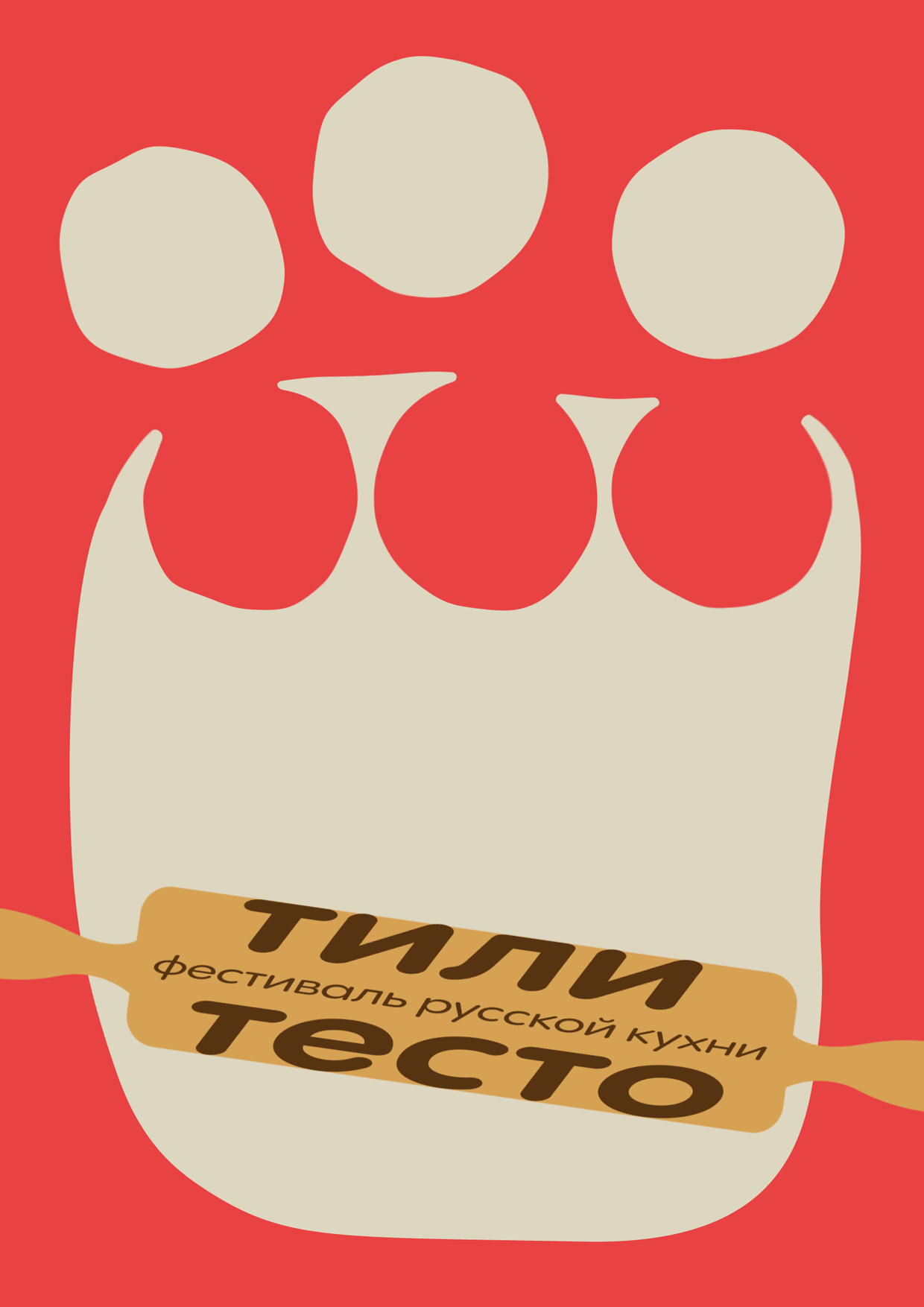
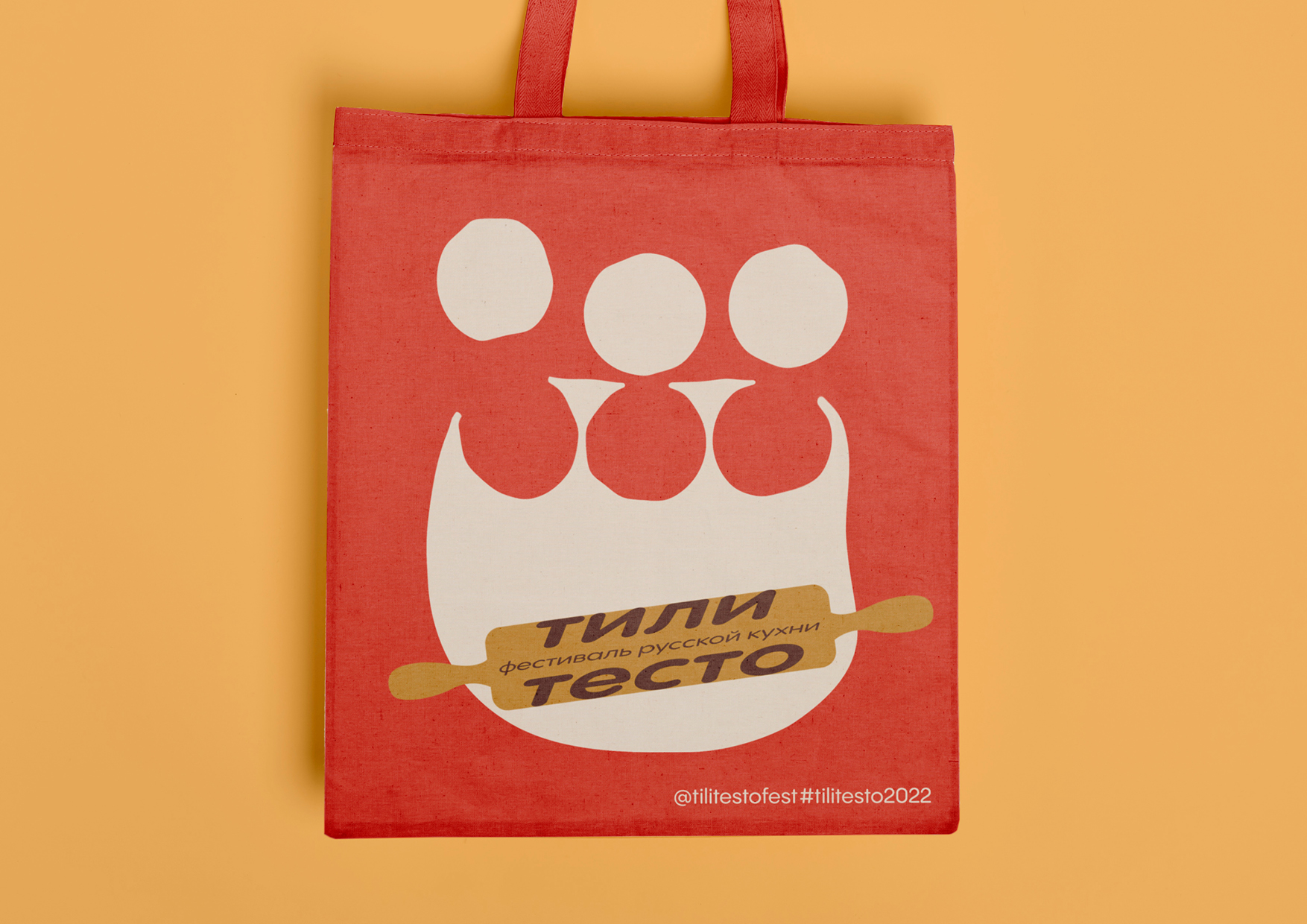
A huge part of traditional Russian food is the dishes made of dough. Sometimes the dough is being cut to circles to make, for example, the Russian dumplings. Sometimes it’s just being and cut into pieces to make the traditional buns. There are so many dishes cooked in a different ways: some of them go with meat, some of them go with vegetables, berries, fruits. Some of them has to be boiled, some of them has to be fried and some of them has to be baked. But the main thing stays the same: to make the most part of dishes you have to roll it.
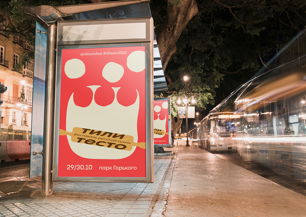
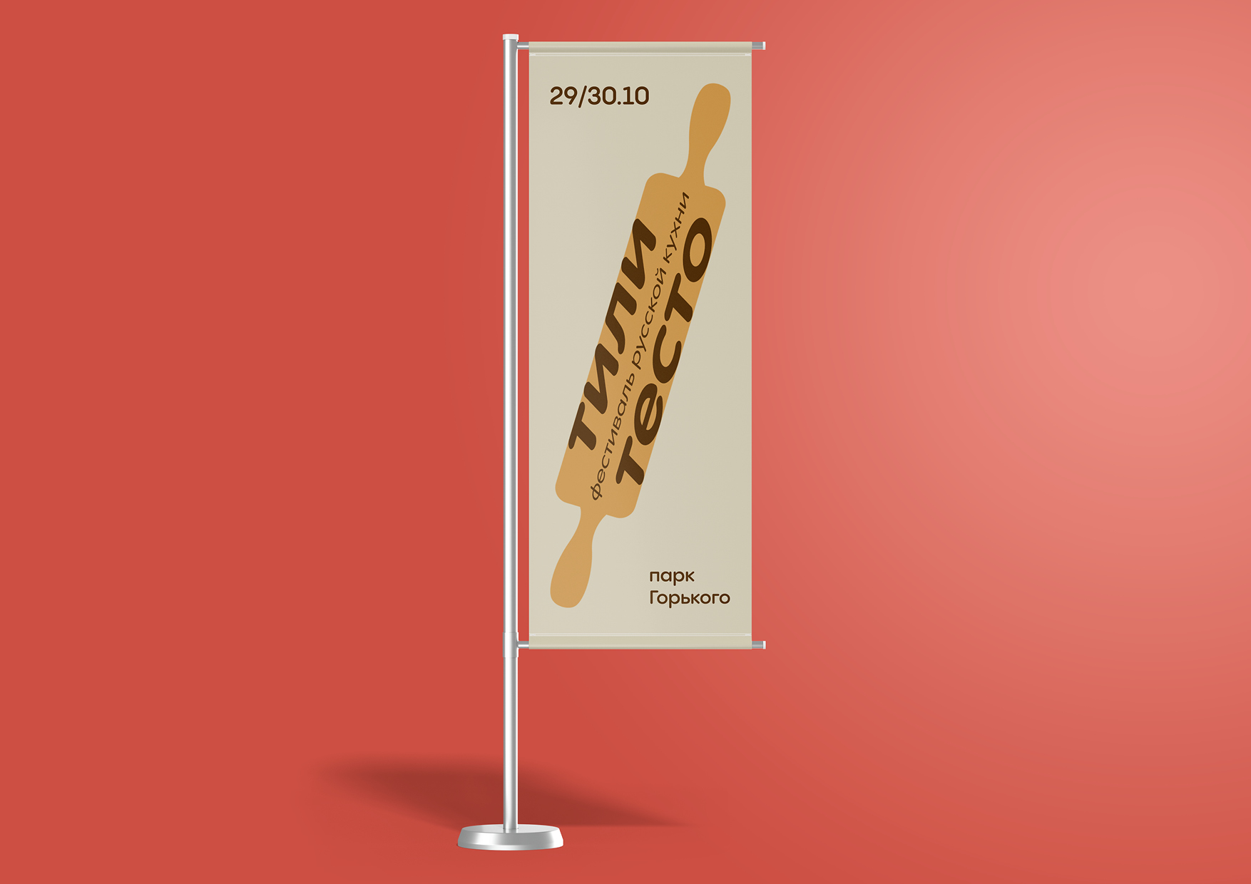
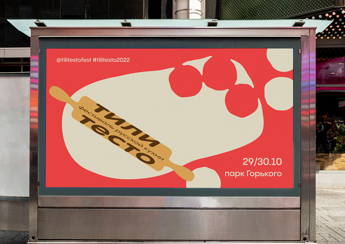
Therefore, the event identity is based on flexible shape of dough, and the main tool to work with it — a rolling pin. The rolling pin itself became a logo for the festival. But it never goes without the dough that could be shaped different depending on where the logo placed.
CREDIT
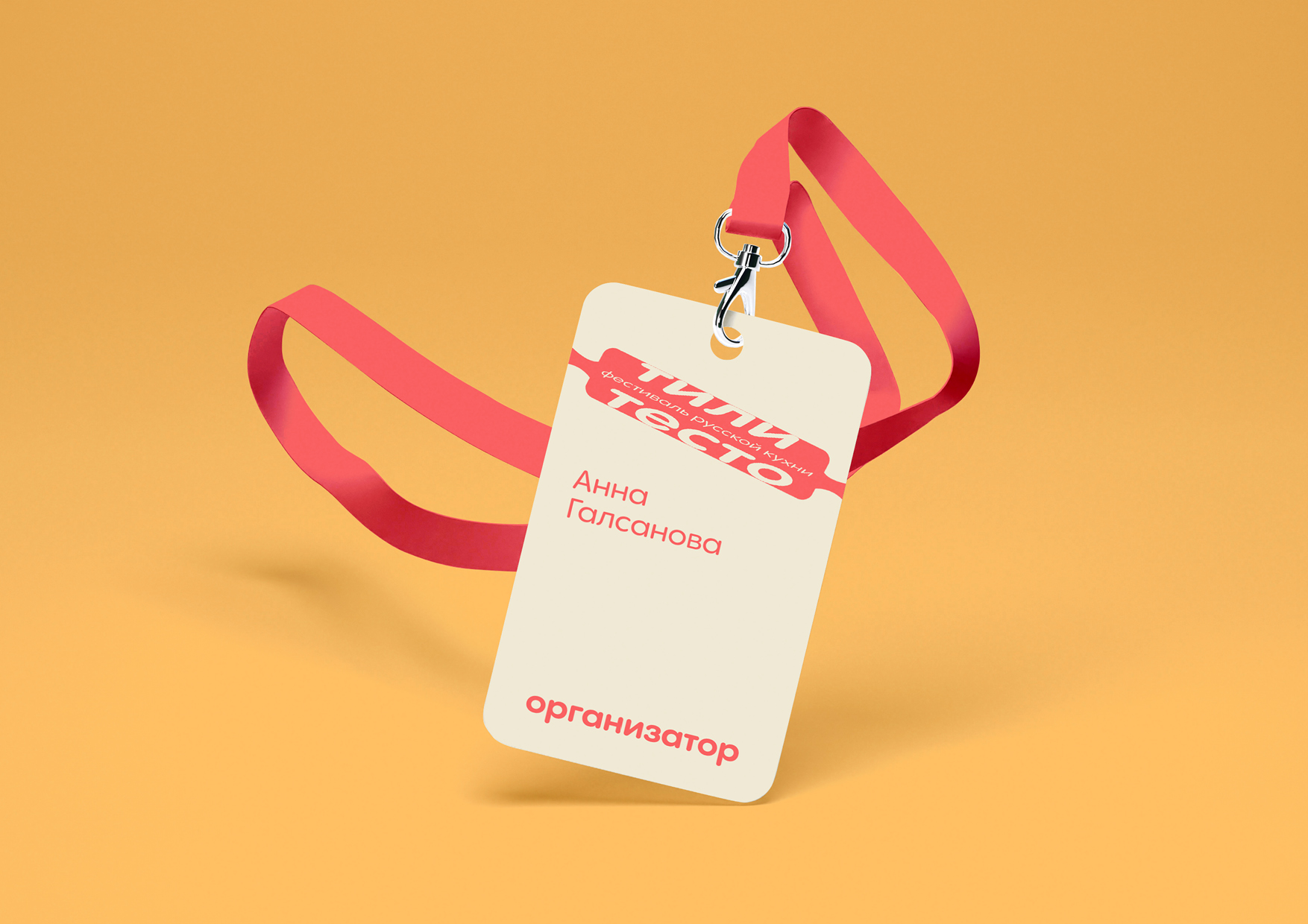
- Agency/Creative: Anna Galsanova
- Article Title: Tili Testo Student Brand Design Concept
- Organisation/Entity: Student
- Project Type: Identity
- Project Status: Non Published
- Agency/Creative Country: Russia
- Agency/Creative City: Moscow
- Market Region: Europe
- Project Deliverables: Design, Identity System
- Industry: Food/Beverage
- Keywords: food festival
-
Credits:
Designer: Anna Galsanova
Art Director: Leonid Slavin


