


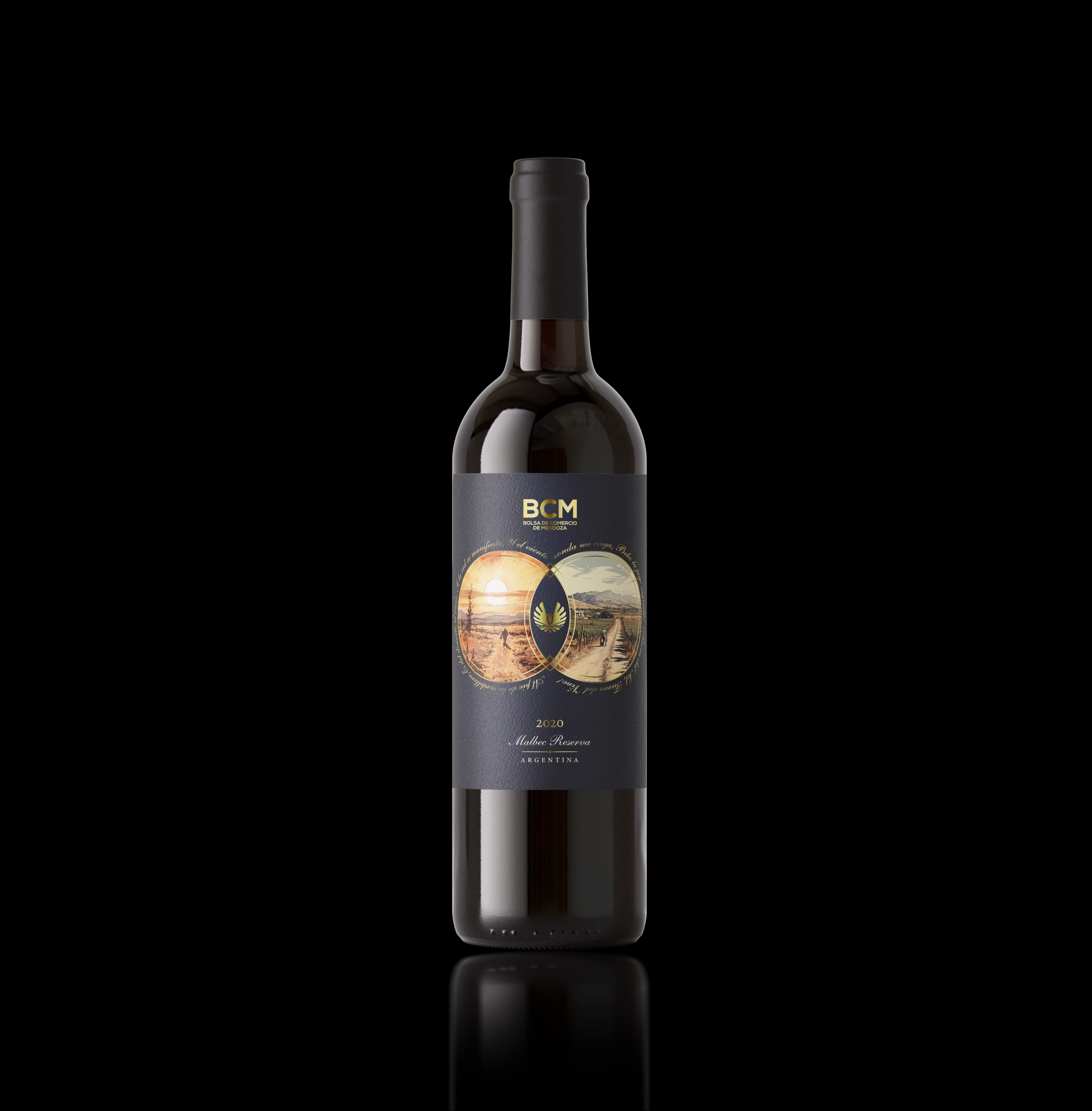
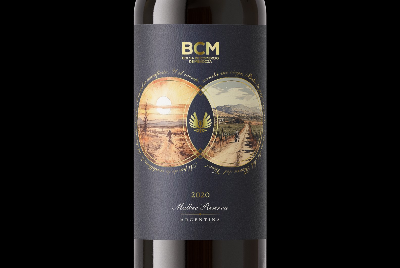
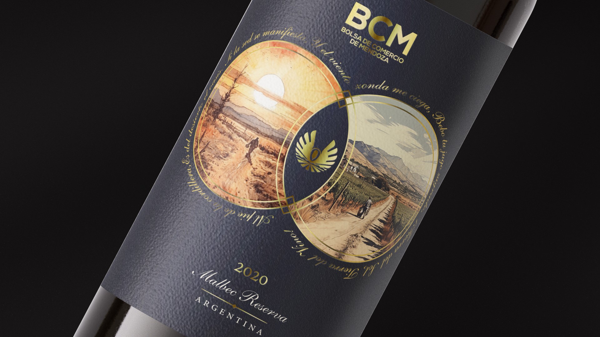
In the heart of Mendoza, where the Andes mountains cradle the landscape and the sun paints the earth with its fiery hues, a unique story unfolds. This narrative, a blend of nature’s artistry and human craftsmanship, is encapsulated in the label design of “Tierra del Sol, Tierra del Vino” wine—a tribute to the duality that defines Mendoza.
The design, meticulously curated, seeks to embody the essence of Mendoza, a region renowned for its arid lands and the relentless embrace of the sun. A bold, warm palette captures the intensity of the sunlight that bathes the vines, symbolizing the strength and resilience of the terroir. The juxtaposition of earthy and green tones echoes the fusion of parched soil and the rich, robust flavors that flourish under the Argentine sun.
At the center of the label, a silhouette of the Bolsa de Comercio logo “Andean Vultur” stands proudly, representing the geographical backbone that shelters Mendoza from the harshness of the surrounding desert. This natural oasis, cradled at the foot of the mountains, is a testament to the region’s ability to turn adversity into prosperity—a theme mirrored in the robust character of the wines it produces.
Embedded within the design are fragments of poetic verses that pay homage to Mendoza. “If thirst manifests, and the wind blinds me, I drink your sacred juice, Land of the Sun, Land of Wine!” These lines, extracted from the “Song to Mendoza” by José Virgilio Gudiño (1994) and “Poem to Mendoza” by Roxana Romano (2012), serve as a lyrical accompaniment to the visual narrative, adding a layer of cultural depth to the overall experience.
The typography chosen for the label reflects both elegance and strength, mirroring the characteristics of Mendoza’s acclaimed Malbec wines. The font, reminiscent of calligraphy, gracefully weaves the historical threads of the region’s viticulture into a contemporary tapestry. Each element of the design harmonizes with the others, creating a label that is not merely a marker of a bottle’s contents but a visual ode to Mendoza’s spirit.
As consumers indulge in “Tierra del Sol, Tierra del Vino,” they are not just savoring a glass of wine; they are partaking in the symphony of Mendoza’s terroir—the sun-drenched landscapes, the resilient vines, and the poetry that echoes through every sip. This label design serves as a portal, inviting wine enthusiasts to embark on a sensory journey through the very soul of Mendoza—a land where sun and wine intertwine in a timeless dance.
CREDIT
- Agency/Creative: Emiliano Miszei
- Article Title: “Tierra del Sol, Tierra del Vino: A Visual Symphony of Mendoza’s Terroir Crafted by Emiliano Miszei
- Organisation/Entity: Freelance
- Project Type: Packaging
- Project Status: Published
- Agency/Creative Country: Argentina
- Agency/Creative City: Luján de Cuyo
- Market Region: South America
- Project Deliverables: Packaging Design
- Format: Bottle
- Industry: Food/Beverage
- Keywords: wine
-
Credits:
Designer: Emiliano Miszei


