


Concrete® is a coffee bar in New York, conceived as a space where anyone can feel at home, where coffee becomes a pause for those desiring privacy, a connection to build new friendships, or a ritual for anyone who wants to blend into the city’s fast-paced tempo. Today, cafés compete on quality but also on the experience they create. Yet many follow the same formulas, losing authenticity, personality, and potential customers.
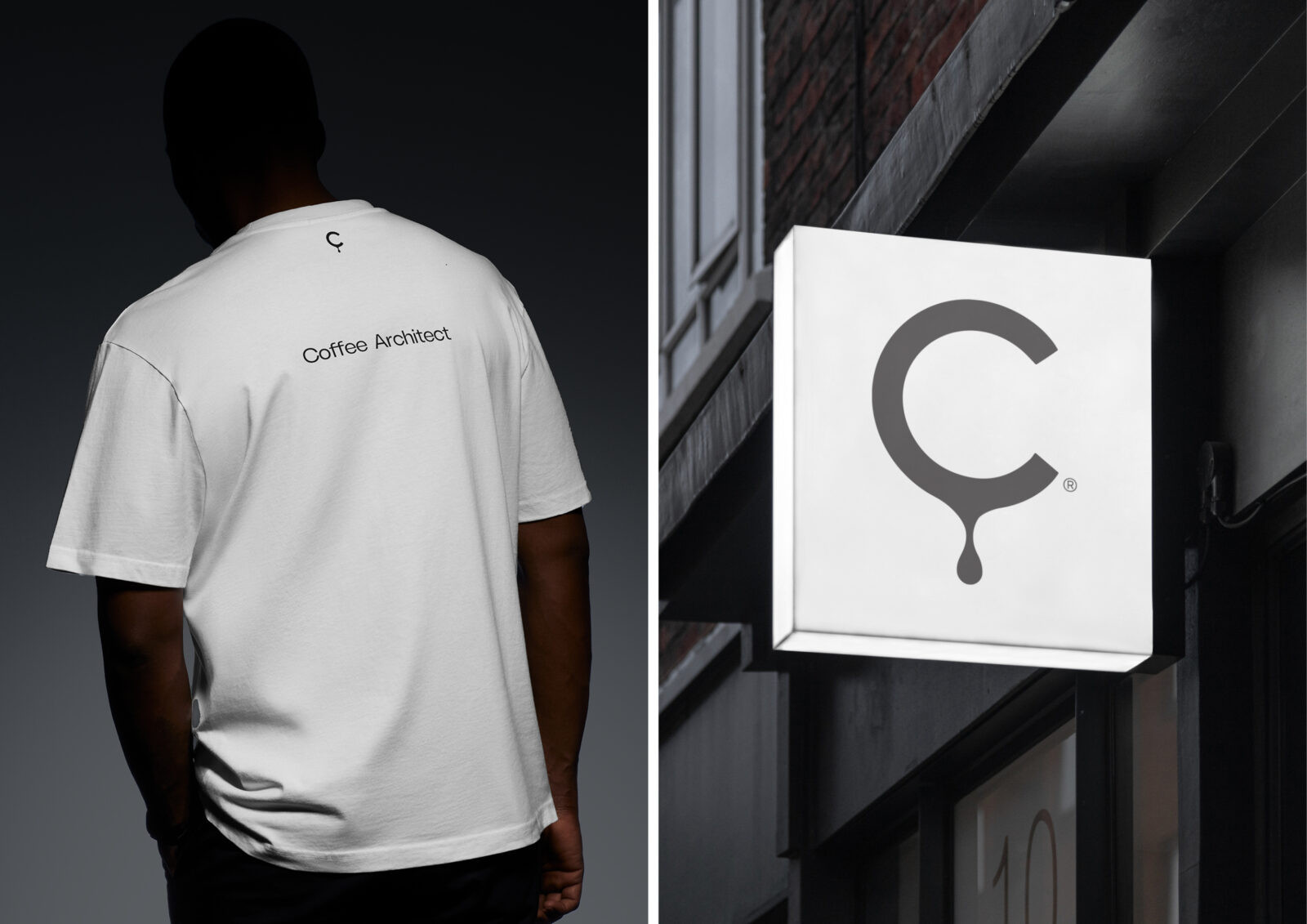
Built upon the Concrete® philosophy, this brand’s visual narrative lays its foundation in a concept designed to drive and balance individuality with community, in an easy, minimalistic yet powerful way.
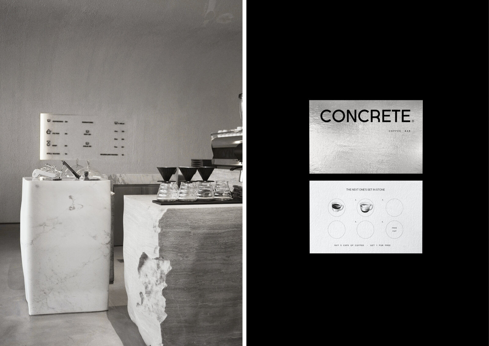
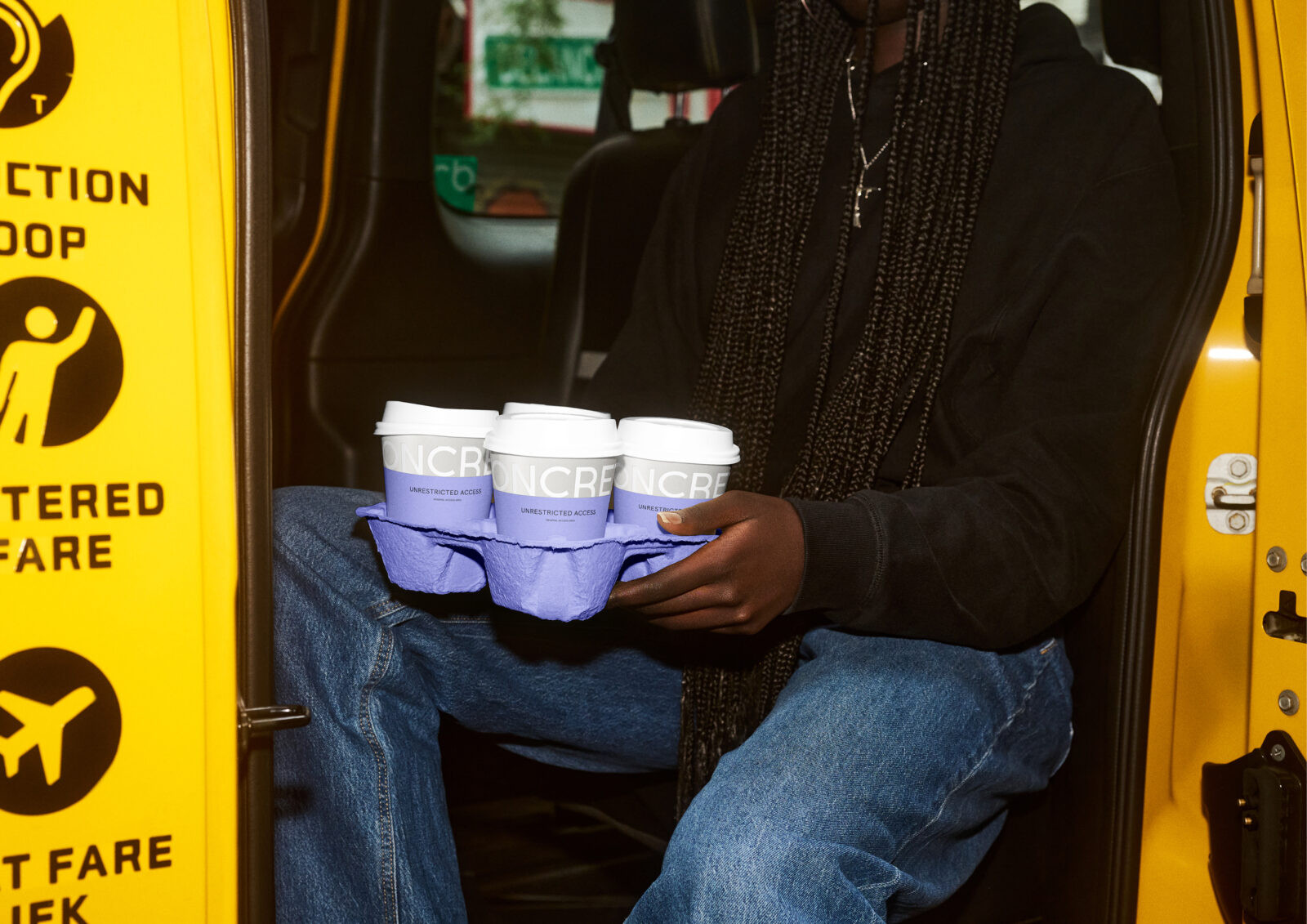
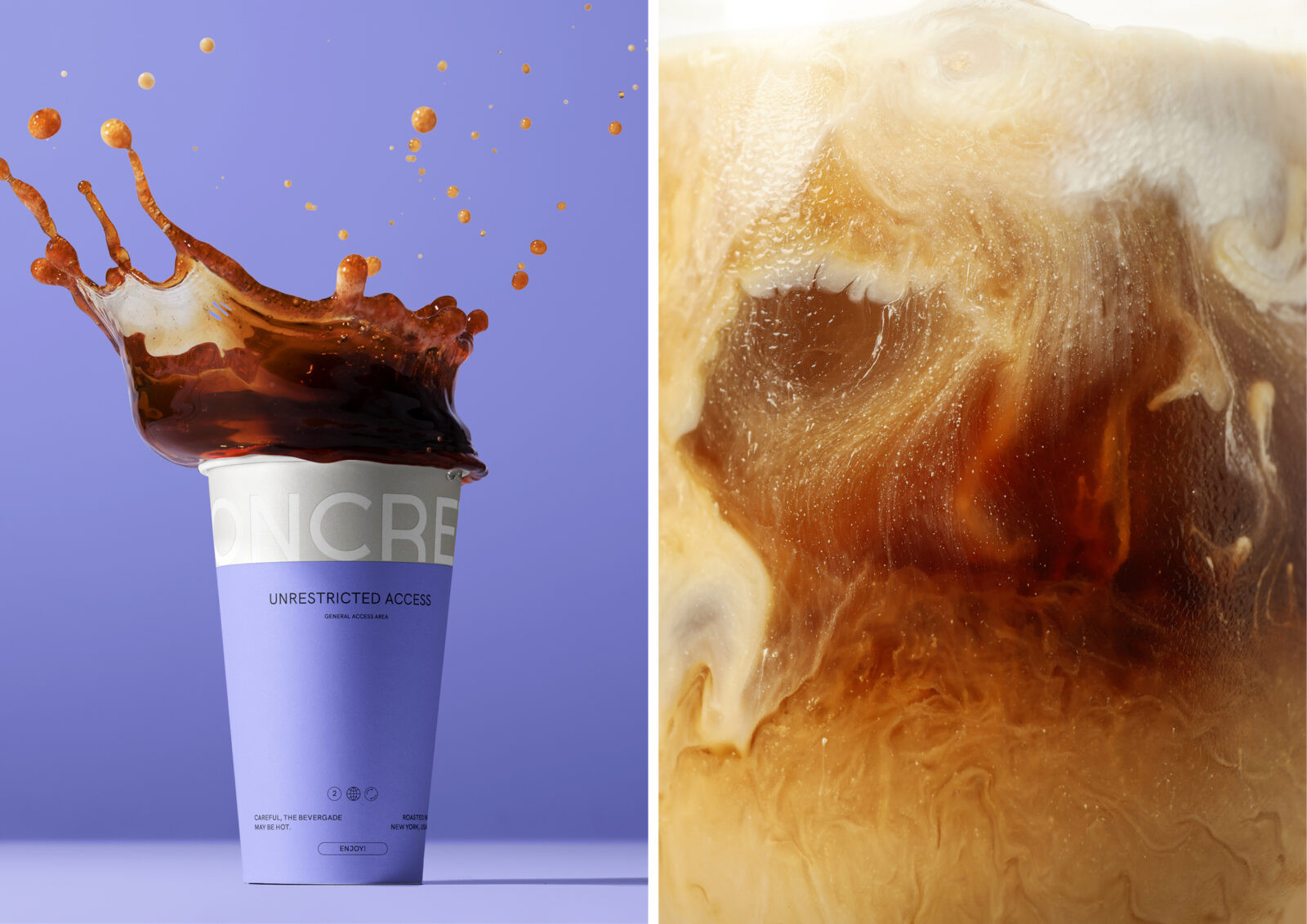
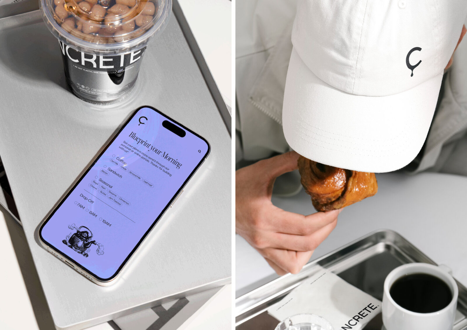
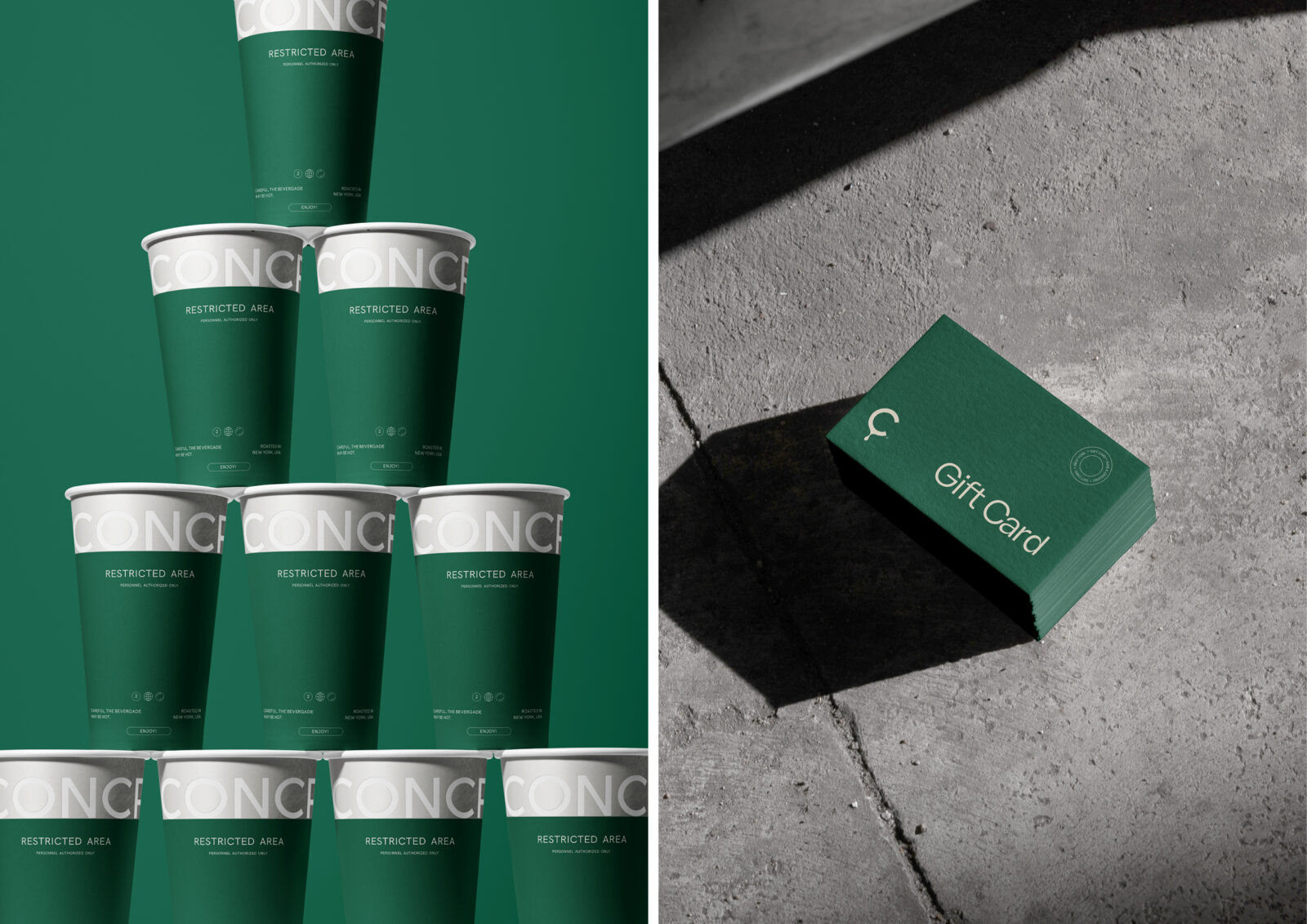
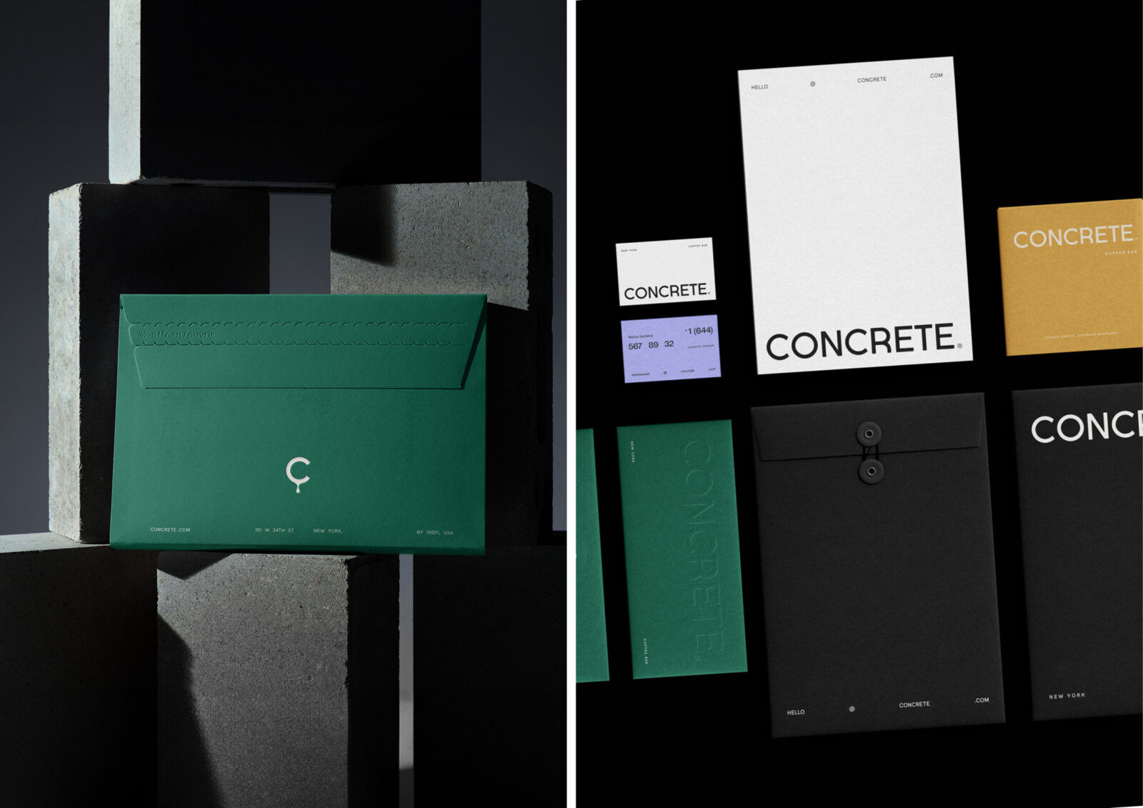
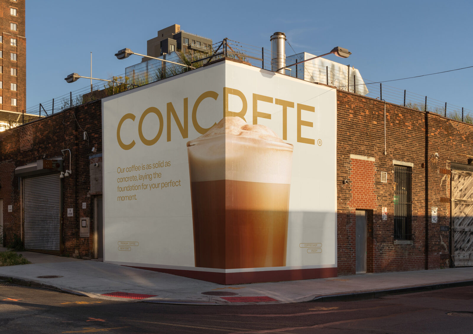
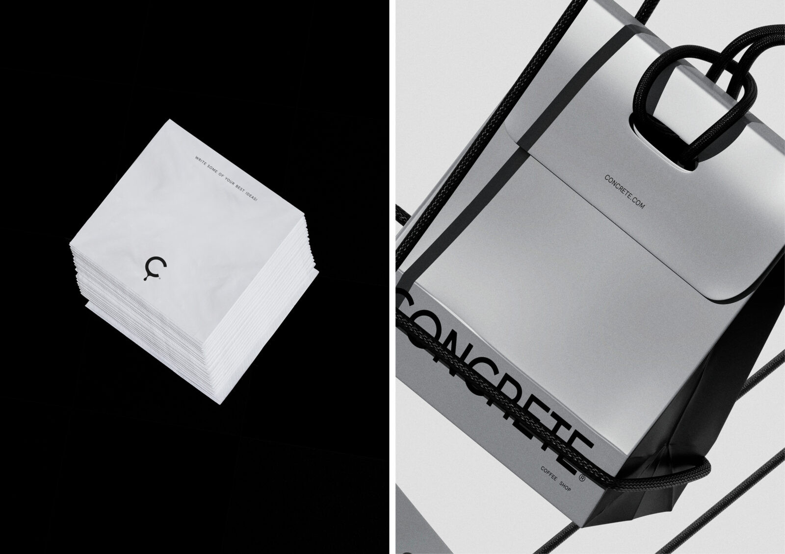
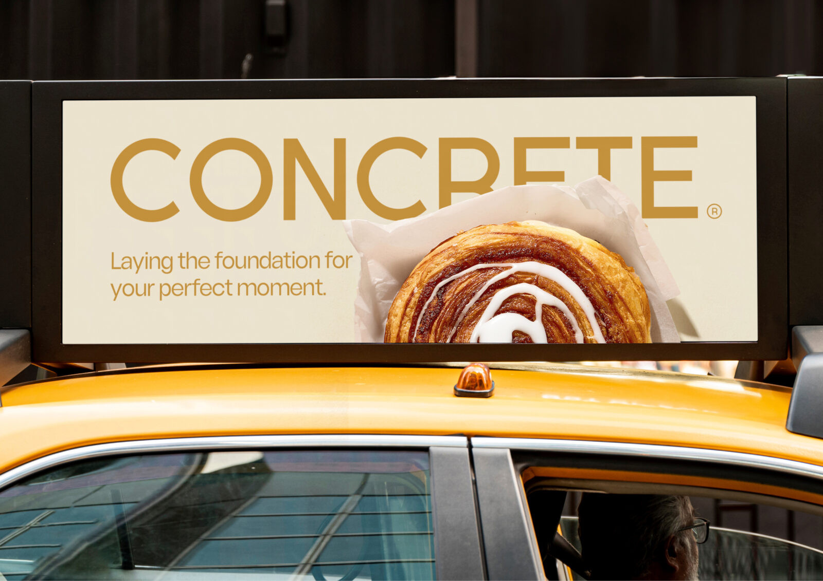
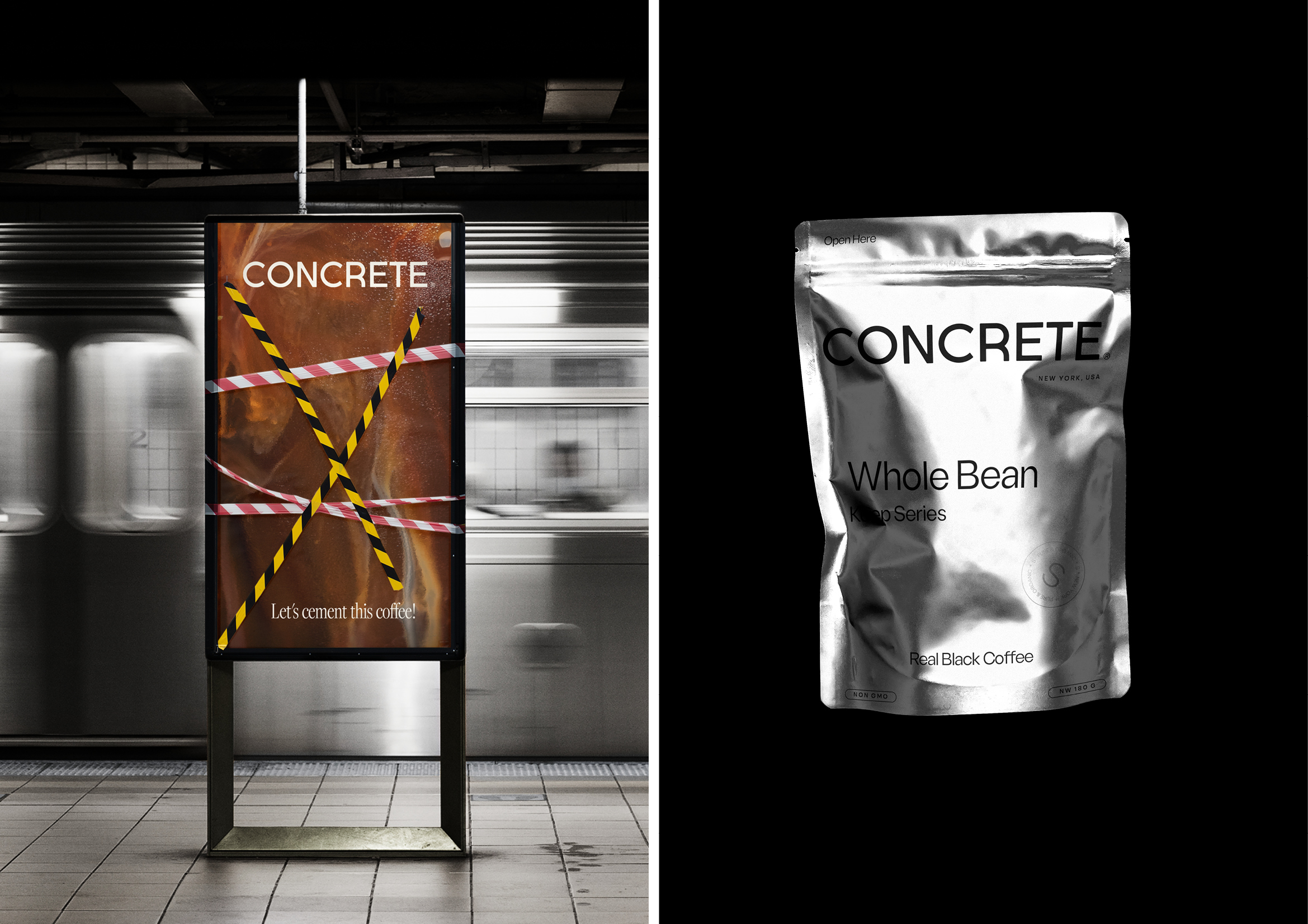
It was created a selection of color palettes not only constituting the brand’s story but also reflecting how the coffee bar operates and presents itself through photography. This visual cue system makes it easy for patrons to instinctively decide whether they like to be part of an energetic conversation or enjoy some peaceful solitude. Lilac fosters connection in shared spaces, while Earth Green offers solitude for reflection. Coffee Gold emphasizes the warmth of coffee in ads and social media. Black and White provide transparency for general information, reflecting city life, while Silver, taking inspiration from the NYC subway train’s metallic look, adds a modern, industrial touch.
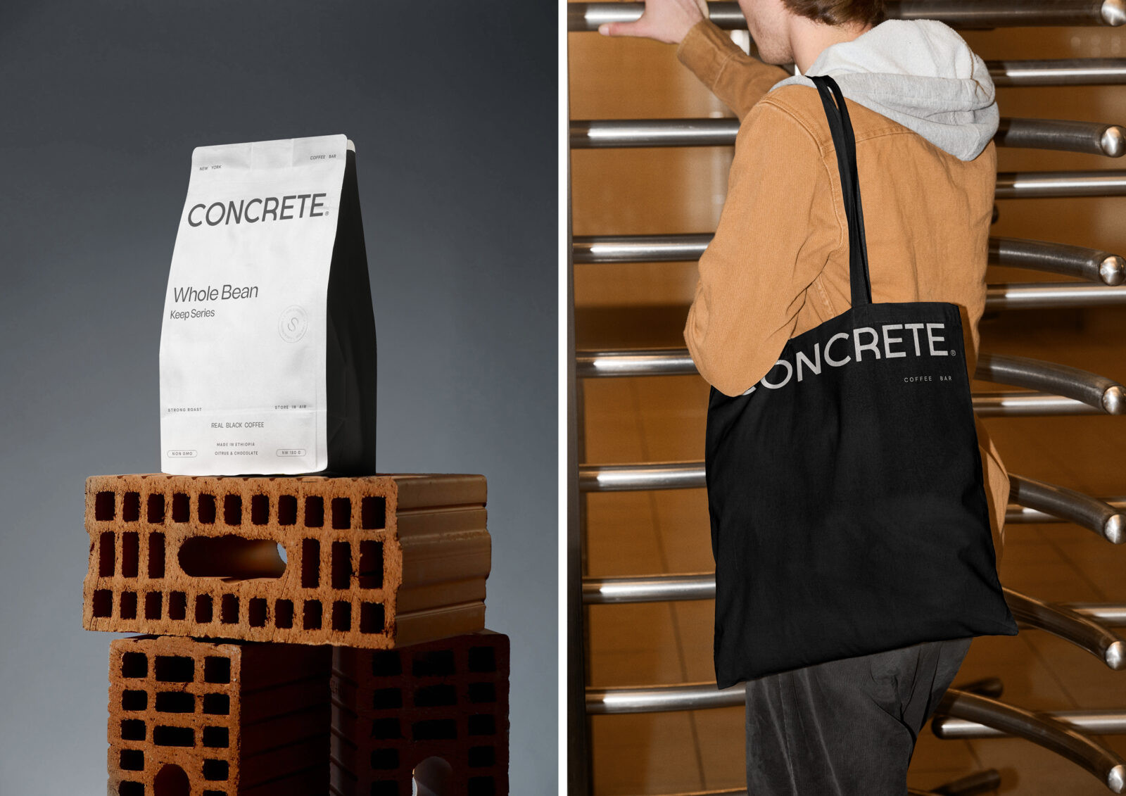
This color distinction also extends to internal communication: green indicates private communication like envelopes or letters, while lilac marks shared communications like social media and ads. This ensures clear and effective categorization. This approach guarantees that each message is visually aligned with its purpose. The typography combines neutrality and modernity, featuring a clean and accessible design, while the tone of voice is direct and industrial.
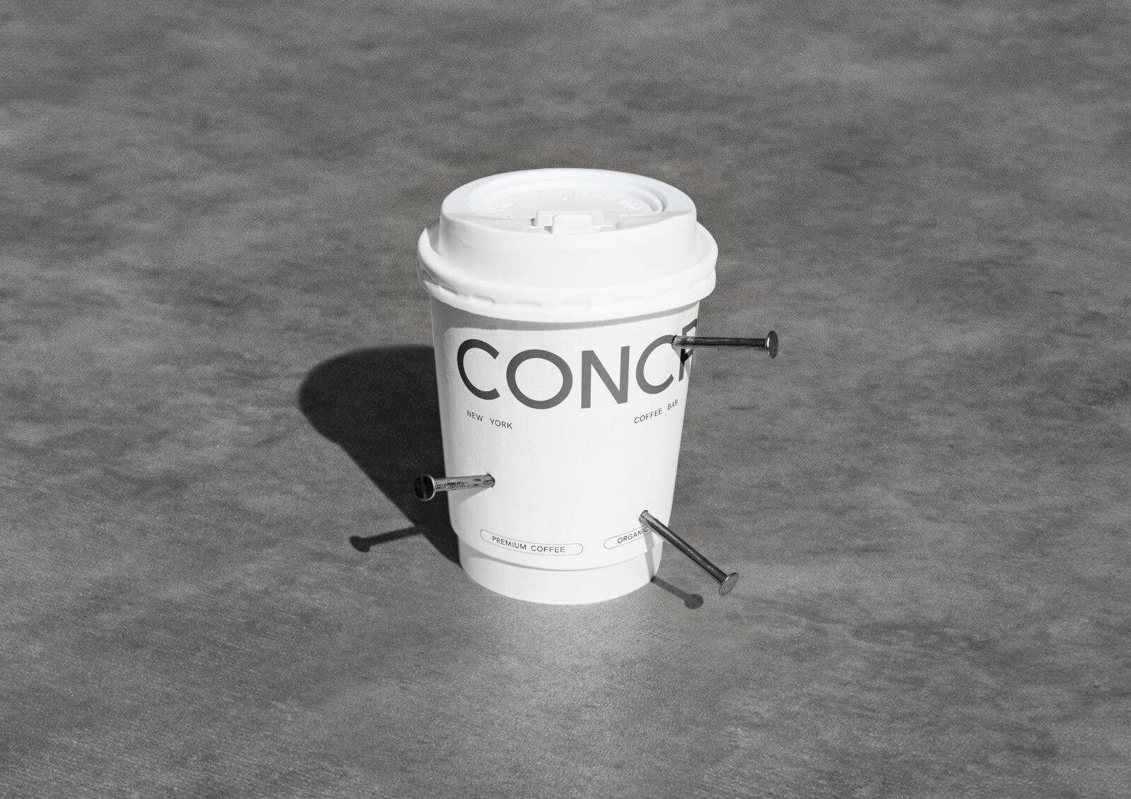
Finally, this visual identity integrates illustrations with modern design elements, akin to a well-built structure that stands the test of time. The minimalist packaging draws inspiration from the construction industry, giving a touch of organic elegance and setting it in concrete.
CREDIT
- Agency/Creative: Tiare Payano
- Article Title: Tiare Payano Shapes Concrete With a Color-Led Visual Identity for Urban Coffee Culture
- Organisation/Entity: Creative
- Project Status: Non Published
- Agency/Creative Country: Spain
- Agency/Creative City: Madrid
- Market Region: America
- Project Deliverables: Art, Art Direction, Brand Creation, Brand Design, Brand Experience, Brand Guidelines, Brand Identity, Brand Mark, Brand Naming, Brand Strategy, Brand Tone of Voice, Brand World, Branding, Concept Art, Copywriting, Creative Direction, Design, Directing, Identity System, Insight, Packaging Design, Pattern Design
- Industry: Food/Beverage
- Keywords: WBDS Creative Design Awards 2025/26 , Branding design coffee bar concrete
-
Credits:
Photographer: Javier Díez
Photographer: Marc Tran


