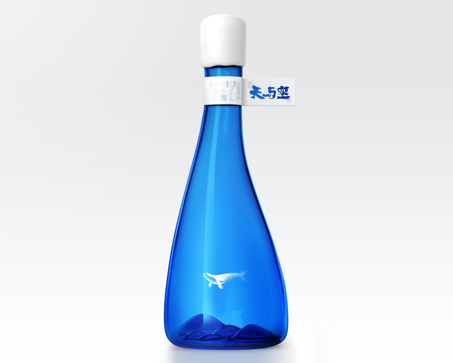
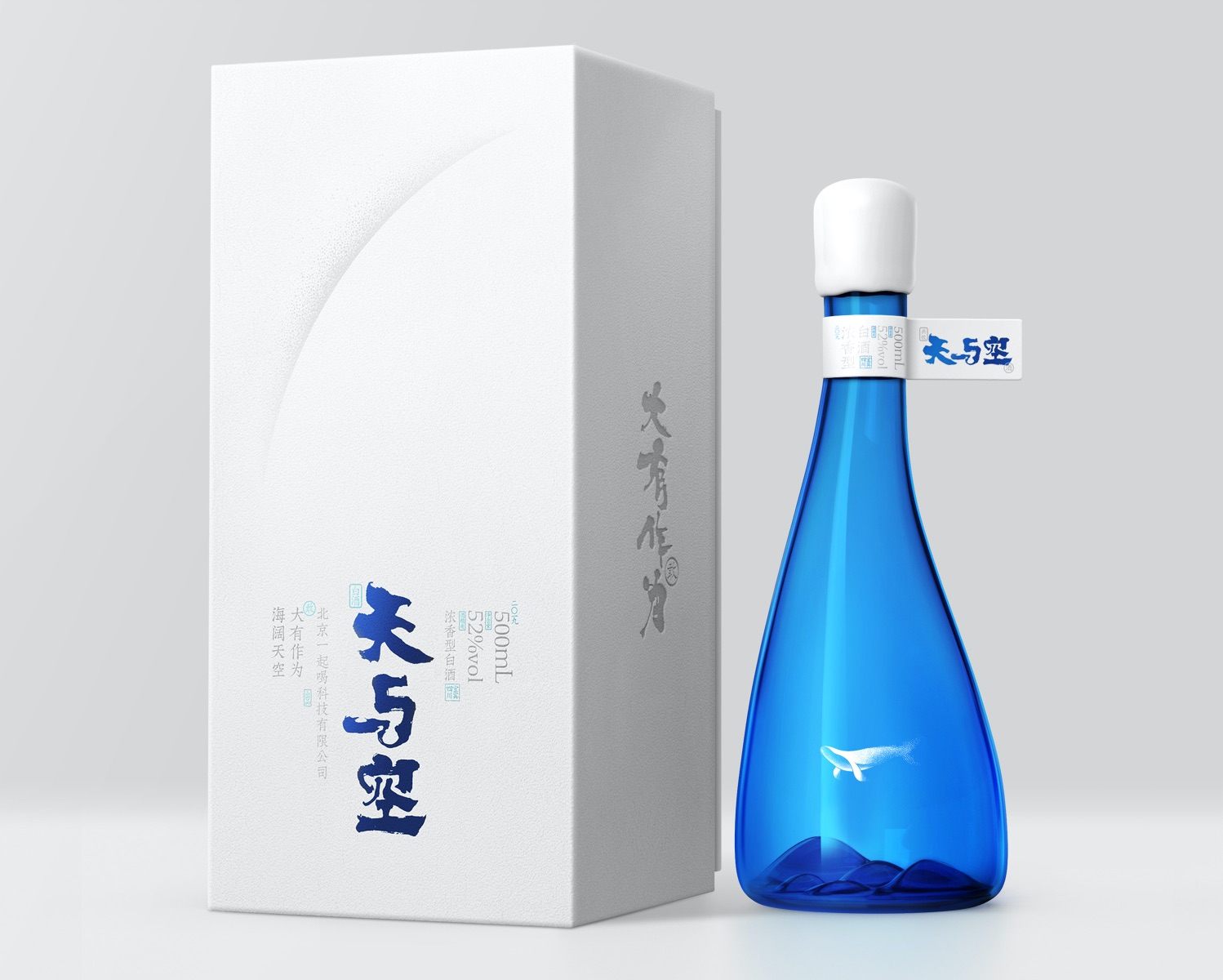
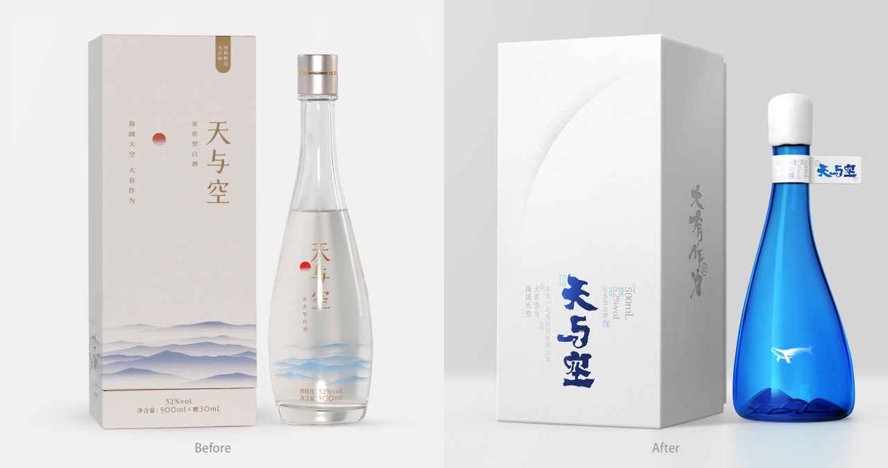
This distilled spirit product from China is named “Tian and Kong”,meaning the sky and emptiness. In Chinese writing, what differentiates “Tian and Kong” from “Tian Kong” (meaning the sky) is only the adding of the word “and”, but in terms of meaning, the former carries a little more sense of romance, which is the key element that separates this brand from other traditional liquors on the Chinese market.
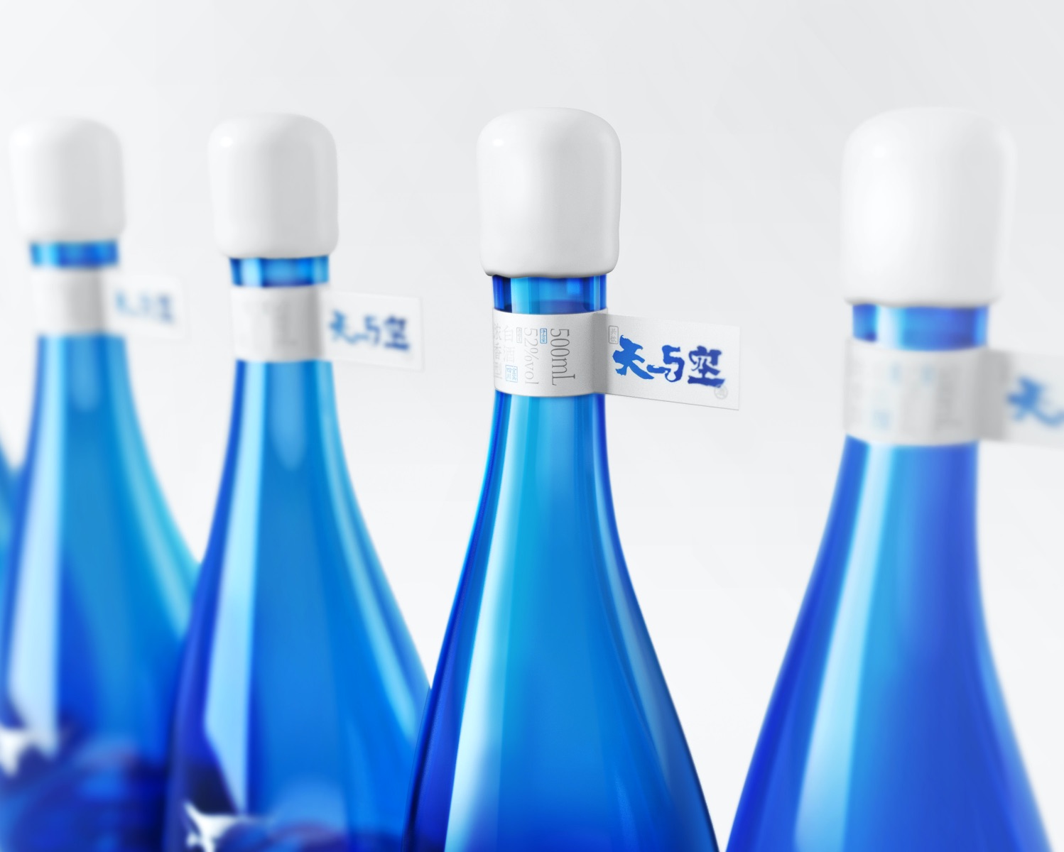
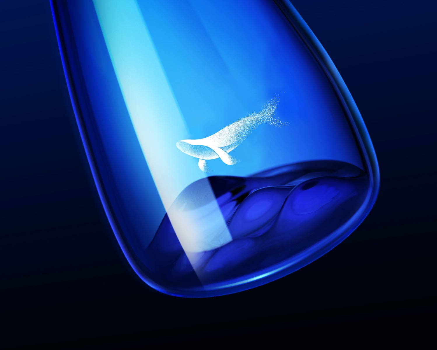
To be better in line with the product’s unique style, the container is designed to present an asymmetrical streamlined appearance, and several reverse hollows are made at the bottom to look like rolling hills. With the semi-transparent image of an whale on the container and above the “hills”, the entire design displays a fantastic scene just like a big fish is soaring in the sky, which also interprets how we understand the spirit of the brand “Tian and Kong”.
CREDIT
- Agency/Creative: ShenZhen Lingyun creative packaging design Co.,Ltd.
- Article Title: Tian and Kong Liquor Packaging Redesign
- Organisation/Entity: Agency
- Project Type: Packaging
- Project Status: Published
- Agency/Creative Country: China
- Agency/Creative City: ShenZhen
- Market Region: Asia
- Project Deliverables: Packaging Design
- Format: Bottle
- Substrate: Glass Bottle
- Industry: Food/Beverage
- Keywords: WBDS Agency Design Awards 2021/22
-
Credits:
Creative Director , Designer: Xiongbo Deng


